Colorful and Creative Business Cards with MOO

This post is sponsored by MOO. I’ve partnered with them to share some colorful and creative business card ideas. All content and opinions are my own. MOO 100% recycled Cotton Business Cards are completely tree free and print vivid, saturated color – all on archival quality paper. Thank you for supporting the sponsors that make Oh So Beautiful Paper possible!

I absolutely LOVE business cards. I think of them as mini works of art, and I keep a bowl full of all the beautiful, inspiring business cards that I’ve received over the years. I was VERY intrigued when I heard about MOO’s new 100% recycled Cotton Business Cards – I wanted to see how the new paper could handle bright colors and delicate illustrations! I teamed up with a few illustrators, stationers, and graphic designers to showcase some of their business card designs printed on MOO’s cotton paper, and share some tips for colorful and creative business cards. And if you’re a new MOO customer and you’d like to check out the cotton business cards yourself, MOO is offering Oh So Beautiful Paper readers 15% off Cotton Business Cards with the promo code OHSOMOO!

Colorful and Creative Business Cards with MOO Recycled Cotton Business Cards

First, a bit more about the paper! MOO teamed up with one of the best paper mills in the country, Mohawk Fine Papers, to create a modern twist on a traditional cotton rag paper. Made from t-shirt offcuts, the paper is completely tree-free and reuses waste material from the fashion industry to create an archival quality paper at an affordable price point. The 100% recycled cotton paper is bright white, with a subtle texture that looks and feels great in person. And it prints vivid, saturated colors like a dream!

Colorful and Creative Business Cards with MOO Recycled Cotton Paper

Business card design: Juliet Meeks

Nothing bums me out quite like a cheap, low quality business card, so I love that MOO makes quality paper available at an affordable price! And if you work in a design-related field, it’s especially important to have great business cards. Here are some tips for creating colorful and creative business cards.

1. Stay true to your personal style.

Business cards make a lasting impression and can tell the person on the other end a ton about you. Is your style bright and colorful? Minimalist? Romantic? What colors do you love? Are you playful or serious? Bright white recycled cotton paper allows for really bright, saturated color, which is perfect for colorful styles! Your business cards should reflect your style and personality. I love the way illustrator Juliet Meeks showcased her floral illustration work around her logo!

Colorful and Creative Business Cards with MOO Recycled Cotton Business Cards

2. Show your work

If your work is visual, show it on your business cards! This is a thousand times true for illustrators, calligraphers, photographers, and other artists, but I think it’s equally true for everyone from woodworkers to contractors to make up artists.

Colorful and Creative Business Cards with MOO Recycled Cotton Business Cards

Business card design: Fiber & Dye

With double-sided printing, business cards are the perfect opportunity to show examples of your work! Lisa of Fiber & Dye used MOO’s Printfinity feature to print different examples of her illustration and hand lettering work on the back of each business card. You can also print professional photos instead of illustrations – just make sure the photos are properly edited and formatted to showcase your work in the best possible way.

3. Think outside the box

I’ve seen business cards of all shapes and sizes: rectangles, large squares, small squares, rounded corners, even circles and unique die cut shapes! The shape of your business card speaks to your personal style, and there’s no need to stick to a traditional rectangular format! Choose the shape that best shows your style and your work.

Colorful and Creative Business Cards with MOO Recycled Cotton Business Cards

4. Consider Both Sides

No one-sided business cards here! I’m personally a fan of putting contact info on one side and logo/artwork on the other side, but there are so many options for making that happen. Bright and colorful on one side, white minimalist on the other side? Artwork on both sides? Should the front and back designs mirror each other? MOO’s design guidelines allow for a full bleed on both sides of the card, so your design can go across the whole card without worrying about white edges. I’m loving these full bleed business card designs from Meeschmosh and Heidi Gruner Design.

Colorful and Creative Business Cards with MOO Recycled Cotton Business Cards

Business card design: Meeschmosh

Colorful and Creative Business Cards with MOO Recycled Cotton Business Cards

Business card design: Heidi Gruner Design

Colorful and Creative Business Cards with MOO Recycled Cotton Business Cards

Colorful and Creative Business Cards with MOO Recycled Cotton Business Cards

Colorful and Creative Business Cards with MOO Recycled Cotton Business Cards

Colorful and Creative Business Cards with MOO Recycled Cotton Business Cards

I’d love to hear your tips for creative and colorful business cards! Feel free to share a link to your business cards in the comments. And for new MOO customers out there – don’t forget that you can get 15% off Cotton Business Cards with the promo code OHSOMOO!

Photo Credits: Nole Garey for Oh So Beautiful Paper

This post is sponsored by MOO. All content and opinions are my own. Thank you for supporting the sponsors that make Oh So Beautiful Paper possible!

Behind the Stationery: Yao Cheng Design

Our next installment of Behind the Stationery take us to Columbus, Ohio to visit Yao Cheng’s design studio. She’s not only the owner and watercolor artist, but also the calligrapher and graphic designer of all things Yao Cheng Design! Over time, Yao has found that designing for custom clients versus her product line requires different creative processes and dives into how she approaches each of them. With a new baby and a growing team, she navigates through the changes in her business and talks about the reality of coming back to work after maternity leave. Here’s Yao! —Megan Soh

Behind the Stationery: Yao Cheng Design

From Yao: Looking back, it’s been a very interesting journey of what I thought my business was going to be and what it has become. When I first left my full-time corporate design job to start my own venture in 2012, I thought my business was going to revolve around my interpretation of hand-painted Pysanky eggs. At the same time, I was playing around the idea of art prints and greeting cards because I really loved painting watercolor more than anything else. As I was figuring all of this out, I applied for my first craft show. It was at that show that I had everything displayed and it became very clear to me what people were gravitating towards. Customers felt more connected to my art prints and cards because it’s a natural interpretation of my paintings. After that show, I shifted my focus into the direction of art prints and stationery.

Behind the Stationery: Yao Cheng Design

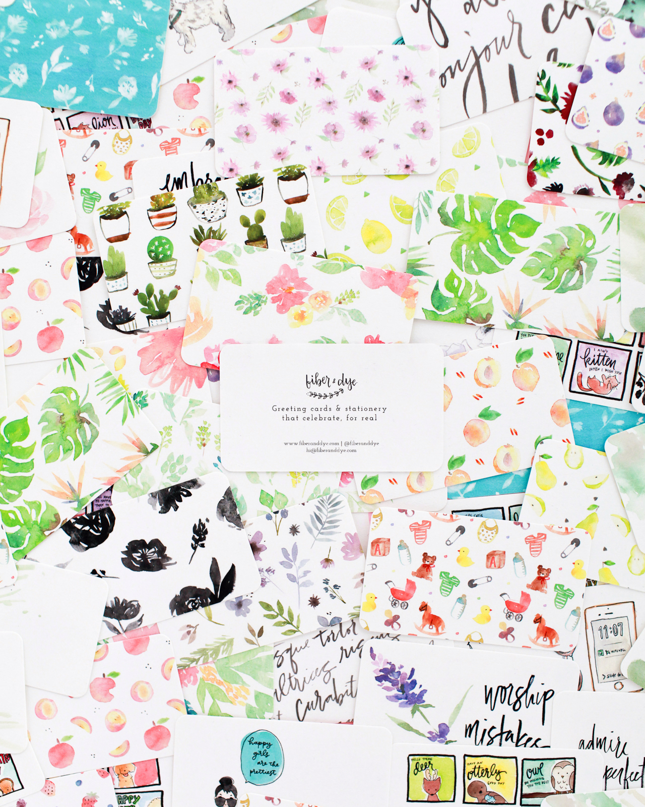
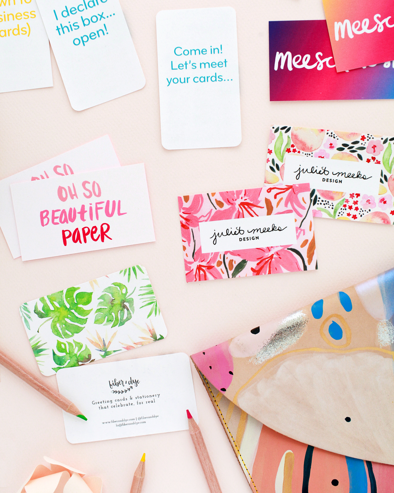
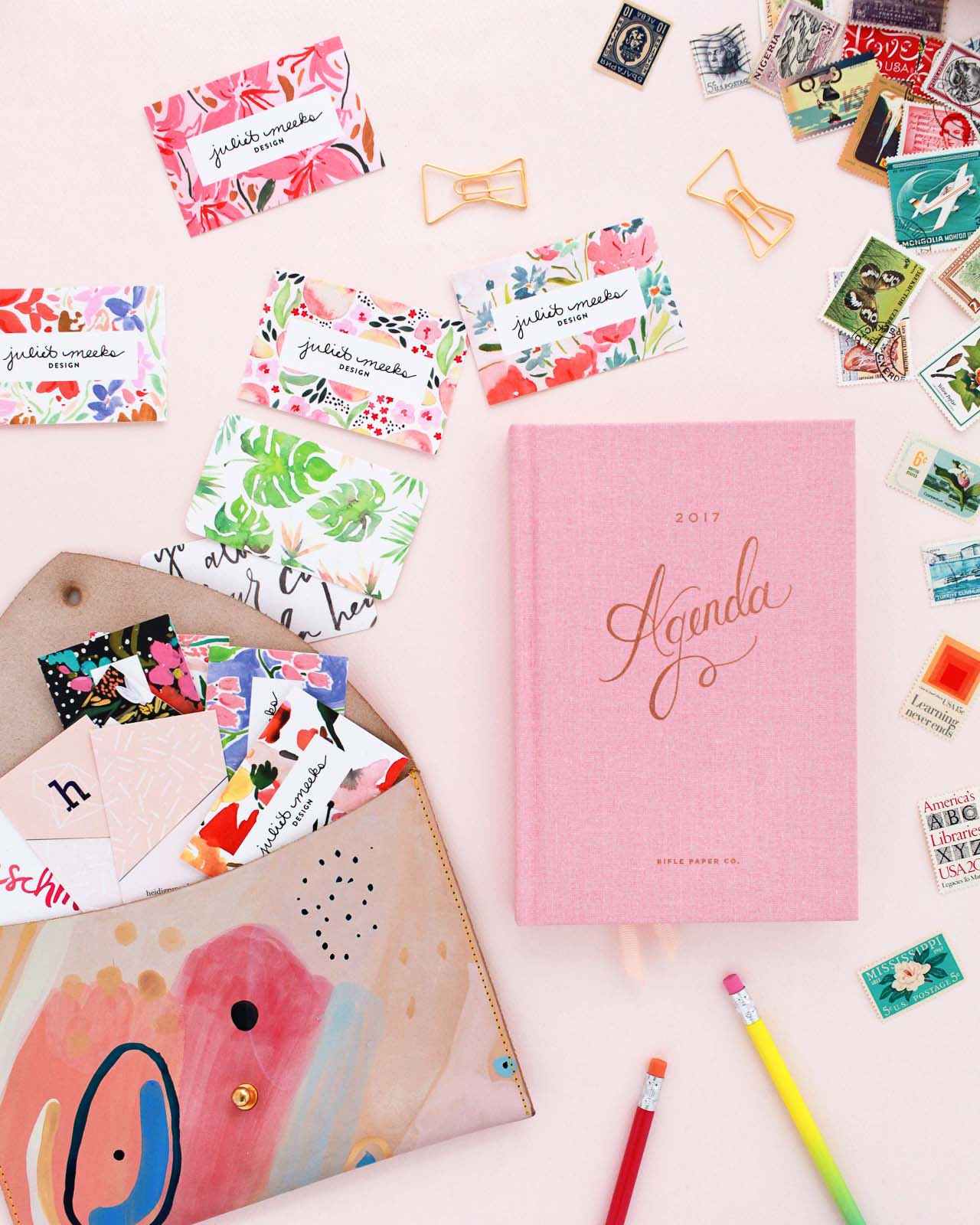
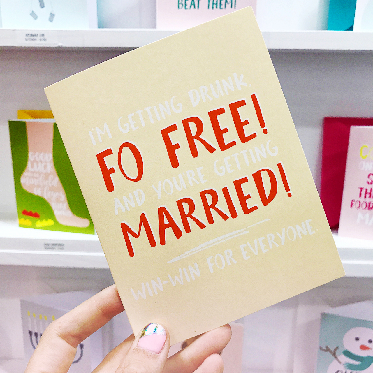
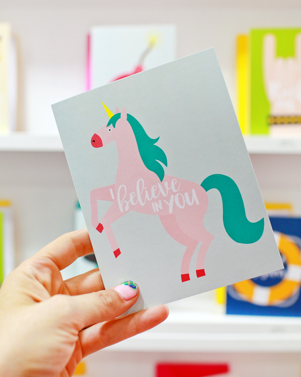
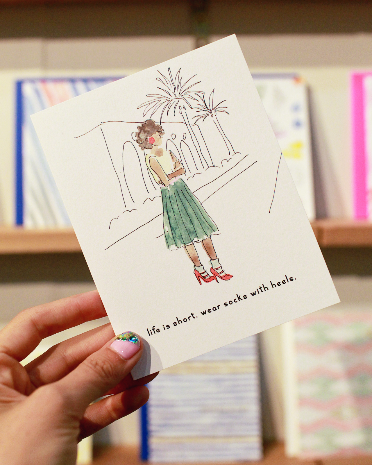
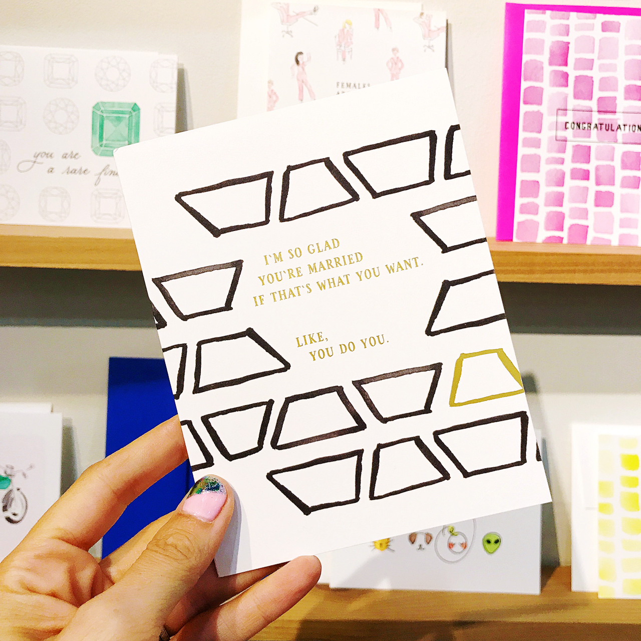
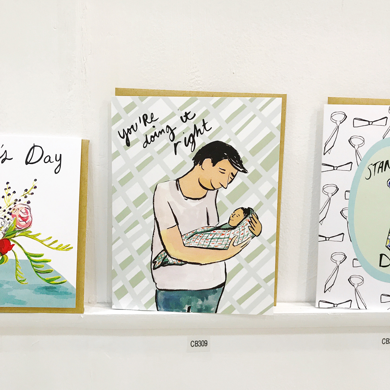
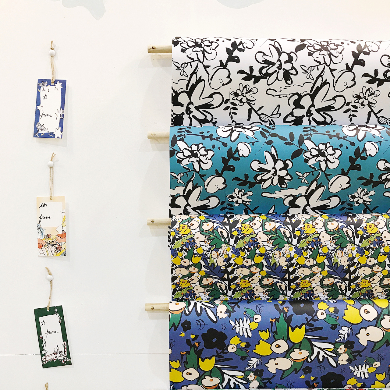
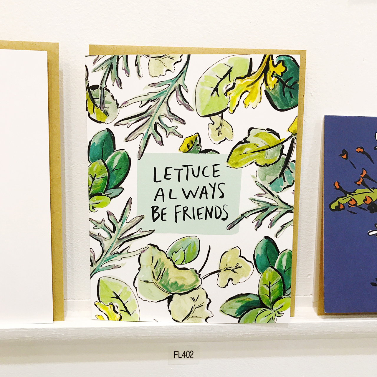
Our business is unique in both the style of watercolor that I create and also in the way that it is structured. We offer giclée art prints, greeting cards, wedding stationery (custom, pre-designed, and calligraphy services!), and gift wrap in addition to our line of textile products. We also have an exciting collaboration with Chronicle Books in which you can find my watercolor designs on a line of notebooks, notecards and the latest One Line a Day journal!

Behind the Stationery: Yao Cheng Design

Photo by Chancey Charm

It wasn’t until 2013 that I really dove into the world of wedding stationery. The Style Me Pretty post of a styled autumn wedding featuring some of my first wedding invitations was really the beginning of our wedding business. As a creative, I love being able to touch and hold things in my hands. The tactile quality makes me feel like I have a tangible connection to something real. Whenever I’m designing wedding invitations, I try to replicate this feeling. I think of wedding invitations as more than just a piece of paper, they are small pieces of artwork that really captures a special moment in a couples life and all the memories of that day!

Behind the Stationery: Yao Cheng Design

Photo by Lily Dent for the Metropreneur

Everyone knows that as a small business, you wear many different hats. That is certainly true with us! We are a very small team at the moment as I am very careful about how fast we grow. Because I have a little one, my days are limited to an 8-hour day. We plan out our next week’s calendar the Friday before, so when I come in in the morning, I have a pretty concise agenda of what needs to be done. Still, I am known to be overly ambitious with my tasks, so I almost never finish all of my tasks for that day! I could be spending the morning answering emails or questions from my team, then jumping on calls with clients or new manufacturers, or even doing a styled shoot for an upcoming newsletter. In a week, I try to carve out an afternoon or a full day to paint, but I wish I had more time devoted to painting!

Behind the Stationery: Yao Cheng Design

I spend 70-80% of my time running the business, but it’s my dream to flip that so I am able to spend that amount of time painting new work. Don’t get me wrong — I am fascinated by the business side of things because I think learning about strategy, planning, pricing, bookkeeping, etc is all empowering. I think it’s crucial, as the owner, to understand the basics of all the facets of the business before delegating it to others. However, I recognize my strength is in painting, so that’s where I’d like to focus my time on one day.

Behind the Stationery: Yao Cheng Design

Photo by Lily Dent for the Metropreneur

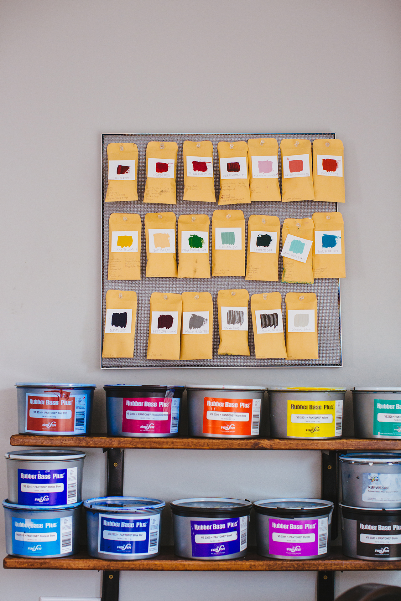
Our design studio is located in downtown Columbus, Ohio. It’s a space that I am very proud of because it is almost exactly how I’ve envisioned my dream space! We are in a very unique building that is zoned both commercially and residentially. This gave us the opportunity to have our own kitchen and bathroom, offering us the privacy that I knew I’d need in order to focus on the day-to-day! My favorite feature about this space is the large windows that bring in so much natural light, which is great for painting. Half the space is an open loft, and that’s where we spend most of our time. I love that this studio inhabits every step of the design process from painting the original artwork to designing the final product or design. I even had a custom table made by a talented local carpenter so that it would be large enough for us to host our workshopscreative meet-ups, and other events!

Behind the Stationery: Yao Cheng Design

My design process for wedding stationery is different from how I approach our product line in that I include sketches during the process. For custom bespoke work, I have an initial chat with the client to get a feel of the style and colors that they are looking for. Once I have some visuals to work from, I start sketching with a black pen different layout options of what I think would work. This is actually the most involved part of the design process because I am fully designing out multiple versions of the invitation suite so that all of the layouts and wording are in place before I move into painting. Once we have the layout and color palette approved, I will start painting and adding color in the pieces. It’s sort of magical to see something black and white come to life in watercolor! Designing wedding invitations requires this type of process because I want to make sure our bride can get a visual understanding through every step.

Behind the Stationery: Yao Cheng Design

Behind the Stationery: Yao Cheng Design

We really value working closely with our brides through every step of the process! Having planned my own wedding, I know how special and important this day is to each person. One of our most unique custom wedding pieces is my custom maps because the couple gets to highlight what they love about and around the place that they are getting married. I really enjoy creating each one of them because they are more illustration-based and different from the rest of my work. I also create the calligraphy script, making our invitations a complete package. Everything feels cohesive because I can match the calligraphy style to the feel of the entire suite. I think addressing envelopes might be my favorite part of wedding stationery, actually! It’s mindless and a different translation of my love for the free-flowing, fluidity of watercolor.

Behind the Stationery: Yao Cheng Design

However, outside of our wedding work, I take a different approach. First of all, I skip the sketching in black and white phase because I find it much more liberating and challenging to work when I am not really sure of where I am going. My work is very connected to the idea of intuition and improvisation. I like to respond and be in the moment with my paintings, and often find that this is where I find happy surprises! Watercolor, as a medium, lends itself very well to my approach of painting because of how quickly it dries. This allows me to paint fast, usually within an hour or two, and move on to the next idea. I am usually painting 3 different things at once because of this. I love this way of “sketch painting” because it takes away the expectation that this artwork will be the masterpiece. I am free to explore new ideas, expound on them or move on to another and not feel too attached. So in the end, I might make 3-4 painted versions of the final design. Once a piece is finished, we will scan them into the computer and then minimally edit it in Photoshop.

Behind the Stationery: Yao Cheng Design

One of my business struggles of this year has been ramping back up to speed from taking almost 6 months off for maternity leave. I am so grateful that we were able to keep everything running while I was gone, but I would have never expected the kind of challenges I’ve faced coming back. Having turned down many projects and going months without creating new work, I do feel like I “fell behind” in some ways. I have found the panic of feeling like we might not be relevant at any moment to be a common experience for small business owners! Still, it was a fear that became very real as my overhead increased with a studio space and payroll to run every month.

Behind the Stationery: Yao Cheng Design

Another daily struggle is learning how to be a good boss. Managing employees is not something I learned in art school, and it is definitely unique to each business. I’ve also had to learn not to allow my creative “monkey” brain to get side-tracked with all of the ideas that I think of in a day. This is definitely something I’ve recently learned and happens when you expand to more than just yourself. When it was just me, I didn’t have to plan my calendar out for the year — every product release happened when I had the time to get to it. After all, it was just me, so if it meant working longer days, I could do that. But now, strategies have to be made and clients are committed to far in advance because there are other people involved now. I can no longer just throw a curve ball last minute and think we can stay on schedule with everything else!

Behind the Stationery: Yao Cheng Design

The way my business is structured really reflects the person that I am. I am never satisfied with doing one thing, and I think my strongest work comes from doing multiple projects at once and allowing my ideas for each to bounce off of one another. I truly believe in the work that I do and see so many avenues that my watercolors can go, so it makes sense for me to have every product or project culminate in watercolor, but take on lives of their own.

Photos by Christa Kimble Photography except where noted.

Want to be featured in the Behind the Stationery column? Reach out to Megan at megan [at] ohsobeautifulpaper [dot] com for more details.

Behind the Stationery: And Here We Are

Everyone has such unique stories about how they came into the stationery world and Meghan from And Here We Are is no exception. Meghan eased into the stationery industry after designing and printing her own wedding invitations, and after 9 years in New York, moved her Brooklyn studio to Columbus, Ohio where she recently moved (again!) to an industrial space. Walking us through her design process from brainstorming and sketching to printing techniques, here’s Meghan! —Megan Soh

Behind the Stationery: And Here We Are

From Meghan: Hi there! I’m Meghan, owner and founder of And Here We Are, a design & letterpress printing studio based in Columbus, Ohio. I went to school for graphic design – and back again for typeface design – and in past lives have worked as a textile designer, a designer in a traditional firm, an in-house designer for a PR firm, and finally, a print designer at a television network. I live in the Short North neighborhood here in Columbus with my husband, John, our son Wiley, and our dog Martha.

Behind the Stationery: And Here We Are

And Here We Are launched in 2012 out of our apartment in Greenpoint, Brooklyn. It started after I went a little nuts on our personal wedding invitations and paper goods, and the press led to several more custom wedding commissions. I always loved letterpress printing, which I’d discovered in college, and was really excited about the idea of getting my hands dirty again!

Behind the Stationery: And Here We Are

I worked nights and weekends for about a year before I officially left my day job to purse paper goods full time. At first I was working out of the corner of our living room, meeting clients in coffee shops and renting letterpresses at a local studio in Brooklyn. We bought our first letterpress in 2015, and moved out here to Columbus (after 9 years in New York) in search of affordable space. We were lucky to find an adorable little Victorian house just north of Downtown with a 400 square foot sun room that made a perfect home studio.

We worked out of this studio until it was just about bursting at the seams; we recently moved all of our equipment and product stock out into a 1,000 square foot space across town. Being in this industrial space will allow for more (and heavier) equipment, and I plan to host events and workshops, too.

Behind the Stationery: And Here We Are

In addition to custom design and printing, we have a full line of letterpress printed greeting cards and accessories that we sell both retail and wholesale (we exhibited in our first National Stationery Show this Spring). We do all of our letterpress printing in house, but offer all sorts of printing methods through our network of trusted vendors here and back in New York. We often combine letterpress printed pieces with foil stamping, digital printing or die cutting.

Behind the Stationery: And Here We Are

Behind the Stationery: And Here We Are

We currently have a Vandercook SP-15 letterpress, which carries about 90% of the load, and a C&P pilot press which we use mostly for coasters and some smaller items. We trim on a Challenge Triumph hydraulic trimmer. A Windmill or Kluge letterpress is probably not too far off in the future, and I’d like to bring foil-stamping in house too.

Behind the Stationery: And Here We Are

Behind the Stationery: And Here We Are

From 2014-16, my husband John was also working with me, but went back to a day job last year when we found out we had a baby on the way. So for now, I’m working by myself again, with the occasional part time or temp helpers. Now that we’ve moved into our new space I’m hoping to bring on 1-2 members to join the team.

Behind the Stationery: And Here We Are

There really isn’t such a thing as a typical day when you run a business and have an 8-month-old; most days we’re up at 6:30, having breakfast and taking a long walk before heading into the studio. Around 8:30, I drop the baby off at day care or bring him with me, depending on the day of the week. I could be drawing, printing, trimming, filling orders, or writing estimates and invoices (the most glamorous part of the job). There’s always a lot more emailing and administration than I’d like, but I’m often able to tackle those tasks at home after the little one’s gone to bed.

Behind the Stationery: And Here We Are

Even when I’m not in the studio, I’m almost always carrying a notebook or sketchbook to jot down new ideas, doodles or notes. I usually start with just a list of words that I keep on my phone, which I then distill into a few categories and then every month or two I’ll block out a few solid days to sketch out some lettering and illustrations, and then spend another week or two refining those.

Behind the Stationery: And Here We Are

I usually move from pencil sketches to brush and ink or brush pens, often drawing and redrawing an idea through layers of tracing paper to distill it down to the simplest form possible. Sometimes I work backwards from an ink color I really want to use, or a print method I want to try. Then the drawings get scanned into the computer, cleaned up and digitized. I assign ink colors on the computer (although I often change my mind when I’m on the press!), prep the files for letterpress printing, and send the art out to have plates made.

Behind the Stationery: And Here We Are

Often, I start with art prints, then extend the artwork through other items like totes, coasters or cards. I usually release new collections about once a quarter.

Behind the Stationery: And Here We Are

Custom work is a whole other monster. These start with a client meeting and idea board; then I’ll ruminate on it a bit and pull some visual examples into a Pinterest board. I keep my sketchbook handy and usually in a week or two I’ll hit on an idea that I can get excited about (and when I’m lucky, the client is excited about it too!). Totally custom jobs usually go through about 3-4 rounds of design before we hit the press. Since we had the baby, I’ve been shifting the focus of And Here We Are toward the retail and wholesale side of the business, but do still take a limited amount of custom projects each season.

Behind the Stationery: And Here We Are

And Here We Are is a member of the Designer Rolodex – see more of their beautiful work right here!

Follow along with And Here We Are on Instagram and Twitter.

Studio photos by Adam Lowe Photography; others by And Here We Are.

Interested in being featured on the Behind the Stationery column? Reach out to Megan for more information at megan[at]ohsobeautifulpaper.com.

NSS 2017: New Exhibitors, Part 1

There are always a slew of new exhibitors at every National Stationery Show, and this year was no exception! Some of the new exhibitors have been on my radar for years but just made their trade show debut this year, while others are new-to-me businesses (always a pleasant surprise at the show!), and even others are just launching their businesses. Today I thought I would introduce you to a few of those new exhibitors – with a few more to come tomorrow. Let’s start with the playful hand lettered greeting cards from Pinwheel Print Shop, definitely one of my faves from this year’s show!

NSS 2017: Pinwheel Print Shop

NSS 2017: Pinwheel Print Shop

NSS 2017: Pinwheel Print Shop

Pinwheel Print Shop (see the full booth here!)

I love the clean, elegant aesthetic of these cards from Bred & Butter Paper Co. – those pops of color are so good paired with classic black text!

NSS 2017: Bred & Butter Paper Co.

NSS 2017: Bred & Butter Paper Co.

NSS 2017: Bred & Butter Paper Co.

Bred & Butter Paper Co. (see the full booth here!)

It was hard to miss the bold, colorful style of Brooklyn-based Ash + Chess, for good reason! Their illustration and hand lettering style is so fresh and unique.

NSS 2017: Ash and Chess

NSS 2017: Ash and Chess

NSS 2017: Ash and Chess

NSS 2017: Ash and Chess

Ash + Chess (see the full booth here!)

I love cards that make me laugh! The Lovebird Paper booth was full of bold, sassy humor – from greeting cards to notepads and mugs. So fun!

NSS 2017: Lovebird Paper Co.

NSS 2017: Lovebird Paper Co.

NSS 2017: Lovebird Paper Co.

Lovebird Paper Co. (see the full booth here!)

So many beautiful gems in Party Sally’s debut at the National Stationery Show! Each design is created from an original watercolor painting or illustration, with plenty of shiny gold foil sprinkled throughout the collection.

NSS 2017: Party Sally

NSS 2017: Party Sally

NSS 2017: Party Sally

Party Sally (see the full booth here!)

I’m a huge fan of the bold, graphic style of And Here We Are. Gotta love those monstera leaf illustrations and pops of neon!

NSS 2017: And Here We Are

NSS 2017: And Here We Are

NSS 2017: And Here We Are

And Here We Are (see the full booth here!)

Ivy House was a surprise find at this year’s show – I just love her illustration style and sweet sentiments! Designer and illustrator Rachel Cohen previously worked in textile design and art education, which definitely shines through her loose, nature-inspired patterns and illustrations.

NSS 2017: Ivy House

NSS 2017: Ivy House

NSS 2017: Ivy House

Ivy House (see the full booth here!)

I literally stopped and did a u-turn after spotting these colorful pencils from UK-based I Am A out of the corner of my eye. Isn’t this unicorn set (with rainbow foil!!) the CUTEST??? I also love the cheerful emoji cards and scratch off cards – with a secret emoji hidden underneath!

NSS 2017: I Am A (London)

NSS 2017: I Am A (London)

I Am A (London)

I Am A (see the full booth here!)

I mentioned Tokketok in the round up of beautiful booth designs, and the products inside were equally gorgeous! I particularly love these gold foil notepads, which come with a variety of messages in rainbow colors. Keep a couple of notepads at the office to write out quick thank you notes or birthday notes to colleagues, or even at home to leave little love notes for your spouse or kids!

NSS 2017: Tokketok

NSS 2017: Tokketok

Tokketok (see the full booth here!)

That’s it for today! You can browse all the booths from this year’s show right here, and I’ll be back with more new exhibitors tomorrow!

Photo Credits: Nole Garey for Oh So Beautiful Paper

Behind the Stationery: Ramona & Ruth

Taking us to Nebraska, our next feature on Behind the Stationery is Ramona & Ruth!  Kim, the brand’s founder and designer, shares about her self-taught journey with letterpress and why this classic print method is a key element of Ramona & Ruth. As an illustrator, Kim gives us an inside look to how she sets up her ideal sketching environment, what inspires her designs, and what she’s been sketching lately. –Megan Soh

Ramona & Ruth

From Kim: It was around 9 years ago that my first little antique tabletop press was delivered to my doorstep in Omaha, Nebraska. It was better than Christmas morning. I had begun my nationwide search for a letterpress after a few years of working as a graphic designer in a corporate job and not feeling very fulfilled. I initially set out to use this letterpress to print wedding invitations for clients, but the more I learned, the more I wanted to explore, so I began printing my own hand-drawn illustrations. I spent countless hours researching the craft and fumbling around on the press trying to figure out how it worked. I still remember the very first illustration I printed of a little coffee cup and the joy it brought me to see my design come to life in print. It was then that I knew this was meant to be.

Ramona & Ruth

Over the years, my Omaha-based studio has grown to include two antique printing presses as well as a paper cutter from the late 1800’s. It was a few years ago that I knew time was right to purchase a Heidelberg Windmill letterpress to help me with printing larger wholesale orders. With this press upgrade also came a studio upgrade. Weighing in at 3,000 pounds, the Windmill was a much larger machine than my current press and therefore needed the space to accommodate it. Instead of finding a separate off-site studio space, my husband and I decided to have a letterpress studio built onto the back of our home. With no overhead and no commute I could better balance staying at home with my two little boys with my work in the studio.

Ramona & Ruth

After a few months, the studio was finished and the presses were moved in safe and sound. It was so important to me to have a generous amount of windows so the studio would be filled with an abundance of natural light. My studio is my outlet. I just love the light and airy feeling of my space and how it provides me with an inspirational and uplifting place to design and print. It is in this studio that I strive each day to build a brand of letterpress goods that create delicate, thoughtful designs that leave lasting impressions.

Ramona & Ruth

Ramona & Ruth is named for my grandmothers who inspired me to find beauty in simplicity. Ramona, an entrepreneur who handcrafted beautiful floral designs in her very own floral shop; and Ruth, who spent her days tending to dairy cows and wrangling chickens out on the farm. These hardworking, dedicated women helped instill my passion for developing my own business.

Ramona & Ruth - Ink

Ramona & Ruth

At Ramona & Ruth we print contemporary designs with timeless sentiment the old-fashioned way. While offering a variety of paper goods, the core of our product line is letterpress greeting cards. Each design starts from a sketch in my notepad and from there, is transferred to a digital image in Illustrator and prepared for platemaking. Letterpress is an art form and the details are what make it remarkable. The initial sketch, hand-mixing the colors, the intricacies of typography and spacing, hand-feeding the vintage presses — from conception to fruition, each and every product is a beautiful journey.

Ramona & Ruth

Each day at the studio is a little different, which is part of what I love about running this business. I typically start the work day at around 9 am once my boys are at their grandparent’s. After I pour a fresh cup of coffee and check through my emails, I go through my list of the day’s tasks which often include a mix of designing new products, printing, packaging wholesale orders, and marketing tasks including social media posts and newsletter design. I recently hired my first employee who will be working as our wholesale coordinator. I am hopeful that this will free up some time for me to focus on more of the things I enjoy, such as the design work and marketing outreach.

Ramona & Ruth

Ramona & Ruth

Designing fresh new products is the absolute favorite part of my job. I can sometimes be quick to tire of my more seasoned products, so I gain a lot of enjoyment out of dreaming up new ideas and nurturing them to life. When it’s time to start thinking about designs for new product releases, I like to start the design process by setting up a calm, quiet atmosphere where there are minimal distractions. This could be at my studio desk alongside my favorite citrus candle with a little music playing in the background. Other times I need a change of scenery so will head over to my favorite little coffee shop that is both quiet and spacious and design there for a few hours. Setting aside specific blocks of time to design along with creating a calm, relaxing atmosphere helps to clear my mind and allow the ideas to flow.

Ramona & Ruth

I have one designated notebook where I jot down my ideas and draw little sketches so that all of my ideas can be found in one place. Recently, I have been really drawn to patterns, so have been experimenting with different shapes and lines and how those can interact with each other in different ways. I also find it helpful to curate boards of things that inspire me such as fashion, textiles, interiors and ceramics. From there, it is interesting to see what overarching theme is apparent across the board and draw inspiration from there. Some of the most fulfilling products to develop are the letterpress greeting cards since many times I am involved in the production from start to finish. It is such an amazing feeling to see a design that started as a little idea in my head pressed into the sheet of cotton paper for the very first time.

Ramona & Ruth

Ramona & Ruth

All photos courtesy of Ramona & Ruth.

Interested in being featured on the Behind the Stationery column? Reach out to Megan for more information at megan[at]ohsobeautifulpaper.com.