FONT: RAINDROP


FONT: RAINDROP
Good morning! Who here thinks brunch is the best meal of the day? You, too? Good, I thought so! Now imagine combining brunch and weddings! Citrus centerpieces, a waffle (or pancake!) bar, crossword puzzles at each place setting, coffee favor bags, and so much more. Here’s a little wedding stationery inspiration for those of you planning a brunch wedding! – Annie

Add some sunshine to your table with fresh citrus and coordinating menus. | Photography: Paula G Furió, Wedding Design: Macarena Gea via Ruffled
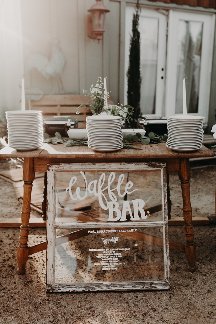
If a waffle bar doesn’t convince you to have a brunch wedding reception, I don’t know what will. I love how they upcycled an old window with white hand lettering into a waffle bar sign. | Photography: Alyssa Luzaich Photography, Event Planning: Red Barn Weddings via Junebug Weddings
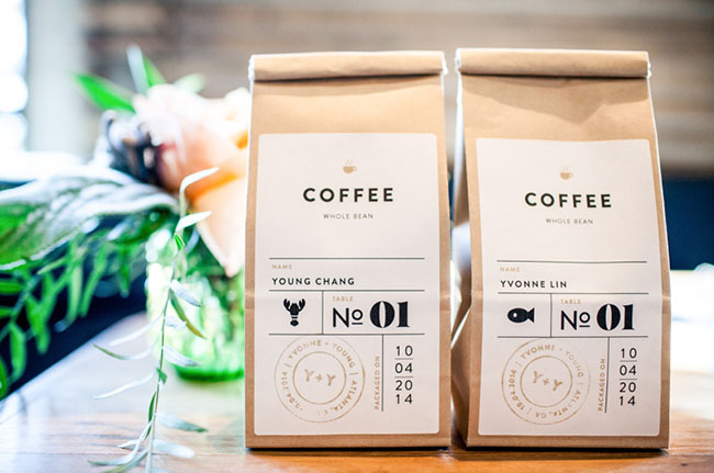
These coffee bags serve as both a favor and an escort card! | Photography: Kaitie Bryant Photography via Green Wedding Shoes
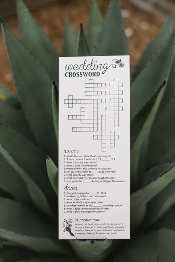
How clever is this wedding crossword puzzle?! | Photography: Rachel Whyte, Event Coordinator: Teresa Choate of The Bride’s Rep, Stationery: Alexandra Green of Red Skies Design via Wedding Chicks

Make custom coffee sleeves for that personal touch. | Photography: Effjay Photography via Brit + Co
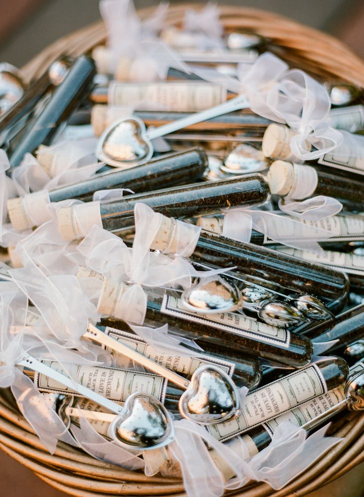
Not a coffee drinker? These loose-leaf tea favors are just as charming (and the puns for your personalized labels are endless). | Photography: Rebecca Yale Photography via The Knot
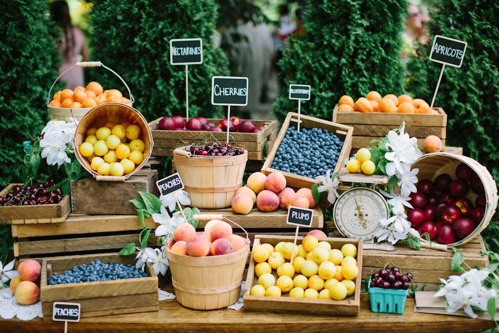
Create a farmers market-inspired fruit stand, complete with graphic chalkboard signs. | Photography: Andrew Mark Photography, Calligraphy: Barbara Kua Calligraphy via Weddingbells
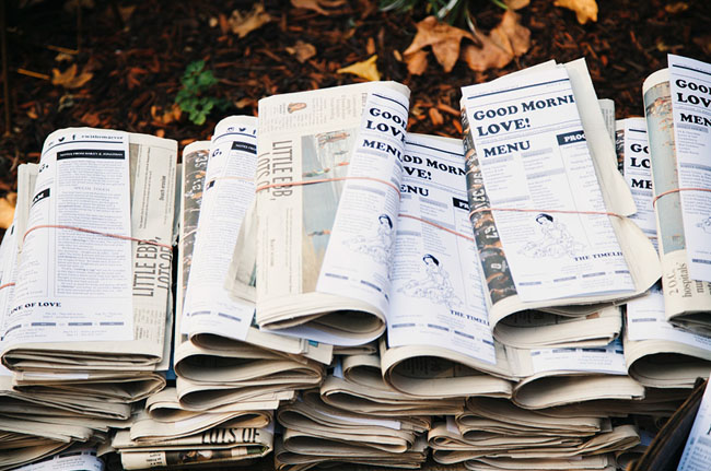
Attach your menu (or program) to the morning paper. | Photography: Novel Hill Studio, Paper Goods: Alexis Ann Design & Hoover Printing via Green Wedding Shoes
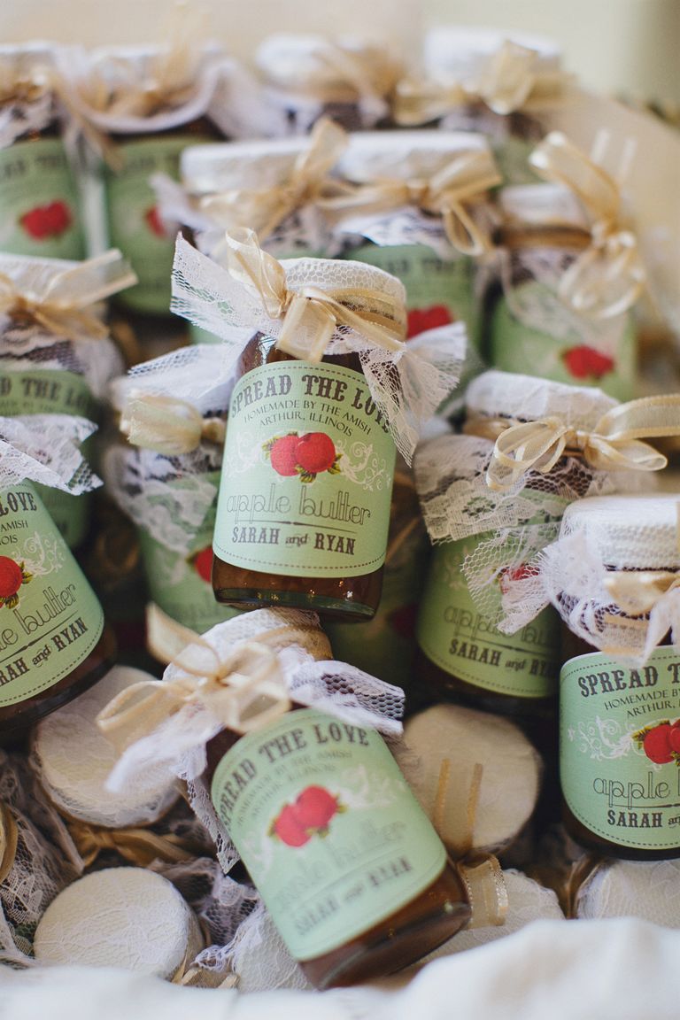
Or how about sweetly packaged berry jam as your favor? | Photography: Jasmine Star Photography via The Knot
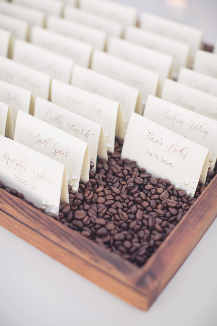
Nestle your escort cards in a bed of coffee beans. | Photography: This Love of Yours Photography, Event Design: Estate Weddings and Events via Style Me Pretty
Raise your hand if you’re thinking about a brunch wedding!
Our next designer on Behind the Stationery is a new-to-me stationer that I discovered at NSS 2017. Megan’s delicate and minimalistic work at Tiny Bones Press caught my eye amongst the other booths with brighter hues and bold art. With a background in post and print production for fashion designers and photographers, Megan shares about her journey into the letterpress and stationery world as a solopreneur. —Megan Soh
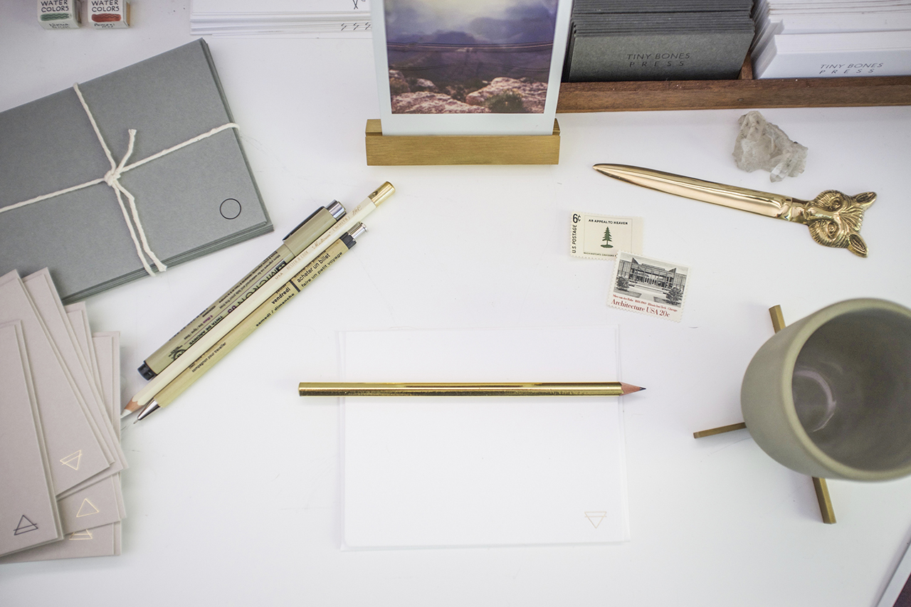
From Megan: I’ve always worked within the printing world in NYC and slowly started exploring practices on my own. I learned to letterpress about five years ago and really fell in love with the process. I love writing letters and notes and started to make stationery that I wanted to use myself.
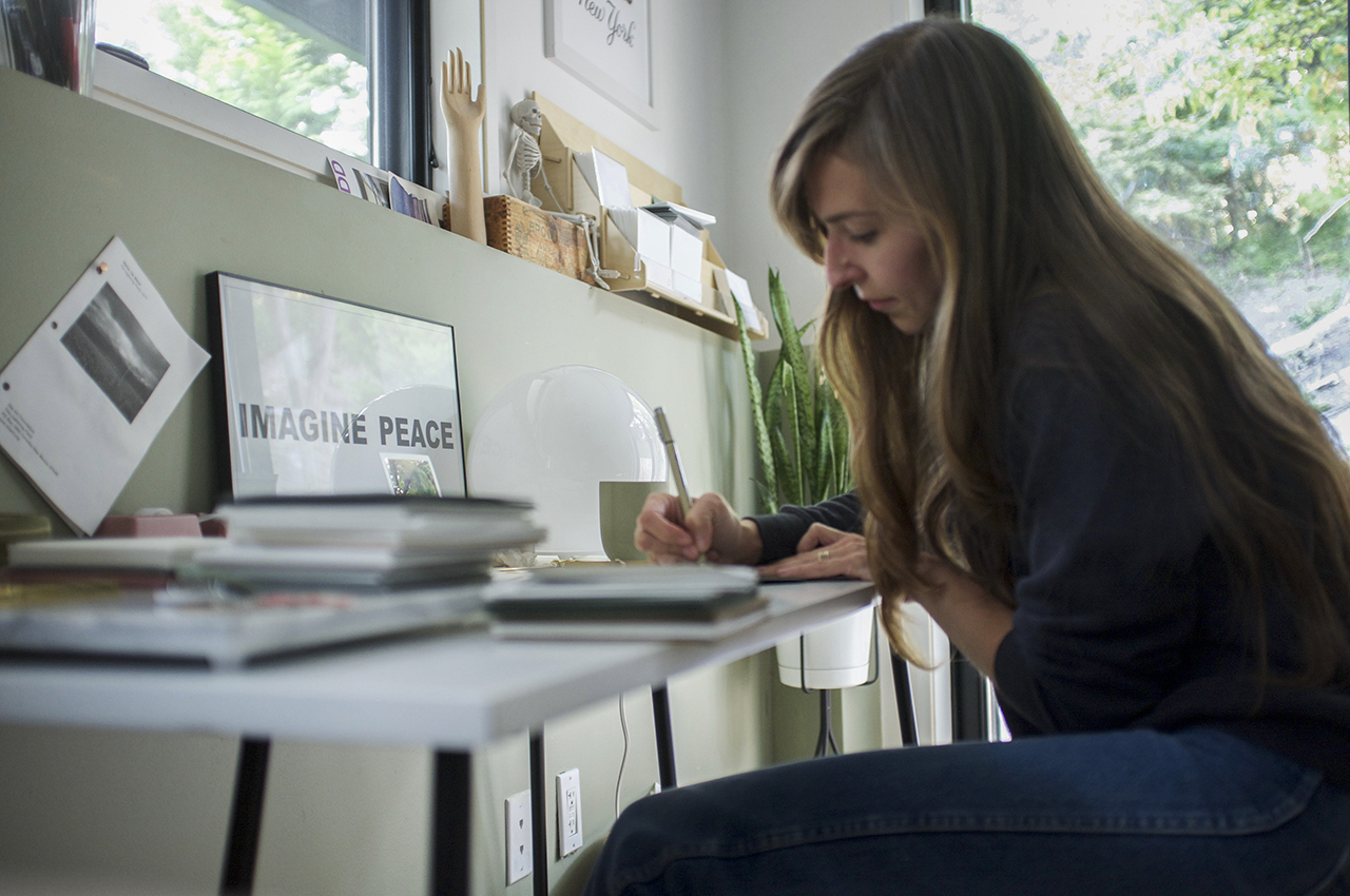
My husband and I bought a house on the north shore of Long Island. We were in Brooklyn for a decade and loved it but needed a bit more space and I really wanted to be by the water! We truly lucked out and now I have a lovely little studio that really has provided me the creative haven I was dreaming of.
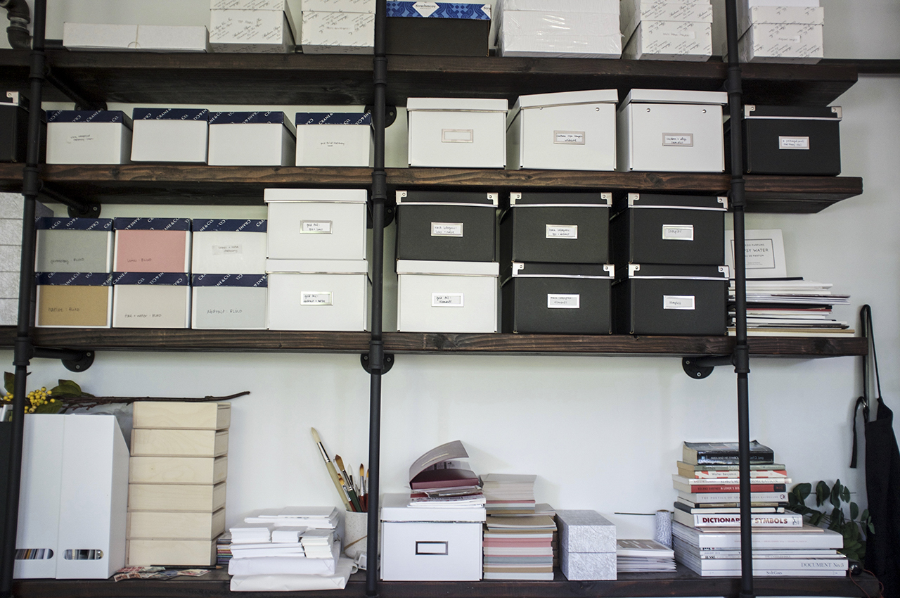
In house, I offer design services and letterpress and foil stamp printing. I frequently collaborate with trusted digital printers to add that process to my designs as well. People who are drawn to my work are people who love minimal design and also who love truly love paper and print. Having a minimal aesthetic — the feel of the paper, the tones, the delicate foiling and letterpress all add up to make the pieces special and unique. All Tiny Bones Press stationery is printed in my studio, by me, one by one, on vintage presses.
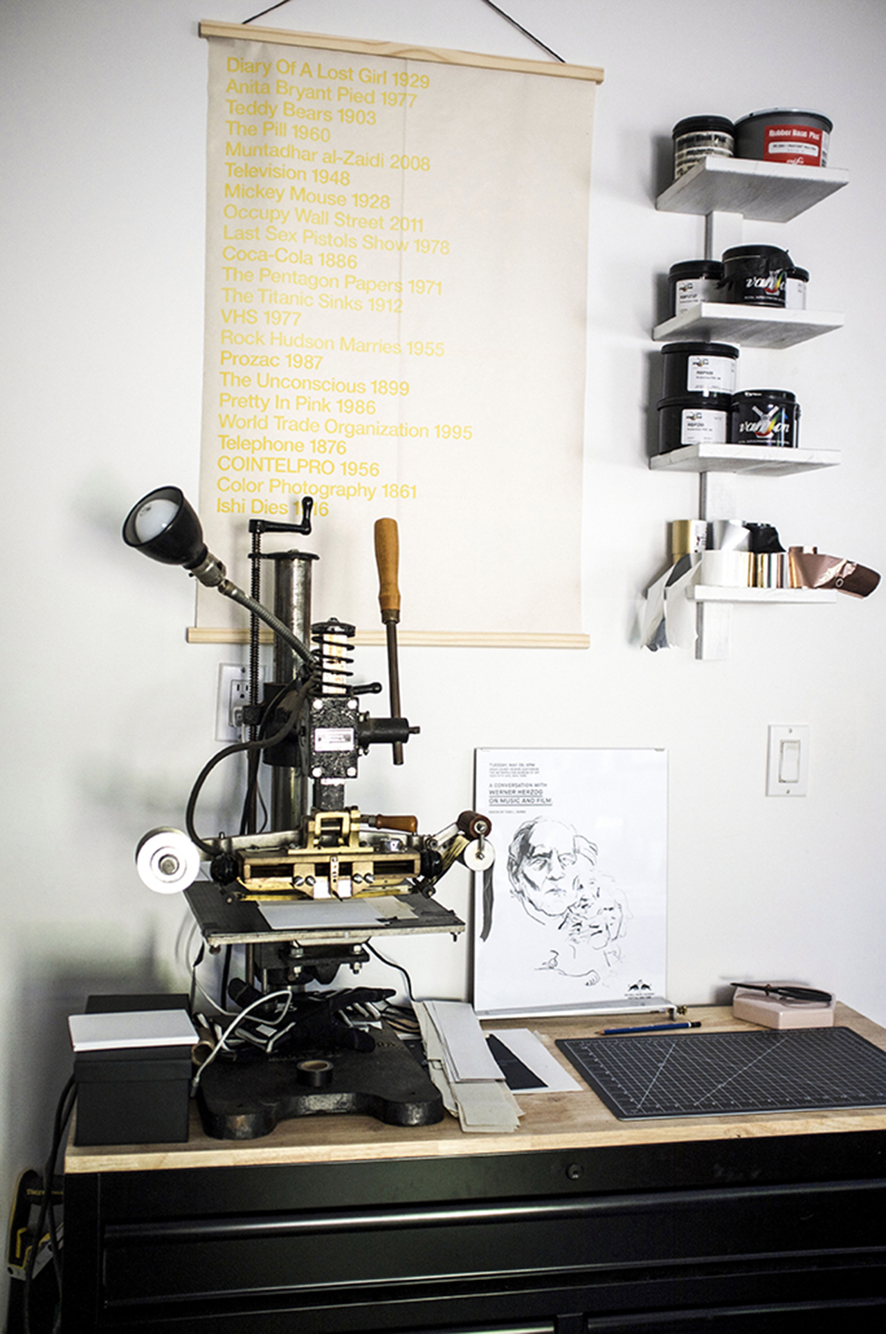
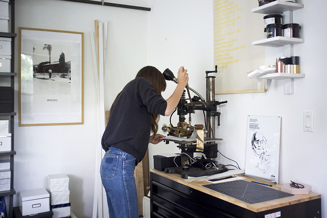
Right now, I am a one woman team! I typically start the day with a coffee and make my daily list. Usually I get to work on emails (I try to do this outside if I can) and then spend the afternoon in the studio printing. I’m trying to get better at balancing all aspects of the business – it can be hard to juggle everything solo.
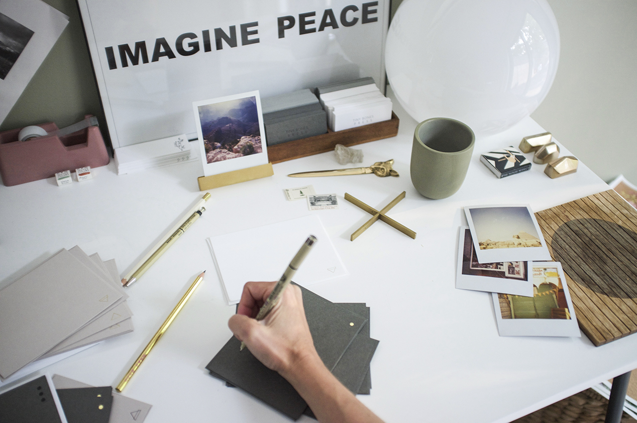
My design process is all about exploring – I’m very interested in the world around me and try to find inspiration by exposing myself to a number of different images throughout industries: from architecture to art to books and science, etc. I always make lists and keep a notebook handy and do feel that it’s important to explore things that you as a person are naturally drawn to – for me that is geometric linework and symbols. My sketches then turn into digital drawings, which then turn into plates, and then finished printed pieces – the evolution of a piece is really the most fun aspect (next to sending them off for others to enjoy).
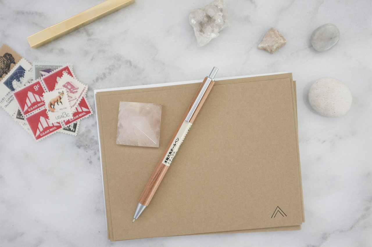
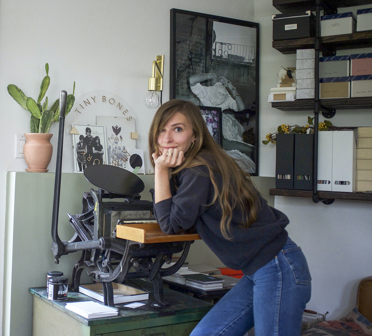
All photos by Tiny Bones Press.
Want to be featured in the Behind the Stationery column? Reach out to Megan at megan [at] ohsobeautifulpaper [dot] com for more details.
Yes way, rosé! These bohemian hot pink watercolor wedding invitations by Kacey Munson of Hoopla Love feature funky hand lettering, hot pink watercolor washes, and an abstract floral painting. So fun!
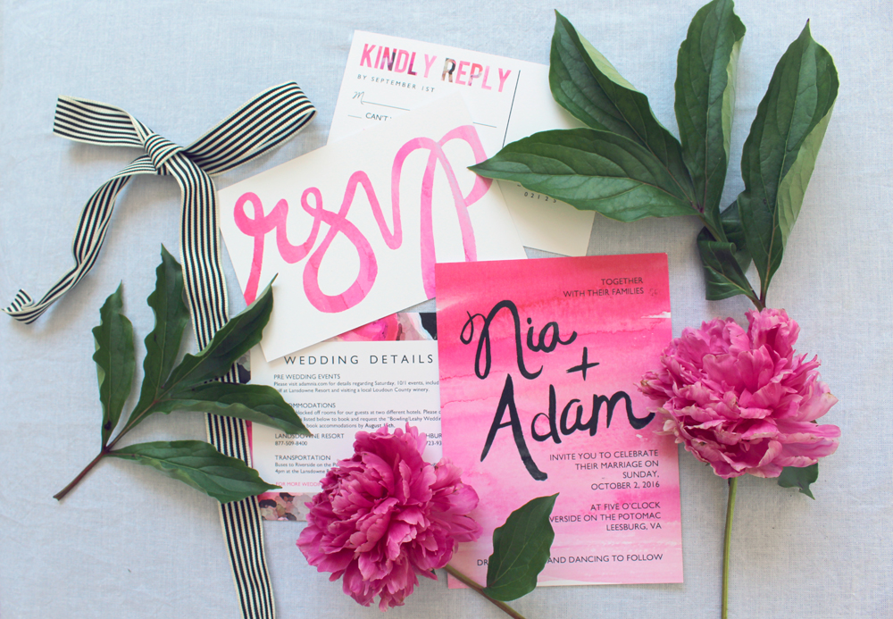
From Kacey: When Nia contacted me about creating a bold and colorful suite for her “Rustic Bohemian” October wedding, I was thrilled. It’s not every day that a bride requests hot pink watercolor washes and messy hand painted lettering for her invitations, but it’s just the kind of style that I love to work with. I started with a watercolor floral painting that I digitally edited to create an edgy abstract look and we used that as the border for her save the date.
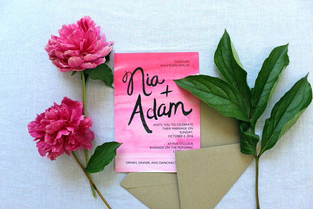
The focal point of the floral art was shades of pinks from blush to hot pink, with some pops of more rustic tones, like ivory, grays, greens and wine tones to contrast. Paired with black painted freehand lettering and a kraft envelope, it really captured the rustic boho look.
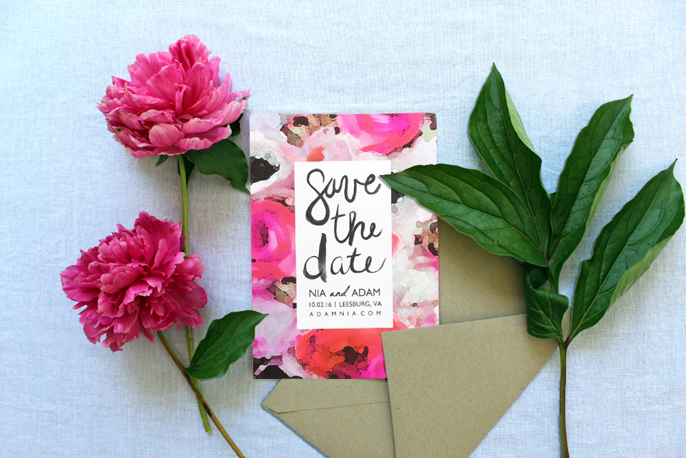
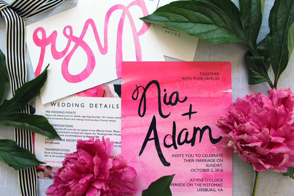
When someone asks me to create a whole coordinating suite including a save the date, I typically start with one central design or artistic element and try to carry the look throughout the rest of the suite – without being too repetitive or matchy- matchy. These invitations were designed around the abstract floral of the save the dates, and the pattern was incorporated in the RSVP postcard and wedding details card.
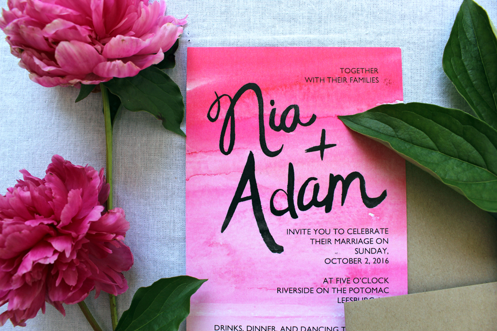
The pink ombré watercolor wash in the invitation card looks so crisp and striking when paired with black painted lettering – it might be my favorite element of the suite. The RSVP postcard really ties the entire suite together, combining both the abstract floral design and watercolor wash in subtle, different ways on each side of the card.
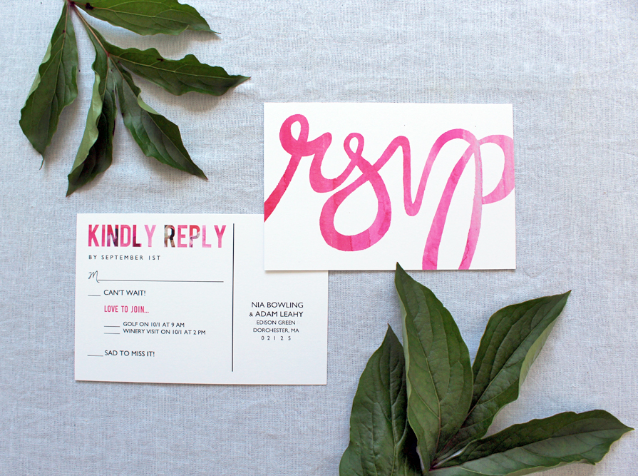
I always say that invitations are so important because it gives guests an idea of the look and vibe of the celebration. Nia and Adam’s fun, colorful, edgy and unique invitations almost had me asking if I could come to the wedding, too!
Thanks Kacey!
Design: Hoopla Love
Printing: Printech
Hoopla Love is a member of the Designer Rolodex – you can see more of their beautiful work right here or visit the real inviÂtaÂtions gallery for more wedding invitation ideas!
Photo Credits: Hoopla Love
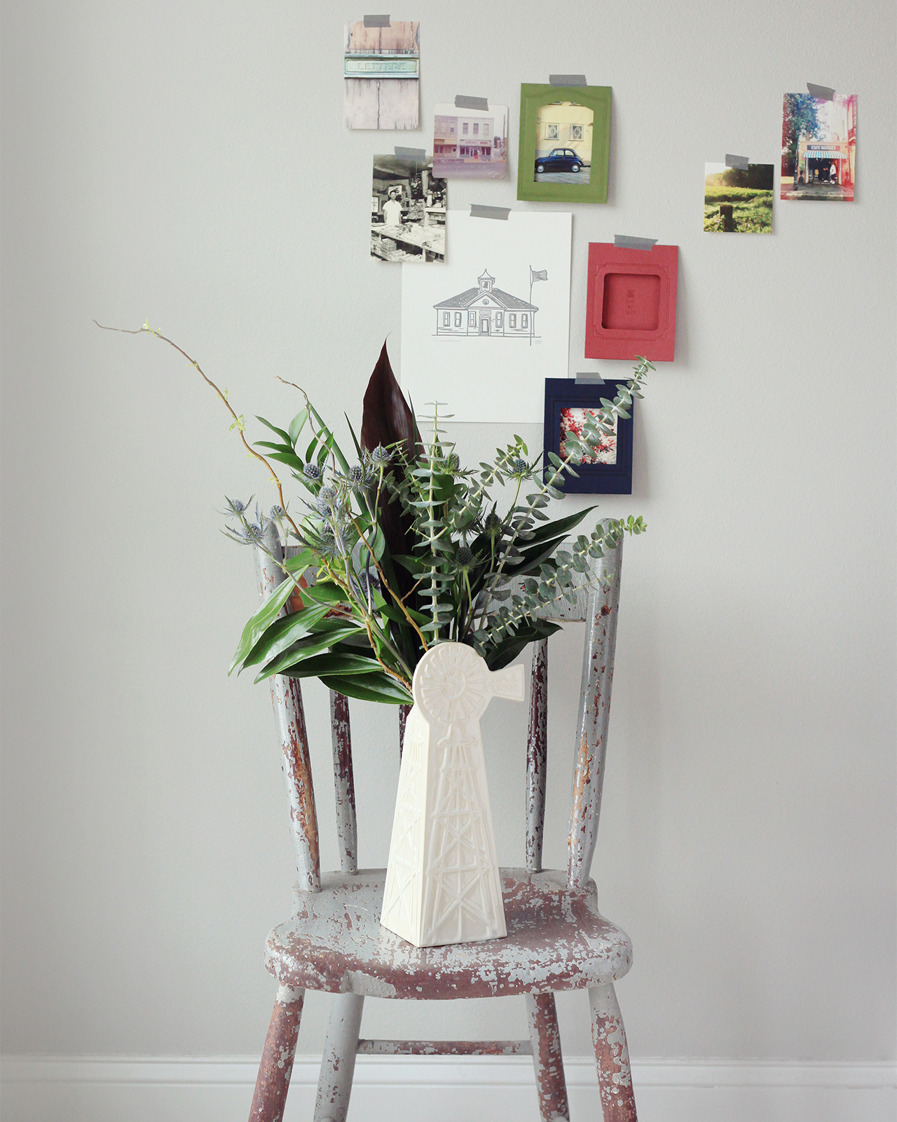
I’ve been going through all my summer photos and trying to decide which ones to print; my parents and in-laws are always asking for more photos of my girls, and it’s fun to display some of our favorite memories around the house. I’m loving these new vintage-inspired photo card frames from Meg at Belle & Union! After traveling abroad this past spring, Meg wanted a way to share her memories outside of her phone screen, so she created these beautiful letterpress printed die cut photo cards to share her favorite memories!
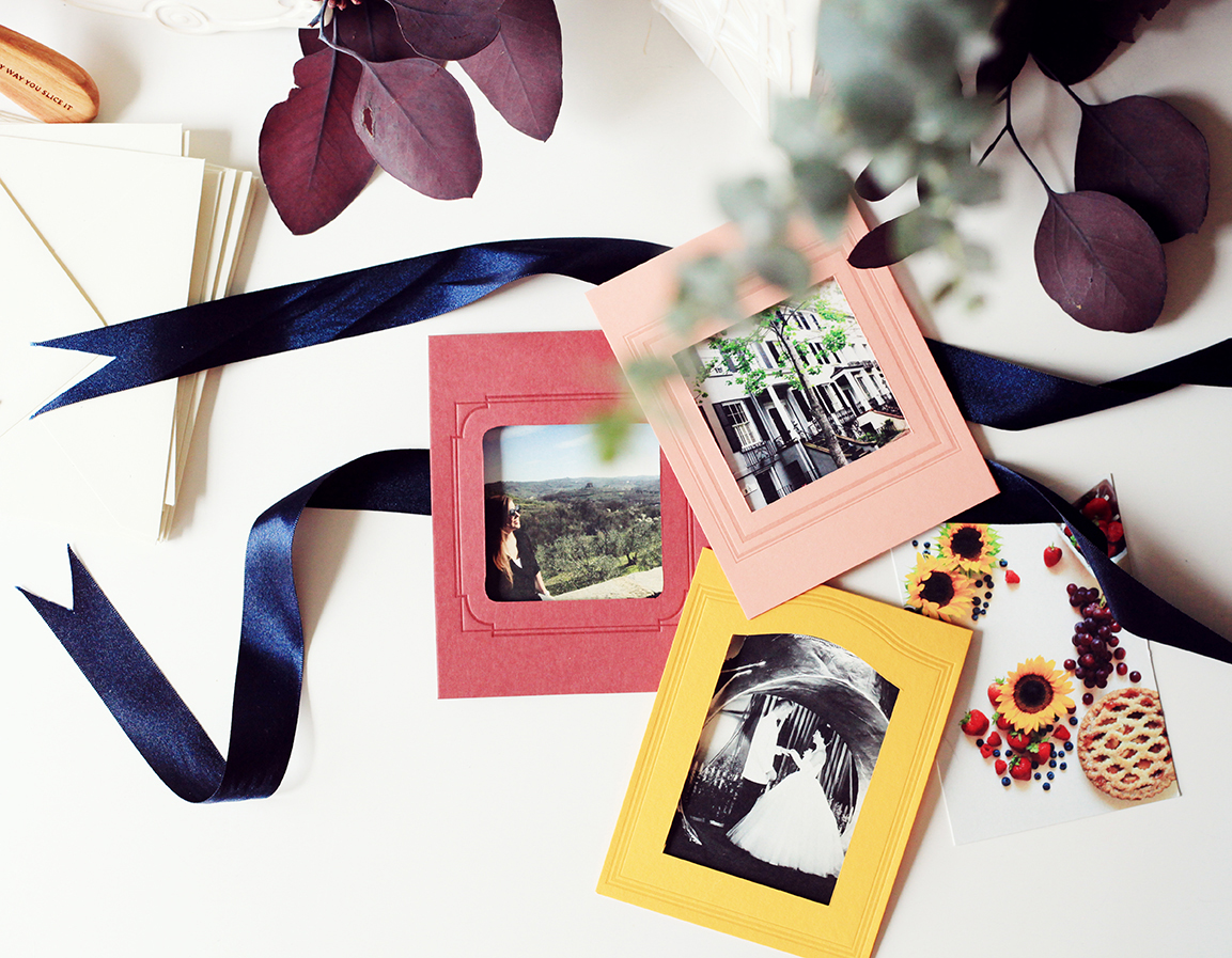
The die cut photo cards reveal a hidden message underneath the photo, which stays in place through pre-cut slits (no tape or adhesive is needed). Just slide your photo in and mail the card to its recipient! Reminiscent of vintage matted photography, these cards are meant to be kept and treasured – perfect for sharing memories with family!
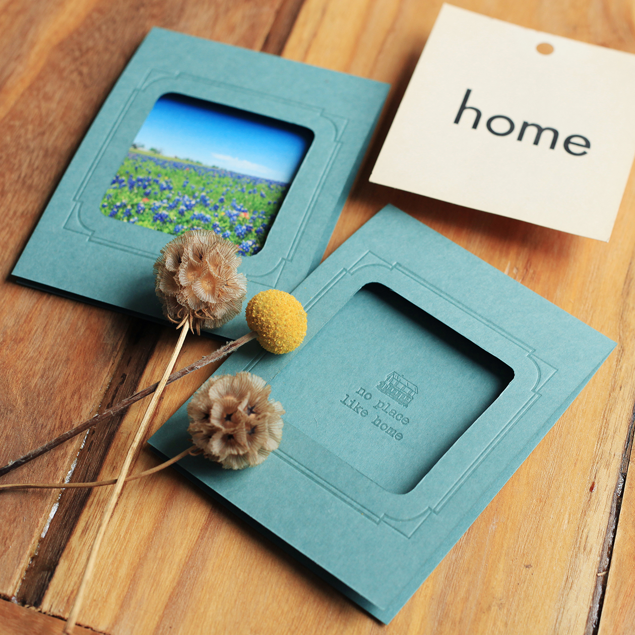
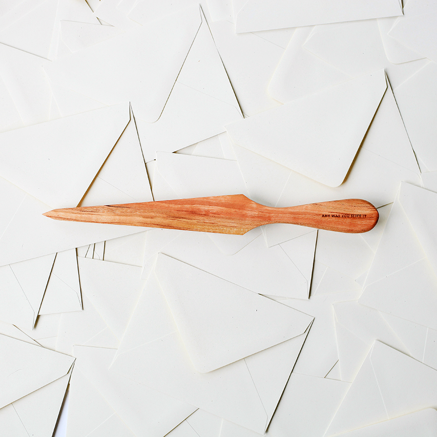
Also, how gorgeous is this hand-carved, maple hardwood letter opener?? It has the phrase “any way you slice it” engraved on it, which makes opening bills a little bit better and opening happy mail even happier!
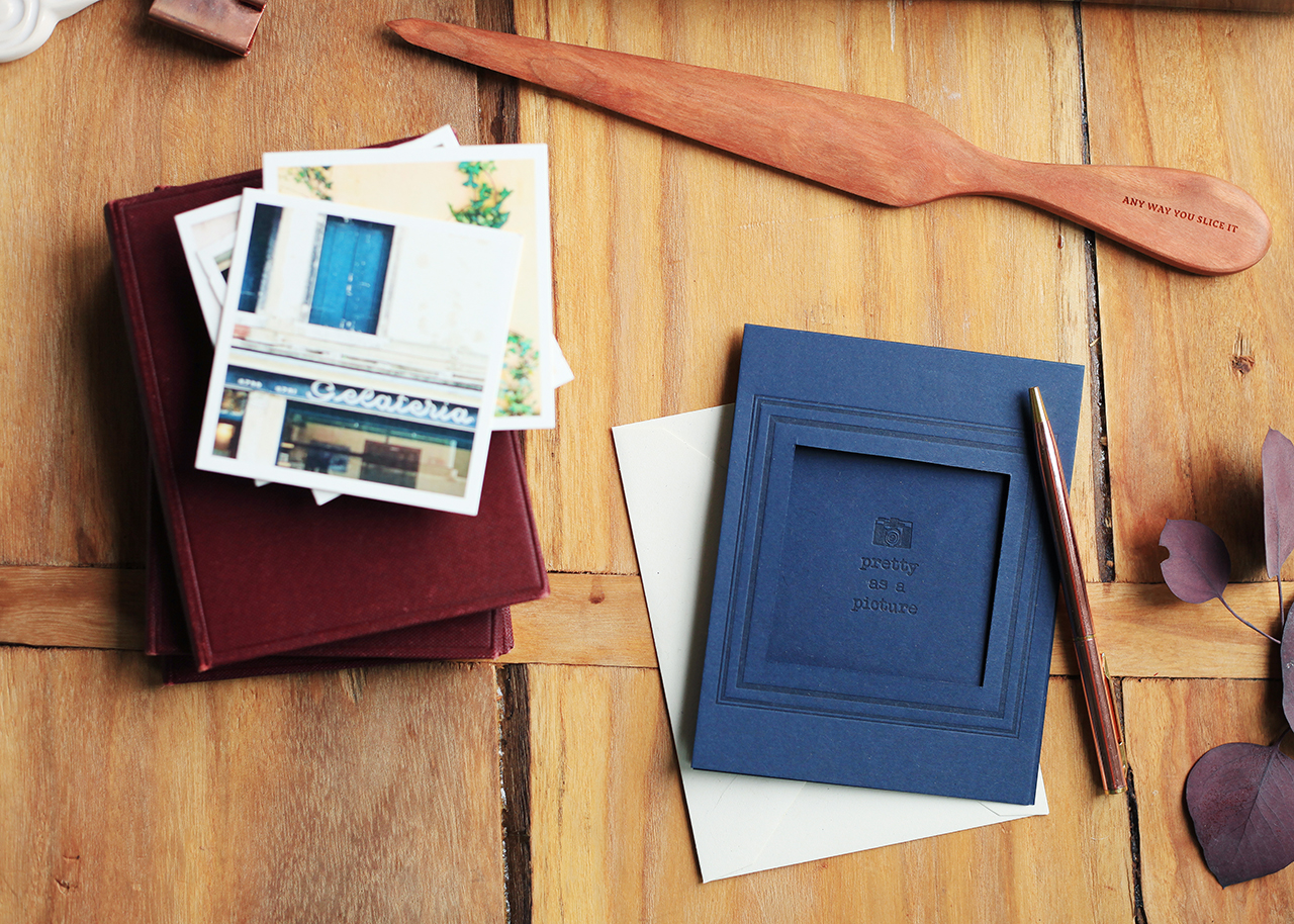
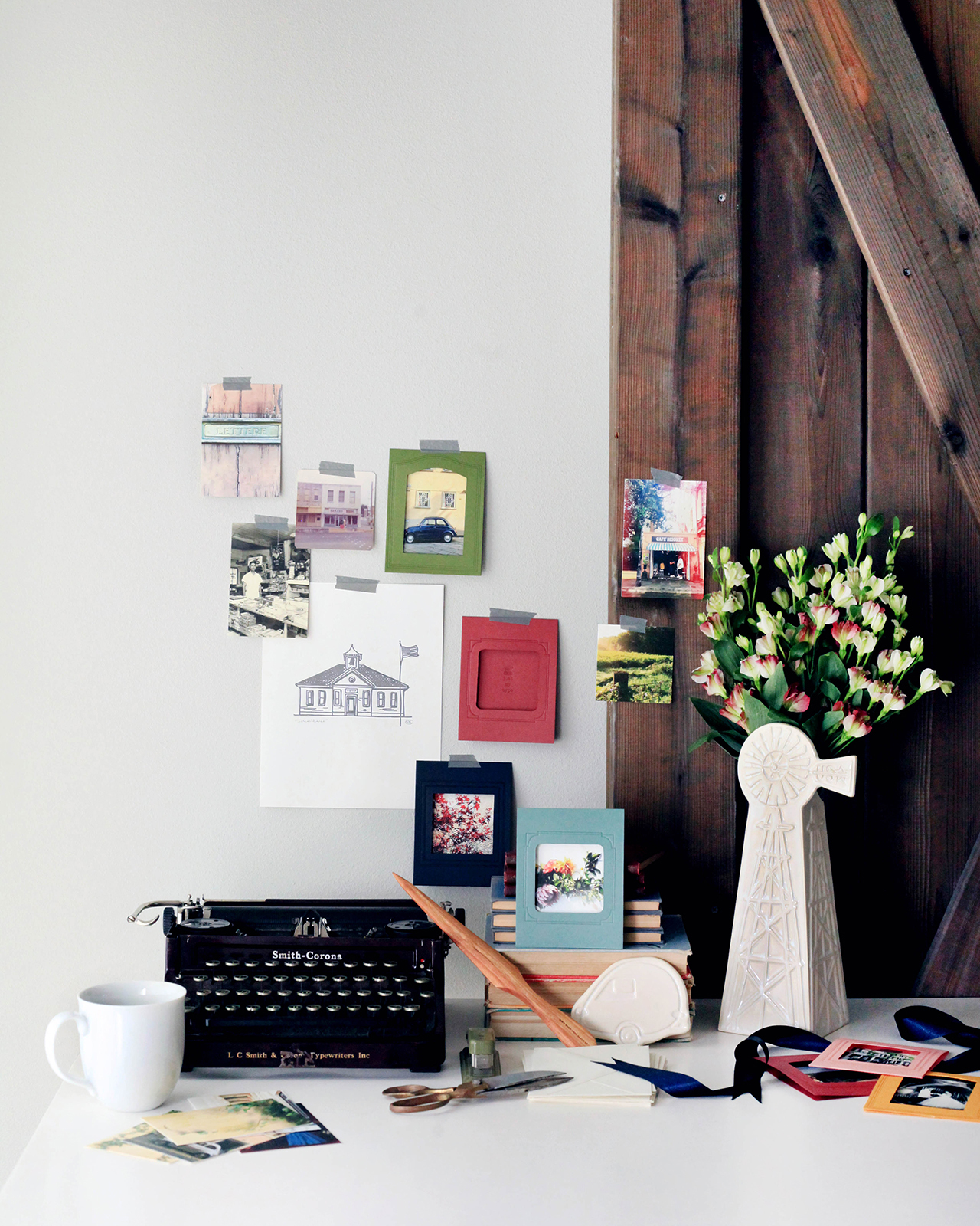
In addition to the photo cards and letter opener, Belle & Union just released a brand new ceramic Windmill vase. So classic!

Lots more over at Belle & Union!