Bailey’s Creative Bridal Shower Invitations

Today I’m thrilled to feature the bridal shower invitations for Bailey Amon of Antiquaria, created by Bailey’s business partner (and talented calligrapher) Emma James.  You might recognize Bailey and Emma from their regular DIY tutorials here on OSBP, so it’s no surprise that these bridal shower invitations  reflect their clever DIY sensibilities.  Emma incorporated  vintage illustrations and her beautiful hand lettering into the design, which was then accented with ribbons and rubber stamp details.

Bridal Shower Invitations by Antiquaria via Oh So Beautiful Paper (3)

From Emma: Bailey’s wedding was in La Jolla, California and we held her shower on the morning of the wedding. We began with brunch at an adorable cafe called The Cottage and then walked back to her hotel suite for mimosas and presents.

Bridal Shower Invitations by Antiquaria via Oh So Beautiful Paper (2)

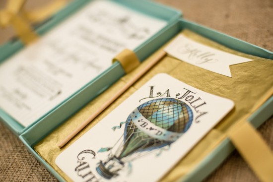
For the shower invitations, I wanted to design something really special that would get her guests even more excited about coming to La Jolla. The invitation was hand lettered and printed with an awning striped background. Since Bailey loves hot air balloons I used a vintage illustration of one as the front of the enclosure/rsvp card.

Bridal Shower Invitations by Antiquaria via Oh So Beautiful Paper (4)

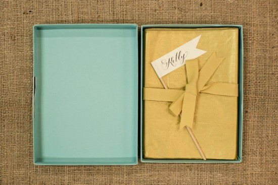
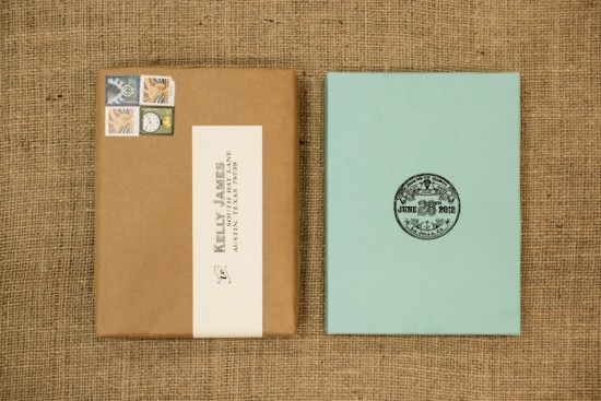
The invitations were mailed in A7 box mailers in pool from Paper Source. I designed a logo for the outside of the box and had it made into a rubber stamp, which was used to emboss the logo on the front of the box.

Bridal Shower Invitations by Antiquaria via Oh So Beautiful Paper (1)

Thanks Emma and Bailey!

Anti­quaria is a mem­ber of the Designer Rolodex – you can see more of their beau­ti­ful work right here or visit the real wedding invitations gallery for more wedding invitation ideas!

Photo Credits: Kelly James of Studio Austin Weddings

Ashley + Beau’s Classic Navy and White Wedding Invitations

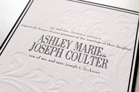
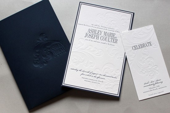
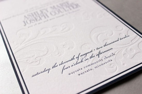
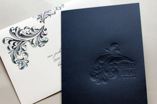
Navy and white is a classic combination, and it proved to be just right for achieving the balance of modern and formal in Ashley and Beau’s wedding invitations.  Designer Gretchen Berry chose classic fonts and an elegant blind deboss detail to complete the design.

Classic Navy Debossed Wedding Invitations by Gretchen Berry Design Co. via Oh So Beautiful Paper (1)

From Gretchen: Ashley and Beau live in the preppy lakeside city of Wayzata, Minnesota. They were married at a church in Wayzata with the reception at the Lafeytte Country Club. They wanted their invitations to have the style and feel of the lake but without being too nautical: preppy and modern yet formal and classic.

Classic Navy Debossed Wedding Invitations by Gretchen Berry Design Co. via Oh So Beautiful Paper (4)

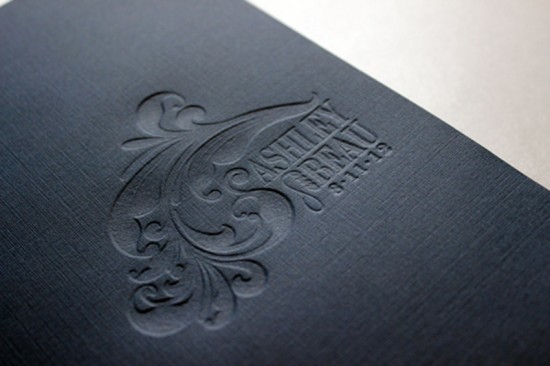
I created a custom two-pocket folder with Ashley and Beau’s logo blind debossed on the front. We used a navy linen card stock to create the folder, which was a great accent to the bright white cotton stock we used for the invitation pieces. The navy letterpress text in classic fonts makes a formal and masculine statement, while the blind debossed elements create a romantic and modern look.

Classic Navy Debossed Wedding Invitations by Gretchen Berry Design Co. via Oh So Beautiful Paper (3)

Classic Navy Debossed Wedding Invitations by Gretchen Berry Design Co. via Oh So Beautiful Paper (5)

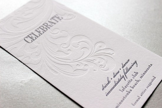
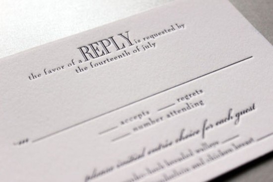
The long and narrow reception card showcases the plume of the debossed design. The reply card and map were simple one color letterpress pieces that complemented the invitation style.

Classic Navy Debossed Wedding Invitations by Gretchen Berry Design Co. via Oh So Beautiful Paper (6)

Classic Navy Debossed Wedding Invitations by Gretchen Berry Design Co. via Oh So Beautiful Paper (7)

Classic Navy Debossed Wedding Invitations by Gretchen Berry Design Co. via Oh So Beautiful Paper (8)

Thanks so much Gretchen!

Check out the Designer Rolodex for more tal­ented wed­ding invi­ta­tion design­ers and the real invi­ta­tions gallery for more wedding invitation ideas!

Photo Credits: Gretchen Berry Design Co.

Seasonal Stationery: Functional and Stylish 2013 Planners

If you’re like me and you need to keep track of your appointments and goals in written form, then finding a planner that is both functional and well-designed is almost like finding the Holy Grail.  Each year I round up my favorite planners – from the annual Laurel Denise planner in a range of pretty colors to the Russell + Hazel SmartDate binder system – and this year’s round up is available right here!

Stylish and Functional 2013 Planners via Oh So Beautiful Paper

1. Laurel Denise; 2. Poketo; 3. Anthropologie; 4. Dozi; 5. Poketo; 6. Julia Kostreva

Check out the full round up of 2013 planners right here!

{images via their respective sources}

Thomas + Bonnie’s Illustrated Austrian Wedding Invitations

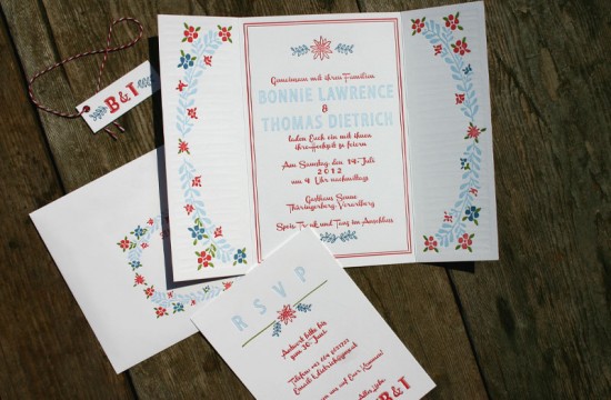
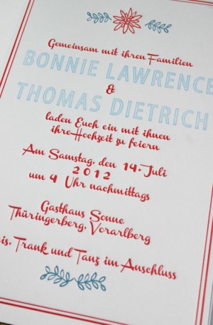
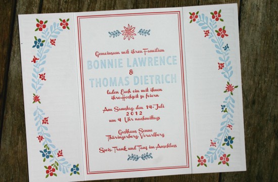
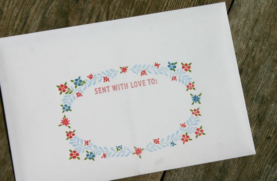
We’re continuing the travel-inspired theme with these whimsical letterpress invitations from Marissa at For the Love of Press for a wedding in Austria.  Marissa was inspired by the wedding location (a picturesque Austrian village) and traditional Austrian emblems to create an illustrated invitation suite with floral details and a playful gatefold layout. Such a wonderful way to set the tone for wedding guests!

Hand-Illustrated Austrian Wedding Invitations by For the Love of Press via Oh So Beautiful Paper (2)

From Marissa: Bonnie and Thomas came to me from Austria wanting something playful, sweet, and charming with “hopefully” the added bonus of having some traditional Austrian elements.

Hand-Illustrated Austrian Wedding Invitations by For the Love of Press via Oh So Beautiful Paper (8) Hand-Illustrated Austrian Wedding Invitations by For the Love of Press via Oh So Beautiful Paper (9)

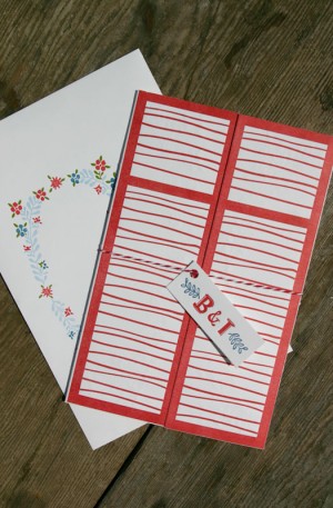
Inspired by the traditional landscape of Austria and the couple’s wedding location – a village in the mountains with white houses and red shutters everywhere! – we directly translated the location and ceremony venue into the outside of the invitation: a pair of playful hand-drawn red shutters, which opened up gatefold-style to reveal the invitation inside.

Hand-Illustrated Austrian Wedding Invitations by For the Love of Press via Oh So Beautiful Paper (3)

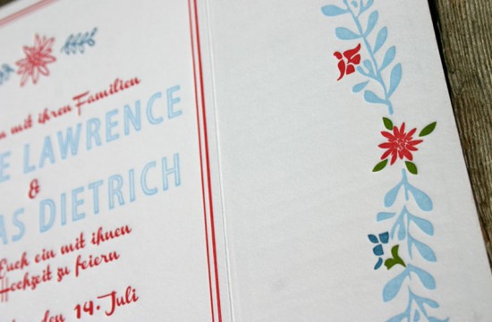
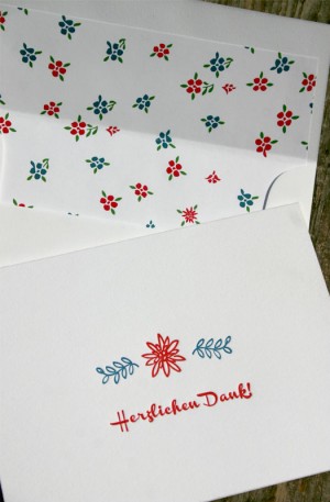
We incorporated the Edelweiss flower (the national flower of Austria) into the design, along with other floral elements reminiscent of Austrian embroidery and clothing.

Hand-Illustrated Austrian Wedding Invitations by For the Love of Press via Oh So Beautiful Paper (1)

The shutters, leaves, flowers, and some of the fonts were all hand drawn and illustrated to exude a playful, low-key vibe. These invitations were four color letterpress, which was insanely intricate and detailed to print in terms of registration (lining each color up next to the others) and time. Each invitation piece itself was printed on one piece of paper with the shutters on one side and the four color invitation on the other, so any mistakes and the whole thing had to be thrown out!

Hand-Illustrated Austrian Wedding Invitations by For the Love of Press via Oh So Beautiful Paper (4)

Hand-Illustrated Austrian Wedding Invitations by For the Love of Press via Oh So Beautiful Paper (5)

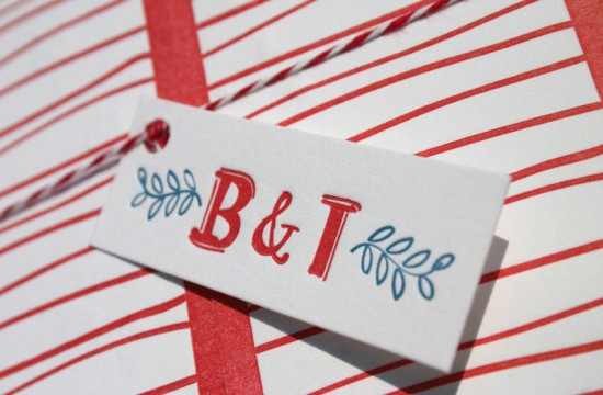
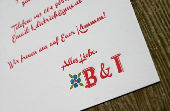
The RSVP card was designed to look like a personal note from the couple and slipped inside the gatefold invitation, which was then bound with charming red and white bakers twine and a hand-lettered tag displaying the couple’s initials. We also created “thank you” cards that say “thanks tons!” in German along with adorable coordinating floral envelope liners.

Hand-Illustrated Austrian Wedding Invitations by For the Love of Press via Oh So Beautiful Paper (10) Hand-Illustrated Austrian Wedding Invitations by For the Love of Press via Oh So Beautiful Paper (11)

Hand-Illustrated Austrian Wedding Invitations by For the Love of Press via Oh So Beautiful Paper (7)

Thanks so much Marissa!

Check out the Designer Rolodex for more tal­ented wed­ding invi­ta­tion design­ers and the real invi­ta­tions gallery for more wedding invitation ideas!

Photo Credits: For the Love of Press

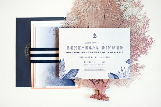
Amy + Kenn’s Ombre and Gold Foil Nautical Wedding Invitations

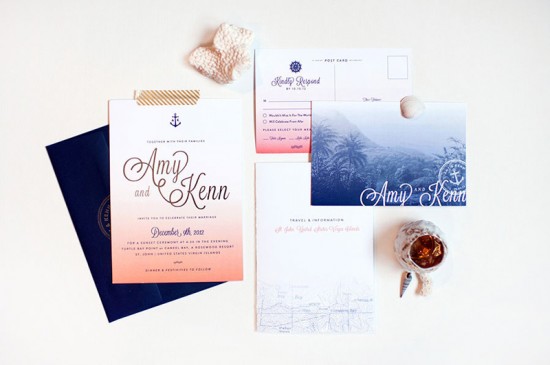
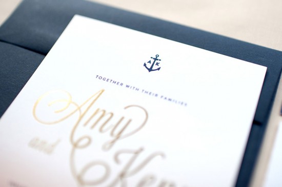
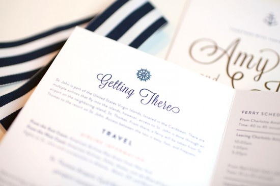
Happy Monday!  I hope all my East Coast friends are safe and sound as Hurricane Sandy passes through.  We’re having a quiet day at home here in DC – not that we have any other option since the government and all public transportation is closed due to the storm!  So today I’m envisioning a warm and rain-free beach vacation with these wedding invitations from designer Carina Skrobecki.  Created for a destination wedding in the U.S. Virgin Islands, Carina incorporated an ombre effect in tropical colors along with travel-inspired and nautical design elements – a fantastic combination!

Ombre and Gold Foil Nautical Wedding Invitations by Carina Skrobeck Design via Oh So Beautiful Paper (2)

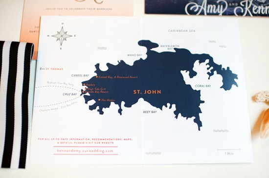
From Carina: Amy and Kenn are getting married in the U.S. Virgin Islands in December. So when they came to me to design their St. John-inspired wedding invitations, I knew I had an opportunity to incorporate the rich and exotic colors naturally found on the island and have some fun bringing in an ocean/travel theme.

Ombre and Gold Foil Nautical Wedding Invitations by Carina Skrobeck Design via Oh So Beautiful Paper (1)

Ombre and Gold Foil Nautical Wedding Invitations by Carina Skrobeck Design via Oh So Beautiful Paper (4)

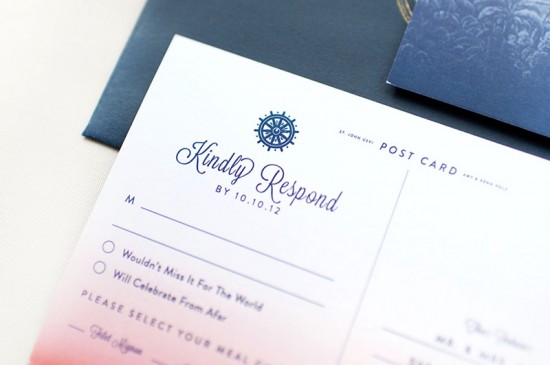
The suite came together with lush orange and coral tones, along with deep blue.  We created an ombre effect, which was digitally printed on all the pieces to tie everything together. The main invitations were then kissed with gold foil, which brought out the names of the bride and groom.

Ombre and Gold Foil Nautical Wedding Invitations by Carina Skrobeck Design via Oh So Beautiful Paper (3)

Amy and Kenn wanted a monogram with an anchor to use on other printed materials, so we created a small design that was then used on a custom stamp to seal the envelopes.

Ombre and Gold Foil Nautical Wedding Invitations by Carina Skrobeck Design via Oh So Beautiful Paper (10)

Ombre and Gold Foil Nautical Wedding Invitations by Carina Skrobeck Design via Oh So Beautiful Paper (11)

We drew inspiration from the beautiful St. John sunsets, natural materials such as rope and linen, and travel postcards. When doing research, I found an old lithograph of St. John created in the late 1800s by a Danish artist, and that became the inspiration for the postcard RSVP.

Ombre and Gold Foil Nautical Wedding Invitations by Carina Skrobeck Design via Oh So Beautiful Paper (5)

Ombre and Gold Foil Nautical Wedding Invitations by Carina Skrobeck Design via Oh So Beautiful Paper (6)

Ombre and Gold Foil Nautical Wedding Invitations by Carina Skrobeck Design via Oh So Beautiful Paper (8)

Thanks so much Carina!

Design: Carina Skrobecki Design

Printing and Gold Foil: Nikko Media

Custom Stamp: RubberStamps.net

Striped Ribbon: TeaParty Ribbons

Check out the Designer Rolodex for more tal­ented wed­ding invi­ta­tion design­ers and the real invi­ta­tions gallery for more wedding invitation ideas!

Photo Credits: Carina Skrobecki Design