Ashley + Russell Creative Fabric and Letterpress Wedding Invitations

I’m completely in love with these letterpress, gocco, AND stitched (!!) wedding invitations featured over on Studio on Fire:

Designed by the bride and groom, Studio on Fire printed the long fold-out letterpress invitation, including a perforated RSVP card.  They printed the fabric insert (containing the invite text) separately using a gocco.  After the printing was complete, the bride and her mom then had a field day stitching everything together.

Wow.  Fold-out letterpress invitation?  Gocco-printed fabric insert?  My jaw is kind of on the floor right now, I’m so impressed by these invitations.   These are stunning!

Check out the Designer Rolodex for more tal­ented wed­ding invi­ta­tion design­ers and the real invi­ta­tions gallery for more wedding invitation ideas!

{images via Studio on Fire’s new blog – Beast Pieces}

Wedding Invitations — Bird and Banner, part 2

Bird and Banner was one of the first invitation design studios that I featured here, just after I started blogging back in September.  I love, love, love the work of Bird and Banner, so I wanted to save some of their work for a later time – and what could be a better occasion than my 300th (!!) post?

So, continuing my recent infatuation with handkerchief wedding save the dates and invitations, this gorgeous invitation suite was hand-printed on vintage hankies and post cards:

Bird-Banner-French-Flea-Market

Bird-Banner-French-Flea-Market1

Bird-Banner-French-Flea-Market2

{french flea market}

This engagement announcement was inspired by the groom’s regular trek from DC to NY via the Chinatown bus:

Bird-Banner-Chinatown-Bus

Bird-Banner-Chinatown-Bus1
{chinatown bus}

This invitation suite combined hand-printing on fabric with letterpress for an unbelievably gorgeous result:

Bird-Banner-Letterpress-Yarn

Bird-Banner-Letterpress-Yarn1
{texture and type}

Handprinted Save the Date post cards:

Bird-Banner-Save-the-Date-Forest

Bird-Banner-Save-the-Date-Forest1
{a wedding in the mountains}

Love the elegance of this black and white suite featuring stitched ribbon for a Spring wedding…

Bird-Banner-Black-White-Ribbon

Bird-Banner-Black-White-Ribbon1
{festive sophistication}

…and lobster bib Save the Dates for a Fall wedding in Cape Cod:

Bird-Banner-Lobster

Bird-Banner-Lobster1
{lobsters in love}

And I love these photo booth Save the Dates (and vintage stamps!):

Bird-Banner-Photobooth-Save-the-Dates

Bird-Banner-Photobooth-Save-the-Date1
{photo booth}

For more from Bird and Banner, you can check out their portfolio here and visit their etsy store here – and you can find my first Bird and Banner post right here.

{image credits: Bird and Banner}

Lindsay + Ryan’s Kraft Paper + Gold Wedding Invitations

I completely fell for these beautiful letterpress wedding invitations and Save the Date from SeeSaw Designs during Angela Hardison‘s guest posts on Black*Eiffel.  The invitations were designed and printed for and by one of SeeSaw’s own designers, Lindsay Tingstrom-Casey:

Seesaw_letterpress1

Luckily for me, Lindsay was kind enough to both send over a few additional photos of her invitations and share some of the inspiration behind the design.  Let’s start with the initial inspiration.

From Lindsay: We were married at the Phoenix Art Museum, a beautiful modern space.  The building itself focuses on a lot of natural, raw materials, and we wanted to continue that feeling with the invites themselves. Our colors included brown, cream, orange and yellow.

Pam_lcentral_sm

346

And now for the invitations!

The contrast between roughness of the natural kraft paper material and the clean crispness of the Lettra was really appealing to us. We knew we wanted the invite to have three pieces, so the chocolate enclosure was a perfect solution.

Invite3

The blind deboss on the enclosure’s belly band was totally a happy accident – I had no idea it would be legible without ink, but lo and behold, it worked!

Invite1

Invite2

Lindsay printed both the accommodation enclosure from her invitations and her ceremony programs on thick chipboard:

Invite4

Invite7

A couple detail shots of Lindsay’s Save the Dates:

Invite5

Invite6

Lindsay also carried the design elements from her invitation suite over to her escort cards and table numbers and printed them on similar material to the Save the Dates and accommodation card:

391

513

The letterpress that we used to print my invitations, a Kluge, was a recent addition to Seesaw’s studio.  We already had a C&P when the Kluge came to us, and this was actually the first job we printed on it.  Talk about pressure!  Our prior letterpress experience was limited, but it all worked out for the best.

I hope everyone has enjoyed Lindsay’s invitations as much as I have!  Thanks so much Lindsay, for sharing your beautiful wedding invitations and inspiration with us!

Check out the Designer Rolodex for more tal­ented wed­ding invi­ta­tion design­ers and the real invi­ta­tions gallery for more wedding invitation ideas!

{images via Lindsay Tingstrom-Casey and SeeSaw designs}

Maddy + Devon’s Vintage-Inspired Letterpress Wedding Invitations

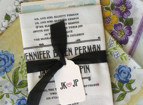
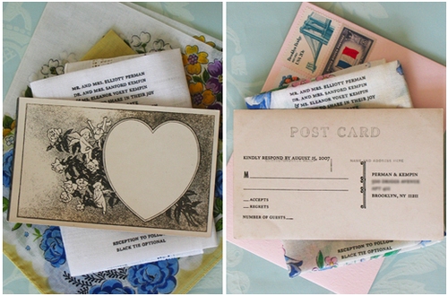
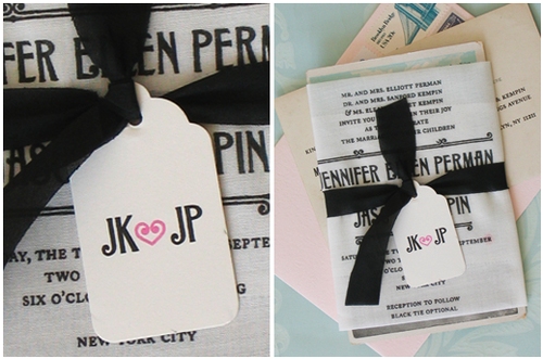
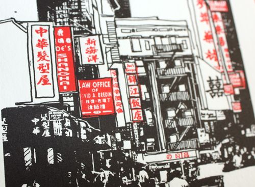
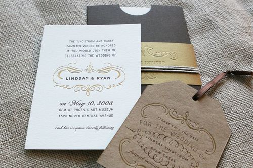
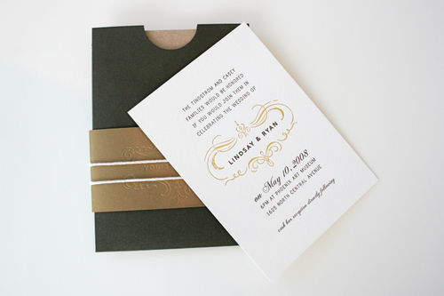
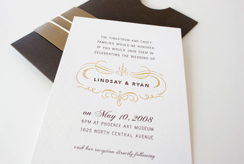
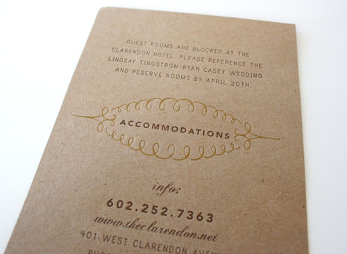
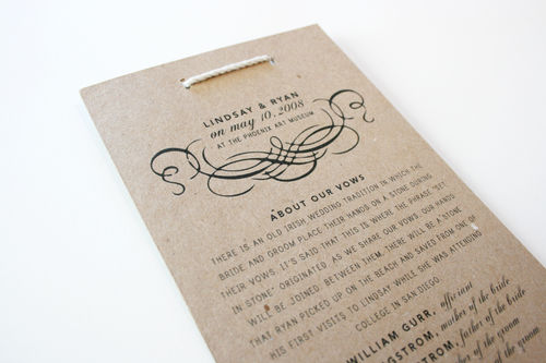
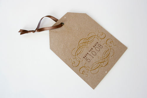
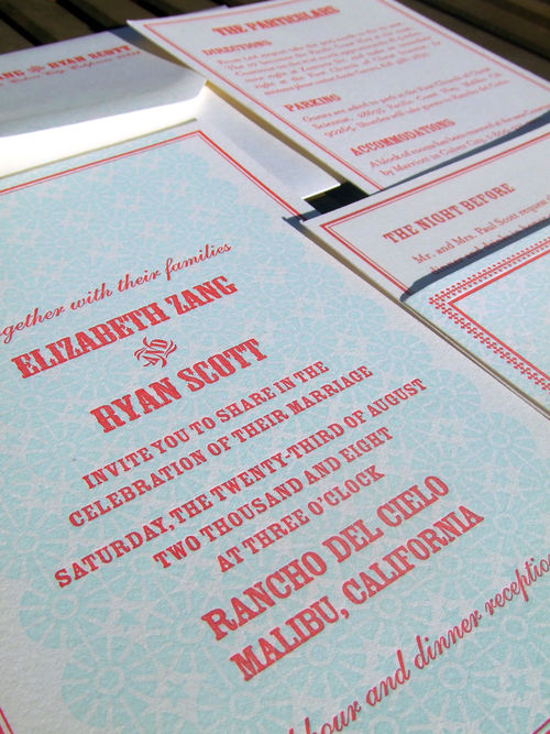
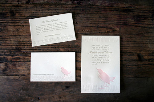
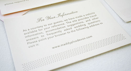
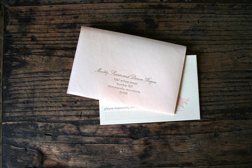
Maddy, of the fabulous wedding blog Inspired Bride, and her fiancé Devon are planning an afternoon wedding for the end of May.  When I first discovered that Maddy is a graphic designer and was planning to design her own letterpress wedding invitations, I begged her to let me feature them here.  Well, the invitations are just in from the printer, so you’re getting the first look here!  Here’s the full invitation suite:

pink-bird-silhouette-letterpress-wedding-invitations

Maddy also sent over some information about the inspiration behind the design.  Here’s what Maddy had to say:

Since I’m a graphic designer, I knew from the outset that I would design my own invitation.  The concept we came up with from the outset was “vintage modern” – we have very contemporary taste in general but wanted to bring in antique elements as a nod to something old and something new.  My dress, for example, is an antique champagne color, and has vintage style detailing:

pink-bird-silhouette-letterpress-wedding-invitations

pink-bird-silhouette-letterpress-wedding-invitations

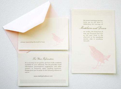
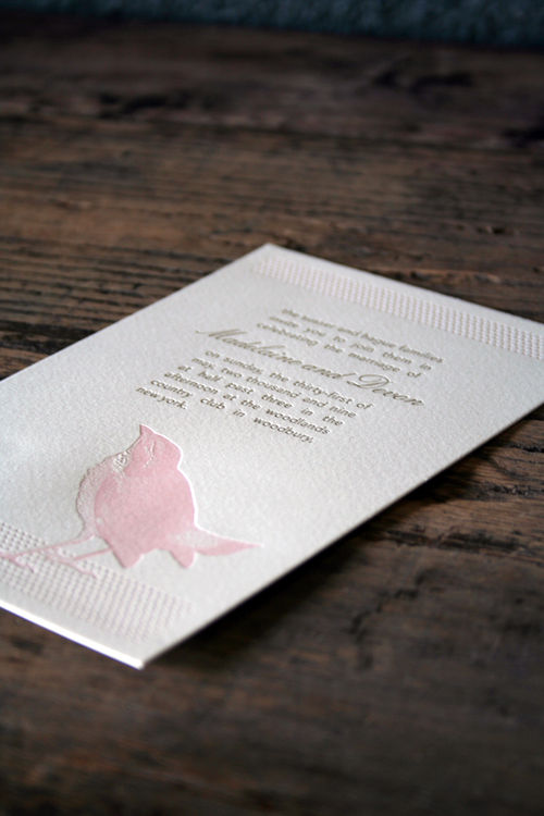
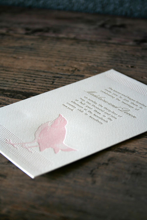
The color scheme was originally pulled from Sophia Coppola’s Marie Antoinette.  The first palette was pink, peach, and antique gold.  The color scheme was modified to pink, green and antique gold after my parents decided they didn’t want to wear pink.  The color change gives it a little more of a modern spin, so I think it still works pretty well.  For the purposes of the invitation, I wanted to keep the palette simple and restrict it to only two of the colors.

pink-bird-silhouette-letterpress-wedding-invitations

pink-bird-silhouette-letterpress-wedding-invitations

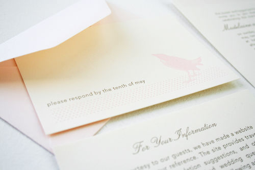
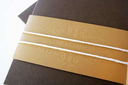
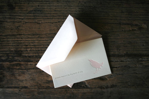
You’ll notice the invitation envelope is missing from the suite.  All of my envelopes were directly shipped to my calligrapher, Laura Hooper, who is matching the Lucia Script in an antique gold.  They look exactly like the RSVP envelopes, except the addressing is on the front.

pink-bird-silhouette-letterpress-wedding-invitations

pink-bird-silhouette-letterpress-wedding-invitations

I went through over fifty designs before I got to this one.  I knew the “something old” I wanted was in the printing method and the “something new” was in the typography and overall graphic treatment.  The typefaces I used were Avenir and Lucia Script, which I thought paired together well without looking too casual.

pink-bird-silhouette-letterpress-wedding-invitations

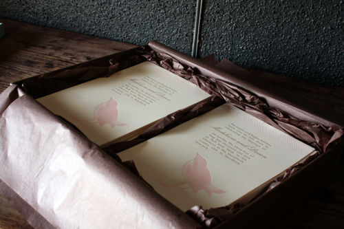
The invitations were printed by Hello!Lucky, and I would highly recommend them to any graphic designer looking for someone to letterpress his or her work.  Alex from HL was so incredibly helpful and patient.  She was a great resource and was happy to send me any samples I needed or answer any questions I had.

pink-bird-silhouette-letterpress-wedding-invitations

pink-bird-silhouette-letterpress-wedding-invitations

In addition to sending over these gorgeous photos of her invitations, Maddy was also kind enough to include some fabulous advice for other brides thinking about designing their own invitations:

If you’re planning to design your own invitation, I’d highly recommend researching your printing options first. Certain design elements were scaled back or modified because of letterpress limitations. If you know who is printing it before designing it, you’ll have less of a chance of having to let go of design elements you’re attached to later on. Also, make an inspiration folder with images of designs you like but aren’t totally you. Reference these whenever you’re having a design block so you can recall what you’re looking for in your ideal invite.

I love the chic and simple elegance of the design – from the pink and gold color palette to the bird graphic that is just so perfect for a springtime invitation!  Thanks so much Maddy for sharing your invitations, and for sharing such helpful insights into your design process!

Check out the Designer Rolodex for more tal­ented wed­ding invi­ta­tion design­ers and the real invi­ta­tions gallery for more wedding invitation ideas!

{all photos by Maddy Susser}

Liz + Ryan’s Modern Americana Wedding Invitations

I first came across these lovely invitations while browsing through one of my favorite blogs, Parcel Post.  Luckily, Audrey (the author behind Parcel Post) is good friends with the bride, Liz, and put us in touch so that Liz could share the inspiration behind her invitations.   Liz and Ryan’s invitation suite included the stand-alone invitation, enclosures with accommodation information, directions, and a rehearsal dinner invitation, as well as a matching RSVP card:

red-blue-modern-letterpress-wedding-invitation

From Liz: It was important to us that our wedding felt personal, relaxed and fun – that was our inspiration behind the invitation design. We choose a favorite color combination of red and turquoise because it feels fresh and fun and like summer; it also was perfectly suited to the ocean view at our venue.

red-blue-modern-letterpress-wedding-invitation

The design of the invite was celebratory and informal, signaling the laid back vibe of our wedding.  We worked with our stationer Audrey Woollen at Urbanic in Venice, CA, to order the Classic Cowboy invitation design from the Hello! Lucky letterpress studio.  Audrey is the consummate professional and the entire process was a breeze.

red-blue-modern-letterpress-wedding-invitation

For our escort cards we put name and table number on a stick inside little boxes of kettle corn.  They doubled as our wedding favors.  On the reverse side of the card was one of 10 different shots from our engagement session.  These were a big hit as they served as a take away reminder of the day as well.

red-blue-modern-letterpress-wedding-invitation-Escort-Card

red-blue-modern-letterpress-wedding-invitation-escort-cards
{escort card photos by Viera Photographics}


{photos by Audrey Woollen}

Liz also sent a couple of photos of her Save the Date postcards, which I couldn’t resist sharing as well:

red-blue-modern-letterpress-save-the-date

red-blue-modern-letterpress-save-the-date

I love all the details – from the red and pool color palette to the popcorn bag escort cards, this seems like such a fun and relaxed wedding!  For a couple more pictures from Liz and Ryan’s wedding, be sure to check out Audrey’s post on Parcel Post.  And thanks to Liz for sharing her invitations!

Check out the Designer Rolodex for more tal­ented wed­ding invi­ta­tion design­ers and the real invi­ta­tions gallery for more wedding invitation ideas!

{all photos by Liz Zang, unless noted otherwise}