Eucalyptus and Vellum Birthday Party Invitations

With the winter months upon us, these fresh and whimsical invitations are a fun deviation from the usual deeper hues of this season. Juliann Ford of Mint for Hue designed these eucalyptus and vellum birthday party invitations to celebrate her daughter’s first birthday. Don’t you simply love all the small details, especially the stamp and address formatting on the envelopes? The embossed details and gold leaf accents are perfect finishing touches!

Eucalyptus and Vellum Birthday Party Invitations by Mint for Hue

From Juliann: For my daughter’s first birthday, I wanted to create an elegant yet chic invitation collection that was simple, youthful, and whimsical. Since her birthday lands on November 3rd, it’s the final days of fall leaves in Wisconsin, but not quite winter. Knowing I wanted to stay away from everything Fall, I chose to use bright whites, deep greens, and a pop of peachy-pink and dark purple to welcome the colder days ahead of us.

Eucalyptus and Vellum Birthday Party Invitations by Mint for Hue

For the birthday invitations, I knew immediately that I wanted to include embossing to some degree and showcase my love of calligraphy and hand-lettering. Therefore, I kept the rest of the invite simple, only utilizing fonts and lettering on the actual invitation. I added a simple embossed border to the top and bottom of the invite to frame the content. To add interest to the whole piece, I wrapped the invitation in a vellum overlay with a soft hand-drawn eucalyptus wreath.

Eucalyptus and Vellum Birthday Party Invitations by Mint for Hue

Eucalyptus and Vellum Birthday Party Invitations by Mint for Hue

Since the invitation itself did not have any fancy wording, and I wanted to specifically include that it was her first birthday, I embossed a “1” on a tag and accented the corners with gold leaf foil detailing. I secured the tag to the invitation with a metallic gold thread to hold the entire invitation set together. I chose a soft peachy-pink envelope and designed floral blooms for the custom postage. To keep the entire piece clean & elegant, guest addresses were printed on each envelope, adjacent to the custom stamp. Lastly, I included a simple design on the back flap of the envelope, highlighting my daughter’s first birthday.

Eucalyptus and Vellum Birthday Party Invitations by Mint for Hue

I love the simplicity of this invitation set, but there is also a lot of texture and depth that creates so much interest to this piece. These invitations are an exact representation of who my daughter is, and I couldn’t be happier with how they turned out.

Eucalyptus and Vellum Birthday Party Invitations by Mint for Hue

Eucalyptus and Vellum Birthday Party Invitations by Mint for Hue

Thanks, Juliann!

Design, calligraphy, & printing: Mint for Hue 
Paper: Paper and Moore
Envelopes: Cards and Pockets  
Custom Stamps: Zazzle

Photo Credits: Juliann Ford

Navy and Gold Foil Agate-Inspired Wedding Invitations

Modern yet classic and geometric yet organic, this wedding invitation suite is full of the very best juxtapositions. Michael Musser of Anticipate Invitations drew inspiration from one of nature’s most beautiful elements when creating these striking navy and gold foil agate-inspired wedding invitations. How beautiful is that gold foil border formed by the agate lines against that gorgeous dark blue paper?! 

Navy and Gold Foil Agate-Inspired Wedding Invitations by Anticipate Invitations

From Michael: Sharla and Nick approached me with their own jumping off point ideas for their wedding stationery design, and I knew they were on to something that could be taken to another level with some carefully well thought-out details.

Navy and Gold Foil Agate-Inspired Wedding Invitations by Anticipate Invitations

Sharla wanted to bring in something modern and abstract, yet also keep the feeling classic and traditional. She also wanted to use the blue hues and metallic golds she would repeat through her other wedding design elements. After some initial designs that were more geometric in nature, we landed on the more organic, yet graphic lines, of an agate slice. It allowed for the invitation to be fully classic and fully modern at the same time. To lean classic, we kept everything in metallic gold foil and printed on Colorplan paper’s dramatic Imperial Blue. The lines of the stone were pulled from a scan of an actual agate slice, and then edited and filled in as necessary to perfectly frame the invitation’s wording.

Navy and Gold Foil Agate-Inspired Wedding Invitations by Anticipate Invitations

Navy and Gold Foil Agate-Inspired Wedding Invitations by Anticipate Invitations

To further mimic the stone, we used graduated shades of blue paper from Colorplan for the remaining details cards, so that when stacked, it would create a beautiful ombré effect. To visually tie the pieces together, the agate lines of the invitation were repeated on all the corners of the smaller cards. When stacked, they formed the complete agate design, but perfectly hid the invitation’s wording.

Navy and Gold Foil Agate-Inspired Wedding Invitations by Anticipate Invitations

The secondary cards included accommodations, a modern map card that mixed simple watercolor lines and gold foil, and the reply card with envelope.

Navy and Gold Foil Agate-Inspired Wedding Invitations by Anticipate Invitations

The cards were tied together with gold string in a random and layered fashion while framing the monogram that was printed on the back of the top details card.

Navy and Gold Foil Agate-Inspired Wedding Invitations by Anticipate Invitations

The suite was slipped into a clear vellum envelope, which was then inserted into a light blue outer envelope and lined with metallic gold paper. The envelope’s finishing touch was the set of four vintage postage stamps, that highlighted the blue tones and the geodes.

Navy and Gold Foil Agate-Inspired Wedding Invitations by Anticipate Invitations

Thanks, Michael!

Design: Anticipate Invitations
Printing: Hodgins Engraving
Paper: Colorplan Papers
Planning: Two Be Wed

Check out the Designer Rolodex for more tal­ented wed­ding invi­ta­tion design­ers and the real invi­ta­tions gallery for more wedding invitation ideas!

Photo Credits: Very Robin & Co.

Behind the Stationery: Fox and Fallow

Today we’re taking you all the way to Australia to meet Janet from Fox and Fallow! Her bright designs and style reflect her surroundings in Brisbane. Janet shares her schedule for creating new product collections, how she brings each new product to life from design through production, and how her team helps to get it all done and shipped out each day. Take it away, Janet! —Megan Soh

Behind the Stationery: Fox & Fallow

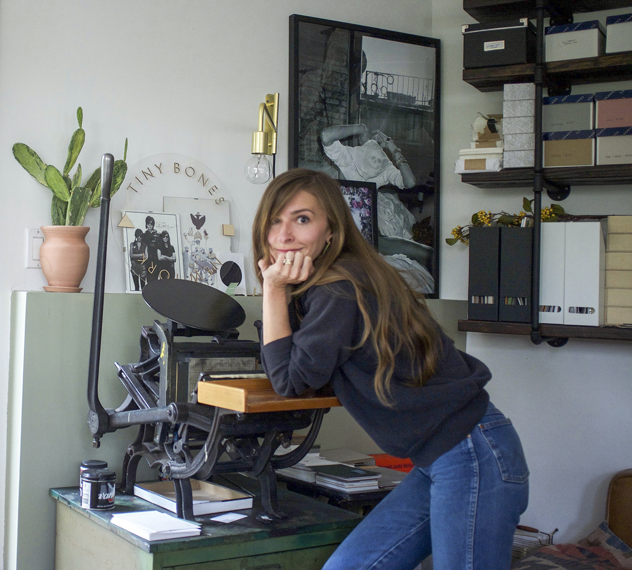
From Janet: My background is in graphic design and art direction but after spending 10 years in design studios and advertising I felt like I needed a bit of a change. I really wanted to build my own brand after so many years of building other people’s brands. I fell in love with weddings after designing our own wedding stationery and signs and in 2013 we began creating wedding stationery and signs for couples as a side project. After about a year and a half I really wanted to reach a wider audience and create products of my own. So in 2015 we jumped right into the deep end and we launched our brand at the National Stationery Show in New York in 2015 and haven’t looked back!

Behind the Stationery: Fox & Fallow

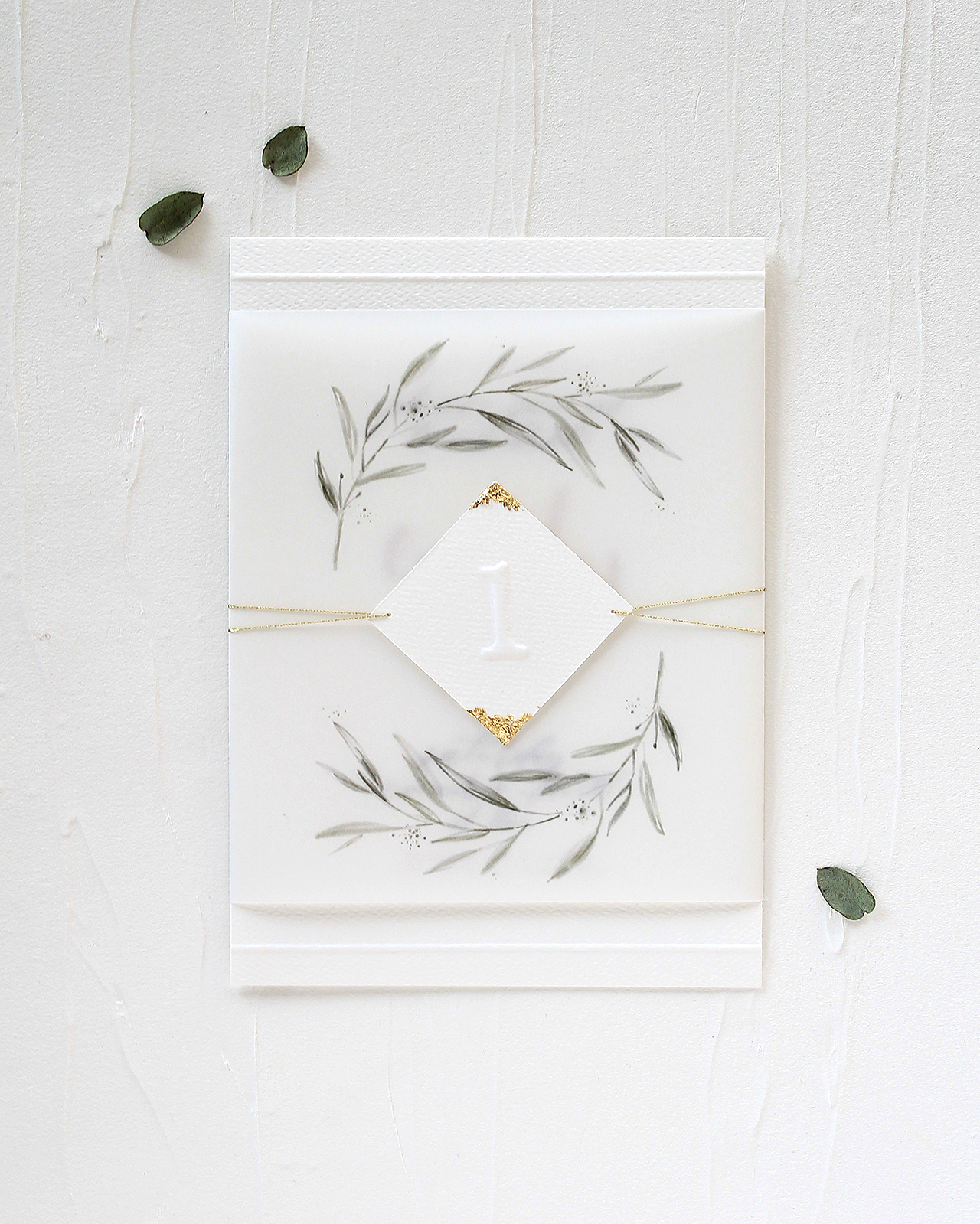
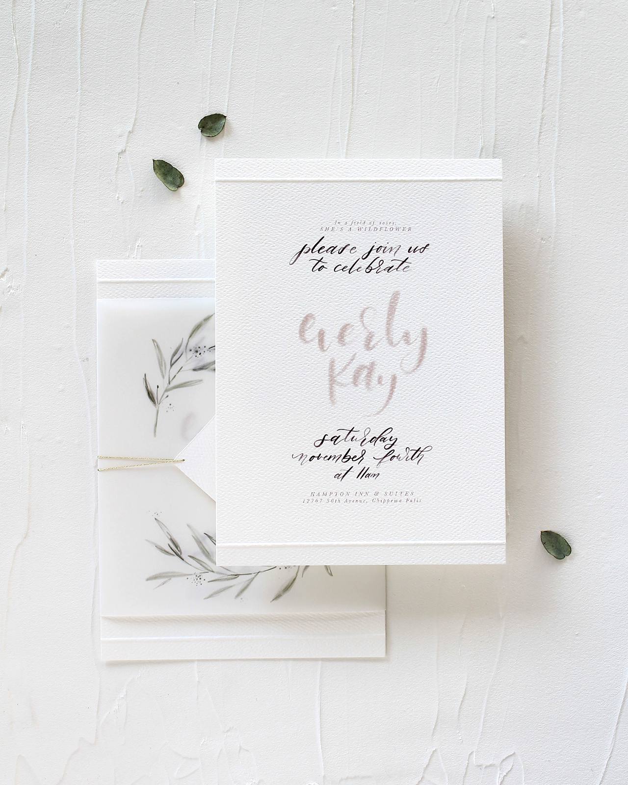
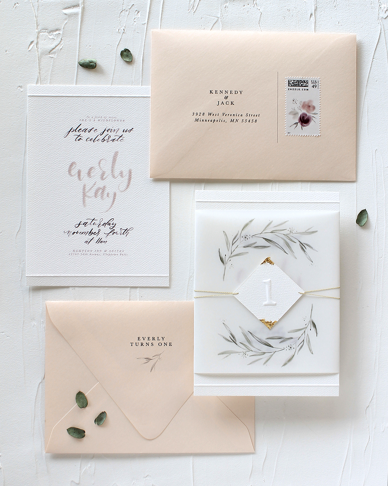
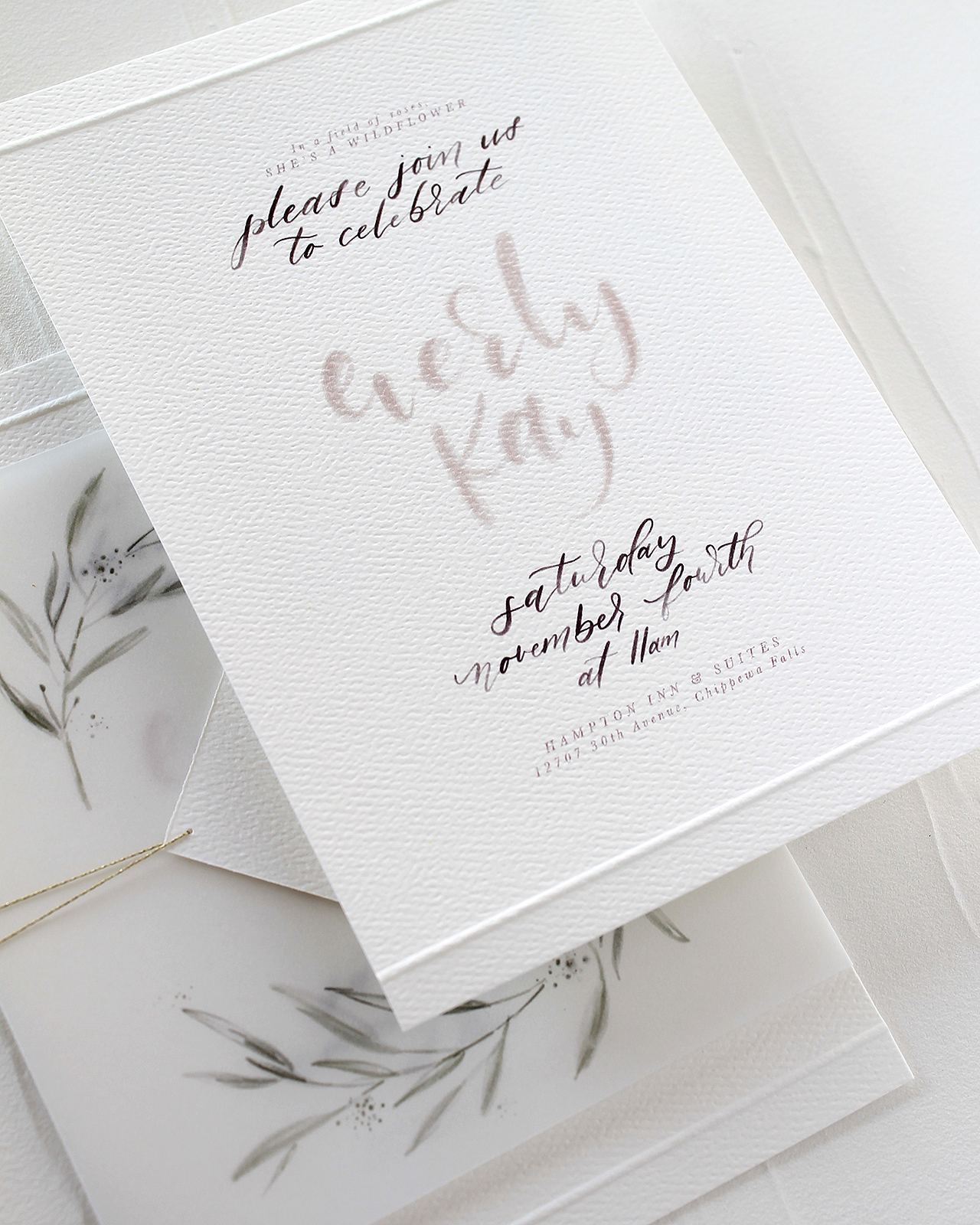
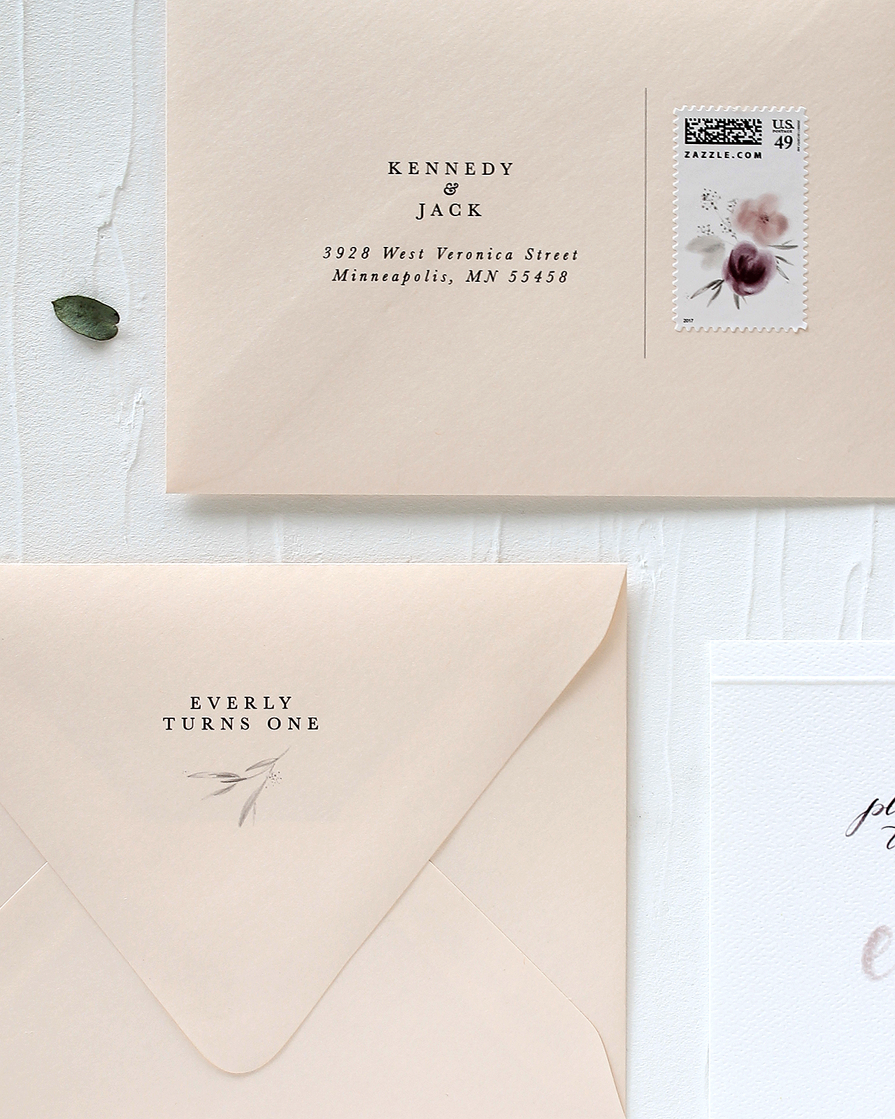
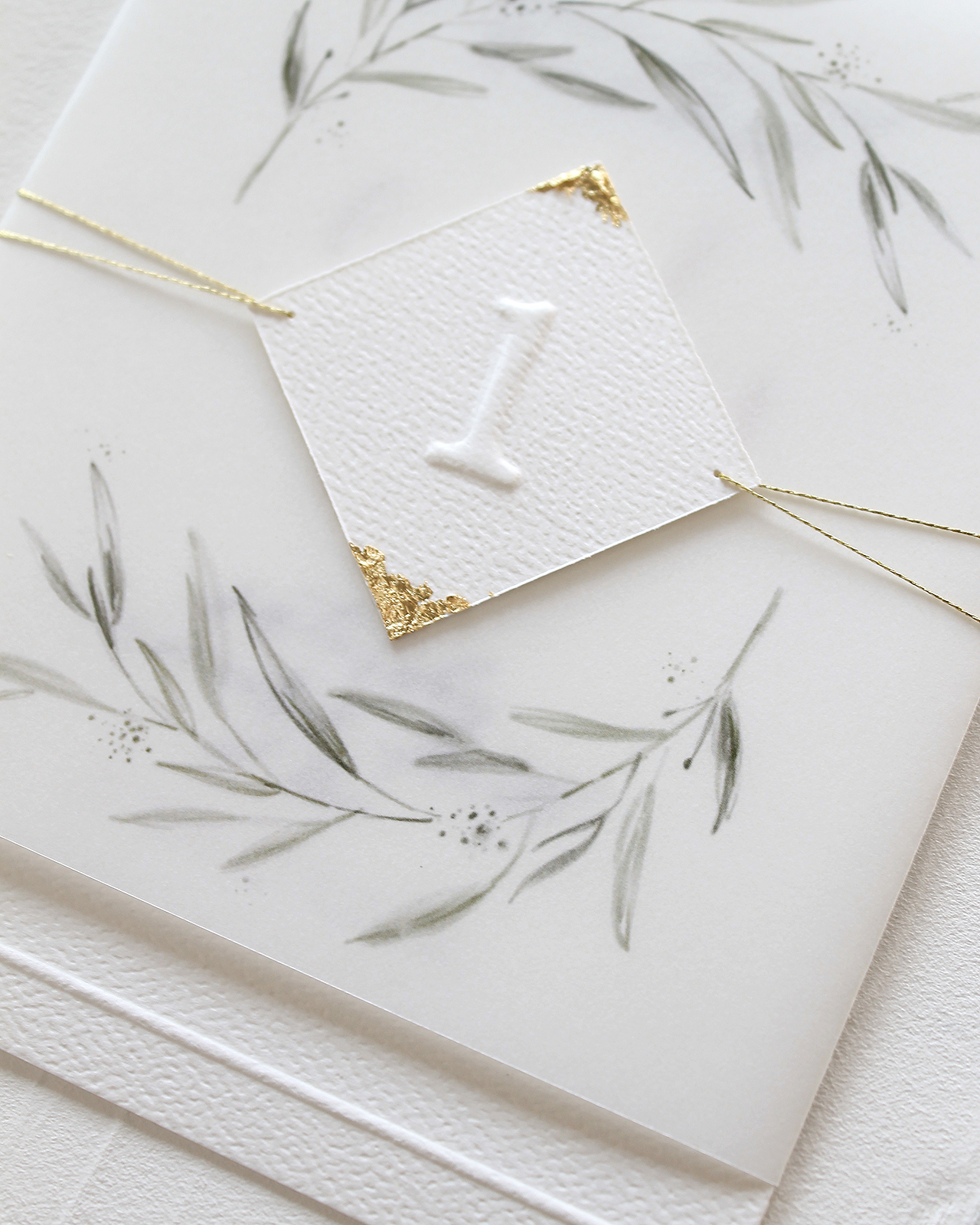
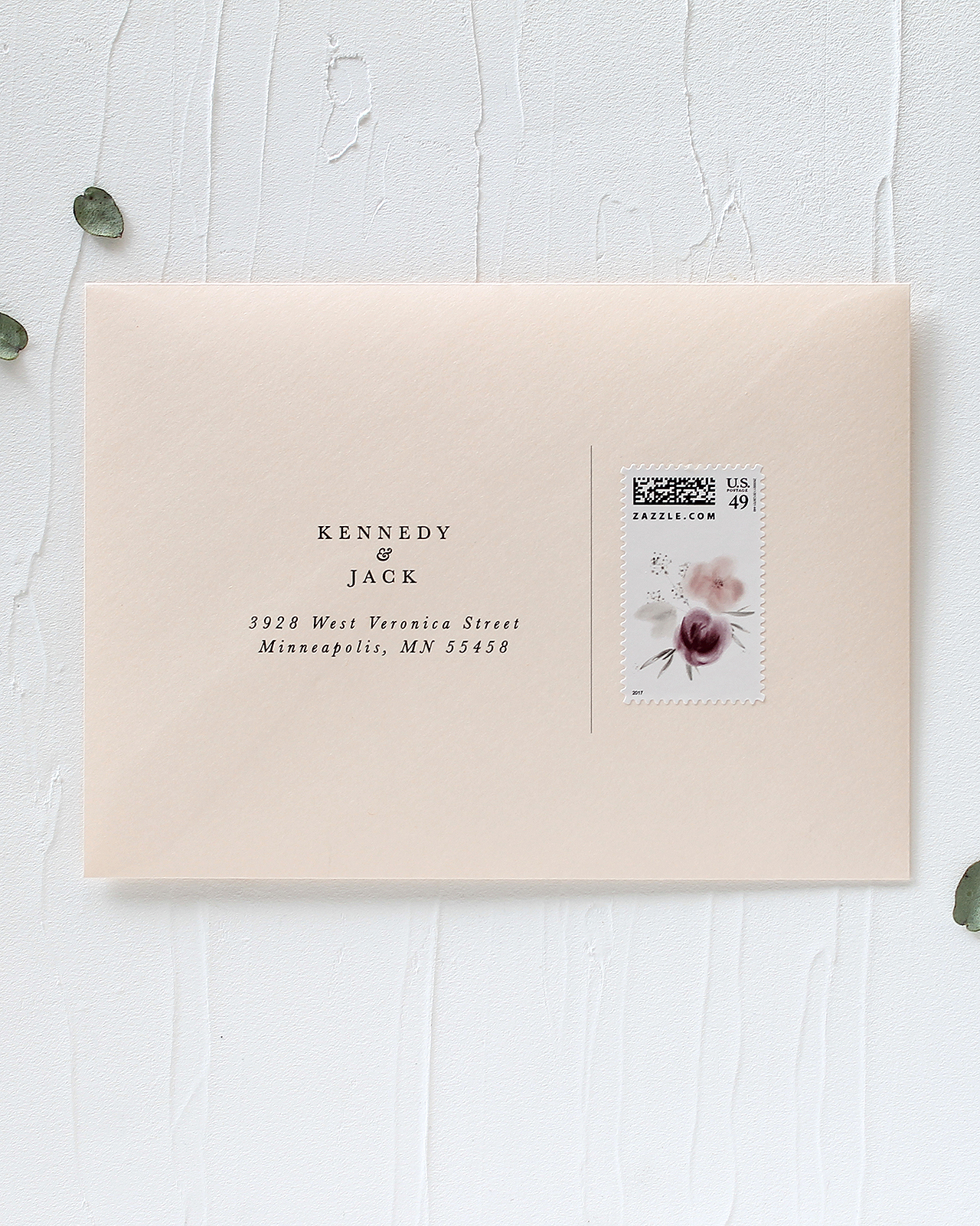
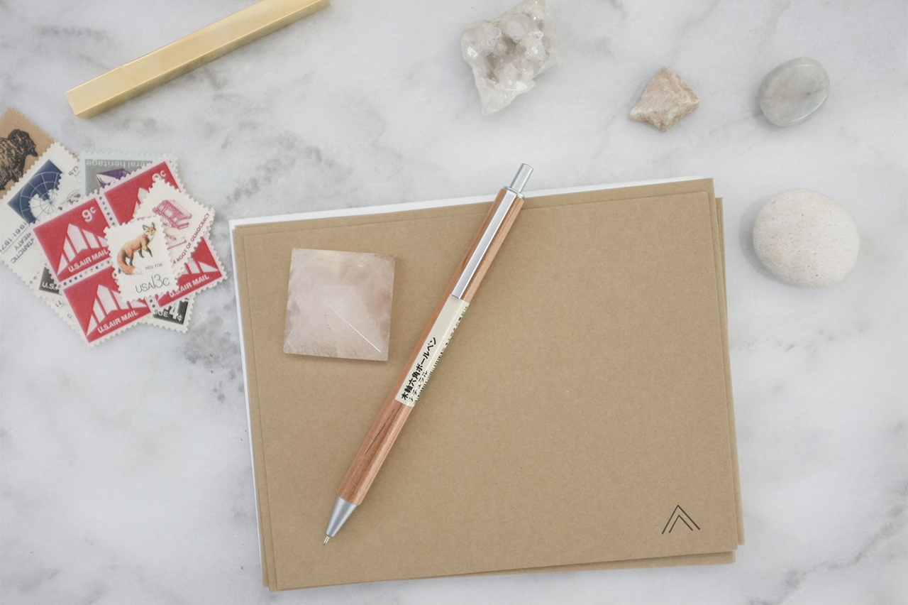
We’re located in sunny Brisbane, Australia. It’s a fabulous city, the people are laid back, the food and bars are great and we’ve got more sunshine than we can handle! Our style is bright, fun, intricate and we love foil, so most of our paper goods are offset printed and foil stamped. I like to design in collections, releasing 3-4 collections per year, each with a totally different theme and style. This keeps things fresh and interesting and allows us to keep evolving our style each year.

Behind the Stationery: Fox & Fallow

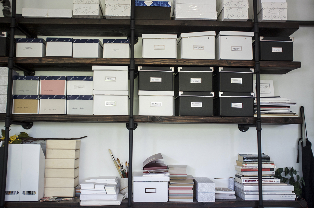
Our studio is part office, part warehouse. All the design work, invoicing etc. gets done in the office and orders and products are checked, assembled, packaged and shipped out of the warehouse.We make a wide range of paper goods including greeting cards, gift wrap, flat notes, gift tags, prints, journals, notebooks, notepads and calendars.

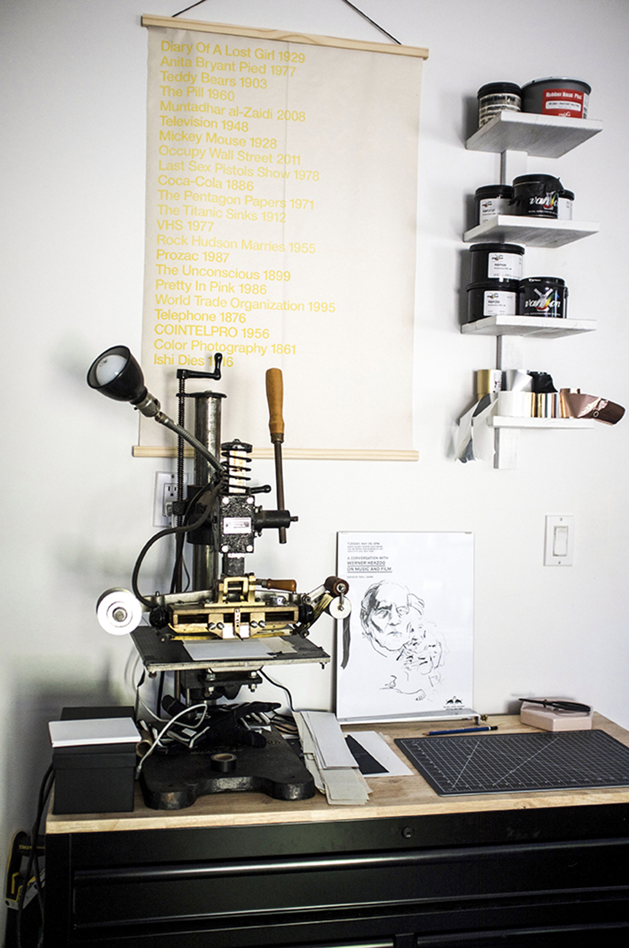
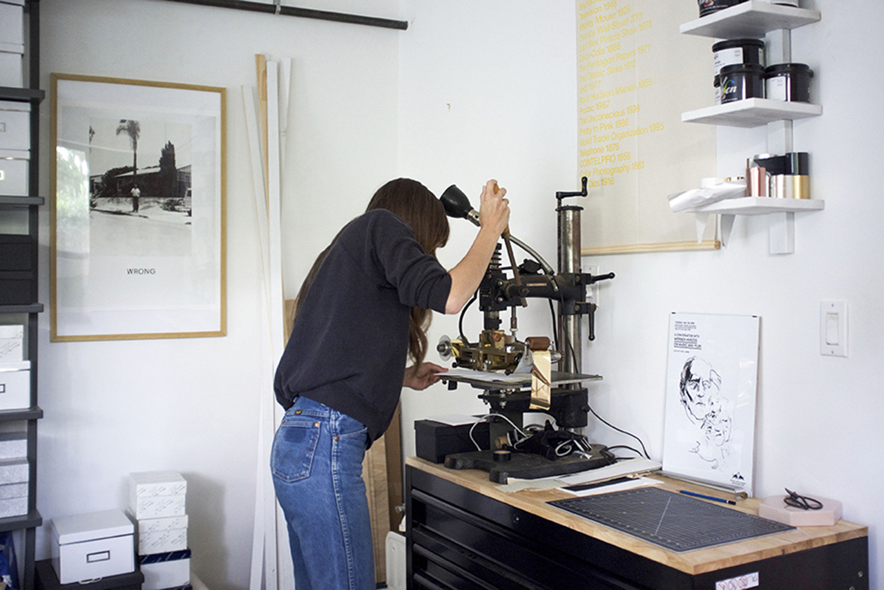
We also make clipboard packs which are a really fun gift item and we make the clipboards in house, which involves sourcing the wood from a local supplier, laser cutting and engraving them, sanding, riveting and shrink wrapping the whole pack together.

Behind the Stationery: Fox & Fallow

We take care of the design, quality checking, packaging and assembly but leave the printing to our local and offshore printers. We make most of our products locally in Brisbane or Sydney, but a few products we had to get manufactured offshore to make sure the price points work for our customers.

Behind the Stationery: Fox & Fallow

I usually start with a double espresso and an attempt to clean out my inbox (which rarely happens)! We’ll get any orders from the previous day and ones that have come in overnight to the team to pick and pack so they’re shipped out ASAP. We try to wrap this up by 2pm so they’re ready to be collected by our couriers. After the orders are done for the day the team often keeps working on quality checking, assembling and packaging products and anything else that needs doing before finishing up around 5pm. If we’ve got a big order to get out, it’s all hands on deck and we’ll do some pretty big hours to get it out in time, but it’s great we can be flexible and have our team take product home to package – which works great! No one wants to be working late in the office right?

Behind the Stationery: Fox & Fallow

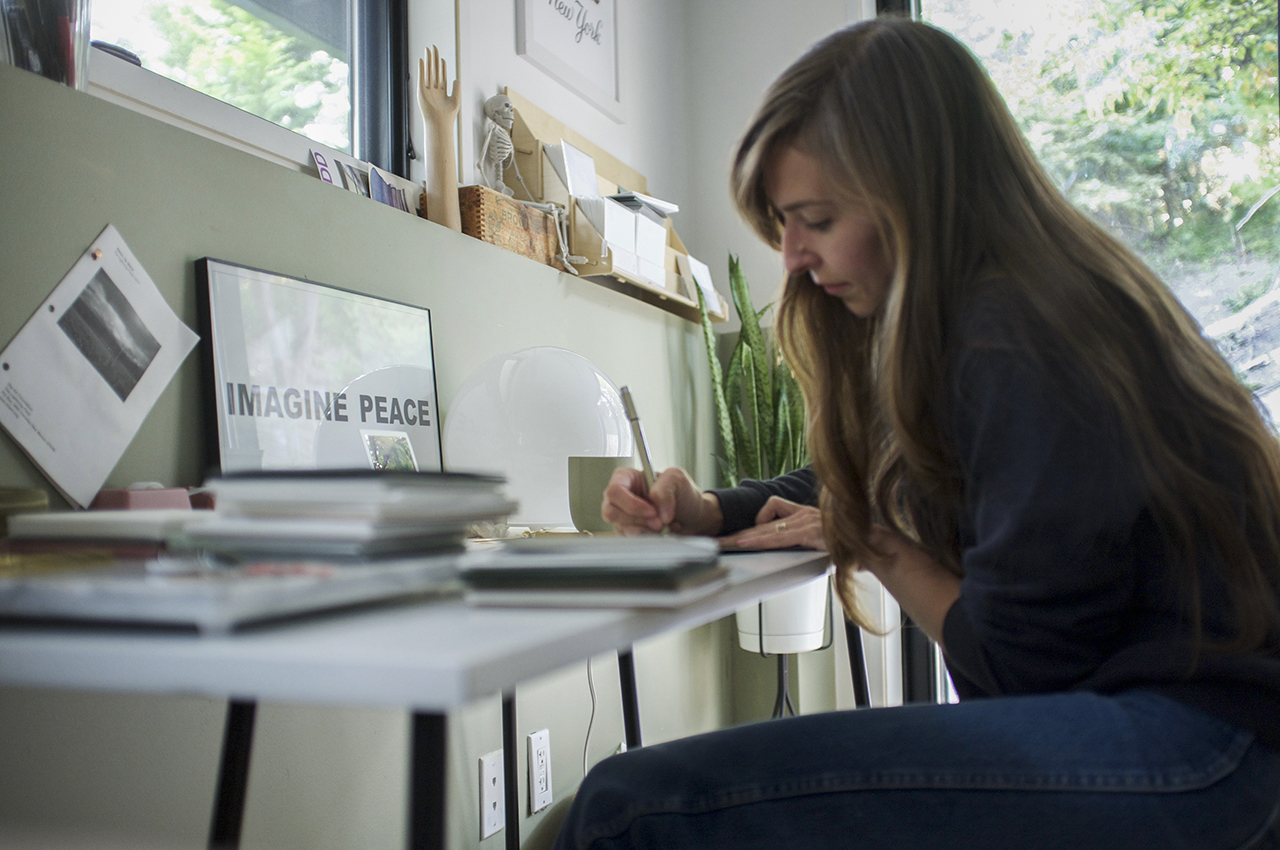
I’ll usually grab another coffee and get started on artwork, product sourcing, bill-paying and general day-to-day business things. Darrell and I are both night owls, so we usually work pretty late. I wish my days were filled with painting and making new products, but as I’m sure all creative business owners know, the creative part is a tiny sliver of the running-a-small-biz pie.

Behind the Stationery: Fox & Fallow

Behind the Stationery: Fox & Fallow

I start each collection with a bunch of random thoughts in a notepad file on the computer and on my phone, then I’ll scour Pinterest, Google or books for snippets to create a mood board. I like having the inspiration and colours for each collection all nutted out on a mood board so I can show Darrell and get his thoughts. Once we’re happy with the direction it’s a matter of more research, sketching, scanning, detailed ink sketches, painting, scanning, colouring and refining and deep-etching each element in Photoshop.

Behind the Stationery: Fox & Fallow

Behind the Stationery: Fox & Fallow

I like painting all artwork as separate components so I can change the colours easily in Photoshop and change the size if needed. If I’m working on custom typography I’ll usually start with sketches and then use a brush pen and ink before I scan each word and vectorize them in Illustrator. I composite all artwork in InDesign and send it off to print for the proofing stage. Once we’ve checked and approved the proofs we wait for the finished goods to arrive.

Behind the Stationery: Fox & Fallow

This is the most fun part of what we do and it’s so rewarding when we see our retailers and customers loving our products. We love doing trade shows and pop up events as you really get to see people’s reactions to your products – it’s super valuable having that face-to-face contact. We love it when we meet people who are discovering us for the first time – it makes all the hard work so worthwhile!

Behind the Stationery: Fox & Fallow

All photos by Fox & Fallow.

Want to be featured in the Behind the Stationery column? Reach out to Megan at megan [at] ohsobeautifulpaper [dot] com for more details.

Modern Botanical Chicago Wedding Invitations

I’m partial to oversize floral patterns in wedding invitations – they make such a fantastic statement in a wedding invitation! (If you haven’t already, you have to check out the botanical envelope liners on these invitations.) I love how designer Christina Egan Chang combined modern elements with classic florals in these modern botanical Chicago wedding invitations. The large scale (and negative space!) text over the oversized botanical print on the RSVP card? So good! What a fun modern twist on a botanical invitation suite!

Modern Botanical Chicago Wedding Invitations by Christina Egan Chang

From Christina: This was a fun save the date announcement and wedding invitation suite for an elegant September Chicago wedding! Lauren, the bride, is a stylish advertising agency account manager and Michael is a teacher and writer. The pair, both Chicago natives, met in Michigan while at college and became engaged after six years of dating. Lauren and Michael wanted to evoke the ambiance from their wedding venue within the invitation details, so their color palette of green, white, black, and silver was pertinent to the design.

Modern Botanical Chicago Wedding Invitations by Christina Egan Chang

Their wedding reception took place in an antique shop turned event space by night, so we selected a vintage botanical print featuring the same flowers in Lauren’s bouquet as a recurring element in the invitation suite. Their table centerpieces featured stacks of vintage books draped with green eucalyptus and various seasonal white blooms, a visual that was frequently referred to during the design process. We created a modern crest with their first initials to add some boldness to their effortless black and white invitations.

Modern Botanical Chicago Wedding Invitations by Christina Egan Chang

Modern Botanical Chicago Wedding Invitations by Christina Egan Chang

Lauren and Michael opted for traditional letterpress printing on their wedding invitation. To balance out the cost of letterpress printing, we transformed the vintage botanical print multiple times, rather than purchasing additional botanical prints. Most noticeably the leaves from the print were trimmed out and reconstructed into a leaf composition for the envelope liners and front of the RSVP card. Lauren wanted a strong use of green for the envelope liner to contrast with the crisp white envelope, so this made for an excellent solution.

Modern Botanical Chicago Wedding Invitations by Christina Egan Chang

A fold over map card was included for traveling guests along with wedding details and favorite places to visit in Chicago. Lauren and Michael initially explored script fonts, classic serif fonts, and calligraphy – but ultimately opted for a modern sans serif font on their invitation suite. This type selection perfectly rounded out their personal style: an appreciation for styles of the past, combined with a love for modern and mid-century design.

Modern Botanical Chicago Wedding Invitations by Christina Egan Chang

Thanks Christina!

Design: Christina Egan Chang

Printing: Steracle Press

Check out the Designer Rolodex for more tal­ented wed­ding invi­ta­tion design­ers and the real invi­ta­tions gallery for more wedding invitation ideas!

Photo Credits: Christina Egan Chang

Behind the Stationery: Tiny Bones Press

Our next designer on Behind the Stationery is a new-to-me stationer that I discovered at NSS 2017. Megan’s delicate and minimalistic work at Tiny Bones Press caught my eye amongst the other booths with brighter hues and bold art. With a background in post and print production for fashion designers and photographers, Megan shares about her journey into the letterpress and stationery world as a solopreneur. —Megan Soh

Behind the Stationery: Tiny Bones Press

From Megan: I’ve always worked within the printing world in NYC and slowly started exploring practices on my own. I learned to letterpress about five years ago and really fell in love with the process. I love writing letters and notes and started to make stationery that I wanted to use myself.

Behind the Stationery: Tiny Bones Press

My husband and I bought a house on the north shore of Long Island. We were in Brooklyn for a decade and loved it but needed a bit more space and I really wanted to be by the water! We truly lucked out and now I have a lovely little studio that really has provided me the creative haven I was dreaming of.

Behind the Stationery: Tiny Bones Press

In house, I offer design services and letterpress and foil stamp printing. I frequently collaborate with trusted digital printers to add that process to my designs as well. People who are drawn to my work are people who love minimal design and also who love truly love paper and print. Having a minimal aesthetic — the feel of the paper, the tones, the delicate foiling and letterpress all add up to make the pieces special and unique. All Tiny Bones Press stationery is printed in my studio, by me, one by one, on vintage presses.

Behind the Stationery: Tiny Bones Press

Behind the Stationery: Tiny Bones Press

Right now, I am a one woman team! I typically start the day with a coffee and make my daily list. Usually I get to work on emails (I try to do this outside if I can) and then spend the afternoon in the studio printing. I’m trying to get better at balancing all aspects of the business – it can be hard to juggle everything solo.

Behind the Stationery: Tiny Bones Press

My design process is all about exploring – I’m very interested in the world around me and try to find inspiration by exposing myself to a number of different images throughout industries: from architecture to art to books and science, etc. I always make lists and keep a notebook handy and do feel that it’s important to explore things that you as a person are naturally drawn to – for me that is geometric linework and symbols. My sketches then turn into digital drawings, which then turn into plates, and then finished printed pieces – the evolution of a piece is really the most fun aspect (next to sending them off for others to enjoy).

Behind the Stationery: Tiny Bones Press

Behind the Stationery: Tiny Bones Press

All photos by Tiny Bones Press.

Want to be featured in the Behind the Stationery column? Reach out to Megan at megan [at] ohsobeautifulpaper [dot] com for more details.