Today I’m sharing a few favorite wedding invitations over on Snippet & Ink while Kathryn is away spending time with her brand new baby girl. Check them out right here!
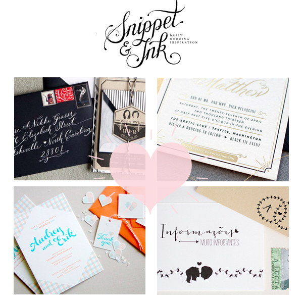

Today I’m sharing a few favorite wedding invitations over on Snippet & Ink while Kathryn is away spending time with her brand new baby girl. Check them out right here!

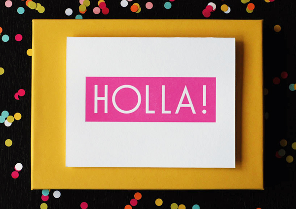
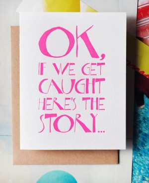
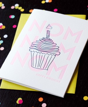
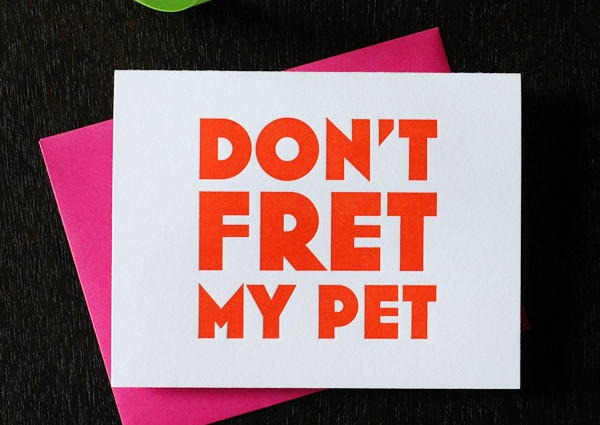
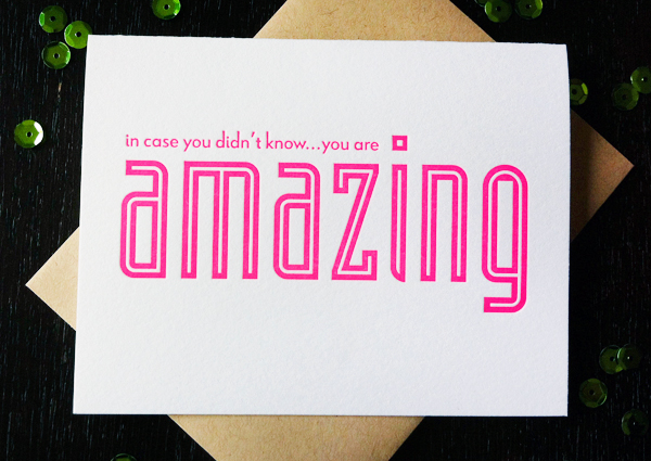
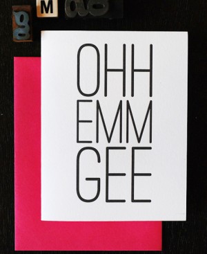
Some of these cards may look familiar, as I’m a longtime fan of Richie Designs. I love the bright colors, bold designs, and sassy messages that Richele incorporates into her greeting card designs. Each card is guaranteed to make someone smile!
 Â
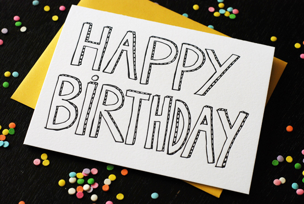
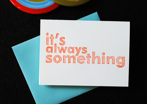
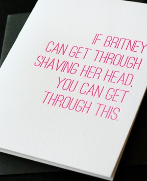 Â
 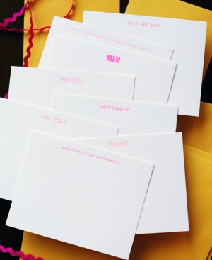
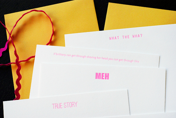
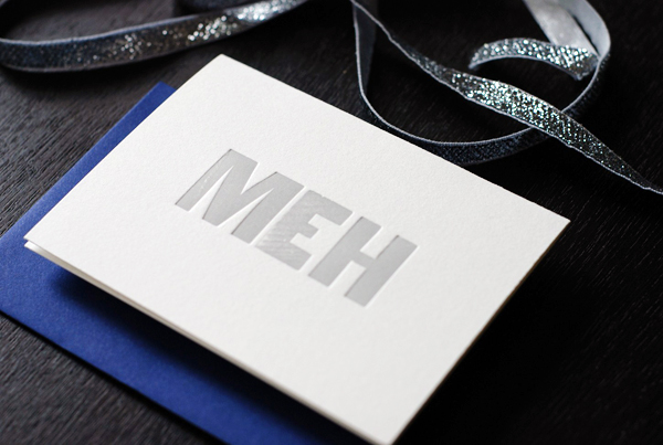
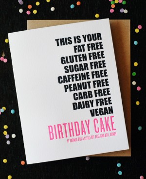 Â
 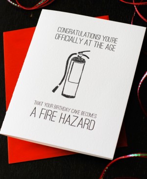
 Â
 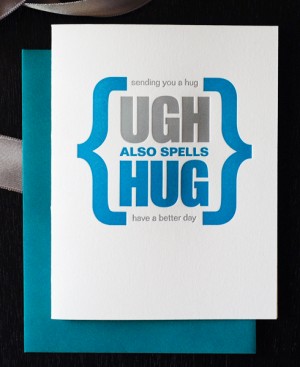
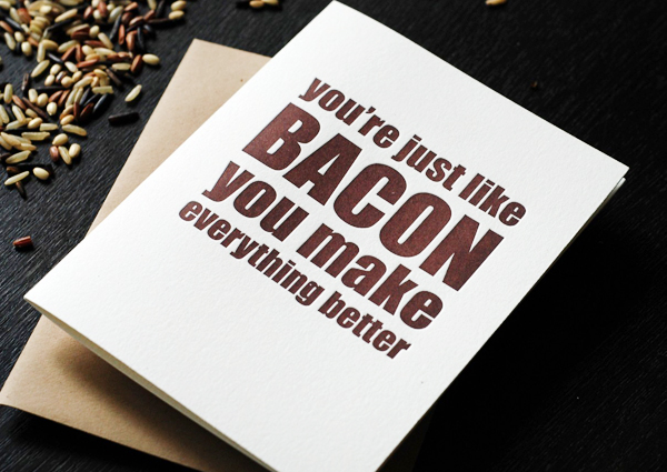
More over at Richie Designs!
Photo Credits: Richie Designs
I think navy is perhaps the most perfect summer neutral. I really start to fall in love with it each season as the Fourth of July approaches (can you believe it’s next week!?) and the red, white and blue starts to make its appearance. Navy can be adapted for so many summer wedding styles: preppy, classic, nautical and Americana. It lends itself well to stationery, as it looks great in stripes or as the backdrop for fine white calligraphy. Here’s a few navy ideas that span its versatility, with a subtle nod to the Fourth, too. —Kelly
Photo by Jen Huang Photography, Escort Cards by Mélangerie Inc. via Style Me Pretty
Photo by Jen Huang Photography, Place Cards by Mélangerie Inc. via Style Me Pretty (left), Photo by Katelyn James Photography, Ceremony Program by Tucker Francis via Grey Likes Weddings (right)
Photo by Jen Huang Photography, Pennant Flags by Mélangerie Inc. via Style Me Pretty
Photo by Mandy Mayberry via Ruffled (left), Photo by Kate Murphy Photography, Ceremony Program by Buchanan Ink via Elizabeth Anne Designs (right)
Photo by Annie McElwain, Menu by Posh Paperie via Green Wedding Shoes
Photos by Beaux Arts Photographie, Stationery by Lilly & Louise via Santa Barbara Chic
Photo by Jill Thomas via Green Wedding Shoes
Photo by Troy and Aimee Grover, Flags by Papermade Designs via Grey Likes Weddings (left), Photo by M Three Studio via Elizabeth Anne Designs (right)
Photo by Troy and Aimee Grover, Escort Cards by Papermade Designs via Grey Likes Weddings
Photo by Kristyn Hogan via Wedding Chicks (left), Photo by Heather Roth Fine Art Photography, Table Number by Ten Four Paper via Elizabeth Anne Designs (right)
{images via their respective sources}
FONT: BERGAMOT
So here’s the thing: I am not a crafty person. I have aspirations of craftiness, but I mostly just marvel at the creative genius of others. So when I do sit down to craft something, it needs to be super simple and as easy as possible. I used the same folded paper technique to create the heart backdrop in yesterday’s St-Germain housewarming cocktail party and the shadowbox decor at my Paper Party last month, so I figured now was a good time to share the process!
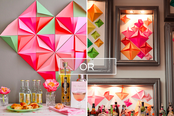
The backdrop idea came about on a random evening in February – right in the middle of planning for the Paper Party – when I stumbled upon a cool 3D geometric window display at my local mall. We needed something to fill the large shadowboxes behind the bar, and it seemed like the perfect inspiration. I loved the idea of doing something geometric and 3D, but I also needed something that didn’t take too long to set up and could travel from my home in DC to the party venue in NYC. Folded paper triangles in a diamond shape turned out to be the perfect answer. I brought the materials up to NYC, then Janice, Kelly, and I ended up putting the shadowbox display together in my hotel room the night before the party!

Here’s what you’ll need to create your own folded paper backdrop:
Cardstock or Cover Weight Paper in your desired color palette (I used Mohawk Britehue in 65 lb cover weight)
Guillotine Paper Cutter
Double Sided Tape or Painters Tape
Foam Core (optional)
Ruler and Bone Folder (optional)
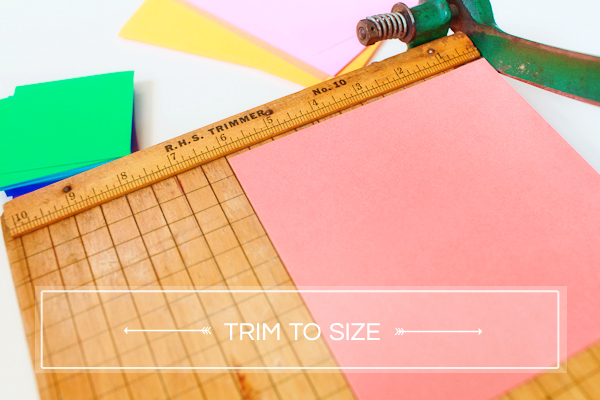
First, you’ll need to trim your paper down to size. The shadowbox display calls for squares in three different sizes. The Mohawk paper came in large 25″ x 35″ sheets, which I chose to down to squares of 6, 4, and 2.5 inches. If you’re using letter size sheets, you could switch to 5, 3.5, and 2.5 inch squares to maximize use of each individual sheet.
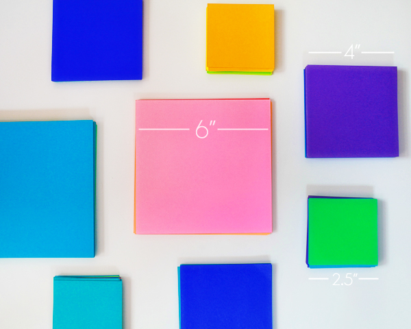
The heart backdrop only needs one square size, so that’s a bit easier! I went with the large 6″ squares to keep things easy.
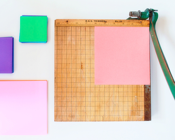
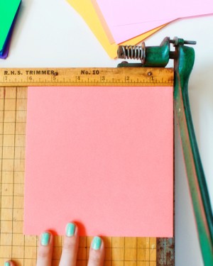
Depending on the number of sheets and eventual squares, you can trim the individual sheets on a desktop paper cutter or using a craft knife and cutting pad. But if you’re cutting down lots of sheets (like I did), I recommend trying to find a heavy duty guillotine to cut down all the sheets at once. You can often find someone to do this for a small fee at Office Depot, Staples, and other office supply stores, but you might also look to see if there is a book arts center in your area with an industrial strength guillotine. I cut my sheets down at Pyramid Atlantic Art Center before leaving for NYC and I seriously felt like superwoman cutting dozens of sheets in a single motion. It was so much fun! Also, the trimmings were super pretty.
 Â
 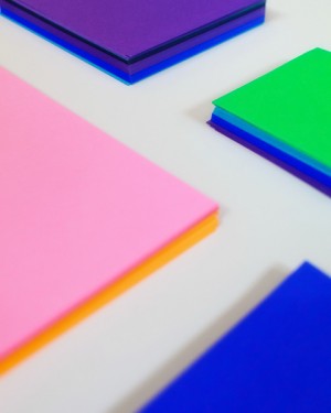
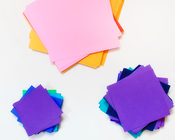
Next up, folding the squares into triangles! I wasn’t super precise with my folds – I just brought opposite corners together and pressed them along the crease on a sturdy, flat surface. That meant some imperfect triangles, but I like a bit of imperfection to keep things from looking too fussy. If that drives you crazy, use a ruler and a bone folder to mark the straight line between opposite corners, then fold along that line.
 Â
 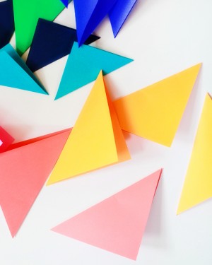
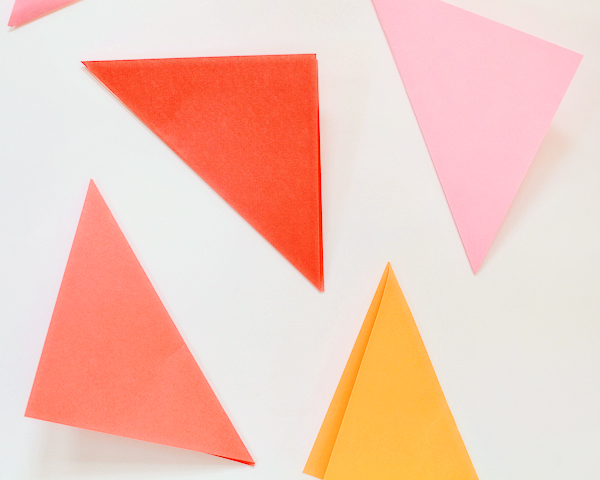
Now all you have to do is arrange the triangles in a diamond shape of four triangles each, with the corners facing in to create a pyramid. For the shadowboxes, we chose a random pattern of large, medium, and small shapes grouped together in similar colors – pinks, oranges, and yellows or blues, greens, and purples – but I also think the random pattern would look wonderful in just two or three complementing colors. We used the largest size as our anchor, then filled in with medium and small sizes. Adhere the triangles using double sided tape (for foam core) or painters tape.
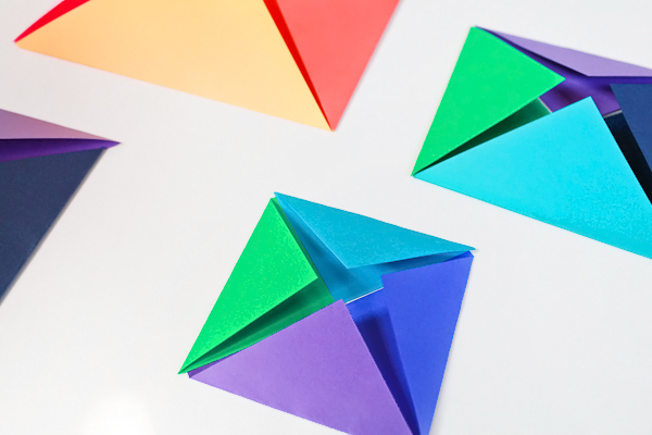
The heart requires several large pyramid shapes (of four triangles each) placed right next to each other in a diagonal line. Start in the upper left corner, then work your way down to the right until you’re satisfied with the overall size. For the St-Germain heart background, I used eight large pyramids for a total of 32 triangles. You could even do smaller hearts of just three pyramids: two for the top of the heart and another for the bottom point. I used three colors below – pink, coral, and light orange – but I think they’d look great in a single color, too!
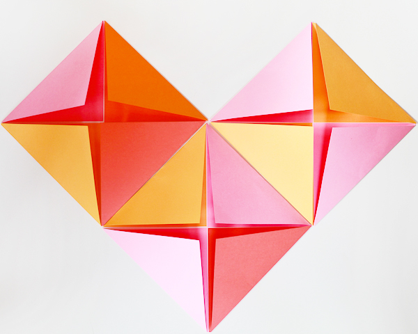
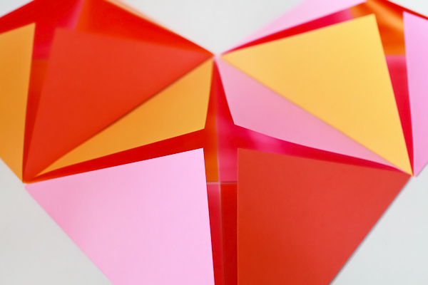
That’s it! So easy, right? But such a fun way to incorporate color and dimension into a party! This is the first time I’ve even attempted a DIY tutorial of any kind, so if you have any questions please leave them in the comments and I’ll do my best to answer!
Photo Credits: Nole Garey for Oh So Beautiful Paper