Jenna + Asa’s Floral Australian Wedding Save the Dates

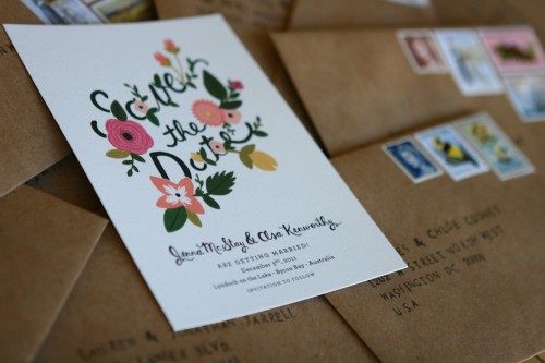
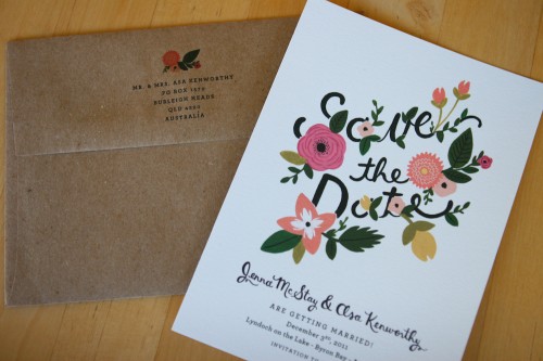
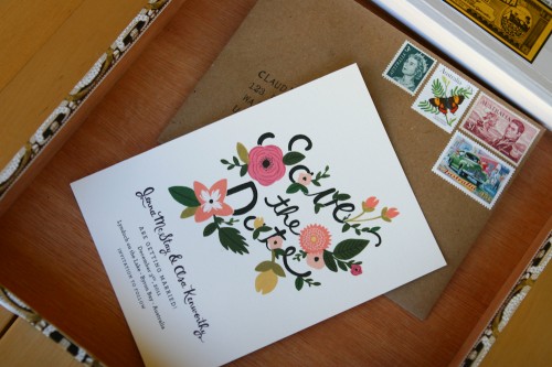
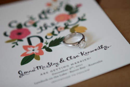
I’ve always been a big fan of the talented Anna of Rifle Paper Co. – particularly when it comes to wedding invitations and wedding stationery.  So it comes as no surprise that a long-time reader of this blog would choose Rifle for her own wedding stationery!  Jenna is getting married later this year in Australia, and commissioned one of Anna’s beautiful floral illustrations for her save the dates.

Rifle-Paper-Co-Illustrated-Save-the-Dates

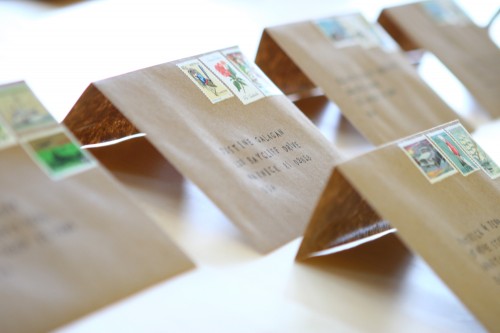
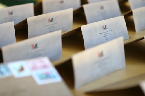
From Jenna:  Our inspiration is the summer garden themed wedding we are planning in December (Australia).  My fiancé and I added the vintage postage stamps and hand stamped each alphabetical letter to create the “to” addresses.  They could not be more suited to the day we envision having!

Rifle-Paper-Co-Illustrated-Save-the-Dates-Australia-Wedding

Rifle-Paper-Co-Illustrated-Save-the-Dates-Australia-Wedding

Rifle-Paper-Co-Illustrated-Save-the-Dates-Australia-Wedding

Rifle-Paper-Co-Illustrated-Save-the-Dates-Australia-Wedding-Envelopes

Rifle-Paper-Co-Illustrated-Save-the-Dates-Australia-Wedding-Envelopes-Return

Congrats Jenna – I can’t wait to see your wedding invitations!

{image credits: jenna mcstay}

p.s. I know some of you reading via RSS are having trouble seeing the images in posts – we’re working on resolving the issue as quickly as possible!  But in the meantime please feel free to click on through to the main site to see any missing images.

{happy weekend!}

You know how some weeks are just harder than others?  This has been a tough week for me, with a to-do list that feels like it’s getting longer by the minute and a rapidly dwindling energy level.  I’ve been feeling overwhelmed, drained, and a little burned out – and on top of all of that, over the last few days I also managed to come down with a bit of a cold.  Not a good combination!  I’m hoping to recharge a bit this weekend and start fresh next week.  But in the meantime…

…a few links for your weekend:

This week on Oh So Beautiful Paper:

That’s it for me this week!  I hope you all have a lovely weekend, and I’ll see you back here on Monday!

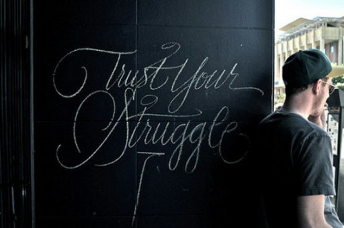
{image credit: mrmikej via design crush}

Dawn + Matthew’s South Carolina Low Country Wedding Invitations

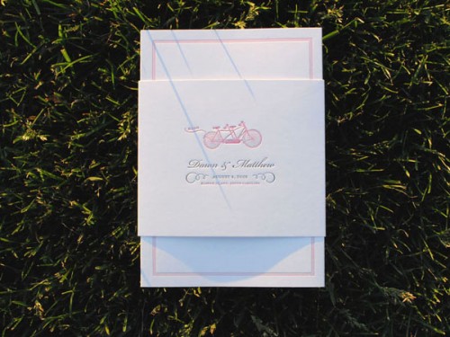
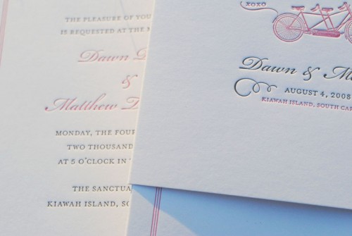
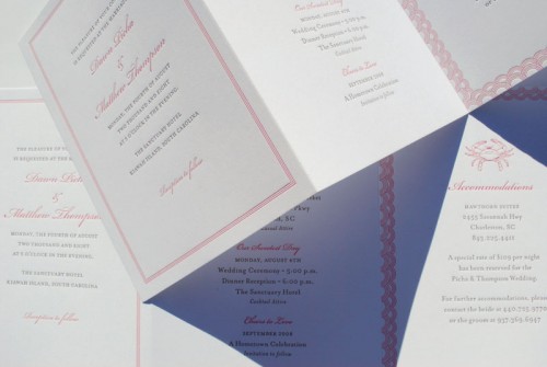
Having just spent some time in coastal South Carolina this past weekend, I was delighted to see these low country wedding invitations pop into my inbox!  Dawn and Matthew were married a couple of summers ago on Kiawah Island, South Carolina.  Designer Christine Wisnieski created a simple and playful invitation that reflected the relaxed vibe of the wedding location.

South-Carolina-Pink-White-Low-Country-Wedding-Invitation

From Christine:  I created this custom wedding invitation for two very close friends, Dawn and Matthew.  They wanted a suite of materials that were light-hearted and easy to use.  The solution was an accordion fold letterpress invitation card held together with a simple paper band.  The spirit of the invitation suite took inspiration from the laid-back style of South Carolina’s low-country.

South-Carolina-Pink-White-Low-Country-Wedding-Invitation-Detail

South-Carolina-Pink-White-Low-Country-Wedding-Invitation

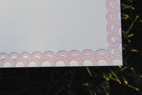
South-Carolina-Pink-White-Low-Country-Wedding-Invitation-Pattern

I love the accordion fold layout – and such a pretty scallop border!  Thanks Christine!

{image credits: christine wisnieski}

Spring Wedding Invitations from Campbell Raw Press

Maggie from Campbell Raw Press sent me a little sneak peek at the new designs in her wedding invitation collection, and I’m loving the spring inspired botanical elements!  Maggie included a little background behind each invitation design, so scroll down for more info…

Spring-Letterpress-Blind-Impression-Wedding-Invitations-Leaves

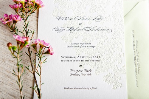
Leaves:  I used one of my own drawings, giving the text a bright cushion of leaves printed in pale green under gray lettering. This invite suite pairs with pale green envelopes that match the ink color on the vine background.  These would be perfect for a spring or summer wedding – airy and natural.

pring-Letterpress-Blind-Impression-Wedding-Invitations-Entwined

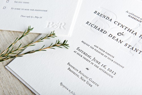
Entwined:  This suite is all about taking advantage of the sculptural, tactile nature of letterpress printing.  The couple’s initials are blended and printed as a blind deboss – just impression, no ink.  The invitation text is just a simple black, making this design spare and elegant and sophisticated.  Available with or without a chiyogami (Japanese silkscreened paper) envelope liner to dress up the invitation suite.

Spring-Letterpress-Blind-Impression-Wedding-Invitations

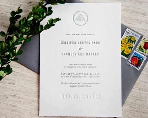
Signature:  I used a delicate vine drawing of mine with elegant text.  A tiny sprig is encircled by the couple’s name and wedding date, and the text of the invitation itself is set in simple, serif font.  The wedding date is blind debossed along the bottom and  I just love the invitation with gray envelopes.

You can check out the entire collection right here – thanks Maggie!

{image credits: campbell raw press}

Caroline + Reese’s Screen Printed Wedding Invitations

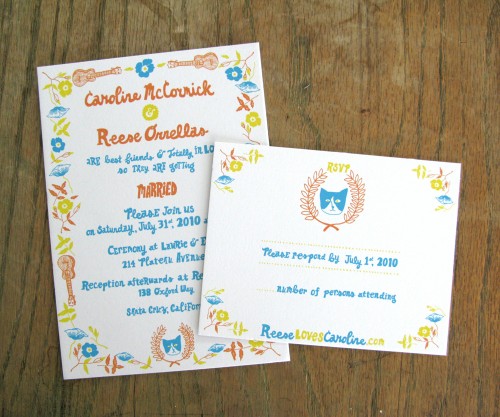
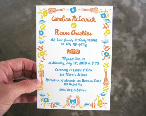
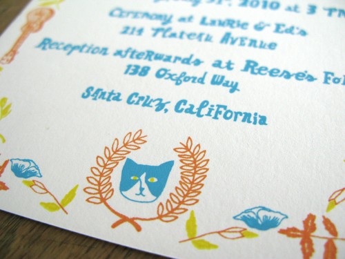
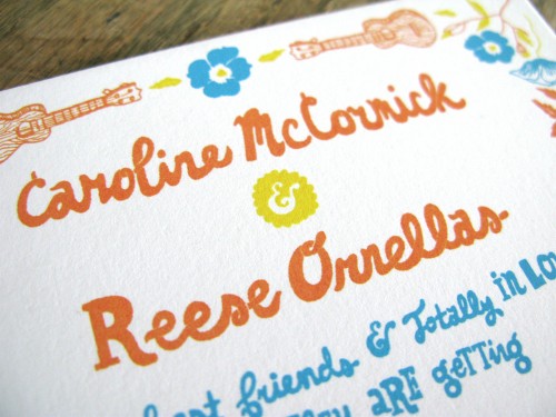
I’ve had these illustrated wedding invitations by Will Bryant bookmarked for the longest time, and since things are starting to warm up here in DC (fingers crossed for an early spring!) I decided today was the day to finally share them.  With the sunny yellow, orange, and blue color palette and playful hand lettering, these invitations are totally perfect for a summer picnic wedding

Blue-Orange-Yellow-Hand-Illustrated-Wedding-Invitations

Blue-Orange-Yellow-Hand-Illustrated-Wedding-Invitations

Blue-Orange-Yellow-Hand-Illustrated-Wedding-Invitations

Blue-Orange-Yellow-Hand-Illustrated-Wedding-Invitations

Blue-Orange-Yellow-Hand-Illustrated-Wedding-Invitations-RSVP

Design and lettering by Will Bryant (you can also check out his blog here) and screen printing by Rand Renfrow.

{image credits: will bryant}