Archer’s Mint + Silver Letterpress Birth Announcements

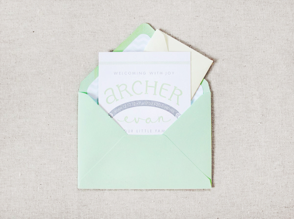
How sweet are these darling letterpress birth announcements? Johanna from Arbor Corner Studio created these announcements for her own baby boy – born on 12.12.12! – with hand lettering and sweet details that complement little Archer’s unique name. Johanna chose a mint and silver color palette and a chevron envelope liner to complete the design.

Mint + Gray Birth Announcements by Arbor Corner Studio via Oh So Beautiful Paper (2)

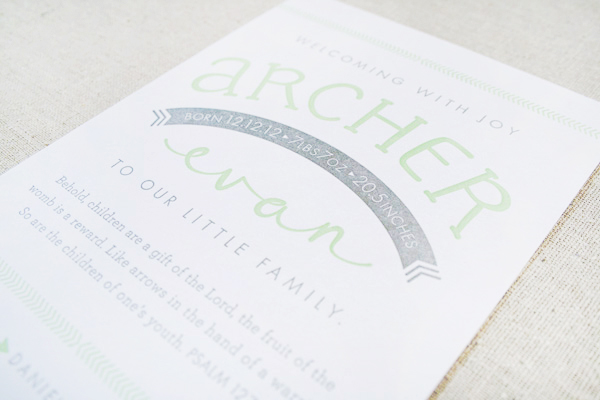
From Johanna: I designed and printed this custom letterpress birth announcement for our own little bundle. I wanted the design to give a slight nod to his name – Archer – without being too “theme-driven” with archery elements. With a name like Archer, he will probably be sick of bows and arrows in no time!

Mint + Gray Birth Announcements by Arbor Corner Studio via Oh So Beautiful Paper (4)

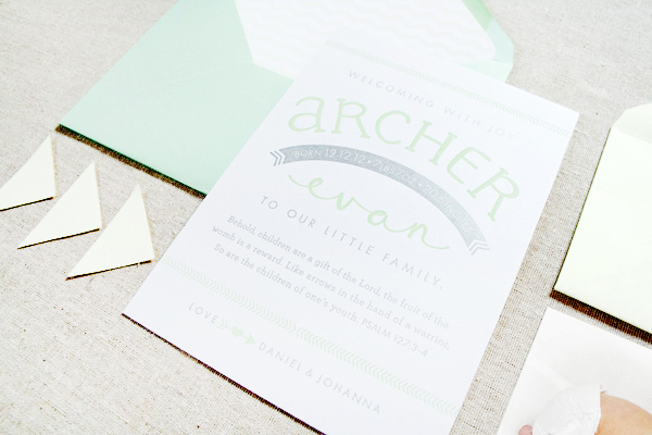
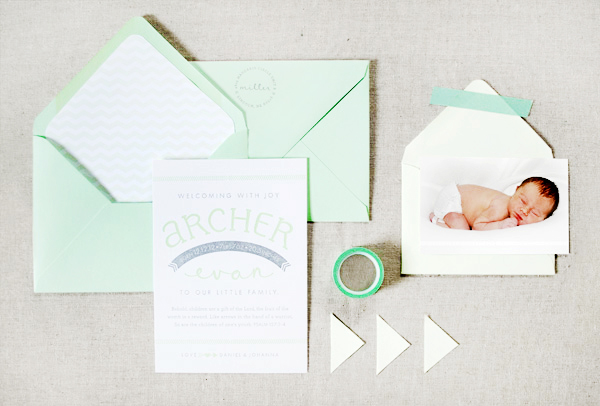
The design was printed with two colors: mint green and silver. A chevron envelope liner was used in the outer mint envelope which paired nicely with an inner envelope containing his newborn picture.

Mint + Gray Birth Announcements by Arbor Corner Studio via Oh So Beautiful Paper (3)

I hand lettered his first and middle name, and then used an arched banner to divide the two. His birth stats are revealed in the banner.

Mint + Gray Birth Announcements by Arbor Corner Studio via Oh So Beautiful Paper (1)

Thanks Johanna!

Photo Credits: Arbor Corner Studio

Emma + Paul’s Floral Block Printed Wedding Invitations

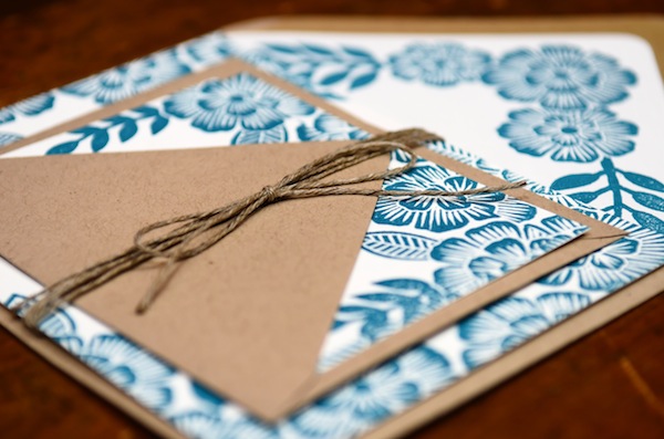
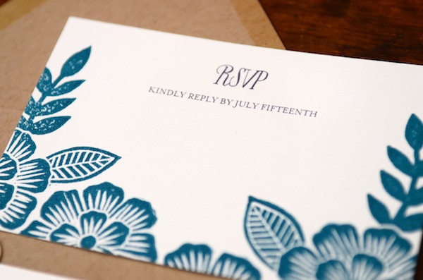
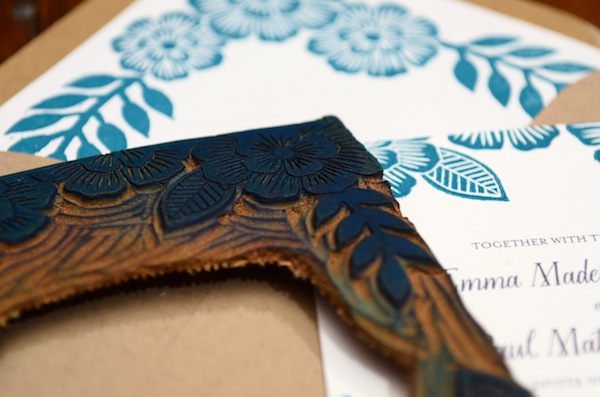
I’ve always loved floral prints, but my love for anything floral seems to quadruple in the spring and summer. Katharine Watson creates some incredibly beautiful floral patterns – all carved by hand on linoleum blocks! Katharine created these invitations for a couple with a shared love of nature – first drawing and carving the floral border, then letterpress printing the entire design. So pretty!

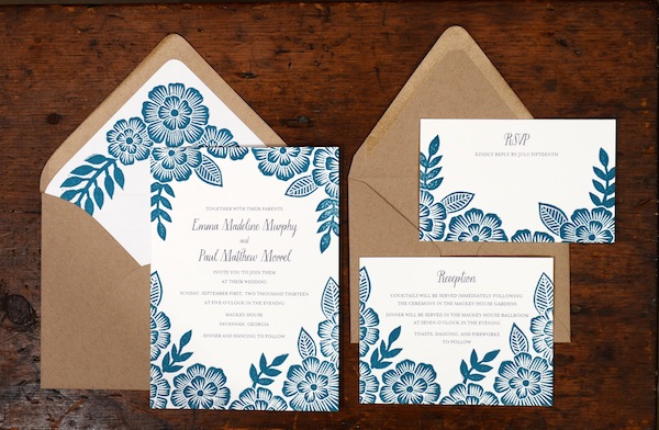
Floral Block Printed Wedding Invitations by Katharine Watson via Oh So Beautiful Paper (4)

From Katharine: This invitation was created for a couple that loves the outdoors. Emma is a yoga teacher and Paul is a runner, and they wanted to translate this love of nature into their invitations. I created a floral design for them in a deep turquoise, that brought to mind an image of the outdoors without being too literal.

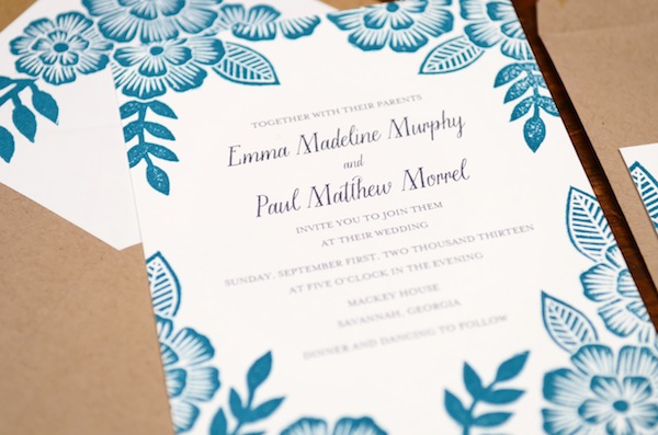
Floral Block Printed Wedding Invitations by Katharine Watson via Oh So Beautiful Paper (6)

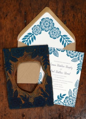
The floral design was hand-carved from a linoleum block, using one block for the invitation cards and another for the envelope liner. The suite was then printed on a Chandler and Price [letterpress] printing press, and tied together with twine to finish off the natural look. 

Floral Block Printed Wedding Invitations by Katharine Watson via Oh So Beautiful Paper (1) Floral Block Printed Wedding Invitations by Katharine Watson via Oh So Beautiful Paper (2)

Floral Block Printed Wedding Invitations by Katharine Watson via Oh So Beautiful Paper (7)

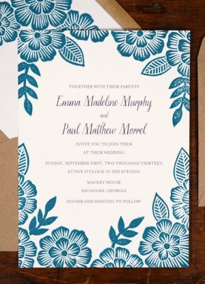
Floral Block Printed Wedding Invitations by Katharine Watson via Oh So Beautiful Paper (5)

Floral Block Printed Wedding Invitations by Katharine Watson via Oh So Beautiful Paper (3)

So beautiful!  Thanks Katharine!

Check out the Designer Rolodex for more tal­ented wed­ding invi­ta­tion design­ers and the real invi­ta­tions gallery for more wedding invitation ideas!

Photo Credits: Katharine Watson

Friday Happy Hour: The Inner Loop

Our neighborhood – the eastern half of DC’s Capitol Hill – has changed a lot in the ten years Nole and I have lived in the District. To put it mildly. One of our favorite neighborhood restaurants, where President Obama has chowed down on burgers and about which I’ve written before, occupies a space that once housed a rundown locksmith guarded by bulletproof glass. Which is why it is both a pleasure and not a surprise at all that an awesome new restaurant has moved into our neighborhood recently, Beuchert’s Saloon. Here’s my ode to one of their best cocktails: the very brown, very masculine, very delicious Inner Loop. – Andrew
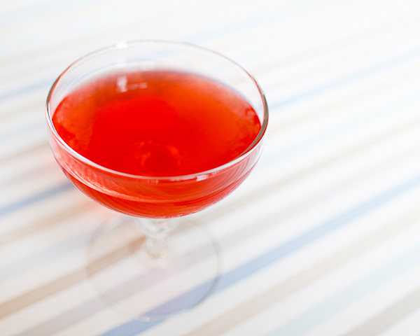
Signature Cocktail Recipe: The Inner Loop by Oh So Beautiful Paper (20)

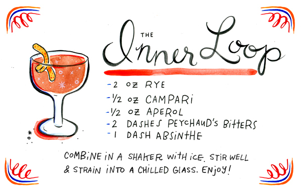
Cocktail Recipe Card: The Inner Loop, Illustration by Tuesday Bassen for Oh So Beautiful Paper

Illustration by Tuesday Bassen for Oh So Beautiful Paper

The Inner Loop

2 oz Rye
1/2 oz Campari
1/2 oz Aperol
2 Dashes Peychaud’s Bitters
1 Dash Absinthe

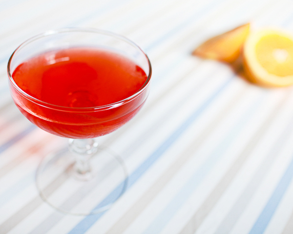
Combine everything with ice. Stir well. Strain into a chilled cocktail glass, garnish with an orange twist, and enjoy.
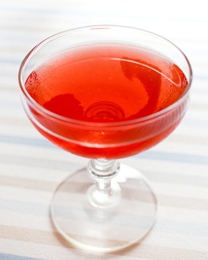
Signature Cocktail Recipe: The Inner Loop by Oh So Beautiful Paper Signature Cocktail Recipe: The Inner Loop by Oh So Beautiful Paper (8)

Rye, one of my favorite spirits, gives the Inner Loop a rich, spicy and oaky base. The two amari, Campari and Aperol – Italian bitter herbal liqueurs, add lots of bitterness and just a touch of orangey sweetness. The Peychaud’s reminds me of one of my absolute favorite drinks, the Sazerac, but not in a distracting way – the Inner Loop stands on its own merits. The Absinthe is noticeable, especially in the aftertaste, but is mostly there to knit all these other bold, complex flavors together into a richer whole.
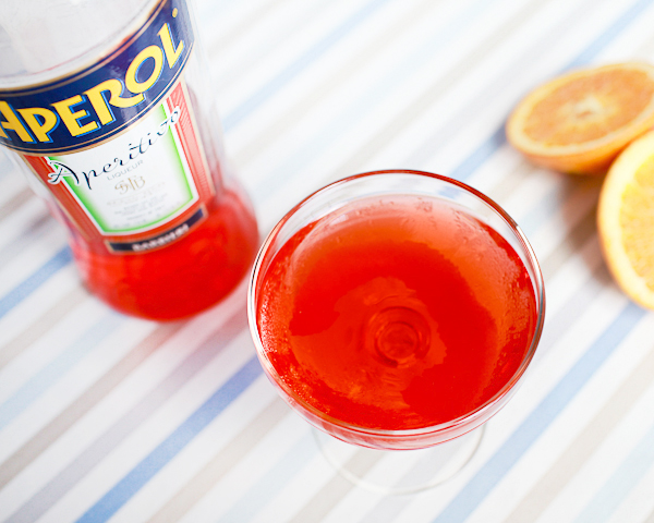
Signature Cocktail Recipe: The Inner Loop by Oh So Beautiful Paper (4)

In other words: it’s rich, spicy, bitter and a real Man’s Man drink. Unless you’re a lady who likes brown drinks, because I know there are plenty of you out there, in which case, then this one’s for you too.
Signature Cocktail Recipe: The Inner Loop by Oh So Beautiful Paper (16)

Beuchert’s takes its name from a bar that once occupied the same space on Pennsylvania Avenue, founded by a German immigrant in 1880. The original apparently operated as a speakeasy during Prohibition but vanished sometime after that. The new Beuchert’s is a seriously good eat – these guys know how to grill a steak. But the real stars of the show (at least to a cocktail geek like me) are the drinks, including The Beltway Boy, the drink that inspired the Inner Loop.

Photo Credits: Nole Garey for Oh So Beautiful Paper
{happy weekend!}

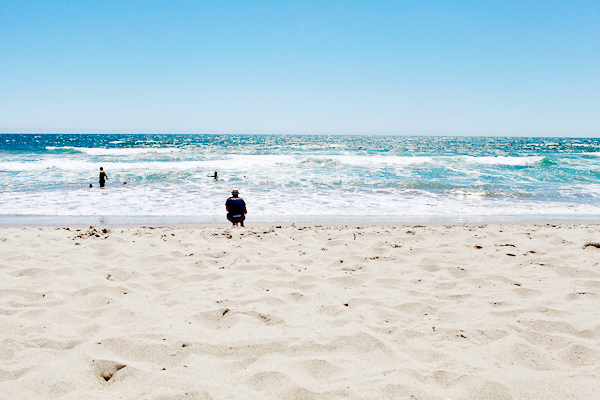
Happy Friday everyone! I’ve been doing a lot of thinking lately along the lines of the quote in this week’s font post… inspired in part by some of the conversations that I had with friends in California. The last year has been amazing with the arrival of Sophie, but it has also been really hard with house hunting, moving, and trying to get settled into (much less fix up) our new house with a young baby at home and a very limited budget. It’s so easy to get weighed down by our problems and lose sight of our bigger goals and dreams. So I’ve been thinking about what I really want, not in my normal immediate sense but more in the big picture sense – like Jordan’s list from a few years ago. I don’t have any answers yet, but it’s what keeps me up at night these days. I’ll keep you all posted. And in the meantime…

California! by Oh So Beautiful Paper (15)

Photo by me from our trip to California

…a few links for your weekend!

This week on Oh So Beautiful Paper:

Check back soon for this week’s cocktail! I hope you all have a wonderful weekend, and I’ll see you back here next week! xoxo

Quick Pick: Wednesday

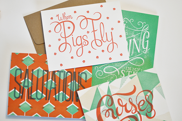
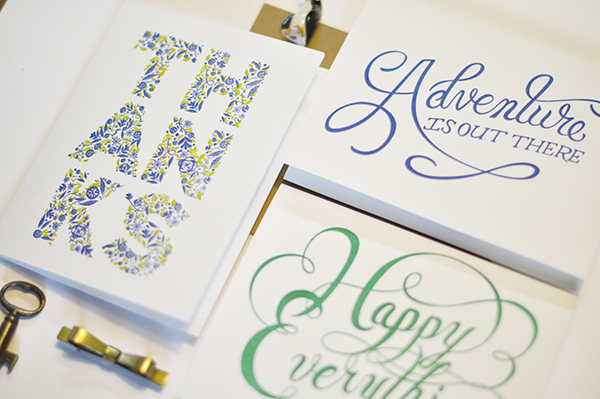
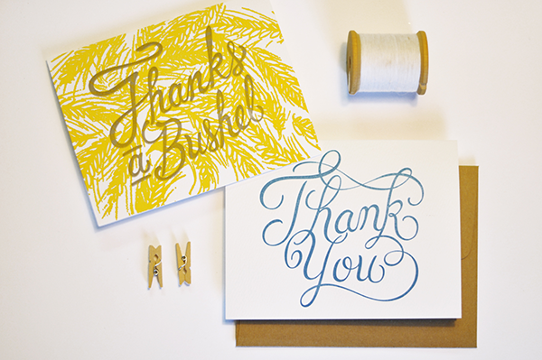
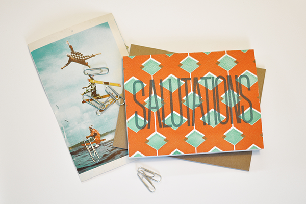
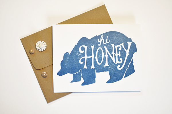
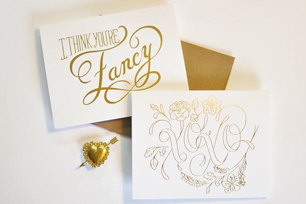
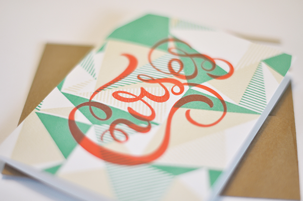
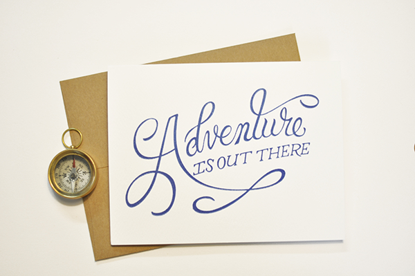
Jessica and Garett – the husband and wife team behind the Oklahoma-based stationery and design studio Wednesday – are two of the nicest and most adorable people in the stationery community. And they just had a baby – yay! They also happen to create some seriously pretty letterpress and gold foil greeting cards featuring Garett’s design work and beautiful hand lettering.

Quick Pick: Wednesday via Oh So Beautiful Paper (1)

Quick Pick: Wednesday via Oh So Beautiful Paper (2)

Quick Pick: Wednesday via Oh So Beautiful Paper (4)

Quick Pick: Wednesday via Oh So Beautiful Paper (8)

Quick Pick: Wednesday via Oh So Beautiful Paper (10)

Quick Pick: Wednesday via Oh So Beautiful Paper (11)

Quick Pick: Wednesday via Oh So Beautiful Paper (12)

Quick Pick: Wednesday via Oh So Beautiful Paper (13)

Lots more available right here!

Photo Credits: Wednesday