Pretty Paper in the Office: Binders

It’s certainly hard to resist checking out all the back to school merchandise when I’m out shopping. Some things never change, and it’s neat to see the same notebooks and erasers that once filled my desk as a child. Lucky for us, these supplies are still quite relevant in adult life. One thing that I realized I had missed are binders! For those of us that need a little extra help keeping all those papers in place, binders are here to save the day. And don’t forget how great these look lined up one-by-one. Here are a few charismatic and colourful options for your workspace! – Julie

Pretty Paper in the Office - Binder Round Up


No. 1 russell+hazel Mini 3-ring binders from The Container Store; No. 2 Semikolon clamp binders from See Jane Work; No. 3 O-CHECK filing binders from NoteMaker; No. 4 Ring binders from ferm LIVING; No. 5 Bella leather binders from See Jane Work; No. 6 The Basic binder by See Jane Work

{images via their respective sources}

Dara + Todd’s Bold Modern Wedding Invitations

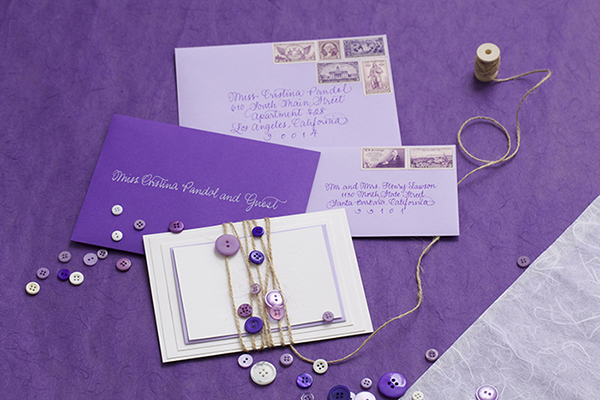
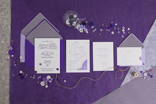
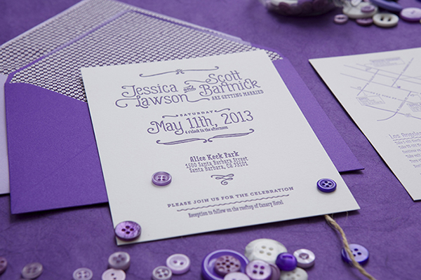
For her own wedding at a gastropub in Brooklyn, Dara from Rafftruck Designs wanted to create a clean design that would complement the wedding venue. Dara incorporated a floral envelope liner and a striped teal backing for some pops of color. Personality-filled fonts, colorful envelopes, and a small letterpress card announcing the “The Rafftruck Wedding” (a combination of their last names) helped to round out the invitation suite!

Bold and Modern Wedding Invitations by Rafftruck Designs via Oh So Beautiful Paper (1)

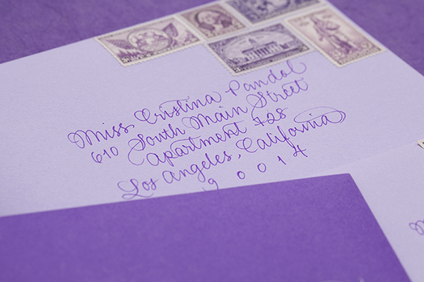
From Dara: Todd and I were getting married in a gastropub in Brooklyn that has so much character all on it’s own, and we knew we wanted our clean style to complement the space. We also knew we wanted to incorporate our nickname, Rafftruck (the combination of his last name and my maiden name), that had been with us from the start. With that in mind, I set out to design our wedding suite, knowing our guests’ first impression of our special day would be based on the contents of the envelope.

Bold and Modern Wedding Invitations by Rafftruck Designs via Oh So Beautiful Paper (2)

Bold and Modern Wedding Invitations by Rafftruck Designs via Oh So Beautiful Paper (3)

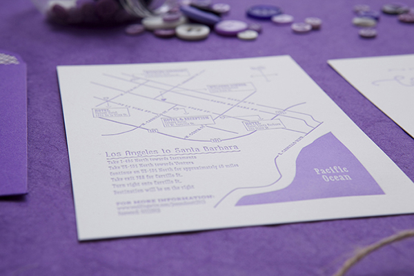
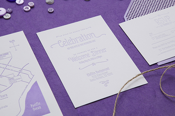
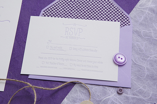
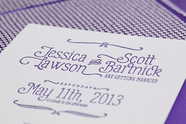
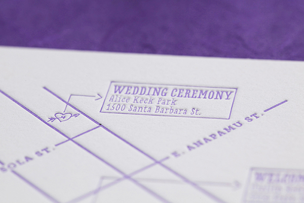
I decided that pairing a modern serif with some fun, bold, personality-filled fonts would liven up the design, yet keep things simple and classic. For that extra something, the envelopes were lined with a bright floral print and the invitations were backed with a teal (our favorite color) stripe.  All the pieces were letterpress printed on 118# bright white 100% cotton paper. Charcoal ink was used across the board, with the exception of a single hot pink heart on the map to pinpoint the location of our reception. Rounding out the suite, a letterpress card announcing The Rafftruck Wedding was adhered to a teal band to wrap the individual items.

Bold and Modern Wedding Invitations by Rafftruck Designs via Oh So Beautiful Paper (4)

Bold and Modern Wedding Invitations by Rafftruck Designs via Oh So Beautiful Paper (5)

Bold and Modern Wedding Invitations by Rafftruck Designs via Oh So Beautiful Paper (7)

To tie everything together, I letterpress printed coasters using the same color palette and patterns as our invitations to give away as favors at the wedding. If there’s one way I had to describe this project overall, it’s that it’s totally “Rafftruck”.

Bold and Modern Wedding Invitations by Rafftruck Designs via Oh So Beautiful Paper (8)

Thanks Dara!

Check out the Designer Rolodex for more tal­ented wed­ding invi­ta­tion design­ers and the real invi­ta­tions gallery for more wedding invitation ideas!

Photo Credits: Rafftruck Designs

Inspired by: Zebra

I’m not the biggest fan of animal prints, but actual zebra motifs? They’ve been popping up everywhere and I can’t get enough of them! From my favorite gift wrap pattern from Smudge Ink to classic wallpaper, here are a few zebra motifs that have caught my eye lately!

Inspired-By-Zebra2

1. Smudge Ink gift wrap (soon to also be available as correspondence sets); 2. Madewell (no longer available); 3. Scalamandre wallpaper; 4. The Printed Village via The Chriselle Factor; 5. Zebra crib sheet from Serena & Lily; 6. Scalamandre wallpaper in Kate Spade’s bathroom (I love the bold color!)

{images via their respective sources}

Jessica + Scott’s Purple Ombre Letterpress Wedding Invitations

I’m loving this take on the ombre trend from designer Cristina Pandol: instead of a gradient on a single piece of the invitation, the entire suite progresses from dark to light purple! Cristina thought through every single detail of the suite, from the custom envelope liners to the purple calligraphy and vintage postage!

Purple Ombre Letterpress Wedding Invitations by Cristina Pandol via Oh So Beautiful Paper

From Cristina: I’ve been dying to apply the ombre concept to stationery, but was waiting for the right project to come along. When Jessica reach out to me for her wedding and stressed how much she loves all shades of purple, I knew that she would love the concept. The wedding suite progresses from dark purple to light purple, and everything from the calligraphy to the postage is purple.

Purple Ombre Letterpress Wedding Invitations by Cristina Pandol via Oh So Beautiful Paper

Purple Ombre Letterpress Wedding Invitations by Cristina Pandol via Oh So Beautiful Paper

Purple Ombre Letterpress Wedding Invitations by Cristina Pandol via Oh So Beautiful Paper

Purple Ombre Letterpress Wedding Invitations by Cristina Pandol via Oh So Beautiful Paper

Purple Ombre Letterpress Wedding Invitations by Cristina Pandol via Oh So Beautiful Paper

The design revolves around the pairing of three very different typefaces to show the couple’s playful and eclectic style. The primary type is Gulyesa, with Love Potion and Museo Slab used to compliment the primary type.

Purple Ombre Letterpress Wedding Invitations by Cristina Pandol via Oh So Beautiful Paper

Purple Ombre Letterpress Wedding Invitations by Cristina Pandol via Oh So Beautiful Paper

Every piece was letterpress printed with a fairly deep impression on a bright white French cotton paper. I wanted to make sure the pressing and ombre was done properly, so I rented a Vandercook machine and printed every piece myself. Jessica wanted to do some of the work herself and be part of the experience. I created a stencil for her to use to cut all of the envelope liners and Jessica secured all of the pieces together with string and buttons.

Purple Ombre Letterpress Wedding Invitations by Cristina Pandol via Oh So Beautiful Paper

Purple Ombre Letterpress Wedding Invitations by Cristina Pandol via Oh So Beautiful Paper

Thanks Cristina!

Design + Printing: Cristina Pandol via press rental at Lala Press

Calligraphy: Calligraphy Katrina

Check out the Designer Rolodex for more tal­ented wed­ding invi­ta­tion design­ers and the real invi­ta­tions gallery for more wedding invitation ideas!

Photo Credits: Garrett Shannon