OSBP at Home: In the Garden

It’s been a few weeks since we moved to our new house, and although we’re still not completely unpacked I have lots of house-related things on the brain as I dream about all the updates and improvements I’d love to make to our home. I hope you won’t mind if I share some of my thoughts with you from time to time? And since spring has firmly arrived here in DC, I thought I’d start with my plans for our outdoor spaces!

Oh So Beautiful Paper at Home: Garden Inspiration (3)

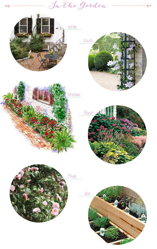
1. Patio; 2. Rain Spout Trellis; 3. Foundation Garden; 4. Foundation Garden; 5. Camellias; 6. Herb Garden

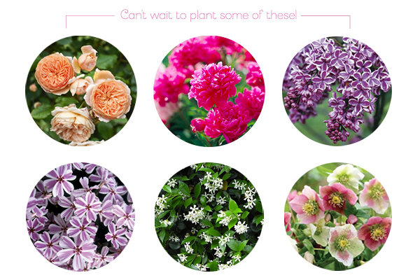
Outdoor space wasn’t a high priority when we first started looking for houses, but somehow ended up with a house with a bit of green space in both the front and back! Our back yard is more of a patio with a large area of paver stones and a smaller space for planting, but it should be more than enough for my limited gardening skills. We’re planning to fill our space with some of our favorite flowers and shrubs, including lilacs, English garden roses, peonies, and hellebores. I’m also hoping to train a few vines (I’m thinking jasmine and clematis) around the yard and perhaps even create some narrow raised beds for herbs and select veggies along the fence. My goal is to create a colorful and fragrant little oasis for eating and grilling outdoors during warm weather months.

Oh So Beautiful Paper at Home: Garden Inspiration (2)

TOP ROW: Roses, Peonies, Lilacs

BOTTOM ROW: Phlox, Jasmine, Hellebores

In our front yard, the previous owners left us a mystery rosebush (I can’t wait to see what color blooms emerge soon!) against the foundation and some wonderfully fragrant lavender closer to the sidewalk, but there are some bare patches to fill. The front yard receives lots of direct sunlight in the morning, so I’m thinking of doing pretty spring-blooming phlox next to the lavender and a colorful foundation garden under the mystery roses. The yard in front of our old apartment was completely shaded by a giant old maple tree, so I’m excited to have a full sun area to dig into!

Are any of you planning new garden projects for spring?

Tania + Nick’s Coral and Mint Modern Wedding Invitations

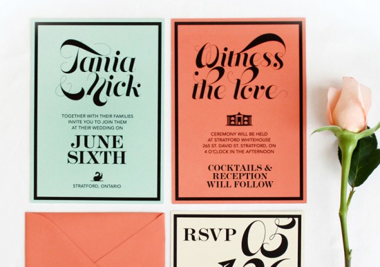
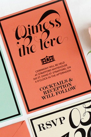
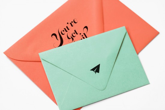
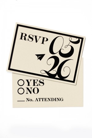
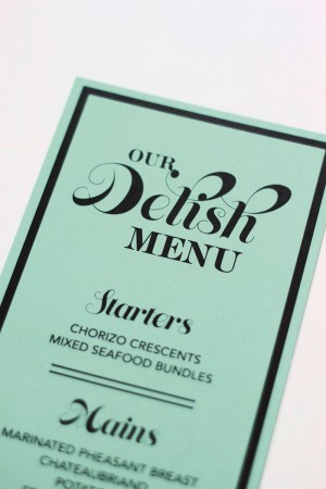
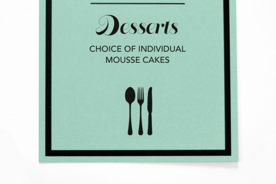
Coral and mint green happen to be two of my favorite colors at the moment – so how could I resist when James and Vinti of OOXX sent over these modern wedding invitations? In keeping with the bride and groom’s personalities, James and Vinti kept the design on the informal side with playful wording and the bright color palette.

Colorful Modern Wedding Invitations by OOXX via Oh So Beautiful Paper (1)

From James and Vinti: Nick and Tania are a couple based out of Stratford Ontario. They are a really young couple who didn’t want their invitations to feel like they take themselves too seriously, especially since their are just having a small ceremony with their family and friends and then a cocktail reception to follow on a Thursday.

Colorful Modern Wedding Invitations by OOXX via Oh So Beautiful Paper (7) Modern Mint and Coral Wedding Invitations by OOXX via Oh So Beautiful Paper

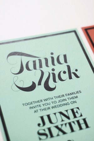
Their wedding colors were coral and mint and they wanted their invitations to reflect that, so we created this dynamic invitations using the different colors for different cards and this helped make this invitation more playful. We really love the simplicity and graphical elements in the design of this invitation. We used a great font with lots of movement to contrast the hard edges of the black borders.

Colorful Modern Wedding Invitations by OOXX via Oh So Beautiful Paper (3)

Colorful Modern Wedding Invitations by OOXX via Oh So Beautiful Paper (5) Colorful Modern Wedding Invitations by OOXX via Oh So Beautiful Paper (6)

Colorful Modern Wedding Invitations by OOXX via Oh So Beautiful Paper (4)

Thanks James and Vinti!

Check out the Designer Rolodex for more tal­ented wed­ding invi­ta­tion design­ers and the real invi­ta­tions gallery for more wedding invitation ideas!

Photo Credits: OOXX

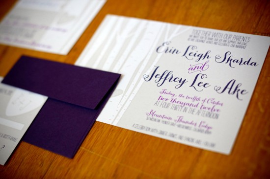
Erin + Jeff’s Sweet Colorado Aspen Tree Wedding Invitations

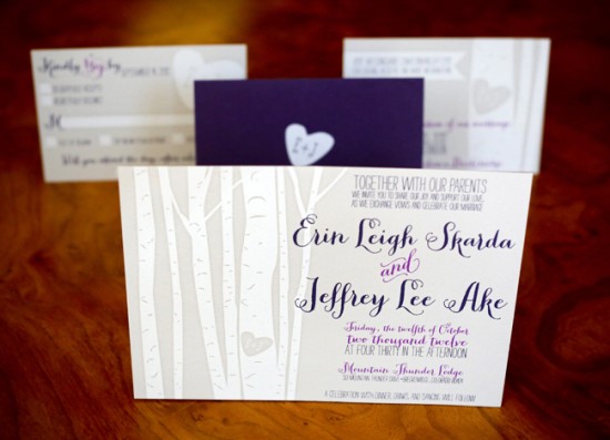
The image of initials carved in wood is such an icon of love, and so very sweet as part of a wedding invitation! Chloe from hello there, design created these invitations for a fall wedding in Colorado, incorporating the heart illustration along with the bare trunks of aspen trees. The invitations and RSVP envelopes were then screen printed by the talented folks at Mama’s Sauce for an added element of color and texture. Pretty!

Screen Printed Rustic Colorado Wedding Invitations by Hello There Design via Oh So Beautiful Paper (5)

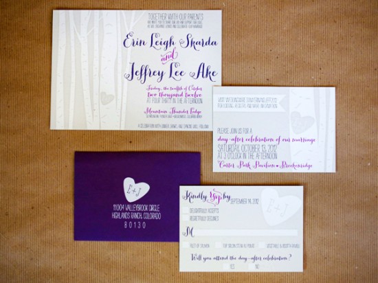
From Chloe: The wedding colors were purple and silver/gray; so a mixture of two whimsical and romantic typefaces in two purple hues are really set off against the white and pale gray background. Erin really wanted to capture the physical place, Breckenridge, Colorado, in the invitations. Aspen trees came up in our very first conversation and became our primary design motif. I love the look of bare aspen trees and created an illustration of some aspen trunks.

Screen Printed Rustic Colorado Wedding Invitations by Hello There Design via Oh So Beautiful Paper (7)

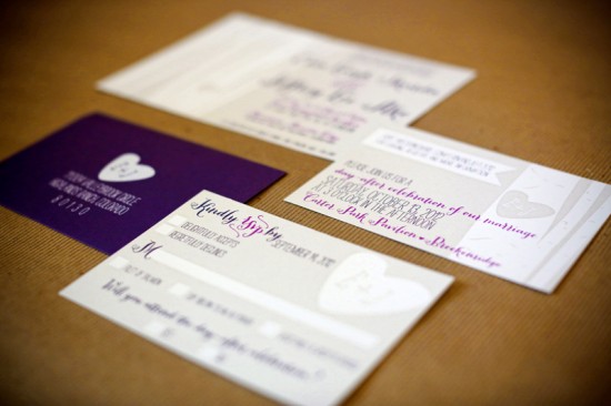
I incorporated a little “tree carving” that says “E+J” which added a little extra sweetness. This heart with the “E+J” became the second motif used in the invitations and was carried over to the RSVP cards and envelopes.

Screen Printed Rustic Colorado Wedding Invitations by Hello There Design via Oh So Beautiful Paper (4)

Screen Printed Rustic Colorado Wedding Invitations by Hello There Design via Oh So Beautiful Paper (1)

Thanks Chloe!

Design: hello there, design

Printing: Mama’s Sauce

Check out the Designer Rolodex for more tal­ented wed­ding invi­ta­tion design­ers and the real invi­ta­tions gallery for more wedding invitation ideas!

Photo Credits: Brooke Bryand Photography

Christina + Aaron’s Quirky “Awkward Family Photo” Save the Dates

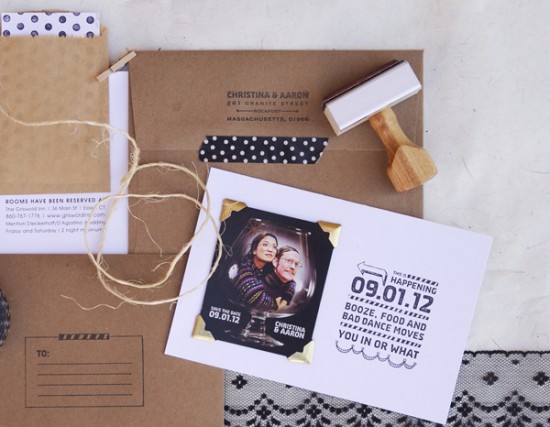
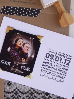
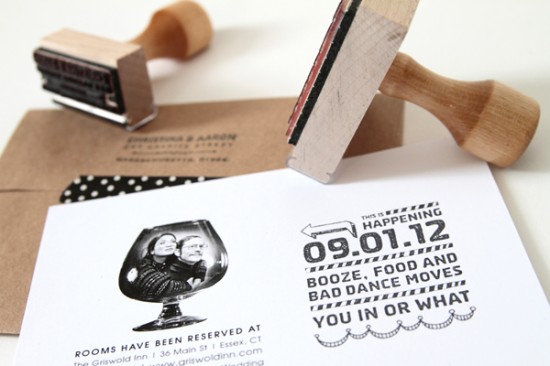
Sometimes we just need a reminder of happy occasions, silly memories, or a little something to make us laugh. Enter these quirky and silly save the dates from Patti Murphy Design Boutique & Paperie. Christina and Aaron wanted to play off the idea of an awkward family photo, so Patti designed a postcard-size save the date incorporating a custom rubber stamp. Definitely made me smile!

Funny Rubber Stamp Postcard Save the Date by Patti Murphy Designs via Oh So Beautiful Paper (6)

From Patti: Christina and Aaron wanted their save the dates to correspond with their personalities: fun, light-hearted, quirky, and silly. To achieve this, they collaborated with photographer Michelle Gardella and decided on the “awkward family photo” pose, incorporating gold wire-frame glasses with an ugly sweater theme. The photo was also turned into a magnet save the date.

Funny Rubber Stamp Postcard Save the Date by Patti Murphy Designs via Oh So Beautiful Paper (4) Funny Rubber Stamp Postcard Save the Date by Patti Murphy Designs via Oh So Beautiful Paper (3)

Not wanting to take anything away from the effect of the photo, Christina and Aaron wanted a simple design. I decided on white postcards, and added the gold corners to accentuate the photo.  I created a custom stamp with the event details—made the wording fun and silly to match their personalities, but also simple and to-the-point—and then used black ink to contrast with the white postcard.

Funny Rubber Stamp Postcard Save the Date by Patti Murphy Designs via Oh So Beautiful Paper (1)

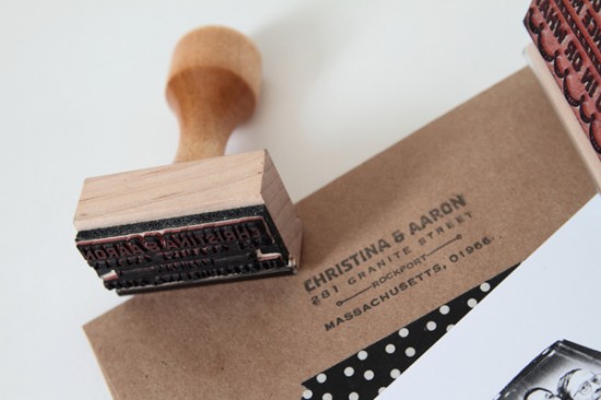
The envelopes were designed in the same simple fashion with custom “to” and “from” stamps.

Funny Rubber Stamp Postcard Save the Date by Patti Murphy Designs via Oh So Beautiful Paper (7)

Thanks Patti!

Check out the Designer Rolodex for more tal­ented wed­ding invi­ta­tion design­ers and the save the date gallery for more beau­ti­ful cus­tom save the dates!

Photo Credits: Save the Date photos by Patti Murphy Design Boutique & Paperie, engagement photo by Michelle Gardella