Michelle + Oshine’s Paris-Inspired Wedding Invitations

Today’s real invitations come courtesy of Michelle from Armas Design.  Michelle’s rockin’ wedding was featured on snippet & ink a few weeks back, where I fell in love with her Paris-themed invitations.  Michelle was kind enough to send over some additional photos and information about how she put her invitations together – so I’ll turn things over to Michelle:

We had a small wedding, and I wanted to make the invitations very special, but not too precious. I wanted the invitations to exude a playful, quirky quality but with a crisp, buttoned up undertone.  That pretty much sums up our wedding look!

Michelle7

We also had a tight budget, so I bought some plain ivory cards embossed with a wreath on the top and printed the invitations at home:

Michelle2

The special details come from the vintage reproduction maps of Paris that I used to line the envelopes with, which were too dull and thin on their own, and vintage stamps. I bought tons of vintage stamps on eBay and peppered the envelopes and the reply envelopes with gorgeous colored stamps:

Michelle3

I also printed the programs and the reply cards at home. For our thank you cards, I bought an embosser with our initials and some red rimmed cards from Crane and made “custom” thank you cards.  I also used that embosser to make our programs unique and give them a more tactile feel:

Michelle5

To add a little bit more of an irregular, organic element, I had the post office hand stamp the envelopes, so they have that nice round stamp on on them.  It was a nice finishing touch since the suite was very symmetrical and classical.

I love the way Michelle incorporated vintage maps and stamps to balance out the more classic invitation elements.  And the use of a custom embosser is one of my favorite details – particularly since it can be used to customize any future personal correspondence.  Just lovely!

{images via Armas Design – thanks Michelle!}

Illustrated Wedding Invitations – Rifle Design

I love, love invitations that incorporate hand-lettering or illustration, particularly the work of Florida-based illustrator Anna Melcon Bond of Rifle Design.  Anna seems to effortlessly blend traditional illustration with folk art elements to create some of the most lovely Save the Dates and wedding invitations.

This first Save the Date is one of my all-time favorites – I love the the contrast between the black background, floral illustrations, and white hand-lettering is just so beautiful:

The next set is one of Anna’s most recent invitation suites, created for a late Spring wedding in North Carolina:

Rifle Paper Co Illustrated Wedding Invitation Suite

Rifle Paper Co Illustrated Wedding Invitation and Map

Rifle Paper Co Illustrated Wedding Invitation and Map

As you might expect, Anna designed the invitations for her own wedding.  She then carried those elements through to other elements of the wedding, such as the ceremony programs and even to the cake!

Rifle Paper Co Anna Bond Illustrated Wedding Invitation

Rifle Paper Co Fan Ceremony Programs

Anna Bond Rifle Paper Company Wedding Cake

I love the way Anna brings a sense of fun and whimsy to every invitation design:

Rifle Paper Co Hand Lettered Wedding Invitation

Rifle Paper Co Hand Lettered Wedding Invitation

Rifle Paper Co Hand Lettered Wedding Invitation

Gorgeous, right? For more of Anna’s lovely work, head on over to her website, blog, and flickr page (where you can also see a few photos from her lovely, lovely wedding)!

{image credits: rifle design}

Tara + Michael’s Illustrated Jewish Wedding Invitations

I just love seeing the way that real couples and designers work together to produce an invitation design that represents the bride and groom as a couple and suits their unique wedding style.  Today’s real wedding invitations were created by Tara, half of the design duo behind Paperwink, for her own wedding in 2006.  The invitation design is based on the Jewish concept of Besheret, a concept that definitely played a role in my own wedding last year.  I just love the way that Tara used the images of a flower and bulb throughout the invitation suite as a visual representation of the concept.

Inv_Besheret_1

Tara’s invitation suite conveys the Jewish concept of Besheret, or fate – in Tara’s case, the fate that brought the bride and groom together originally, as well as the fate that would bring their loved ones together on their wedding day.  The invitation also included a quote, which says “man and wife ‘are the roots to one complete soul’.”

Inv_Besheret_2

The quote served as the inspiration for the mail visual elements of the invitation design. Paperwink used a hand-drawn flower and bulb as the central design elements throughout the invitation suite to visually represent the concepts of roots and fate.  The invitations were letterpress printed on ultra-thick coaster stock to add an organic texture.

tara-paperwink-besheret-wedding-invitation

In addition to the main invitation, the suite included a custom map of the area and rsvp card.  In the map, the roots of the bulb were converted into the highways and streets of Atlanta, giving out-of-town guests a sense of the city as well as taking guests on a journey through Tara and Michael’s relationship and places that brought them together:

tara-paperwink-besheret-wedding-invitation-roots

The rsvp card even chimes in with a “It was meant to be. Were you meant to be there?” Guests were given two reply options – “It’s Besheret, I’ll be there” or “I’ll be there in spirit:”

tara-paperwink-besheret-wedding-invitation-rsvp

Finally, the concept of Besheret and the visual image of a bulb was carried through to the wedding itself.  The ceremony programs incorporated design elements from the invitation suite:

BE_Beshseret_3

Escort cards (actually small boxes) played double duty as favors, containing flower bulbs for guests to take home and plant.  Tara placed color-coded hand-drawn flowers on the outside of the boxes to indicate the guests’ previously chosen entree preferences:

tara-paperwink-besheret-wedding-invitation-favors

Can I just say how much I love this invitation suite?!  The entire suite is so beautiful, and I love the way Tara incorporated the concept of Besheret throughout the invitations and wedding – creating a meaningful design that represents Tara and Michael as a couple as well as their new life together.  To see more of the incredible creativity over at Paperwink, click here to head on over to the Paperwink wedding collection.

{images via Paperwink – thanks Tara!!}

Laurel + Jedd’s Creative and Elegant Wedding Invitations

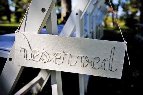
I’ve been holding out on all of you – I hope you’ll forgive me.  But I am so excited about these real invitations that I wanted to save them until today – the best for last, right?  Anyway, I first fell in love with Laurel & Jedd’s wedding after seeing the hand-stitched signs that Laurel created:

I asked Laurel if she’d be willing to share the paper ephemera from her wedding, and she very kindly obliged.  Here’s what Laurel had to say about her invitations:

Creating my invitation suite was, I’m ashamed to say, probably the most important part of my wedding.  I just really, really wanted these to be perfect and elegant and appeal to all of our guests – from my creative friends to some of our elderly relatives – and I wanted to make sure each piece obviously fit into my style.

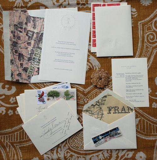
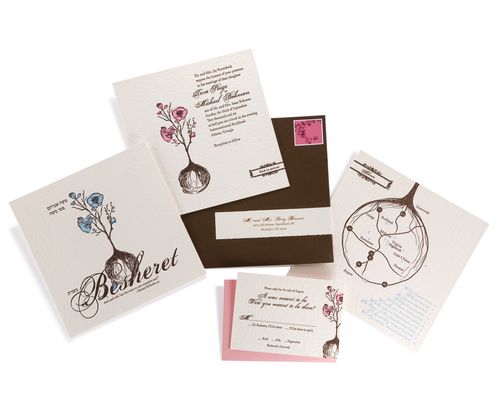
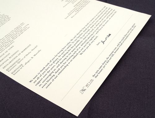
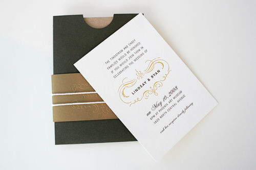
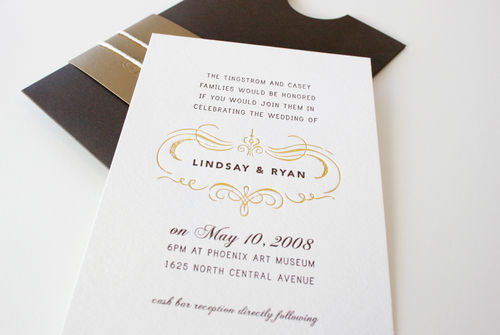
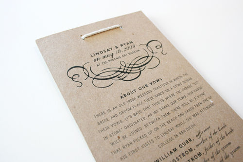
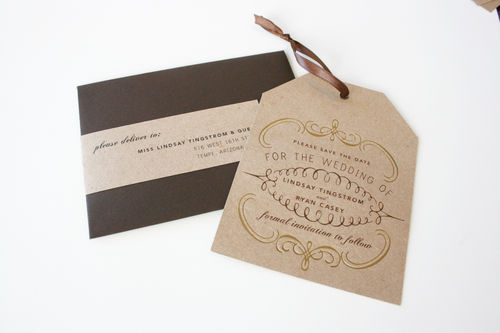
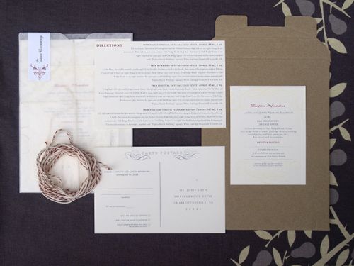
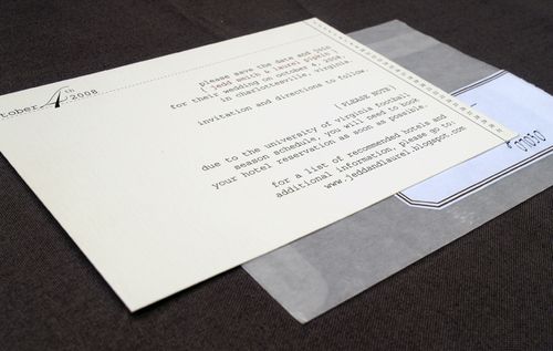
Laurel’s invitation suite included a stand-alone invitation, rsvp postcard, information card with directions and accommodation information, and a reception card, all of which were assembled using red & white baker’s twine in a glassine envelope:

Invite+Envelope
{the main invitation and a fully assembled package}

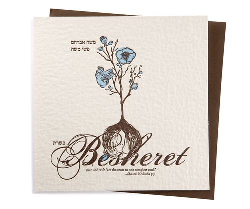
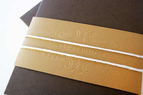
The invitation suite used a primary color palette of creams and soft browns, with red accents in the baker’s twine and labels:

I don’t think I could have created an invitation with any other kind of color grouping – it just wouldn’t have been me.  Glassine envelopes are all over my business‘ packaging – I feel like they are an interesting way to tie printed items together – so I leaned naturally toward including those.  I love creams and browns and neutrals and I felt like the pop of red introduced a little vintage country into the design.

InviteSuite-Full

InviteSuite
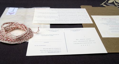
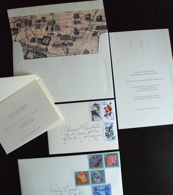
{the additional elements from Laurel’s invitation suite}
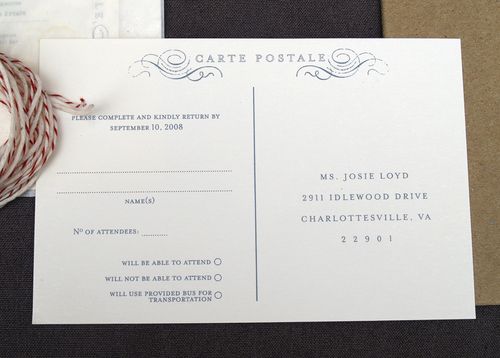
RSVP
{the rsvp postcard}

InfoCard

Directions
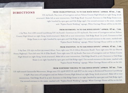
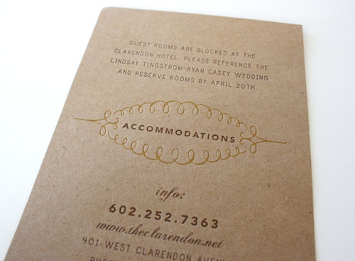
{the double-sided enclosure provided guests with accommodation information on one side and directions on the other}

ReceptionInfoCard
{the reception card enclosure}

GlassineEnvelope
{the fully assembled invitation, ready for mailing}

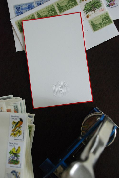
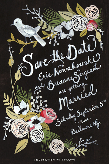
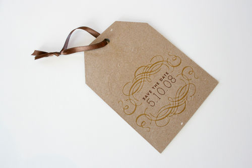
Laurel also created and printed her own Save the Dates, also enclosed in a glassine envelope, and thank-you cards:

SavetheDate
{the Save the Date card}
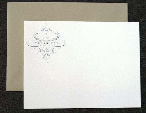
ThankYou
{thank you cards}

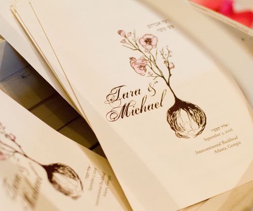
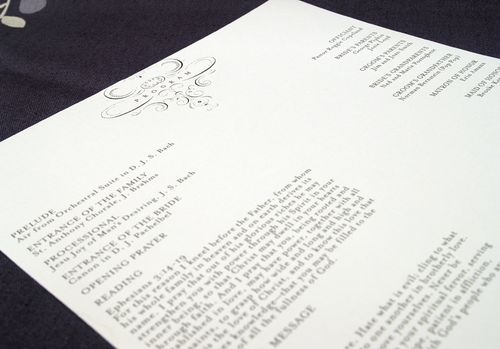
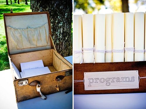
For her ceremony programs, Laurel incorporated the design graphic from the thank-you cards and printed each program on a long single sheet of linen texture paper:

ProgramTop

ProgramBottom

Guests found their programs behind more hand-stitched signs:

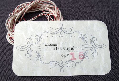
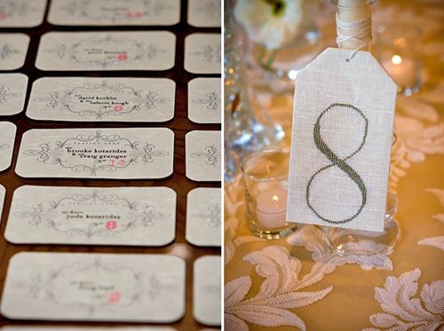
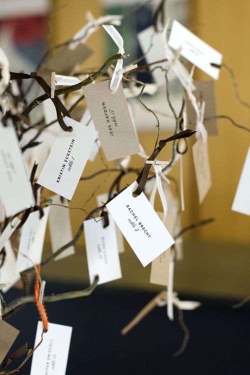
For the reception, Laurel printed the guests’ escort cards on obanai tissue paper:

EscortCard2
{the table number was hand-stamped on each escort card}

Escort and Table
{photo by Rob Garland Photographers via snippet & ink}

Here’s a bit more from Laurel about the inspiration behind her designs:

I started an inspiration folder for the printed materials I think about 5 minutes after Jedd proposed!  I love the idea of found paper and not having anything be “matchy matchy” (I think that might have been the theme of my wedding – NO matchy matchy!).  Though it’s hard to get your style just right since each piece still has to fit together!

Inspiration copy
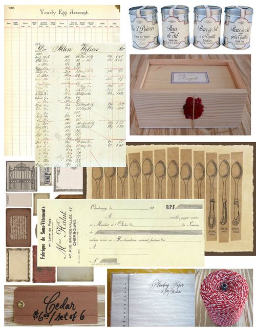
{Laurel’s invitation inspiration board}

I pulled so much inspiration from Minhee and Truman‘s wedding invitation suite and, oddly enough, home items – like the details found on the ends of silverware, the softness and textures of fabric and wallpaper design.


{Minhee and Truman’s invitations via MS Weddings}


I also love old office supplies and found inspiration for the labels and the font there.  The colors are, well, just me.


{wooden tags via Bell’occhio}

Some of my happiest accidents – like figuring out how to print the escort cards on obanai paper with the hand-stamped numbers, and the program design – happened really quickly.  Sometimes when you just have to make a decision or else, the best design is produced!

Thanks so much Laurel, for sharing your invitations and design inspiration with us!  And it’s so true, sometimes just taking a deep breath and letting things go is the best way to find the right design.  If you haven’t already seen them, definitely head on over to snippet & ink for more photos from Laurel & Jedd’s absolutely gorgeous wedding!

{except where otherwise noted, all photographs by me}

Lindsay + Ryan’s Kraft Paper + Gold Wedding Invitations

I completely fell for these beautiful letterpress wedding invitations and Save the Date from SeeSaw Designs during Angela Hardison‘s guest posts on Black*Eiffel.  The invitations were designed and printed for and by one of SeeSaw’s own designers, Lindsay Tingstrom-Casey:

Seesaw_letterpress1

Luckily for me, Lindsay was kind enough to both send over a few additional photos of her invitations and share some of the inspiration behind the design.  Let’s start with the initial inspiration.

From Lindsay: We were married at the Phoenix Art Museum, a beautiful modern space.  The building itself focuses on a lot of natural, raw materials, and we wanted to continue that feeling with the invites themselves. Our colors included brown, cream, orange and yellow.

Pam_lcentral_sm

346

And now for the invitations!

The contrast between roughness of the natural kraft paper material and the clean crispness of the Lettra was really appealing to us. We knew we wanted the invite to have three pieces, so the chocolate enclosure was a perfect solution.

Invite3

The blind deboss on the enclosure’s belly band was totally a happy accident – I had no idea it would be legible without ink, but lo and behold, it worked!

Invite1

Invite2

Lindsay printed both the accommodation enclosure from her invitations and her ceremony programs on thick chipboard:

Invite4

Invite7

A couple detail shots of Lindsay’s Save the Dates:

Invite5

Invite6

Lindsay also carried the design elements from her invitation suite over to her escort cards and table numbers and printed them on similar material to the Save the Dates and accommodation card:

391

513

The letterpress that we used to print my invitations, a Kluge, was a recent addition to Seesaw’s studio.  We already had a C&P when the Kluge came to us, and this was actually the first job we printed on it.  Talk about pressure!  Our prior letterpress experience was limited, but it all worked out for the best.

I hope everyone has enjoyed Lindsay’s invitations as much as I have!  Thanks so much Lindsay, for sharing your beautiful wedding invitations and inspiration with us!

Check out the Designer Rolodex for more tal­ented wed­ding invi­ta­tion design­ers and the real invi­ta­tions gallery for more wedding invitation ideas!

{images via Lindsay Tingstrom-Casey and SeeSaw designs}