Hello Brick & Mortar: Trends, Unsolicited Advice and Wild Ideas

Happy New Year! If your December was anything like mine, things got a little foggy. I woke up on New Year’s Day feeling a bit like Snow White after eating that apple. (Probably exactly how she felt, if she still had to finish her year-end accounting.) The point is, December is no time for wild ideas. But now it’s January, and a bit of reckless brainstorming is what launched us into the work we’re in. So, let’s get back at it. – Emily of Clementine

OSBP-Hello-Brick-and-Mortar-Clementine-by-Emily-McDowell-Illustration

Illustration by Emily McDowell for Oh So Beautiful Paper

I. Trends. Just so we’re on the same page, I am not a trendsetter. I live in Vermont, I just got on board with neon and I am decidedly not a fan of Pantone’s color of the year. That said, I am a creative-envelope pusher, professional brainstormer, and confessional for customer wishes. I also really love watching your lines grow, offering feedback, and cheerleading along the way. I want both of our businesses to grow. Here are a few opportunities that I see:

OSBPsideshowpresshellonotes

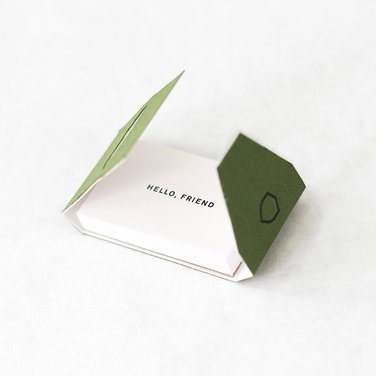
These message booklets from Side Show Press are fantastic

  • Calling Cards, with a Modern spin. Business cards aren’t obsolete, but I quickly recycle 97% of the ones I get. (Not your cards, they’re too pretty. You are the 3%). A lot of my customers concur – a stack of little, flat notes would be far more useful than business cards. A recent chat with Kimberly confirmed how functional (and fun) a beautiful flat card would be to leave with clients after a meeting, tuck into an online order, or as a sweet hello. You provide a great border and unexpected surprises.
  • More Flat Notes. This is the number one request I get: simple, flat stationery (this time card size, with an envelope). Everyone says they want to send more notes, but they don’t want fuss. Anna Beth told me these are called Buck Slips, which I’d never heard and I like, because I love little turns of phrases from your pocket of the world. Which reminds me…
  • More Colloquialisms. Those little sayings that your grandmother or your longtime neighbor said often make the best cards. Our southern sisters have an edge on this one, but everyone can try! My customers especially like new phrases to express love.
  • Postcard (sets). The folded card is clearly not trending. Building on the “flat notes” request above, postcards are often requested. They’re the quickest hello and the world can read them en route which makes them cheeky and nostalgic. To dip your toes in, I think they’d sell well for: Valentine’s Day, Just Because/Hello, Summer Camp (for parents to give to kids at camp drop-off) and thank yous.
  • Stationery, Plus. I love watching your lines branch out into new territory. If you’re itching for something new, these items are selling well and seem like a natural addition: coasters, wrapping paper, custom rubber stamps, pillows, pencil cases, notepads, temporary tattoos, candles, tea towels, journals, or matchbooks. Megan uses bits and pieces in her flowers and also suggests: more envelope accessories like stickers, stamps and washi tape.

OSBPmogleaawesome

Moglea can neon edge print anything to perfection, on a flat card no less

A final note on trends: Gold foil, neon, triangles, gem stones and foxes? I liken them to bangs: all of the cute girls have them and maybe you should too. But take it from a girl who has two cowlicks and super fine hair, some styles are not for you. Remember, as a buyer, I see a lot of what’s trending, I only need to see more if you do it really well. Otherwise, I want to see the things I haven’t even imagined yet.

II. Unsolicited Advice. My favorite. You don’t have to do any of these things, but I’d be thrilled to see your take on any of them:

  • More Stationery for Guys & Better Father’s Day Cards. You know your heart’s not quite in these, right? If you have an amazing card with a tie/golf club on it, ignore this, but otherwise, get out there and ask guys what they want. Trust me, they want to write quick notes on well designed stationery. Still not feeling it? Think about what makes men in history so compelling: They wrote. Fall back on images of your favorite writers, use that to spark some ideas.
  • Valentines and Thank You Cards, for kids to give. Please don’t leave me alone on Feb 13th at CVS buying Lightning McQueen Valentine cards for my son’s classmates. There must be another option and you can make them.
  • Selection packs. Customers often want thank you and birthday cards in bulk, but they want variety. Do 2 of 4 designs, or 4 of 2. (Caveat: This may be one of those “things people request, I purchase and they never buy.” But I do think it’s a good idea.)
  • More Bibliophile Goods. Bookmarks, book plates, other biblio-inspired goodies? Yes, yes, and yes. Antique book covers, card catalogs and the architecture in athenaeums could inspire a pretty nice series of, say…calling cards.
  • Baby Shower Thank Yous & Forever Stamps. At my baby shower, my friend, Laura, graciously said, “don’t send us thank you cards.” I objected, but after Julian was born I honestly couldn’t remember if I had sent cards. The weight of her gift sank in. Since I’m not in the business of telling people not to send cards, I’d rather make it easy: A set of pre-stamped thank you cards makes the perfect gift and she can hand them to her right-hand woman to address while she’s opening gifts. Ta-da!
  • Think Beyond the Holiday or Sentiment. I can sell love all year, but Valentine’s Day cards only for a few weeks. When you’re designing cards, you don’t have to follow a prescribed calendar or topic heading (at least not for me). I always want: more love cards, uplifting sympathy cards, congratulations for endless occasions and new thank you cards.
  • Prints of your most popular cards. These sell. That’s all. (and you’ve already designed them!)

May-Day-Studio-Sunshine-Card3

May Day Studio’s You Are My Sunshine is a lovely card and my best selling broadside print

III. Wild Ideas. Now we’re talking.

  • That Thing You Daydream About. Do it! I was a huge fan of Yellow Owl Workshop’s #getwise2013. It was so unexpected and delightful. I want more of this kind of thing. A lot more. Let’s make 2014 the year people have fun learning the difference between their, there, and they’re.
  • Wallpaper & Fabric from Your Designs. Both of these are niche markets and I probably couldn’t sell them, but boy-o-boy would I love to see them.

OSBPyellowowlgetwise

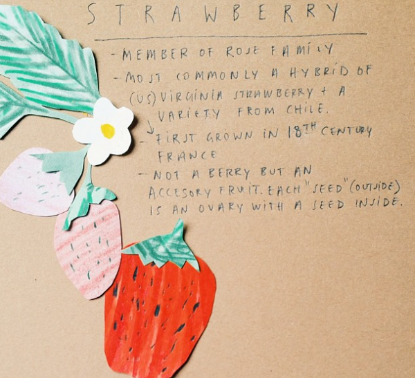
Yellow Owl Workshop made me smarter this year

  • Partnerships that lead to products. You have creative, skilled friends: Chefs, bartenders, florists, fabric designers, seamstresses, ceramicists, professors, stand-up comics, day-care teachers. How could you collaborate and produce something? I, for example, would love to see an OSBP illustrated cocktail series made into a set of flat cards – it would be the perfect hostess gift. (Ed Note: Ha! Okay, okay, I’m on it!)

I hope the new year brings you some down time with blank pages and new ink colors. I’d love to hear the wild ideas and trends you’re loving for in 2014…

Rebecca + Jeffrey’s Windswept Beach Wedding Invitations

So what do I do when the temperatures dip to sub-zero levels? Dream of the beach! Nina from Tweedle Press sent over these windswept beach letterpress invitations for a summer wedding on the Jersey shore. The invitations feature pale pink text in a feminine script, blind impression background imagery, and a thin piece of wood veneer to evoke the feeling of driftwood.

Windswept-Beach-Letterpress-Wedding-Invitations-Tweedle-Press3

From Nina: When I first met with Rebecca last year to discuss her  invitations, she was very clear that, although their wedding would be at a beach location in New Jersey, they did NOT want any cheesy, theme-y, overdone imagery. We discussed muted colors, driftwood, beach grass, and shore birds. She also mentioned that she really liked the idea of bringing in a sea green and a feminine, pale pink. I could tell that they were putting together a very romantic and yet modern wedding, so I set to work using a flowing script font and subtle imagery.

Windswept-Beach-Letterpress-Wedding-Invitations-Tweedle-Press4

This was one of my favorite wedding invitations I worked on all of last year because it so beautifully showcases the best of what letterpress printing has to offer. The inkless or “blind” impression of the background scenery on each of the pieces, pressed into the thick cotton paper, looks delicious enough to eat.

Windswept-Beach-Letterpress-Wedding-Invitations-Tweedle-Press9

Windswept-Beach-Letterpress-Wedding-Invitations-Tweedle-Press5

To bring in the driftwood concept, we affixed the main invitations to a very thin slice of a wood. The translucent green envelopes gave the whole package an incredibly airy feel, and guests could see the natural twine wrapping before even opening the envelope. I love these invitations!!

Windswept-Beach-Letterpress-Wedding-Invitations-Tweedle-Press8

Windswept-Beach-Letterpress-Wedding-Invitations-Tweedle-Press6

Windswept-Beach-Letterpress-Wedding-Invitations-Tweedle-Press

Thanks Nina!

Tweedle Press is a member of the Designer Rolodex – you can see more of their beautiful work right here or visit the real invi­ta­tions gallery for more wedding invitation ideas!

Photo Credits: Tru Studio

Party Paper: Radiant Orchid

As the first Party Paper post of 2014, I thought I’d shine a little party light on Pantone’s color pick of the year… Radiant Orchid! How do you guys feel about the choice? I’ll be honest that I’m not typically a purple person, but rounding up some of these fun and festive supplies below may have me changing my tune! Just look at that purple confetti! How could you say no!? —Kelly

Party Paper: Radiant Orchid

No. 1 DIY Ombré Tassel Backdrop by Berinmade for London Bride , No. 2 Confetti by The Confetti Bar, No. 3 Paper Garland by Makeshop NYC, No. 4 Watercolor Gift Tags by The Clever Little Fox, No. 5 Watercolor Thank You Notes by An Open Sketchbook, No. 6 Crepe Paper from Shop Sweet Lulu

{images via their respective sources}

Sarah + Winston’s Navy, Gold, and Coral Letterpress Wedding Invitations

Navy and gold is such a classic color combination – but add coral and it instantly becomes modern! Jenny C Design created these invitations for a wedding at an historic casino-turned-museum in upstate New York. The invitations feature details inspired by the museum’s architecture along with bright pops of coral. Jenny even incorporated some sophisticated casino-inspired details into the day-of wedding stationery!

Blue-Gold-Letterpress-Wedding-Invitations-JennyC-Design

From Jenny: Sarah and Winston’s wedding took place in Saratoga Springs, New York. They both lived in NYC, and about 95% of their guests would be from out of town. They really wanted their wedding invitations to evoke the feeling of their venue – the Historic Canfield Casino – and what fun the entire wedding weekend would be for everyone!

Blue-Gold-Letterpress-Wedding-Invitations-JennyC-Design2bBlue-Gold-Letterpress-Wedding-Invitations-JennyC-Design2a

Blue-Gold-Letterpress-Wedding-Invitations-JennyC-Design3

Blue-Gold-Letterpress-Wedding-Invitations-JennyC-Design6

Sarah and Winston were inspired by the history and architecture of the Canfield Casino (once a casino, now the city’s preeminent event space and historical museum). The border on the letterpress invitation and certain design elements throughout the suite are reminiscent of the those architectural details.

Blue-Gold-Letterpress-Wedding-Invitations-JennyC-Design5

The envelope liner and coral edging adds a perfect pop of color! Mini information cards about the rest of the weekend were placed in a fun navy stripe and coral envelope.

Blue-Gold-Letterpress-Wedding-Invitations-JennyC-Design4

Blue-Gold-Letterpress-Wedding-Invitations-JennyC-Design7

We continued the casino inspired theme, in an elegant way, into their day-of stationery items. Sarah and Winston’s ceremony program was shaped liked a deck of cards. On the back was a custom playing card design, with their monogram and design elements from the invitation incorporated into it. Their escort cards were shaped and designed to look like poker chips, displayed with dice glued on the back of each card so they would stand.

Blue-Gold-Letterpress-Wedding-Invitations-JennyC-Design8

Photo Credit: Tracey Buyce Photography

Thanks Jenny!

Check out the Designer Rolodex for more tal­ented wed­ding invi­ta­tion design­ers and the real invi­ta­tions gallery for more wedding invitation ideas!

Photo Credits: Elario Photography, except where noted

Shauna + Darrell’s Rustic Etched Wood Barn Save the Dates

For her upcoming summer farm wedding, designer Shauna Luedtke plans to incorporate lots of handmade elements with a focus on hand lettering and typography. Shauna incorporated playful lettering into a beautiful laser etched wood save the date – in the shape of a barn! Shauna even added a magnet to the back, turning an already lovely save the date into a wedding keepsake.

Rustic-Etched-Wood-Barn-Save-the-Dates-Shauna-Luedtke

From Shauna: Everything I’m doing for my wedding is handmade with a focus on lettering and typography. There will be lots of hand painted wood signage and I’m even having neon signs made with beautiful type. We will be married on a farm and the reception will take place in a barn. I wanted to capture the rustic vibe of the barn by using wood in the save the dates.

Rustic-Etched-Wood-Barn-Save-the-Dates-Shauna-Luedtke2

Originally I planned on silkscreening onto sheets of wood, but I thought etching it took the idea even further. I also wanted the save the dates to be something people would want to keep. I added a magnet to the back so that it could be a keepsake for years to come. The decor will very modern and bold which will contrast nicely with the rustic surroundings.

Rustic-Etched-Wood-Barn-Save-the-Dates-Shauna-Luedtke3

Each save the date is laser etched and cut, making each one slightly different from the other. I designed and ordered custom stamps through Canada post for the envelopes.

Rustic-Etched-Wood-Barn-Save-the-Dates-Shauna-Luedtke4

Rustic-Etched-Wood-Barn-Save-the-Dates-Shauna-Luedtke7

Rustic-Etched-Wood-Barn-Save-the-Dates-Shauna-Luedtke6

Thanks Shauna!

Check out the Designer Rolodex for more tal­ented wed­ding invi­ta­tion design­ers and the save the date gallery for more beau­ti­ful cus­tom save the dates!

Photo Credits: Shauna Luedtke