Alexandra + Doug’s Green and Kraft Graphic Wedding Invitations

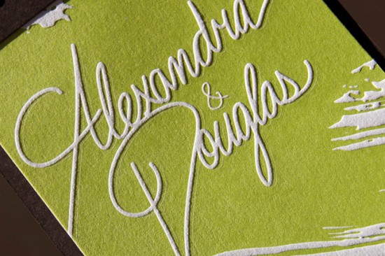
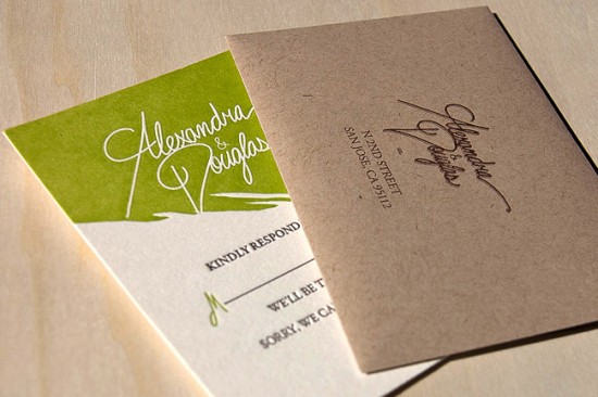
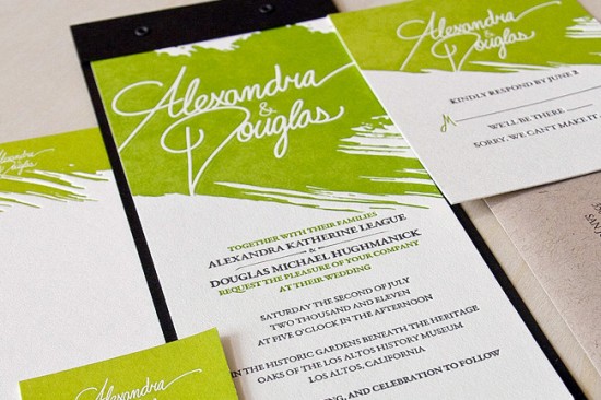
The texture of these wedding invitations is just so incredibly awesome.  Designed by Doug Hughmanick for his own wedding this summer and letterpress printed by Miguel from Heavy Metal Letterpress, the invitation features a brushstroke element at the top of each piece in the suite, knockout text, and kraft paper envelopes.  I love the bold color paired with classic wording and typeface selections.

Here’s a close up look at that awesome knockout text and texture…

Design: Douglas Hughmanick

Letterpress Printing: Heavy Metal Letterpress

Check out the Designer Rolodex for more tal­ented wed­ding invi­ta­tion design­ers and the real invi­ta­tions gallery for more beau­ti­ful cus­tom invitations!

Photo Credits: Miguel Castro | Heavy Metal Letterpress

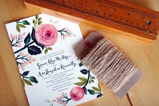
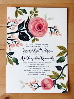
Jenna + Asa’s Floral Wedding Invitations from Rifle Paper Co.

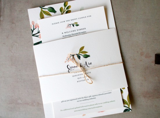
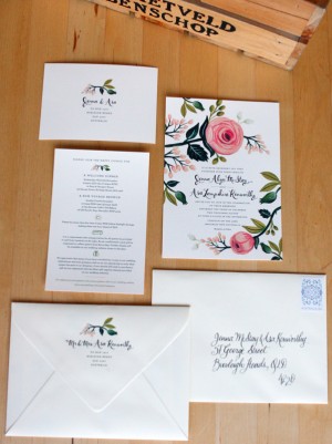
Back in March, a longtime reader in Australia sent over her beautiful save the dates for her summer garden wedding.  Well, today Jenna and Asa are back with their wedding invitations!  Like the save the dates, the wedding invitations were designed by Rifle Paper Co. and feature Anna’s signature floral illustrations and beautiful hand lettering.  Just perfect for a garden wedding!

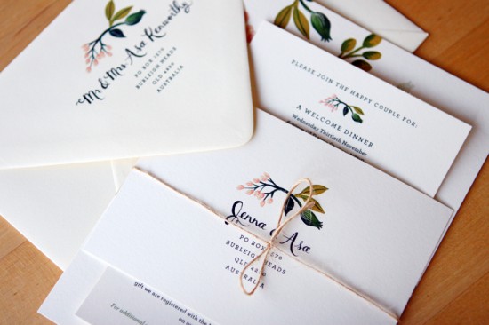
The full suite includes the main invitation, an invitation to the welcome dinner and farewell brunch, and RSVP postcard, all tied together with an understated piece of twine.  Jenna commissioned Danielle from Freestyle Calligraphy to address the outer envelopes.

Thanks Jenna!

Photo Credits: Daniel McStay

Mexican Tile-Inspired 50th Wedding Anniversary Party Invitations

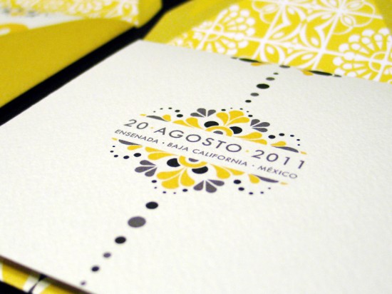
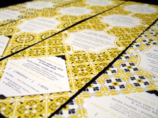
A 50th wedding anniversary is most definitely an occasion to be celebrated!  Lizzely from LizzyB Loves had the pleasure of designing her in-law’s 50th anniversary party invitations earlier this summer.  Lizzely drew her inspiration from the traditional tile work surrounding the celebration venue, a 1930s hotel in Mexico, and mid-century modern design.

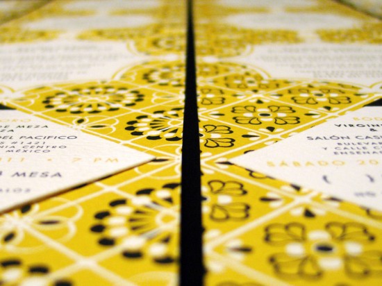
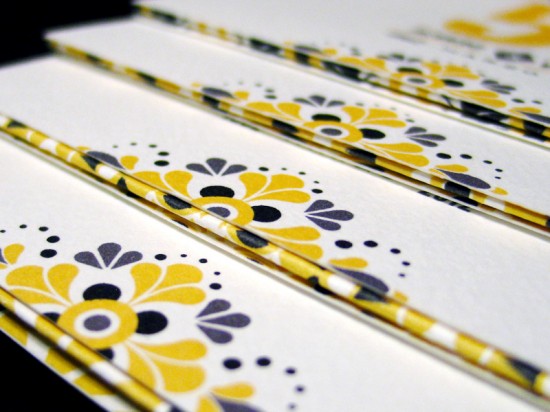
From Lizelly:  The anniversary celebration will be held in Ensenada, Mexico in a circular ballroom dating back to the 1930s, which used to be a casino and hotel in its prime and later a military fort during WWII.  I took inspiration from the various tile work surrounding the venue and created an assortment of pattern motifs used throughout the invitation suite.

My brother-in-law served as the client for this project, and early on he said that he wanted the tile motifs surrounding the venue to be used in the design.  He also wanted to give the invitations a Mad Men feel, so I came up with a Mad-Mex theme with the use of clean and modern text paired with the Mexican tile designs.

Thanks Lizelly!

Photo Credits: LizzyB Loves

Citrus-Inspired Letterpress Overprinting Wedding Invitations

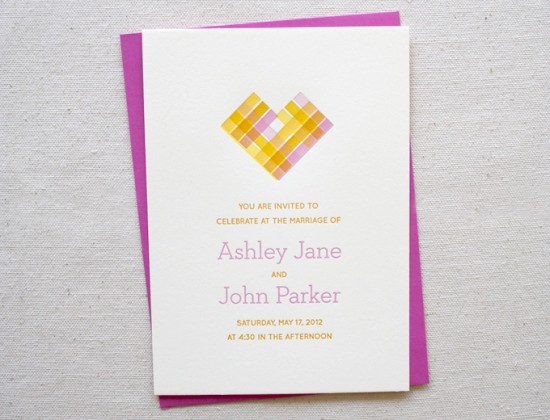
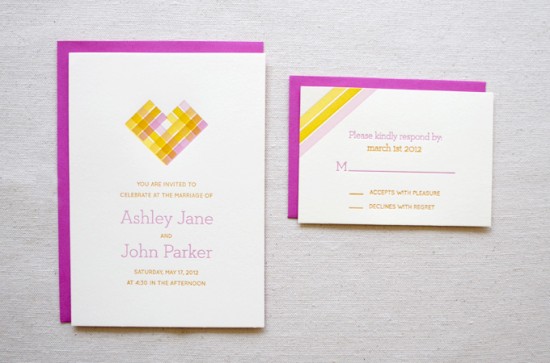
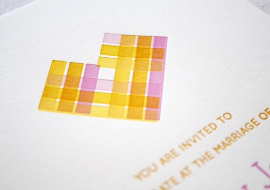
These invitations and bright, summery, and undeniably lovely.  The invitations were letterpress printed by Sara and Brad of Constellation & Co. for their design intern Sarah Paulhus.  The main invitation incorporates a letterpress technique known as overprinting – where two different ink colors are layered during the printing process to produce a new color – to create the heart design in the main invitation.  Sarah selected pretty citrus-inspired colors of pink, orange, and yellow for the entire suite.  Beautiful!

Pink-Yellow-Letterpress-Overprinting-Wedding-Invitations-Constellation-Co

From Sara of Constellation & Co.: Our summer intern Sarah Paulhus did the design for this fun invitation suite under our art direction, and then we produced them at the end of the internship for her portfolio.

Pink-Yellow-Letterpress-Overprinting-Wedding-Invitations-Constellation-Co

Pink-Yellow-Letterpress-Overprinting-Wedding-Invitations-Constellation-Co

Sarah described her inspiration this way: “My summer wedding concept was inspired by citrus!  Grapefruit, oranges, lemons – they all remind me of summer afternoons.  I wanted to take advantage of the letterpress process and add a vintage-y feel to the theme, which comes off in the paper choices and ink.  Overall, I want the design to be clean and fresh, breezy, but also warm and inviting.”  We think she did a great job – not bad for her first wedding invite!

Pink-Yellow-Letterpress-Overprinting-Wedding-Invitations-Constellation-Co

Pink-Yellow-Letterpress-Overprinting-Wedding-Invitations-Constellation-Co

Constellation & Co. is a mem­ber of the Designer Rolodex – you can see more of their beau­ti­ful work right here!

Photo Credits: Constellation & Co.

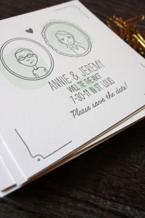
Annie + Jeremy’s Illustrated Portrait Save the Dates

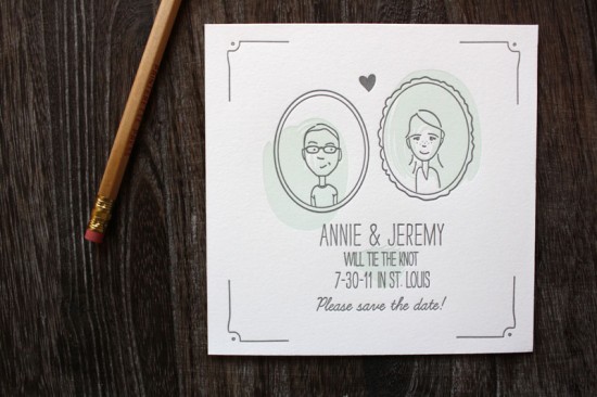
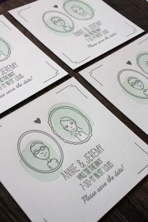
Printerette Press was one of my favorites at this year’s National Stationery Show, so I was thrilled when Catherine from Printerette Press sent over these sweet and whimsical save the dates that she created for a recent couple.  Catherine incorporated the most adorable illustration of the bride and groom – even the bride’s sweet freckles!

From Catherine:  Annie & Jeremy might be the most down-to-Earth, funny, and sweet couple we’ve ever worked with.  Annie is a clothing designer and Jeremy is a librarian here in Minneapolis.  Both of them being from St. Louis, they planned a (hot) summer wedding in their hometown.

We love incorporating sweet, simple portraits into wedding stationery and we were delighted when Annie and Jeremy were on board with our idea!  I think my favorite element of the whole piece is Annie’s freckles.  The save the dates were printed on cotton paper with hand-mixed inks and lovingly hand-fed one at a time on our 100-year-old press.

Thanks Catherine!

Printerette Press is a member of the Designer Rolodex – you can see more of their beautiful work right here!

Photo Credits: Printerette Press