Megan + Mike’s Modern Organic Chicago Wedding Invitations

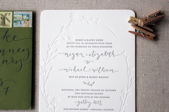
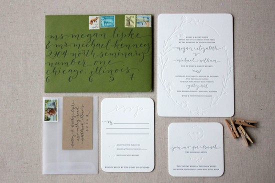
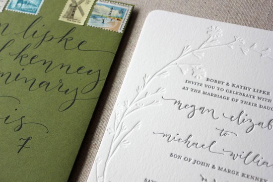
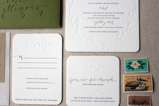
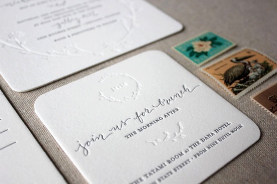
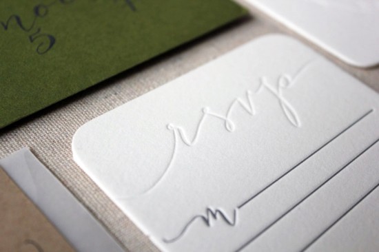
Happy New Year everyone!  We’re getting back to business and starting the new year off with a gorgeous wedding invitation suite from Megan of Ruby the Fox.  You may remember Megan’s awesome stitched save the dates from last April, and I’m just as much in love with her wedding invitations.  Megan wanted to keep the design simple and understated, with modern details in the blind impression letterpress elements, gorgeous calligraphy from Angelique Ink, and a custom garland illustration by the talented Shanna Murray.  So beautiful!

From Megan: Being a stationery designer, I knew our invitations had to be special, represent us as a couple, and reflect our vision for our wedding.  We chose to go very understated, organic, and simple with a clean color palette.

We utilized some amazingly talented vendors to make our vision come together.  We commissioned Shanna Murray to create the beautiful one-of-a-kind garland we used throughout the wedding suite.  Angi Phillips of Angelique Ink graced us with her gorgeous calligraphy and we found vintage stamps through The Paper Nickel Stamp Company.  We lined the envelopes in a white tissue paper which was possibly the only traditional part of the entire suite!

Thanks Megan!

Check out the Designer Rolodex for more tal­ented wed­ding invi­ta­tion design­ers and the real invi­ta­tions gallery for more wedding invitation ideas!

Photo Credits: Ruby the Fox

Best of 2011: Illustrated Wedding Invitations

Before we head off for the weekend and to count down the final hours of the year, I have one final collection of favorite posts from 2011 to share – illustrated wedding invitations!   I absolutely love it when designers incorporate line drawings and illustrations into custom wedding invitations.  Each invitation suite is like a little work of art!  Here are a few of my favorite illustrated wedding invitations from the past year:


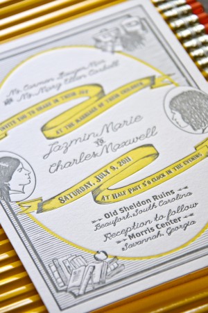
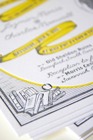
Charles + Jazmin’s illustrated wedding invitations by Belle & Union feature illustrated versions of their silhouettes along with details representing their respective passions – all in a beautiful yellow and gray color palette.

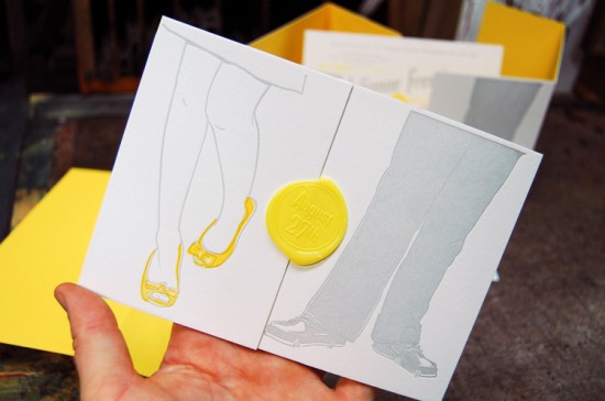
Julianne + Philip’s illustrated letterpress invitations from Mama’s Sauce featured joyful illustrations of the couple’s dancing shoes along with wax seals and beautiful edge painting


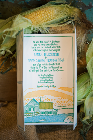
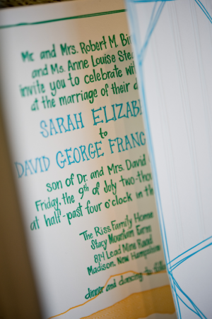
Elizabeth + David’s farmhouse wedding invitations from Gus & Ruby Letterpress feature hand lettering paired with beautiful illustrations from Nate Duval.  Gorgeous!

Gus & Ruby Letterpress is a member of the Designer Rolodex – check out more of their beautiful work right here!

Photo Credits: Elk Photo for Low Country Press; Mama’s Sauce; Brea McDonald for Gus & Ruby Letterpress

Best of 2011: Watercolor

Like neon, 2011 was a big year for watercolor – from calendars to greeting cards to baby shower invitations.  I’m looking forward to seeing a lot more watercolor in 2012, but in the meantime here are a few of my favorite posts incorporating watercolor from 2011!

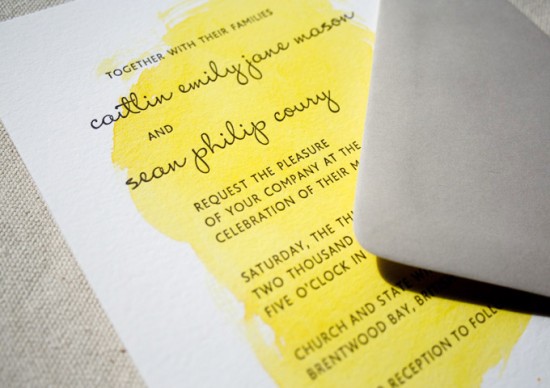
Caitlin + Sean’s watercolor wedding invitations by Constellation & Co.

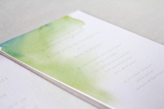
Nancy + Elias’s watercolor letterpress wedding invitations by Oh Happy Day

Watercolor collection from The Aerialist Press

p.s. See how to make your own watercolor invitations and stationery right here!

The Aerialist Press and Constellation & Co. are mem­bers of the Designer Rolodex – you can see more of their beau­ti­ful work here and here – or visit the real invi­ta­tions gallery for more wedding invitation ideas!

Photo Credits: Constellation & Co., Alexis Birkmeyer for Oh Happy Day, The Aerialist Press

Best of 2011: Jaime + Anthony’s Modern Woodgrain Wedding Invitations

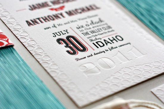
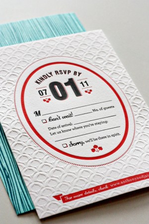
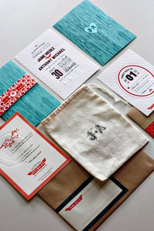
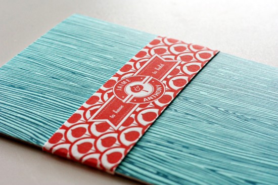
I love texture in wedding invitations; it’s one of the reasons I’m drawn to letterpress printing overall, and I particularly love blind impression (no ink) elements in letterpress cards and invitations.  Jaime and Anthony’s mountain wedding invitations by designer Kate Holgate are full of beautiful texture, from the woodgrain enclosures to the muslin bags (in lieu of traditional internal envelopes) to the beautiful blind impression details and patterns.  So very lovely.


Check out Jaime + Anthony’s wedding invitations right here!

Check out the Designer Rolodex for more tal­ented wed­ding invi­ta­tion design­ers and the real invi­ta­tions gallery for more wedding invitation ideas!

Photo Credits: Kate Holgate

Best of 2011: Neon Storybook Wedding Invitations

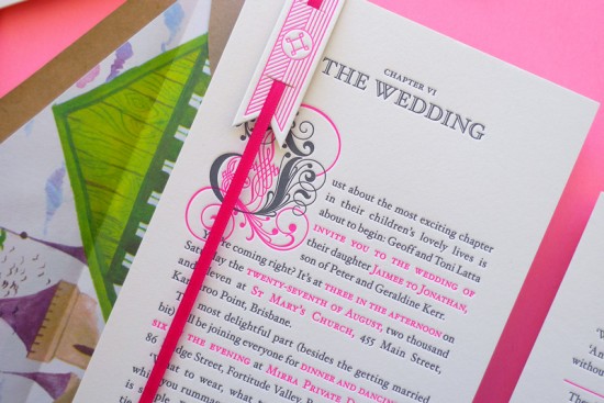
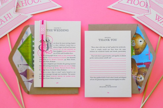
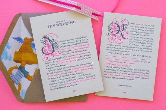
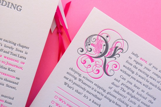
Since we’re on the subject of neon wedding invitations today, I thought I’d mention one additional wedding invitation suite that I actually didn’t have the chance to feature earlier in the year but is still incredibly awesome.  These fantastic storybook wedding invitations were created by Simon and Jenna of The Hungry Workshop in Australia and feature antique drop caps, a bookmark-inspired belly band, and of course bright neon pink details from the text to the matching ribbon.

From The Hungry Workshop:  We tried to capture the personalities of Jaimee & JK throughout the invitation suite.  The quirky story we wrote (with a little help from a very talented friend) is brimming with character and printed in charcoal ink, with the details of the wedding highlighted in a neon pink accent colour.  Perhaps the most striking element is the vintage drop caps, circa 1682.  We found these in an old type specimen book which we carefully re-drew, and modernised by splitting them into two plates.

The invitation is accompanied by an RSVP postcard forming the second page of the story, with a return address letterpress printed on the back.  Both pages are lovingly wrapped up with a bookmark inspired vertical belly band and matching pink ribbon.

Check out more over on The Hungry Workshop!

Check out the Designer Rolodex for more tal­ented wed­ding invi­ta­tion design­ers and the real invi­ta­tions gallery for more wedding invitation ideas!

Photo Credits: The Hungry Workshop