FONT: SHOWCASE
FONT: SHOWCASE

Every designer has a unique method that works for them. With so many different ways to arrive at the final product, there is always room for experimenting with different styles, supplies and ideas; it’s all about trial and error. Illustration is a process that is near and dear to my heart. I studied illustration at Syracuse University and it’s been the consistent force in my life (sorry flair jeans). I thought I’d share our illustration process here and give you a few tips on how we go about our projects. – Courtney of Swiss Cottage Designs
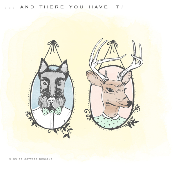
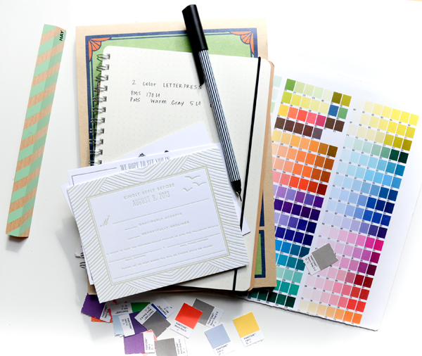
This one is a fun one: it was a crest for a client’s wedding invitation suite. Her last name is Buck and his last name is Scott, so they wanted to play off that and personify drawings of a deer and scottie dog to represent them. I was in love with this idea right from the get-got! Here is how we started Marie’s crest.
Tools
Every good project starts with your most tried and trusted tools. The ones shown here were not all used for this project but I thought I’d share a few of our favorites:
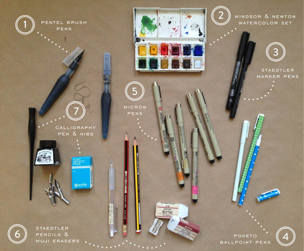
1. Pentel Brush Pens: I bought these while in London recently and they blew me away. They are amazing for loose sketches and lettering.
2. Poketo Ballpoint Pens: I couldn’t go a day without these guys. They have a fine point and make marking up proofs pretty neat and tidy.
3. Micron Pens: The amount of Micron pens I have is unhealthy. I color code them with Washi tape so I know which points work better than others.
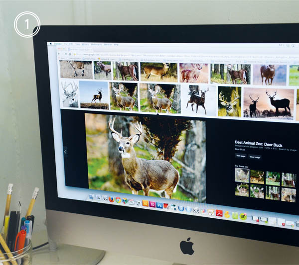
Step 1: After I get my supplies sorted out, I like to start with sourcing a few inspiration images. While the internet can be both blessing and a curse (who hasn’t fallen down a Pinterest black hole before?), it’s a wonderful resource to get started! I always remind myself that I don’t have to create in a vacuum. If I’m struggling to draw a deer, a million source images are only a few clicks away. One of the lessons I’ve had burned in my mind from college was photographic reference. It helps bring a certain likeness to the drawings.
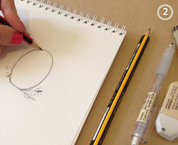
Step 2: Next, I sketch out a few options in my sketch book. I love using Straedtler pencils, I find they erase nice and clean so I don’t end up with a muddy mess before it’s all over. If you find yourself at an art supply shop, there are loads of options for leads, colors, weights, etc. so you can find what works best for you and your drawing style.
Step 3: Once I’m happy with the sketches, I’ll redraw them on vellum tracing paper using micron pens. Micron pens come in every thickness and weight under the sun, so I never have trouble creating the line style I’m after. Line weight change is key! The beauty of this step is that is allows me to add or subtract anything I wasn’t wild about from the original sketch.
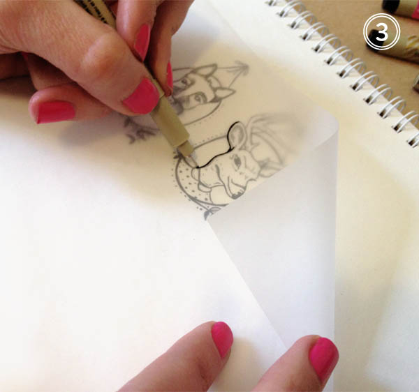
Step 4: Next I head over to my trust scanner! This little guy is key in the whole process. While I love digital illustration, nothing beats drawing by hand. Without my scanner, I wouldn’t be able to translate anything to digital. I scan in each image at a high resolution and always in black and white as I find it maintains the line integrity better.

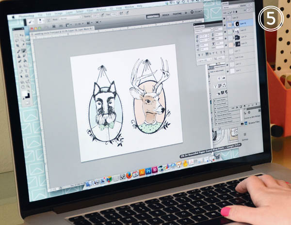
Step 5: Now that everything has been scanned, I can start working with color and placement. When I draw, I tend to illustrate everything in smaller pieces. This provides more flexibility in terms of adding, subtracting, or moving elements around. If I drew everything in one large image, it’d be more difficult to edit it down the road. Photoshop brushes are my best friend! It’s astounding how many textures and styles you can achieve using them. For this particular project, I’m looking for a softer, watercolor wash effect. This is the really fun part as it allows for experimentation. If I don’t like it, I can always undo or delete the layer.
And finally (drum roll!) I’m all done and ready for the client to have a look.
 … an illustration from start to finish! Some days I might bust out the watercolors or my trusty brush pens depending on the project, but it’s always great to experiment with what works best for you and refine your process as you learn. It’s always a lot of fun and very exciting to see the end result.
Photo/Image Credits: Swiss Cottage Designs
Did your family throw Easter egg hunts when you were a kid? Or did you attend any in your town? They were probably my most favorite thing about Easter. So I couldn’t resist getting in the egg hunt spirit for today’s party paper post! There’s so many paper pretties out there now that are perfect for an Easter family rendezvous, even if all the kids really care about is what’s inside the eggs! —Kelly
 No. 1 Easter Egg Hunt Kit by Meri Meri from The Land of Nod, No. 2 Color Block Plate from Oh Joy for Target, No. 3 Polka Dot Party Hats from Oh Joy for Target, No. 4 Easter Egg Hunt Invitations from Fable Paper Co., No. 5 Bunny Cups by Meri Meri from The Land of Nod, No. 6 Floral Paper Straws from Shop Sweet Lulu
{images via their respective sources}
Hello from Brooklyn! I’m Courtney from Swiss Cottage Designs and I’m stoked to be guest blogging this week on our most favorite paper blog, Oh So Beautiful Paper! I’ve been a huge fan of Nole’s blog since the early days so it’s really fun to be able to contribute back to such an inspiring blog. Thanks for having us!
I thought it would be fun to start our week of guest blogging with a peek into our life here in Brooklyn. I founded Swiss Cottage Designs in 2009 after working in the design industry for 4 years. While those years were filled with amazing professional experiences, I always knew I wanted to work for myself. Thus, SCD was born! We specialize in illustration, invitations and custom branding. In the last 5 years we’ve had the pleasure of working with brands such as Warby Parker, Crown Publishing, and Paperless Post as well as many, many wonderful couples and planners. I feel so lucky to be in such an amazing and inspiring industry!
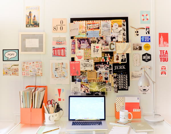
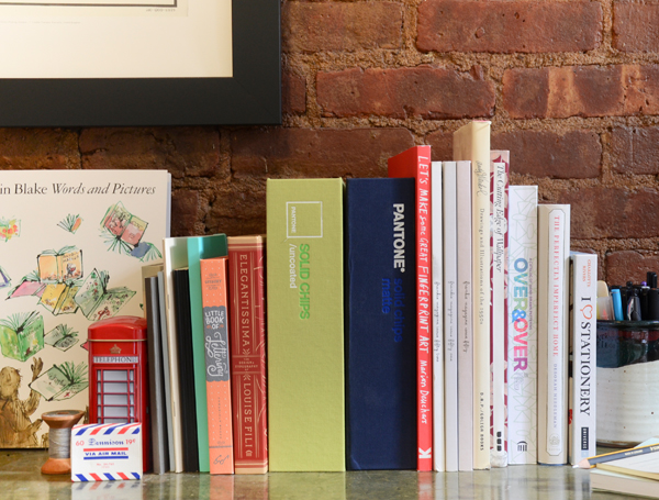
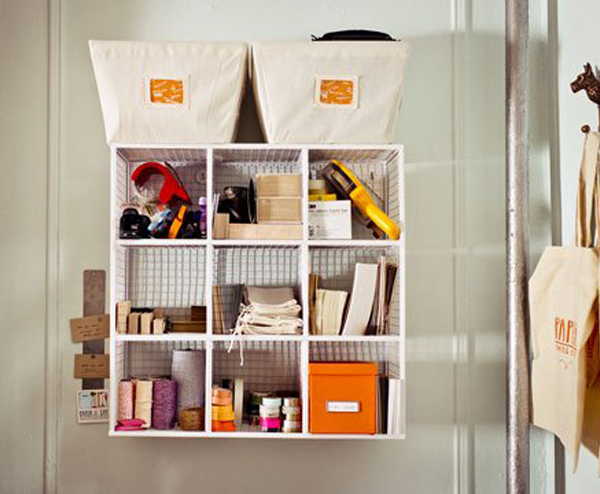
We’re located in Carroll Gardens, a Brooklyn neighborhood of tree lined streets, historic brownstones and about a million places to grab tasty treats (it’s kind of a problem, really.) We have a home studio which means the neighborhood becomes sort of like a co-worker. Lucky for us, he’s not that annoying guy who breathes too heavy in the next cube over.
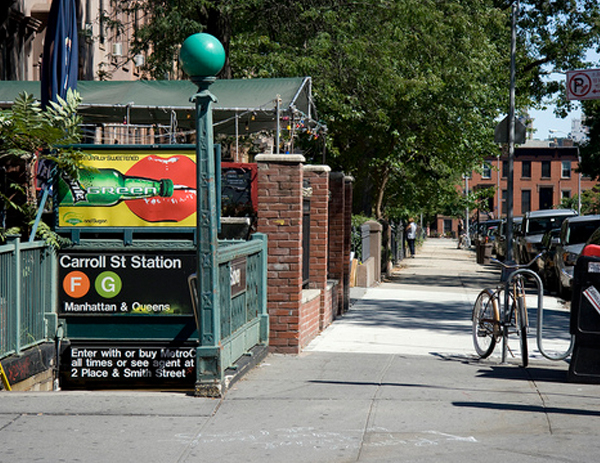
Photo courtesy bigriffith
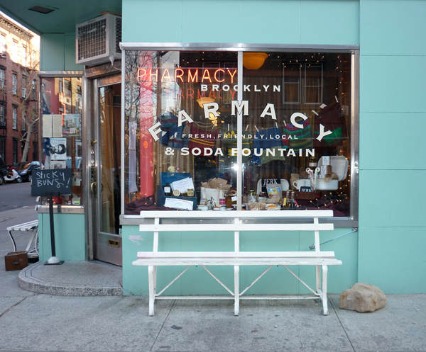
 Photo courtesy of Shiny Bright
A day typical day (if there is such a thing) around the studio consists of lots and lots of emails, drawing, scanning, painting, designing, packaging, eagerly awaiting shipments from the printer, opening said shipments with bated breath, more emails, drawing, packaging and of course illicit amounts of coffee and tea. Running a business is the most incredible experience yet can be just as equally frustrating! There are days when the printer jams all your envelopes, a FedEx package goes missing and a press run comes back wrong and you just want to phone it in. Then you have days that are better than anything you could have imagined. I wouldn’t trade it for anything.
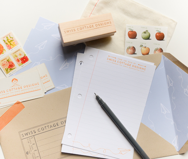
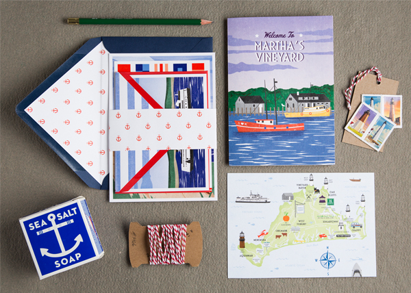
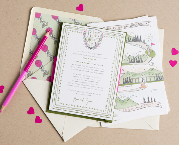
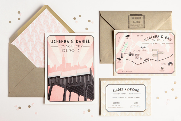
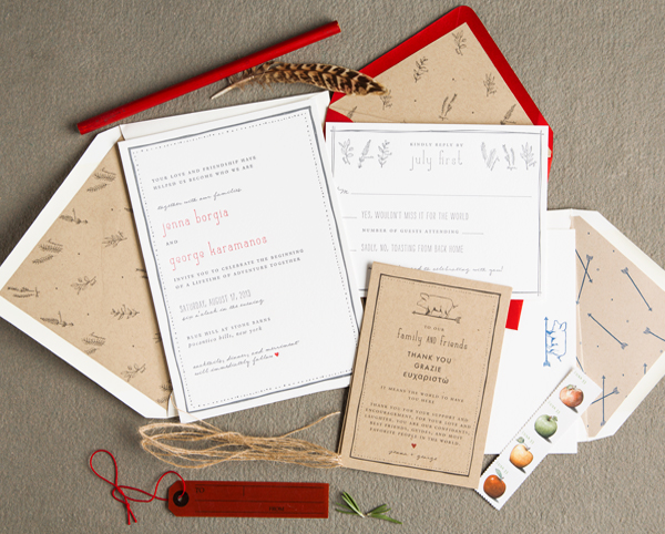
Our clients are constantly inspiring us! Because all of our projects are custom, we’re constantly exploring different methods of art and design. We love that no two jobs are alike. Here are a few recent projects we’ve worked on:
We can’t wait to share more with you! Stay tuned to Oh So Beautiful Paper this week and in the mean time, say hi to us on Twitter and Instagram. Looking forward to meeting you all!
Photo Credits: Swiss Cottage Designs, except where noted
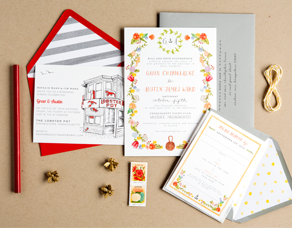
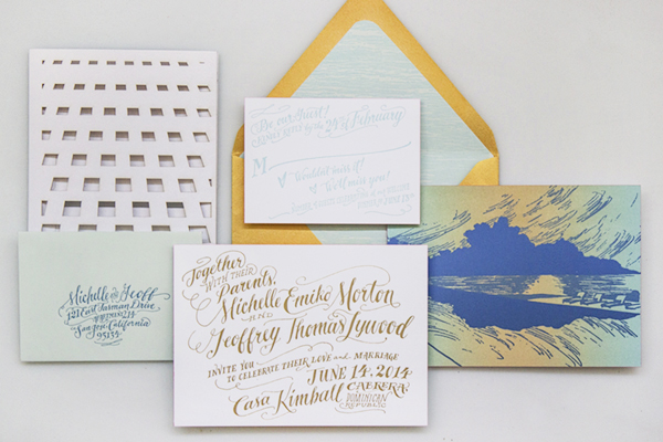
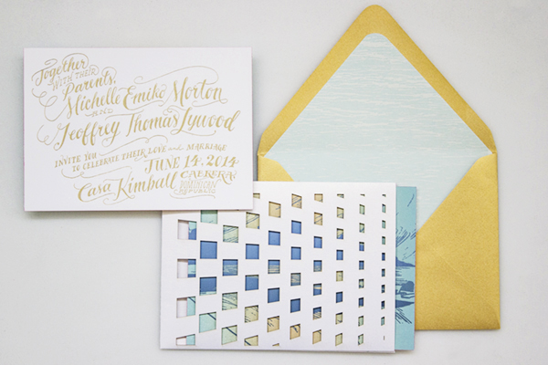
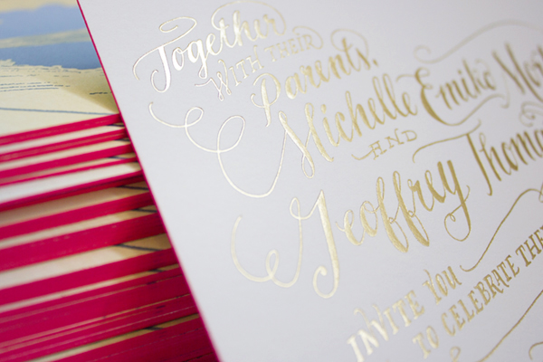
Happy Monday everyone! Before I head off for a few days in the sun, I just had to share these gorgeous wedding invitations from Arley-Rose and Morgan of Ladyfingers Letterpress! Created for a wedding in the Dominican Republic, these invitations feature Arley-Rose’s signature hand lettering in stunning metallic gold foil, a beautiful rainbow roll sunset, architectural laser cut details, and a pop of bright neon edge painting. Love, love, love!
From Arley-Rose and Morgan: It didn’t take long for Michelle and Geoff to knock us off our feet and inspire us to make some of our most favorite invitations we’ve ever made! Influenced by their correspondence through adorable hand-written cards, genuinely sweet emails, and giddy phone calls filled with excitement and pure joy, we put our heads together to come up with some invitations fit for some of the sweetest clients we’ve ever had!
Since their wedding is going to be held in the Dominican Republic, they wanted an invitation suite that reflected the excitement and love they have for each other, while relaying the modern simplicity of their beautiful ocean-side venue.Â
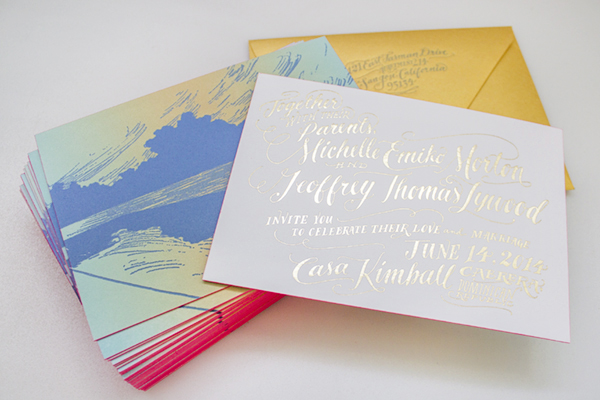
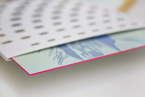
Their hand-lettered invitations were hot foil stamped in bright gold foil onto thick, 220lb cotton Crane Lettra paper. On the backside of the invitation, a drawing of the sunset from the Casa Kimball infinity pool was rendered as a dual-split letterpress rainbow roll. Hot pink edge painting was applied to the edge of each piece, giving just the perfect amount of pop for each invitation!
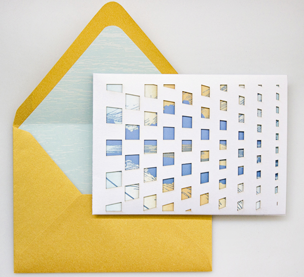
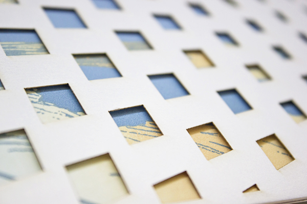
The design for their enclosure mimics a pattern found in one of the architectural features at the venue. The pattern was then laser cut out of a Shimmer Ice paper and assembled with a pocket in the back to hold the RSVP card and envelope.

Their bright gold outer envelope is lined with a soft blue paper that was letterpress printed with a serene ocean design, and a letterpress return address. In the end, we were sad to see these invitations leave our studio, but happy to know that they were going to a good home. Sure enough, every time we come across the extras that we made here in the studio, we think of Michelle and Geoff and are reminded how fortunate we are to be able to make beautiful things for wonderful people!
Thank you so much ladies!
Ladyfingers Letterpress is a member of the Designer Rolodex – check out more of their beautiful work right here or visit the real inviÂtaÂtions gallery for more wedding invitation ideas!
Photo Credits:Â Ladyfingers Letterpress