FONT: VELIK
FONT: VELIK
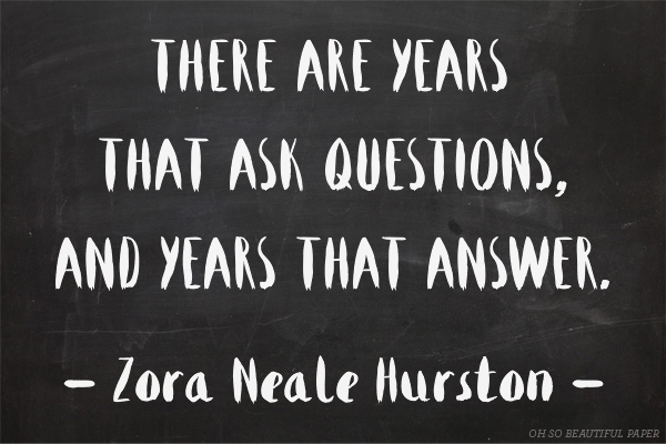
Happy New Year! If your December was anything like mine, things got a little foggy. I woke up on New Year’s Day feeling a bit like Snow White after eating that apple. (Probably exactly how she felt, if she still had to finish her year-end accounting.) The point is, December is no time for wild ideas. But now it’s January, and a bit of reckless brainstorming is what launched us into the work we’re in. So, let’s get back at it. – Emily of Clementine
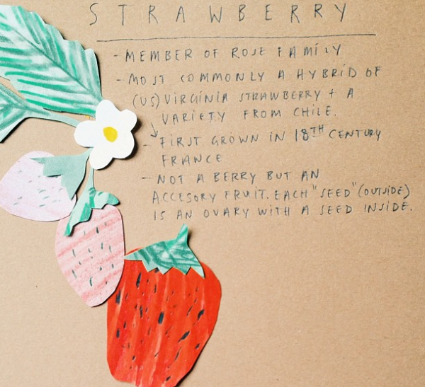
Illustration by Emily McDowell for Oh So Beautiful Paper
I. Trends. Just so we’re on the same page, I am not a trendsetter. I live in Vermont, I just got on board with neon and I am decidedly not a fan of Pantone’s color of the year. That said, I am a creative-envelope pusher, professional brainstormer, and confessional for customer wishes. I also really love watching your lines grow, offering feedback, and cheerleading along the way. I want both of our businesses to grow. Here are a few opportunities that I see:
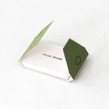
These message booklets from Side Show Press are fantastic
Moglea can neon edge print anything to perfection, on a flat card no less
A final note on trends: Gold foil, neon, triangles, gem stones and foxes? I liken them to bangs: all of the cute girls have them and maybe you should too. But take it from a girl who has two cowlicks and super fine hair, some styles are not for you. Remember, as a buyer, I see a lot of what’s trending, I only need to see more if you do it really well. Otherwise, I want to see the things I haven’t even imagined yet.
II. Unsolicited Advice. My favorite. You don’t have to do any of these things, but I’d be thrilled to see your take on any of them:

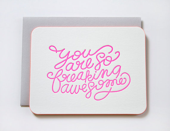
May Day Studio’s You Are My Sunshine is a lovely card and my best selling broadside print
III. Wild Ideas. Now we’re talking.
Yellow Owl Workshop made me smarter this year
I hope the new year brings you some down time with blank pages and new ink colors. I’d love to hear the wild ideas and trends you’re loving for in 2014…
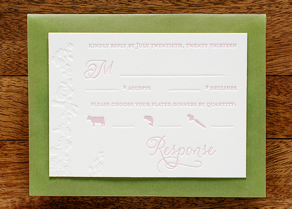
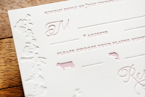
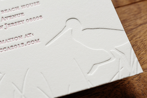
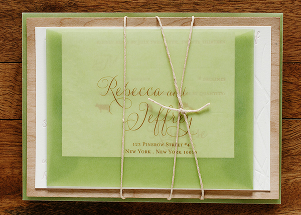
So what do I do when the temperatures dip to sub-zero levels? Dream of the beach! Nina from Tweedle Press sent over these windswept beach letterpress invitations for a summer wedding on the Jersey shore. The invitations feature pale pink text in a feminine script, blind impression background imagery, and a thin piece of wood veneer to evoke the feeling of driftwood.
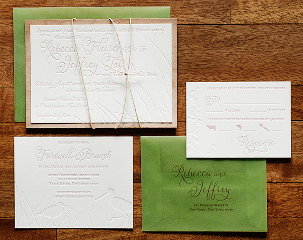
From Nina: When I first met with Rebecca last year to discuss her invitations, she was very clear that, although their wedding would be at a beach location in New Jersey, they did NOT want any cheesy, theme-y, overdone imagery. We discussed muted colors, driftwood, beach grass, and shore birds. She also mentioned that she really liked the idea of bringing in a sea green and a feminine, pale pink. I could tell that they were putting together a very romantic and yet modern wedding, so I set to work using a flowing script font and subtle imagery.
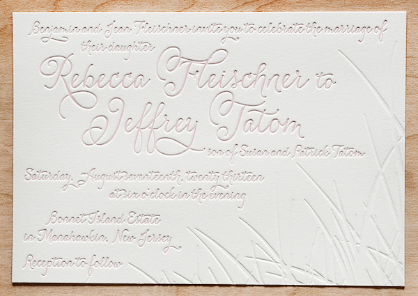
This was one of my favorite wedding invitations I worked on all of last year because it so beautifully showcases the best of what letterpress printing has to offer. The inkless or “blind” impression of the background scenery on each of the pieces, pressed into the thick cotton paper, looks delicious enough to eat.
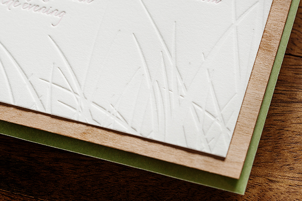
To bring in the driftwood concept, we affixed the main invitations to a very thin slice of a wood. The translucent green envelopes gave the whole package an incredibly airy feel, and guests could see the natural twine wrapping before even opening the envelope. I love these invitations!!
Thanks Nina!
Tweedle Press is a member of the Designer Rolodex – you can see more of their beautiful work right here or visit the real inviÂtaÂtions gallery for more wedding invitation ideas!
Photo Credits: Tru Studio
As the first Party Paper post of 2014, I thought I’d shine a little party light on Pantone’s color pick of the year… Radiant Orchid! How do you guys feel about the choice? I’ll be honest that I’m not typically a purple person, but rounding up some of these fun and festive supplies below may have me changing my tune! Just look at that purple confetti! How could you say no!? —Kelly
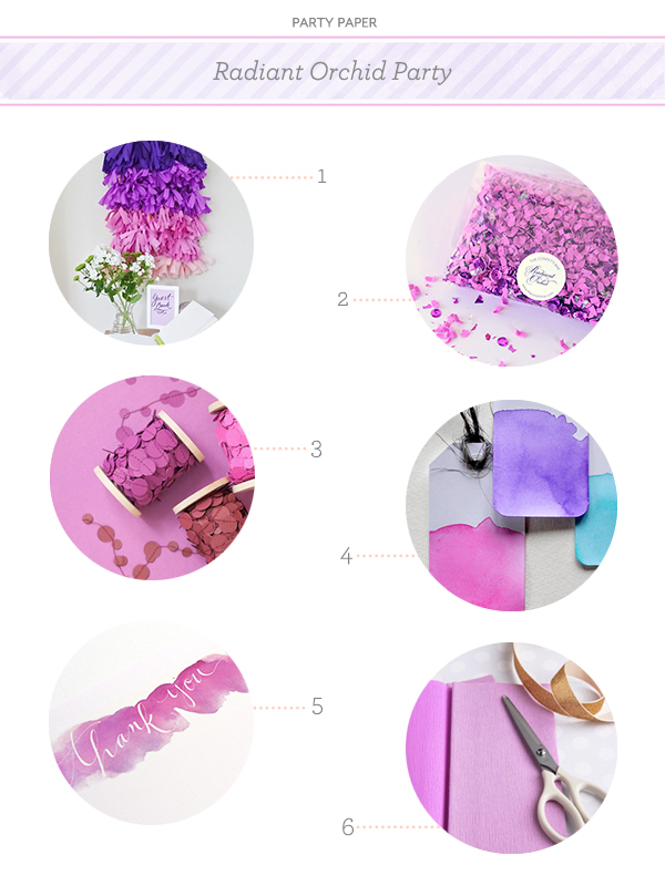
No. 1 DIY Ombré Tassel Backdrop by Berinmade for London Bride , No. 2 Confetti by The Confetti Bar, No. 3 Paper Garland by Makeshop NYC, No. 4 Watercolor Gift Tags by The Clever Little Fox, No. 5 Watercolor Thank You Notes by An Open Sketchbook, No. 6 Crepe Paper from Shop Sweet Lulu
{images via their respective sources}
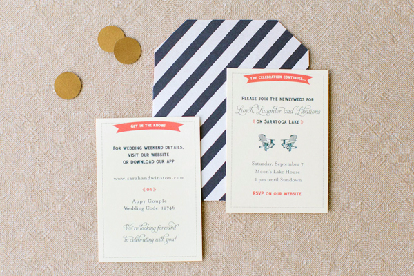
Navy and gold is such a classic color combination – but add coral and it instantly becomes modern! Jenny C Design created these invitations for a wedding at an historic casino-turned-museum in upstate New York. The invitations feature details inspired by the museum’s architecture along with bright pops of coral. Jenny even incorporated some sophisticated casino-inspired details into the day-of wedding stationery!
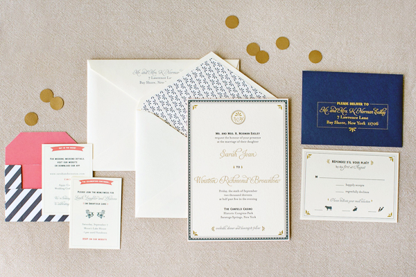
From Jenny: Sarah and Winston’s wedding took place in Saratoga Springs, New York. They both lived in NYC, and about 95% of their guests would be from out of town. They really wanted their wedding invitations to evoke the feeling of their venue – the Historic Canfield Casino – and what fun the entire wedding weekend would be for everyone!
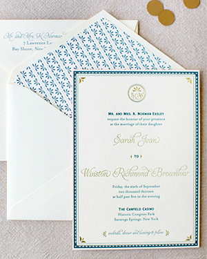
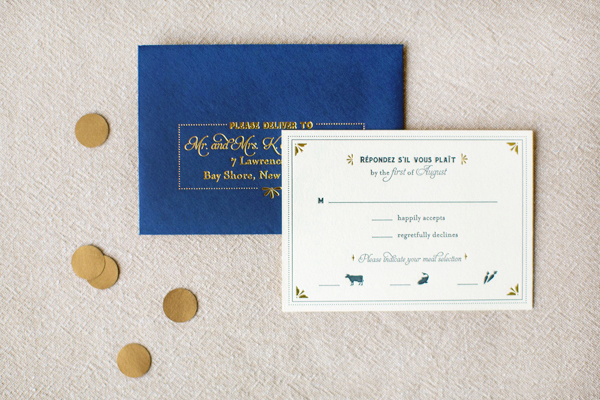
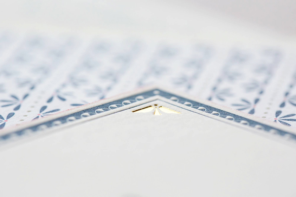
Sarah and Winston were inspired by the history and architecture of the Canfield Casino (once a casino, now the city’s preeminent event space and historical museum). The border on the letterpress invitation and certain design elements throughout the suite are reminiscent of the those architectural details.
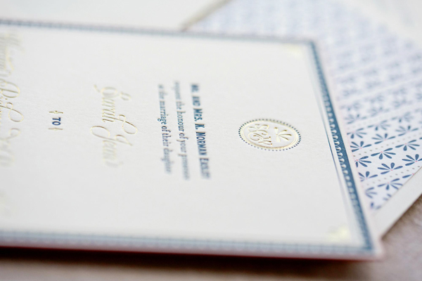
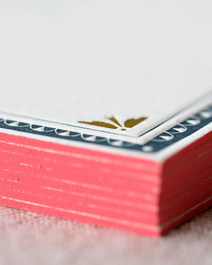
The envelope liner and coral edging adds a perfect pop of color! Mini information cards about the rest of the weekend were placed in a fun navy stripe and coral envelope.
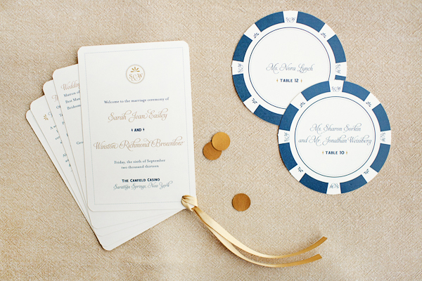
We continued the casino inspired theme, in an elegant way, into their day-of stationery items. Sarah and Winston’s ceremony program was shaped liked a deck of cards. On the back was a custom playing card design, with their monogram and design elements from the invitation incorporated into it. Their escort cards were shaped and designed to look like poker chips, displayed with dice glued on the back of each card so they would stand.
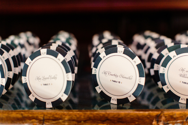
Photo Credit:Â Tracey Buyce Photography
Thanks Jenny!
Check out the Designer Rolodex for more talÂented wedÂding inviÂtaÂtion designÂers and the real inviÂtaÂtions gallery for more wedding invitation ideas!
Photo Credits:Â Elario Photography, except where noted