Purple and Gray Watercolor Wash Wedding Invitations

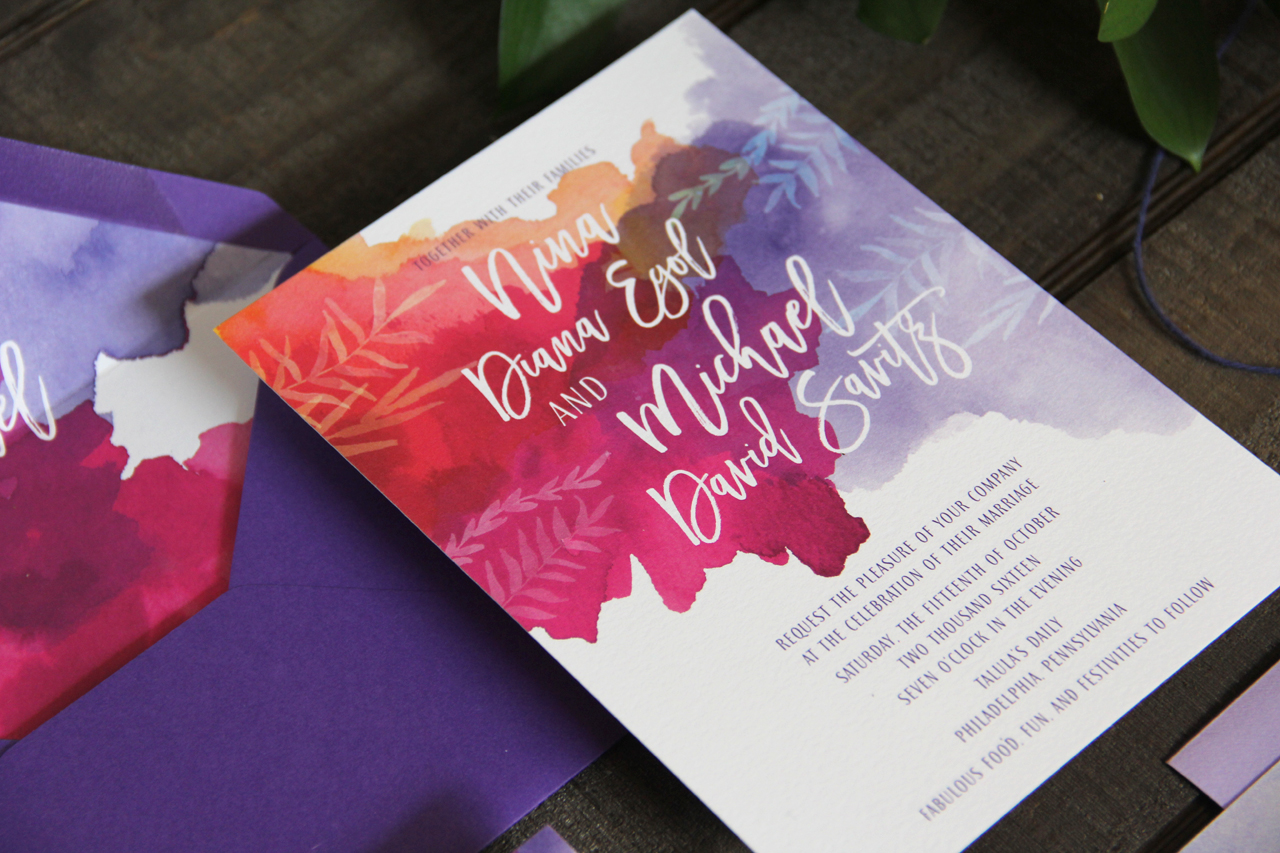
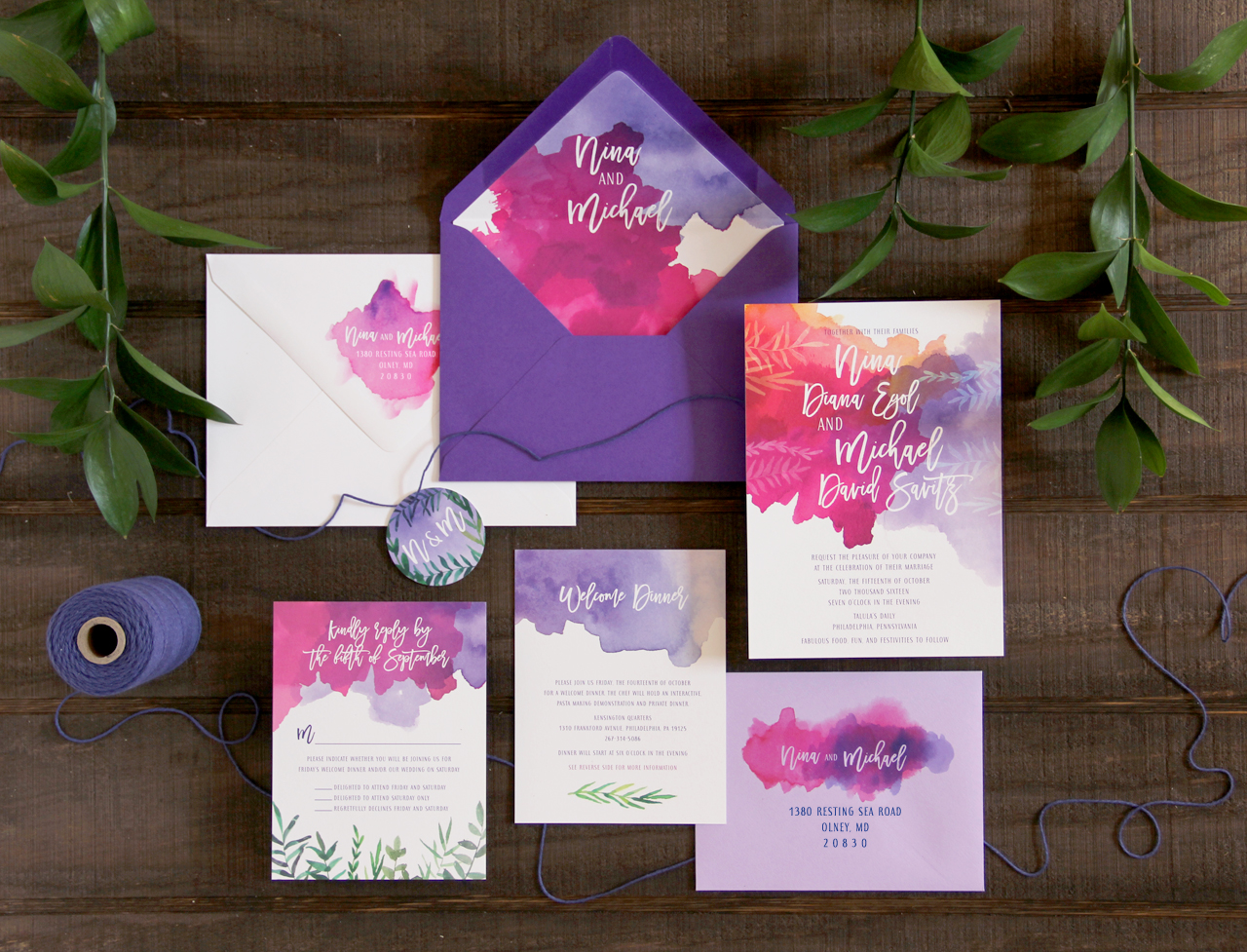
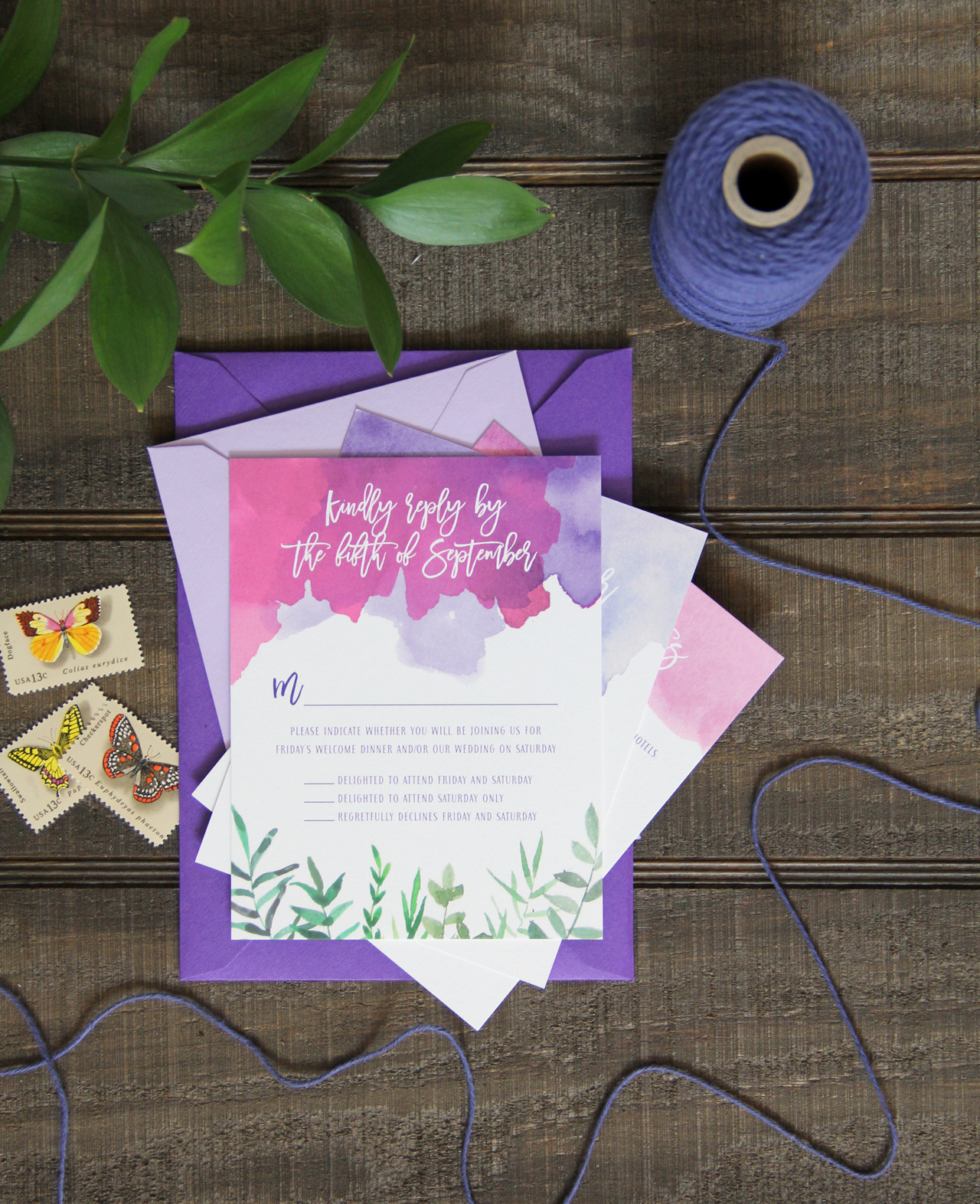
Watercolor and letterpress printing are such a fabulous combination. Lauren of Darling + Pearl designed these gorgeous purple and gray watercolor wash wedding invitations for a wedding in Philadelphia with the juxtaposition of hard and soft in mind. Other special touches, like the floral envelope liner, perfectly curated vintage postage, and the print of city hall, pull everything together in such a beautifully cohesive way!

Purple and Gray Watercolor Wash Wedding Invitations by Darling and Pearl

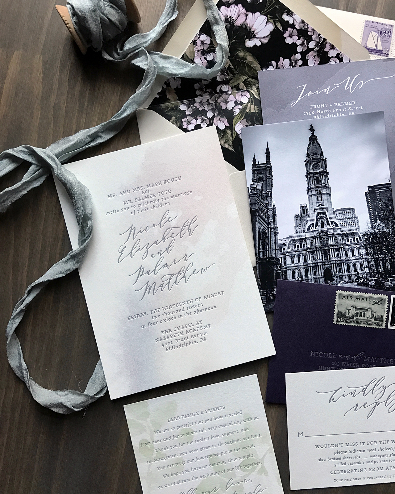
From Lauren: The inspiration for Nicole and Matthew’s wedding invitations was heavily drawn from their Philadelphia venue, Front + Palmer, a modern loft style venue in the city that was renovated from an old barrel factory. How rad is that? We wanted to emphasize the balance between masculine and feminine, hard and soft, and color and neutral (which is usually my aim as I piece together the elements of my work anyway, so it was definitely a win-win.)

Purple and Gray Watercolor Wash Wedding Invitations by Darling and Pearl

Purple and Gray Watercolor Wash Wedding Invitations by Darling and Pearl

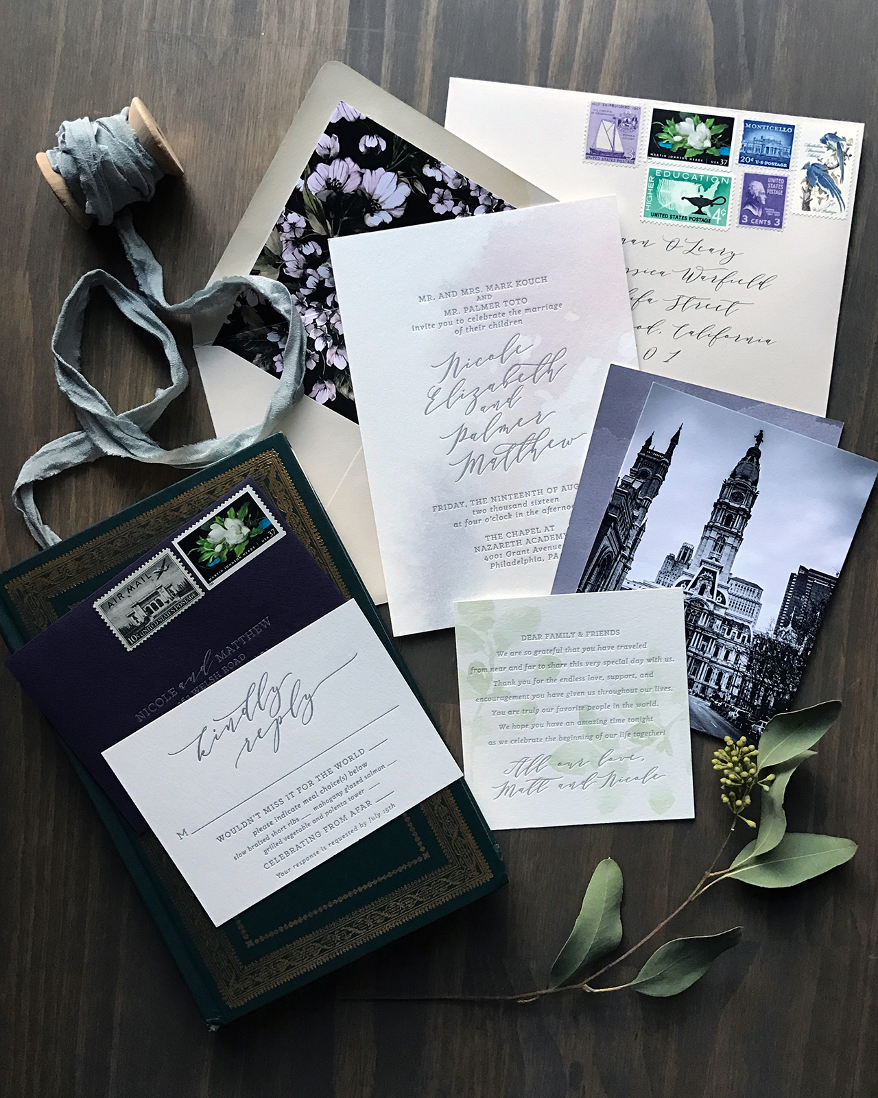
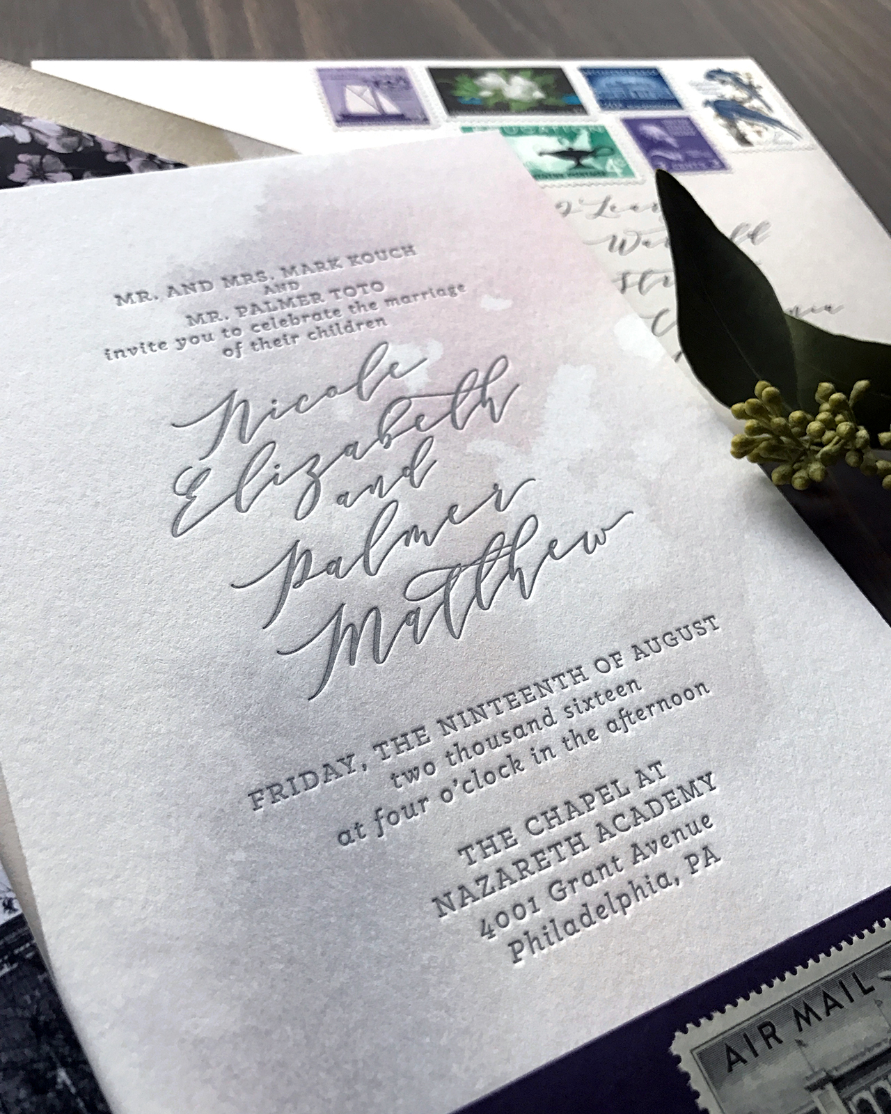
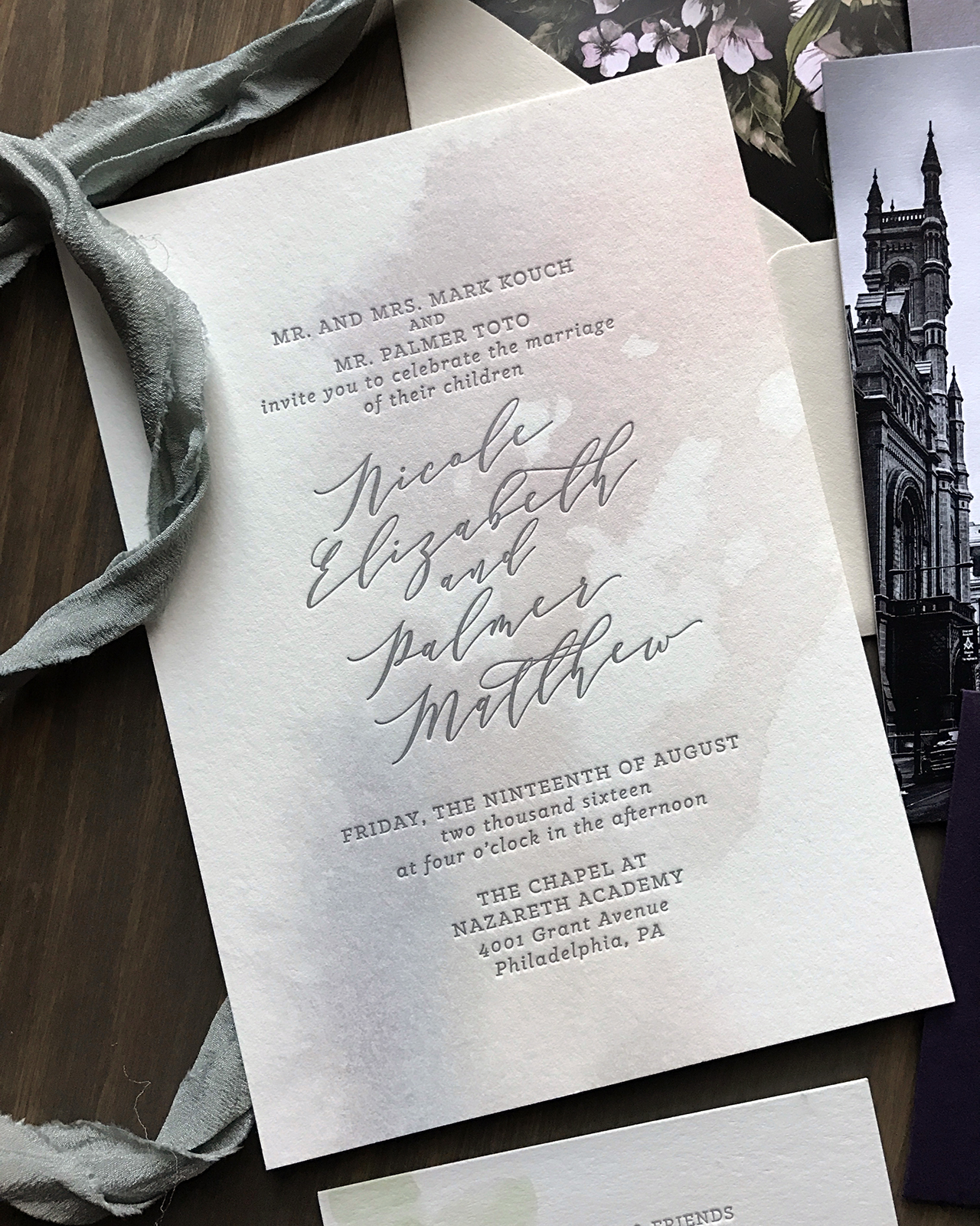
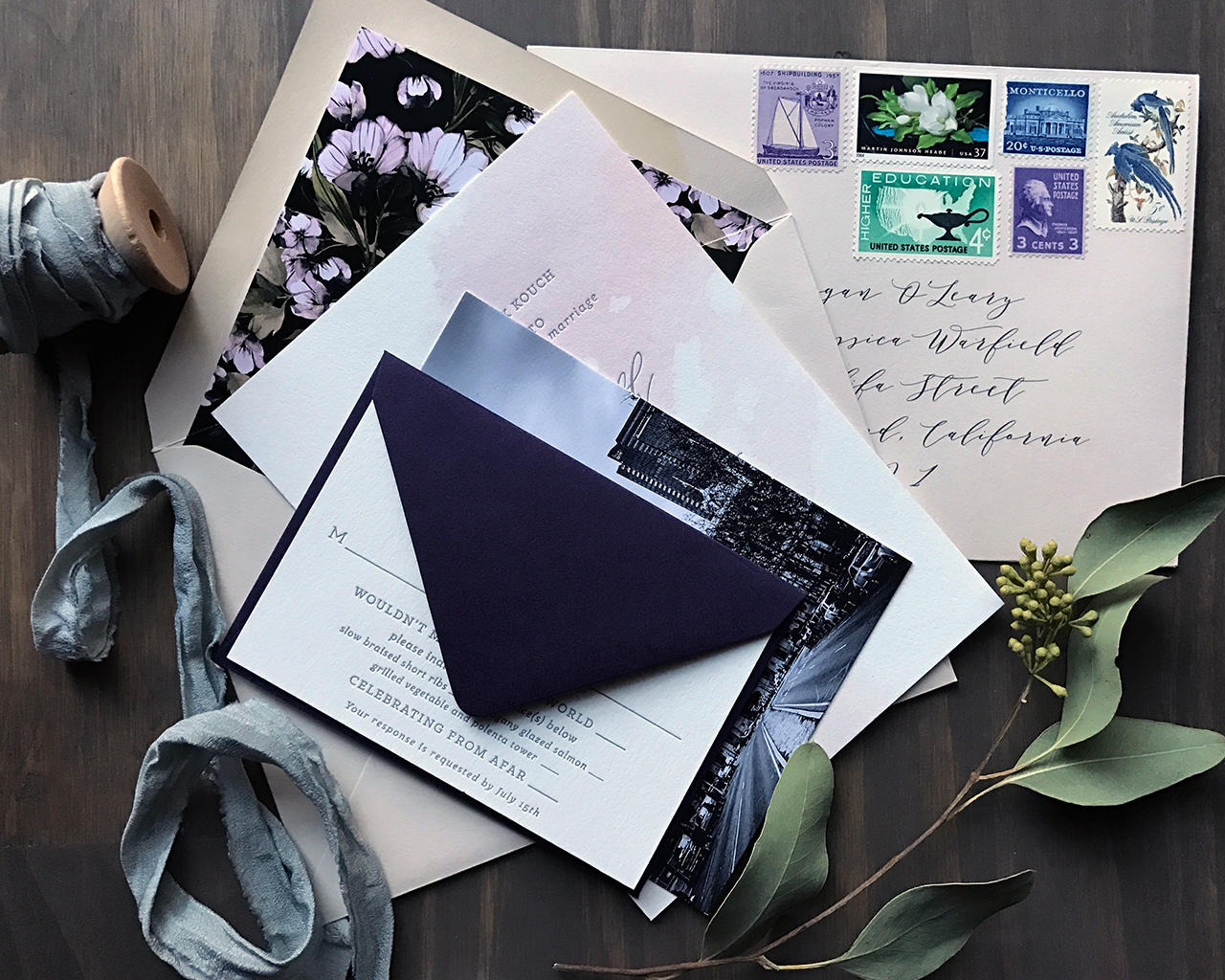
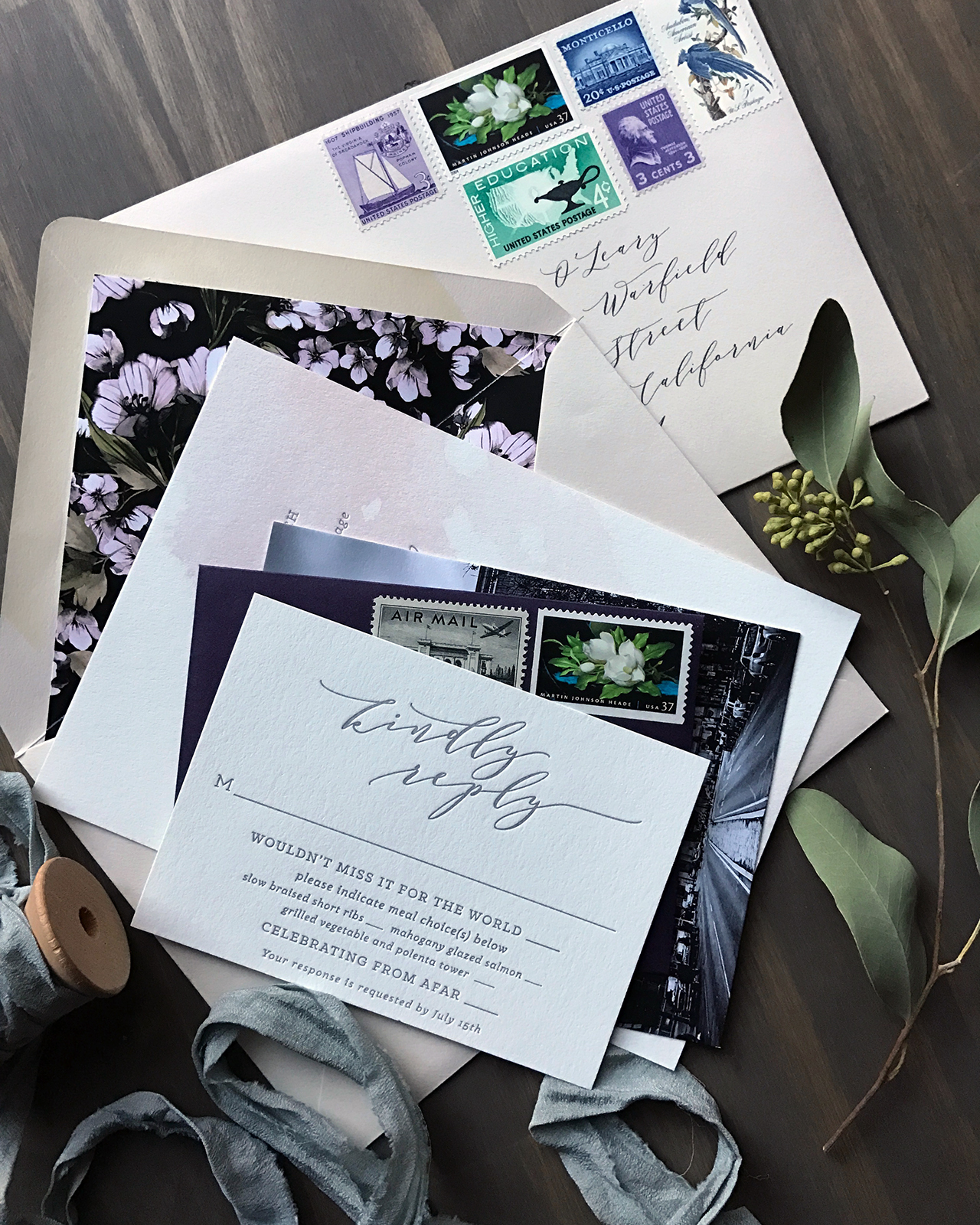
It was ridiculously fun seeing all these elements come together! The suite was letterpress printed in grey with varying watercolor elements throughout. The main invitation had a patina-esque background wash that picked up some of the lavenders from the STUNNING floral print envelope liner and the backside of the information card.

Purple and Gray Watercolor Wash Wedding Invitations by Darling and Pearl

Purple and Gray Watercolor Wash Wedding Invitations by Darling and Pearl

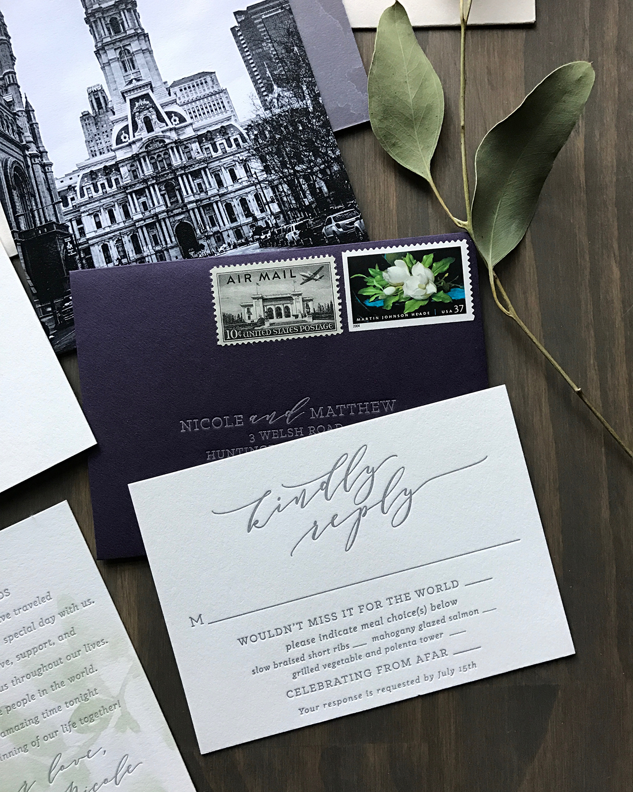
Nicole and Matt LOVED the idea of representing the city within their wedding stationery. We included a black and white print of iconic Philadelphia city hall that I’m sure has now made for an awesome keepsake for many of their guests. We used dark purple reply envelopes so we could letterpress print their return address in silver.

Purple and Gray Watercolor Wash Wedding Invitations by Darling and Pearl

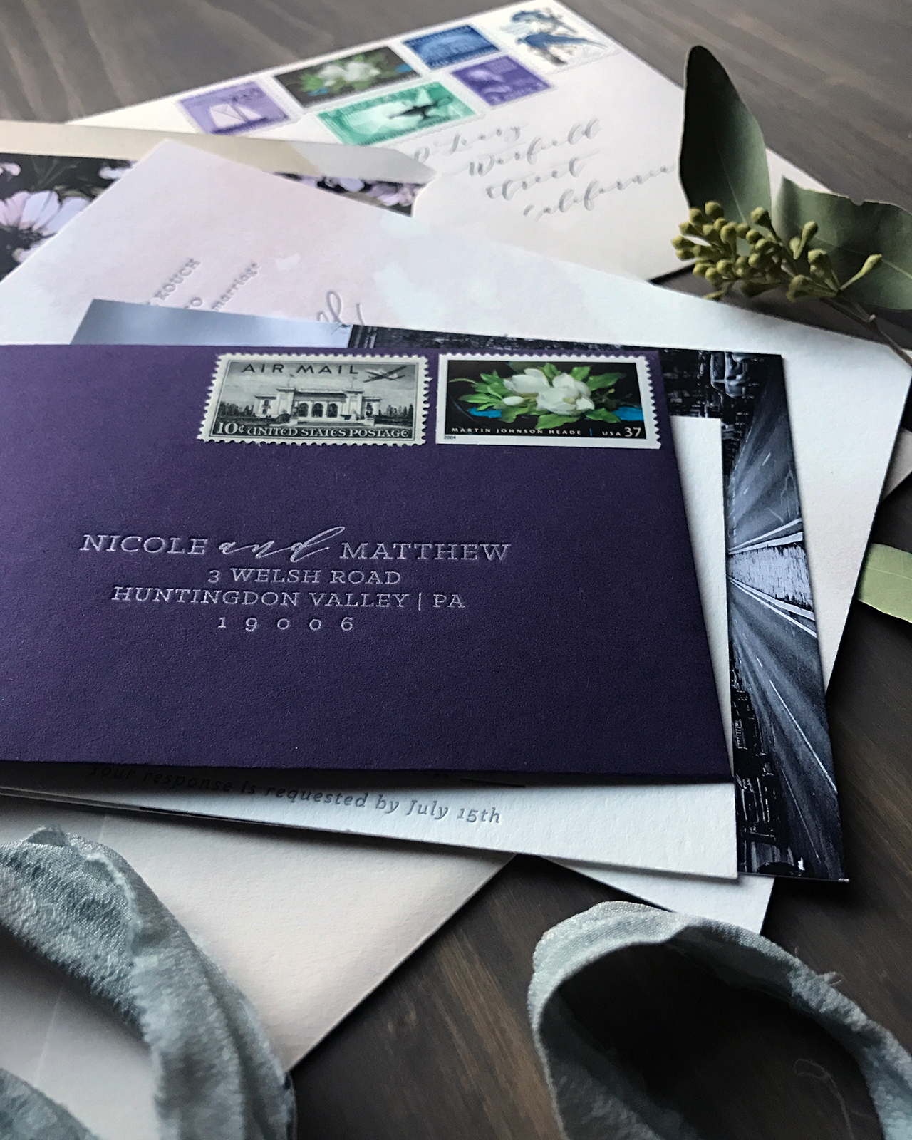
The icing on the cake for the invitation design was certainly the vintage postage we curated. Vintage stamps can really pull everything together even more when they’re chosen effectively. It’s really inspiring to check out all of the postage that’s still available out there.

Purple and Gray Watercolor Wash Wedding Invitations by Darling and Pearl

Purple and Gray Watercolor Wash Wedding Invitations by Darling and Pearl

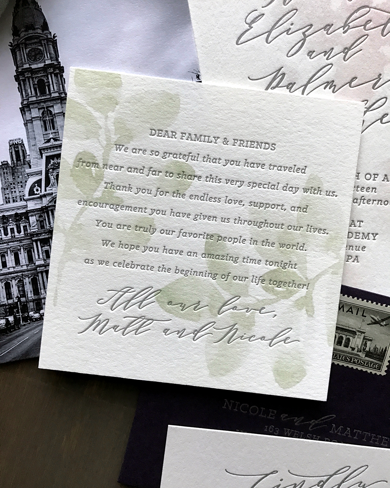
For their day-of stationery we letterpress printed small thank you notes that were placed at each table setting. Nicole and Matt were able to express a sweet sentiment to their guests and also introduced some new watercolor elements that lead back to the originality of their invitations, but in a refreshing and cohesive way.

Purple and Gray Watercolor Wash Wedding Invitations by Darling and Pearl

Thanks Lauren!

Design: Darling + Pearl

Darling + Pearl is a member of the Designer Rolodex – you can see more of their beautiful work right here or visit the real invi­ta­tions gallery for more wedding invitation ideas!

Photo Credits: Lauren Reed

2016 Gift Guide: For Designers, Artists, and Calligraphers

Today we’re sharing some gift ideas for designers, artists, and calligraphers! I started doing this guide a couple of years ago, after a very sweet husband sent an email asking for gift ideas for his wife. This year, Ashley Buzzy, Li Wardian, Emily from Hartland Brooklyn, and Katie from Odd Daughter Paper all sent over some fabulous ideas!

2016 Gift Guide: Gift Ideas for Designers, Artists, and Calligraphers

1. I’m obsessed with these shimmery iridescent calligraphy inks! They come in every color of the rainbow, but I’m loving iridescent coral, silver, and green.

2. This leather artist kit from Signora e Mare boasts six pockets to hold tools and instruments, while the convenient inkwell and carrier allow for those on-the-go projects and easy travel. Each kit is secured tight with a hand stitched strap.

3. The cutest hologram pencil case for corralling all those essential pens, pencils, and small tools.

4. Tom’s Studio makes the most unbelievably gorgeous copper calligraphy pen holders

5. Rich and radiant liquid watercolors for everything from brush lettering to watercolor illustration. The colors are available both individually and in three separate sets – Set #2 has beautiful earthy colors like indian red, sepia, and yellow ochre.

6. + 7. Handmade paper is an absolute treat for a calligrapher – and there are so many options these days! Arpa Handmade Paper (available in gorgeous shades of pale pink and lavender and envelopes with gorgeous deckled flap edges!), Share Studios (pictured in no. 6 above), Fabulous Fancy Pants, Signora e Mare, and Silk & Willow, just to name a few.

8. Blocks of watercolor paper will always be a welcome gift to any watercolor artist. Calligrapher and watercolor artist Li Ward recommends blocks of Fabriano and Arches cold press watercolor paper.

9. Pretty pink and navy blue pens for lovely stocking stuffers

10. These Ikea storage boxes are perfect for keeping track of small tubes of paint, brushes, and other small art supplies, according to Ashley Buzzy. Ashley uses her boxes to store paint tubes, brushes, washi tape, calligraphy pens, ink pots, and more.

11. This beautiful Japanese watercolor set comes with 36 color pans, including bright neons and shimmery metallics!

12. Every studio or home office needs a pretty candle. I’m a big fan of these Clementine + Clove candles from Sydney Hale Co., while calligrapher Li Ward recommends this Smoke on the Water candle for lettering sessions. Li says it smells romantic and mysterious like a haunted house!

13. A couple essential paper tools: a deckle edge ruler and transfer tape gun (with plenty of refills)

14. This paper & book press is definitely a high end item, but Ashley Buzzy says it’s the single most useful tool in her studio. From Ashley: With the textural type of projects that calligraphers are being asked to do more and more, it’s amazing for flattening out watercolor-washed paper and flattening folded place cards. When I gold leafed a large order of invitations I pressed them afterward in a stack to make sure the leaf was securely adhered. If I do brush lettering on a sheet and it warps the paper, I just press it for a couple of days to flatten it out. Sometimes I’ll press lined envelopes for a couple of hours to flatten them out, etc. It’s just so so so helpful!

p.s. If you’re handy, you could probably DIY your own paper & book press at home. I found a few options here!

15. These simple and modern notebooks by Iron Curtain Press are perfect for sketching, writing down ideas, and so much more.

16. This Italian wood desk set is a beautiful gift for calligraphers and brush lettering artists! I also love these wood block pen holders for designers, illustrators, and hand lettering artists.

A couple additional ideas:

Online workshops and classes make a wonderful gift for both aspiring and established artists. There are classes to fit pretty much any and every need and interest, from Stationery Biz 100 to Tradeshow Bootcamp webinars for stationers interested in developing wholesale collections, to calligraphy and watercolor classes on Skillshare, Brit + Co., Creativebug, and of course the Modern Calligraphy Summit!

For artists that enjoy working with music playing in the background, consider a Spotify or music streaming subscription.

This post contains affiliate links. By clicking on these links, you’ll help support Oh So Beautiful Paper while also purchasing some wonderful gifts. I only recommend products that I truly love and trust that you’ll love, too. My full disclosure policy can be found here.

Purple and Fuchsia Watercolor Wedding Invitations

I’m always on board for bold watercolor washes with vibrant colors, and these purple and fuchsia watercolor wedding invitations from Lea Robinson of Lattice Tree Studio are no exception. Lea paired abstract watercolor patterns with festive hand lettering to create this bright invitation suite. We’re loving the depth that the watercolor adds to the suite and the fun envelope liner that ties the whole suite together!

Purple and Fuchsia Watercolor Wedding Invitations by Lattice Tree Studio

From Lea: Nina and Michael wanted their invitations to reflect their personal style as well as their wedding venue. They were married at a restaurant in Philadelphia, Talula’s Daily, which has a pretty whimsical style. The restaurant has modern meets rustic decor, with beautiful wooden farm dining tables. The couple also wanted to incorporate bold colors in the design. To achieve this look, I hand painted bright watercolor swashes and paired these with some hand painted leafy elements to bring in that natural/rustic feel from the restaurant’s decor. The typefaces (sans serif and script) were carefully chosen to reflect this whimsical style.

Purple and Fuchsia Watercolor Wedding Invitations by Lattice Tree Studio

Purple and Fuchsia Watercolor Wedding Invitations by Lattice Tree Studio

The main invitation is printed front and back, with the couple’s names on the back overlaid on a bright watercolor wash. This watercolor wash is also used for the couple’s return address on the outer envelopes. Their invitation suite uses inner and outer envelopes so we could incorporate envelope liners that would be both functional and add an element of surprise for the guests. I often tell my brides that envelope liners only work when the guests actually have a chance to see the liners. Often times, if the liner is used on an outer envelope, the flap is sealed and when the guest opens the envelope, they rip it at the top seam. This causes them to miss the envelope liner entirely. To avoid this, we used inner and outer envelopes, making the inner envelopes a beautiful deep purple color that would add a pop of color to the suite.

Purple and Fuchsia Watercolor Wedding Invitations by Lattice Tree Studio

Purple and Fuchsia Watercolor Wedding Invitations by Lattice Tree Studio

The RSVP cards and the accommodations/welcome dinner cards also utilized different colors of watercolor washes as well as leafy elements. The couple was having a welcome dinner before the wedding day so they wanted to include information about that, as well as the accommodations on one card (printed front and back). To add even more interest to this bright invitation suite, we mix and matched the colors of the envelopes, so the response envelopes were a beautiful lavender. This variation in colors provided a nice contrast to the entire suite.

Purple and Fuchsia Watercolor Wedding Invitations by Lattice Tree Studio

To complete the suite and to hold all of the pieces together, a tag with the couple’s initials was tied around the entire piece. I hand painted all of the watercolor elements to create a truly one of a kind design for all of my clients.

Purple and Fuchsia Watercolor Wedding Invitations by Lattice Tree Studio

Thanks Lea!

Design: Lattice Tree Studio

Invitation Printing: Printswell

Envelope Printing: Indigo Ink

Check out the Designer Rolodex for more tal­ented wed­ding invi­ta­tion design­ers and the real invi­ta­tions gallery for more wedding invitation ideas!

Photo Credits: Lea Robinson

Oh So Beautiful Paper x Mixbook (and a giveaway!)

Well, this is an exciting day! I’m absolutely thrilled to announce my brand new collaboration with Mixbook: holiday photo cards! I’ve enjoyed working with Mixbook over the last year, including at this year’s Paper Party, and I was completely delighted when they invited me to create two designs as part of their Holiday Photo Card Collection! Today I’m sharing both holiday photo card designs with all of you, AND we’re giving a Mixbook credit to one lucky reader below!

Oh So Beautiful Paper x Mixbook Holiday Photo Cards

I wanted the cards to be able to serve as both holiday cards and New Year’s cards (since I can never get my own cards out before Christmas), and I wanted the design to appeal to those of you who might be looking for a fun and whimsical but decidedly non-traditional design. For the first design, the Mixbook team and I really wanted to capture some of the iridescent and holographic vibe from this year’s Paper Party back in May, with some sparkly gold elements and bold brush lettering for an extra dose of holiday cheer. The second design features a barely-there pink watercolor wash behind the photo with clean and modern type selections. They’re both available for purchase from Mixbook right here!

Oh So Beautiful Paper x Mixbook Holiday Photo Cards

Oh So Beautiful Paper x Mixbook Holiday Photo Cards

The cards are digitally printed on ethically sourced paper certified by the Forest Stewardship Council and the Rainforest Alliance on your choice of satin finish, signature matte, or premium paper and with the choice of square or rounded corners. You can even add in matching address labels and holiday gift tag stickers!

Oh So Beautiful Paper x Mixbook Holiday Photo Cards

The cards come with Mohawk 70 lb white envelopes with an option for pre-printed envelope addresses, but I couldn’t resist bringing in a few gorgeously calligraphed envelopes by Anne Robin Calligraphy.

Oh So Beautiful Paper x Mixbook Holiday Photo Cards

I had so much fun working with Mixbook to create this mini collection – I hope you love the designs as much as I do! To celebrate the new designs, we’re giving $50 Mixbook credit to one lucky reader that you can use for your own holiday photo cards! Just enter via Rafflecopter below!

a Rafflecopter giveaway

Romantic Gold Foil Calligraphy Wedding Invitations

We may be heading into winter, but Spring will always be my favorite season in my heart. I adore the combination of spring floral illustrations and  whimsical calligraphy in these romantic gold foil calligraphy wedding invitations by Kara Anne Paper. Kara designed this invitation suite for her own wedding and incorporated many meaningful nods to her family, including her new family crest and an illustration of her father’s home. What a special invitation suite that will certainly be treasured for a long time to come!

Romantic Gold Foil Calligraphy Wedding Invitations by Kara Anne Paper

Romantic Gold Foil Calligraphy Wedding Invitations by Kara Anne Paper

From Kara: Designing my own wedding invitation suite came easy! After finalizing our wedding style and color scheme, the late night invitation doodles began. Staying cohesive with all the paper details was important to me.

Romantic Gold Foil Calligraphy Wedding Invitations by Kara Anne Paper

Romantic Gold Foil Calligraphy Wedding Invitations by Kara Anne Paper

William and I wanted a chic backyard wedding filled with beautiful spring colors and a touch of gold accents. I felt introducing an original watercolor invitation cover was just the perfect touch for our gold foil calligraphy invitation. The invitation was printed on 220# Crane’s Pearl White Lettra with gold painted edges. We also included a tri-fold reply card with our new family crest on the front and an illustration of the ceremony location and reception venue. This design was letterpress printed on 110# Pearl White Lettra. Our special wedding suite was all tied together beautifully with silk blue ribbon and placed inside a Crane’s Royalty envelope. The front of the envelope was graced with gold calligraphy to match the invitation.

Romantic Gold Foil Calligraphy Wedding Invitations by Kara Anne Paper

Romantic Gold Foil Calligraphy Wedding Invitations by Kara Anne Paper

The wedding program was one of my favorites! The small booklet included a cover page with a pop-up illustration of my father’s house, where I was raised and where William and I first met. To tie the program back in with the wedding suite the cover was a blind embossed printed impression of the same floral pattern used on the invitation cover. Behind the pop-up, on the inside page was the illustration of the pond and dock where William and I exchanged vows. The pages that followed included the ceremony and wedding party details.

Romantic Gold Foil Calligraphy Wedding Invitations by Kara Anne Paper

Romantic Gold Foil Calligraphy Wedding Invitations by Kara Anne Paper

Although our rehearsal dinner was indoors we wanted it to have a fresh spring, outdoor feel. We had fresh flowers that matched the watercolor paintings used on both invitations. The invitation was placed inside a wood and glass box with preserved green moss laid nicely on the bottom. The top of the box included the guest names with a pretty blue silk ribbon tied around it. Our closest friends and family were invited so we wanted these invitations to be extra special and personalized.

Romantic Gold Foil Calligraphy Wedding Invitations by Kara Anne Paper

Romantic Gold Foil Calligraphy Wedding Invitations by Kara Anne Paper

Thanks Kara!

Design: Kara Anne Paper

Check out the Designer Rolodex for more tal­ented wed­ding invi­ta­tion design­ers and the real invi­ta­tions gallery for more wedding invitation ideas!

Photo Credits: Kara Anne Paper and Kim Box Photography