Real Invitations – Liesl & Jeremy, Part 2

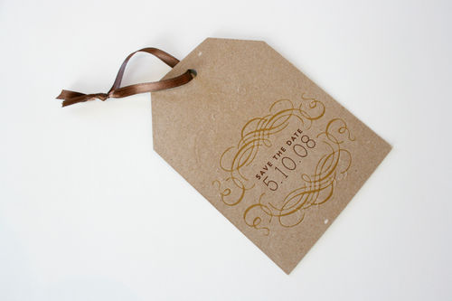
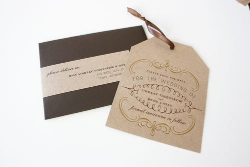
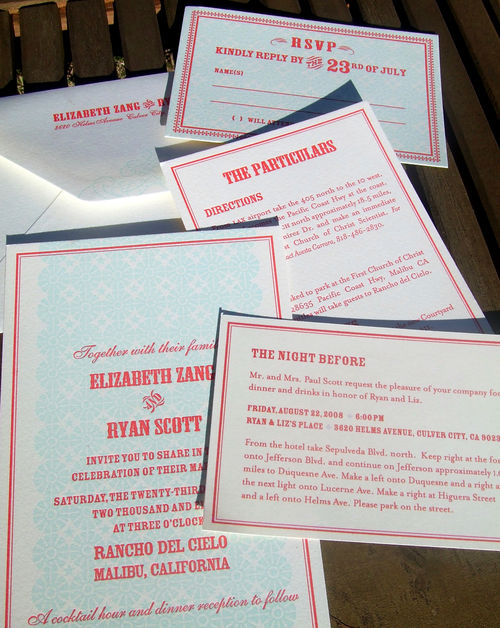
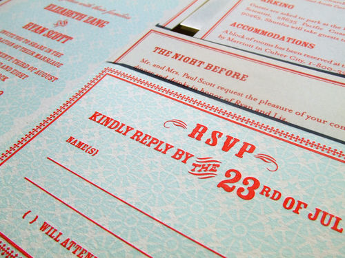
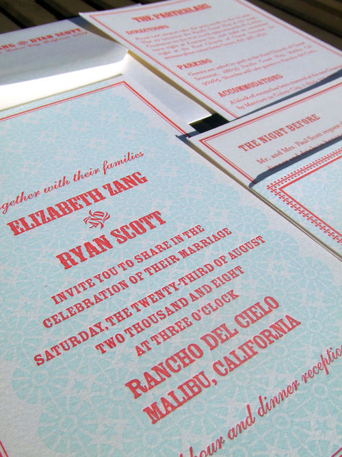
I'm back with more of the beautiful wedding paper ephemera from Liesl & Jeremy's gorgeous wedding, this time focusing on some of the printed wedding details and online material:

Despite a million other things to do, we decided to put a lot of time
into designing most of our own printed and online materials.  This was a
great collaboration, with Liesl having a ton of creative design ideas
and Jeremy with the computer and graphics skills to make it happen. 

It
also ended up being a key part of our wedding because it was through
all this stuff that our personalities really showed through – making
the whole wedding seem very us and very unlike a typical wedding.  Just
what we were going for!

In addition to the Save the Date postcards, the list of elements that Liesl and Jeremy co-designed is quite extensive:

Wedding web site
We spent a long time putting this all together and giving it the right
feel.  We wanted people to know this was a party, not a boring formal
occasion:

Picture 1


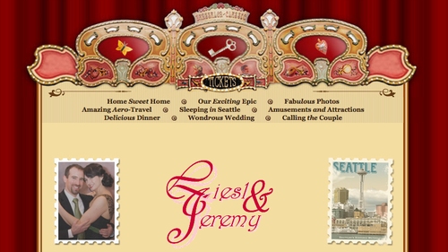
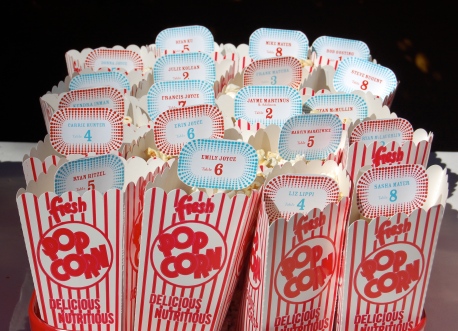
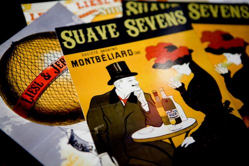
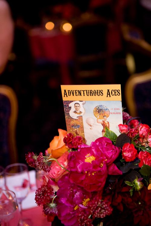
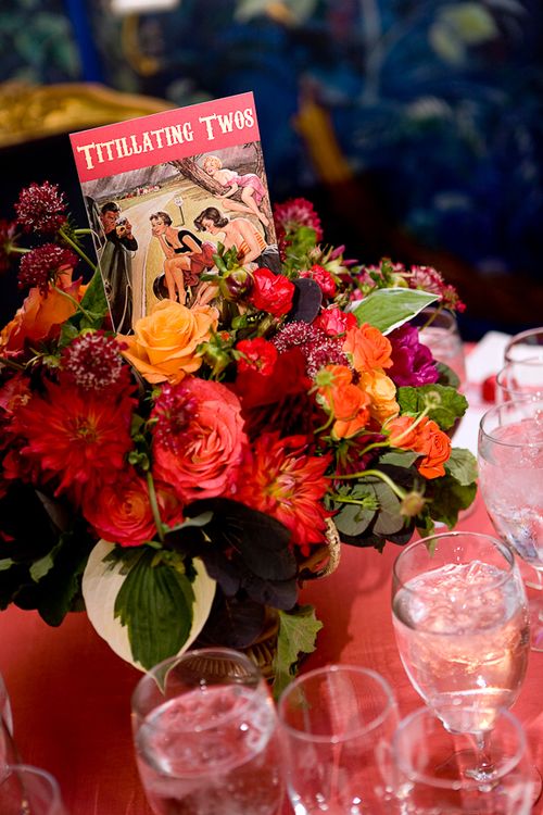
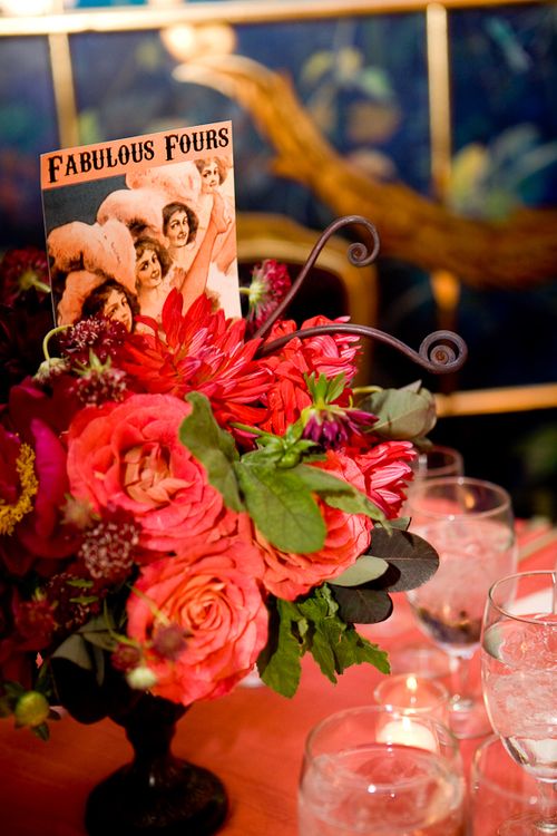
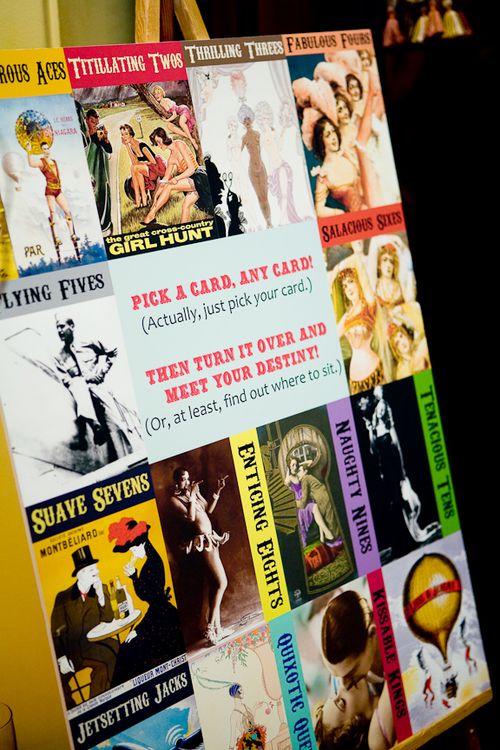
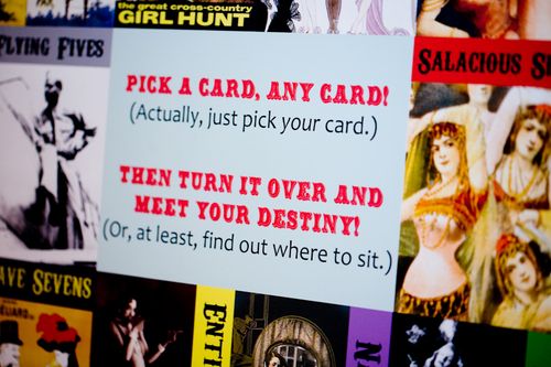
Table name cards.  Our reception had 13
tables which, coincidentally, is also the number of ranks in a standard
deck of playing cards.  We decided to name each table after a card rank
(Adventurous Aces, Quixotic Queens, Suave Sevens, etc.):

La Vie Photo15


We custom-designed each of the 13
cards that went on the tabletops, finding thematic photos to go with
each card.  This took a lot of work but was so worthwhile!

La Vie Photo25
 
La Vie Photo23 

La Vie Photo27

Escort playing cards.  First, we got
several decks of custom playing cards printed up.  We based it on a
print we found of a hot-air-balloon with someone's name on it; we photoshopped out the old name and replaced it with "Liesl and Jeremy." 
We also added a space to write each guest's name:

La Vie Photo28

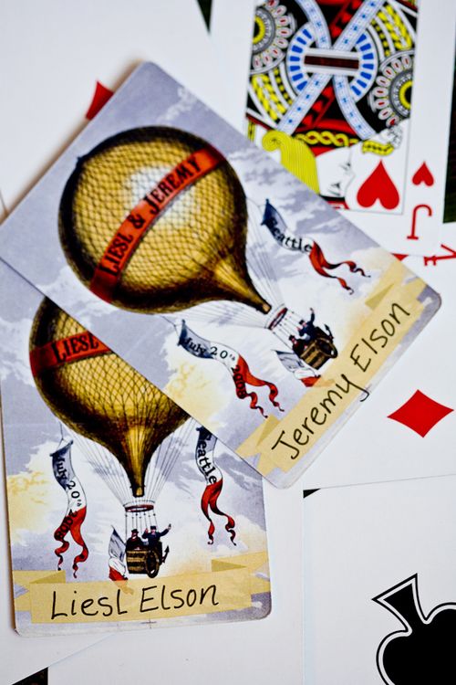
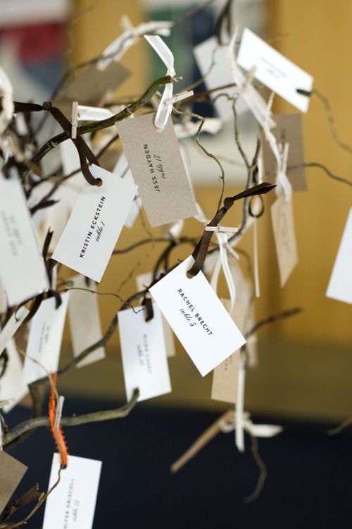
Seating Chart.  The guests would find
the playing card with their name on it and turn it over to reveal the
table where they would be sitting. 
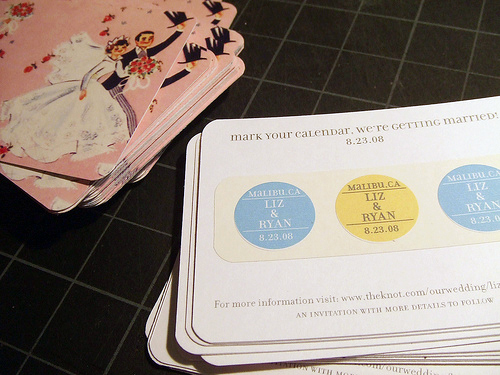
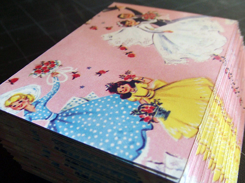
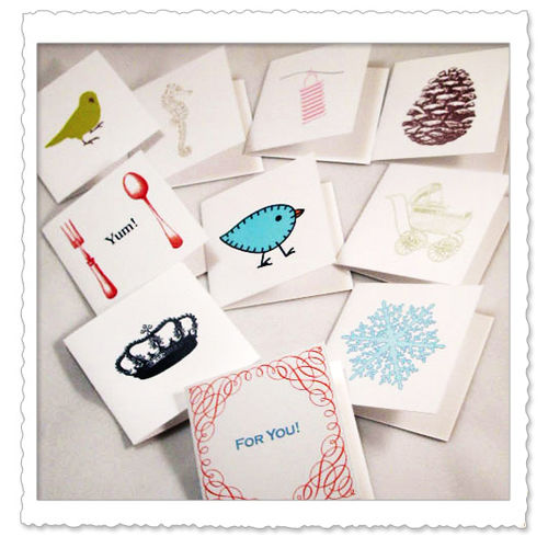
La Vie Photo31

La Vie Photo36

Postcards
for out-of-town guests.  Each guest received a gift basket with various
goodies (candies, champagne, etc.) and we also enclosed 2 postcards
with custom “Liesl and Jeremy" designs on them:

La Vie Photo14

Postcard 1

{bottom photograph by Liesl & Jeremy Elson}

Shuttle
information for out-of-town guests.  A simple sheet telling hotel
guests how to use the shuttle between the venue and the hotel; we
decided to print something beautiful and thematic rather than a boring
old photocopied black & white sheet:

Shuttle Info

{design by Liesl & Jeremy Elson}

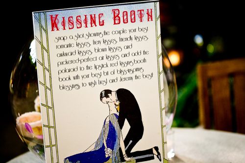
Kissing Booth Sign.   We designed a sign that directed people to our photo "kissing" booth to take their best kissing shot for us to put into our guest book:

La Vie Photo13

Now that you've seen all the photos – here's what Liesl and Jeremy said to say about the design inspiration behind their wedding ephemera:

We
didn't have one unifying inspiration for our wedding, but rather an
overall feel we wanted to create.  We really wanted to avoid any and
all "traditional" wedding themes and ideas because it seemed to us that
so many weddings get lost in formalities and trivial details that can
suck the joy out of the whole experience.  We also really wanted it to
be unique so we worked extra hard to break with tradition whenever
possible.  So we thought about what was most important to us for our
wedding and we decided that it should be stress-free, incredibly fun,
and wildly inappropriate.  A fabulous party for everyone help us
celebrate in style.
 

We drew most of our inspiration from
vintage French cabarets, burlesque and can-can dancers, the sensational
larger-than-life circuses of the 1920's and 30's, and a bit of the Mad
Hatter's tea party to keep things interesting and unexpected.   We had
so many subtle inspirations, many of them very different from each
other, but all with the common art deco theme, even my vintage 1920's
wedding ring.  We wanted to do the same for our music so we hired a
traditional Klezmer band (accordion, clarinet, brass) to evoke the
exotic gypsy-esque music played for Jewish wedding celebrations in the
1920's.  We chose The Ruins for our venue so it could feel like we'd
descended into our our rabbit hole to a rare undiscovered place. The
backdrop of The Ruins provided a vibrant, eccentric and timeless
setting, and like us, a bit over the top with a few surprises.


We picked out mostly art deco styled ephemera to keep with the classic
vintage feel, but made sure to use the sauciest and most amusing
artwork we could find to create a really wildly entertaining
atmosphere.  We wanted to be sure that everywhere our guests looked,
they'd want to laugh and remember that we aren't following any
proscribed set of wedding rules or etiquette, we aren't taking
ourselves too seriously, and we clearly want people to have a good time
WITH us, not around us.

I hope you've all enjoyed Liesl & Jeremy's wedding ephemera as much as I've enjoyed sharing it with you!  I love how every design element just oozes a sense of fun and playfulness – while still maintaining a cohesive design approach!  For more photos from Liesl & Jeremy's gorgeous wedding, check out the La Vie Photography blog here and here.  Thank you so, so much to Liesl and Jeremy for sharing their designs with us – and to Kim at La Vie Photography for sending over so many gorgeous photographs!

{unless noted otherwise, all photographs by La Vie Photography}

Pretty Yellow Place Cards

I’m such a sucker for place cards and escort cards – I just love them!  And I just about squealed when I saw these fun and sunny yellow escort cards, from this gorgeous wedding over at the Bride’s Cafe yesterday:

The combination of yellow + use of an old door as a display is just perfect for a summer wedding.  And I’m totally digging these flowers as well:

Love it.  Lots more right here.

{photos by Beaux Arts Photographie via The Bride’s Cafe}

Lindsay + Ryan’s Kraft Paper + Gold Wedding Invitations

I completely fell for these beautiful letterpress wedding invitations and Save the Date from SeeSaw Designs during Angela Hardison‘s guest posts on Black*Eiffel.  The invitations were designed and printed for and by one of SeeSaw’s own designers, Lindsay Tingstrom-Casey:

Seesaw_letterpress1

Luckily for me, Lindsay was kind enough to both send over a few additional photos of her invitations and share some of the inspiration behind the design.  Let’s start with the initial inspiration.

From Lindsay: We were married at the Phoenix Art Museum, a beautiful modern space.  The building itself focuses on a lot of natural, raw materials, and we wanted to continue that feeling with the invites themselves. Our colors included brown, cream, orange and yellow.

Pam_lcentral_sm

346

And now for the invitations!

The contrast between roughness of the natural kraft paper material and the clean crispness of the Lettra was really appealing to us. We knew we wanted the invite to have three pieces, so the chocolate enclosure was a perfect solution.

Invite3

The blind deboss on the enclosure’s belly band was totally a happy accident – I had no idea it would be legible without ink, but lo and behold, it worked!

Invite1

Invite2

Lindsay printed both the accommodation enclosure from her invitations and her ceremony programs on thick chipboard:

Invite4

Invite7

A couple detail shots of Lindsay’s Save the Dates:

Invite5

Invite6

Lindsay also carried the design elements from her invitation suite over to her escort cards and table numbers and printed them on similar material to the Save the Dates and accommodation card:

391

513

The letterpress that we used to print my invitations, a Kluge, was a recent addition to Seesaw’s studio.  We already had a C&P when the Kluge came to us, and this was actually the first job we printed on it.  Talk about pressure!  Our prior letterpress experience was limited, but it all worked out for the best.

I hope everyone has enjoyed Lindsay’s invitations as much as I have!  Thanks so much Lindsay, for sharing your beautiful wedding invitations and inspiration with us!

Check out the Designer Rolodex for more tal­ented wed­ding invi­ta­tion design­ers and the real invi­ta­tions gallery for more wedding invitation ideas!

{images via Lindsay Tingstrom-Casey and SeeSaw designs}

Liz + Ryan’s Modern Americana Wedding Invitations

I first came across these lovely invitations while browsing through one of my favorite blogs, Parcel Post.  Luckily, Audrey (the author behind Parcel Post) is good friends with the bride, Liz, and put us in touch so that Liz could share the inspiration behind her invitations.   Liz and Ryan’s invitation suite included the stand-alone invitation, enclosures with accommodation information, directions, and a rehearsal dinner invitation, as well as a matching RSVP card:

red-blue-modern-letterpress-wedding-invitation

From Liz: It was important to us that our wedding felt personal, relaxed and fun – that was our inspiration behind the invitation design. We choose a favorite color combination of red and turquoise because it feels fresh and fun and like summer; it also was perfectly suited to the ocean view at our venue.

red-blue-modern-letterpress-wedding-invitation

The design of the invite was celebratory and informal, signaling the laid back vibe of our wedding.  We worked with our stationer Audrey Woollen at Urbanic in Venice, CA, to order the Classic Cowboy invitation design from the Hello! Lucky letterpress studio.  Audrey is the consummate professional and the entire process was a breeze.

red-blue-modern-letterpress-wedding-invitation

For our escort cards we put name and table number on a stick inside little boxes of kettle corn.  They doubled as our wedding favors.  On the reverse side of the card was one of 10 different shots from our engagement session.  These were a big hit as they served as a take away reminder of the day as well.

red-blue-modern-letterpress-wedding-invitation-Escort-Card

red-blue-modern-letterpress-wedding-invitation-escort-cards
{escort card photos by Viera Photographics}


{photos by Audrey Woollen}

Liz also sent a couple of photos of her Save the Date postcards, which I couldn’t resist sharing as well:

red-blue-modern-letterpress-save-the-date

red-blue-modern-letterpress-save-the-date

I love all the details – from the red and pool color palette to the popcorn bag escort cards, this seems like such a fun and relaxed wedding!  For a couple more pictures from Liz and Ryan’s wedding, be sure to check out Audrey’s post on Parcel Post.  And thanks to Liz for sharing her invitations!

Check out the Designer Rolodex for more tal­ented wed­ding invi­ta­tion design­ers and the real invi­ta­tions gallery for more wedding invitation ideas!

{all photos by Liz Zang, unless noted otherwise}

Weekly Link Round-Up

AlysonFox-DesignSponge
{my favorite image of the week – from Alyson Fox’s wedding via Design Sponge}

This has been a busy week in paper goods, so grab a cup of coffee or tea or chai and let’s get started!

Gig
  • Beautiful prints by Clare Rojas via Dear Ada
  • An inspired First Birthday in a Box set by City Bird Design via Inspired Goodness
  • Don’t forget to check out all the DIY projects this month over at EAD!
  • This week was all about Save the Date designs at Brooklyn Bride
  • A new letterpress invitation suite is available at Laura Hooper Calligraphy
  • VintageGlam tells us where to find free Art Deco fonts
  • {ritzy bee} loves escort cards
  • Wedding Paper Divas is offering a special discount on Blurb books – but only until November 30!
  • More lovely work by Bird & Banner over at OnceWed

That’s it for this week — I hope everyone has a wonderful weekend!