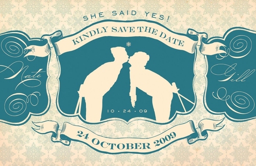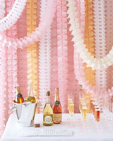
Image from Martha Stewart Weddings
Hello, guys! It's Maddy from the Inspired Bride again, popping in once more to cover for Nole while she's out.
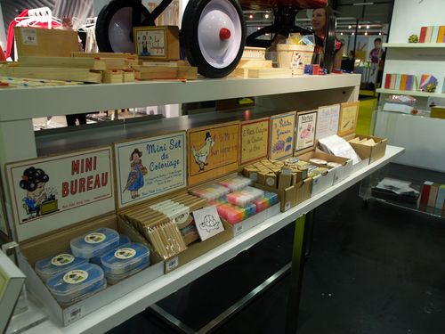
Slowly but surely, I'm starting to see more and more couples stop thinking about paper details in their weddings as favor tags and programs. I'm obviously thrilled about this emerging trend, as a paper fan girl and as a wedding blogger always looking for fresh ideas for her budget-minded readers. Martha showed us how to blow it out with her fantastic paper decor wedding in this summer's issue of Martha Stewart Weddings, but not all of us have a host of stylists at our command to help us decide when we're crossing that really fine line between "fashionable" and "five year old's birthday party". Here's some thoughts I have, from a full time art director's perspective:
Choose a sophisticated color palette. It sounds obvious, but it's important. I think the fact that the image from Martha above is toned down in color and uses picks from a similar family with fresh pops of white helps it read more "classy festive". That's not to say you can't use bright colors, but think about editing – for example, your color palette may be the oh-so-hip red, white and aqua, but if you use all three colors, your guests might start wondering where the Patriotic Pin the Tail on the Donkey is. Instead, consider the aqua and white only – calm and refreshing, and still ties in. If you're looking for more depth, consider using a similar color like a deeper aqua shade in the case of the example scenario.
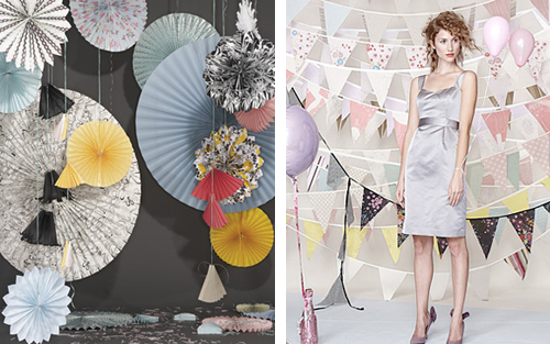
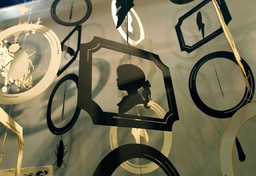
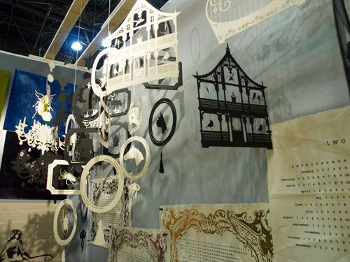
Image from Rebecca Thuss for Simple Silhouettes
Play with scale shifts. Bigger isn't always better. Try incorporating paper decorations in similar shapes but different sizes to add variety and texture without going overboard. The change in size will help break the decor apart visually, too, so it won't be aesthetically overwhelming.
Layer. While it's true you don't want to go overboard, it's not good to underwhelm either. I think the best example is Martha's wall of paper garlands in pink, peach and white above – if you have only a few hanging up, they'll look like sad little streamers. Layered the way they are, they start to mesh together and become an interesting visual of color and texture. You stop reading them as paper garlands and start seeing them as more abstract forms. In the case of Rebecca Thuss' bunting set she did for Simple Silhouettes, the dynamically strung layers helped break up the strong graphic quality of the flag shape that helps make it look surprisingly sophisticated and festive.
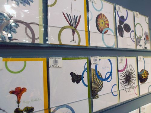
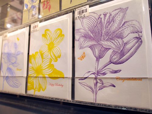
Don't be afraid to incorporate pattern. To take it to another level, try using papers with prints on them. Solids are great staples, but to add a little more personality and to take it one step further away from the dreaded "birthday party aesthetic", try bolder, modern patterns that tie back into your event.