Stationery Inspiration: Mixing Vintage Postage

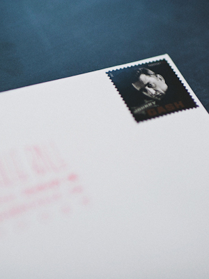
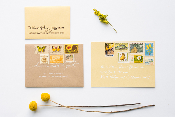
I’m a big big fan of using vintage postage stamps on everything from wedding invitations to baby announcements. So when Cara from Underwood Letterpress and Anne Robin Calligraphy sent over a few tips for mixing vintage postage to create little art collections on your envelopes, I couldn’t resist! These envelopes definitely make an impression and, especially when combined with stunning calligraphy, are a beautiful keepsake for the recipients!

How-To-Mix-Vintage-Postage-Underwood-Letterpress-Anne-Robin-Calligraphy-Pink-and-Beige

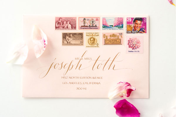
From Cara of Underwood Letterpress: Your wedding invitation sets the tone for your special event. The vintage postage on these envelopes takes first impressions to the next level by mixing genre, color and technique. Here are a few tips for ways to turn your outer envelope in to a piece of art that will leave a lasting impression!

How-To-Mix-Vintage-Postage-Underwood-Letterpress-Anne-Robin-Calligraphy-Sweet-Pea2

Don’t Be Afraid of Color!
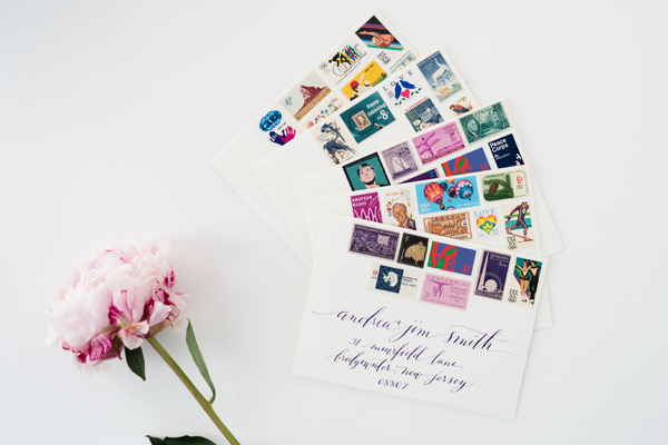
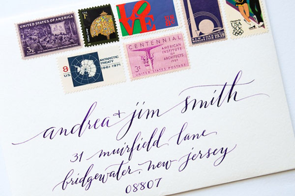
Pops of color are essential to any design palette. Go bold with these fun and out there envelope designs. Mixing traditional design with Pop Art never looked so good. Each of these fabulous postage collages in the “In Love” line come with an eclectic mix of vintage postage plus a special Love stamp to celebrate the occasion!
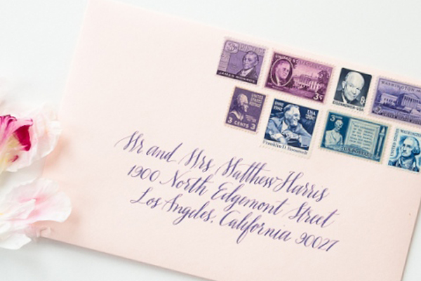
How-To-Mix-Vintage-Postage-Underwood-Letterpress-Anne-Robin-Calligraphy-Love

How-To-Mix-Vintage-Postage-Underwood-Letterpress-Anne-Robin-Calligraphy-Love2

Tone on Tone
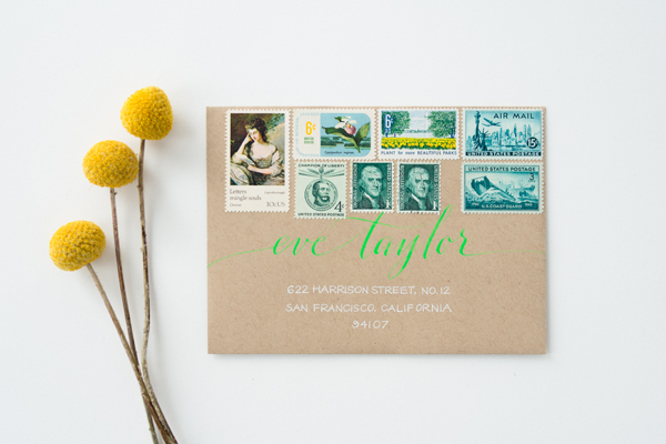
Tone on tone is all the rage this season and there is no better way to maximize your wedding colors than by using multiple shades of your favorite hues. Check out these vintage postage collages with purple tones, blues and greens. Your guests might just decide to put these envelopes in a frame.
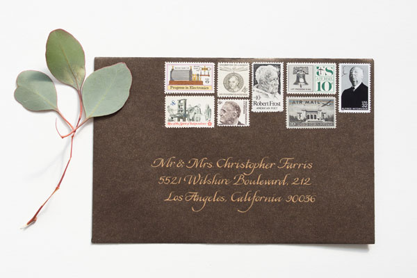
How-To-Mix-Vintage-Postage-Underwood-Letterpress-Anne-Robin-Calligraphy-Black-Tie

How-To-Mix-Vintage-Postage-Underwood-Letterpress-Anne-Robin-Calligraphy-Golden-Sunshine

How-To-Mix-Vintage-Postage-Underwood-Letterpress-Anne-Robin-Calligraphy-Plum

How-To-Mix-Vintage-Postage-Underwood-Letterpress-Anne-Robin-Calligraphy-Something-Blue

Mix Your Mediums
Try mixing techniques on your envelopes with this beautiful watercolor calligraphy design. The watercolor adds a whimsical touch while the modern address provides the perfect amount of juxtaposition.

How-To-Mix-Vintage-Postage-Underwood-Letterpress-Anne-Robin-Calligraphy-Sweet-Pea

Vintage Postage: Underwood Letterpress

Calligraphy: Anne Robin

Photography: Stephanie Collins Photography

Ariel’s DIY “I Love Lucy” Baby Shower Invitations

Seattle-based designer and photographer Ariel Nay is expecting her first child – a baby girl! – this spring. The proud parents have already decided to name their daughter Lucy, so an “I Love Lucy” themed baby shower seemed like the perfect fit. Ariel DIY’d the invitations using some sparkly cardstock, a couple of rubber stamps, and a whole lot of love.

I-Love-Lucy-Heart-Baby-Shower-Invitations-Ariel-Nay

From Ariel: My fiancé and I are expecting our first child this March and recently had her baby shower. We’ve already named her Lucy Mae Lewis and felt an ‘I Love Lucy’ Baby Shower was more than appropriate.

I-Love-Lucy-Heart-Baby-Shower-Invitations-Ariel-Nay8

While I would have loved to have it all professionally printed, I took my small budget and made most of it by hand. After reflecting on the original ‘I Love Lucy’ logo, I wanted to give it a more delicate typographic update. Using the typeface Nelly Script, I designed the ‘I Love Lucy’ and ‘Lucy Mae Lewis’ and had them made into stamps using Simon Stamps. I purchased shimmering red and gold cardstock at Michaels and had the invitation text printed on white cardstock at Staples.

I-Love-Lucy-Heart-Baby-Shower-Invitations-Ariel-Nay3I-Love-Lucy-Heart-Baby-Shower-Invitations-Ariel-Nay4

Then, I used a spray mount to adhere the black and white printed text to the shimmering red paper, cut the hearts by hand and stamped the script type on the front and back. For the smaller gold hearts, I used a heart die-cutter and gold paper clips to attach the heart and Diaper Raffle note to the invitation.

I-Love-Lucy-Heart-Baby-Shower-Invitations-Ariel-Nay9

I-Love-Lucy-Heart-Baby-Shower-Invitations-Ariel-Nay12

In total, I kept right with my $100 budget that made me 35 invitations and the entire project took about 12-15 hours. I would still say hiring a professional printer is an excellent option as they can produce results you just can’t mimic, but it also felt good to make most of this special project with my own two hands.

I-Love-Lucy-Heart-Baby-Shower-Invitations-Ariel-Nay10I-Love-Lucy-Heart-Baby-Shower-Invitations-Ariel-Nay13

The envelopes we ordered from Envelope Mall, the addresses were handwritten, Johnny Cash forever mailing stamps were used as they seemed to fit the era, and lastly, each letter sealed with a self-made, lipstick kiss.

I-Love-Lucy-Heart-Baby-Shower-Invitations-Ariel-Nay2

Thanks so much Ariel – and congrats!

Photo Credits: Ariel Nay

Chrystal + Brendan’s Magnolia Bloom New Orleans Wedding Invitations

I’ve never been to New Orleans, but between the food and the music I’d love to visit one day! Monique from Metal Doily Press sent over these invitations created for a wedding in New Orleans and incorporating several iconic images from the Crescent City. Printed in bright teal and cool gray, the invitations feature a classic magnolia bloom throughout the suite, from the save the dates to post-wedding thank you cards!

NOLA-New-Orleans-Custom-Wedding-Invitations-Metal-Doily-Press

From Monique: Chrystal and Brendan wanted to welcome their guests to New Orleans before they even set foot in Louisiana by hinting at elements of their big day in their wedding invitation suite.

NOLA-New-Orleans-Custom-Wedding-Invitations-Metal-Doily-Press8

The save the dates provided the first opportunity for Chrystal and Brendan to combine their different creative thoughts into one project. They started with the vintage postcard concept and worked out from there. The popular Big Easy phrase “Laissez les bons temps rouler!” captured the intended spirit and required prominent placement on the front. Chrystal’s choice of a magnolia in bloom was also a running theme that started on this collaboration. The fonts were meant to join the jazz character of the city and the vintage theme.

NOLA-New-Orleans-Custom-Wedding-Invitations-Metal-Doily-Press2

On the main invitation, Chrystal had a clear vision of the focal point being the gorgeous magnolia flower. The couple enjoyed the idea of having it appear as both an ampersand between their names and as a contrast to the text. Letterpress printing the two color invitation brought out the tactile details of the illustration. The romantic Heraldica font presented their names in a stylistic contrast to the use of Copperplate below. I printed in teal and cool gray on Cranes Lettra 110 lb stock in Pearl White.

NOLA-New-Orleans-Custom-Wedding-Invitations-Metal-Doily-Press5

The letterpress printed single color thank you cards were designed to be as bold and sincere as possible. It combined the magnolia bloom again with the Heraldica font in teal. Brendan loved the font. Chrystal loved the color.

NOLA-New-Orleans-Custom-Wedding-Invitations-Metal-Doily-Press11

Thanks Monique!

Metal Doily Press is a member of the Designer Rolodex – you can see more of their beautiful work right here or visit the real invi­ta­tions gallery for more wedding invitation ideas!

Photo Credits: Bobby Lee Photography

Carly + David’s Glamorous Coral and Gold Foil Wedding Invitations

Designer Alisa Bobzien sent over these wedding invitations that she recently created using one of my favorite color palettes: coral, gray, and gold foil. So classic, right? Created for a glamorous wedding in Michigan, the invitation suite includes several complementary patterns, botanical details, and of course some shiny gold foil. So pretty!

Coral-Gold-Foil-Glam-Wedding-Invitations-Alisa-Bobzien4

From AlisaI created this custom invitation suite and day-of print material for a glam autumn Michigan wedding. The ingredients for this design were a range of coordinating custom patterns, a botanical element as a nod to their venue (the Planterra Conservatory), and a honeycomb pattern because the groom is a beekeeper and honey maker in Brooklyn.

Coral-Gold-Foil-Glam-Wedding-Invitations-Alisa-Bobzien

I worked closely with the event designer Viva La Diva Events, who provided art direction. The invitation suite was printed on double-thick luxe cotton savoy paper with gold foil stamping, and included printed envelope liners featuring a custom pattern that coordinated with the gold motif border of the dinnerware.

Coral-Gold-Foil-Glam-Wedding-Invitations-Alisa-Bobzien2

Coral-Gold-Foil-Glam-Wedding-Invitations-Alisa-Bobzien3

Coral-Gold-Foil-Glam-Wedding-Invitations-Alisa-Bobzien6Coral-Gold-Foil-Glam-Wedding-Invitations-Alisa-Bobzien10

Coral-Gold-Foil-Glam-Wedding-Invitations-Alisa-Bobzien7

Many of the guests were also from out of state so we highlighted the bride and groom’s favorite local destinations with a custom illustrated map that was included in the hotel welcome bags.

Coral-Gold-Foil-Glam-Wedding-Invitations-Alisa-Bobzien8

Coral-Gold-Foil-Glam-Wedding-Invitations-Alisa-Bobzien5

I also designed thank you notes, a welcome itinerary, signage, programs, dinner menus, cocktail menu, favor stickers, dessert signage, table numbers, escort cards and foil-stamped cocktail napkins.

Coral-Gold-Foil-Glam-Wedding-Invitations-Alisa-Bobzien9

Thanks Alisa!

Graphic Design: Alisa Bobzien

Event Design + Planning: Viva La Diva Events

Check out the Designer Rolodex for more tal­ented wed­ding invi­ta­tion design­ers and the real invi­ta­tions gallery for more wedding invitation ideas!

Photo Credits: Alisa Bobzien

Red, Blush Pink, + Gold Wedding Invitations

Valentine’s Day may have been last week, but I love the idea of a red and pink color palette all year long – don’t you? I couldn’t resist sharing these pretty red, blush pink, and gold wedding invitations from Megan Wright Design Co. The design is romantic and playful with lots of flourishes and classic serif text. So fun!

Red-Pink-Gold-Glitter-Wedding-Invitations-Megan-Wright-Design-Co

From Megan: I was thrilled to be asked to design this invitation suite for a fairytale inspired Valentine’s Day shoot for Events by Katherine V. Candy apple red complemented by rich gold and sweet pink accents inspired me to create a suite that was unexpectedly bold, yet feminine.

Red-Pink-Gold-Glitter-Wedding-Invitations-Megan-Wright-Design-Co7Red-Pink-Gold-Glitter-Wedding-Invitations-Megan-Wright-Design-Co5

As if announcing a royal engagement, I made use of flourishes to create an ornate, floral inspired pattern that evoked feelings of heraldry. A bold serif font worked with the ornamentation to create a look that was fit for a modern day princess without becoming too formal.

Red-Pink-Gold-Glitter-Wedding-Invitations-Megan-Wright-Design-Co9

Red-Pink-Gold-Glitter-Wedding-Invitations-Megan-Wright-Design-Co2

Thanks Megan!

Megan Wright Design Co. is a member of the Designer Rolodex – you can see more of Megan’s work right here or visit the real invi­ta­tions gallery for more wedding invitation ideas!

Photo Credits: Mandy Garvin Photography