Calligraphy Inspiration: Wondrous Whimsy

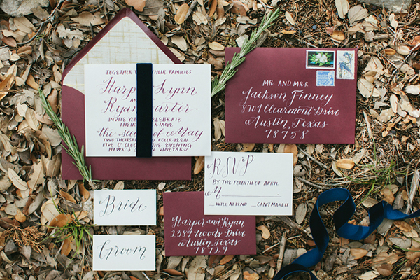
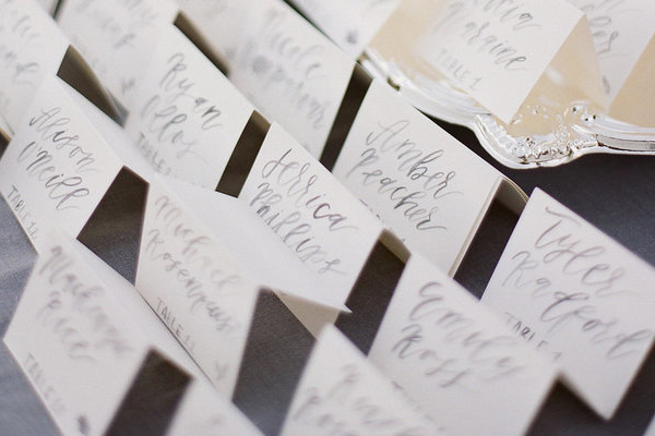
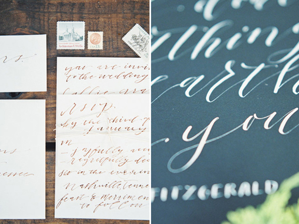
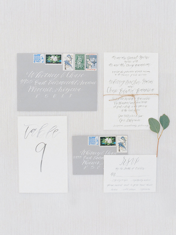
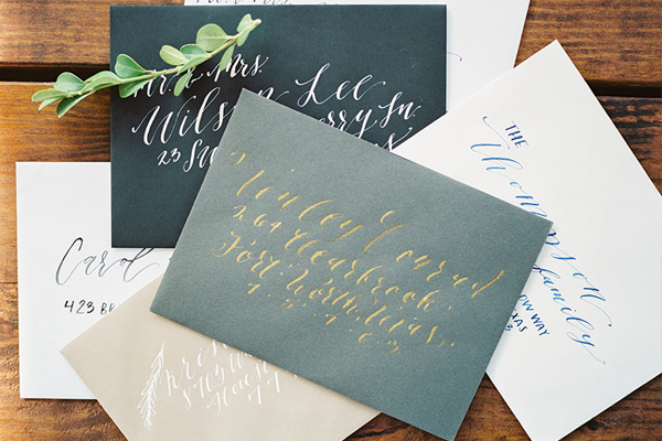
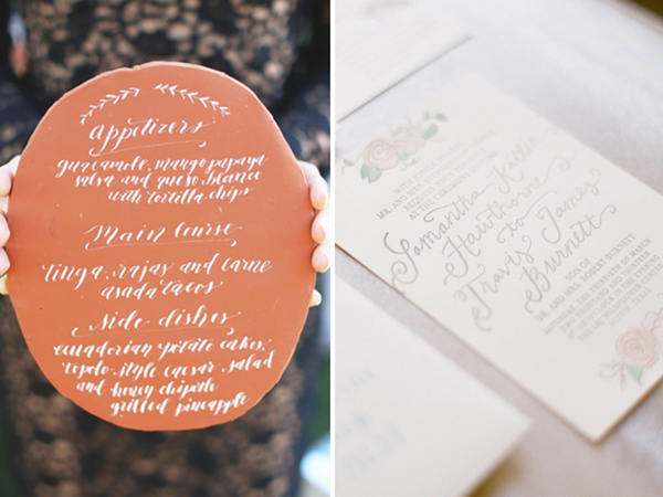
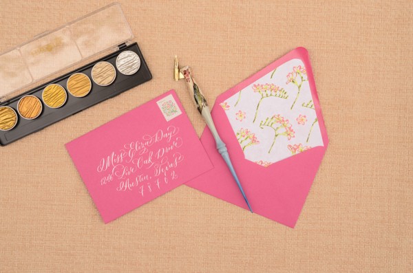
This month, I’m excited to share the work of Samantha Burnett, the talented hand behind Austin, Texas-based Wondrous Whimsy. With a background in graphic design, Samantha taught herself the art of calligraphy, which was a wise decision in my opinion. Her wide array of lettering styles vary from dip pen to airy washes of painted letterforms. Her website and Instagram feed are filled to the brim with calligraphic inspiration. And while you’re at it, don’t forget to stop by her Etsy shop where you can pick up prints, custom stamps, and more. –Julie

Calligraphy Inspiration: Wondrous Whimsy via Oh So Beautiful Paper

Calligraphy Inspiration: Wondrous Whimsy via Oh So Beautiful Paper

Calligraphy Inspiration: Wondrous Whimsy via Oh So Beautiful Paper

Calligraphy Inspiration: Wondrous Whimsy via Oh So Beautiful Paper

Calligraphy Inspiration: Wondrous Whimsy via Oh So Beautiful Paper

Calligraphy Inspiration: Wondrous Whimsy via Oh So Beautiful Paper

Photo credits: 1 Jen Dillender Photography; 2, 4 Diana McGregor Photography; 3 left + right, 5 Jessica Christine Photography; 6 left Seen Photography, right Taylor Lord

DIY Tutorial: Neon Floral Save the Dates

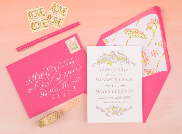
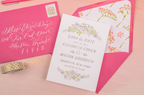
After the dreary days of winter, we are in serious need of bright colors and cheerful designs. This save the date was inspired by an eye grabbing neon floral paper that we recently found. We used a standard highlighter to create the awesome pop of color on the save the date card. Who knew that it would make such a fun addition to the design? –Bailey and Emma of Antiquaria

DIY Neon Floral Save the Date Tutorial by Antiquaria for Oh So Beautiful Paper

Materials

Camellia Floral Save the Date Stamp

Laurel Wreath Return Address Stamp

Stamp Pad

Embossing Stamp Pad

Embossing Heat Tool

Embossing Powder

A6 Notecard (we used Pure White)

A6 Envelope (we used Fuchsia)

Highlighters

Decorative Paper

Envelope Liner Templates

Double Sided Tape

Calligraphy Pen

Finetec metallic watercolor set

DIY Neon Floral Save the Date Tutorial by Antiquaria for Oh So Beautiful Paper

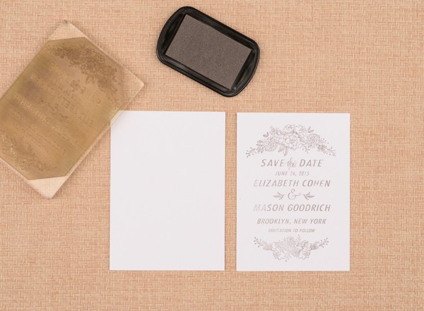
Step One: First, you will want to stamp your save the date (we used our Camellia Save the Date design) on an A6 card. When stamping your card, ink the stamp with the stamp facing you. Center the stamp over your card and press firmly and moderately (not too hard or the image will smudge) and gently lift the stamp off of the paper. Set aside to dry. Please watch this video for more information on inking and stamping an oversized stamp.

DIY Neon Floral Save the Date Tutorial by Antiquaria for Oh So Beautiful Paper

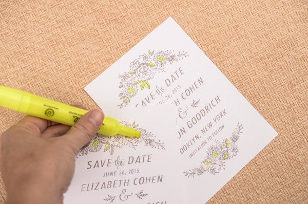
Step Two: To add a fun pop of color, we used a highlighter to color in the leaves and the center of the stamped flowers. This simple touch really makes the design come alive!

DIY Neon Floral Save the Date Tutorial by Antiquaria for Oh So Beautiful Paper

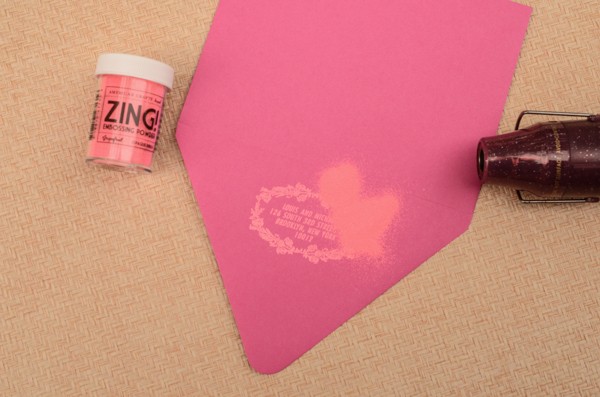
Step Three: Wanting to bring in some of the awesome neon pink from the patterned paper, we decided to use fuchsia envelopes and a tonal, neon grapefruit embossing powder to pull everything together. To emboss, simply stamp your desired return address stamp on the back flap (either in matching ink or with Versamark glue ink, as pictured) dust the powder over it, tap off the excess and heat set the print. For more information about how to emboss using stamps, please watch this instructional video.

DIY Neon Floral Save the Date Tutorial by Antiquaria for Oh So Beautiful Paper

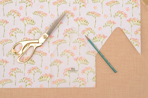
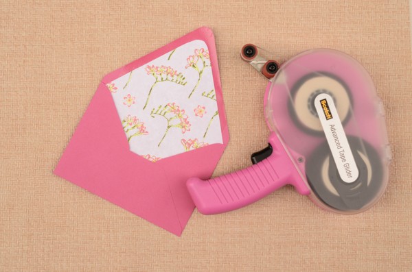
Step Four: Since this suite was directly based off of this amazing paper, it was an easy decision to incorporate it into the design as an envelope liner. We traced the liner template and cut out each liner by hand. Then, we used double sided tape (alternatively, you could use stick glue) to install the liners into the envelopes (adhere around the top triangle).

DIY Neon Floral Save the Date Tutorial by Antiquaria for Oh So Beautiful Paper

DIY Neon Floral Save the Date Tutorial by Antiquaria for Oh So Beautiful Paper

Step Five: It’s time to address your save the dates! We used a beautiful finetec metallic paint palette (the silver one) with a calligraphy pen for this design. Experiment with styles until something feels natural to you! You could also use a silver gel pen and your fanciest handwriting to achieve a similar look.

DIY Neon Floral Save the Date Tutorial by Antiquaria for Oh So Beautiful Paper

Anti­quaria is a mem­ber of the Designer Rolodex – you can see more of their beau­ti­ful work right here!

Photography by Antiquaria for Oh So Beautiful Paper

Brick + Mortar Q + A: Is my line too one-note?

Dear Emily,

I’m wondering if my line is too “one note.” Long story short, the Louie finalists came out last week, and the last two years in a row I have been a finalist for a Rising Star. This year (the final year I could enter) I was not. Not a huge deal (ok, a bit of a blow to my confidence), but it opened up a conversation with my husband (which is probably never a good idea relating to design), about how my line, cards especially, are “all the same.” As a retailer, do you find that to be true, and if so, is it an issue? I feel like I have somewhat successfully been able to create a full breadth of a collection across multiple product categories, however at the same time, I see what he is saying.

I would just love to hear your perspective on this line of thinking… the good, bad, and ugly!

Thank you!

Meg, Belle & Union Co.
OSBPEmilyMcdowellIllustration

 Illustration by Emily McDowell for Oh So Beautiful Paper

Dear Meg,

This is the stuff. This question is my favorite blend of all of my favorite parts of small business ownership: recognition, self-evaluation and how on earth do I talk to my partner about my work?

I’ll answer your main question so we can move on. Is your line too one note? No. I mean, yes, it is one-note, in the sense that your voice is clear. Your cards are always recognizable as yours. Your style is consistent. Your colors are varied within a complimentary palate. Your sentiments are part of a conversation that customers are comfortable stepping into. You have a great line: strong cards, great wrap and a growing batch of extras. As a vendor I order based on the sentiments that resonate in my region. But my customers? They buy your ‘I love you a bushel and a peck’ card in, well, bushels. I’m not a stationery designer, so I can’t speak to exactly what your end game should be, but I think it’s the look I see the look on my customers faces when they read your cards.

As for the Louie Awards; awards are great aren’t they? It feels good when you win them. Winning them may affect your business and it may not, but it always feels good. I have absolutely no insight as to why you weren’t nominated as a finalist. But my take is this: Your line doesn’t seem like something rising, it seems like something that has already established itself. This wasn’t your award to win.

As for partners, and work, and how do you talk about one about the other? When I figure out how to give advice in this area, I am going to charge all of the money and save all of the marriages. Your husband isn’t wrong, he’s touched on something real and I’ve reinterpreted it. He’s touched on something you should return to each time you design a new card: Have I already said this? But ultimately, it’s your line, and your job is to make what you make, to edit when it’s time to edit, and to keep going.

All the stars,

Emily

To submit a question, email [email protected] or ask in the comment section below. Thank you!