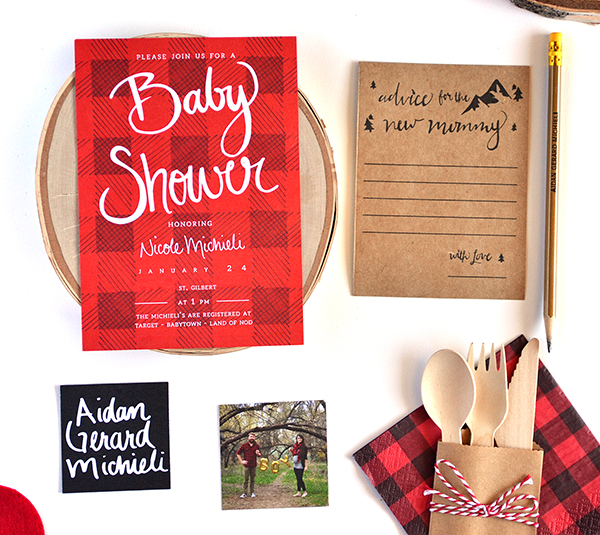
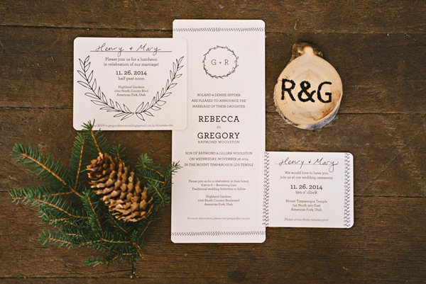
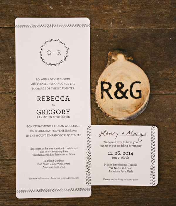
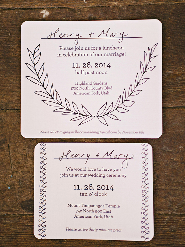
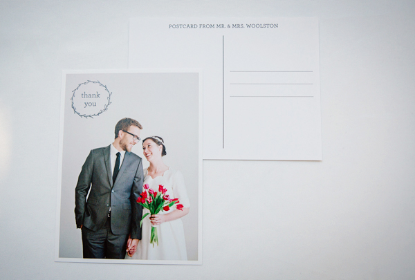
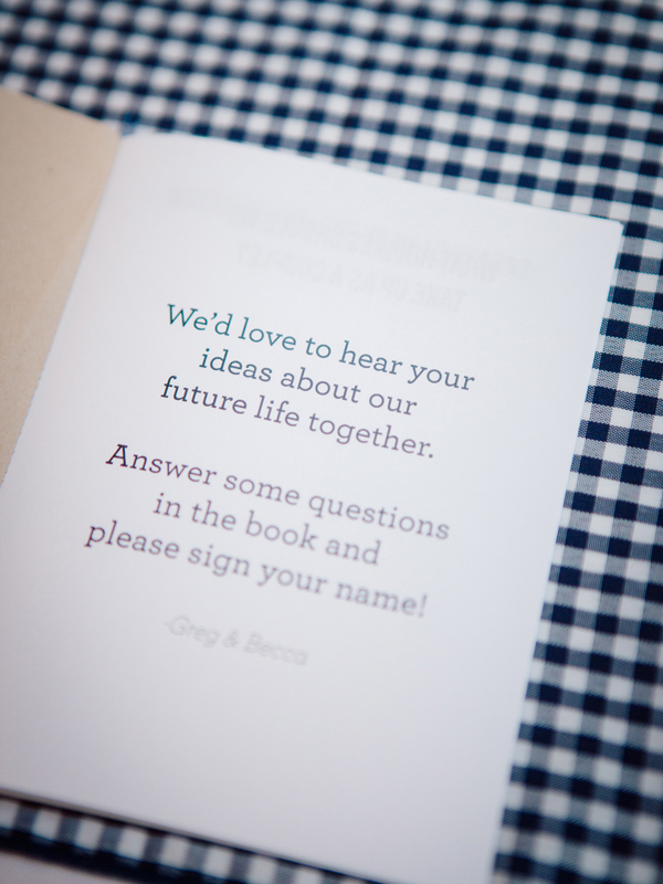
I love everything about the invitations that Rebecca created for her own wedding last year – from the affordable production to the beautiful illustrations and the meaning that Rebecca imbued into each element. And the simple color palette of black, white, and kraft? So perfect for a late fall (early winter?) wedding!

From Rebecca: When you’re a graphic designer, and you’ve been analyzing wedding announcements your whole life, it makes paper planning for your own wedding rather difficult. A few years ago, I decided I would have lace on my wedding invitations. I started making sketches and comps so that I would be ready with the perfect design when the day came. After Greg and I got engaged, I opened up those old files and knew it wasn’t quite right. It seemed outdated and not really “us.”

So I started designing. Well I tried to start designing, and every time I tried, I got too nervous. I always over-analyze wedding invitations and so I would imagine people analyzing our wedding invitations and I would panic. But one night when I had some downtime, I sat down with just my sketchbook and my favorite pen. I drew all of my favorite things. The first was a loop-de-loop.

When I had been going through my lace phase, I was also going through a loop-de-loop phase, but the loop-de-loop stuck with me. I would always sketch an ongoing infinity symbol back and forth on my sketch books. Always. I experimented with all sorts of weights and styles and lengths, I thought they were so pretty. And then the more I analyzed it, the more I thought it was the perfect motif for a wedding invitation. It was never ending. There were ups and downs, but it was always connected. The line might be thinner in some spots and thicker in others. In my sentimental, symbolic view, I decided it was perfect. I explained it to Greg about our relationship and future union would be eternal and always bound and connected. That there would be ups and downs, but we would always be together. So we knew the loop-de-loops had to stay.

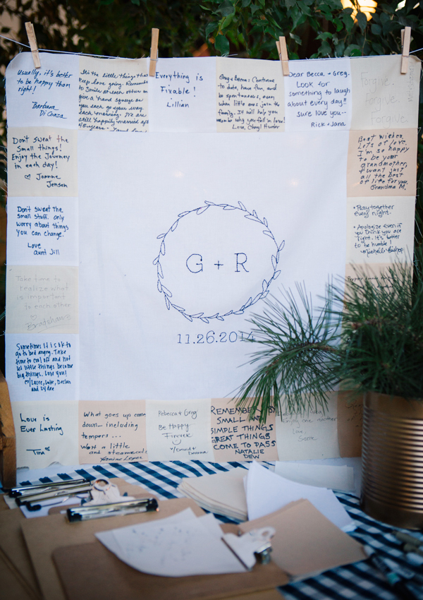
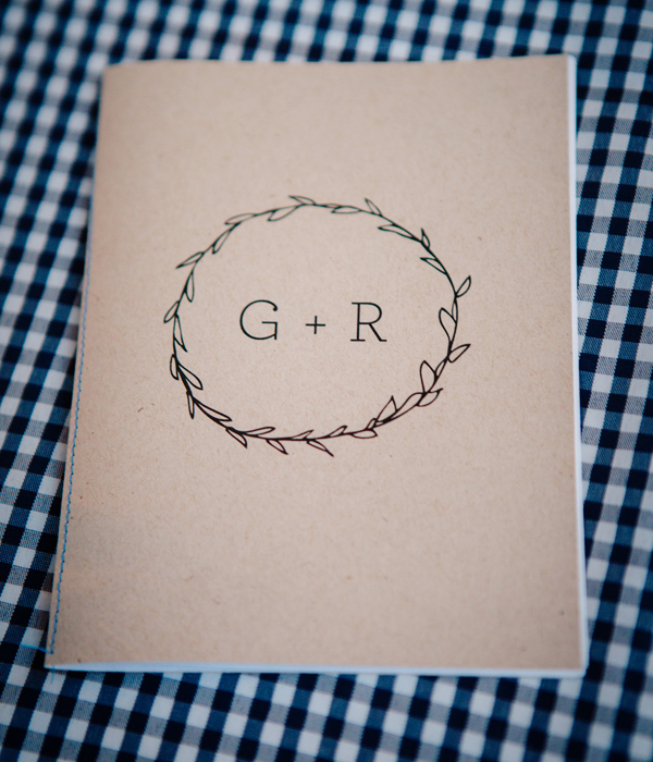
But I also really love circles. And I wanted the circle to be involved too. I went back to my sketches and showed them to my sister, Melissa. She loved the wreath I had made with our initials. She stopped at the wreath and said,”Yes, yes. That is so you.” So we put it on a quilt, some notebooks, our invitation, etc. It became the branding of our union. I’ve always loved linen paper, so that was an obvious choice for both the paper and the envelopes. I wrote out all the addresses with some of my favorite fancy pens and used a stamp that my parents already had as the return label.

In the end, it was really nice to make our own wedding invitations. It was a special experience and I’m so glad that I was able to make something super affordable and with lots of meaning.


Thanks Rebecca!
Design: Rebeccamade
Printing:Â BYU Print & Mail
Check out the Designer Rolodex for more talÂented wedÂding inviÂtaÂtion designÂers and the real inviÂtaÂtions gallery for more wedding invitation ideas!
Photo Credits: Mikki Platt and Claire Marika Buys
