These wedding invitations are part natural rustic beauty and part bold modern design. Created by Mina and Ian of Birdwalk Press for their own wedding, the suite reflects both Mina’s upbringing in the Northwest and Ian’s love of cinema. Such a great combination of influences!
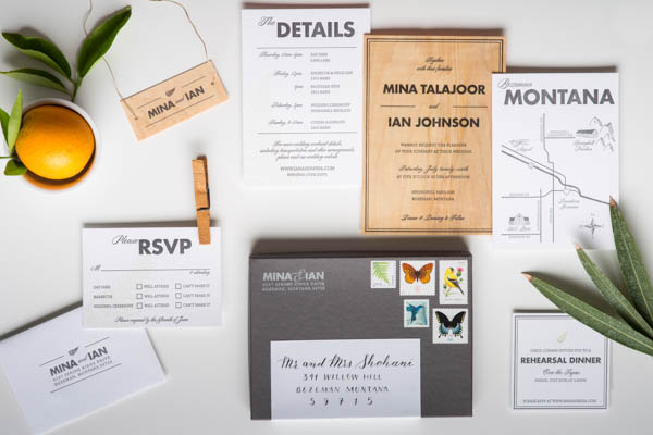
From Mina and Ian: As wedding suite designers and letterpress printers, we didn’t take our own wedding invitations lightly. In fact, it was quite the challenge to develop a suite that we were both happy with – we were our most difficult clients yet! Here’s what resulted from months of design revisions and printing tests.
The suite was conceived and printed by yours truly (Mina & Ian Johnson of Birdwalk Press). We wanted to design a bold, modern feeling invitation that incorporated elements of Mina’s Northwest upbringing and Ian’s passion for cinema and typography. The suite features bold, structured design elements as well as light, organic forms to give a balanced feel reflective of our wedding’s aesthetic. It was all printed on our first press: a treadle-powered 200 year old Old Style Gordon restored and recovered from a chicken coop.
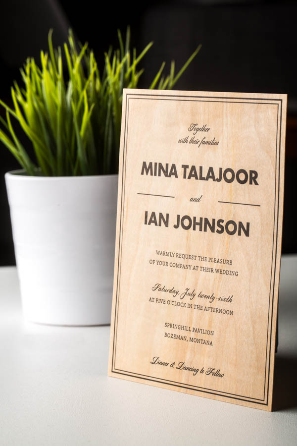
The star of our suite is the invitation itself: letterpress printed on real maple wood veneer, each invitation was completely unique with its own grain pattern and unique texture. The title font is Futura, one of filmmaker Wes Anderson’s go-to fonts for his films (remember the yellow titles in Life Aquatic?). Three of the four paper pieces are printed with incredibly light green fern silhouettes, incorporating that lush Northwest rainforest feel. We printed these inserts on 220# fluorescent white Crane’s Lettra.
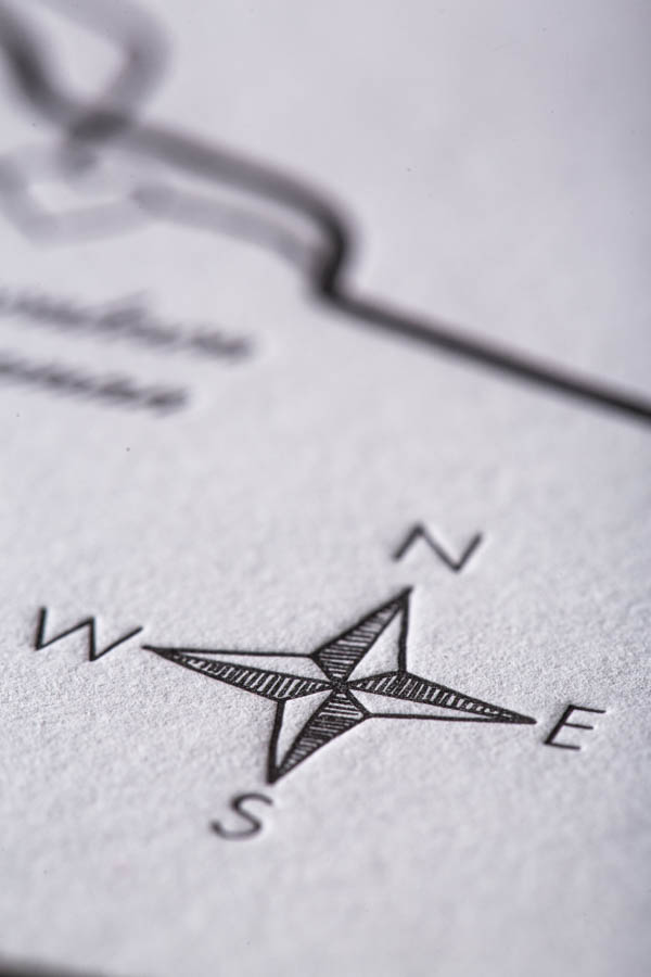
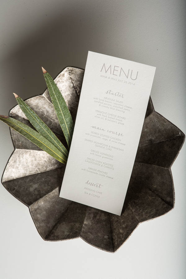
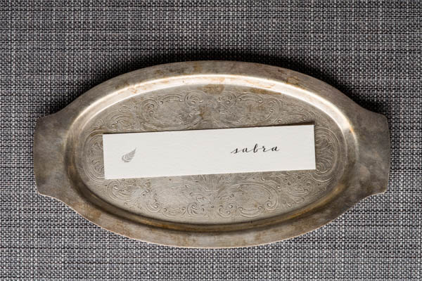
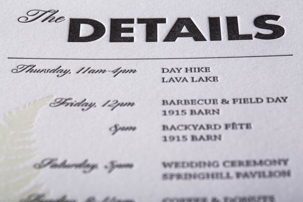
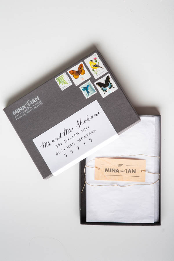
The whole suite was wrapped in jute twine with a printed maple tag, and sealed in a charcoal gray mailing box from Design Aglow.
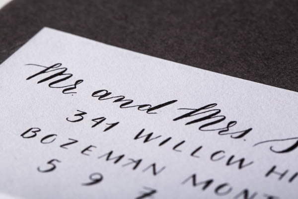
Thanks (and congrats!) Mina and Ian!
Check out the Designer Rolodex for more talÂented wedÂding inviÂtaÂtion designÂers and the real inviÂtaÂtions gallery for more wedding invitation ideas!
Photo Credits: Lockie Photography

