Well this is fun! A collaboration between artist Kearsley Lloyd and Albertine Press, these invitations feature a bright and colorful color palette with a regional New England Quahog inspired design – and some beautiful watercolor illustrations to boot. Pretty!
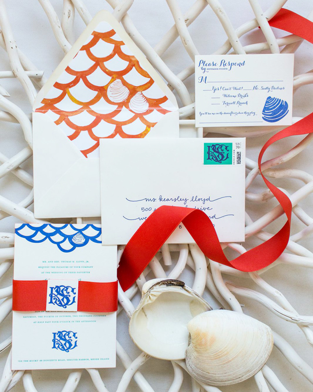
From Kearsley: Having designed custom wedding monograms and crests for years, I was especially eager to craft an invitation suite for my own wedding. All of my designs begin by hand with an original watercolor and gouache illustration, which I then manipulate digitally. The watercolor painting is preserved for use on stationery and paper goods while the digital version can be converted to any color scheme to feature on embroidery, screen printing, stamping, and other decorative uses for weddings…and well beyond.
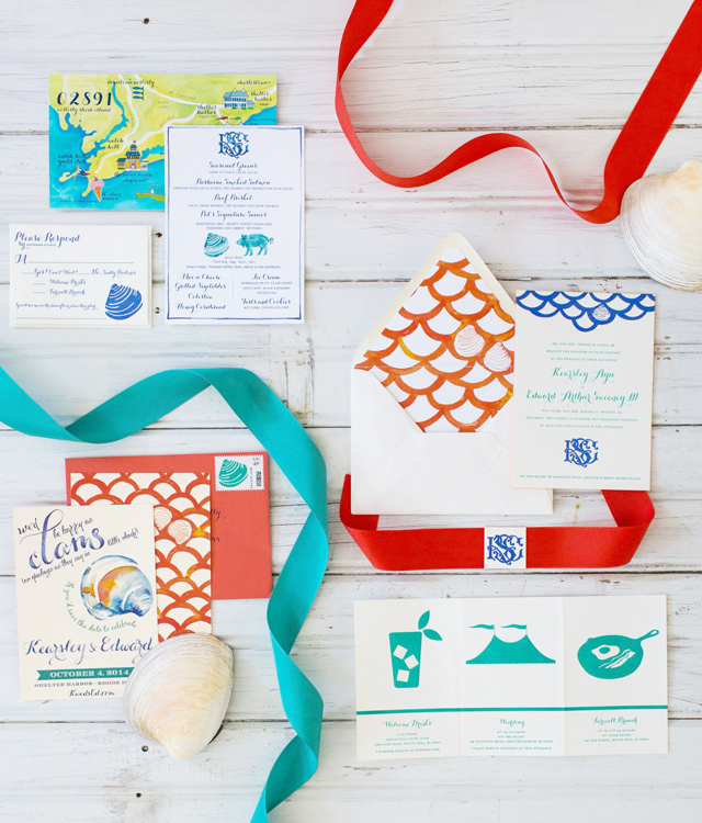
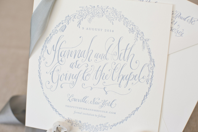
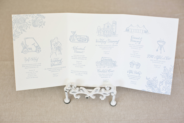
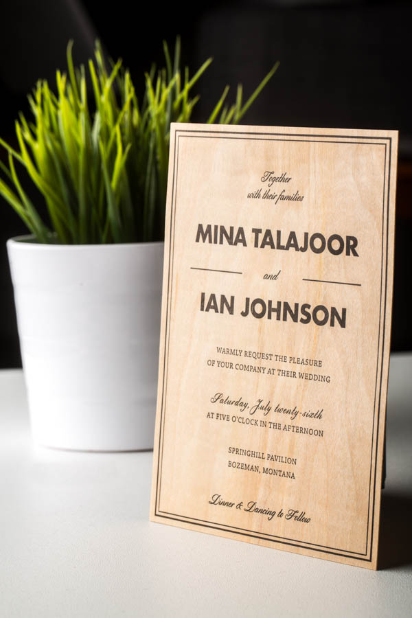
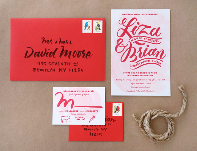
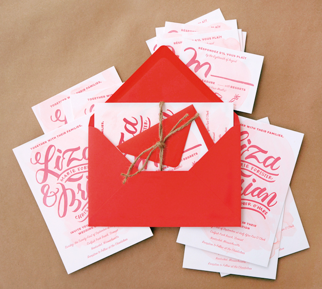
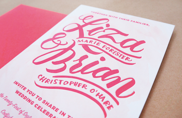
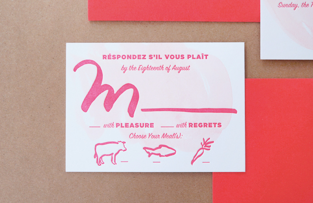
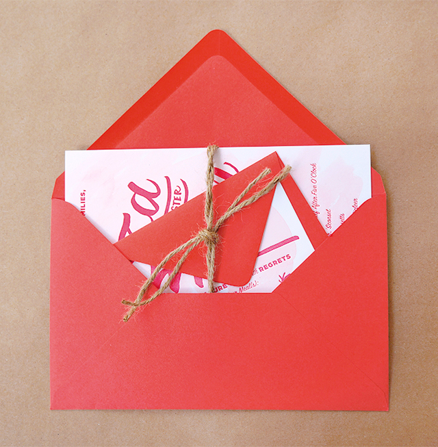
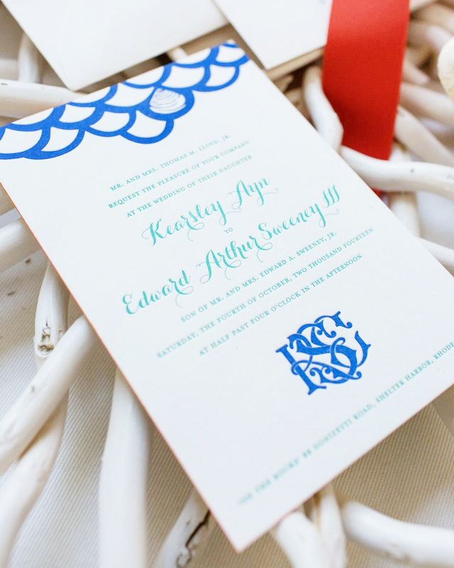
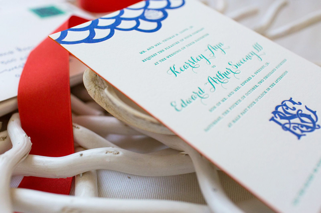
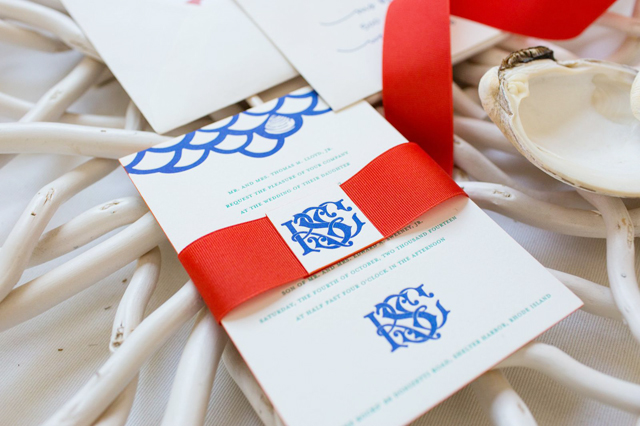
Our save the date was flat printed to preserve the unique appearance of the watercolor, and then invitations were letterpress printed by Albertine Press. It introduced and established the colorful theme and playful impression that carried through the invitation and entire sequence of wedding events.
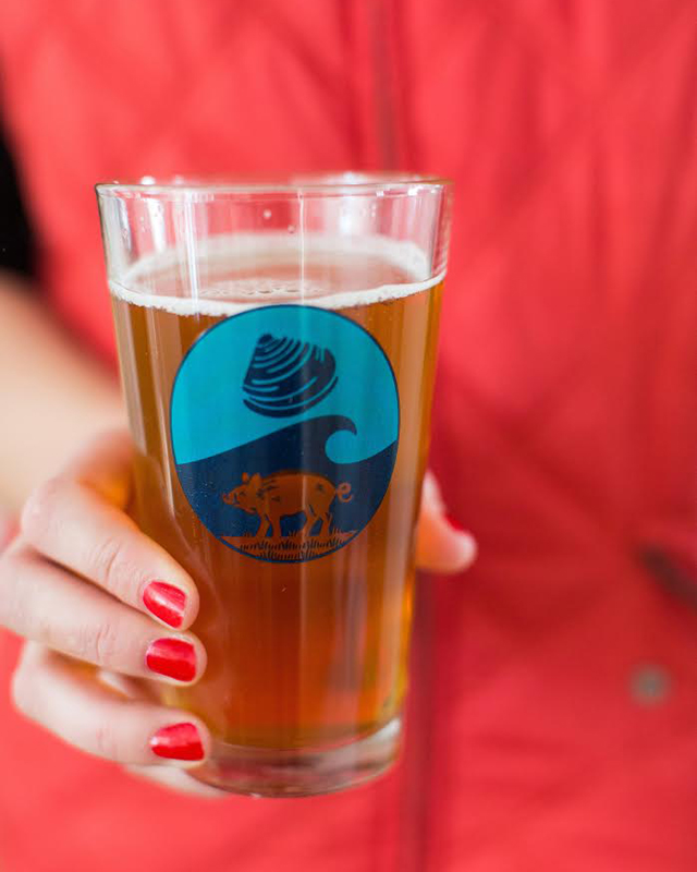
Our wedding was to take place at my family’s home on the Rhode Island coast, so we chose to feature the well-recognized Rhode Island Quahog (also known as a cherrystone clam) in our theme. Since my husband and I live in Bermuda, a British colony, the Hog Penny had become a symbol of our new life together and a fun secondary theme. Finally, a little research turned up a handy coincidence: my fiancé’s Celtic family crest indeed featured wild boars! You can imagine what fun we had, once the ‘Qua-Hog’ theme was established!

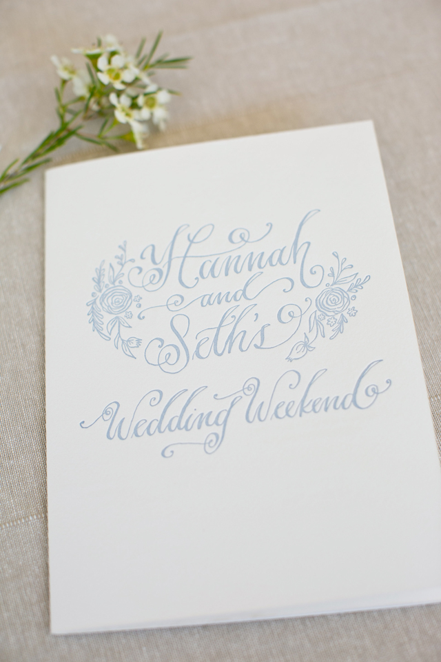
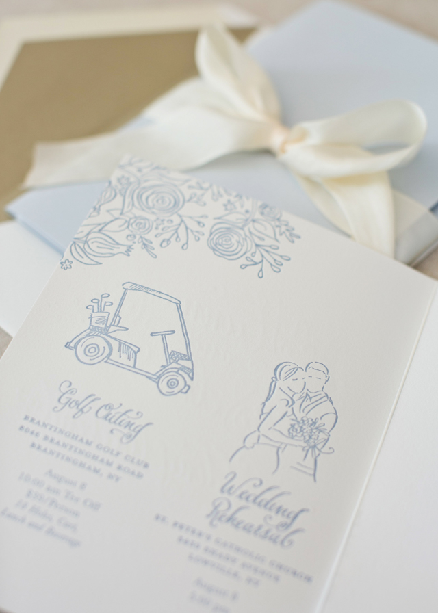
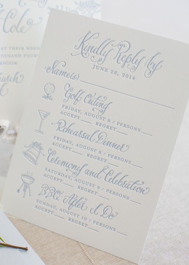
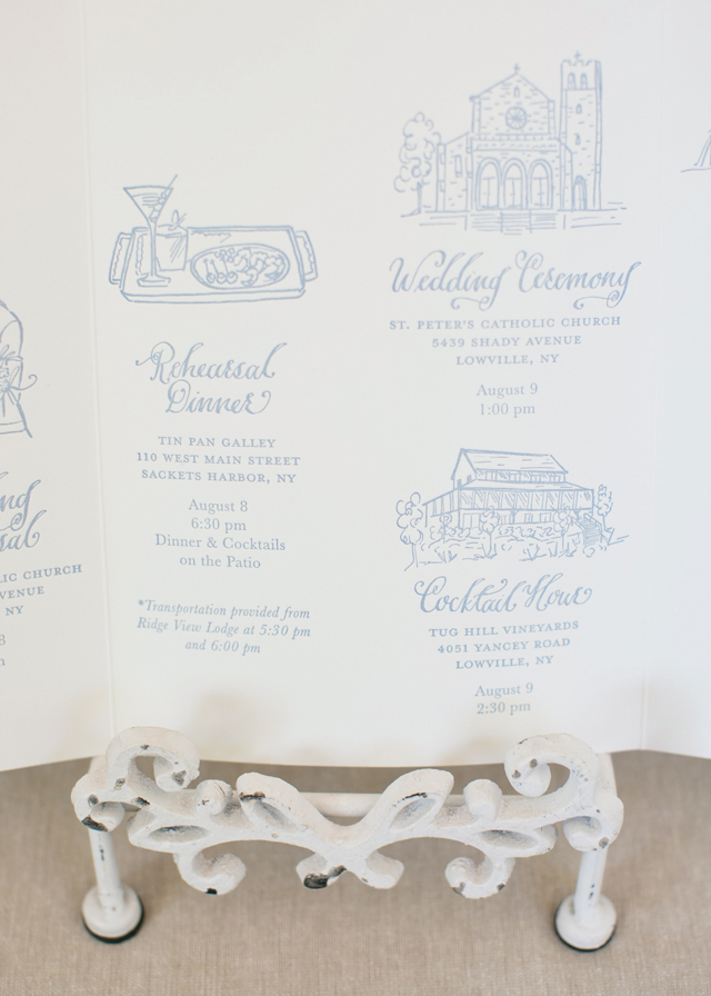
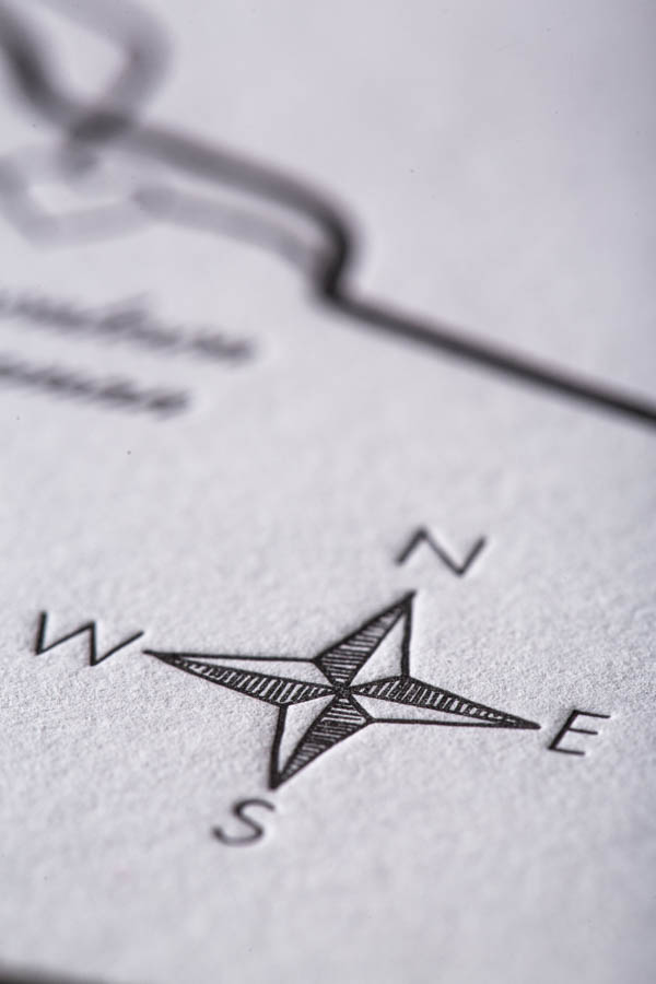
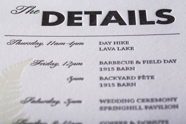
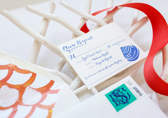
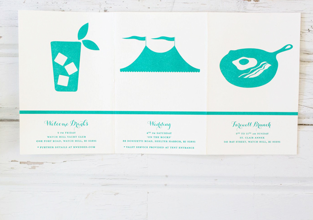
I love taking a twist on traditional letterpress printing by infusing it with unusual colors and pattern. Echoing the fish scale pattern of our save the date card, I introduced an intertwined monogram design that served as the central theme of our wedding day décor. The painted edge on the invitation tied the color palette together beautifully. To that, I added a colorful tri-fold schedule of weekend events, as well as custom postage for the outer and RSVP envelopes. The design from the back of the dave the date greeting became the perfect pattern for the envelope liner, and my vibrant watercolor map design was a handy travel guide, included in a welcome bag for out-of-town guests.
Thanks Kearsley and Abby!
Design:Â Kearsley Lloyd
Letterpress Printing:Â Albertine Press
Styling:Â Abby Capalbo
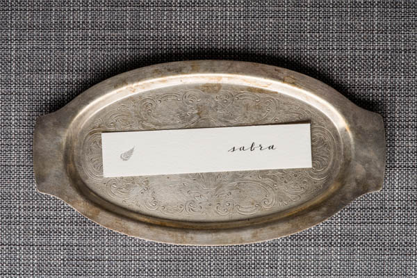
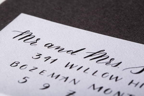
Calligraphy:Â Deanna Wiles
Custom Postage:Â Zazzle.com
Albertine Press is a member of the Designer Rolodex – you can see more of their fabulous work right here!
Photo Credits:Â Erin McGinn