Trimming the Budget without Sacrificing the First Impression

Labels

Images from Martha Stewart Weddings (right styled by Rebecca Thuss)

Hello, everyone! It's Maddy from the Inspired Bride blog, here to once again fill in for Nole.

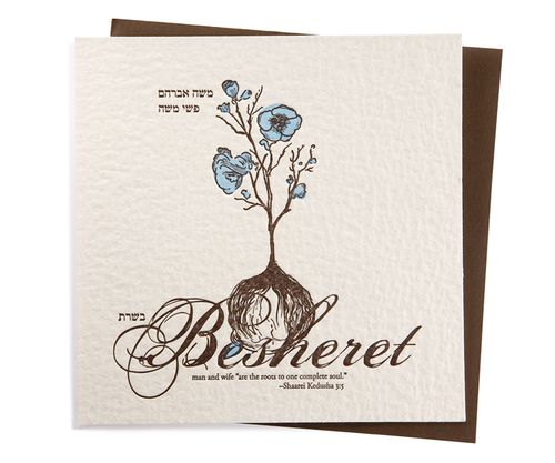
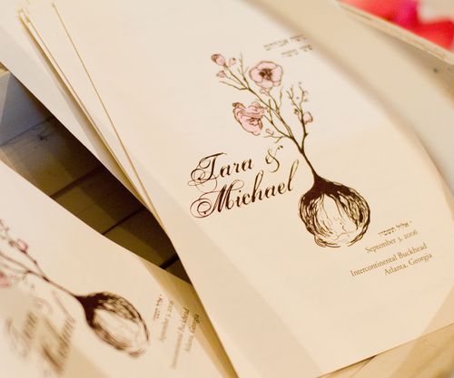
Everybody is thinking of ways to save money nowadays, and the first things to go are the ones that aren't in the "absolutely necessary" column. For a lot of brides, that means sacrificing hand calligraphy – while it's gorgeous, it also can rack up quickly if you have lots of guests. Here are some suggestions on how to cut the calligraphy without losing the great first impression it makes.

Make an investment in a commercial calligraphy face and print your envelopes. Please don't go down the free font route! I've pleaded this case on my blog before because, as a graphic designer, it can be a little painful to see. There's a reason they're free – typographically, they're generally not up to par with pay fonts, and when that craftsmanship is not there from the get go, you won't be leaving the impression with your guests that you want. There are plenty of typefaces available for affordable prices, and I've covered some on the Inspired Bride. A great resource for affordable fonts is MyFonts – I would recommend you start there. Remember that the more you use the fonts, the better deal you're getting, so consider using them on favors, place cards, and programs, as well – anywhere you would have originally considered using calligraphy.

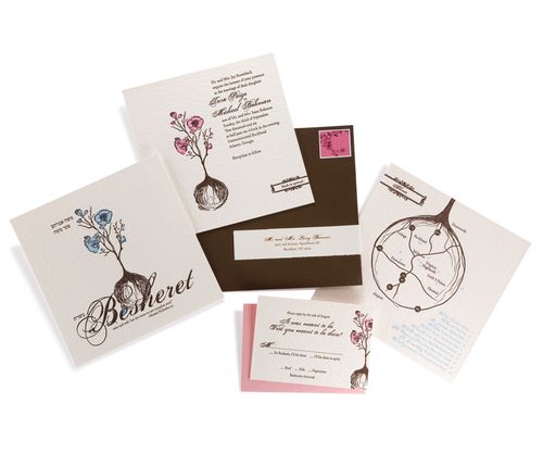
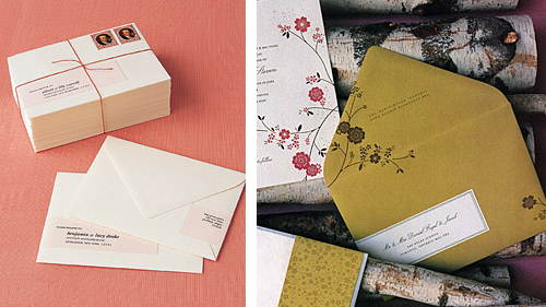
Do the wrapping label. Normally, it's considered a faux pas to put labels on an invitation, and in most cases I'd agree – however, the trend of making a wrapping label (as shown above), I think, is incredibly modern and gives an added element of "specialness". Plus, it just looks great – I loved the look so much, I nixed the hand calligraphy on the envelopes of my escort cards and used wrap labels instead in my own wedding two months ago.

DIY, literally. I came across a brilliant idea a few months back, but I definitely would recommend this only for those of you with steady hands and a heck of a lot of time and patience. This blogger had the brilliant idea to print her envelopes with a slightly darker ink on dark envelopes to use as a "trace line". She then went back over the slightly visible letters with an opaque white ink pen to give the quirkiness of hand calligraphy to the letters without being a trained professional.

Save the Date Contest Finalists {Part 2}

As promised, I have more inspiration boards from the finalists of the Save the Date contest from Delphine!  Here are the next three finalists (again, in no particular order):


Kate S: Design: Meeting Street;  Ink Colors: Crimson and Freesia
My fiance and I had our entire wedding planned in my native New York City, but the economy has taken its toll and we have had to cancel our plans and move everything to my moms backyard in Westchester, NY. Its even more exciting now as we are planning a very communal wedding, asking friends and family to contribute towards the day in lieu of gifts. The style of the wedding is going to be very outdoorsy and whimsical, with a vintage feel. We are going to have a 1930's style band, elegant dresses, men in straw hats and floral prints – a sort of hippie meets glamour evening. Since I love color so much its hard to narrow them down for a theme, but red and yellow have always been my favorite combination, they shouldn't work together but they just do!
Save-the-Date-Contest-KateS
image sources, from left to right: hair piece via ban.do; Save the Date card via Delphine; cake via MS Weddings; backyard viaLittle Winter Bride; bouquet via New York Magazine; papel picado banner via Ay mujer; boutonniere via Something Old, Something New


Libby: Design: Savannah;  Ink Colors: Two-tone greens (like
key lime and palm)

My fiance, Lee, and I live in Providence, RI, but are getting married next May in Fairhope, Alabama (close to my family and friends). Lee and I are having to pay for the majority of the wedding, and because of extra costs such as traveling and hotels, our budget is tight. I feel that the Savannah style fits perfectly with my wedding. We are getting married at The Fairhope Inn. It is a small charming bed and breakfast and restaurant in Fairhope, AL. We will have both the ceremony and the reception in the garden courtyard. I want my wedding to be fun and springy and green and fresh. I love botanical anything, and I love, love the Savannah invitations and Save the Dates! They would fit so perfectly with the theme!

Save-the-Date-Contest-Libby
image sources, from left to right: Save the Date via Delphine; centerpiece via Style Me Pretty; bridesmaid dress via J Crew; shoes via Style Me pretty; sparklers via events wholesale; dress via Once Wed; bouquet via Style Me Pretty; centerpieces via MS Weddings

Lindsay: Design: The Robin Collection;  Ink Colors: Tangerine +
Chocolate. 

Lindsay and her fiancé are planning a wedding that reflects their memories of a trip to Napa Valley, California, where they were engaged:

We chose the Fairmont Copley as our venue because of its beautiful architecture, intricate gold detailing and cozy, warm ambiance. We picked the month of October for its rich autumn hues and seasonal food offerings. From there we began focusing on the little details: stacked corks to hold the seating cards, wooden wine crates to give depth and height to our antipasto display, olive oil favors to honor my fiancé's Greek heritage. We started thinking about the flowers; clustered vases with full garden roses, submerged orchids, dripping crystals and floating candles. We want our wedding to reflect the romance and beauty of the California vineyards. We see the candlelight as being reminiscent of the wine cellars with their antique candelabras and cool cement walls. The colors that we chose; gold, champagne, ivory, peach and cream play to the peaceful elegance of the area and the cascading crystals add that sexiness that permeates everything in Napa Valley.


Save-the-Date-Contest-Lindsay
image sources, from left to right: sunlight photo via flickr; invitation via Delphine; boutonniere via Style Me Pretty; Pumpkin
Soup
here; wine cellar via flickr; dress via Style Me Pretty; flowers via the knot; vineyard via National Geographic; flowers and escort cards via the knot; submerged flowers via Style Me Pretty; cake via Southern Weddings; bridesmaid dress by Jim Hjelm; Lindsay's venue, the Venetian Room.
I've got a few more finalist inspiration boards to post, so if you entered the contest, check back tomorrow morning!

Fun and Free!

One of my favorite things about the internet is all of the incredibly creative people who don't hesitate to share their talents with the rest of us. Here are some of my favorite goodies that are out there to download…

Frolic(cheeryinvite)

Bright and cheerful invitations by The Small Object, via {frolic!}

Poppytalk(downloadtag)
Vintage-style number tags by Poppytalk.

Matchbooknotepadfavors

Matchbook notepad covers by Creature Comforts.

MSclipart

Favor cones and recipe cards, both from Martha Stewart.

Thank you so much to Nole for inviting me to guest blog this week! I hope you enjoyed these posts, and that you'll stop by Snippet & Ink for more inspiration!
 

Inspiring Packaging

The Dieline is a blog that's all about packaging – new designs, new products, and why the packaging works or doesn't work. To be honest, I almost never read the text – I just scroll through the photos. And every once in awhile there's something that really inspires me – that I could just see translated into a wedding invitation or party favors or a birthday gift. Here are some of my favorites…

Belvoir

Belvoir Fruit Farms via The Dieline. Don't you think the angled label, and the font, along with the simple floral illustration would be lovely as an address on invitations?

Mccraws

McCraw's Confections via The Dieline. I love how retro this is, while at the same time clean and modern. I think the colors would be nice for a stationery set, maybe with a monogram inspired by the company's logo.
Mastbros

Mast Brothers Chocolate via The Dieline. Wouldn't you love to see envelopes lined in paper like this? It would be a great way to dress up an otherwise simple invitation or note. Or maybe favors wrapped in a variety of fancy papers and displayed together. Okay, and I'd really like to try this chocolate, too…

Tara + Michael’s Illustrated Jewish Wedding Invitations

I just love seeing the way that real couples and designers work together to produce an invitation design that represents the bride and groom as a couple and suits their unique wedding style.  Today’s real wedding invitations were created by Tara, half of the design duo behind Paperwink, for her own wedding in 2006.  The invitation design is based on the Jewish concept of Besheret, a concept that definitely played a role in my own wedding last year.  I just love the way that Tara used the images of a flower and bulb throughout the invitation suite as a visual representation of the concept.

Inv_Besheret_1

Tara’s invitation suite conveys the Jewish concept of Besheret, or fate – in Tara’s case, the fate that brought the bride and groom together originally, as well as the fate that would bring their loved ones together on their wedding day.  The invitation also included a quote, which says “man and wife ‘are the roots to one complete soul’.”

Inv_Besheret_2

The quote served as the inspiration for the mail visual elements of the invitation design. Paperwink used a hand-drawn flower and bulb as the central design elements throughout the invitation suite to visually represent the concepts of roots and fate.  The invitations were letterpress printed on ultra-thick coaster stock to add an organic texture.

tara-paperwink-besheret-wedding-invitation

In addition to the main invitation, the suite included a custom map of the area and rsvp card.  In the map, the roots of the bulb were converted into the highways and streets of Atlanta, giving out-of-town guests a sense of the city as well as taking guests on a journey through Tara and Michael’s relationship and places that brought them together:

tara-paperwink-besheret-wedding-invitation-roots

The rsvp card even chimes in with a “It was meant to be. Were you meant to be there?” Guests were given two reply options – “It’s Besheret, I’ll be there” or “I’ll be there in spirit:”

tara-paperwink-besheret-wedding-invitation-rsvp

Finally, the concept of Besheret and the visual image of a bulb was carried through to the wedding itself.  The ceremony programs incorporated design elements from the invitation suite:

BE_Beshseret_3

Escort cards (actually small boxes) played double duty as favors, containing flower bulbs for guests to take home and plant.  Tara placed color-coded hand-drawn flowers on the outside of the boxes to indicate the guests’ previously chosen entree preferences:

tara-paperwink-besheret-wedding-invitation-favors

Can I just say how much I love this invitation suite?!  The entire suite is so beautiful, and I love the way Tara incorporated the concept of Besheret throughout the invitations and wedding – creating a meaningful design that represents Tara and Michael as a couple as well as their new life together.  To see more of the incredible creativity over at Paperwink, click here to head on over to the Paperwink wedding collection.

{images via Paperwink – thanks Tara!!}