Carly + David’s Glamorous Coral and Gold Foil Wedding Invitations

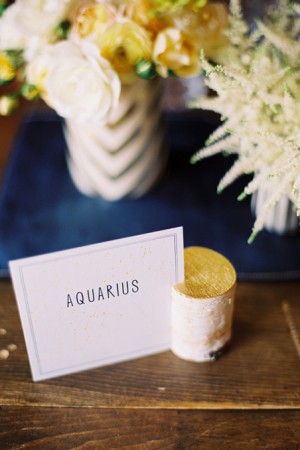
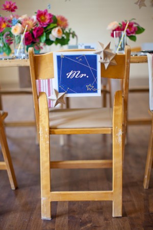
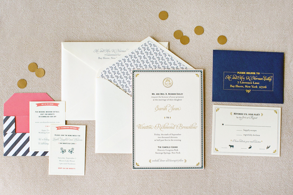
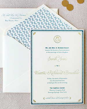
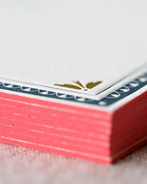
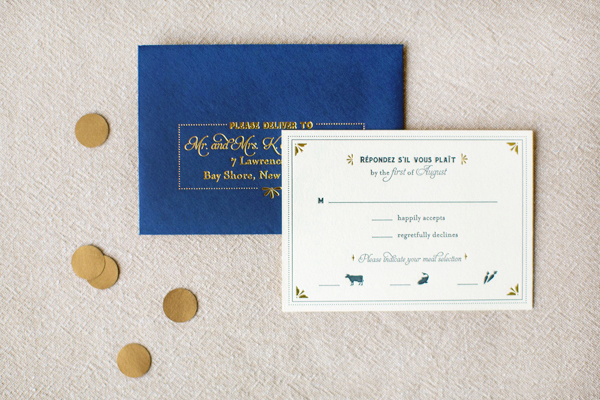
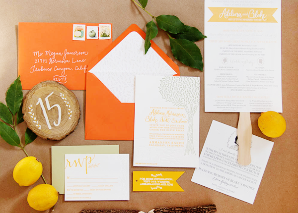
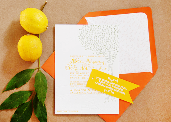
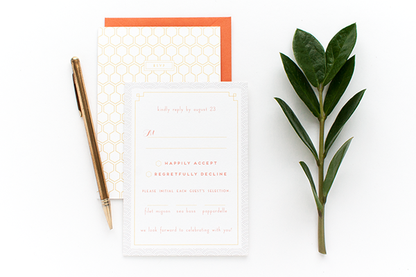
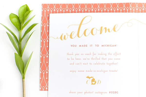
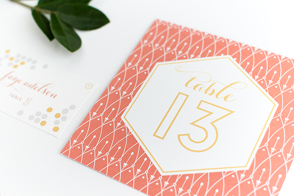
Designer Alisa Bobzien sent over these wedding invitations that she recently created using one of my favorite color palettes: coral, gray, and gold foil. So classic, right? Created for a glamorous wedding in Michigan, the invitation suite includes several complementary patterns, botanical details, and of course some shiny gold foil. So pretty!
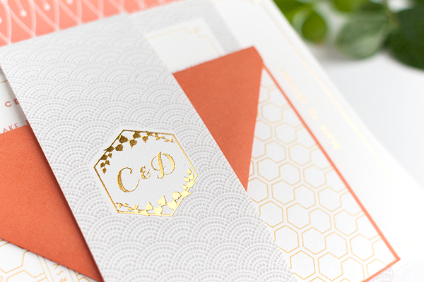
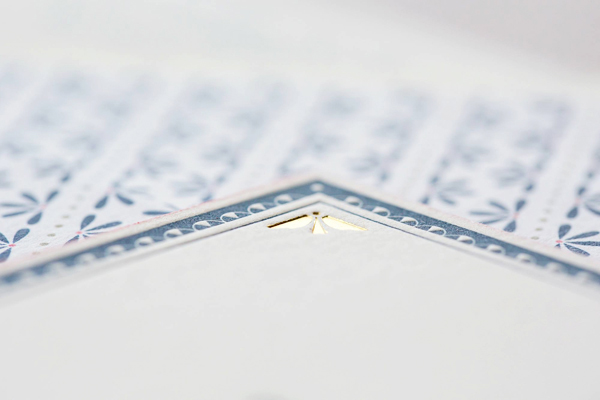
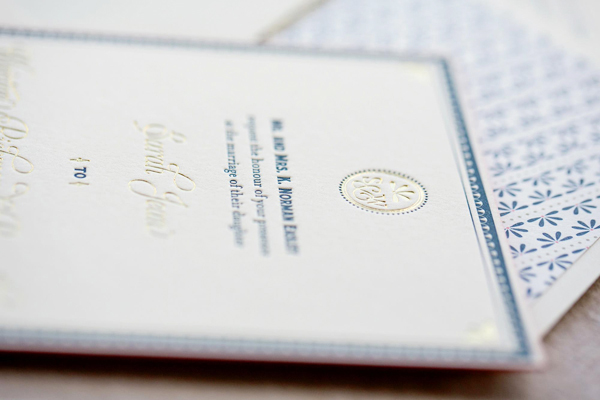
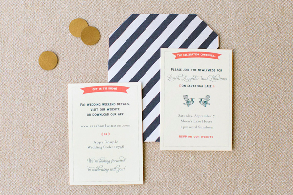
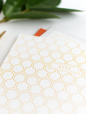
Coral-Gold-Foil-Glam-Wedding-Invitations-Alisa-Bobzien4

From AlisaI created this custom invitation suite and day-of print material for a glam autumn Michigan wedding. The ingredients for this design were a range of coordinating custom patterns, a botanical element as a nod to their venue (the Planterra Conservatory), and a honeycomb pattern because the groom is a beekeeper and honey maker in Brooklyn.

Coral-Gold-Foil-Glam-Wedding-Invitations-Alisa-Bobzien

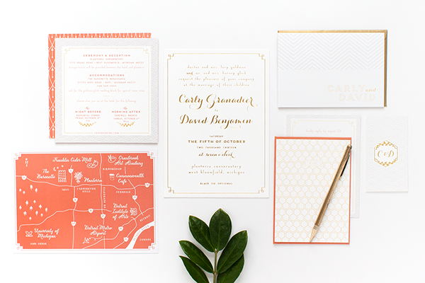
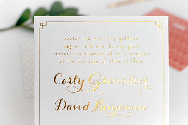
I worked closely with the event designer Viva La Diva Events, who provided art direction. The invitation suite was printed on double-thick luxe cotton savoy paper with gold foil stamping, and included printed envelope liners featuring a custom pattern that coordinated with the gold motif border of the dinnerware.

Coral-Gold-Foil-Glam-Wedding-Invitations-Alisa-Bobzien2

Coral-Gold-Foil-Glam-Wedding-Invitations-Alisa-Bobzien3

Coral-Gold-Foil-Glam-Wedding-Invitations-Alisa-Bobzien6Coral-Gold-Foil-Glam-Wedding-Invitations-Alisa-Bobzien10

Coral-Gold-Foil-Glam-Wedding-Invitations-Alisa-Bobzien7

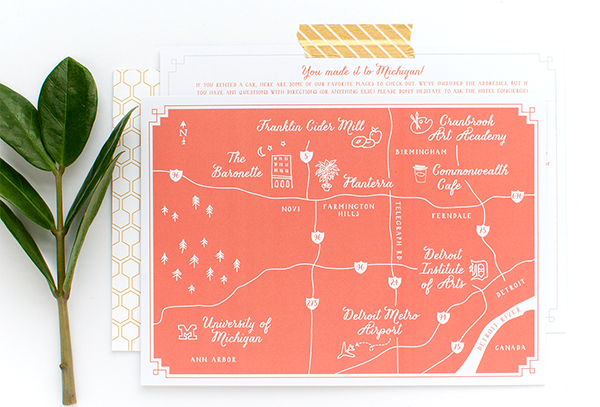
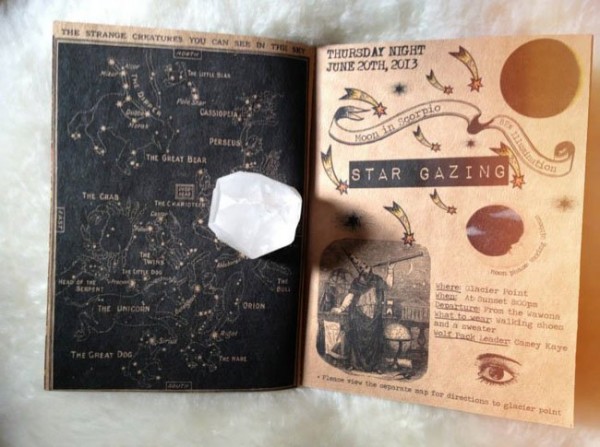
Many of the guests were also from out of state so we highlighted the bride and groom’s favorite local destinations with a custom illustrated map that was included in the hotel welcome bags.

Coral-Gold-Foil-Glam-Wedding-Invitations-Alisa-Bobzien8

Coral-Gold-Foil-Glam-Wedding-Invitations-Alisa-Bobzien5

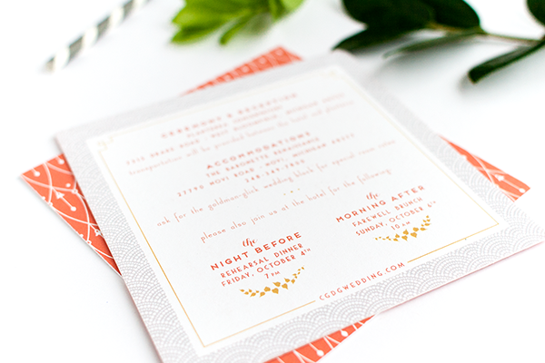
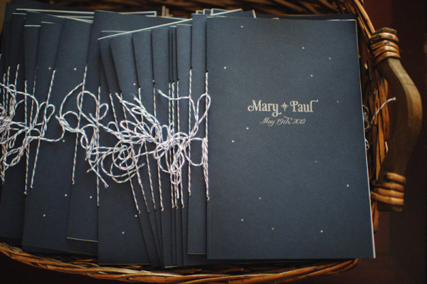
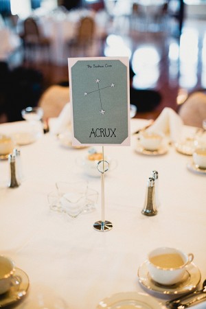
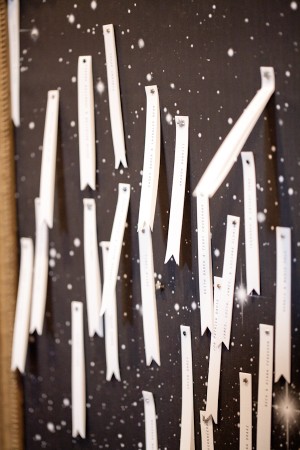
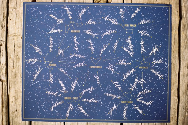
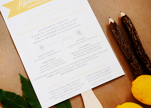
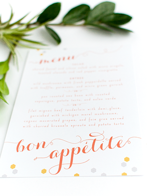
I also designed thank you notes, a welcome itinerary, signage, programs, dinner menus, cocktail menu, favor stickers, dessert signage, table numbers, escort cards and foil-stamped cocktail napkins.

Coral-Gold-Foil-Glam-Wedding-Invitations-Alisa-Bobzien9

Thanks Alisa!

Graphic Design: Alisa Bobzien

Event Design + Planning: Viva La Diva Events

Check out the Designer Rolodex for more tal­ented wed­ding invi­ta­tion design­ers and the real invi­ta­tions gallery for more wedding invitation ideas!

Photo Credits: Alisa Bobzien

Wedding Stationery Inspiration: Constellations

It’s no secret that constellations are quite beloved around here. I figured it was about time they got their time in the wedding stationery spotlight! I’ve seen so many stunning was to incorporate constellations into everything from table numbers (hello creative seating chart!) to signage, including a truly amazing wedding genealogy chart. And how about a stargazing excursion on the eve of your wedding!? But first, some paper goodies to leave you starry eyed. (Couldn’t resist.) —Kelly

Day-of Wedding Stationery Inspiration Ideas: Constellations via Oh So Beautiful Paper

Photo by Paper Antler, Programs by Mary Rosamond via Style Me Pretty

Day-of Wedding Stationery Inspiration Ideas: Constellations via Oh So Beautiful PaperDay-of Wedding Stationery Inspiration Ideas: Constellations via Oh So Beautiful Paper

Photo by Lev Kuperman via Ruffled (left), Photo by Kelly Kollar Photography via Ruffled (right)

Day-of Wedding Stationery Inspiration Ideas: Constellations via Oh So Beautiful Paper

Wedding Constellation Chart by Melangerie NYC

Day-of Wedding Stationery Inspiration Ideas: Constellations via Oh So Beautiful PaperDay-of Wedding Stationery Inspiration Ideas: Constellations via Oh So Beautiful Paper

Photo by Tec Petaja, Table Card by Mr. Boddington’s Studio via Design*Sponge (left), Photo by Love, The Nelsons, Sign by Yuling Designs via Ruffled (right)

Day-of Wedding Stationery Inspiration Ideas: Constellations via Oh So Beautiful Paper

Photo by Love, The Nelsons, Sign by Yuling Designs via Ruffled

Day-of Wedding Stationery Inspiration Ideas: Constellations via Oh So Beautiful Paper

Photo by James Moes via Green Wedding Shoes

Day-of Wedding Stationery Inspiration Ideas: Constellations via Oh So Beautiful Paper

Photo by Tec Petaja, Seating Chart by Mr. Boddington’s Studio with Calligraphy by Neither Snow via Design*Sponge

{images via their respective sources}

Melanie + Robert’s Chagall-Inspired Hand Painted Wedding Invitations

The hand painted invitations created by Kristy Rice and her team at Momental Designs are true works of art – and even more so when the design itself is inspired by art! Drawing inspiration from song lyrics, Kristy created an invitation suite incorporating watercolor patterns inspired by ikat and suzani textiles, hand painted flowers, and lots more!

Chagall-Inspired-Handpainted-Artwork-Wedding-Invitations-Momental-Designs-Kristy-Rice-15

From Kristy: Melanie and Robert were a colorful and fun-loving couple with a deep appreciation of the arts. Both shared a love for reading so books were to be part of the design from the very beginning conversations. The suite was inspired by the song “Painting by Chagall.”

Chagall-Inspired-Handpainted-Artwork-Wedding-Invitations-Momental-Designs-Kristy-Rice-5

We developed three patterns from various floral watercolor elements inspired by Ikat and Suzani textiles. Each cover was then adorned with an individually hand painted poppy bloom. The poppy bloom was first introduced on the bold and colorful save the dates. The wedding programs were patterned booklets tied up in a curated collection of vintage hankies – so sweet!

Chagall-Inspired-Handpainted-Artwork-Wedding-Invitations-Momental-Designs-Kristy-Rice-16

Chagall-Inspired-Handpainted-Artwork-Wedding-Invitations-Momental-Designs-Kristy-Rice-9

Kristy and her team even produced a behind the scenes video showing the creation of these amazing invitations – which you can see right here!

Chagall-Inspired-Handpainted-Artwork-Wedding-Invitations-Momental-Designs-Kristy-Rice-3

Chagall-Inspired-Handpainted-Artwork-Wedding-Invitations-Momental-Designs-Kristy-Rice-14

Chagall-Inspired-Handpainted-Artwork-Wedding-Invitations-Momental-Designs-Kristy-Rice-7

Chagall-Inspired-Handpainted-Artwork-Wedding-Invitations-Momental-Designs-Kristy-Rice-2

Chagall-Inspired-Handpainted-Artwork-Wedding-Invitations-Momental-Designs-Kristy-Rice-1

Thanks so much Kristy!

Check out the Designer Rolodex for more tal­ented wed­ding invi­ta­tion design­ers and the real invi­ta­tions gallery for more wedding invitation ideas!

Photo Credits: Momental Designs

Sarah + Winston’s Navy, Gold, and Coral Letterpress Wedding Invitations

Navy and gold is such a classic color combination – but add coral and it instantly becomes modern! Jenny C Design created these invitations for a wedding at an historic casino-turned-museum in upstate New York. The invitations feature details inspired by the museum’s architecture along with bright pops of coral. Jenny even incorporated some sophisticated casino-inspired details into the day-of wedding stationery!

Blue-Gold-Letterpress-Wedding-Invitations-JennyC-Design

From Jenny: Sarah and Winston’s wedding took place in Saratoga Springs, New York. They both lived in NYC, and about 95% of their guests would be from out of town. They really wanted their wedding invitations to evoke the feeling of their venue – the Historic Canfield Casino – and what fun the entire wedding weekend would be for everyone!

Blue-Gold-Letterpress-Wedding-Invitations-JennyC-Design2bBlue-Gold-Letterpress-Wedding-Invitations-JennyC-Design2a

Blue-Gold-Letterpress-Wedding-Invitations-JennyC-Design3

Blue-Gold-Letterpress-Wedding-Invitations-JennyC-Design6

Sarah and Winston were inspired by the history and architecture of the Canfield Casino (once a casino, now the city’s preeminent event space and historical museum). The border on the letterpress invitation and certain design elements throughout the suite are reminiscent of the those architectural details.

Blue-Gold-Letterpress-Wedding-Invitations-JennyC-Design5

The envelope liner and coral edging adds a perfect pop of color! Mini information cards about the rest of the weekend were placed in a fun navy stripe and coral envelope.

Blue-Gold-Letterpress-Wedding-Invitations-JennyC-Design4

Blue-Gold-Letterpress-Wedding-Invitations-JennyC-Design7

We continued the casino inspired theme, in an elegant way, into their day-of stationery items. Sarah and Winston’s ceremony program was shaped liked a deck of cards. On the back was a custom playing card design, with their monogram and design elements from the invitation incorporated into it. Their escort cards were shaped and designed to look like poker chips, displayed with dice glued on the back of each card so they would stand.

Blue-Gold-Letterpress-Wedding-Invitations-JennyC-Design8

Photo Credit: Tracey Buyce Photography

Thanks Jenny!

Check out the Designer Rolodex for more tal­ented wed­ding invi­ta­tion design­ers and the real invi­ta­tions gallery for more wedding invitation ideas!

Photo Credits: Elario Photography, except where noted

Adelina + Blake’s Citrus and Olive Wedding Invitations

Happy Monday! After weeks of holiday-related posts, I’m so excited to get back to my first stationery love: wedding invitations! First up for the week are these whimsical invitations from Kim at Bright Room Studio – the bright color palette is inspired by citrus and olive trees! The invitation suite was letterpress printed in lemon yellow and olive green, with blind impression elements for added texture. Such a sunny wedding invitation for a cold and dreary winter day!

Citrus-Letterpress-Wedding-Invitations-Bright-Room-Studio2

From Kim: Adelina and Blake came to me with a million amazing ideas! They wanted to incorporate their vibrant citrus palette, a rustic yet classic vibe and some fun and unique touches. They got married under a large olive tree and the ceremony site was very special to them, so we used that location as the inspiration for the suite.

Citrus-Letterpress-Wedding-Invitations-Bright-Room-Studio6

The invitation featured a custom illustration of the actual ceremony spot, including the path and hills, which were blind letterpress printed and the big, beautiful tree that framed the text of the invitation, which was letterpress printed in olive green. We then carried the tree texture onto the RSVP card, which was also blind letterpress printed. The subtle textures were accented with a vibrant lemon color ink for the most important information.

Citrus-Letterpress-Wedding-Invitations-Bright-Room-Studio10

For a little added texture, we hand-stamped the couple’s website onto a tag that was tied around the suite with twine. It was then topped off with a custom envelope liner that featured the leaf pattern from the olive tree.

Citrus-Letterpress-Wedding-Invitations-Bright-Room-Studio7

For their big day, we also created a program fan that featured some fun facts about the couple and hand-painted the table numbers on to wood slabs.

Citrus-Letterpress-Wedding-Invitations-Bright-Room-Studio3

Citrus-Letterpress-Wedding-Invitations-Bright-Room-Studio4

Citrus-Letterpress-Wedding-Invitations-Bright-Room-Studio5

Thanks Kim!

Design: Bright Room Studio

Printing: Mercurio Brothers

Bright Room Studio is a member of the Designer Rolodex  – you can see more of Kim’s beautiful work right here or visit the real invi­ta­tions gallery for more wedding invitation ideas!

Photo Credits: Bright Room Studio