My oh my, after spending two of the last three weeks on the road, I am definitely looking forward to a relaxing weekend at home! Â I’m excited to snuggle my cats, hang out with some friends, and otherwise do as little as possible this weekend. Â I hope you have something a bit more exciting planned for yourselves! Â But in the meantime…

Photo by me via instagram
…a few links for your weekend!
- I love Erin’s adorable family holiday card
- Want something custom screen printed? Â Check out Industry Standard Printing!
- If you’re looking for something special for your Valentine, two of my favorite calligraphers are offering their services. Â Order a vintage Parisian postcard from Betsy Dunlap, or commission Bryn from Paperfinger to write out a custom love letter for your sweetheart!
- Speaking of Valentine’s Day, a few more fun cards: here, here, here, and here (and you can check out my previous picks here)
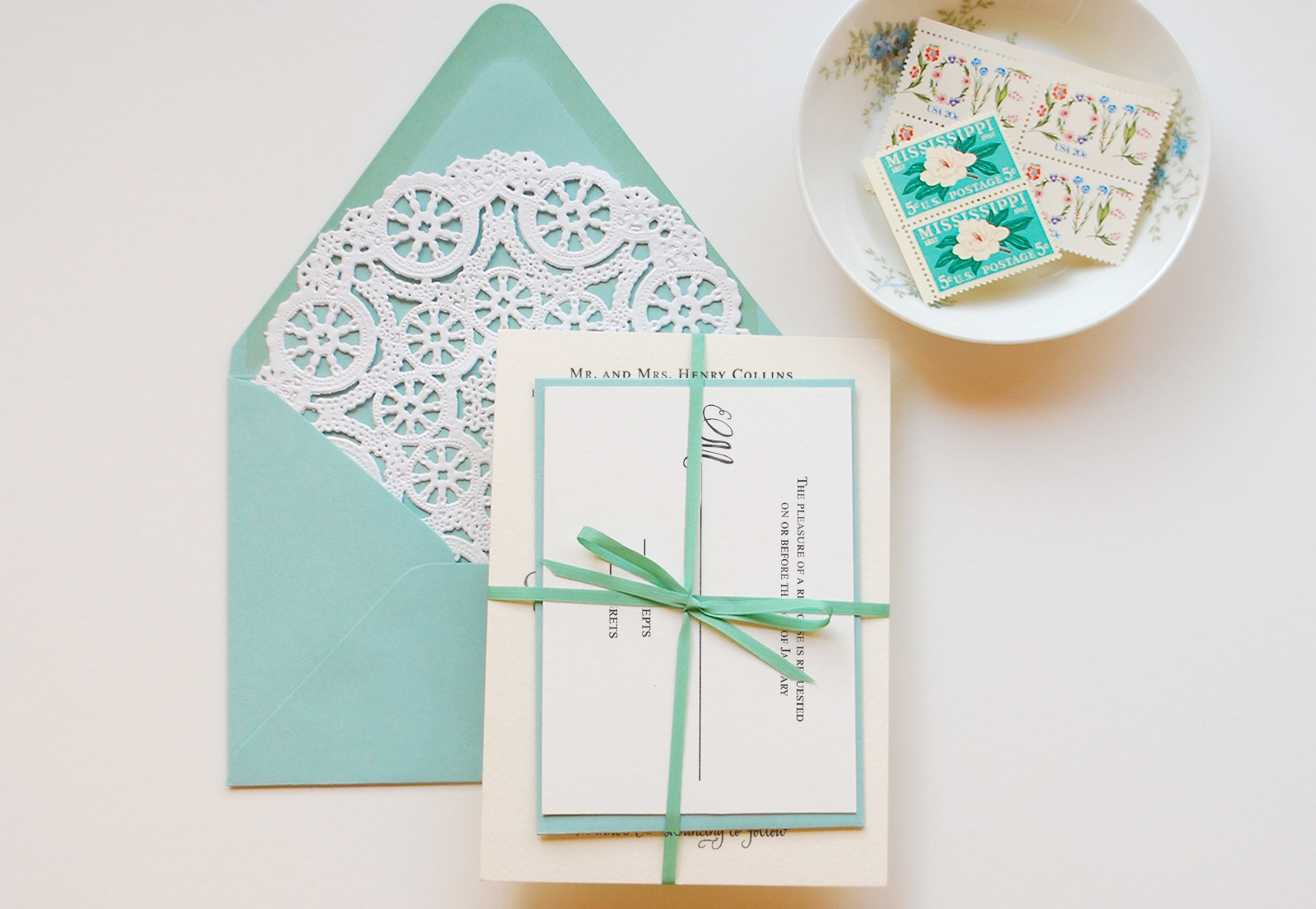
- Beautiful calligraphy wedding invitations by Neither Snow
This week on Oh So Beautiful Paper:
- Enter to win save the dates from Delphine!
- Whimsical illustrated kraft paper wedding invitations
- Wedding invitations inspired by sea creatures!
- Recaps from the New York International Gift Fair: Part 1, Part 2, and Part 3
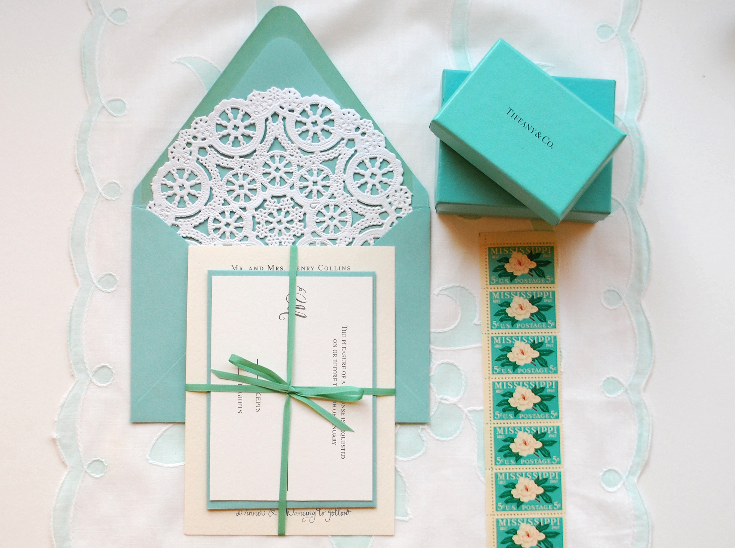
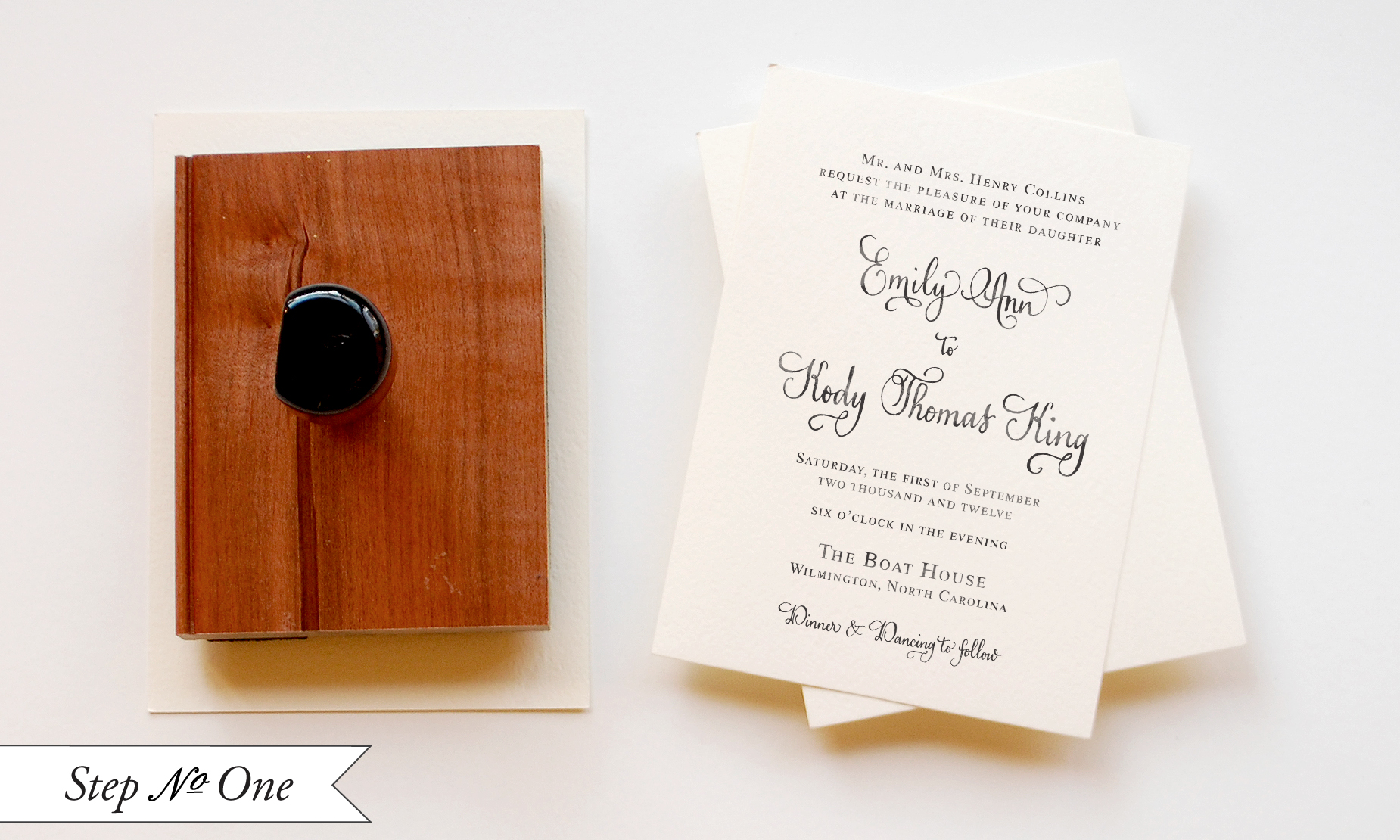
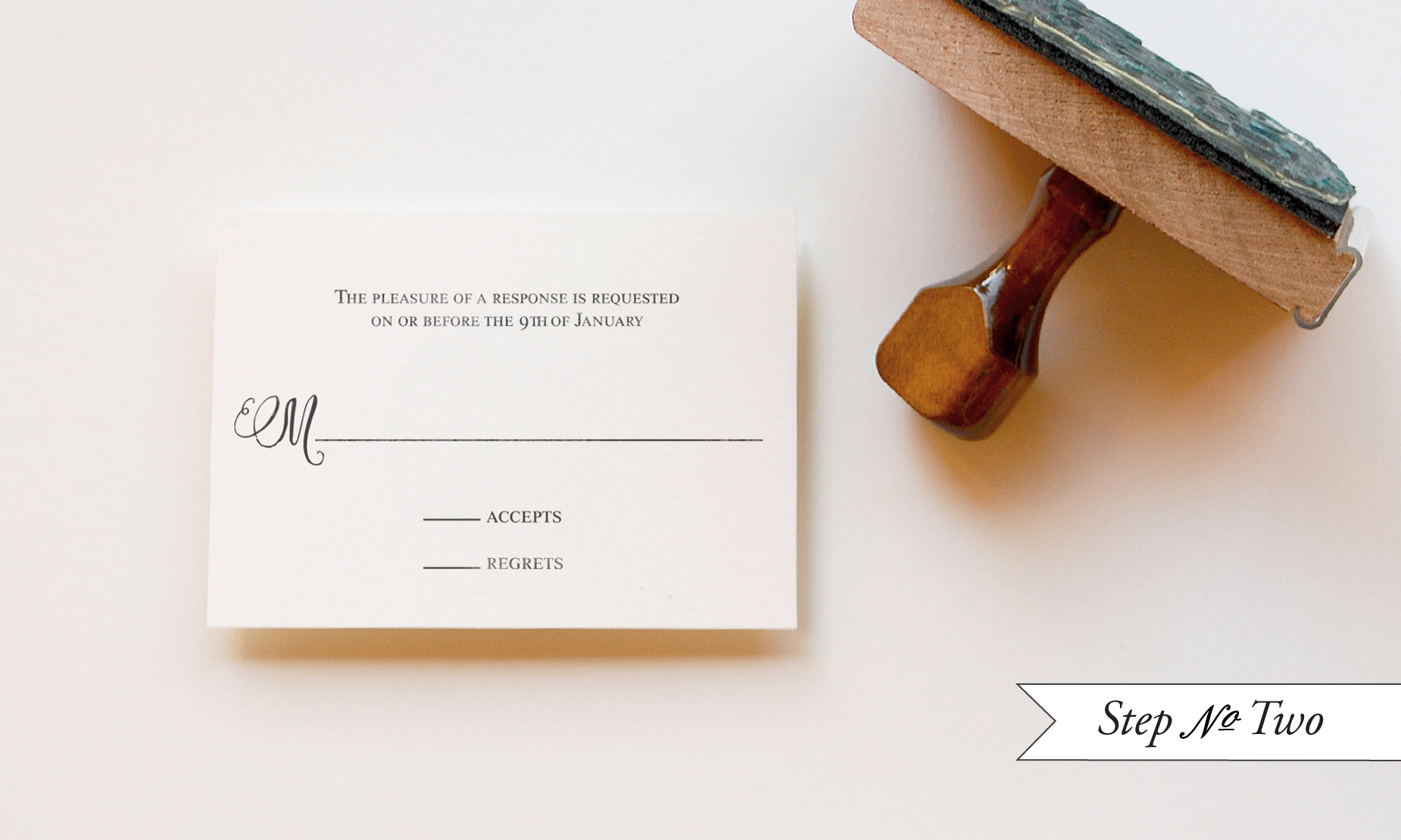
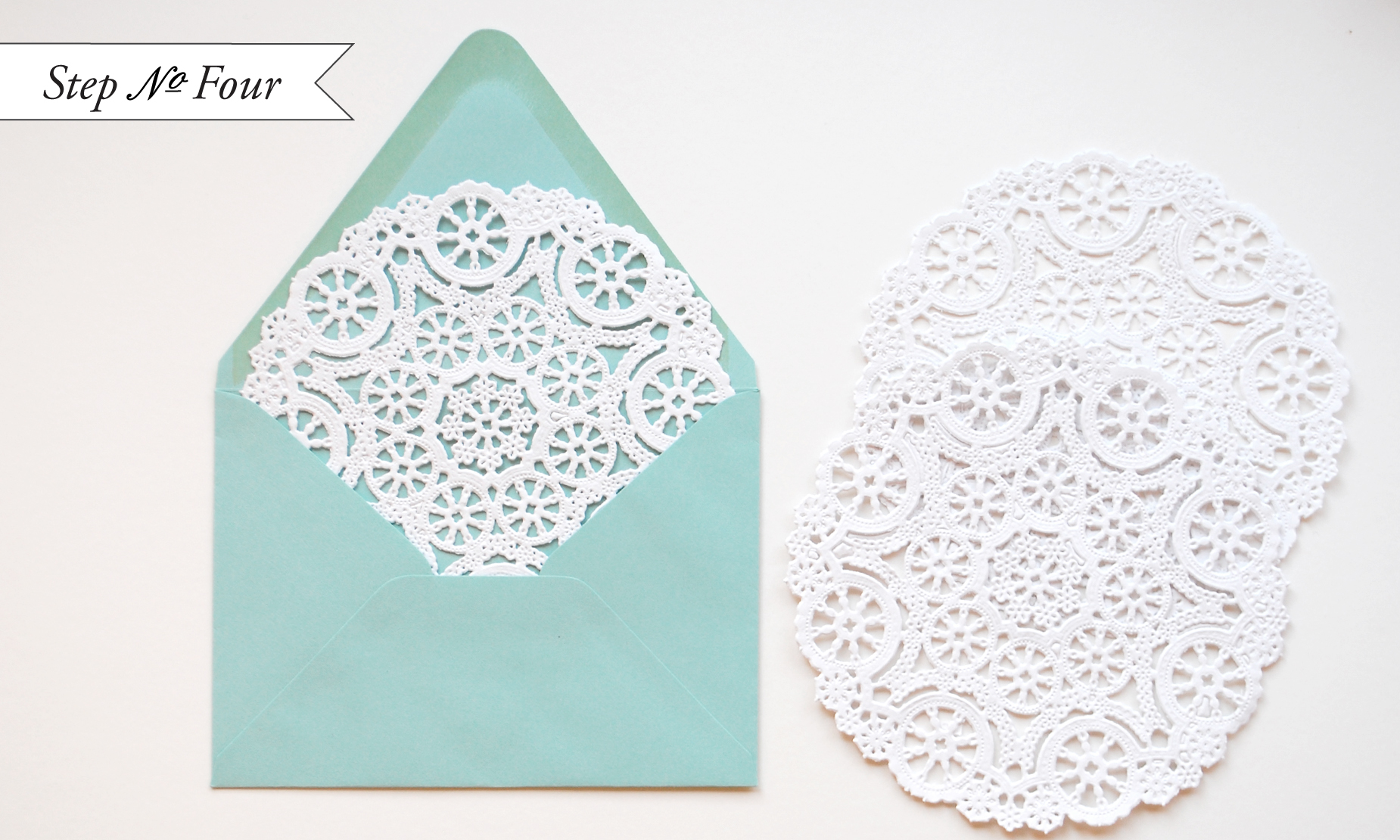
- DIY rubber stamp wedding invitations inspired by Tiffany & Co.
- Papel picado-inspired printable wedding invitations
A big welcome to the newest member of the Designer Rolodex – Campbell Raw Press!
As usual, we have a fun cocktail coming up for you this afternoon, so check back a bit later for the recipe!  I hope you all have a wonderful weekend, and I’ll see you back here on Monday!  xoxo