Little Man Bow Tie-Inspired Baby Shower Invitations

Baby shower invitations and birthday party invitations are such a wonderful opportunity to let loose and have some creative fun, from design to packaging.  Melissa and Amy from Atheneum Creative created these adorable invitations for a “Little Man” theme baby shower, incorporating mini bow ties into each invitation along with a few playful details for the day of the shower.  So cute!

Little Man Baby Shower Invitations and Details by Atheneum Creative via Oh So Beautiful Paper (13)

From Melissa + Amy: We were asked to create the invitations for a ‘Little Man’ theme baby shower.  Whenever possible, we love to bring a level of interaction to any invitation – and what better way to do that than ask each guest don a bow tie for the party?

Little Man Baby Shower Invitations and Details by Atheneum Creative via Oh So Beautiful Paper (5) Little Man Baby Shower Invitations and Details by Atheneum Creative via Oh So Beautiful Paper (7)

Each invitation contained a bow tie in a different pattern and was packaged in a box with wood chips and a custom label.

Little Man Baby Shower Invitations and Details by Atheneum Creative via Oh So Beautiful Paper (11)

Little Man Baby Shower Invitations and Details by Atheneum Creative via Oh So Beautiful Paper (1)

We also created day of signage: a welcome sign reminding everyone to don their bow tie, a well wishes form/sign for the little man, food signs, and favors. For the day-of materials, we kept to the theme of little man by adding in some fun mustaches.

Little Man Baby Shower Invitations and Details by Atheneum Creative via Oh So Beautiful Paper (2) Little Man Baby Shower Invitations and Details by Atheneum Creative via Oh So Beautiful Paper (14)

Little Man Baby Shower Invitations and Details by Atheneum Creative via Oh So Beautiful Paper (3)

So cool!  Thanks Melissa + Amy!

Photo Credits: Chelsea Davis Photography

Arley-Rose + Morgan’s Neon Wedding Invitations

Happy Monday everyone!  And my oh my, do I love today’s wedding invitations.  The ladies of Ladyfingers Letterpress, Arley-Rose and Morgan, created these invitations for their Massachusetts farm wedding this past September.  They both have design school backgrounds and lots of experience designing and printing custom wedding invitations, so they knew they wanted to create something totally unique for their own wedding.  They ended up creating a fantastic poster-size invitation with exuberant hand lettering and neon ink.  So awesome!

From Arley-Rose and Morgan: At Ladyfingers Letterpress, we had been doing a lot of A7-size invitations for other couples.  We knew we wanted to break out of the box on many levels – including size – for the invitations, so we explored the idea of creating a poster.  After months of sketching and experimenting, we finally arrived at a colorful text-based drawing as the invitation.

A friend of ours showed us a really neat glow-in-the-dark silkscreen poster, and as soon as we saw it we knew we had to have some glow-in-the-dark element to our invitations.  The large, 11 x 17″ poster was printed in three color offset and one color letterpress (fluorescent red!) on text-weight 32lb Lettra in fluorescent white and folded down in quarters to fit in a gray A9 envelope.

The location of our wedding was called Seven Arrows Herb Farm, so we incorporated these hand-drawn arrows throughout the design.  We created a pattern out of them and printed them on the backs of our RSVP and “Backyard Soiree” (aka rehearsal dinner) cards that were printed on thick 220lb Lettra and edge painted in fluorescent pink.  We also used the arrow pattern to create a one-color envelope liner.


We created a booklet called “Interesting Bits of Knowledge” that included info regarding accommodations, attire, and one small yet important notice regarding an allergy of our wedding officiant.  This booklet enclosed our Soiree card and fit inside a gold enclosure with two pockets that we designed and die cut.  Our RSVP and return envelope fit inside the other golden enclosure pocket.

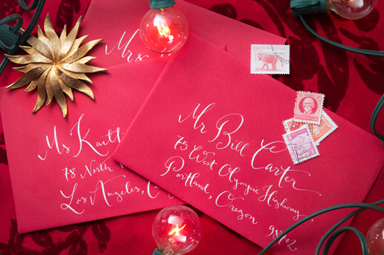
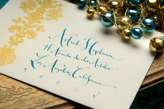
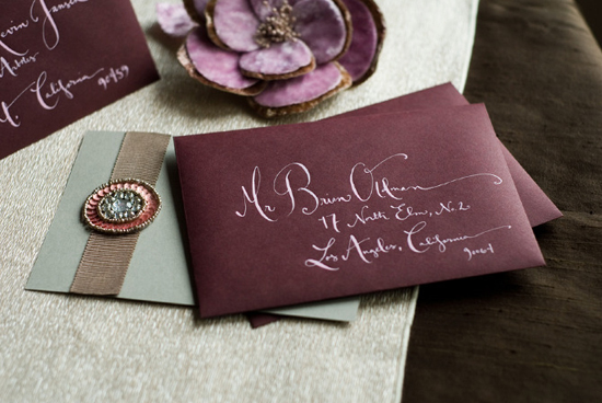
We didn’t have a giant mulit-tiered wedding cake, but in some ways, we did. It was called our invitation: The folded invite was stacked with the filled-up golden enclosure and wrapped with a pink plastic-like belly band and stuffed into our lined envelopes.  Arley hand-painted the addresses on the front with gold and white guache and the envelopes were sealed and taken over to the post office!

Thanks Arley and Morgan!  Check out their wedding over on their blog Ladies in Love – and check out more of their beautiful letterpress work right here!

Check out the Designer Rolodex for more tal­ented wed­ding invi­ta­tion design­ers and the real invi­ta­tions gallery for more wedding invitation ideas!

Photo Credits: Ladyfingers Letterpress, with many thanks to Carrie for sending over the link.

Calligraphy Inspiration: Kathryn Murray

Gone are the days when western calligraphy was synonymous with traditional and predictable handwriting.  Kathryn Murray consistently delivers amazing work with her fresh and elegant style.  You may have seen it before on greeting cards, prints, and in magazines.  Kathryn’s impressive portfolio of work has earned her a go-to standing in today’s world of wedding calligraphy.  Though, it may also have something to do with the fact that the only thing more delightful than her work, is working with her. – Julie

Kathryn Murray holiday envelopes

Kathryn Murray bride & groom buttons

Never one to be afraid of colour, Kathryn’s portfolio showcases an array of hues. (And this is not only visible in her work, but also in her styling!)

Kathryn Murray envelope detail

Kathryn Murray wood placecards

Words cannot express how much I adore these place cards. A lovely contrast of soft hand-written lines and rough, natural wood.

Kathryn Murray addressed envelopes

Kathryn Murray labels

She has mastered a wonderfully fanciful calligraphic style that is playful yet refined. A perfect balance!

Kathryn Murray edible calligraphy cookies

Kathryn has also launched a new product recently: edible calligraphy cookies to be used as customized favors or even place cards.  She noted that, “The calligraphy is printed on edible paper with edible ink as part of a delicious shortbread cookie, with just a hint of cinnamon.”  That’s quite a sweet touch for any special event, don’t you think?

Photo Credits: All photos by Matt Murray, except image(s) no.6 by Sweet Monday Photography

Joanna + Martin’s Music-Inspired Book Wedding Invitations

Longtime readers might remember the awesome pulp novel-inspired wedding invitations that Lyndsay from It’s a Date Design created for her good friends Lis and Jay (and if not, they’re definitely worth checking out!).  Well, Lyndsay is back with another awesome book wedding invitation that she created for newlyweds Joanna and Martin!  Lyndsay incorporated Joanna and Martin’s love for music into a modern book-style wedding invitation, as well as several accompanying elements for the day of the wedding.

From Lyndsay: This project was for a UK couple, librarian Joanna and IT specialist Martin.  Joanna hired me after seeing my last book invitation and we worked together to make their project unique and very personalised to them.  Joanna and Martin got engaged at the Glastonbury Music Festival in June 2010, and their invitation design was influenced by their love of music and literature.

The wedding invitation was a book with a paper slip cover, concertina-folded rather than bound, with a hidden section at the back that revealed a USB drive filled with digital goodies by the couple for each guest.

In addition to the invitation, I also designed quite a few paper items for the day of the ceremony and reception which also had a music/book theme: a music poster seating chart, record-themed menus, bookmark favors, and name badges.  The wedding program we designed together was also fun: it had a glassine envelope filled with confetti attached to the front of each booklet.

Thanks Lyndsay!

Check out the Designer Rolodex for more tal­ented wed­ding invi­ta­tion design­ers and the real invi­ta­tions gallery for more wedding invitation ideas!

Photo Credits: It’s a Date Design

Giada + Davide’s Kraft Paper and Lace Wedding Invitations

As much as I love bright pops of color, I’m just as easily blown away by a beautiful wedding invitation suite done all in soft and natural colors.  Valentina from Cut and Paste created these beautiful invitations for a recent wedding in Friuli, Italy, combining kraft paper, lace, and even lasercut wood into the wedding invitations and day-of stationery!

From Valentina:  Giada and Davide wanted a soft boho style wedding with lots of little flags and banners.  I created an invitation suite with a natural color palette, incorporating lace, kraft paper, and wood.  The kraft paper invitations were screen printed in white ink with a lace overlay at the top, then paired with white envelopes and kraft paper wrap-around address labels.

For favors, we printed copies of Giada and Davide’s favorite biscuit recipe on kraft paper and bound them to small jars of cinnamon.


Lasercut wooden flags served as table numbers, while laser engraved clothespins functioned as place cards.


Thanks Valentina!

Check out the Designer Rolodex for more tal­ented wed­ding invi­ta­tion design­ers and the real invi­ta­tions gallery for more wedding invitation ideas!

Photo Credits: Valentina | Cut and Paste