Finding the Paper: Brass Union
With spring officially here, that means trade show season will be upon us before we know it. Things around the studio have been hectic, between shipping The Parcel, filling samples and a bit of business travel, I barely even noticed the hellebores blooming. Before we get too busy, I wanted to share this brand identity for Brass Union that draws on the history of its surroundings for its design inspiration. – Jill

With a cohesive brand identity that pays homage to the building’s history, Brass Union is a pub housed in the former police station in Union Square’s Somerville neighborhood. Designed by Rory & Jen at Oat, Brass Union’s brand identity is a great example of the stellar results that can be achieved when mixing different paper stocks, textures, type and production techniques. The team at Oat utilized the building’s history to channel bureaucratic and administrative in a subterranean hideaway, housed in a historic police station.

Gold metallic ink pairs beautifully on the deep blue shade of the business cards, offset printed in one color on French Paper’s Construction 100# Cover in Midnight Blue.

The letterhead feels official with a blind embossed seal on text weight paper, printed offset in two colors on Mohawk Via 70# Text in 100% PC Cream White. Accompanied by a standard bright white #10 window envelope, giving the stationery suite a utilitarian look.

The menu system echoes the details of the stationery, with main menu printed offset on the same stock as the letterhead in metallic gold and blue. The drink and dessert menus carry through with the cropped type treatment, bringing in a bit of color. The drink menu is printed on Mohawk Via Light Pink 70# Text. The metallic gold on the dessert menu pops, printed on French Poptone 100# Cover in Blu Raspberry and sporting a blind embossed navy seal.

With die-cut, badge shapes and cropped type in shades of blue, the coasters tie in perfectly to Brass Union’s identity and space. Cheers!


Photo Credits: Oat
Printable Calligraphy “Hello” Note Cards
Spring and summer always bring a handful of new occasions that require a thank you note or a quick note to say hello. There are backyard BBQs hosted by your friends, bridal showers and weddings galore, and the ubiquitous ‘just because’ note to check in. I’ve tried to get in the habit of sending more handwritten notes. I hand letter things all day, so it seems silly that I don’t incorporate this more into my daily life for people other than customers. We all know the feeling of getting something other than bills in the mail, so I decided to help you guys get into the habit as well with these printable calligraphy “hello” note cards that are perfect for spring and summer. – Lauren

To make the note cards, simply download the printable file right here and print on white cover weight card stock using your home printer! I designed the cards to be a half sheet of paper each, meaning you’ll get two cards per letter-sized sheet of paper. Just print and cut straight down the middle using a paper trimmer. Trim the white edges off as well. And remember to select “scale to fit” in your printer settings so that your printer doesn’t trim the artwork.


Tuck these notes in with gifts, packages, hostess gifts, your friend’s windshield wiper… whoever needs a quick hello! You can also print out a few extra sets, tie them up with a pretty ribbon, and keep them for last minute gifts on the go. I can’t think of anyone who wouldn’t appreciate an extra set of notecards in their desk.
Printable artwork © Lauren Saylor of A Fabulous Fete and created exclusively for Oh So Beautiful Paper. All artwork is created for personal use only and may not be altered, reproduced, or sold in any way without prior written consent.
Post-it Brand Celebrates 35 Years!
I’m always writing little notes. Notes with little reminders, favorite quotes, and even little love notes to my husband and my kids. I’ve been writing little notes – to myself, to my family, to friends and co-workers – for as long as I can remember. And so many of those notes have been on Post-it® Notes! I usually keep a few Post-it® Note pads scattered around my office, and I love the bright pop of color on my desk. Post-it® Brand products have been a huge part of my life – from student to creative entrepreneur – and I’m thrilled to help them celebrate 35 years of helping great ideas take shape!

Believe it or not, Post-it® Brand launched in 1980 with the introduction of the original Canary Yellow Post-it® Note! Fun fact: To help introduce the brand new product, Post-it® Brand mailed packs of the original notes to Fortune 500 CEOs and their secretaries. Pretty smart, huh? Since then, Post-it® Brand has introduced everything from Post-it® Notes in new colors, shapes, and sizes to help us all create and collaborate, to Post-it® Note Flags and Tabs to help keep us all organized, to fun Post-it® Note Big Pads that help us when we need to dream a little bigger. Post-it® Brand products are an indispensable tool for anyone trying to create or stay organized, whether in the office, at school, or at home.


Last year, I partnered with Post-it® Brand to create a fun cocktail party menu made entirely of Post-it® Notes from the World of Color Collection! The Post-it® Notes come in a range of bright colors with 9 color palettes inspired by global design. We used the tropical-inspired colors of the Bora Bora collection, but I also love the bright neons of the Rio de Janeiro collection, the soft pastels of the Bali collection, and the candy colors of the Cape Town collection. It was such a fun challenge to think of a new way to use a product that has been a constant presence on my desk for so many years!


Post-it® Brand products have transformed the way we work, create, and even inspire achievement over the last 35 years – I’d love to hear the creative ways that you’ve used Post-it® Notes and other Post-it® Brand products in your life!
This post is sponsored by Post-it® Brand, helping great ideas take shape for 35 years. All content and opinions are my own. Follow Post-it® Brand on Twitter, Facebook, Instagram, and Pinterest. Thank you for supporting the sponsors that make Oh So Beautiful Paper possible!
Hand Lettered Invitations for a Wedding in the Woods
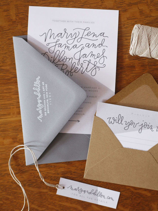
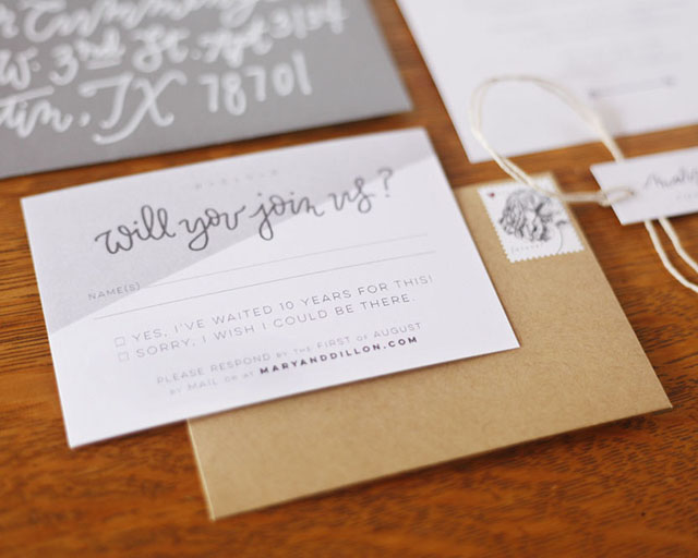
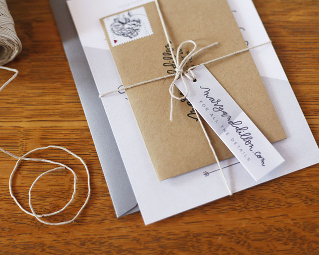
Happy Monday everyone! Did you all have a fantastic Easter weekend? We had so much fun hunting for eggs – we did it twice! Alice (18 months) even managed to get a couple of eggs in her basket, with a little assistance from her older sister and cousins, of course. We’re still recovering from our collective chocolate coma, so I thought I’d ease into the week with a gorgeous set of wedding invitations! Designer Mary Fama created these hand lettered invitations for a wedding in the woods – her own wedding at her parents’ log house in Kansas! Mary wanted to blend hand lettering and modern design with the secluded rustic aesthetic of the wedding venue. Love!
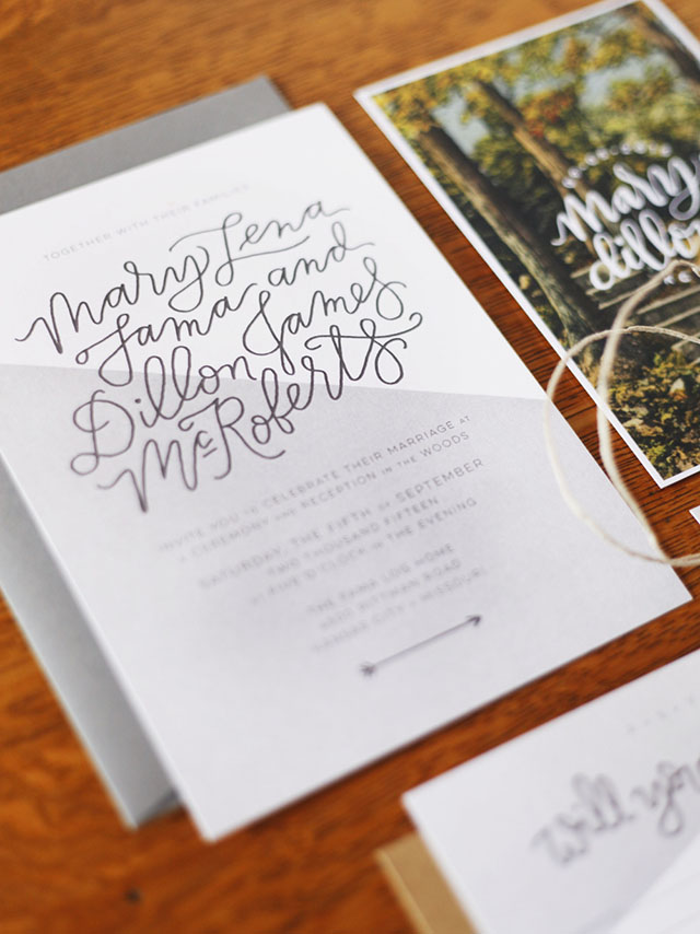
From Mary:Â My husband and I got married in the backyard of my parents’ log house in Kansas City, Missouri, on our ten-year anniversary. We currently live in Brooklyn, but chose to return to the city where we met (as fifteen year olds!) to celebrate with our closest family and friends.
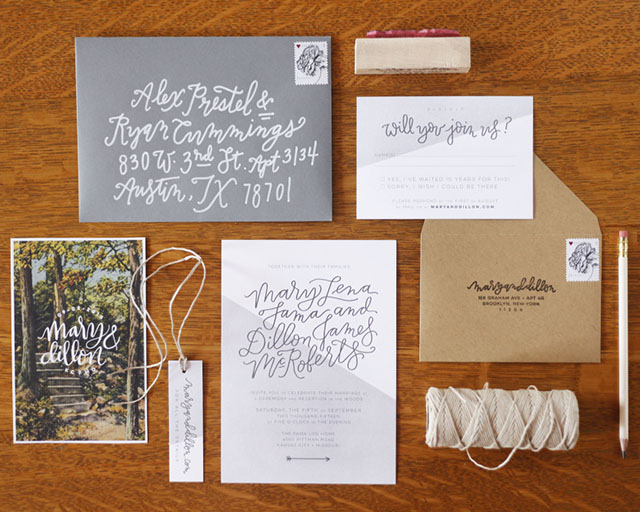
The overarching visual concept of the wedding was to contrast modern, white, and clean lines with the wooded, rustic location. For example, pairing wooden farmhouse tables with clean white plates​ and chairs to achieve that balance​. To translate that theme into the invitations, ​it all started with the save the date.

While I was planning, I found this incredible vintage postcard that was a spitting image of the staircase behind my parent’s house​ that leads up into the woods where the wedding was to be held. ​I wanted to showcase that image because it was so special and also so inviting. People thought that it was a photograph of the actual land, when really it was a postcard from New Haven, Connecticut from the 1930s! Once I had the postcard save the date, I wanted to keep the rest of the suite modern and fresh but pair it with whimsical handwriting, stamped return addresses and a bit of twine​.
The angular, geometric lines in the backgrounds were part of an overarching theme I was trying to bring throughout the wedding. ​​I dip dyed white napkins at a hard angle into gray dye, and those were paired alongside modern white vintage plates at each setting​.
Thanks Mary!
Check out the Designer Rolodex for more talÂented wedÂding inviÂtaÂtion designÂers and the real inviÂtaÂtions gallery for more wedding invitation ideas!
Photo Credits: Mary Fama