Michelle + Oshine’s Paris-Inspired Wedding Invitations

Today’s real invitations come courtesy of Michelle from Armas Design.  Michelle’s rockin’ wedding was featured on snippet & ink a few weeks back, where I fell in love with her Paris-themed invitations.  Michelle was kind enough to send over some additional photos and information about how she put her invitations together – so I’ll turn things over to Michelle:

We had a small wedding, and I wanted to make the invitations very special, but not too precious. I wanted the invitations to exude a playful, quirky quality but with a crisp, buttoned up undertone.  That pretty much sums up our wedding look!

Michelle7

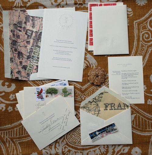
We also had a tight budget, so I bought some plain ivory cards embossed with a wreath on the top and printed the invitations at home:

Michelle2

The special details come from the vintage reproduction maps of Paris that I used to line the envelopes with, which were too dull and thin on their own, and vintage stamps. I bought tons of vintage stamps on eBay and peppered the envelopes and the reply envelopes with gorgeous colored stamps:

Michelle3

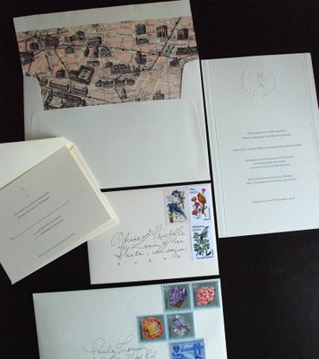
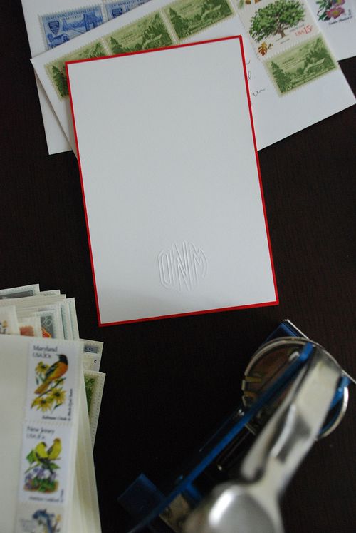
I also printed the programs and the reply cards at home. For our thank you cards, I bought an embosser with our initials and some red rimmed cards from Crane and made “custom” thank you cards.  I also used that embosser to make our programs unique and give them a more tactile feel:

Michelle5

To add a little bit more of an irregular, organic element, I had the post office hand stamp the envelopes, so they have that nice round stamp on on them.  It was a nice finishing touch since the suite was very symmetrical and classical.

I love the way Michelle incorporated vintage maps and stamps to balance out the more classic invitation elements.  And the use of a custom embosser is one of my favorite details – particularly since it can be used to customize any future personal correspondence.  Just lovely!

{images via Armas Design – thanks Michelle!}

Illustrated Wedding Invitations – Rifle Design

I love, love invitations that incorporate hand-lettering or illustration, particularly the work of Florida-based illustrator Anna Melcon Bond of Rifle Design.  Anna seems to effortlessly blend traditional illustration with folk art elements to create some of the most lovely Save the Dates and wedding invitations.

This first Save the Date is one of my all-time favorites – I love the the contrast between the black background, floral illustrations, and white hand-lettering is just so beautiful:

The next set is one of Anna’s most recent invitation suites, created for a late Spring wedding in North Carolina:

Rifle Paper Co Illustrated Wedding Invitation Suite

Rifle Paper Co Illustrated Wedding Invitation and Map

Rifle Paper Co Illustrated Wedding Invitation and Map

As you might expect, Anna designed the invitations for her own wedding.  She then carried those elements through to other elements of the wedding, such as the ceremony programs and even to the cake!

Rifle Paper Co Anna Bond Illustrated Wedding Invitation

Rifle Paper Co Fan Ceremony Programs

Anna Bond Rifle Paper Company Wedding Cake

I love the way Anna brings a sense of fun and whimsy to every invitation design:

Rifle Paper Co Hand Lettered Wedding Invitation

Rifle Paper Co Hand Lettered Wedding Invitation

Rifle Paper Co Hand Lettered Wedding Invitation

Gorgeous, right? For more of Anna’s lovely work, head on over to her website, blog, and flickr page (where you can also see a few photos from her lovely, lovely wedding)!

{image credits: rifle design}

Jamie + Ben’s Kraft Paper Desert Wedding Invitations

I love, love the invitations from Jaime (and her husband Ben) of A Desert Fete.  When I first saw Jamie and Ben’s invitations, I was completely struck by how they totally embodied their Joshua Tree wedding and reflected Jamie and Ben’s architectural and musical influences.  Jamie designed and printed the invitations herself using her trusty Gocco and a home printer.  The invitation suite included a main invitation, printed front and back, an RSVP postcard (both printed on heavy weight museum board), and map enclosure, all of which were bound together using artists tape.  Jaime was kind enough to send over a bit about the design and inspiration process (during her Spring Break no less!), so I’m turning it over to her!

From Jamie: So much of our wedding’s style came from my husband’s request to have red roses.  I am not sure why he was so sure of this, he has never shown a particular preference for roses.  He mentioned something about ‘desert rose.’  I think this must be a music reference…

Desertfete

When we chose our desert location I immediately thought of succulents and a crisp modern aesthetic, but the roses took us down a kind of rustic western/vintage cowboy road.  Ben is a musician and our love for music is a huge part of our lives.  Part of the allure of Joshua Tree for us (where we were married) is around the legend of late musician Gram Parson’s, whose style was very rock & roll/cowboy meets… glam?

With this in mind we then poured through graphic design books and ultimately fell in love with the style of Hatch Show Print.  I started with that idea and then added romantic flourishes.  (I did most of the designing in Adobe Illustrator, a skill I have picked up while studying architecture.)  We became Gocco crazy, and loved the vintage-esque patina that resulted in our lack of experience.  It was perfect.

Desertfete3

For the main cards we used large sheets of museum board (cut to size by kinko’s machines).  We didn’t want to try and Gocco the maps as our inability to do good detail meant they might not communicate as well, but we wanted them to look intentionally different rather than just as an after thought.  I had previously found a roll (like, hundreds of feet long roll) of really really thin paper, like super thin crate paper the same color as kraft paper (At an industrial salvage store. FOR A DOLLAR). We used our regular canon printer and printed the maps I made in illustrator onto the kraft paper, then folded them up (like a map) and stuck them into a mini envelope.

We wanted the whole set to feel like a little object, so we banded all the cards and the mini envelope together with artist tape that is used on the backs of canvases and is self adhesive when you wet it.   We kept it really simple, this was especially important to Ben, every time I tried too complicate something, or add more elements and extras, he would reign me in on the concept of simplicity.

Adesertfete3

If either one of us had made these without the other ones input the designs would have been wildly different, so it is pretty neat to see the result of a true collaboration.  That and the influence of place, again they would have been so different but for a different venue, I think really made these what they are.

Sigh.  I love how element of the invitations, from the colors to the paper choice to the printing method, is so perfectly suited for Jaime and Ben’s wedding.  Thank you so much, Jaime, for sharing your invitations with us (and for putting up with all of my pestering over the past few months)!

{all images by Jaime/A Desert Fete}