NSS 2016 Sneak Peek: Ramona & Ruth

Our next NSS 2016 sneak peek comes from a familiar face, but a brand new company name! Kim of Paper Lovely recently renamed her business Ramona & Ruth after her two grandmothers. In addition to the new company name, Kim has been busy designing new greeting cards, gift tags, and notebooks – all making their debut at the National Stationery Show starting on Sunday! Kim’s focus this year has been on black and white designs with a pop of color and gold foil. So fun and refreshing!

NSS 2016 Sneak Peek: Ramona and Ruth / Oh So Beautiful Paper

NSS 2016 Sneak Peek: Ramona and Ruth / Oh So Beautiful Paper

NSS 2016 Sneak Peek: Ramona and Ruth / Oh So Beautiful Paper

NSS 2016 Sneak Peek: Ramona and Ruth / Oh So Beautiful Paper

More from Ramona & Ruth right here!

Colorful Dip Dyed Baby Announcements

I’ll always have a soft spot for dip dyed stationery, especially when combined with beautiful calligraphy and mint green edge painting! Brittany from Swell Press Paper Co. created these sweet dip dyed baby announcements – with a two color dip dye! And how cute are those mini mint green envelopes with little newborn baby photos???

Dip Dyed Baby Announcements by Swell Press / Oh So Beautiful Paper

From Brittany: When Bradley reached out to me to create a fun, one of a kind letterpress birth announcement for her new baby girl Frances Walker, I immediately knew this project was going to be a blast. Bradley wasn’t scared of color, and let me run wild with whatever design idea I had. I was so excited to be able to combine my two favorite techniques – dip dying (in two colors!) and edge painting – all topped off with the beautiful calligraphy of Melissa from Olive Branch & Co.

Dip Dyed Baby Announcements by Swell Press / Oh So Beautiful Paper

Dip Dyed Baby Announcements by Swell Press / Oh So Beautiful Paper

Dip Dyed Baby Announcements by Swell Press / Oh So Beautiful Paper

Crane’s super thick 220lb Lettra Cotton Paper in Pearl White perfectly absorbed the dip dye and allowed for a beautiful, deep impression of the text. I chose a light periwinkle ink color to match the envelopes; the spring colors were perfect to welcome the new babe into the world!

Dip Dyed Baby Announcements by Swell Press / Oh So Beautiful Paper

New mom Bradley also is a fan of anything miniature (I mean who isn’t?), so I included a mini mint green envelope (with matching edge paint color!) and three tiny photos of Walker (and her adorable chubby legs). This is by far one of my favorite projects to date!

Dip Dyed Baby Announcements by Swell Press / Oh So Beautiful Paper

Dip Dyed Baby Announcements by Swell Press / Oh So Beautiful Paper

Thanks Brittany!

Design, Printing, and Dip Dyeing: Swell Press Paper Co.

Calligraphy: Olive Branch & Co.

Photo Credits: Swell Press Paper Co.

NSS 2016 Sneak Peek: Amy Heitman

I’m a big fan of Amy Heitman’s beautiful illustrated greeting cards, and I’m so excited that she’s exhibiting at the National Stationery Show for the very first time (booth #2066)! Amy will debut more than 20 new greeting cards, including a brand new foil collection, and a new collection of illustrated gift wrap patterns. Here’s a little sneak peek!

NSS 2016 Sneak Peek: Amy Heitman

NSS 2016 Sneak Peek: Amy Heitman

NSS 2016 Sneak Peek: Amy Heitman / Oh So Beautiful Paper

NSS 2016 Sneak Peek: Amy Heitman

NSS 2016 Sneak Peek: Amy Heitman

NSS 2016 Sneak Peek: Amy Heitman

More from Amy Heitman right here!

Gold Foil Architecture-Inspired Wedding Invitations

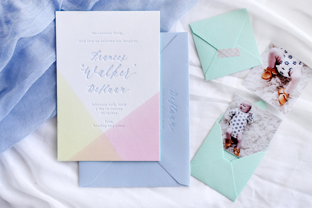
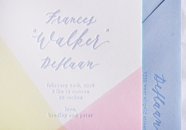
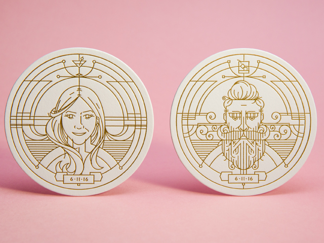
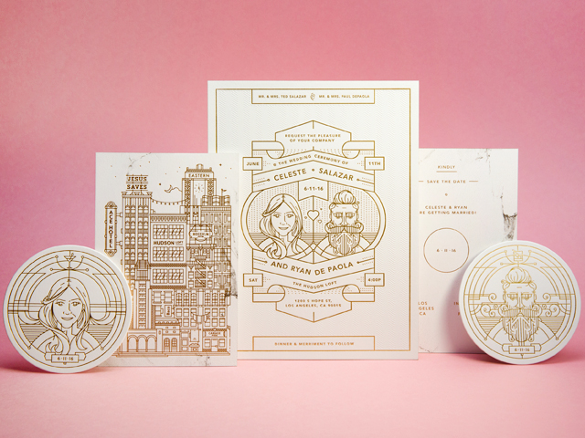
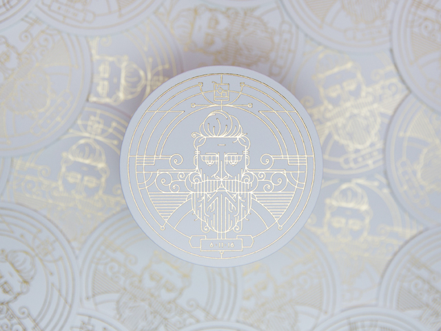
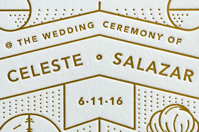
Normally we hear the designer’s perspective on a particular wedding invitation, but today we’re lucky to hear from both the designer and the printer of these beautiful gold foil architecture-inspired wedding invitations and save the dates. Such a treat! Designer Ryan DePaola drew inspiration from his adopted home town, Los Angeles, for both the invitation and save the date design, then the talented production team at Mama’s Sauce brought the design to life through a combination of screen printing, letterpress printing, and gold foil!

Gold Foil Architecture-Inspired Wedding Invitations by Mama's Sauce / Oh So Beautiful Paper

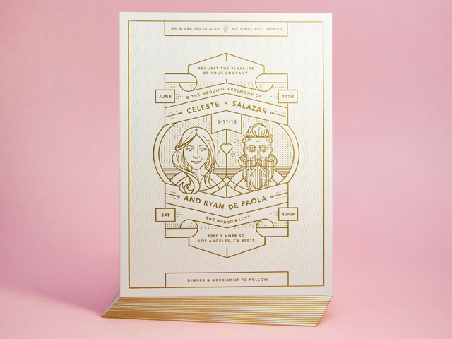
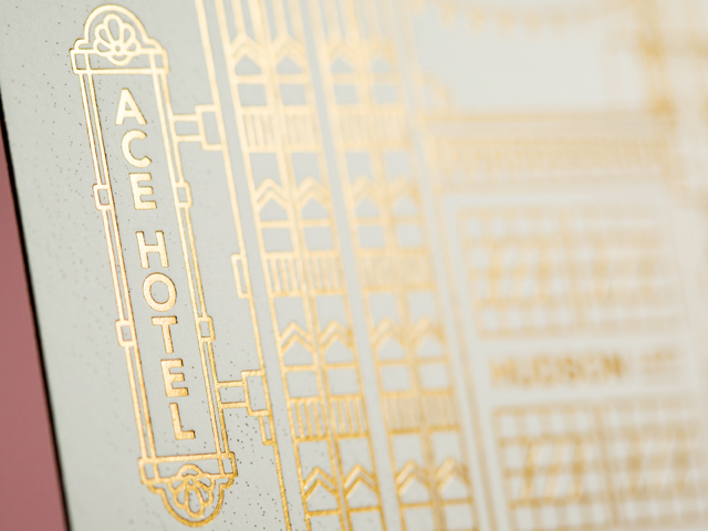
First, a few notes on the design inspiration from designer Ryan DePaola: Our wedding suite was inspired by our venue, its location and what the two together represented to us. We choose to incorporate both ourselves as well as the city itself in our invitation to further integrate the two as one. The foil line work and flourishes are really an homage to the city of LA itself and the impact it has had – not just in style and architecture, but to us.

Gold Foil Architecture-Inspired Wedding Invitations by Mama's Sauce / Oh So Beautiful Paper

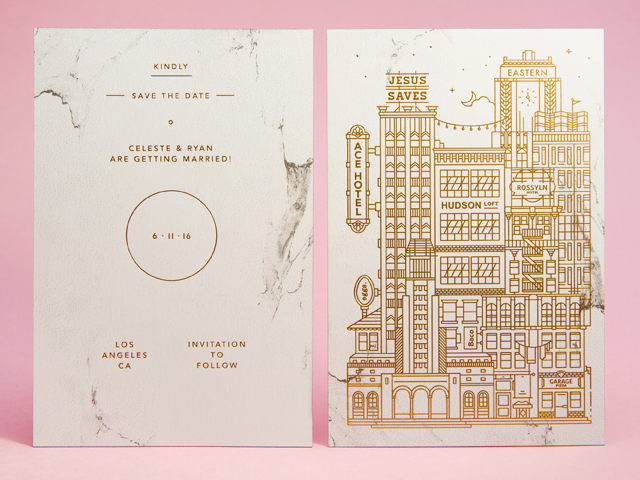
LA is where my fiancé and I first met and dated, so for the save the dates I wanted to pull in all the beautiful architecture of all the buildings in downtown LA that had had special meaning to us. Where we had our first date all the way to our pizza spot. Where we had built our relationship and where we are solidifying it.

Gold Foil Architecture-Inspired Wedding Invitations by Mama's Sauce / Oh So Beautiful Paper

Gold Foil Architecture-Inspired Wedding Invitations by Mama's Sauce / Oh So Beautiful Paper

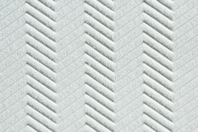
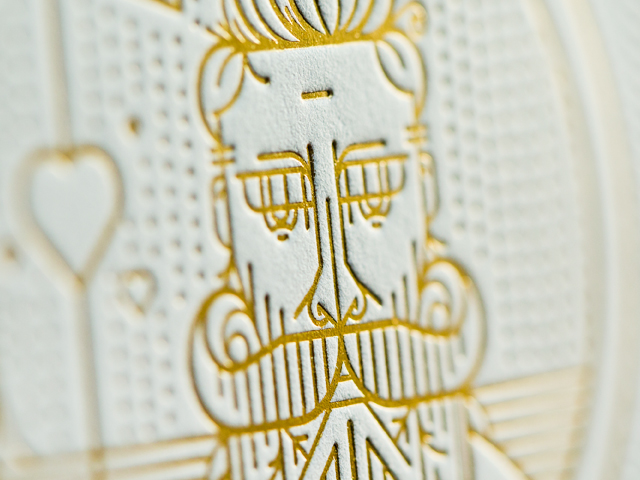
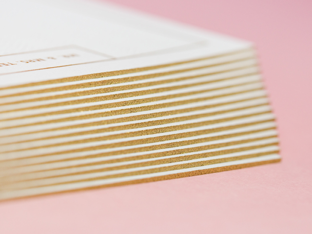
From Mama’s Sauce on printing and production: Ryan’s suite was ultimately letterpress and foil in the end, but for his Save the Date we also incorporated screen printing. That was the only piece in his suite that utilized a different paper. We chose to to go with the smoother, less fibrous, Neenah Classic Crest Solar White for the Save the Date to ensure the half tone screen printed portion of the design (the marbling) printed as consistently as possible. Little technical decisions like this can go a long way when you’re really thinking through the best way to bring art to life within a process, as each design marries (pun!) with the process and paper differently.

Gold Foil Architecture-Inspired Wedding Invitations by Mama's Sauce / Oh So Beautiful Paper

The remainder of the suite was foil stamped and letterpress printed on double thick cotton paper that resulted in a strikingly consistent impression from both processes. They were pre-duplexed to double thick, as there wasn’t any relief printing on the backside.

Gold Foil Architecture-Inspired Wedding Invitations by Mama's Sauce / Oh So Beautiful Paper

Gold Foil Architecture-Inspired Wedding Invitations by Mama's Sauce / Oh So Beautiful Paper

Gold Foil Architecture-Inspired Wedding Invitations by Mama's Sauce / Oh So Beautiful Paper

Gold Foil Architecture-Inspired Wedding Invitations by Mama's Sauce / Oh So Beautiful Paper

Suites like this are a dream to work on for us. The designer is the client, and in this case the designer-client knows how to design well for our processes, yet is able to lean into our expertise for suggestions in order to make the package really shine, like foil is supposed to do.

Gold Foil Architecture-Inspired Wedding Invitations by Mama's Sauce / Oh So Beautiful Paper

Thanks Ryan and Mama’s Sauce!

Design: Ryan DePaola

Letterpress, Foil, and Screen Printing: Mama’s Sauce

Check out the Designer Rolodex for more tal­ented wed­ding invi­ta­tion design­ers and the real invi­ta­tions gallery for more wedding invitation ideas!

Photo Credits: Mama’s Sauce