Monochromatic Illustrated Floral Wedding Invitations
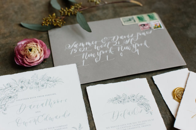
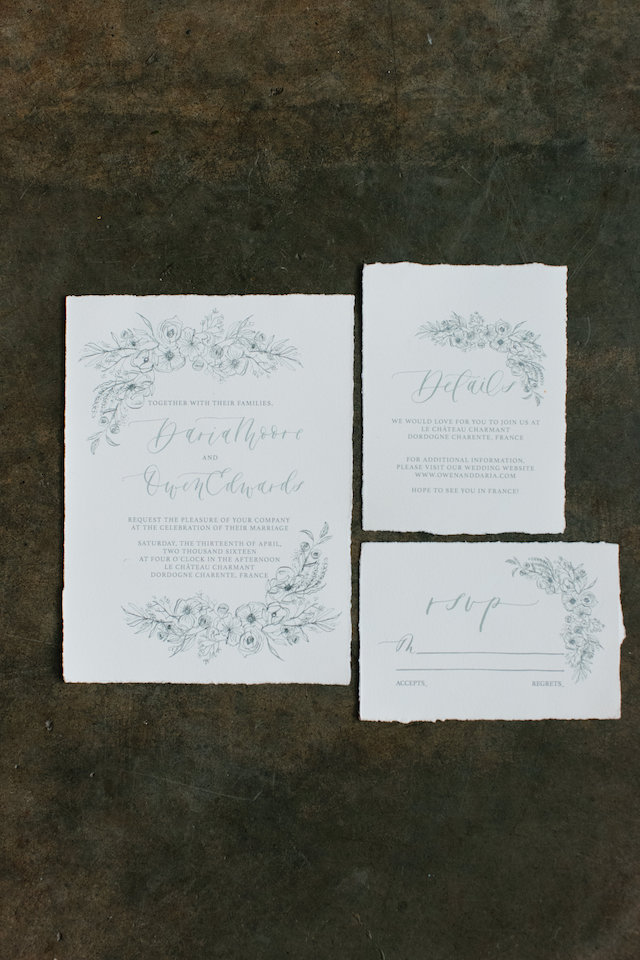
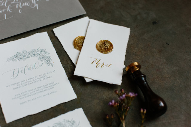
I love big, colorful watercolor floral illustrations as much as the next girl, but sometimes it’s refreshing to see something more restrained. And while these monochromatic illustrated floral wedding invitations from Jill at Art + Alexander are pared down in color, they don’t sacrifice anything when it comes to elegance and romance. I love that Jill used a calligraphy pen and nib to create the floral illustrations – and how pretty are the deckled edges on that Cartiera Magnani paper??
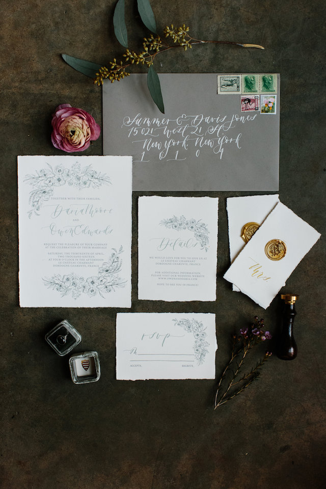
From Jill: I wanted this invitation to be elegant, romantic, organic, and pared down. As an invitation designer, I get a lot of requests for my watercolor florals, which I love creating – but I wanted to try something a bit different for this invitation design.
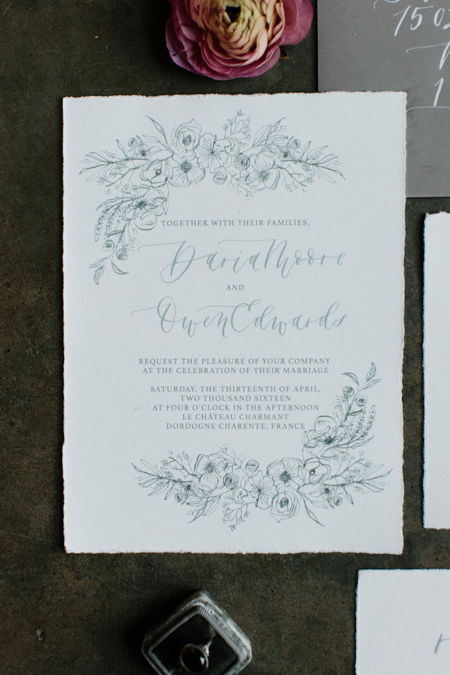
I chose to create the floral illustration using a calligraphy pen and India ink. I wanted the crisp line that a calligraphy pen offers. I opted for a monochromatic design to really keep things simple, allowing the eye to focus attention on the calligraphy and florals. I incorporated pops of color in the invitation suite through the antique postage stamps I used on the envelopes, which I found in an old steamer trunk that belonged to my Grandmother.
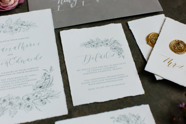
The invitations were digitally printed on Cartiera Magnani paper, which has long been a favourite of mine and offers a very rich, pulpy, organic feel. I decided on a dark gray envelope to add a touch of contrast, and used white ink for the addresses to pull everything together. These envelopes were sourced from Reid’s Stationer’s here in Calgary, and the address calligraphy ink is white India ink.
Thanks Jill!
Design and calligraphy: Art + Alexander
Check out the Designer Rolodex for more talÂented wedÂding inviÂtaÂtion designÂers and the real inviÂtaÂtions gallery for more wedding invitation ideas!
Photographed by: Shannon Yau
DIY Marbled Easter Eggs Using Food Coloring
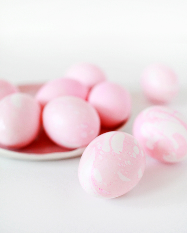
Last year was the first year that Sophie, my (now) three and a half year-old, really got into the whole Easter experience. We spent the holiday weekend with family, and she absolutely LOVED dyeing Easter eggs and the subsequent backyard hunt with her cousins. So naturally I’ve been thinking of fun ways to decorate our Easter eggs this year, and I’m excited to share some with you! First up, marbled Easter eggs using food coloring! I’ve seen some gorgeous marbled Easter eggs that use nail polish (these are my favorite), but nail polish marbling can be very messy and isn’t food safe. But it turns out that you can create beautiful marbled eggs using just plain old liquid food coloring and a bit of vegetable oil. Super easy and totally toddler friendly!
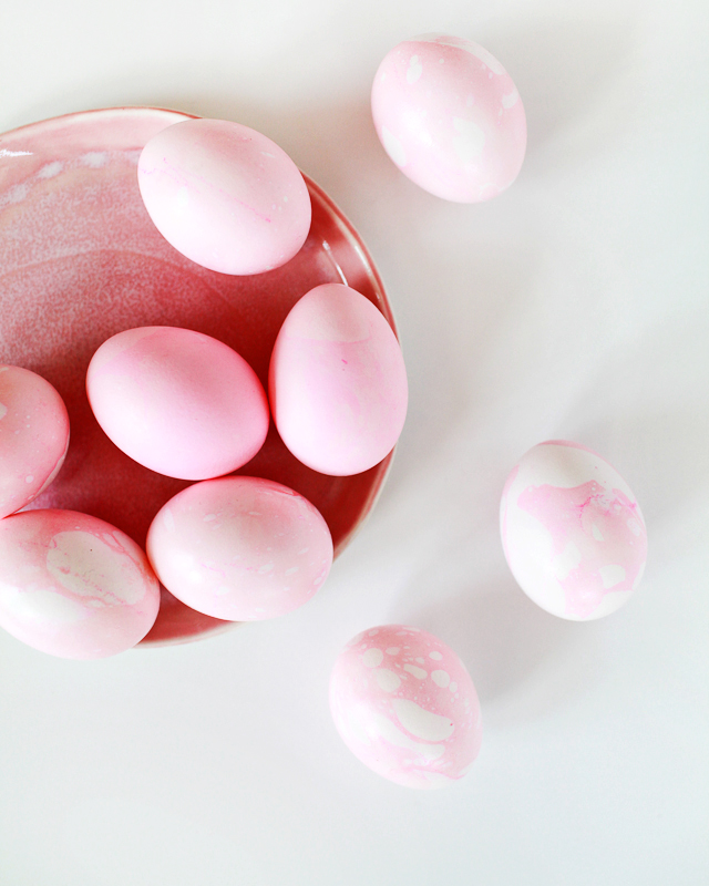
I really had one goal in mind when it came to these eggs: a marbled pattern in my favorite shade of pale pink. It also happens to be Sophie’s favorite color (win win!), but I also think it’s the perfect shade for early spring. Since we’re using regular old liquid food coloring, you can easily adjust the color and shade to your preferences. Start with less food coloring for a lighter shade, or just add more food coloring to achieve a deeper shade of your chosen color.

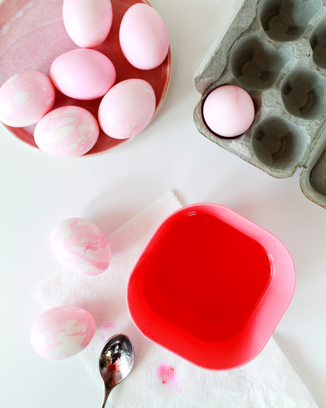
Supplies
Hardboiled Eggs
Liquid Food Coloring
Small Bowl
Vinegar
Vegetable Oil
Spoon
Paper Towels
Disposable Gloves (optional)
To make the eggs:
Step 1. Fill a small bowl with hot water (you’ll want enough water to fully cover a submerged egg). Add one tablespoon of vinegar, followed by several drops of liquid food coloring in your chosen color. I added about ten drops of red food coloring to achieve this pale pink color.
Tip: You can test the dye color with a paper towel before submerging your eggs, but keep in mind that a paper towel will absorb the dye much faster than an egg, so you’ll want the paper towel to show a dye color several shades darker than your intended egg color.
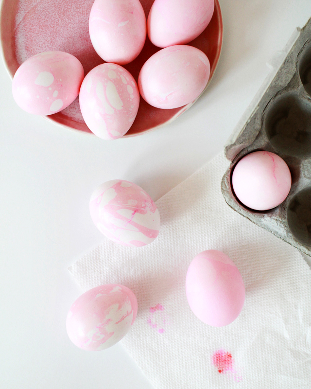
Step 2. Add a dash of vegetable oil (or any other oil you might have in the house) to your dye bath, and swirl around with a spoon. The marbling pattern on your egg will be determined by the size of the little oil bubbles floating around the dye bath, so for a more marbled look be sure to give that oil several stirs!
Step 3. Wearing gloves or using a spoon, submerge an egg in the dye bath, rotating it fully to make sure that the entire surface makes contact with the oil bubbles on the surface of the dye bath. Remove from the dye bath immediately and pat dry with a paper towel.
So easy!
If you like, you can achieve a more subtle tone-on-tone marbled pattern by dyeing your eggs a lighter shade of the same color in a separate dye bath before dipping them in the marbled dye bath, which I did to a couple of my eggs. But I honestly love the look of the marbled dye on white eggs, and it takes all of 30 seconds per egg!
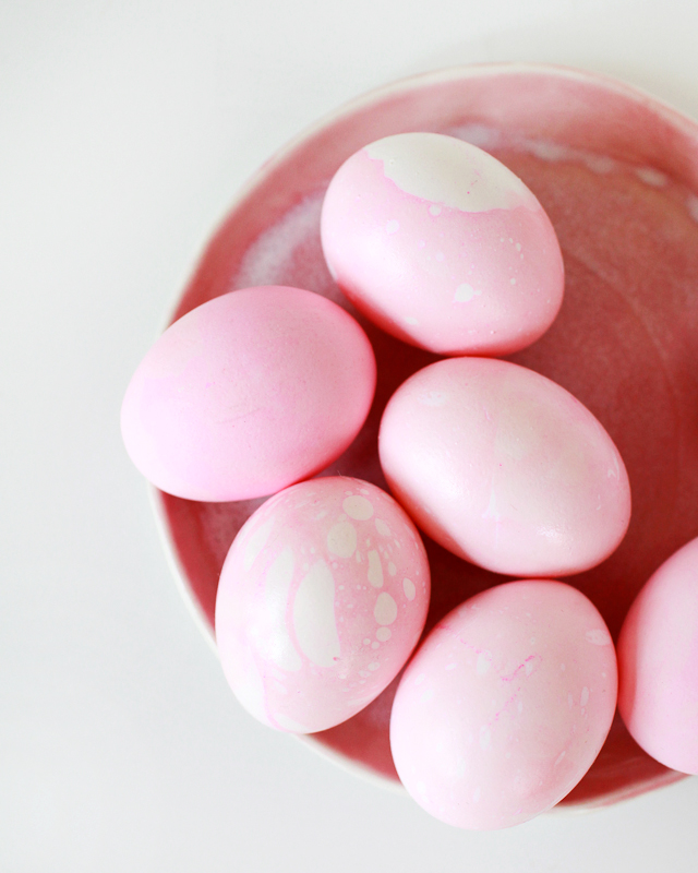
So pretty, right? I’m so excited to make these quick and easy marbled eggs with Sophie (and her cousins) this year! I may even add a few more pastel shades to the final mix. I hope you’ll try making them, too!
Behind the Stationery: E. Frances Paper
In honor of family, these three sweet ladies started the beloved E. Frances Paper. Sharing their beginnings story and how they collectively create as a team and family, Ali, Jenni, and Pippi are here to divulge their experiences with us on this installment of Behind the Stationery! –Megan
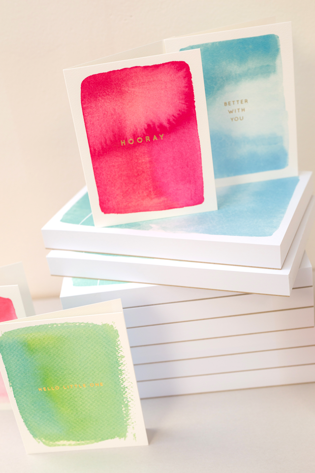
E. Frances Paper! It’s still fun just writing it, this real dream come true to work every day and run a business with your sisters. Well, we are technically two sisters and a cousin, but we’ve been so close the term “sisters” has always seemed more appropriate. (We carried our little Pip for so long her parents had legit concerns about her learning to walk.) We’re sure it’s a common feeling among those who have also started their own businesses… some days you have to give a little pinch to remind yourself you’re not just playing office… it’s all real!
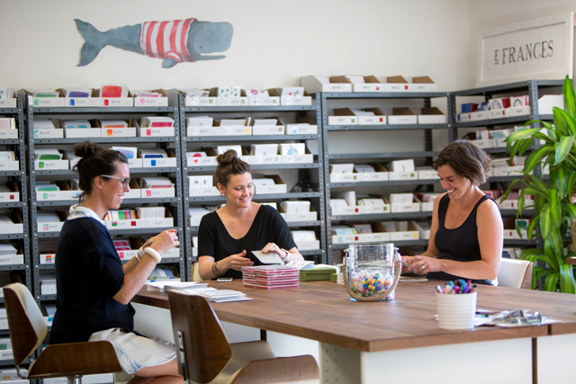
It was never a stretch for Ali, our Creative Director, to enter the world of stationery. As far as we can remember, no piece of paper was safe from her grip. Our childhood soundtrack was one of scissors, tape and the crinkle of paper. We’ve seen entire boxes of tissues turn into parades, rolls of tape into paper fashion shows. Our parents have graciously lived through decades of homemade everything, especially cards. She grew into the world of fashion illustration, graphic design, and eventually her own design business, but we have always tried to think of the best way to exploit her talents. Eventually, it seemed cards were the perfect fit for her artwork and illustrations. A weekend in LA for Katie Hunt’s Paper Camp, and an early mentorship from Carina Murray (Queen of Crow & Canary) opened the door to the industry through which she skipped forward and never looked back.
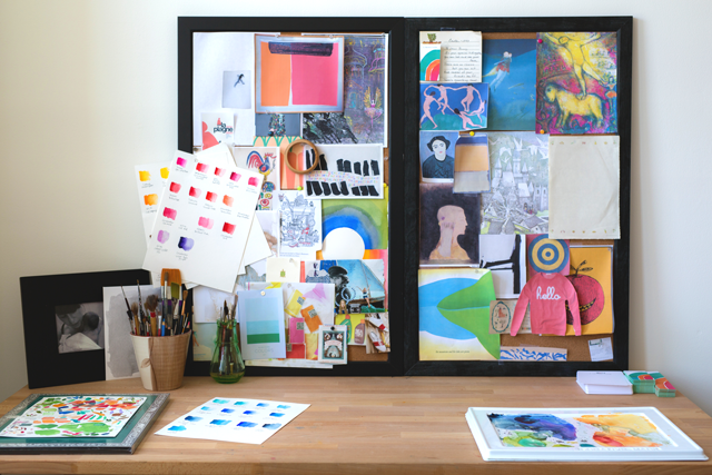
Our factory is currently located in Newport, Rhode Island. It’s hilarious to look back on our past offices: from Ali’s guest room (“Dad, seriously just walk between Holiday and Birthday, the bed is in there on the left”), to an attic, to a basement, and we’ll never forget the storage unit where the lights went out every 90 seconds. The building we’re in now is an old Bubble Gum Factory built in 1912 which we love, because it was also run by women! We are happy to carry on the girl boss tradition. The gum produced was sent to soldiers during during WWI. It’s cool to be an all-women team in the same factory space. They did gum wrappers; we do cello sleeves. It’s basically the same thing.
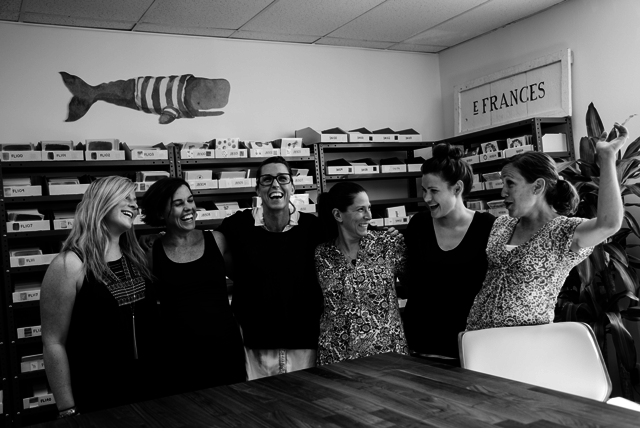
E. Frances is named for our Grandmothers, Elizabeth and Frances, who must be looking down on us and sending us the gifts from heaven that are our employees. We currently have three full time employees and two to three part-time stuffers we call the Pit Crew. To trust your entire company to girls you actually want to be around every day is a gift. Also, it’s a special atmosphere to work with all girls! Aside from when our favorite UPS guy Joe comes in each day, it’s a free atmosphere to discuss facial hair, coconut oil for everything, and wayward toddlers. The stationery industry in general is one that builds each other up. We’ve been grateful to find how open and helpful other stationers have been, both with advice and support. It’s really a beautiful thing.
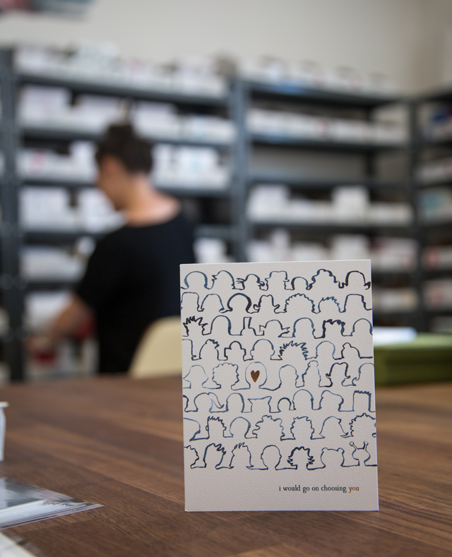
It definitely takes all three of us to come up with our product ideas. We always say we each have a third of a brain and it only works when we put them all together. The artistic third is Ali, amazing combo of brilliant artist and wicked paper dork. We try to balance our designs between beautiful and sweet and happy. We want our products to always feel positive. It seems easy to veer off in new directions, so to stay true to E. Frances, every product has to pass a little test we’ve created in order for us to print it. Sometimes it’s tempting to do something we think will sell well, but if all three of us don’t want to buy it ourselves, it gets the boot.
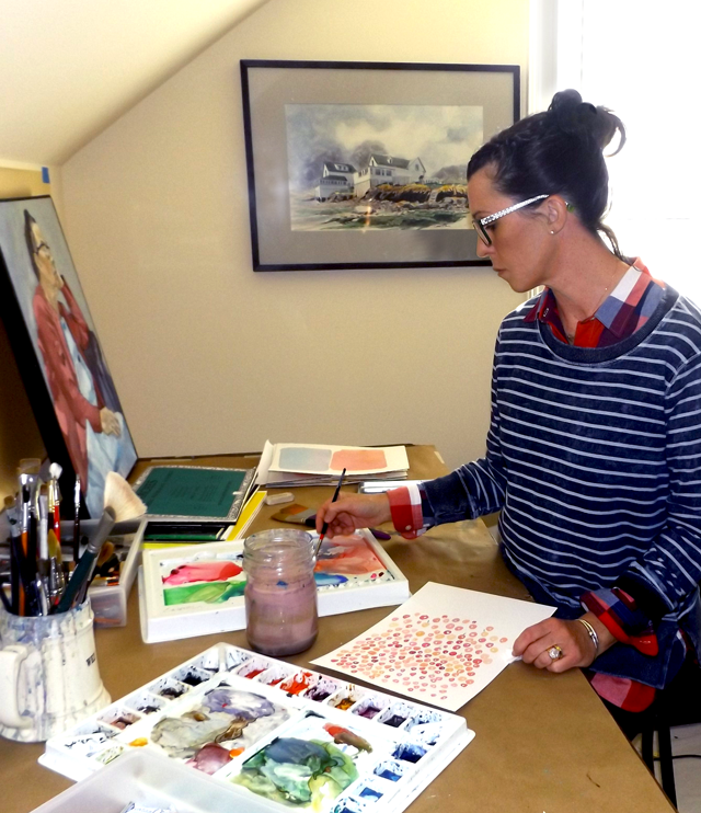
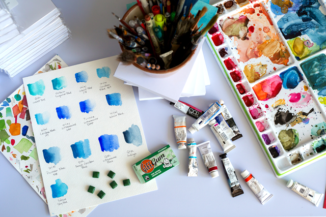
Ali does all the artwork in large, hand-painted watercolors, then scans them in to add text and get print ready. Everything is offset printed and foil stamped. Years ago when we started we were told that ‘watercolor’ has an old-fashioned connotation, but we believed in Ali’s modern, washy look. Today we see a lot of gorgeous watercolors out there, which is awesome. It’s not just a cliché – believe in yourself.
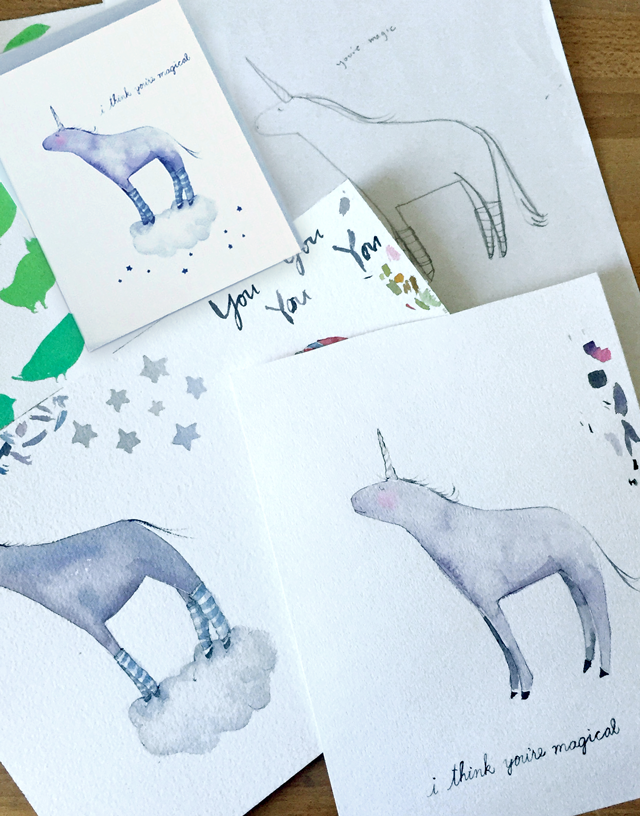
Along with our signature watercolor washes, we have our unique illustrated pieces. Pip and Jenni love coming up with new ideas and sending them to Ali. “Can you just draw a chicken who’s nervous, maybe a little shady, but cute and perfectly chubs?”
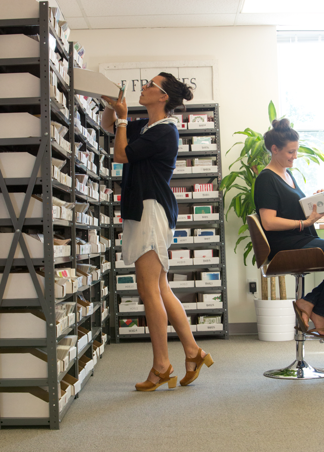
A typical day is…Ha! Nonexistent! Our days are constantly changing and in motion. Most days are spent fulfilling orders, packaging raw goods, organizing inventory, and lately, planning for the National Stationery Show this May (Should we change hotels this year in order to be closer to Whole Foods?). Aside from the painting, Ali is busy re-designing our website, sourcing everything, trying to be clever for social media, and keeping the wheels of new design ideas spinning. Pippi, with her insane talent of being able to do 21 things at once, manages the daily office, works with the bookkeeper, and usually has her leg up doing a barre exercise all while constantly on the phone with customers and reps. Jenni is presently on maternity leave so she spends most of her time ‘doing milkins,’ as her three-year-old would say. And the whole office runs on jelly beans.
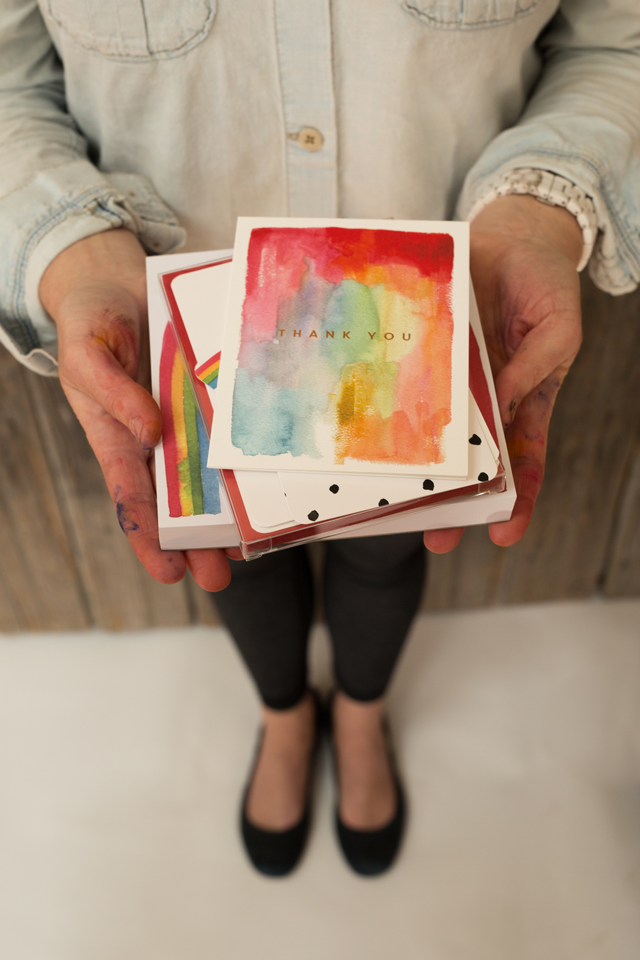
There seem to be lessons and struggles on almost a daily basis. How many cards to order? How will we know which ones will sell better than others? Which of the kabillion shelves from Uline do we choose? Do we seriously need to actually count physical inventory again? What is girth? It’s a constant potpourri of unknowns and a lot of (we hope educated) guessing. But we’ve learned that guessing is an intrinsic part of it. Sometimes we’re very wrong, but you have to go for it. There has also been a lot of learning, and then then more learning on top of that! Balance sheets and budgets and bonus structures, oh my! We have made a lot of mistakes along the way but it turns out our moms were always right: You learn the most from the mistakes. There has definitely been a learning curve but we have truly enjoyed all of it. Ok… most of it. 🙂
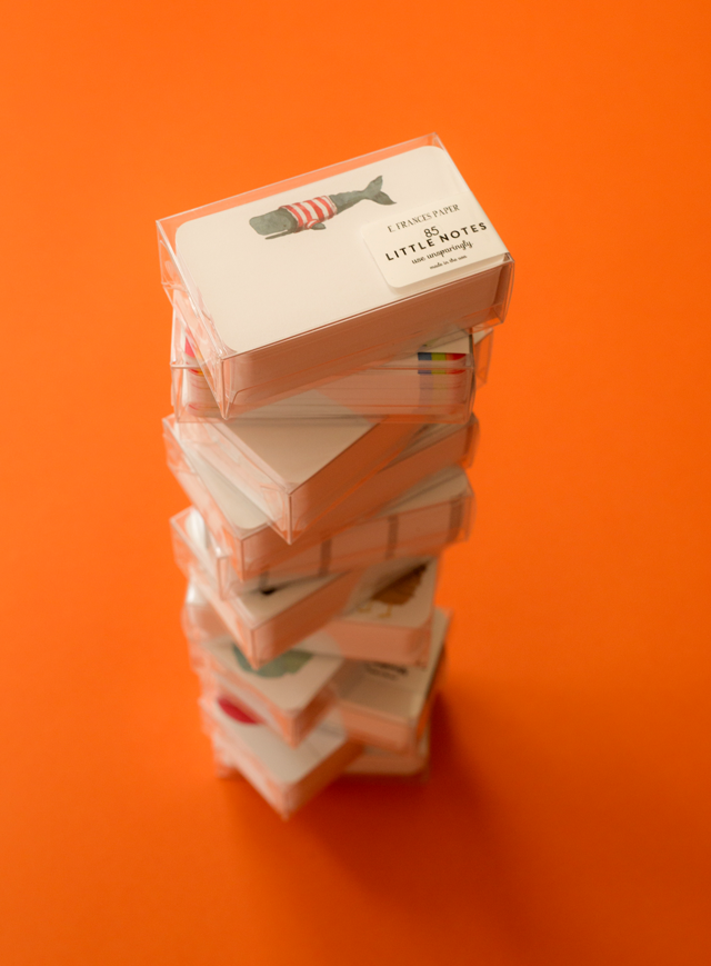
We want to grow bigger and bigger. We want to own a forklift one day and laugh at how excited we were when we bought a dolly and cheered we’ve made it! It’s a very challenging and fun dream to be living. We are grateful to be doing what we do – working hard alongside one another and our amazing crew, having our products in stores across the country and overseas, making new friends in the industry, and learning how to run a real business and say, “Whaaaattt?! We built that!â€
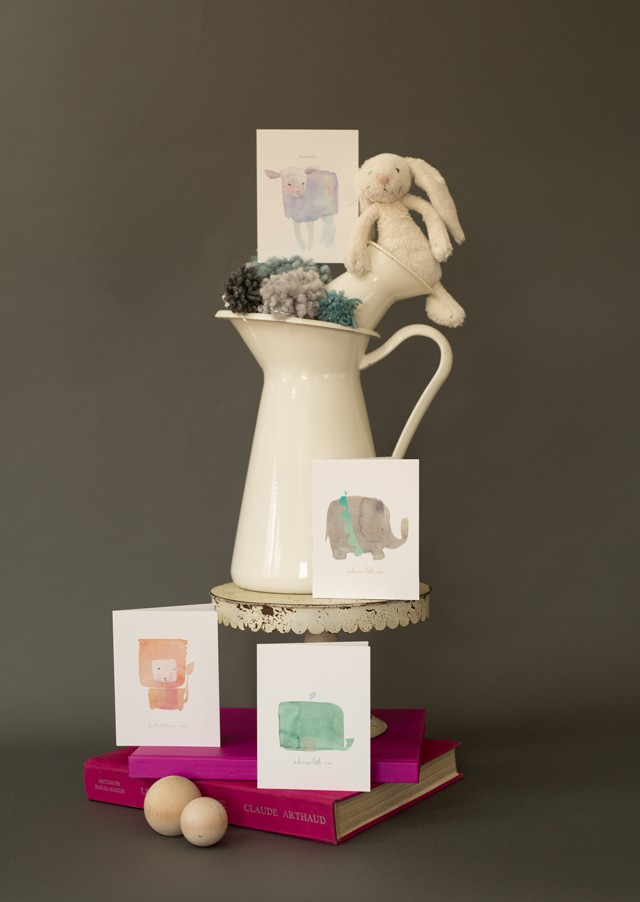
Thanks to Nole and Megan for letting us wax on about our sweet little company. We’d love to stay in touch with you through Instagram!
Photos by Maaike Bernstrom.
Interested in participating in the Behind the Stationery feature? Shoot me an email at megan [at] ohsobeautifulpaper [dot] com.
Signora e Mare + A Giveaway!
GIVEAWAY CLOSED – Thank you to everyone that entered!
I’m a huge fan of the gorgeous organic calligraphy of Katie Decker Hyatt of Signora e Mare, you can check out her work in our monthly calligraphy column here! In addition to being a super talented calligrapher, Katie also makes beautiful handmade, heirloom-quality goods for artists and makers – and we’re giving some of those beautiful goods to a few lucky readers today!
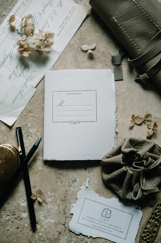
Up first, these beautiful pocket notebooks! Each notebooks features a hand drawn and calligraphed design, letterpress printed in matte gold in Atlanta on 100% cotton rag and cotton paper made by Katie. Measuring 4.25 in x 5 in, the inside of each notebook features 40 blank uncoated text weight sheets in warm gray. Each notebook is finished with brass colored staples in saddle stitch binding and is available in two cover color options: old white and soft rose. I love those deckled edges!

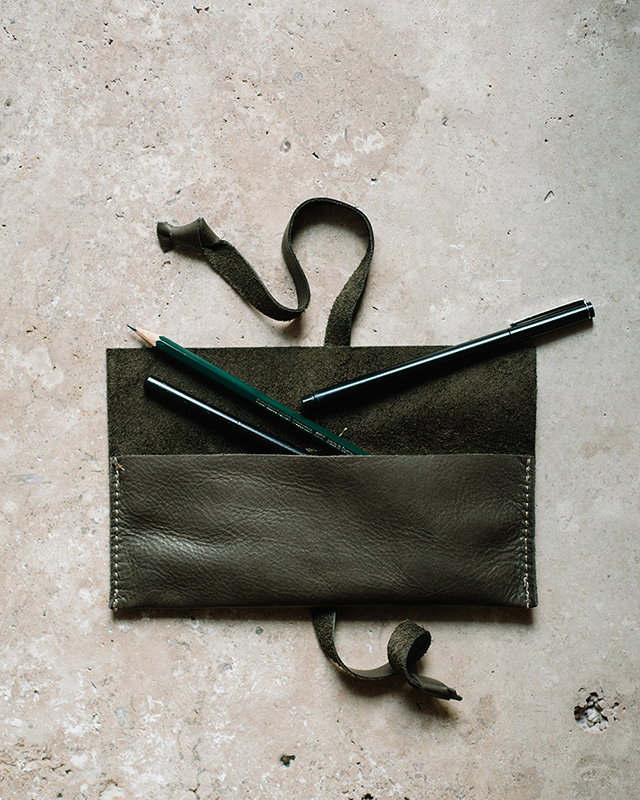
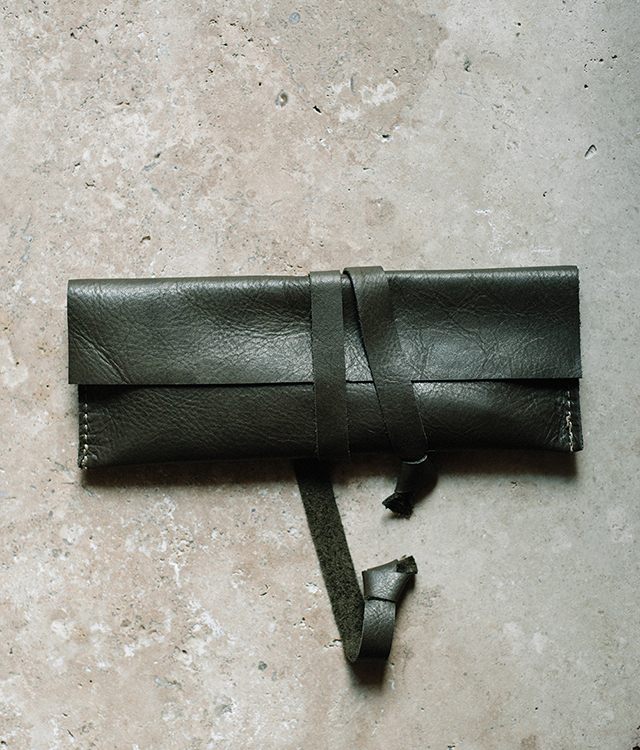
Next, the leather pencil case! Crafted from German leather and individually hand made by Katie’s mother, the pencil case features one large pocket with two leather ties for easy closure. Measuring 8 in x 2.75 in, the pencil case can hold several pens, nib holders and small brushes!
To enter, just follow the options on the Rafflecopter below – there are a bunch of ways to enter! You’ll have until midnight on Thursday, March 10 to enter! Good luck!
*Sorry, limited to U.S. readers only. Please enter via the Rafflecopter boxes below. Limit one entry per entry method per person. $66.50 approximate total retail value. Winners will be contacted via email after comments close.
Photo Credits: Signora e Mare
