Romantic Calligraphy Wedding Invitations on Handmade Paper

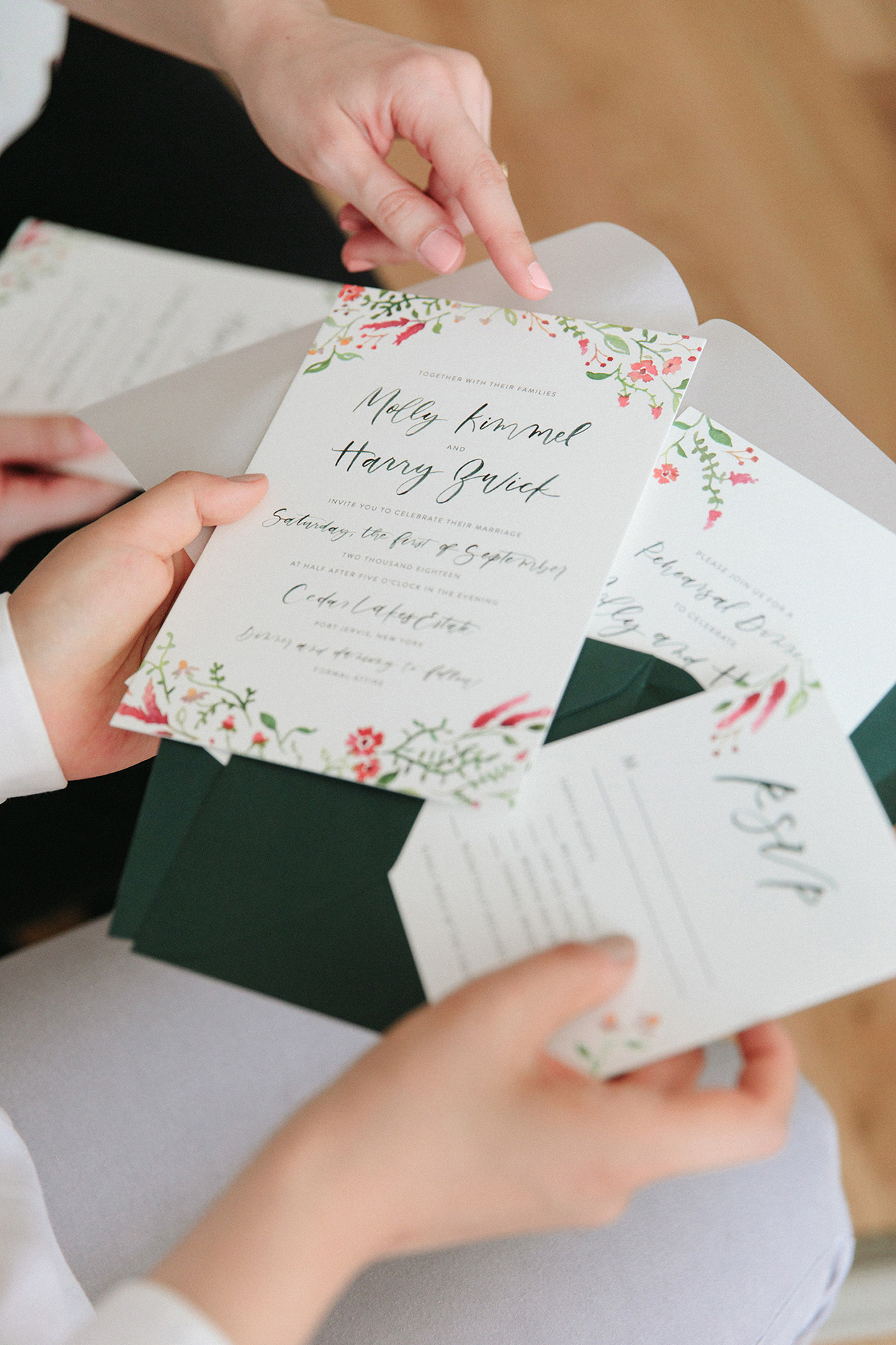
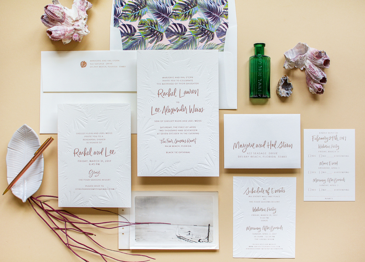
Delicate vellum with a hand painted magnolia branch illustration. Pillowy handmade paper and envelopes with wax seals. Romantic calligraphy letterpress printed with care. Every single detail sings in these romantic calligraphy wedding invitations on handmade paper by Aileen of Plume Calligraphy. Take a look below – you’ll see what I mean!
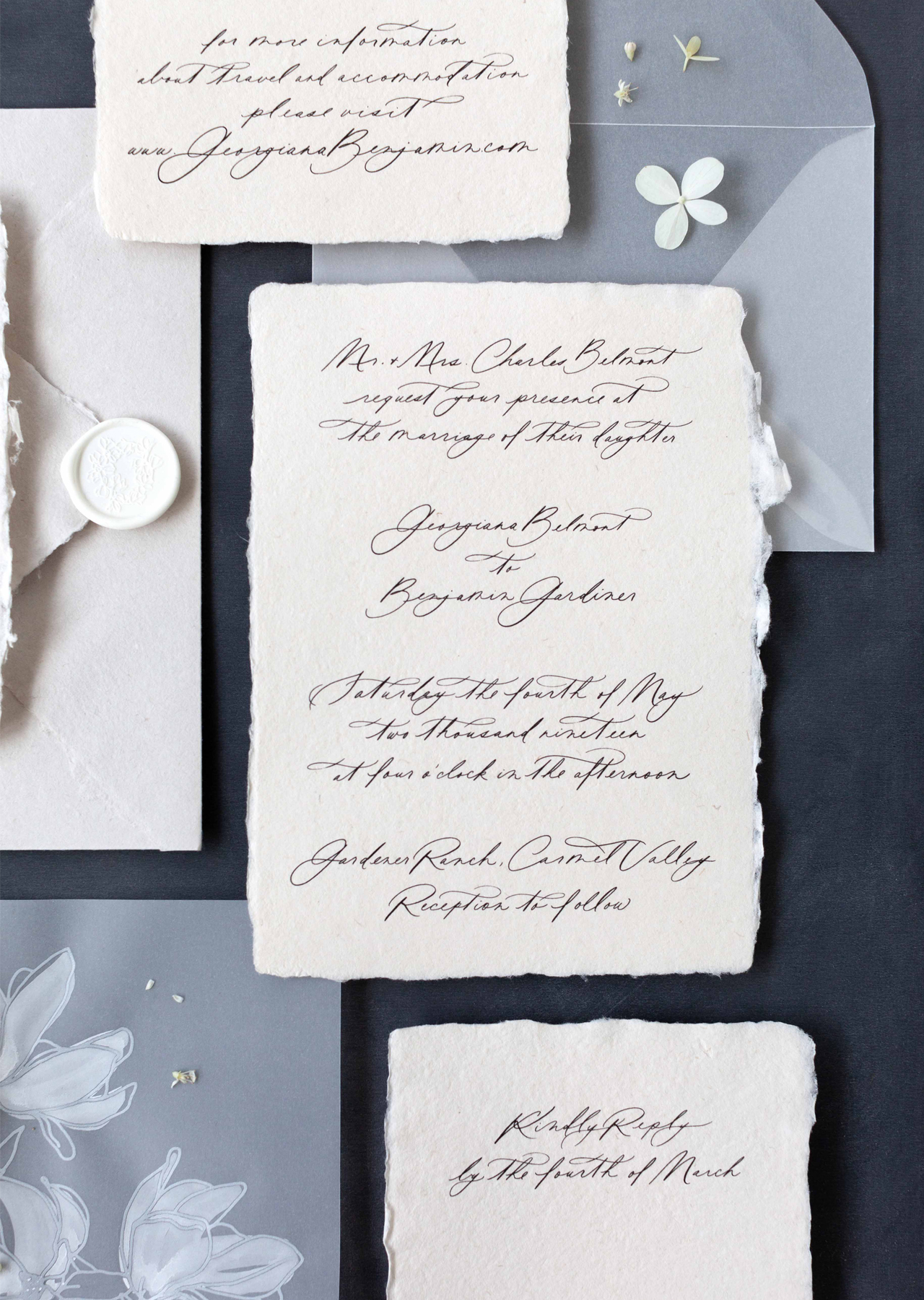
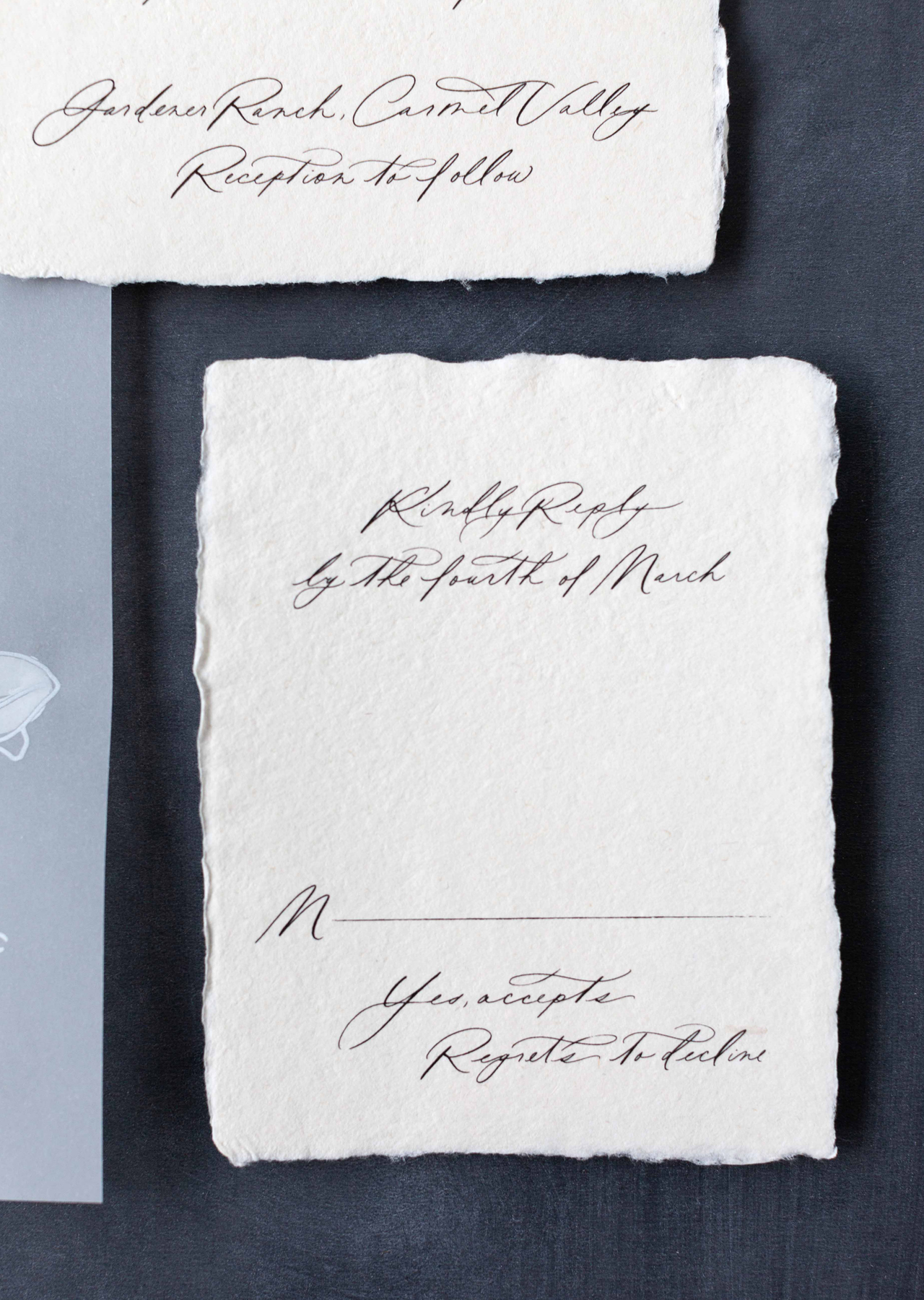
Romantic Calligraphy Wedding Invitations on Handmade Paper by Plume Calligraphy

From AileenThis invitation suite is a full calligraphy design featuring large looping descenders and elegant flourishes. This modern, yet romantic calligraphy style is complimented beautifully by Pressed Paper Co‘s soft, naturally deckled handmade paper. Adding transparent vellum in the form of envelopes and floral illustrated overlays creates contrast between the organic nature of the handmade paper and the clean modern appeal of vellum.

Romantic Calligraphy Wedding Invitations on Handmade Paper by Plume Calligraphy

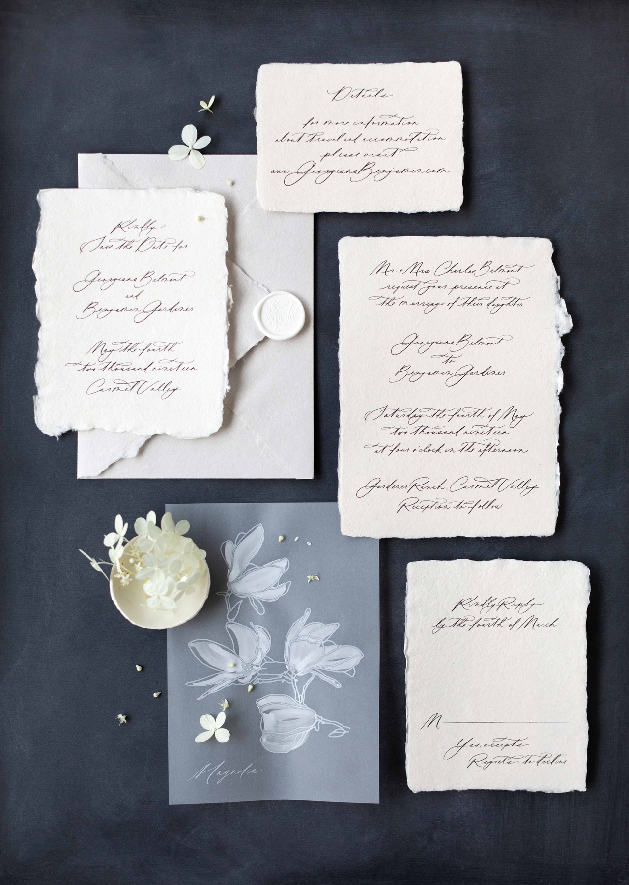
I originally hand painted the Magnolia illustration on vellum for a styled shoot and found that it’s become one of our most popular details couples add to their suite design. We’ve been able to produce this pieces for clients with the help of Sibylle of Hubbub Paper Co., who letterpress printed the illustration in white ink on vellum. Once printed each piece is hand painted to show slightly transparent white brush strokes. The vellum takes on a slightly ruffled effect when painted, which we love as it adds depth and shadow especially when styling for flat lay photographs.

Romantic Calligraphy Wedding Invitations on Handmade Paper by Plume Calligraphy

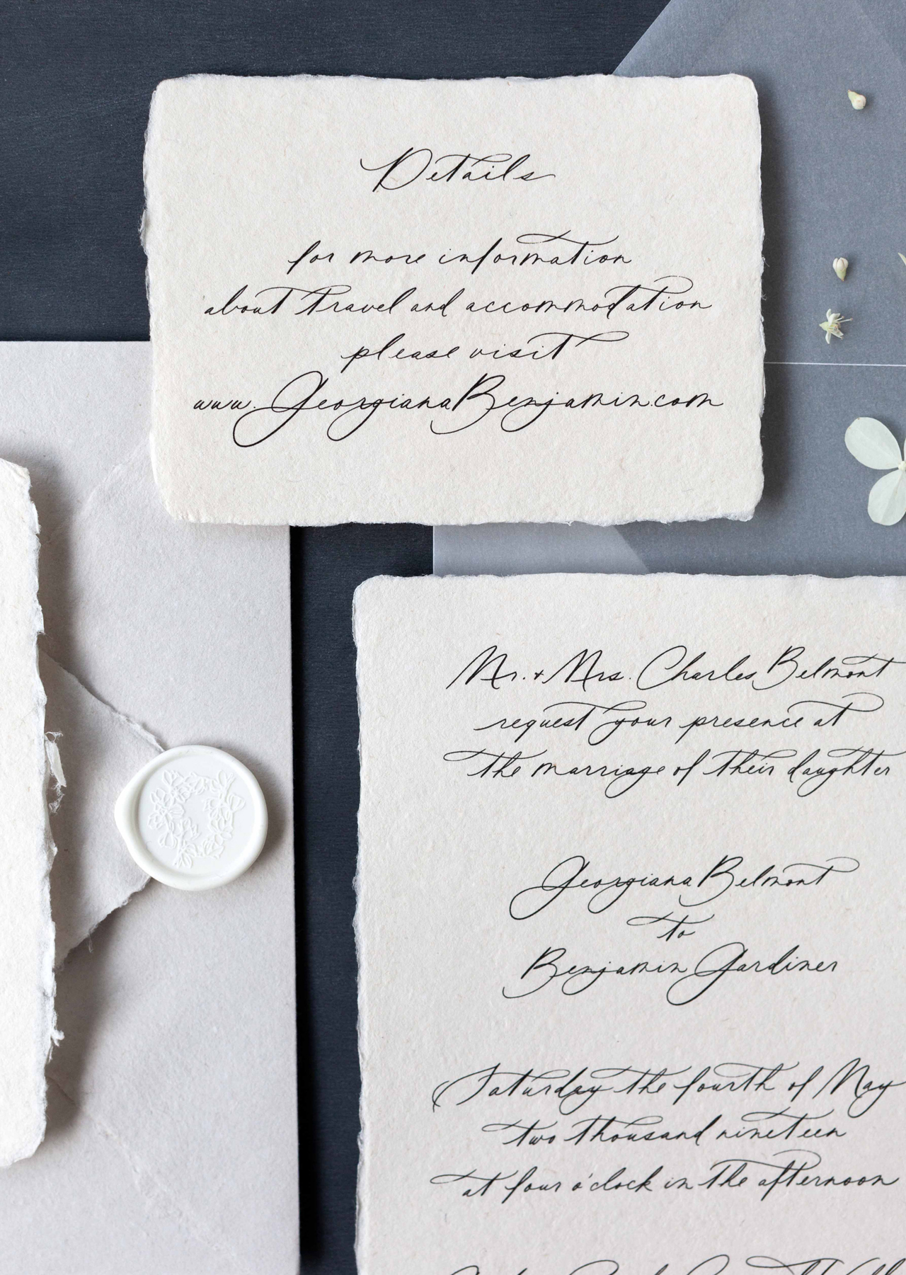
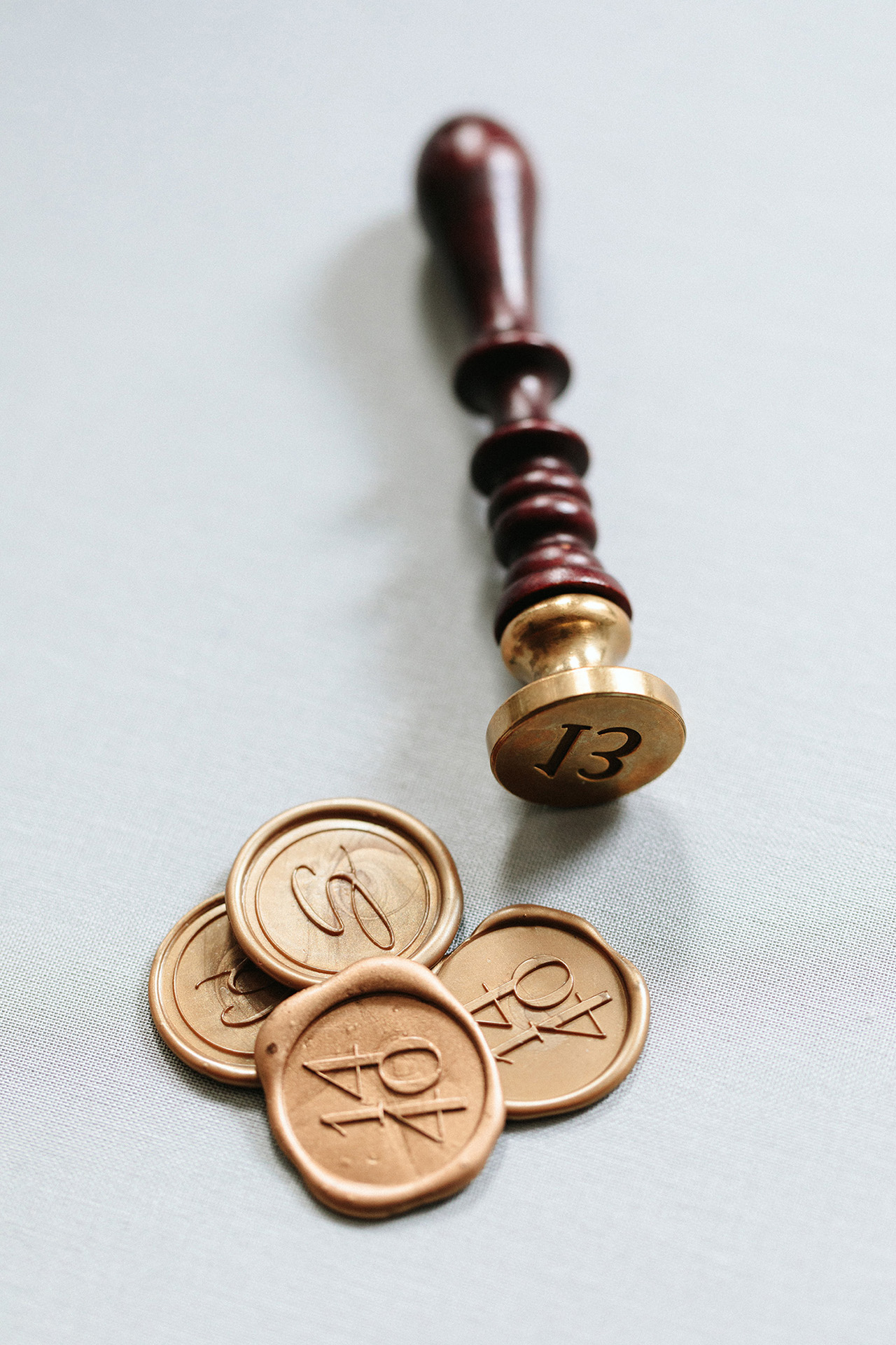
White wax seals featuring our Magnolia design help to add a fresh aesthetic while keeping the overall scheme neutral to emphasize the textures and design elements.

Romantic Calligraphy Wedding Invitations on Handmade Paper by Plume Calligraphy

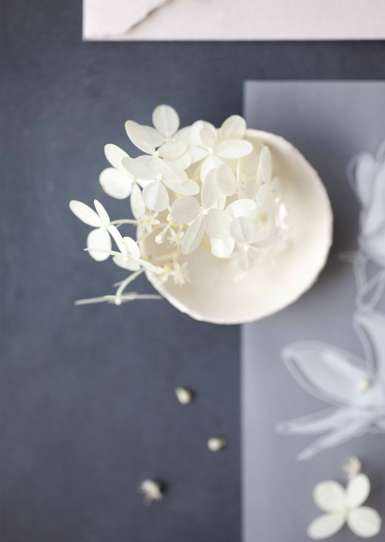
Styling this suite on a dark, moody background gives it organic flair and highlights the transparency of the vellum, the contrasting white details and the deckled edges of the handmade paper. We love creating designs that are mainly neutral and can be altered by the choice of background. Especially when designing for styled shoots, we find that giving the design elements simple, tone on tone schemes helps to allow the photographer or stylist the flexibility to work within their overall color scheme.

Romantic Calligraphy Wedding Invitations on Handmade Paper by Plume Calligraphy

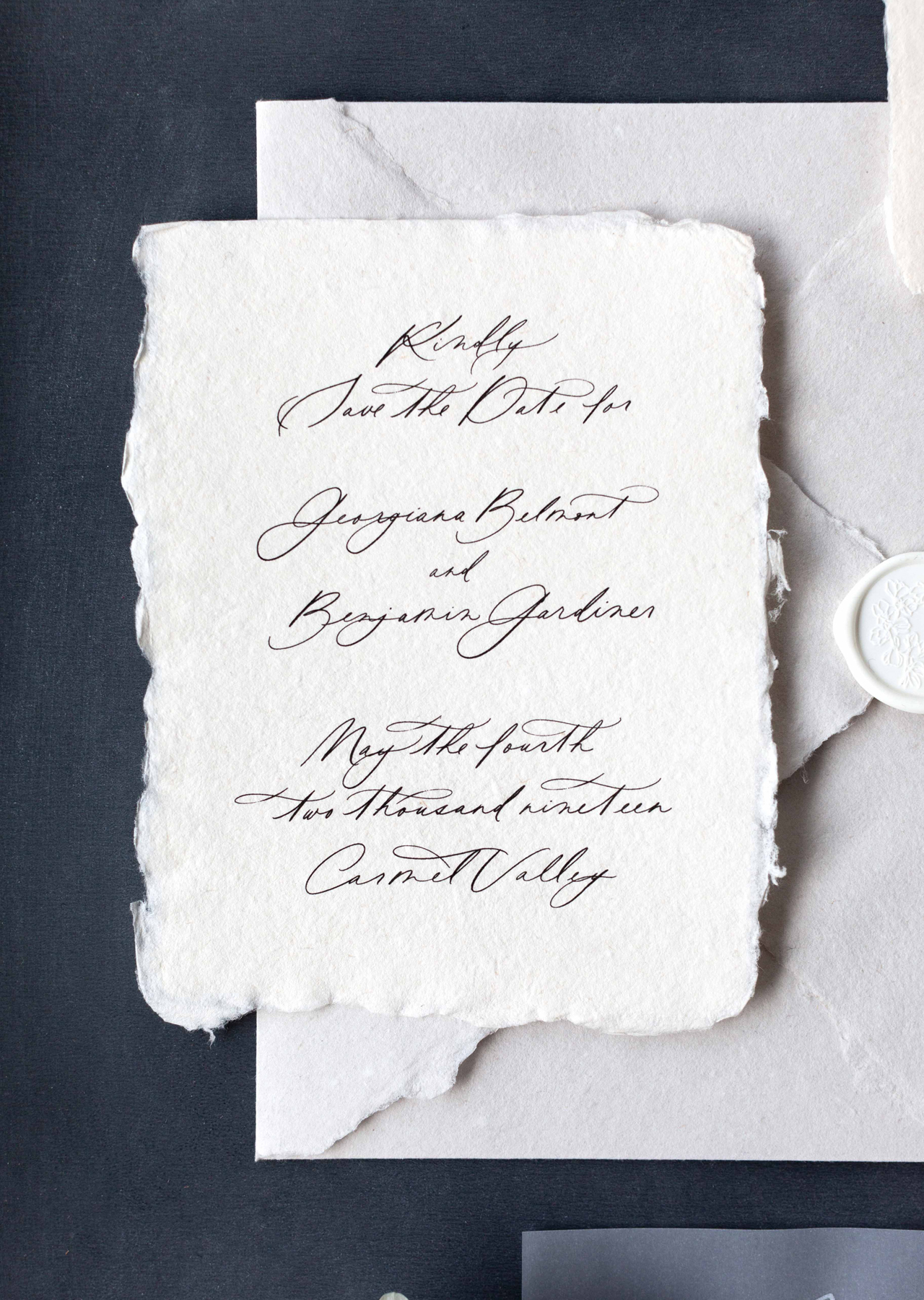
This design is now available through our Semi-Custom Collection as the Winsome Suite! We absolutely love the romantic look of a fully handwritten invitation suite and we wanted to offer this option to our semi-custom couples! We can’t wait to see all the ways this suite will be personalized by our clients!

Romantic Calligraphy Wedding Invitations on Handmade Paper by Plume Calligraphy

Thanks so much Aileen!

Design and Calligraphy: Plume Calligraphy

Paper: Pressed Paper

Wax Seals: Artisaire

Printing: Hubbub Paper Co.

Plume Calligraphy is one of the talented, hand selected members of the Oh So Beautiful Paper Designer Rolodex – you can see more from Plume Calligraphy right here! Or visit our wedding invitations archive for more custom wedding invitation ideas!

Photo Credits: Plume Calligraphy

Behind the Stationery: Fourteen-Forty

I’m thrilled to introduce our next stationery designer, Tricia Kim of Fourteen-Forty! Based here in New York, Tricia works with couples on custom wedding stationery and has grown her business focused in the wedding industry for many years now. She’s here to share about how learning about production processes informed her design process and how her growing team approaches the design process with each client. —Megan Soh

Behind the Stationery: Fourteen Forty

From Tricia: I started Fourteen-Forty about six years ago, after years of designing in the magazine industry. Funny enough, my first job was actually for a wedding publication! While what I learned at these companies was invaluable, working for large brands made me realize that I really wanted to take ownership of something that I could put my heart into. I’ve always loved making things with my hands, so letterpress printing with its mix of art and mechanics came naturally to me, which is where this obsession with stationery all began.

Behind the Stationery: Fourteen Forty

I was living in New York City when letterpress printing was really starting to emerge again as a craft, and I was able to find a lot of resources to start honing my skills as a printer. By no means did I ever completely master the art of printing, but it became a wonderful outlet for creativity and I loved the problem solving that it required. Looking back, I am so glad that I was able to learn the production side since understanding it from first hand experience has truly made me better equipped as a designer. Knowing the limitations, technical aspects, and possibilities helps me make good design decisions for my clients. As I gained experience at the press and became more embedded in the stationery community, the idea of Fourteen-Forty came to life (the name is an homage to the year moveable type was invented) and I slowly started building the company from the ground up.

Behind the Stationery: Fourteen Forty

Fast forward six years, and today Fourteen-Forty is primarily focused on designing custom wedding invitations. Located in the downtown area of Manhattan, we are a hardworking group of creatives dedicated to dreaming up unique keepsakes. We offer custom illustration, watercolor, typographical designs, all kinds of specialty printing, calligraphy, wax sealing, and more. We love working with paper along with other materials, like leather, fabric, acrylic, and wood. And if we haven’t done it before, we’re always willing to try something new!

Behind the Stationery: Fourteen Forty

Behind the Stationery: Fourteen Forty

As the owner of the studio, I handle most of the client-facing and business duties, which pretty much means I am constantly on email. One of the most important things to us is customer service. I love connecting with clients on this level and helping them navigate the whole process, which is usually a completely foreign experience to them. On the business side, I am constantly brainstorming to expand the brand and refine our processes, enhance our client experience, and just meet the day to day challenges of running a small business—fielding emails, meetings, and calls, connecting with planners and vendors, strategizing on marketing initiatives and and checking in to see how different projects are going.

Behind the Stationery: Fourteen Forty

We all work together in an open plan studio, which I love because it promotes an incredible amount of collaboration, which is so key to this process. I find that this set up promotes efficiency as well as keeps everyone aware of the tasks at hand and the goals we need to meet.

Behind the Stationery: Fourteen Forty

One of the more difficult things to manage in a busy studio is prioritizing tasks and keeping the wheels moving for all our clients at the same time. There are days when the to-do list is overwhelming, and it’s so important to see clearly what needs to be done first, second, and so on down the line. That’s why timelines are so important to us—we set a timeline for each client and make sure we do everything we can to stick with the dates and prioritize appropriately.

Behind the Stationery: Fourteen Forty

Our process typically starts with a call and/or client meeting, during which we really start drilling down into the client’s vision, and start sharing with them all of the possibilities. Once a plan is formulated, we begin the design process, during which we’re brainstorming and sketching out ideas, and presenting them in a series of proofs. There is a period of back and forth when we integrate changes, really listening to our client’s feedback, and hone everything to perfection.

Behind the Stationery: Fourteen Forty

Then we are signing off on the designs and sending them to print. Depending on the project, the next phase can actually be the most intense for us. This is when production begins, and we are spending on average one to five weeks (sometimes more!) actually producing the designs. With more elaborate projects, we may be getting supplies and finishing techniques done by 5-10 different artisans during this phase, which takes time and a lot of coordination to get right.

Behind the Stationery: Fourteen Forty

Behind the Stationery: Fourteen Forty

In addition, some of the assembly that we do (liners, vintage stamps, calligraphy, wax seal ties, and even simply collating the right items into a particular guest’s envelope) take an enormous amount of time and precision to achieve.

Behind the Stationery: Fourteen Forty

Behind the Stationery: Fourteen Forty

In the end, it’s all worth it to reach our goal—a design that is new, special, and specific to each client. There is no better moment then when we present the finished suite after months of hard work, and see our client look at their dream invitation for the first time!

Behind the Stationery: Fourteen Forty

All photos by Sasithon Photography except where noted.

Want to be featured in the Behind the Stationery column? Reach out to Megan at megan [at] ohsobeautifulpaper [dot] com for more details.

Tropical Minimalism Wedding Invitations

For anyone out there that wants tropical vibes with a more minimalist feel, this wedding invitation suite is for you! These tropical minimalism wedding invitations from Swell Press (one of our super talented Designer Rolodex members!) are fresh, modern, and elegant all at the same time. With subtle blind-impression (no ink) letterpress printed palm fronds and stunning calligraphy by Nicole Miyuki printed in rose gold foil, and a vibrant envelope liner, there are so many beautiful details to love in this gorgeous suite!

Tropical Minimalism Wedding Invitations by Swell Press

From BrittWhere do I even begin with this invitation suite! Our ‘tropical minimalism’ suite was actually one of my first designs years ago, when I first started designing and printing. Today, it is still one of my favorites. The original design had a clean sans serif font in black, but when Rachel and Lee reached out to me, they wanted something a little more elegant and softer, with a dash of whimsy for their sophisticated wedding in Florida.

Tropical Minimalism Wedding Invitations by Swell Press

Custom brush calligraphy by Nicole Miyuki was a perfect touch for just that, and rose gold foil took the elegance of the suite to the next level. The main invitation was printed on thick, 100% cotton 220lb Crane’s Lettra in Pearl White, with the insert cards on 110lb.

Tropical Minimalism Wedding Invitations by Swell Press

Tropical Minimalism Wedding Invitations by Swell Press

If anyone needs any evidence of how much an envelope liner can impact a suite, this is a perfect example! The palm frond pattern perfectly complements the suite but definitely adds a pop of boldness when the recipient first opens the envelope, and the subtle rose gold monstera leaf on the flap is the most perfect addition.

Tropical Minimalism Wedding Invitations by Swell Press

Tropical Minimalism Wedding Invitations by Swell Press

As much as I LOVE color, this refined, classic and somewhat minimal design has such a huge piece of my heart.We now offer it as a semi-custom design, which means we’ve done various versions of this suite with different color foils from gold to copper, various colors of letterpress inks for the text, and various fonts.

Tropical Minimalism Wedding Invitations by Swell Press

This particular suite was slightly oversized from your typical A7 size to A9 (5.5″ x 8.5″ instead of 5″ x 7″), allowing room for the various insert cards and even more of a visual impact.

Tropical Minimalism Wedding Invitations by Swell Press

Thanks so much Britt!

Design and printing: Swell Press

Calligraphy: Nicole Miyuki

Swell Press is one of the talented, hand selected members of the Oh So Beautiful Paper Designer Rolodex – you can see more of Britt’s work right here! Or visit our wedding invitations archive for more custom wedding invitation ideas!

Photo Credits: Swell Press and Robin Verrir

Neutral Modern Minimalist Wedding Invitations

I’ve been on a bit of a minimalist design kick lately. I first caught sight of the gorgeous save the dates in these neutral modern minimalist wedding invitations from Cindy of Owl Post Calligraphy and fell in love with the way Cindy had played around with the type size and orientation, not to mention the beautiful white foil over a slightly darker neutral paper. I asked Cindy if she’d be willing to share the full suite with all of you, and luckily she agreed! In addition to the fun minimalist type, I love the way Cindy combined slightly different paper colors for a beautiful and tonal neutral color palette. So perfect for fall!

Neutral Modern Minimalist Wedding Invitations by Owl Post Calligraphy

From Cindy: This suite is one of my semi-custom invitation collections called “Sacred Vows.” I was inspired by the traditional vows that are said during the wedding ceremony – hence the name!

Neutral Modern Minimalist Wedding Invitations by Owl Post Calligraphy

Unlike many of my other suites, this one does not contain any calligraphy and was done with all typographical design concepts. The suite is meant for the minimalist but not “boring” couple. Playing with text placement, direction, and size, the element of play is what makes this suite one of my favorites!

Neutral Modern Minimalist Wedding Invitations by Owl Post Calligraphy

The save the date and main invitation card have multiple print processes (foil and letterpress) to add dimension. The details card and reply card are simple and clean so as to not overpower the rest of the suite. The theme of two rings runs throughout the suite as a small emblem on the invitation card and save the date. The age old saying “to have and to hold” is letterpress printed onto the background of the main invitation card.

Neutral Modern Minimalist Wedding Invitations by Owl Post Calligraphy

This suite can be printed in multiple ink and foil colors and paper colors, but the photos I have included represent a beautiful neutral palette that is not the usual eggshell white suite but still neutral enough for timeless elegance. It is the perfect palette for fall weddings! A lot of couples think that all cards and all envelopes have to be the same color but switching it up a bit can really add a lot of intrigue to a suite! If you are afraid of it looking too complicated with all the colors, my favorite this to implement is a tonal palette (like this one) where the papers are only slightly different in the same color family. When creating my semi-custom collections for this year, I really wanted to cater to ALL couples so I made sure that I had same-sex couples represented, including this one!

Neutral Modern Minimalist Wedding Invitations by Owl Post Calligraphy

Thanks Cindy!

Design: Owl Post Calligraphy

Printing: Copper Willow Paper Studio

Looking for more wedding invitation inspiration? Visit our wedding invitations archive for more custom wedding invitation ideas!

Photo Credits: Owl Post Calligraphy

Inspiring Calligraphers: Virginia Lucas Hart

Hey everyone! Sometimes it helps to look for inspiration from the masters. And in the calligraphy world, Virginia Lucas Hart is definitely one of them. As a published author of a calligraphy book on creative lettering, a teacher of modern calligraphy, and a calligrapher who’s worked with some big names (Estee Lauder, The Knot, Sotheby’s, and the New York Design Center, to name a few), she’s officially a calligrapher with skills. But as any paper lover knows, beautiful lettering is a mix of talent and heart. And as an artist, Virginia pulls both together in her work. So let’s dive in with some inspiration of the lettering sort. – Jen

Inspiring Calligraphers: Virginia Lucas Hart

Inspiring Calligraphers: Virginia Lucas Hart

Virginia offers a range of lettering styles, but she says her hand lends itself to looks that are playful and whimsical. “Even though I frequently practice the rules I’ve gleaned in my professional education, I’m truthfully always looking for ways to break them, allowing my lettering to be fresh and fun,” says Virginia. “My favorite calligraphy styles are those infused with a lot of personality.”

Inspiring Calligraphers: Virginia Lucas Hart

Inspiring Calligraphers: Virginia Lucas Hart

Virginia has written on loads of different non-paper surfaces, but her favorites include large-scale mirrors or any sort of tile or agates for place cards. “They truly become keepsakes for your guests!” says Virginia.

Inspiring Calligraphers: Virginia Lucas Hart

Estee Lauder sign: Photo by Jane Houle

“When my clients grant me some creative control on a direction of a custom piece, I love pulling inspiration from a few places,” shares Virginia. Besides the obvious social media spaces to reference, she also pulls inspiration from simply browsing stores in NYC. “Whether it’s paper goods or fashion accessories, a simple color combination can inspire a whole direction,” says Virginia. But once she has a vision in mind, everything starts with a pencil, a piece of paper, and a giant eraser.

Inspiring Calligraphers: Virginia Lucas Hart

Inspiring Calligraphers: Virginia Lucas Hart

Other highlights: “I was beyond thrilled to calligraph Met Gala invitations earlier this year for those wearing Prabal Gurung!” shares Virginia.

Inspiring Calligraphers: Virginia Lucas Hart

Inspiring Calligraphers: Virginia Lucas Hart

And for anyone looking to learn calligraphy, Virginia wrote a book, published by Ulysses Press, that came out at the end of 2017. “Although it’s a children’s book, it’s truly a great resource for all ages,” she adds. “I share all of my favorite supplies, tips and tricks, and break things down into easy-to-follow steps.”

A big thanks to Virginia for sharing a peek into the different types of calligraphy work she’s doing. So inspiring!
Photo Credits:: Monica Chimes did the florals around the large mirror photo. All images via Virginia Lucas Hart except where noted.

Want to be featured in our calligraphy column? Reach out to us at submissions [at] ohsobeautifulpaper [dot] com with the subject line “Calligraphy Feature” for more details!