Calligraphy Inspiration: Vita Popov Studios
Hello! I’m excited to share the work of Vita Popov Studios for our next installment of calligraphy and lettering goodness. Vita is a self-taught calligrapher born in the Ukraine and who now calls Sacramento, California home. Her calligraphy style looks and feels organic — not simply in the brushwork, but also in the materials and styling of the paper goods. You’ll notice the greenery and berries used for propping, the handmade papers, and the earthy color palettes. Vita’s Instagram feed is an absolute treasure trove of beautiful calligraphed paper pieces. Let’s dive in, shall we? – Jen
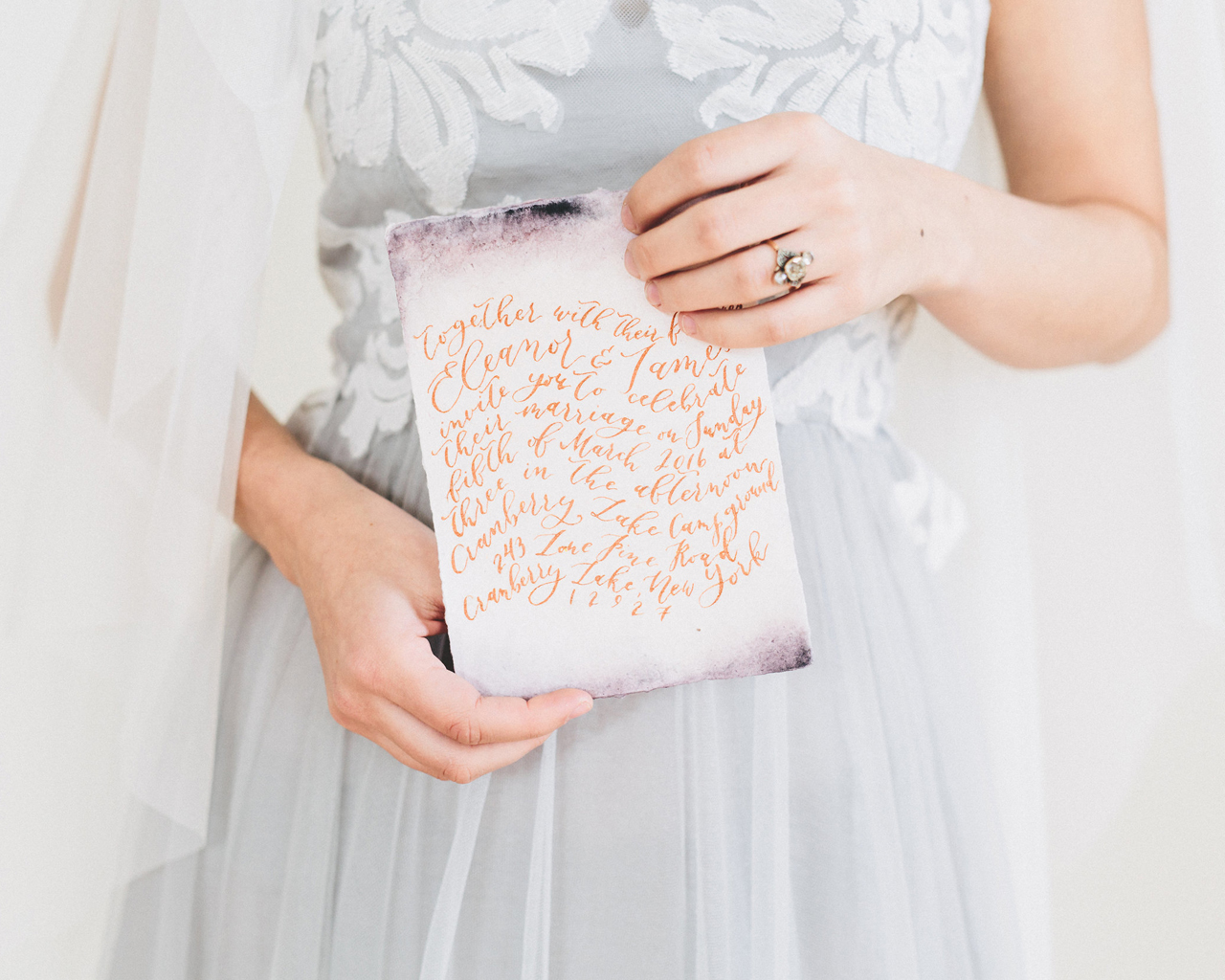
Photo by As Ever Photography
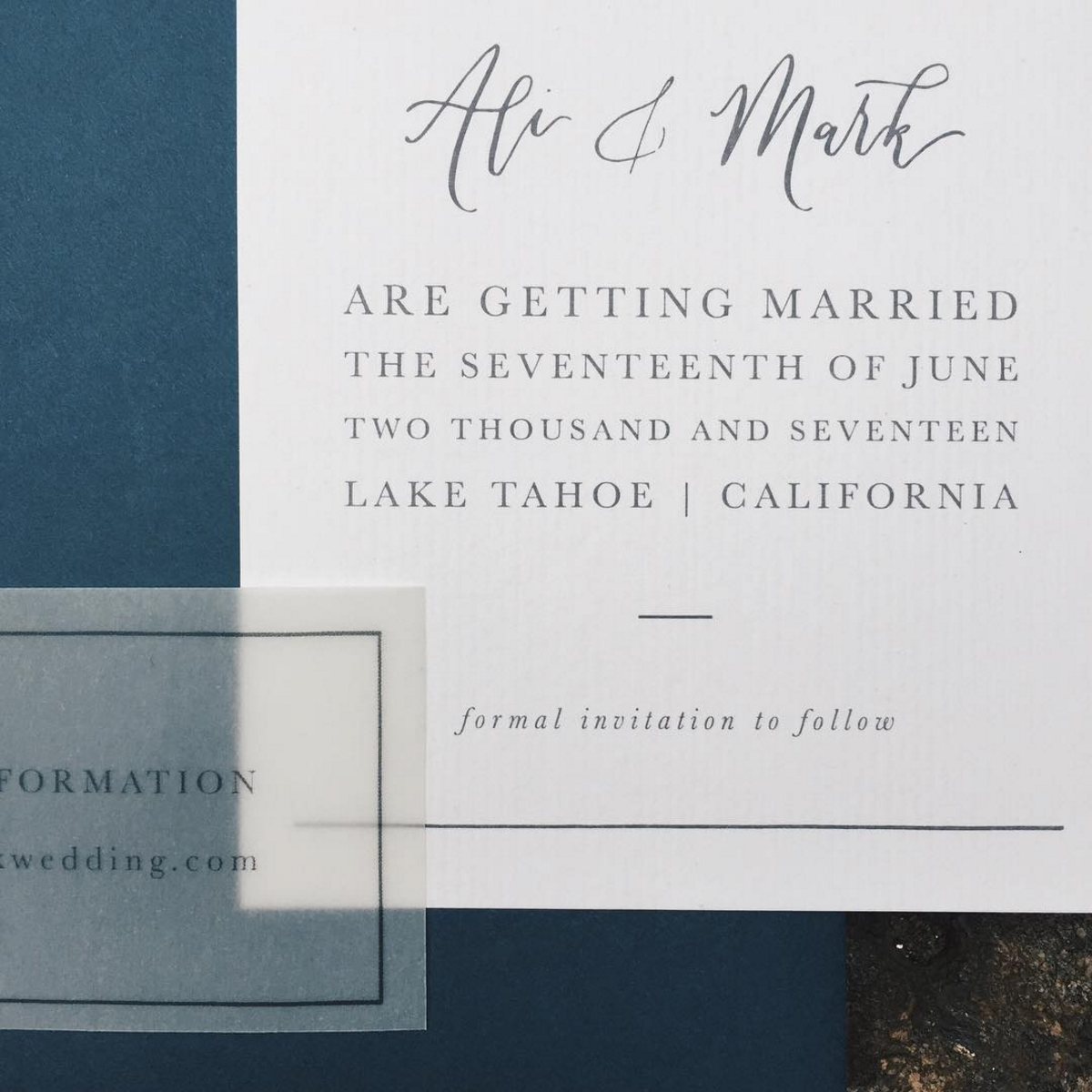
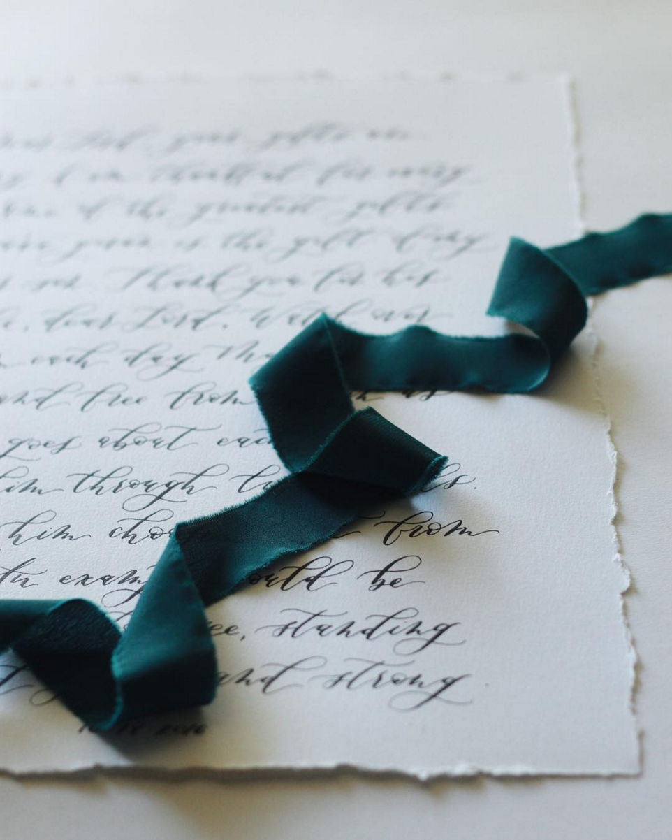
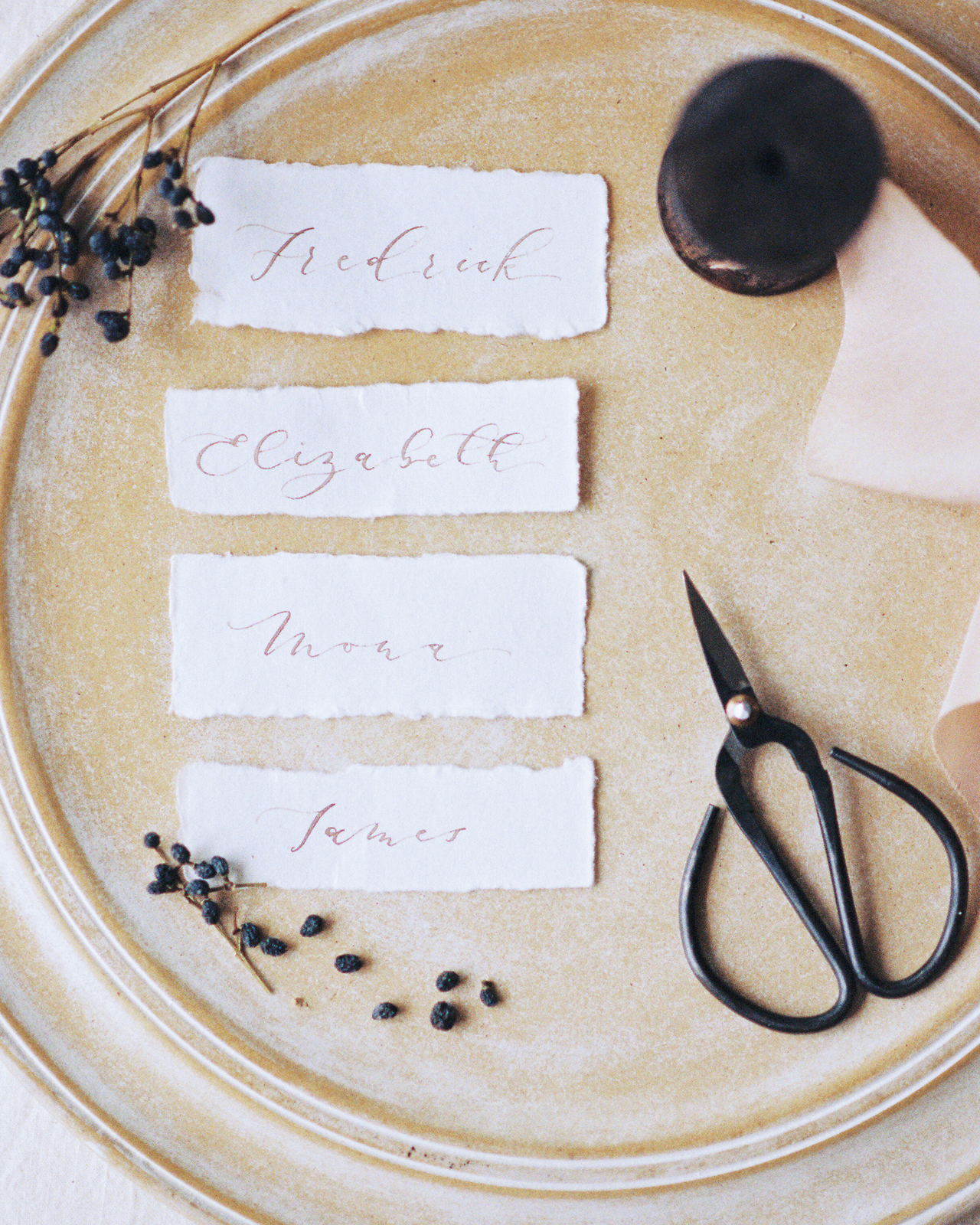
There’s a simple lightness to Vita’s calligraphy that I imagine has taken so much practice to perfect. I also personally love when fanciful lettering is paired with deckled paper, which keeps the calligraphy looking more handmade modern than prim-and-proper.
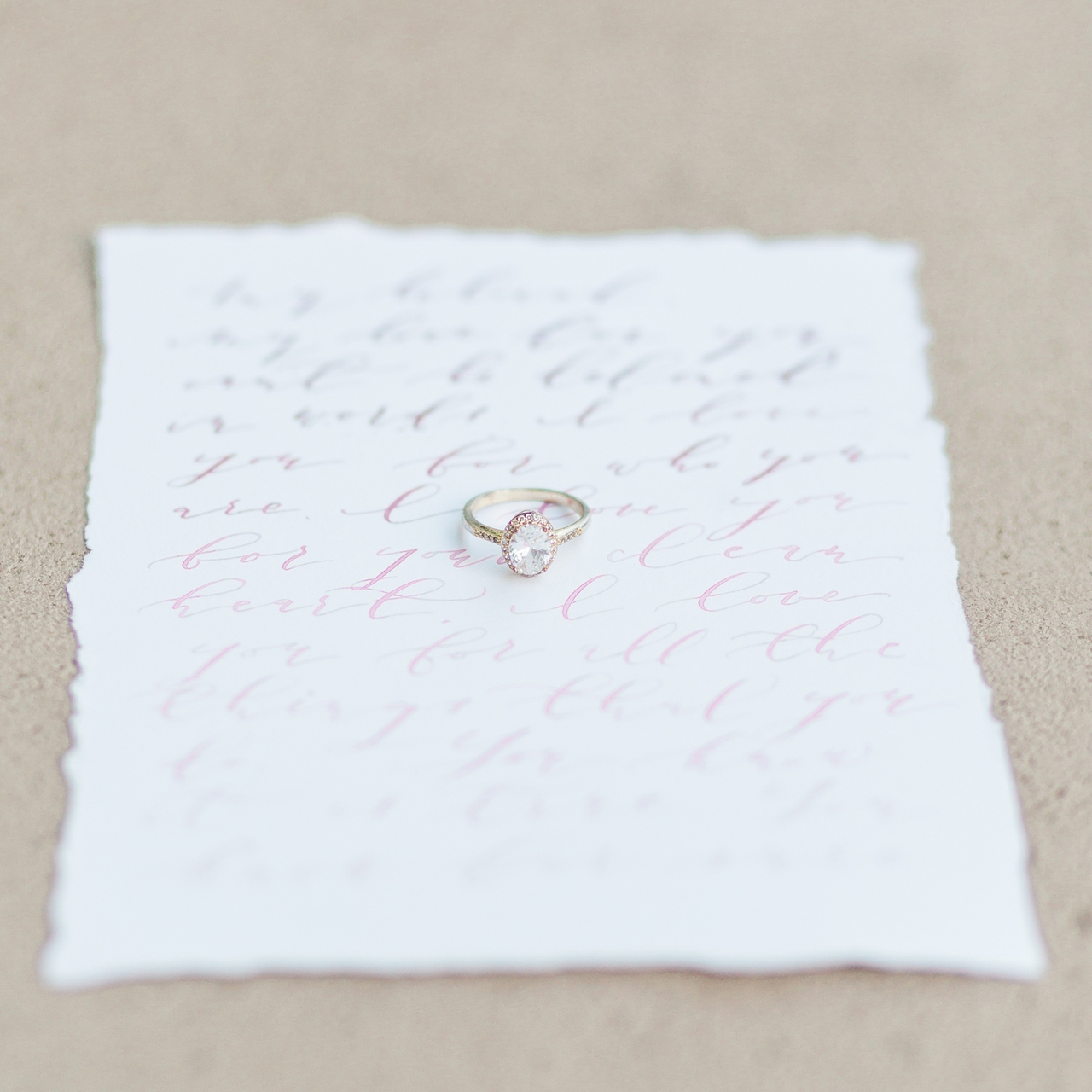
Photo by As Ever Photography
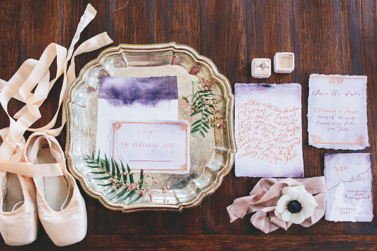
Photo by Kychelle Photography
Vita describes a “moody ballerina” look she was going for in this work. She once again used a cotton handmade paper but the deep flourishes of purple tap into that moody vibe (to counter all the ballerina pinks). See how the invitation lettering looks like a wave? Vita wanted the words to look like they are dancing — mission accomplished!

Photo by As Ever Photography
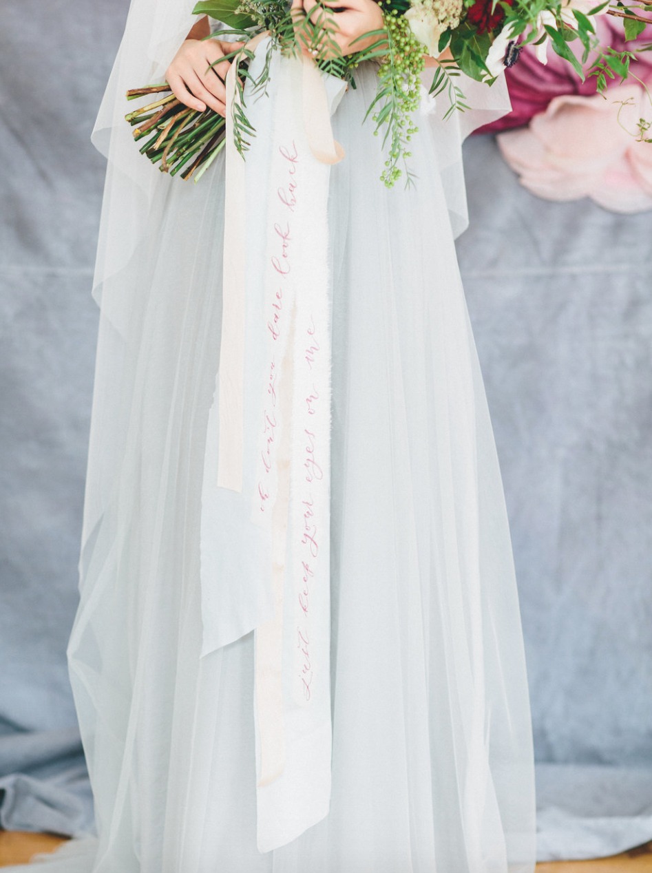
Photo by Lauren Haley
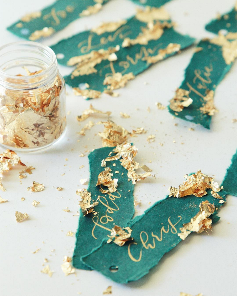
It’s so inspiring to see calligraphy breaking out of being used simply for wedding invitations. Seeing this cascading stream of calligraphed ribbons tied to the wedding bouquet is certainly a fresh idea.
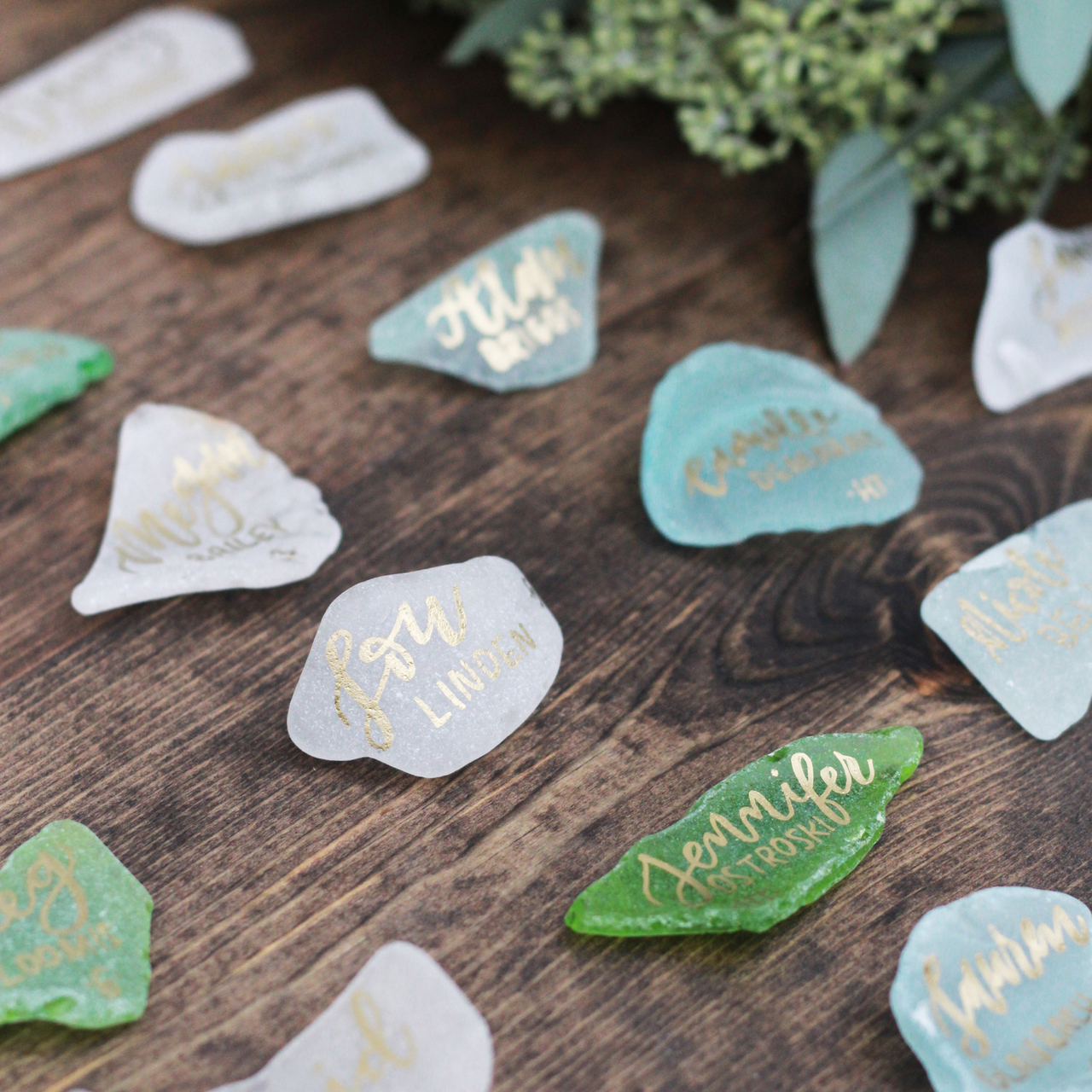
Photo by As Ever Photography
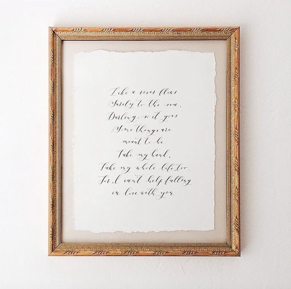
Vita works with clients for all kinds of custom work. Spotted on her Instagram: a wedding song in calligraphy. The gilded frame makes a perfect complement to the scripted lyrics.
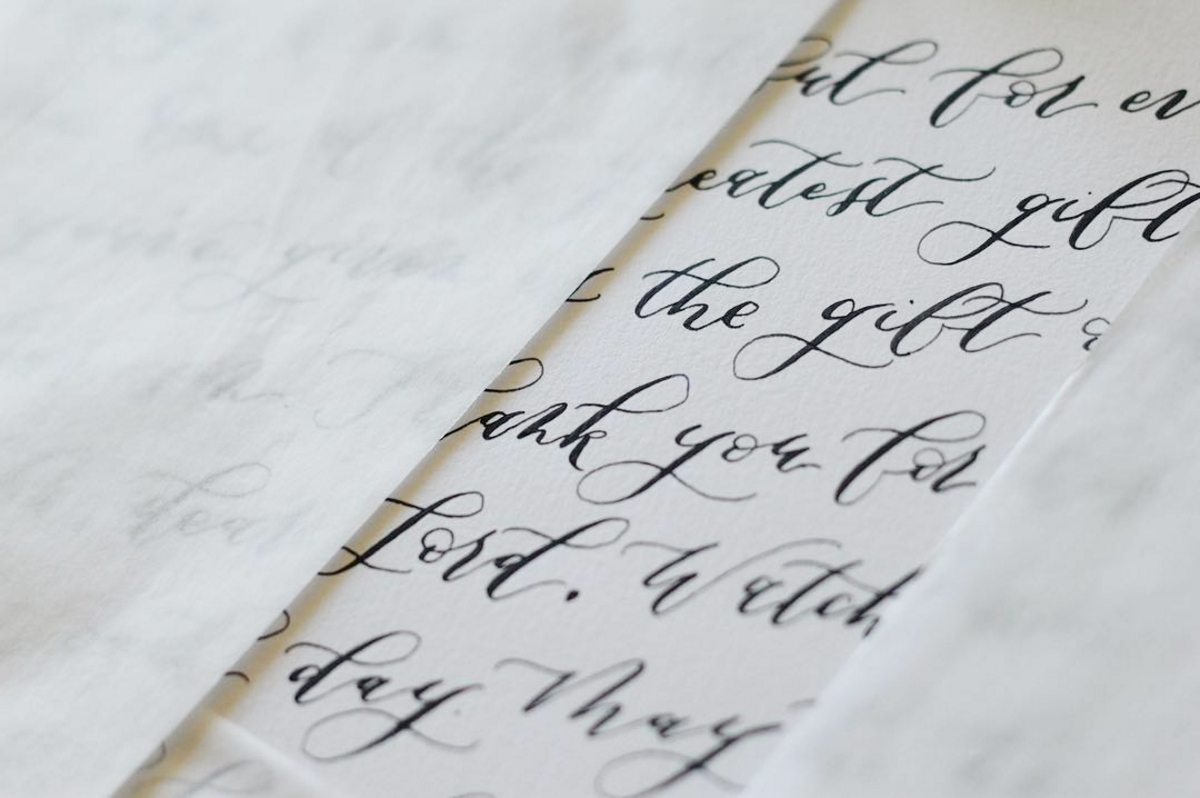
That’s a big dose of calligraphy inspiration! Do you have a favorite? I would pick seeing the lyrics of a most-loved song in calligraphy, framed in gold just like the wedding song above. So pretty! And that’s a wrap on the wonderful work of Vita Popov Studios!
Photos by Viva Popov Studios, except where noted
Brick + Mortar: How to take feedback like a multi-vitamin
Here’s the thing about feedback: Everyone will tell you it’s important. And you’ll agree. You know that it’s good for you. You know you need it to grow a healthy business. But let’s be honest, without good direction, feedback is unwieldy and overwhelming. I call it the multi-vitamin of business, because, no matter how beneficial you imagine it can be, you will spend a lot of time choking on it if you don’t prepare. – Emily of Clementine
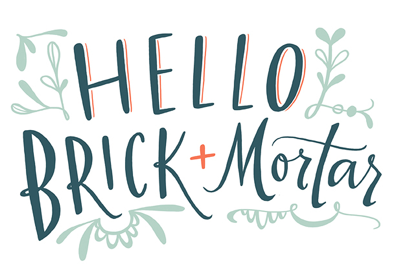
Illustration by Emily McDowell for Oh So Beautiful Paper
It’s true: Good feedback is invaluable for business growth. Insights! Direction! New ideas! New perceptions! These can all help narrow and edit your line to perfection. But that’s an ideal feedback landscape. In reality, the majority of the feedback you’ll receive as a business owner is either exquisitely painful to listen to or pleasant, but essentially useless. So how to you help your business absorb all of those vitamins that feedback has to offer? Here’s my prescription:
Prepare yourself
The best advice I have about feedback is simple: invite it into your business (specifically and selectively). I used the metaphor about choking on a multi-vitamin for a reason. Most people can relate to the feeling of looking at a massive vitamin you know you should take: when you prepare, it it goes down; when you don’t, it hurts the entire way. You will have good and bad feedback. It will not always feel good. But in my experience, the simple act of taking a moment to position yourself to accept the feedback will help.
What this means in practice:Â
- Are you going to a trade show or craft fair? Launching a new collection? Posting something on social media? No matter how big or small the event is, you can always prepare by asking yourself what you want to get out of it and craft your presentation and questions to elicit those responses.
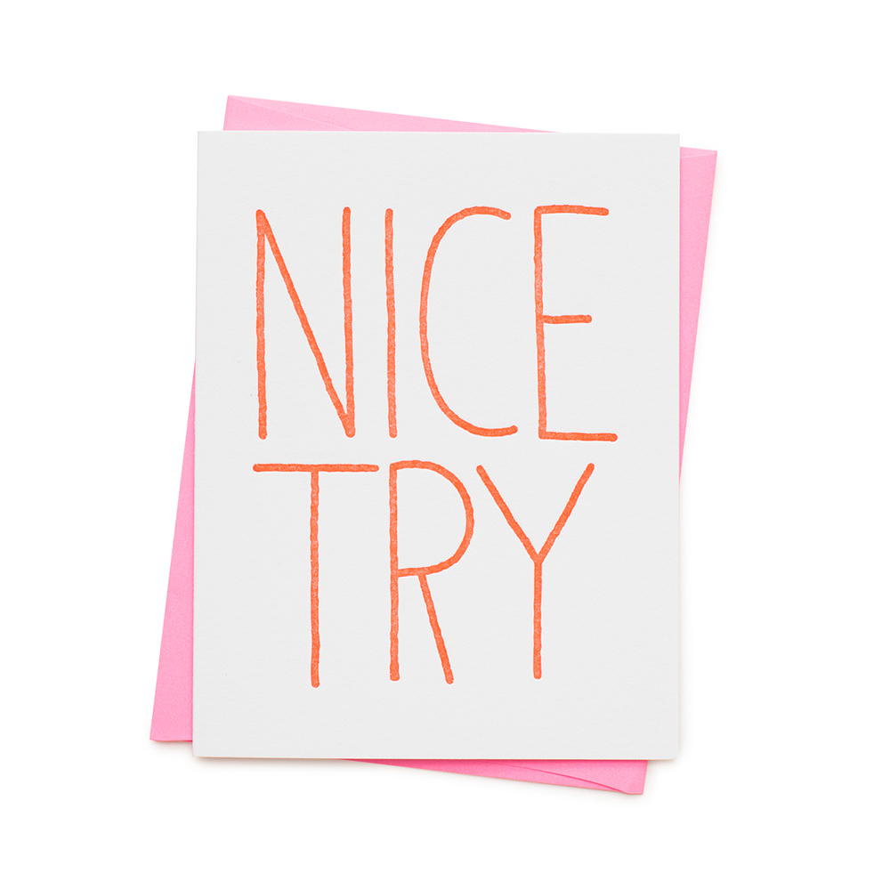
- This is a process: Keep Trying. I have worked with enough emerging lines to know: You want to present your line and have the feedback to be: “This is Fantastic! You have a great line, just get out there!” But the truth is, the lines that I know that are truly strong, are so, because they seek out feedback, they edit, they refine: “NICE TRY” is not a door closing, it’s their jumping off point.
- Want more? Read Pema Chedron’s Fail, Fail Again, Fail Better (yeah, get it from your local bookstore, please). Feedback and failure do not go hand, but in my experience, Chedron’s words can actually make you want to experience the facets of failure to spur your own growth. Asking for feedback, with recognition that it can feel like failure will help you truly open yourself to it.
Ask the right questions
Have you figured out what you want to know? Good, but remember, generic questions beget generic responses. How do you get specific?
- Assess what you want to know:Â Do you want general feedback about whether there is an audience for your never-before-seen product? Or do you want to know if people want to buy this hat in blue or gold?
- Ask specific questions: We are hard-wired to want positive responses, but what do you learn from 1000 likes? You learn that people like the way your photo looks. You do not learn if they will buy it, if they will buy it as a single card or a set, if they like the card or just the on-trend-plant-leaf you’ve styled it with. So, craft the question to get responses that will help guide you.
Ask the right people
Look, the right people will not always answer you (they’re busy!), but they will never answer you unless you ask them directly with the right questions. So before you start gathering feedback, ask yourself:
- What is the problem/issue I’m trying to (re)solve/learn more about?
- Who can help me answer this question? (Customers, retailers, peers, mentors, trendsetters?)
How can I get them to answer?
- If you’re face to face? Trade shows are a great time for specific questions for retailers – be prepared with specific questions.
- If you’re far away? How can you incentivize them to reply – free shipping for retailers, a discount for customers?
Listen to what they say
Solicited feedback, when thoughtfully gathered is your food pyramid. It may be a bitter pill to swallow, but it’s what helps you grow, develop + differentiate your line. Hone your ability to gather it, and use it.
Ignore
Both solicited and unsolicited feedback are important, but they should be weighted differently. Unsolicited feedback can catch us off-guard – sometimes, in a good way, calling to light the things we forget to ask. But in general, it should be the background noise, a general barometer to how you’re doing. This feedback includes:
- Customers who make or leave comments; friends or family who comment on your work; social media followers, likes and generic “love this!” emoji comments. This noise gives a sense of “is my line resonating?” But unless this feedback causes an overwhelming financial impact (e.g. a massive influx of orders on one product, or complete silence when other parts of your line are soaring) you should not make business decisions based on unsolicited feedback.
- Friends and family. They mean well! But they are terrified to hurt your feelings and thus, they do not usually give helpful advice. Listen to them, sometimes indulge them, but do not make business decisions based on their comments (unless they are truly part of your designated target audience.)
- Customers who do not buy and/or strangers. If you are a fellow retailer or you sell at retail markets, you are no stranger to the person who walks in and immediately tells you what else you should sell/make. Be polite, but do not make business decisions based on these people, even if three of the same suggestion start to sound compelling. Stick to your vision.
But wait. Are your longtime, ever-faithful, big spending customers or trusted confidants giving you unsolicited advice? Take the time to listen a bit more carefully when suggestions come from these unsolicited friends.
If you need a little more help tuning in or tuning out, I do some of that work for creative businesses here. But remember: This is your show. As small business owners, there will always be more feedback noise present than we can integrate. So take some time to tune in to what you know: your audience, your product, your limits. And then, tune out.
p.s. Do let me know the specifics of what’s tripping you up about feedback. I always take the time in the days after these posts air to reply as thoughtfully as I can. xo, Emily.
Timeless Black and White Wedding Invitations
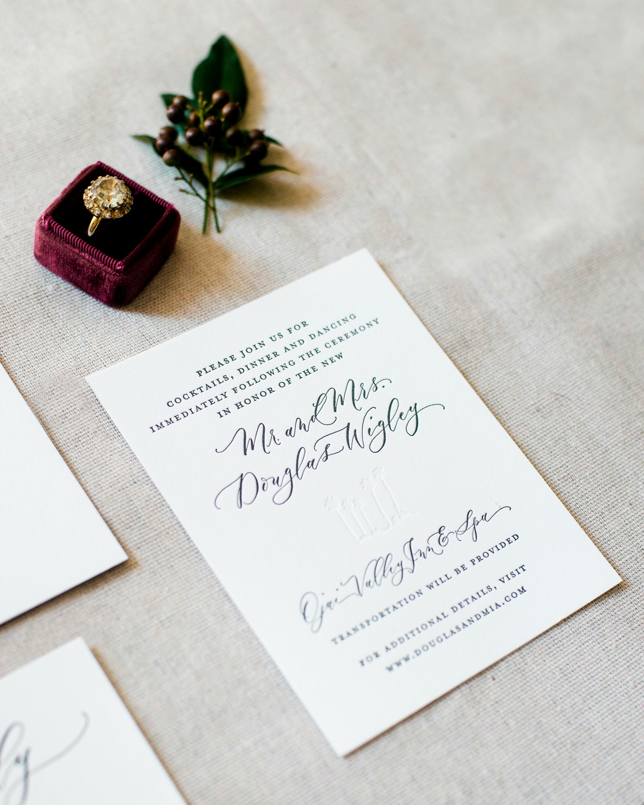
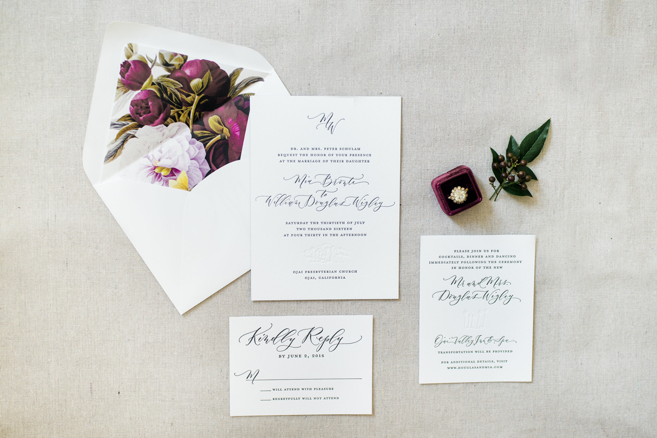
When it comes to timeless wedding invitations, it really doesn’t get any better than classic black and white with a dose of gorgeous calligraphy. These timeless black and white wedding invitations from Megan of Ruby the Fox feature black letterpress printed text, spot calligraphy from Angelique, Ink, blind impression palm trees and mountains inspired by the Ojai, California wedding location! Add in a couple of modern touches, including black edge painting and colorful botanical envelope liners, and you’ve got one seriously gorgeous invitation suite!
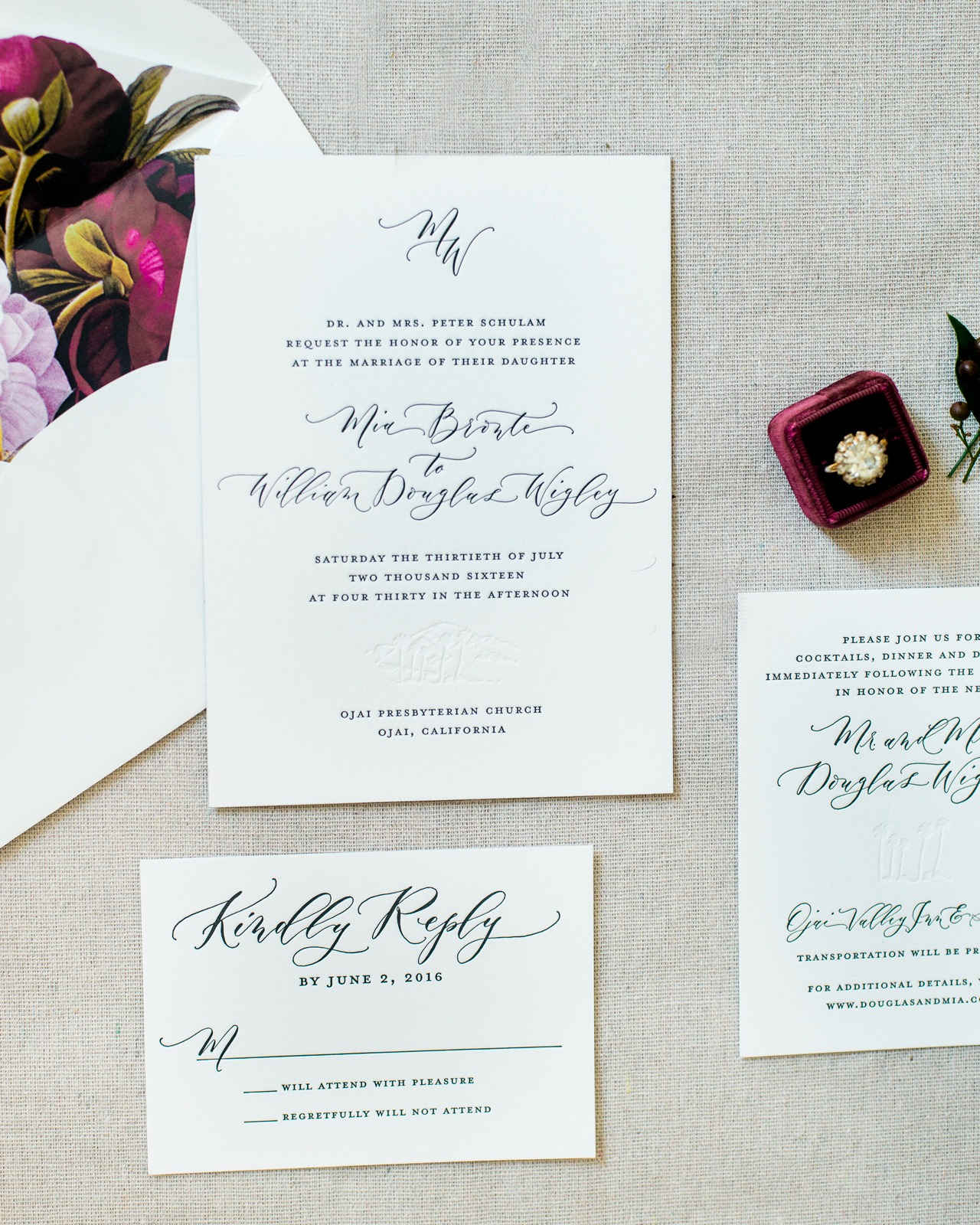
From Megan: This Ojai Valley Inn wedding for Mia and Douglas was an absolute DREAM to work on! I was contacted by Amber Weir Events to create this timeless suite for the most lovely bride. Her vision was super refined, yet organic, and I was honestly smitten with every element of her big day.
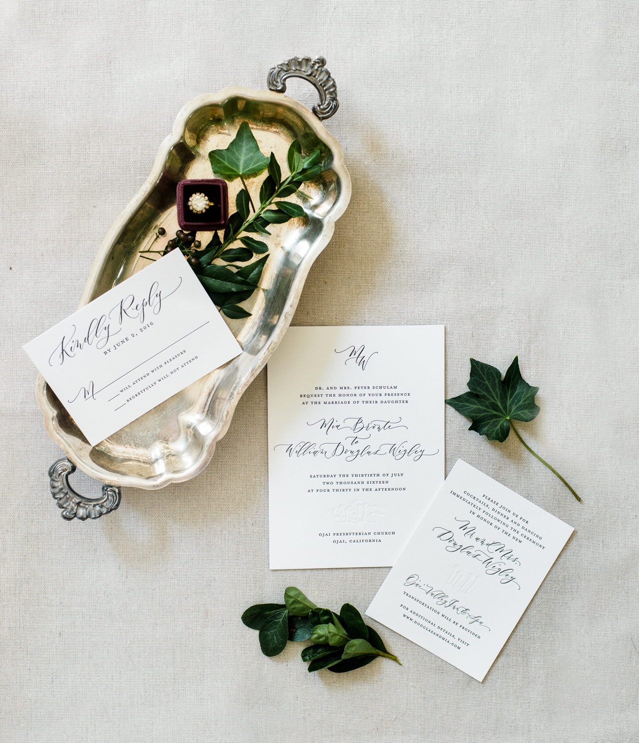
We started the design process with a pared down palette of black, white, and pops of red. After the bride had mentioned she wanted her out-of-town guests to really embrace and enjoy the beautiful venue, we decided to incorporate a blind (no ink) letterpress printed silhouette of the mountains and palm trees. This touch pulled in the gorgeous California scenery while still letting the design feel really fresh and clean. It was such a treat to work on a black and white design that was honestly a bit out of my design element (in the very best possible way!).
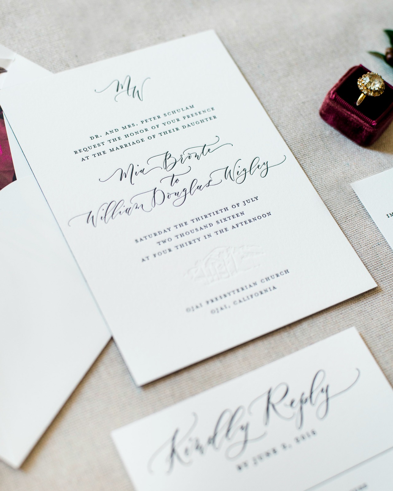
We utilized stunning modern calligraphy from Angi Phillips of Angelique, Ink for the names of the bride and groom, the addresses, and the venue titles. The rest of the invitation text was done in a classic serif font. Using spot calligraphy is one of my FAVORITE ways to really personalize a design. The cards were letterpress printed on white extra heavy cotton stock and were finished with a bold black edge painting. The letterpress printing was done in black ink and a blind (no ink) impression — really showcasing the impression and letting the process shine!
The crisp white envelopes were lined with a beautiful vintage botanical print, which gave the perfect pop of color and mimicked the flowers used at the ceremony and reception! The bride’s vision came together perfectly and I must say, this is one of my favorite wedding invitations to date.
Thanks Megan!
Design: Ruby the Fox
Printing: Steracle Press
Calligraphy: Angelique, Ink
Styling: Caitlin Kruse
Wedding Planner: Amber Weir Events
Ruby the Fox is a member of the Designer Rolodex – you can see more of their beautiful work right here or visit the real inviÂtaÂtions gallery for more wedding invitation ideas!
Photo Credits: Krista Jones Photography
Rustic Boho Wood and Copper Foil Wedding Invitations
With fall in full swing and the leaves starting to change, we just love the warm hues of today’s rustic boho wood and copper foil wedding invitations. Melissa from Atheneum Creative is always coming up with new designs and ingenious printing combinations – and we love her for it! These wedding invitations are both sleek and bohemian, while featuring rustic touches and copper foil finishes!
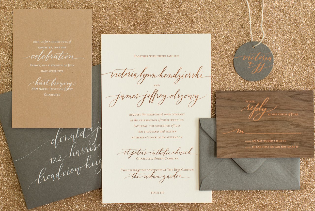
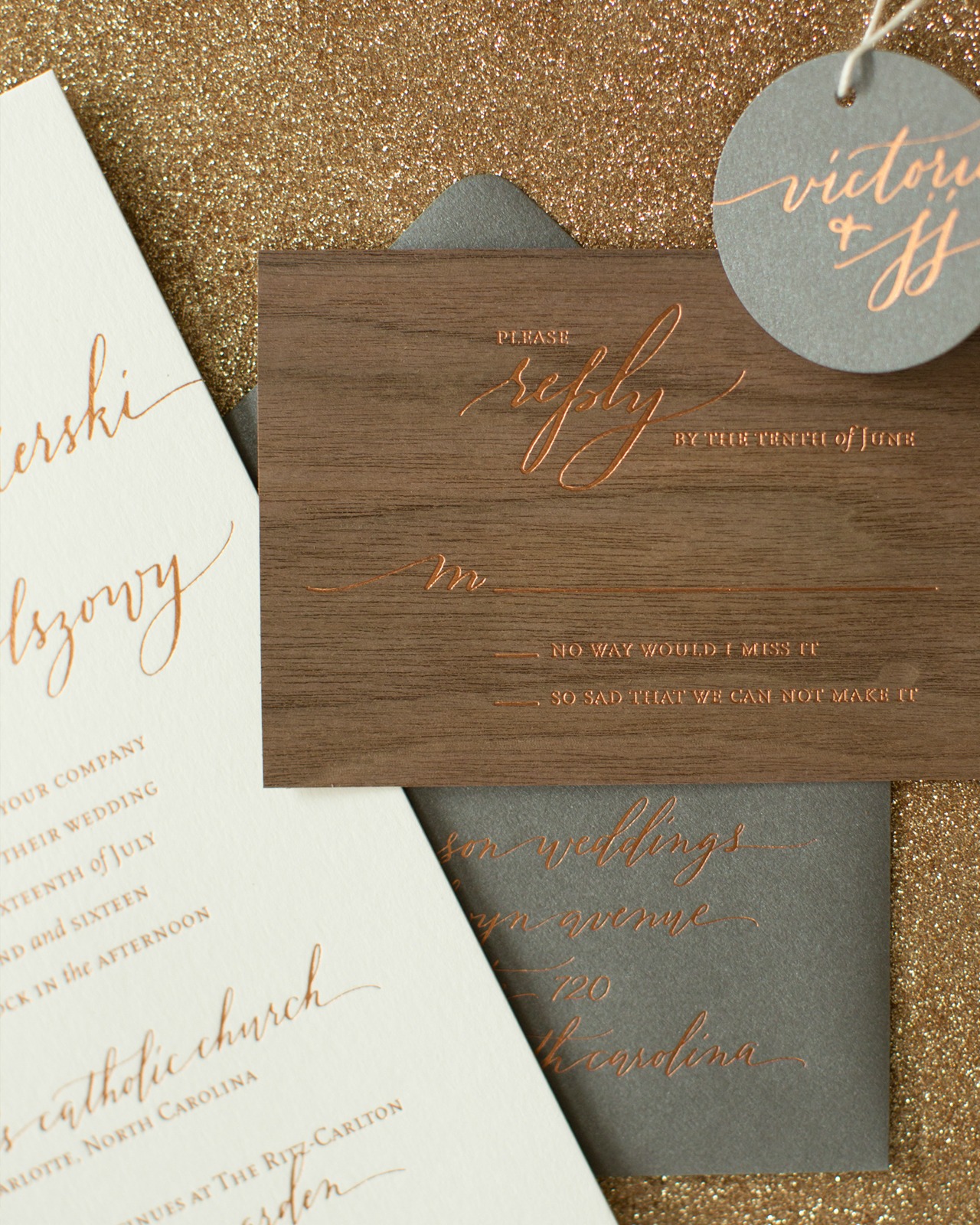
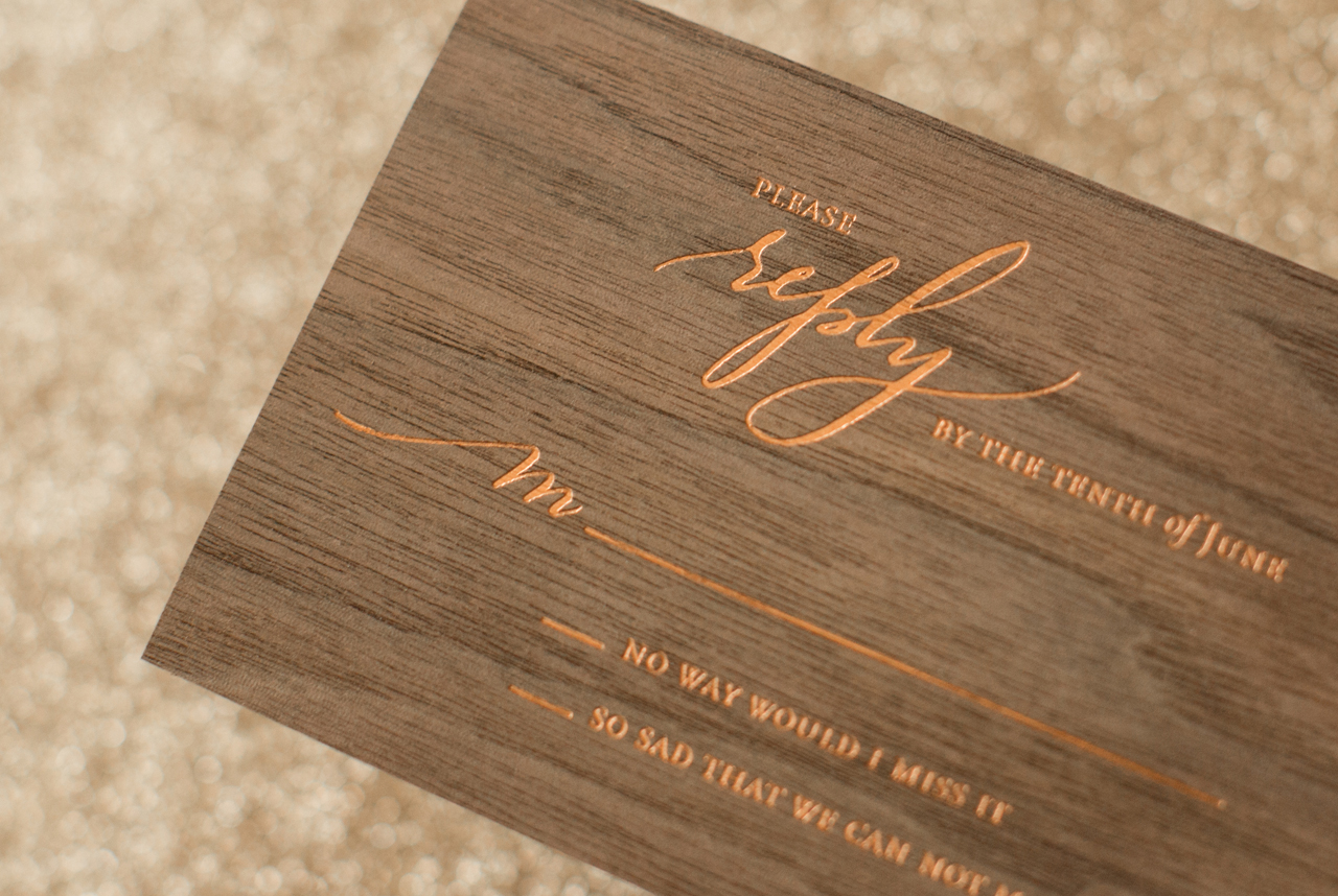
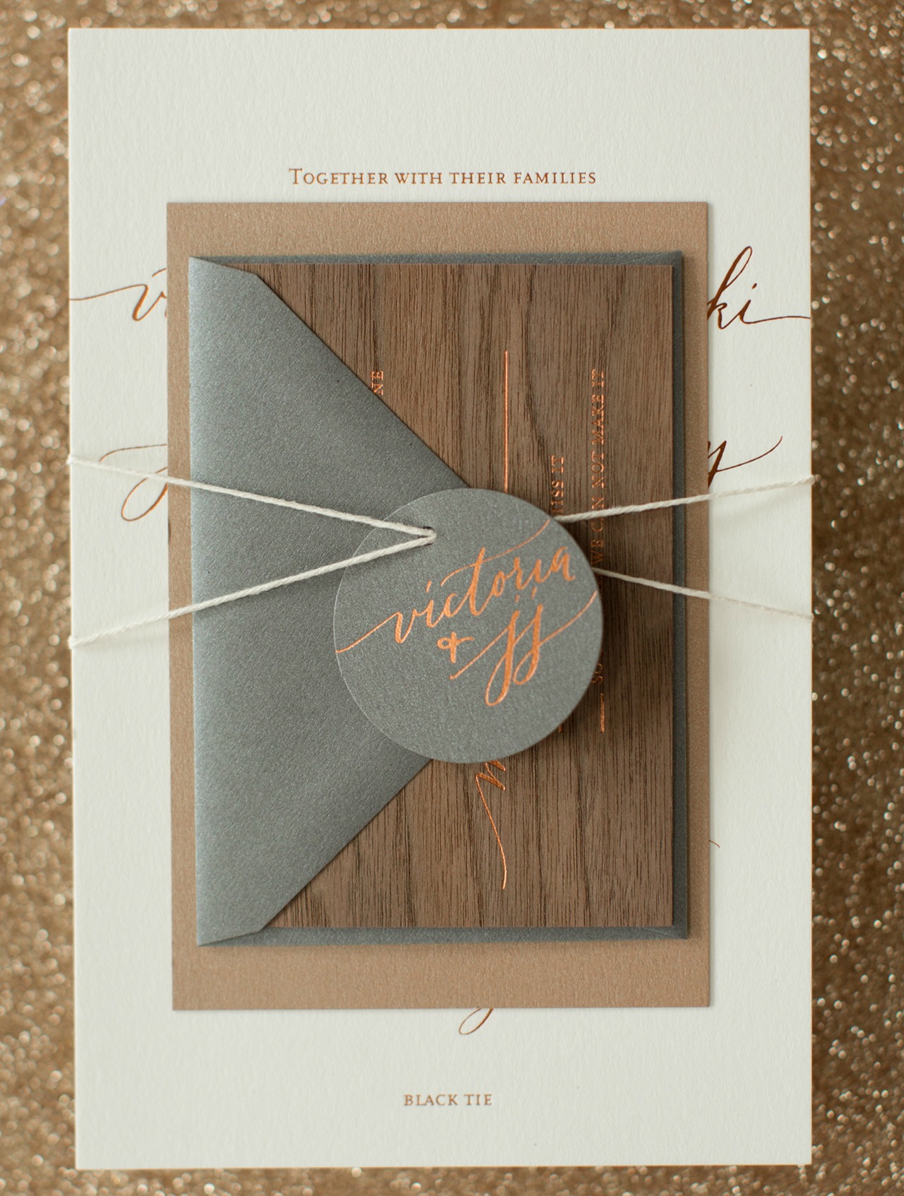
From Melissa: Copper on gray… no problem! Copper on white, no problem! Copper on a deep walnut wood… let’s do it! I love it when a client challenges us to try something new and to push the limits – and this invitation definitely meets that challenge!
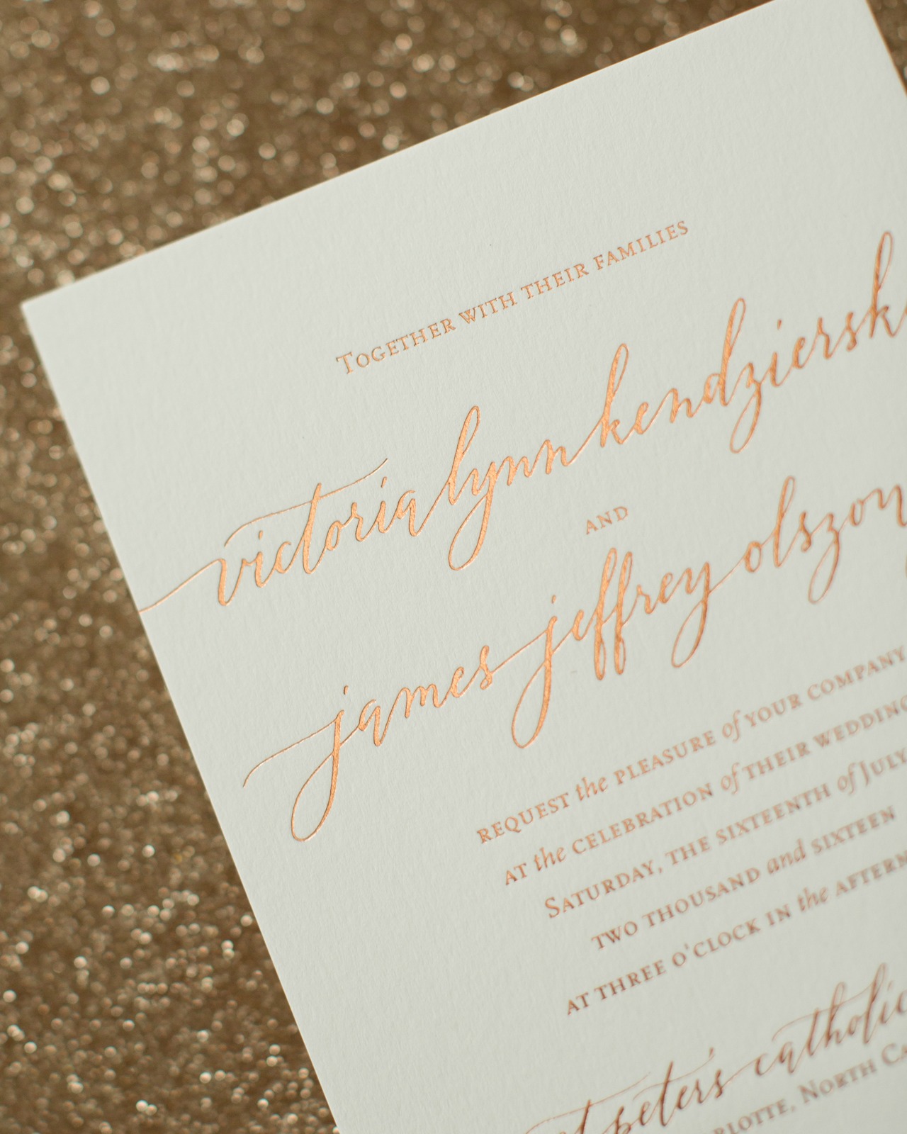
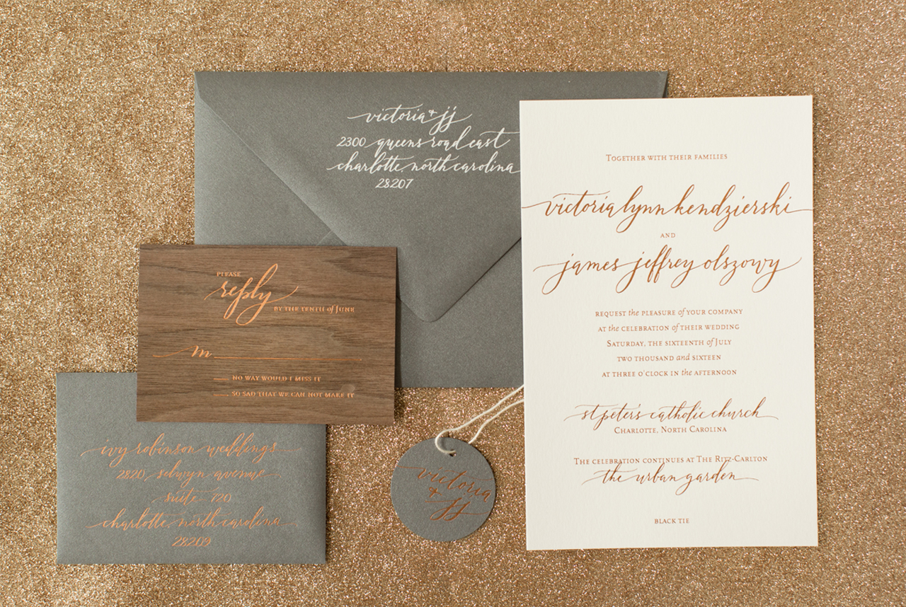
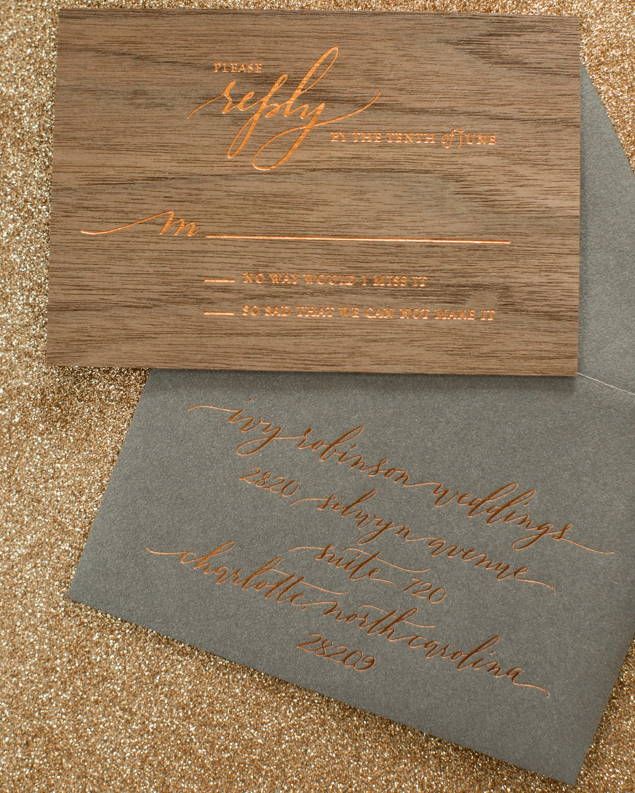
Victoria wanted something modern, something unique, something sleek (and let’s say it.. sexy) for her invitation, all while touching on a rustic boho vibe. The invitation was printed with a mix of white and copper foil printing on the deep gray metallic paper, metallic cappuccino paper, white paper, and a walnut wood veneer. We had to test the copper on the wood to make sure it would print well, especially for a reply card, but it printed great and really ties the whole invitation suite together.
The wording of an invitation also sets the tone for the event, and we love the phrase “join us for a night full of laughter, love and celebration” used on the reception card. A reception card allows your invitation to remain more traditional while bringing in an element that is a little more fun. Because the wedding reception was held at a local brewery, we felt the reception card worked well printed on cappuccino colored paper.
Copper foil gave us the perfect amount of warmth without being super orange. It has a nice deep balance and of course it’s metallic – and who does not love metallics? It was subtle enough to give us the look we wanted on the wood, but also had just the right amount of pop to make it legible.
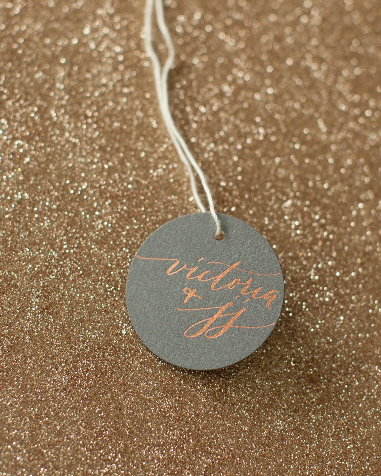
We love how this invitation has the perfect mix of being sophisticated and sleek with the metallic foil, but also brings a rustic touch with the wood veneer and cappuccino paper. The invitation suite was packaged with twine and a hang tag, and mailed in a dark gray envelope addressed by Anne Robin Calligraphy in white ink!
Thanks Melissa!
Design: Atheneum Creative
Calligraphy: Anne Robin
Atheneum Creative is a member of the Designer Rolodex – see more of their beautiful work here or visit the real inviÂtaÂtions gallery for more wedding invitation ideas!
Photo Credits: Chelsea Davis Photography
