Hand Lettering and Calligraphy at Common Room Studio!

Before we jump into the week, I wanted to share a couple of upcoming hand lettering and calligraphy workshops at my new studio space – Common Room Studio! If you’re in the DC area, we’d absolutely love for you to join us. Come hand out with fellow lettering aficionados in the area, and learn a new skill while you’re at it. It’ll be so fun – come hang with us!

August Workshops at Common Room Studio

Painted Palettes / Your Vibe Attracts Your Tribe

First up, a hand lettering and watercolor workshop on Saturday, August 11 from 11 am – 1 pm! Join Samantha Testa of Painted Palettes for a workshop of lettering and good vibes! You’ll learn the basics of hand lettering using four unique pens and four different styles, along with how to create a beautiful watercolor background. And you’ll get to take home your very own 5×7 art print at the end of the workshop! Light sips and snacks will be served. Sign up right here!

Introduction to Modern Pointed Pen Calligraphy by Meant to Be Calligraphy

If you’re interested in learning the art of pointed pen calligraphy, join Michele of Meant to Be Calligraphy for her popular Introduction to Modern Pointed Pen Calligraphy workshop on August 12! Michelle will teach you how to use traditional materials (pointed pen calligraphy nibs, an oblique pen holder and real ink) to create gorgeous hand-lettering with a modern twist. You’ll learn how to create the nuanced thick and thin lines that set pointed pen lettering apart from regular handwriting. Plus, you’ll go home with all the materials you’ll need to continue practicing and showing off your new lettering skills. Sign up right here!

Hope to see you there!

If you’d like to learn about more upcoming workshops and events at Common Room Studio, sign up for our newsletter right here!

Behind the Stationery: ilootpaperie

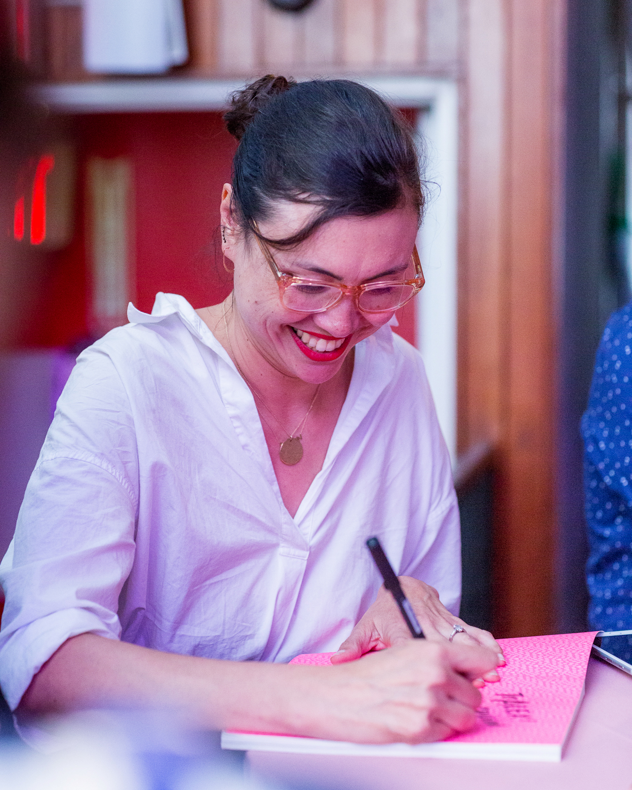
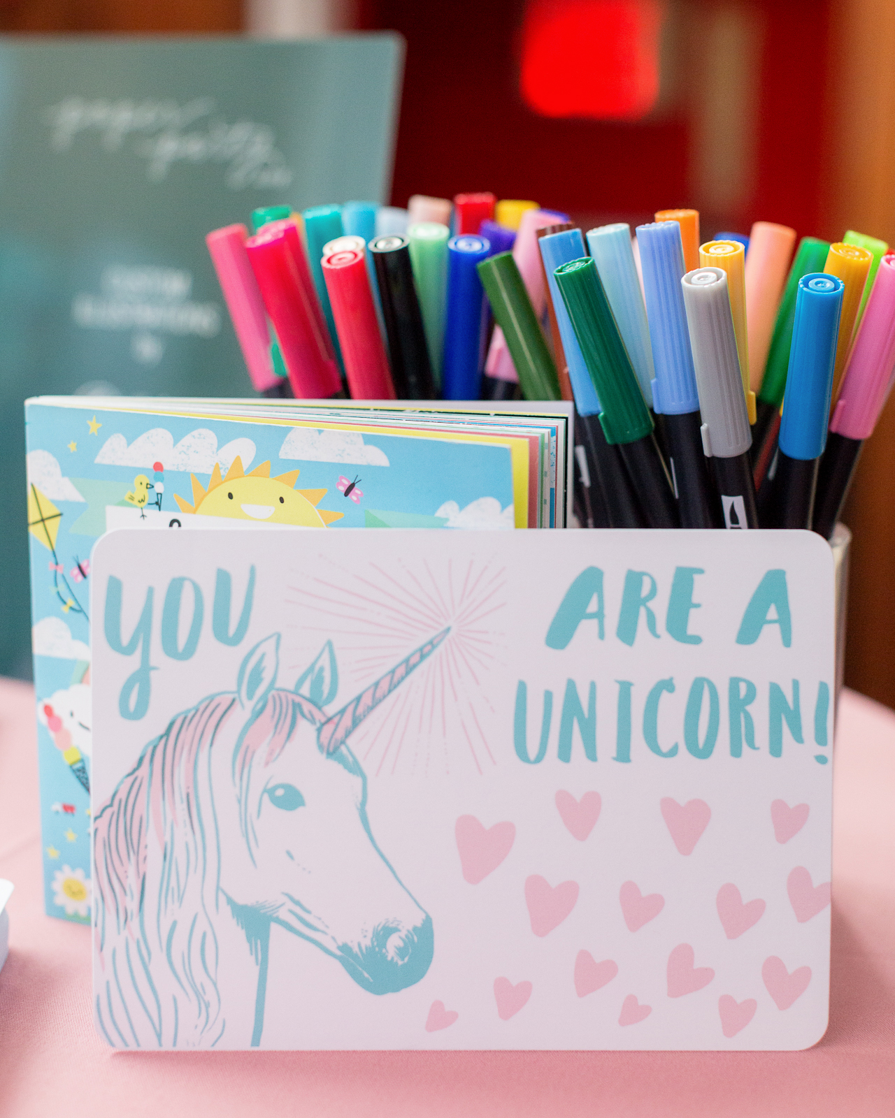
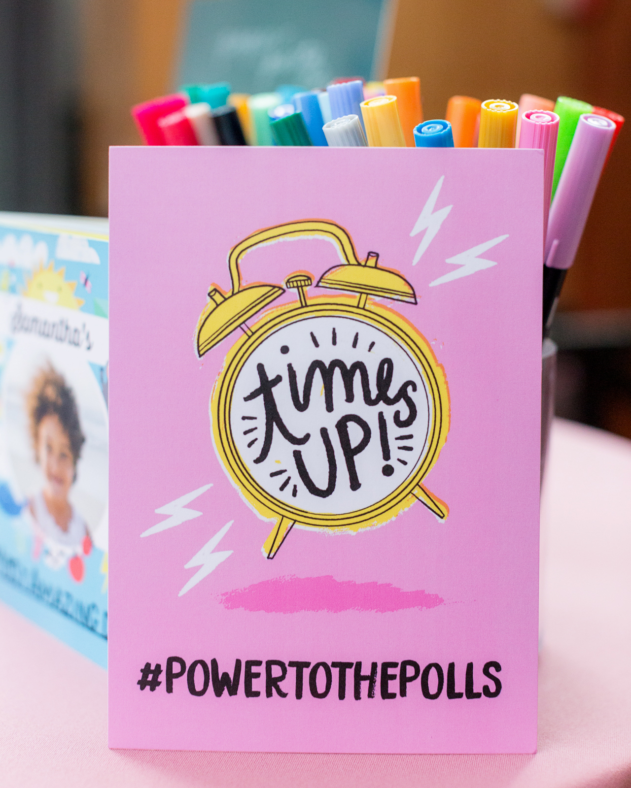
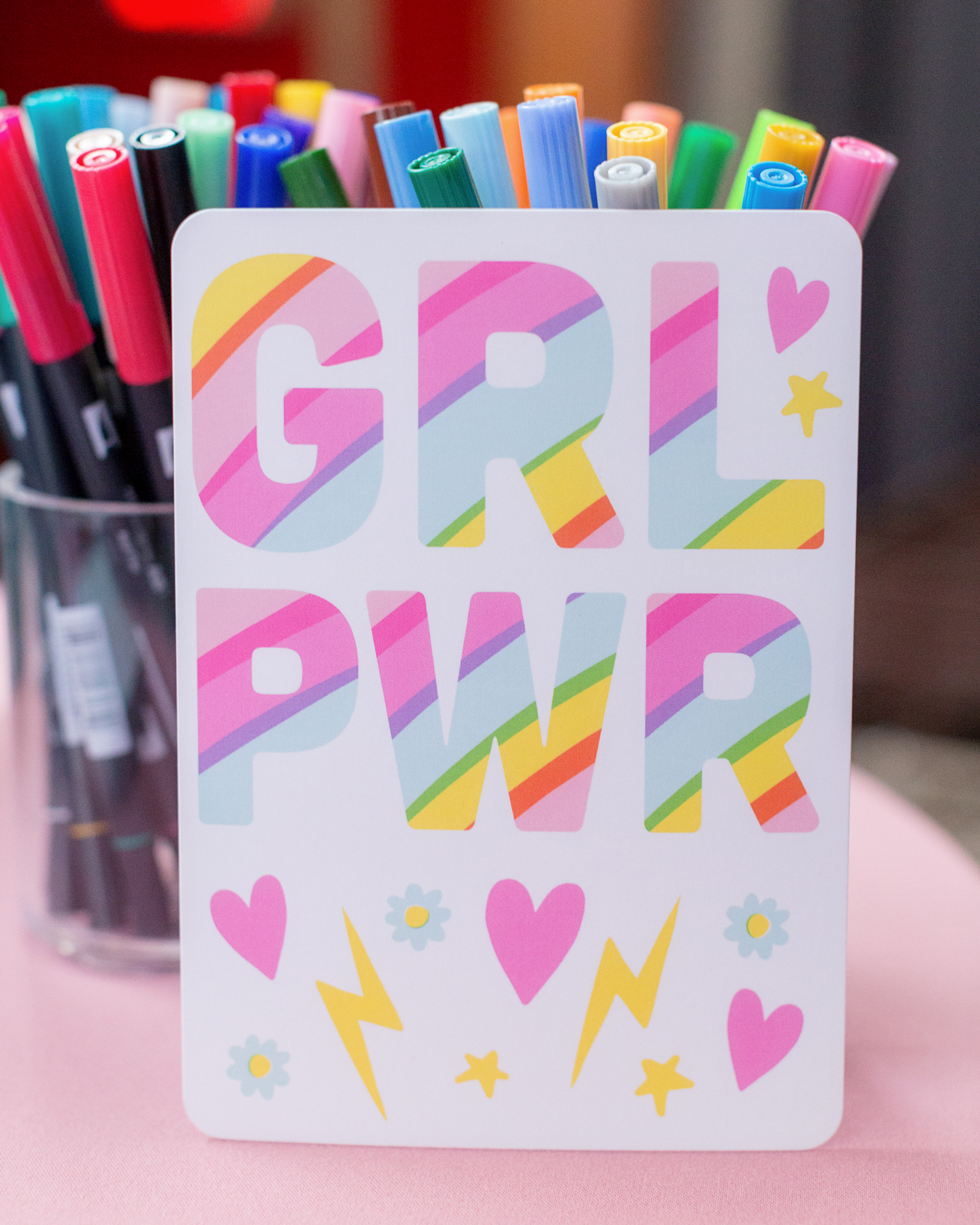
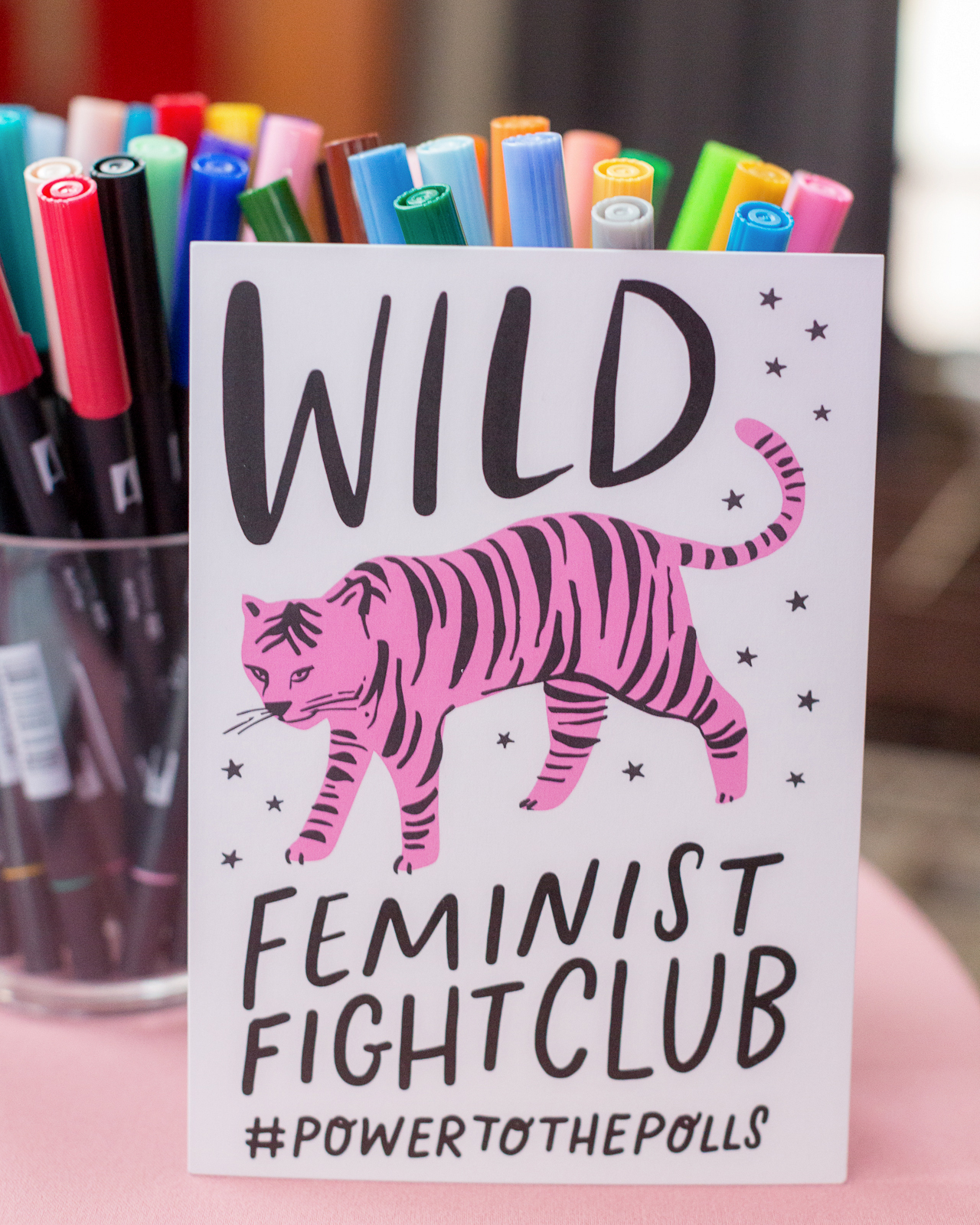
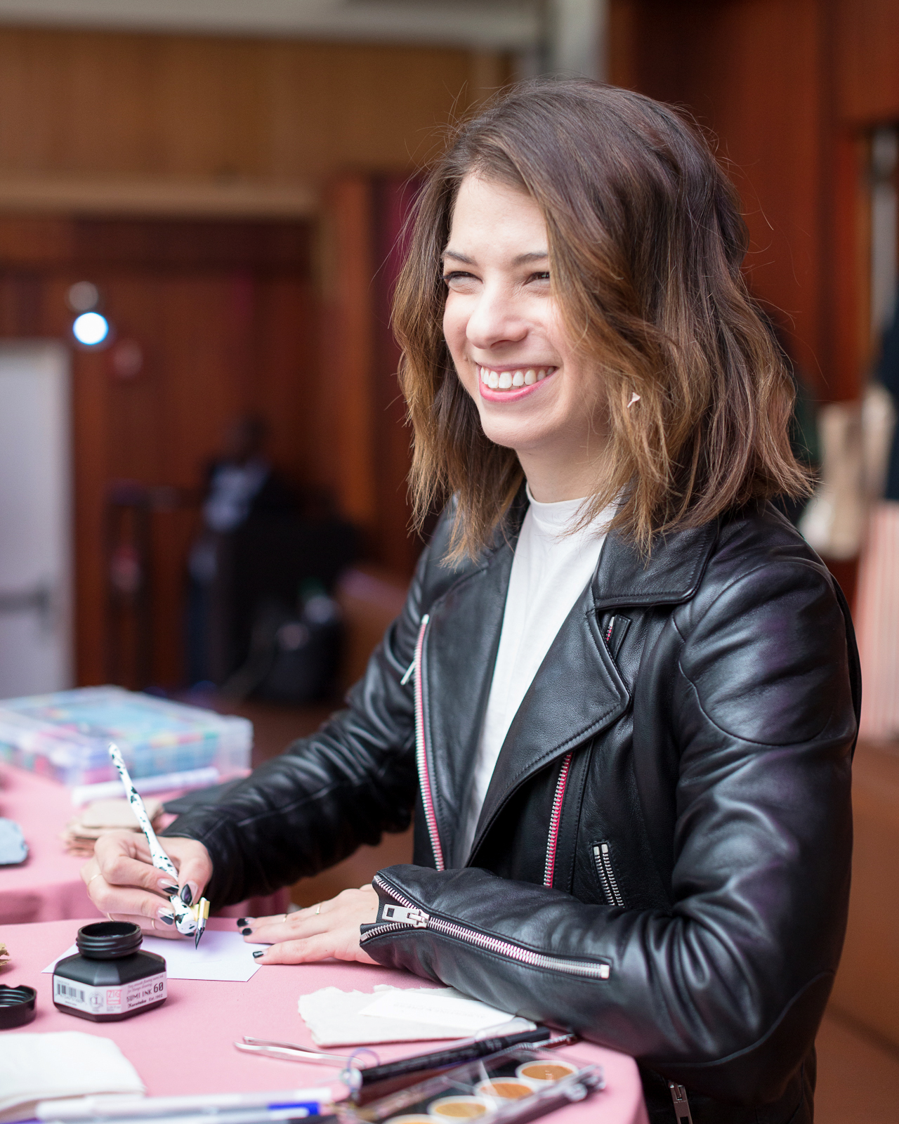
We’re bringing you a sister act on today’s installment of Behind the Stationery! Alice and Doris of ilootpaperie recently moved into a dedicated space this year in Pasadena, California (congrats!) and their greeting card and pin designs are full of vibrant colors and puns galore. They’re here to share their story—from their experience in finding a local printer to outsource their printing needs to the different methods they use to sketch and render designs—take it away, ladies! —Megan Soh

Behind the Stationery: ilootpaperie

From Alice: Our foray into the stationery world had its beginnings, funnily enough, in wedding invitations for some of our close friends. We found quickly that the part of the process that we were drawn to the most was designing the accompanying thank you cards we included with the invitations as part of our gift to the couple. This realization shaped the beginnings of Ilootpaperie when we launched in December of 2010 as a passion project with just six designs on Etsy. This all took place before the advent of the phenomenal of the side hustle, so we simply thought of it as taking steps to get an idea Doris and I had daydreamed about off the ground in case she moved to London for a position she had been applying for at her day job in the finance industry.

During this time, I was working in marketing and design for a shoe design company. After making it through several rounds of layoffs due to company restructures, at the end of August 2013, I was laid off and this set off an unexpected course of events in which we eventually decided I would apply my full effort to help grow the company.

With the advice of our fellow entrepreneurial creatives in mind — that few part-time projects can take off without full-time attention applied to it — we embarked on this ever-challenging but also ever-fulfilling endeavor. We have found ourselves to be a small part of a very special industry filled with fantastically talented kindred spirits that we have the honor of working amongst and calling our friends. Doris continues to work at her day job, so we often joke there is 1 and 1/4 of us getting things done!

Behind the Stationery: ilootpaperie

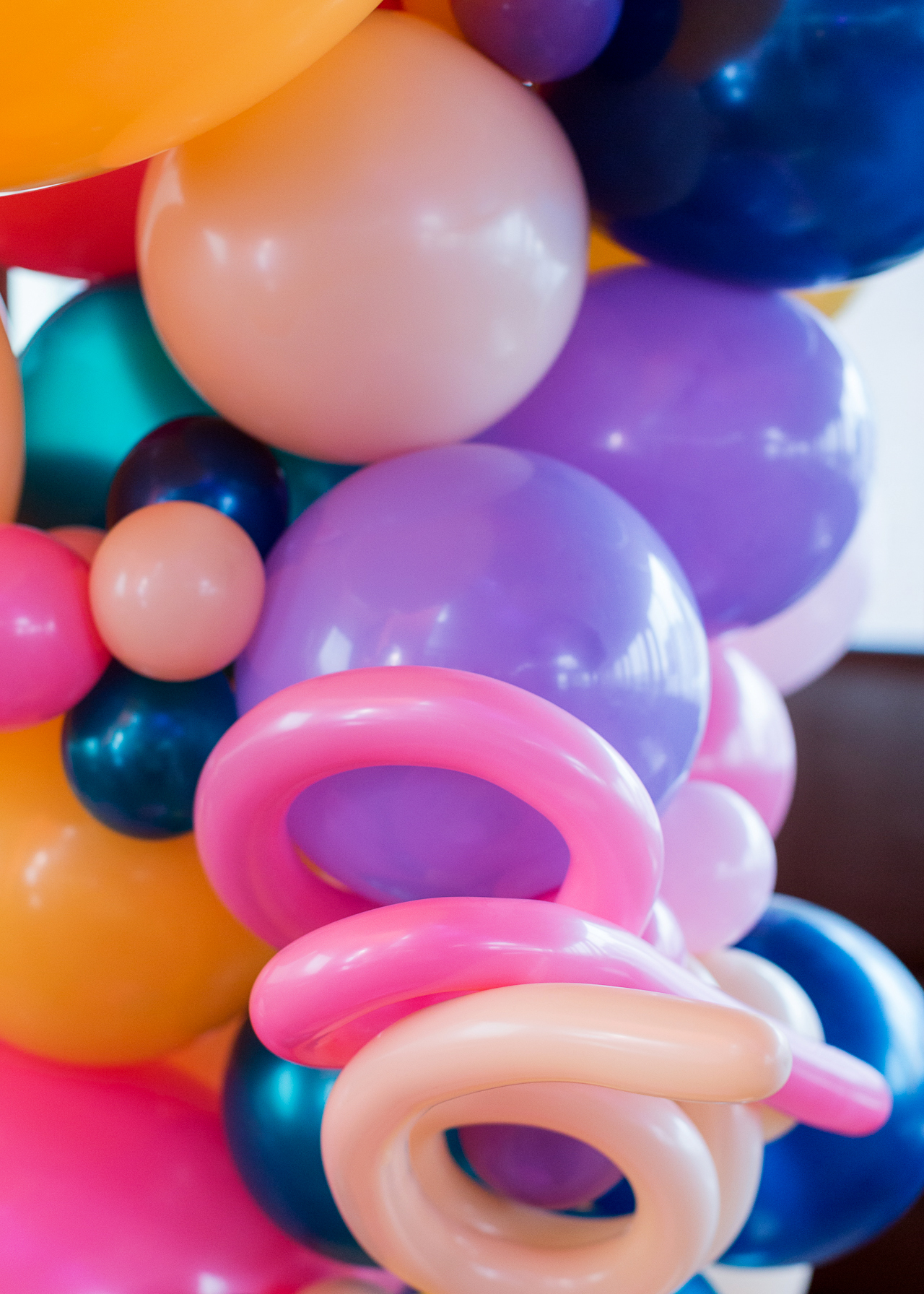
We are based out of Pasadena, California and just moved into a new place this past January. This move was a huge deal for us because for the first time since Ilootpaperie sprung into existence, our little endeavor finally has its own dedicated space. We converted the master bedroom into our working studio and there are two tall windows that let in a flood of beautiful natural light during the day—oh! and we installed an extensive shelving system along one of the walls to hold our inventory, something we’ve dreamt of for years.

Behind the Stationery: ilootpaperie

Our first real card shelves were handmade by Joel Kvernmo of the awesome Iron Curtain Press (it was their previous shelving) and it was a milestone we hold dear because those shelves made us feel like a legit card company. Rosanna’s encouraging words when we met her to pick up the shelves from their beautiful shop Shorthand stayed in our minds as we prepped for our first trade show. Those first shelves dominated the living room of Doris’ tiny studio apartment.

Behind the Stationery: ilootpaperie

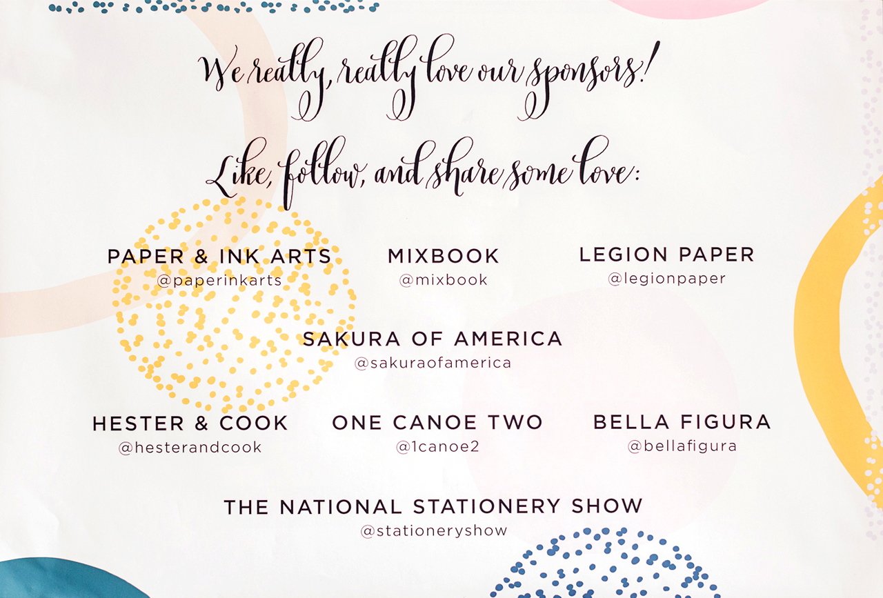
So the idea of this converted studio space has been quite thrilling as we’ve always been about scrappily making it work (card inventory thoroughly infiltrated both our living rooms by time we had moved) and we can’t wait to unpack in the next couple months to create a more centralized studio area with the goal of finding more opportunities to streamline our day-to-day processes. We’ve had to put unpacking on hold to focus on prepping for the National Stationery Show (which took place at the end of May), fulfilling NSS orders, and then NSS show unpacking! As you can see, we’re in a bit of a transitional state. It can be challenging and frustrating at times, but we are learning to be patient with ourselves, to stay focused on current tasks and look to new possibilities just on the horizon to stay motivated as we settle into the new space.

Behind the Stationery: ilootpaperie

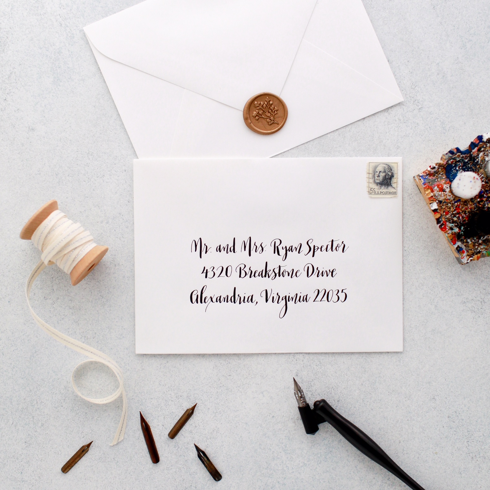
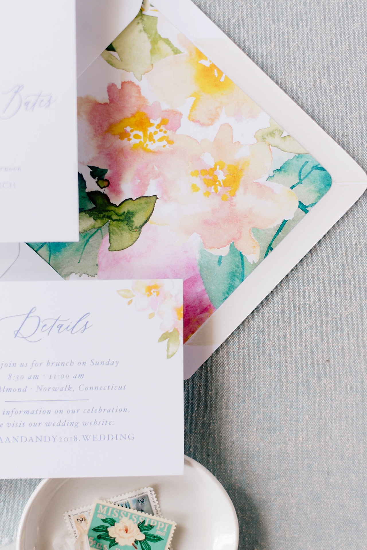
From Doris: In 2015, when we started to seriously consider attending the National Stationery Show in New York, we began researching to outsource the printing and production of our designs. We wanted to educate ourselves on the how-to’s of scaling up should the need arise following the trade show — it was a process of reaching out and learning about the various printing capabilities of printing companies near and far from us, and this definitely took some persistence. We’ve always had a subtle linen texture in the paper stock we used for the line even when we were printing in-house so we wanted to be able to carry that textural brand element forward. In the end, one of the local Pasadena printers (top notch!) with diligent effort was finally able to source a premium linen paper stock that we loved, and the pop of the colors they were able to achieve for the samples we printed for NSS sealed the deal, so voilà! Here we are.

Behind the Stationery: ilootpaperie

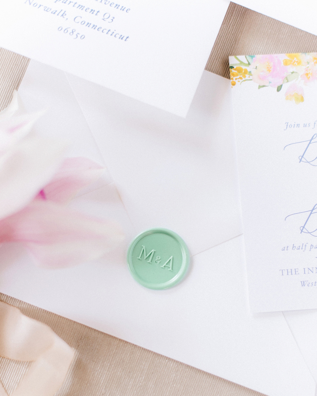
Due to the colorful nature of our designs, our collection is printed on an HP Indigo digital press on the beautiful premium linen stock in white or natural white depending on the design. Certain designs will then go to our second printer, who is also located in Pasadena and specializes in die cutting, foil printing, embossing and debossing. We love being able to build concepts around new design elements we are excited to incorporate be it a new foil color or a technique new to the line (i.e. embossing, debossing). From the printers, everything comes back full circle to us for packing, packaging, finishing and fulfillment.

Being able to work closely with our local printers in Pasadena has been integral to our growth and we feel these strong working relationships with our printing partners have helped us to be able to sustain the order volumes and levels that we had dreamed to achieve when we began attending the National Stationery Show.

Behind the Stationery: ilootpaperie

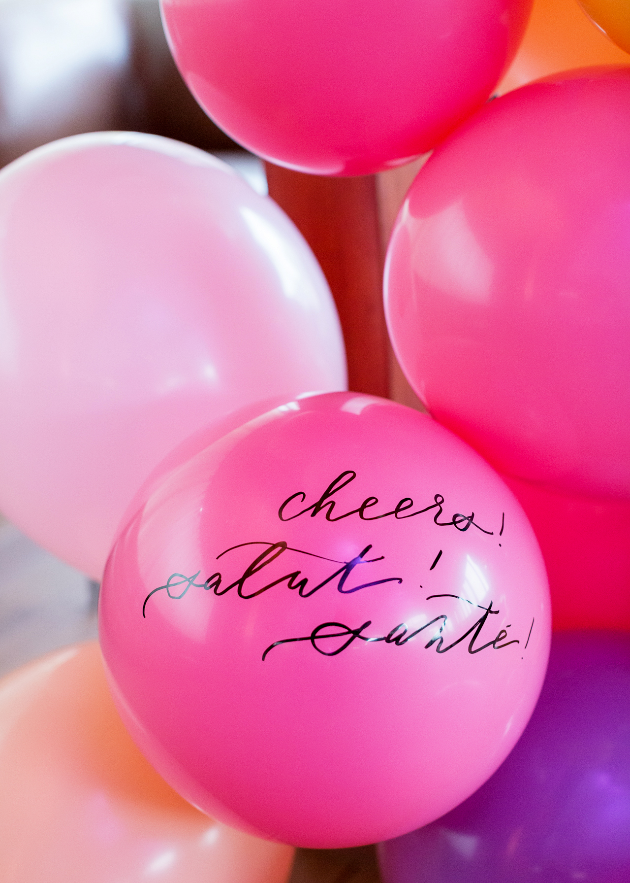
Doris: We believe what really shines through in our cards and sets us apart is how much fun we have when we are coming up with our card designs. There are lots of laughs involved behind the concepts that are full of humor and heart. Even the vetoed concepts tend to make at least one of us giggle while we try to sell it to the other person. We aim to have a good time with it and believe that that’s what makes our products memorable; and that this shared laughter and connection extends beyond just the two of us is a gift.

Behind the Stationery: ilootpaperie

Doris: Each day is different depending on the deadlines that we’re working on so there isn’t really a typical work day—our days are generally filled with pulling items and packing them up for retail and wholesale orders, working with our various printers/vendors to submit new orders for new designs and restocking orders to keep our inventory stocked! Concepts for new cards, pins, and products is an ongoing conversation that happens throughout all of this.

Like many other small business owners, we struggle to find enough time in the day to get everything that we would like to get done completed as there’s an ever-growing list of to-dos that need to be balanced with the fun we’d like to have, the art we’d like to create, and other life obligations that can’t be ignored for long. Moving into the new space has definitely helped us move toward achieving efficiencies in our processes to move quicker and be able to do more. In talking with other creatives in the industry, there are definitely more opportunities and workflow tools that we can continue to explore when we have a little more time on our hands (the irony!). It’s definitely a work in progress.

Behind the Stationery: ilootpaperie

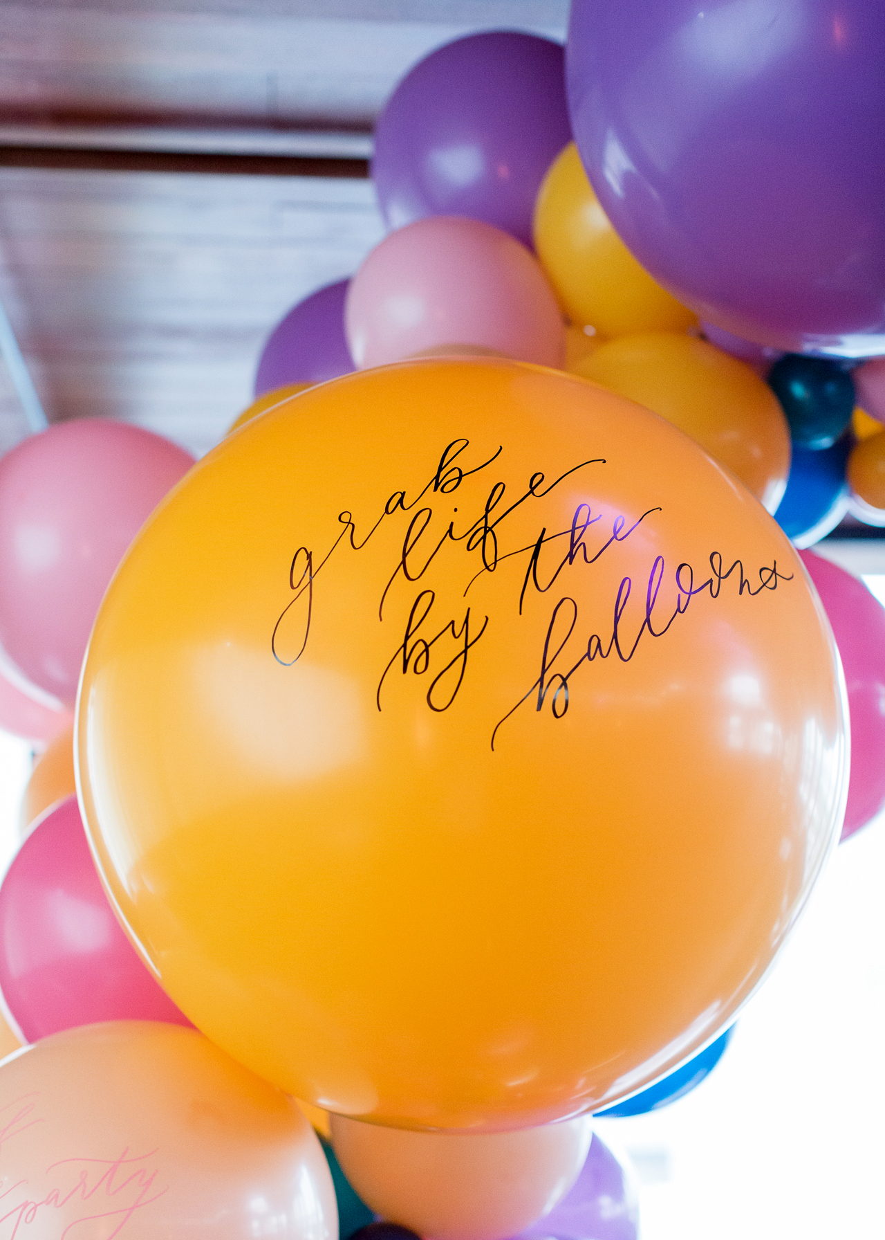
Alice: Our concepts are the sparks that set off our design process. We aren’t always able to set aside a specific time aside to concept so that has always been a constant on-the-flow process for us, even from the beginning. Ideas come about through every day conversations and text conversations back and forth when we aren’t together (inspiration really is everywhere!) and often times in the car on the way to drop off post or while running errands. Things that we feel deeply about also contribute to this flow of inspiration.

Behind the Stationery: ilootpaperie

We keep a running list via email / phone notes /sketchbook list of our half-baked concepts and taglines, and we review the list prior to a print job or placing a pin/ notebook / button order to see which ones we should fully explore and execute. Admittedly there are times when I will take a 4am detour in the midst of designing at night and there will be a surprise concept when Doris wakes up in the morning (I tend to be a night owl when it comes to the creative side of things). We like to keep the design and brainstorming loose and open to playful impulses to keep things lively!

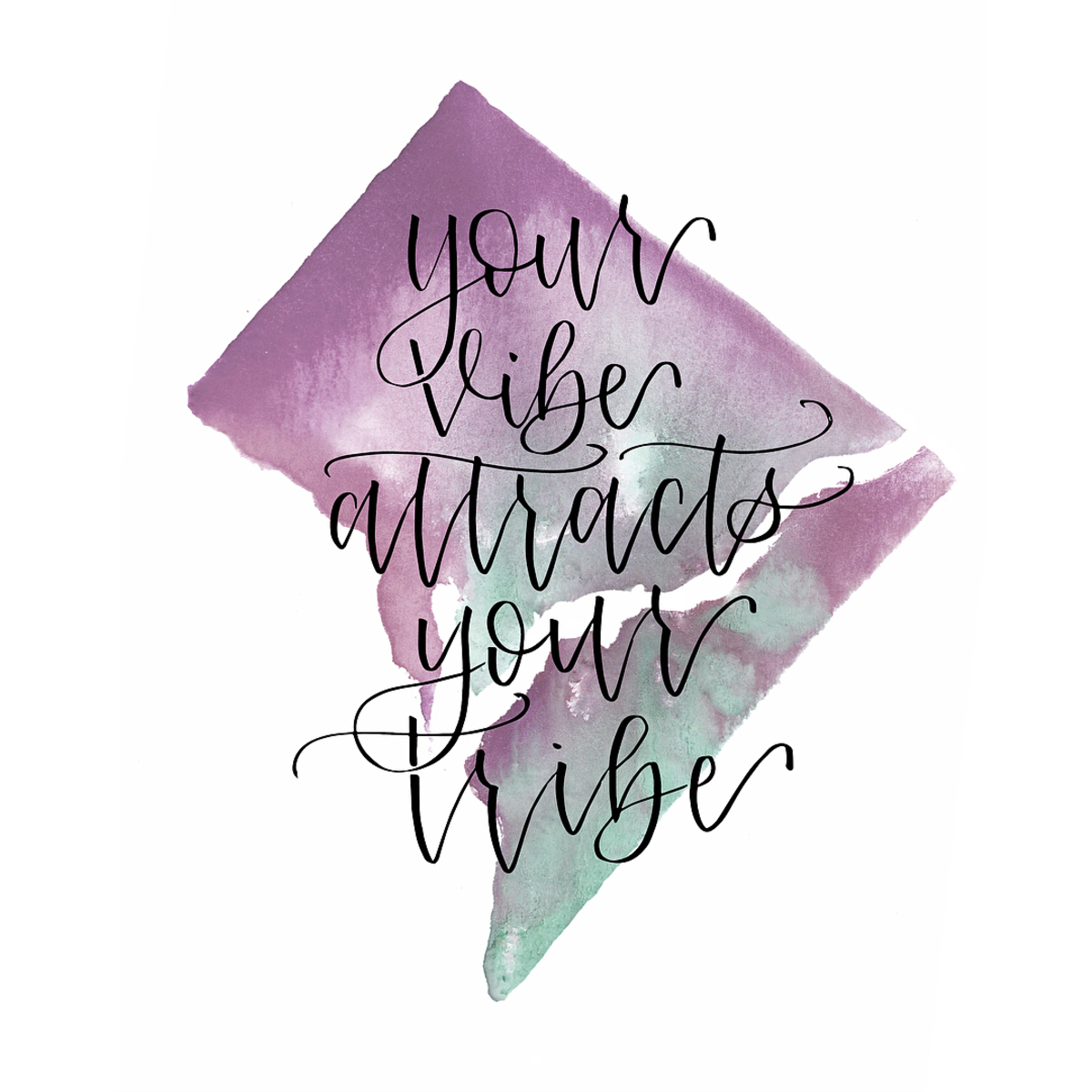
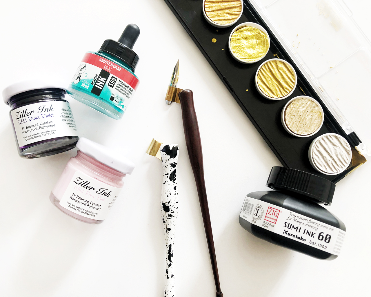
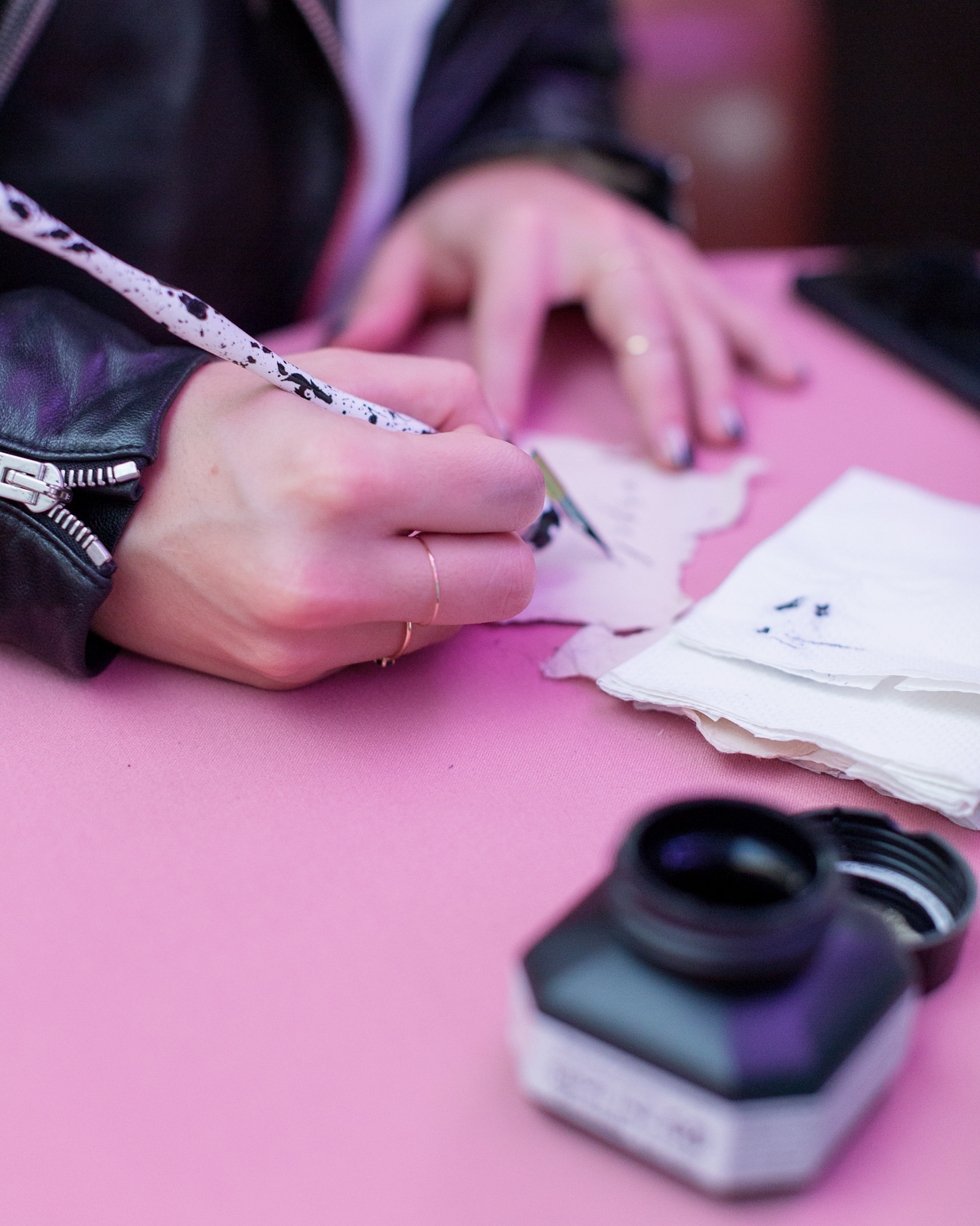
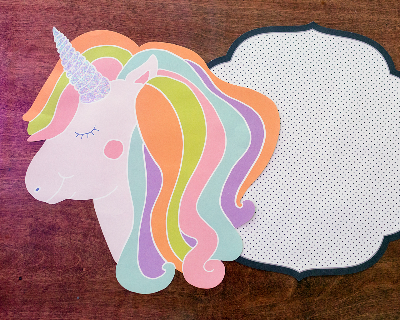
Once a concept has been moved into the “Let’s Execute” list, I often find myself researching lots of images of animals doing funny things (usually for the concept, but sometimes to procrastinate because it is always a little nerve-wrecking to begin a design). When we first started, Doris and I had throughly discussed and agreed we wanted to allow the brand’s visual voice to come into its own. So, especially in the beginning, I incorporated different mediums like watercolor, pencil sketches mixed with vector and text elements, and even thumbprint art when executing the designs.

Behind the Stationery: ilootpaperie

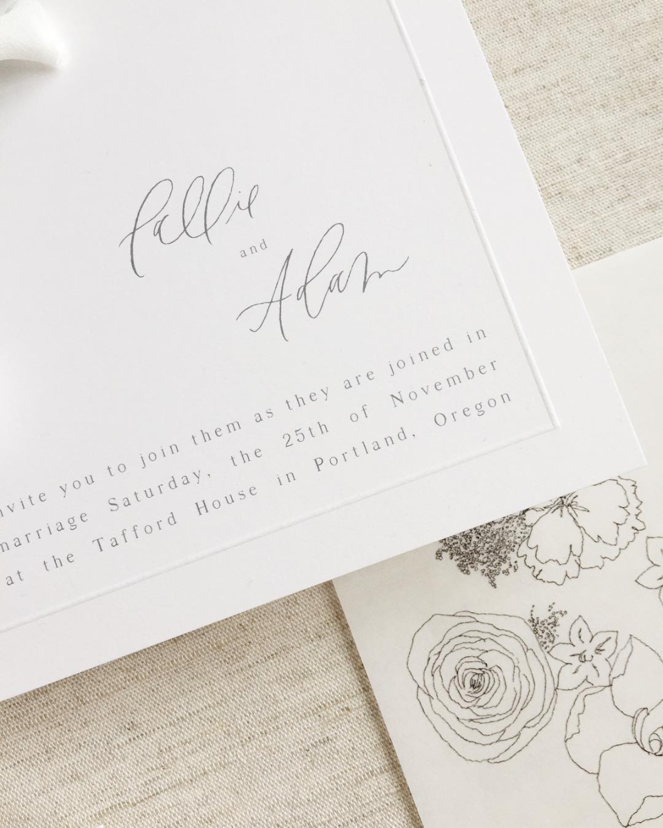
As of late, all designs have begun with a hand sketch but then fall into two main methods of execution. Our enamel pins now all tend to be vectored in detail (meaning point by point by mouse) to give me more control over the small details. For certain card concepts we like the flat clean graphic quality of vectored lines as well, so they are also rendered point by point after the initial sketch like our enamel pins. My second method of execution starts with an ink pen sketch usually on tracing paper or in my sketch book, which I snap a photo of with my phone to take into Photoshop where I then composite my favorite parts of the sketches and clean up the lines. I like the hand-drawn feel that is preserved in these designs. From there these sketches get taken into Illustrator to be vectored using the software’s tools and then I start put together the colors and the composition with the text.
Sometimes your initial instinct is spot on, other days there’s a lot of nudging, and tweaking and pushing to get to the final design. The first test print is always very exciting—we get an idea of where the colors/ tones fall and check the spacing and composition as it lives on the physical space of the card. Then comes more tweaking. When the designs are finalized, they go to our printer and next comes the proofs! At this crucial point, I check to see if we need to make any corrections / notes for printing. Ideally we don’t, and it moves into production.

Behind the Stationery: ilootpaperie

Our overall design process is very much about shaping the physical lines I’m able to achieve toward the idea I have in my head. I never went to proper art school, so what I do is a mishmash of techniques and tricks I learned on the job and in classes I took after work while I was still in marketing.

Behind the Stationery: ilootpaperie

With everything we do for Ilootpaperie, from our product and packaging design to shop window and craft show display designs (and even painting our first mural at our first NSS booths), there is a strong element of improvisation and constant problem solving. We take what we know and mix in a whole lot of research, trial and error, terror and gumption to keep going—it is often terrifying and exciting all at the same time.

Thanks so much for allowing us to share our little piece of our cheeky universe with everyone, Nole and Megan. We cannot fully express what a thrill it is, to be a small part of OSBP as it has inspired us so much always. We pinch ourselves every time!

You can shop all of our cheeky paper, pins and more at ilootpaperie.com and follow along in our day to day shenanigans on IG @ilootpaperie.

Behind the Stationery: ilootpaperie

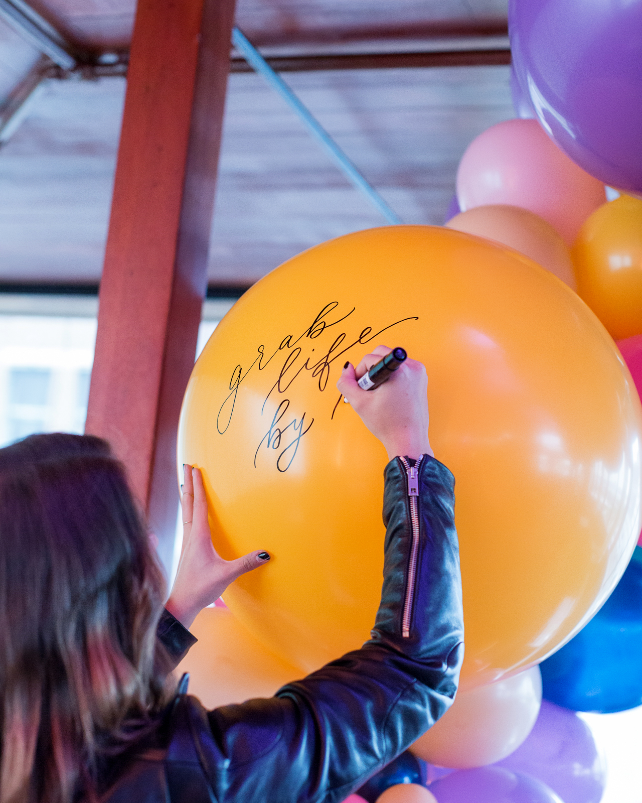
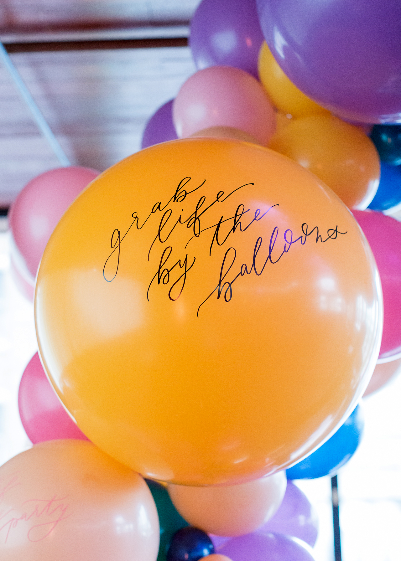
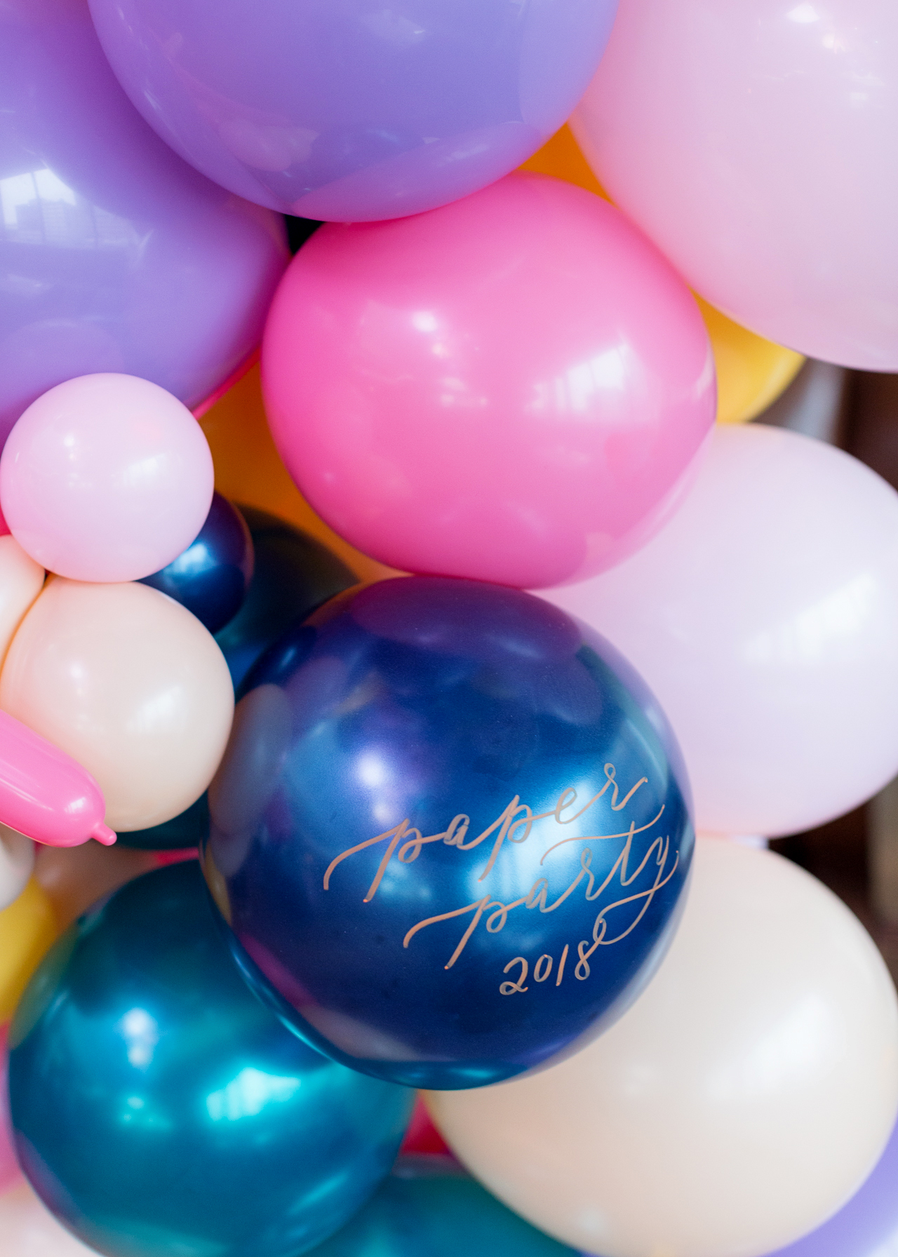
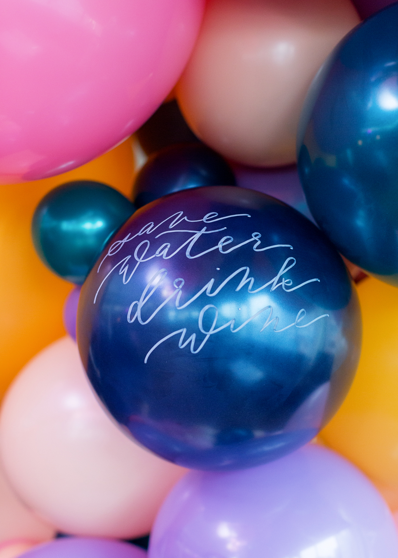
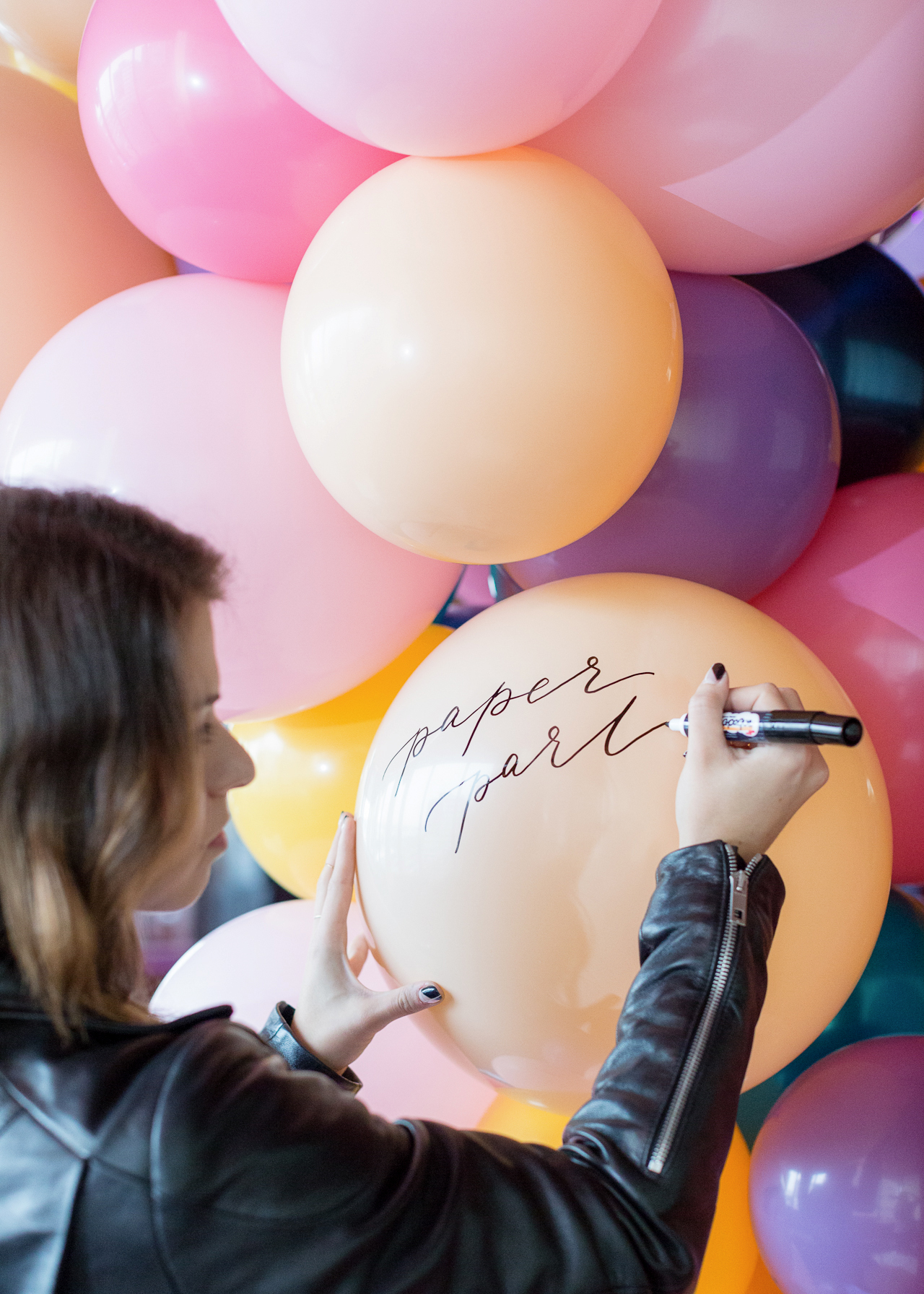
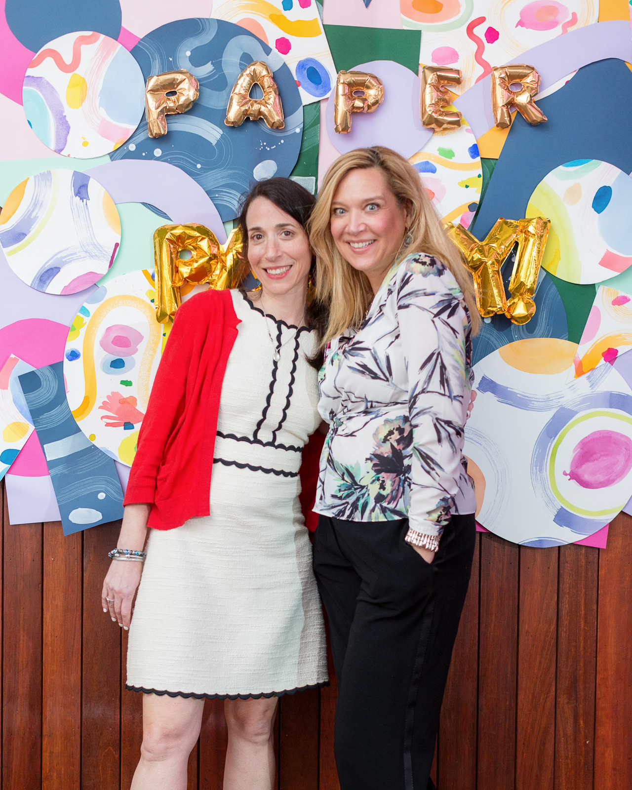
Photos by Michelle Nicole Photography.

Want to be featured in the Behind the Stationery column? Reach out to Megan at megan [at] ohsobeautifulpaper [dot] com for more details.

Nine Ways to Incorporate Calligraphy Into Your Wedding

If I have a weakness for anything, it’s calligraphy. As far as I’m concerned, calligraphy is magic and elevates everything it touches to a work of art. Today I’m sharing nine ways to incorporate calligraphy into your wedding, for those of you in wedding planning mode who are as calligraphy-obsessed as I am!

Calligraphy Place Cards by Script Merchant / Photo Credit: Kayla Barker Photography

Calligraphy by Script Merchant / Photo Credit: Kayla Barker

1. The Invitations and envelopes

First things first – the wedding invitations! When most of us think about wedding calligraphy, we think of envelopes with beautifully calligraphed addresses. And I’m definitely all in favor of going all out for the envelopes, but you can also use calligraphy for your entire wedding invitation! Depending on your budget and guest list size, you could ask a calligrapher to hand write each invitation entirely in calligraphy or brush lettering – like these hand lettered Sumi ink invitations – or commission something called spot calligraphy, where a calligrapher writes out a few words (usually your names and maybe the venue or location) and digitally scans the lettering to incorporate into the final invitation design. There are calligraphy styles to suit every type of wedding: classic and elegant, modern, bohemian, whimsical, and plenty of examples of spot calligraphy in our wedding invitation archive!

Minimalist Wedding Invitation Design by Jenny Sanders

Minimalist wedding invitation design by Jenny Sanders

Semi-Custom Wedding Invitation Design by Anne Robin Calligraphy

Semi-custom invitation design by Anne Robin Calligraphy

Photo and Calligraphy by Lauren Saylor of A Fabulous Fete

2. Wedding Welcome Signs

Large signs are the perfect way to welcome guests to your wedding! Wedding welcome signs can be made out of anything from large pieces of plexiglass to reclaimed wood to an oversized tropical leaf. Looking for even more wedding sign inspiration? You’re in luck! I have an entire Pinterest board dedicated to this topic right here!

Photo Credit: Barrie Anne Photography via Glamour and Grace

3. Ceremony Backdrop

I love the idea of using a favorite quote or a meaningful phrase written in gorgeous calligraphy to serve as a wedding ceremony backdrop! Text can be painted onto fabric (white cotton curtains or even a bed sheet would do the trick!), written onto a roll of art paper, or even printed using a service like Spoonflower!

Calligraphy by Neither Snow / Photo Credit: Erich McVey

4. Seating Charts & Escort Cards

Seating charts and escort cards serve the extremely helpful purpose of letting your guests know where to sit at the reception – but they can also be beautiful! The difference between a seating chart and escort cards is that a seating chart is usually organized by table number, with the names of each guest at that table below, while escort cards are individual cards alphabetized by guest name that help escort guests to their table. Either way, your guests’ names will look absolutely amazing in calligraphy!

Copper Calligraphy Seating Chart / Photo Credit: Blush Wedding Photography

Photo Credit: Blush Wedding Photography via Style Me Pretty

Calligraphy Wedding Seating Chart by Neither Snow / Photo Credit: A Bryan Photo

Calligraphy by Neither Snow / Photo Credit: A Bryan Photo

Calligraphy and watercolor by Holly Hollon, Styling by Ginny Au, Photography by Erich McVey via Once Wed

5. Place Cards

A seating chart or escort card will get your guest to the appropriate table, but if you’re planning on assigned seating at your wedding, you’ll also need place cards. I love these simple color-dipped place cards with deckled edges – or beautiful calligraphy tags pinned to gold spray painted faux fruit for a fall wedding. Plenty more place card ideas right here!

Color Dipped Place Cards by Wildfield Paper Co.

Color-dipped place cards with deckled edges by Wildfield Paper Co. / Photo Credit: Callie Hobbes Photography via Style Me Pretty

Calligraphy by Ashley Buzzy / Photo Credit: Rustic White Photography

6. Drink and Dinner Menus

Planning to offer a signature cocktail? Share the options with your guests with a beautiful calligraphy bar sign! And individual dinner menus  can even double as place cards by writing the name of each guest at the top!

Calligraphy by Meant to Be Calligraphy / Photo Credit: Rebekah J. Murray via Wedding Chicks

Calligraphy by Chelsea Petaja / Photo Credit: Tec Petaja via Once Wed

7. Table Runners

This one is a bit outside the box, but wouldn’t a calligraphed table runner be the perfect addition to the head table for a romantic wedding? Similarly to a wedding ceremony backdrop, ask your calligrapher to write your wedding vows or a favorite poem onto a roll of butcher paper or art paper, making sure that the text appears only on each side of the table so that it isn’t covered by your centerpieces!

Calligraphy by Rachel Jacobson / Photo Credit: Milton Photography via 100 Layer Cake

8. Chair Signs

I love the idea of creating special signs for the bride and groom’s chairs at the wedding reception. Calligraphed signs (or fabric banners) could be the answer! They also look amazing with a little posy of flowers to accent the sign.

Calligraphy by Li Ward / Photo Credit: Dylan Howell and Sarah Byrne

9. Favor Bags

Last, but not least, send your guests home with a sweet little favor bag! Ask your calligrapher to make you a rubber stamp with your names or initials in calligraphy, then stamp it on cotton muslin bags and fill with your favorite treat!

Photo Credit: Jose Villa via Style Me Pretty

Colorful Watercolor Crest Wedding Invitations

When I think about summer, I think of bright, vibrant colors and bold patterns (ideally of the fruit or floral variety). I’m loving these colorful watercolor crest wedding invitations from Sandy of Roseville Designs (one of our fantastic Designer Rolodex members!), whcih feature beautiful summery tones and a vibrant floral envelope liner. The custom watercolor crest is both whimsical and elegant, and the watercolor floral details throughout the suite are the perfect burst of summer color!

Colorful Watercolor Crest Wedding Invitations by Roseville Designs

From Sandy: I am so excited to share Melissa and Andy’s colorful watercolor crest wedding invitations! I love doing watercolor wedding crests because they can be used for not only invitations, but day-of wedding stationery, too! The beauty of a custom crest is you can take the elements of the crest and use them for designing the other paper elements.

Colorful Watercolor Crest Wedding Invitations by Roseville Designs

For Melissa and Andy, I created a watercolor wedding crest incorporating greens, blues, pinks, and peaches to celebrate their bright, summer wedding along the Connecticut shoreline. Since we knew we wanted to use a calligraphy-style font for the names, we used a more formal serif font for their initials inside the shield of the crest. The finishing touch were the rich green vines on the bottom.

Colorful Watercolor Crest Wedding Invitations by Roseville Designs

Colorful Watercolor Crest Wedding Invitations by Roseville Designs

I used elements from the watercolor crest in the rest of the suite, with different pieces of the floral and greenery on the RSVP card, reception card, and details card. Then I took florals from the crest and enlarged them for a bright and happy custom envelope liner! I knew this detail would put a big smile on the faces of their wedding guests when they opened the envelope.

Colorful Watercolor Crest Wedding Invitations by Roseville Designs

The final piece was a custom wax seal incorporating the monogram from the crest. This was placed on the outside of the envelope. I used a sea foam green wax to give it a soft feel. I love using wax seals in my suites because they give texture to design, and we all know invitations are a tactile experience!

Colorful Watercolor Crest Wedding Invitations by Roseville Designs

The entire suite was digitally printed on thick smooth white stock, to allow us unlimited flexibility with colors for the entire suite. This also allowed us to allocate more of her wedding invitation budget to additional pieces, like the envelope liner and wax seal. The result was an invitation suite that is romantic, timeless, and sets the tone for her elegant wedding celebration.

Colorful Watercolor Crest Wedding Invitations by Roseville Designs

Thanks Sandy!

Design: Roseville Designs

Invitation Printing: Stationery HQ

Envelopes + Envelope Printing: Cards & Pockets

Wax Seals: Waxseals.com


Roseville Designs is one of the fabulously talented members of the Oh So Beautiful Paper Designer Rolodex – our curated, members only directory of the best wedding invitation designers. You can check out more of her work right here!

Photo Credits: Xo and Fetti Photography

Paper Party 2018! Colorful Modern Abstract Art Party Inspiration

As promised, I’m sharing the photos from this year’s Paper Party during the National Stationery Show! As you saw with the invitations and save the dates, our party inspiration was driven by a non-traditional color palette – mustard yellow, pale pink, peach, lavender, navy blue, and forest green – and modern abstract shapes. For those of you looking for some colorful modern abstract art party inspiration, we’ll be sharing all the fun party details with you today! This year’s party featured a TON of balloons, a gorgeous art print wall, a hand painted paper art installation, and a calligraphy bar! It was such a wonderful evening with some of the most lovely people in the stationery industry, and together we raised more than seven thousand dollars to help support women’s empowerment and equal rights!

Paper Party 2018 / Colorful Modern Abstract Art Party Inspiration

Paper Party 2018 / Colorful Modern Abstract Art Party Inspiration

This was my fifth year organizing a major party for the stationery industry during the National Stationery Show. In the past, we’ve always done a free party, but this year I wanted to do something a bit different and find a way to give back in a small way. So I joined forces with Writes for Women, an advocacy group for the stationery industry that helps raise money for women’s empowerment and equal rights via the Ms. Foundation. We sold tickets to this year’s party and ended up raising more than $7,100 – more than I had ever imagined in my wildest dreams! Thank you, thank you, thank you from the bottom of my heart to everyone who came to the party for making this possible!

This year’s party was again held at Hudson Terrace on their rooftop terrace. My talented friend (and professional event planner) Janice from Bellwether Events helped me plan the party, along with Melinda of Lion in the Sun and Caroline of CW Pencils (my party planning partners in crime from Writes for Women). And of course the party would not have been possible without our amazing sponsors, including Paper & Ink Arts, Mixbook, Legion Paper, Bella Figura, Sakura of AmericaHester & Cook Design Group, 1canoe2, and the National Stationery Show, and our fantastic creative partners Ramona & Ruth, Sam Teich, Lillian Farag, Farmette Press, and Meant to Be Calligraphy. Let’s get to all the fun details!

Paper Party 2018 / Colorful Modern Abstract Art Party Inspiration

Okay, so first – the balloons! I knew that I wanted to incorporate a balloon installation into our party décor this year, and it turned out so fun and colorful! (We used Balloon Saloon for those of you who might need something similar in NYC) We used balloons in shades of pink, peach, deep yellow, teal, and purple – and calligrapher Sam Teich used some of Sakura of America’s Permapaque markers to letter a few fun party phrases on the balloons! It was super easy!

Paper Party 2018 / Colorful Modern Abstract Art Party Inspiration

Paper Party 2018 / Colorful Modern Abstract Art Party Inspiration

Paper Party 2018 / Colorful Modern Abstract Art Party Inspiration

Paper Party 2018 / Colorful Modern Abstract Art Party Inspiration

Paper Party 2018 / Colorful Modern Abstract Art Party Inspiration

Paper Party 2018 / Colorful Modern Abstract Art Party Inspiration

Paper Party 2018 / Colorful Modern Abstract Art Party Inspiration

Paper Party 2018 / Colorful Modern Abstract Art Party Inspiration

Paper Party 2018 / Colorful Modern Abstract Art Party Inspiration

Paper Party 2018 / Colorful Modern Abstract Art Party Inspiration

Paper Party 2018 / Colorful Modern Abstract Art Party Inspiration

Paper Party 2018 / Colorful Modern Abstract Art Party Inspiration

Paper Party 2018 / Colorful Modern Abstract Art Party Inspiration

We also made this really fun paper art installation in collaboration with artist Lillian Farag and Legion Paper! I was feeling super inspired by our save the date and invitation design by Ramona & Ruth, so I came up with the idea of creating this installation using sheets of Colorplan and Stonehenge Aqua watercolor paper from Legion Paper. Lillian painted on the Stonehenge sheets in her signature free flowing style, and we layered Lillian’s pieces together with the Colorplan paper in lavender, candy pink, fuchsia pink, citrine, park green, forest green, and imperial blue. Stay tuned for a more detailed DIY post so you can create one of these installations for your own party!

Paper Party 2018 / Colorful Modern Abstract Art Party Inspiration

Paper Party 2018 / Colorful Modern Abstract Art Party Inspiration

Paper Party 2018 / Colorful Modern Abstract Art Party Inspiration

Paper Party 2018 / Colorful Modern Abstract Art Party Inspiration

And can we talk about this Mixbook art print wall? So gorgeous! Mixbook works with an amazing roster of artists, including Hello!Lucky, 1canoe2, Black Lamb Studio, Ashley Goldberg, and Amy Tangerine – totally perfect for our colorful evening! The art print wall featured a mix of canvas prints and acrylic block prints, and each print was either super colorful or had a message of women’s empowerment – or both!

Paper Party 2018 / Colorful Modern Abstract Art Party Inspiration

Paper Party 2018 / Colorful Modern Abstract Art Party Inspiration

Paper Party 2018 / Colorful Modern Abstract Art Party Inspiration

Paper Party 2018 / Colorful Modern Abstract Art Party Inspiration

Paper Party 2018 / Colorful Modern Abstract Art Party Inspiration

Paper Party 2018 / Colorful Modern Abstract Art Party Inspiration

Oh! And Mixbook also brought Eunice from Hello!Lucky to sign copies of her brand new book, Be the Change, and do some illustrations on Hello!Lucky for Mixbook stationery. So fun!

Paper Party 2018 / Colorful Modern Abstract Art Party Inspiration

Paper Party 2018 / Colorful Modern Abstract Art Party Inspiration

Paper Party 2018 / Colorful Modern Abstract Art Party Inspiration

Paper Party 2018 / Colorful Modern Abstract Art Party Inspiration

Paper Party 2018 / Colorful Modern Abstract Art Party Inspiration

Paper Party 2018 / Colorful Modern Abstract Art Party Inspiration

I also love having an interactive element at the party – and this year it was a calligraphy bar in collaboration with Paper & Ink Arts! The uber-talented Sam Teich hung out ALL night to do calligraphy demos using a variety of Paper & Ink Arts tools and materials, including this Paint Your Own Oblique Holder, this pointed oblique holder with a Tachikawa G Nib, a Fintec Metallic Palette, Ziller Ink in Wild Viola Violet and Wild Rose Pink, Sumi Ink, and a Size 1 Princeton Series Round Brush.

Paper Party 2018 / Colorful Modern Abstract Art Party Inspiration

Paper Party 2018 / Colorful Modern Abstract Art Party Inspiration

Paper Party 2018 / Colorful Modern Abstract Art Party Inspiration

Paper Party 2018 / Colorful Modern Abstract Art Party Inspiration

Farmette Press also sent an assortment of their GORGEOUS handmade papers for Sam to write on! They make the most beautiful paper in an amazing assortment of colors – I want them all!

Paper Party 2018 / Colorful Modern Abstract Art Party Inspiration

Paper Party 2018 / Colorful Modern Abstract Art Party Inspiration

The CUTEST paper placemats from Hester & Cook! I couldn’t resist these die cut unicorn placemats – that hologram foil on the horn!! – and the black and white swiss dot placemats were perfect for our tall round cocktail tables. Pretty much everything in this Sorbet collection was perfect for the party!

Paper Party 2018 / Colorful Modern Abstract Art Party Inspiration

Paper Party 2018 / Colorful Modern Abstract Art Party Inspiration

Paper Party 2018 / Colorful Modern Abstract Art Party Inspiration

Paper Party 2018 / Colorful Modern Abstract Art Party Inspiration

Paper Party 2018 / Colorful Modern Abstract Art Party Inspiration

Paper Party 2018 / Colorful Modern Abstract Art Party Inspiration

Paper Party 2018 / Colorful Modern Abstract Art Party Inspiration

Paper Party 2018 / Colorful Modern Abstract Art Party Inspiration

Paper Party 2018 / Colorful Modern Abstract Art Party Inspiration

Paper Party 2018 / Colorful Modern Abstract Art Party Inspiration

Paper Party 2018 / Colorful Modern Abstract Art Party Inspiration

Paper Party 2018 / Colorful Modern Abstract Art Party Inspiration

Paper Party 2018 / Colorful Modern Abstract Art Party Inspiration

Paper Party 2018 / Colorful Modern Abstract Art Party Inspiration

Paper Party 2018 / Colorful Modern Abstract Art Party Inspiration

Paper Party 2018 / Colorful Modern Abstract Art Party Inspiration

Paper Party 2018 / Colorful Modern Abstract Art Party Inspiration

Paper Party 2018 / Colorful Modern Abstract Art Party Inspiration

Paper Party 2018 / Colorful Modern Abstract Art Party Inspiration

Paper Party 2018 / Colorful Modern Abstract Art Party Inspiration

Paper Party 2018 / Colorful Modern Abstract Art Party Inspiration

Paper Party 2018 / Colorful Modern Abstract Art Party Inspiration

Finally, a HUGE thank you to the wonderful sponsors and people who made the evening possible:

  • Infinite thanks to Janice, Melinda, Kelly, and Caroline, for their invaluable help over the past few months and throughout the evening – and our small army of friends who helped with set up before the party. We couldn’t have done it without you!

And of course a big thanks to CJ of Charlie-Juliet Photography for the gorgeous photos and Hudson Terrace for having us!

Photo Credits: Charlie-Juliet Photography