Happy Weekend + Sophie at 11 months

Happy Friday everyone! Earlier this week Sophie turned 11 months old – I can’t believe her first birthday is in less than a month! This first year has flown by so incredibly fast, and this past month in particular has been a complete whirlwind. Sophie has turned into a champion speed crawler, so of course she’s into absolutely everything. This week she’s working on standing up, pulling herself up against the couches, coffee table, dining chairs – anything she can reach. It’s simultaneously exhausting to chase her around the house all day but also really fun to watch her make so many new discoveries. This weekend we head up to New York for the NYNOW trade show (formerly NYIGF) – we’re excited to have a few days in the city again! I’ll report back next week with my favorite finds from NYNOW (and you can follow me around during the show via Instagram), but in the meantime…


  

Photos by me via Instagram

…a few links for your weekend!

This week on Oh So Beautiful Paper:

A big welcome to the newest members of the Designer Rolodex!

Check back soon for this week’s cocktail! I hope you all have a wonderful weekend, and I’ll see you back here next week! xoxo

Charles + Merrill’s Ombre Letterpress Wedding Invitations

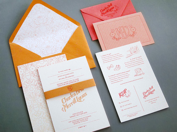
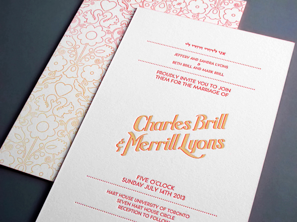
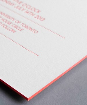
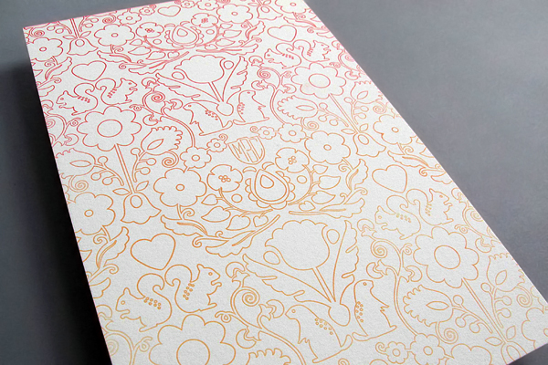
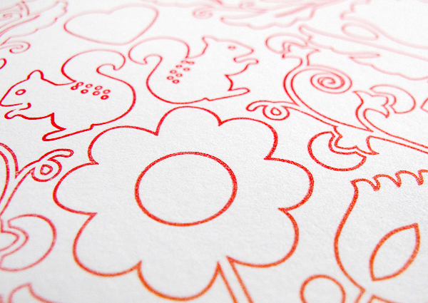
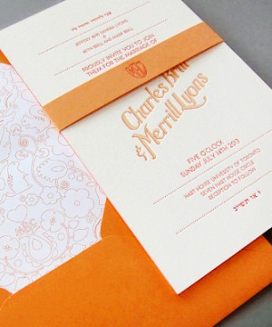
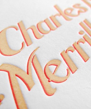
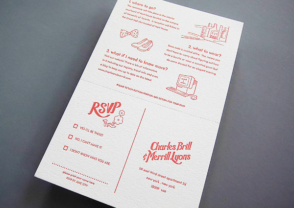
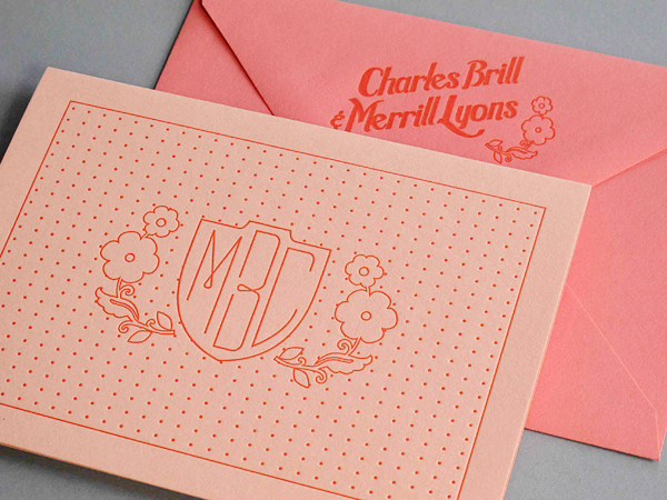
Any stationery aficionado will appreciate the technique and skill behind these stunning wedding invitations: the result of a collaboration between Kseniya of Thomas Printers and bride (and designer!) Merrill Lyons. A lovely ombre split fountain effect, bright edge painting, a tight letterpress registration, and a lot of beautiful detail packed into a bright and modern invitation suite. So pretty!

Ombre Letterpress Wedding Invitations by Thomas Printers via Oh So Beautiful Paper (15)

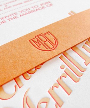
From Kseniya: Charles and Merrill’s wedding invitation suite features some of our favorite printing processes: tight registration, split fountain on the back of the invitation, edge painting, envelope liners with custom pattern, and perforated reply postcards.

Ombre Letterpress Wedding Invitations by Thomas Printers via Oh So Beautiful Paper (16)

Merrill designed the suite (the groom is a designer, too) – note the custom monogram that appears on several of the pieces, and the cute critters on the envelope liner. We selected papers from a variety of mills to make sure everything was perfect and matched in a complementary way. The invitation is printed on super thick 4pt museum board, the reply card is on Lettra, and the colored papers are from Paper Source and Paper Presentation. A great package for a great event!

Ombre Letterpress Wedding Invitations by Thomas Printers via Oh So Beautiful Paper (3) Ombre Letterpress Wedding Invitations by Thomas Printers via Oh So Beautiful Paper (6)

Ombre Letterpress Wedding Invitations by Thomas Printers via Oh So Beautiful Paper (9)

Ombre Letterpress Wedding Invitations by Thomas Printers via Oh So Beautiful Paper (8)

Ombre Letterpress Wedding Invitations by Thomas Printers via Oh So Beautiful Paper (13) Ombre Letterpress Wedding Invitations by Thomas Printers via Oh So Beautiful Paper (10)

Ombre Letterpress Wedding Invitations by Thomas Printers via Oh So Beautiful Paper (1)

Ombre Letterpress Wedding Invitations by Thomas Printers via Oh So Beautiful Paper (5)

Thanks Kseniya!

Design: Merrill Lyons

Letterpress Printing: Thomas Printers

Check out the Designer Rolodex for more tal­ented wed­ding invi­ta­tion design­ers and the real invi­ta­tions gallery for more wedding invitation ideas!

Photo Credits: Thomas Printers

*Thomas Printers is a sponsor of Oh So Beautiful Paper

Socialology’s Academia-Inspired Business Stationery

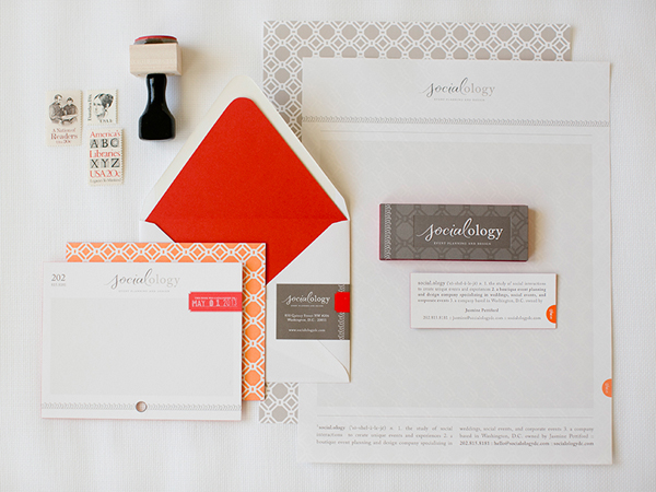
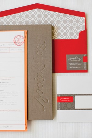
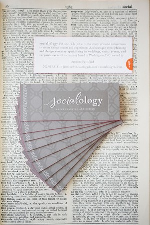
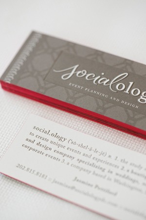
Nikki from Akula Kreative sent over this academia-inspired stationery suite that she designed for a wedding and event planning business – and the whole suite is absolutely stunning from start to finish! The color palette of bright orange and gray is so much fun, and the dictionary-theme letterpress printed business cards? So good!

Academia-Inspired Business Stationery by Akula Kreative via Oh So Beautiful Paper (8)

From Nikki: Jasmine, the owner/founder of Socialology, came to us with a Pinterest board filled with orange, salmon, gray, and taupe images, all inspired by academia. The photographs of pencils, erasers, vintage books, and dictionary pages in conjunction with her company name, Socialoogy, made it obvious from the get-go that we’d have the opportunity to expand on a theme with endless possibilities. From the edge painting and cotton paper to the four printing processes it took to make it, this stationery suite is all about quality and attention to detail.

Academia-Inspired Business Stationery by Akula Kreative via Oh So Beautiful Paper (2) Academia-Inspired Business Stationery by Akula Kreative via Oh So Beautiful Paper (1)

First, we had to do something about the name.  The suffix “-ology” means “the study of,” so “Socialology” refers to “the study of being social.” An academic name for an academic theme. The hurdle, however, was getting people to SAY it correctly, as it was—and is—a bit of a tongue twister. And so we set out to create a logo that would not only be easy to read, but it would have to instruct people how to pronounce it. Enter Andy Luce, who created the beautiful lettering for the first half of the name. He actually came up with options for the entire name, but in the end we landed on a combination of calligraphy for “social” and a serif font for “ology.”

Academia-Inspired Business Stationery by Akula Kreative via Oh So Beautiful Paper (6) Academia-Inspired Business Stationery by Akula Kreative via Oh So Beautiful Paper (5)

To drive the idea home, we went with a dictionary-themed business card. On the front, we used a multi-level sculptural die to deboss the “book plate” area around the logo. On the back, we letterpress printed the contact information in the form of a dictionary entry, complete with pronunciation cues, part of speech, and definition. In the bottom right, we foil-stamped a dictionary tab.

Academia-Inspired Business Stationery by Akula Kreative via Oh So Beautiful Paper (4) Academia-Inspired Business Stationery by Akula Kreative via Oh So Beautiful Paper (3)

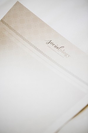
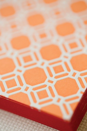
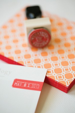
The postcard-style correspondence card mimics a library catalog card, using the phone number as the reference number. The red tab reads “This book was catalogued on” and leaves a space for a date stamp. At the bottom of the letterhead, we repeated the dictionary-style layout and orange tab, but our favorite feature is the ghost-like quality of the pattern that becomes visible when you hold it to the light. To top it all off, we ordered handmade fabric portfolio folders that Jasmine can use when presenting to potential clients. The outside features a blind deboss logo, and the inside features pockets for the 4″ x 1″ business card and a custom-made client intake form.

Academia-Inspired Business Stationery by Akula Kreative via Oh So Beautiful Paper (7)

Thanks Nikki!

Design: Akula Kreative

Custom Calligraphy: Andy Luce

Printing: In to Ink and Senekeo

Photo Credits: Caroline Tran

{happy weekend!}

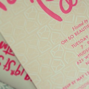
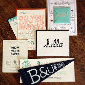
Happy Friday everyone! I spent all day yesterday thinking it was Wednesday, so it feels like the weekend kind of snuck up on me! And do you know what else is sneaking up? The National Stationery Show – it’s only two weeks away! Stationery Show mailers are starting to arrive and one of the photos below is a little sneak peek of something very special that I’ll be sharing in greater detail after the show. Next week I’m kicking off my NSS sneak peek coverage with some new exhibitors and returning favorites. Yay! But in the meantime…

Paper Party Invitation Sneak Peek by Oh So Beautiful Paper via Instagram Stationery Show Mailers by Oh So Beautiful Paper via Instagram

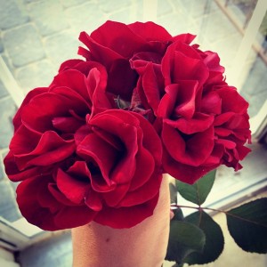
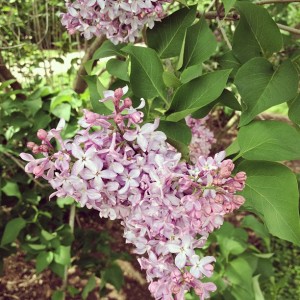
Roses by Oh So Beautiful Paper via Instagram Lilacs by Oh So Beautiful Paper via Instagram

Photos by me via Instagram

…a few links for your weekend:

This week on Oh So Beautiful Paper:

Check back soon for this week’s cocktail!  I hope you all have a wonderful weekend, and I’ll see you back here on Monday! xoxo

Nickolas + Angela’s Neon Pink Illustrated Wedding Invitations

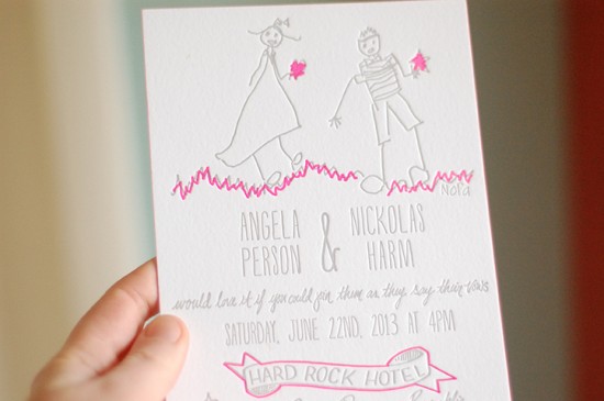
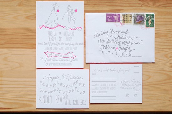
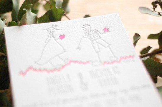
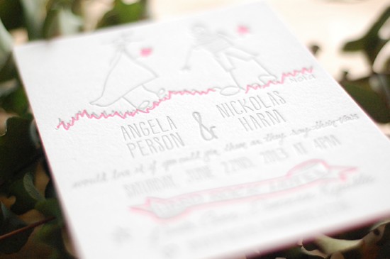
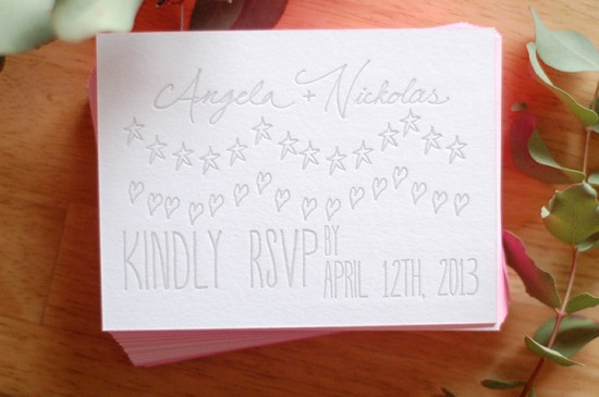
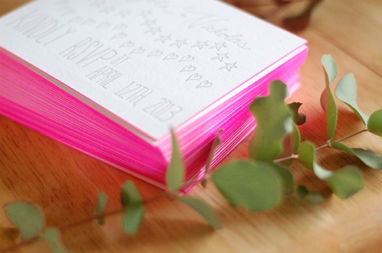
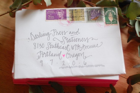
These wedding invitations from Alia and Jason of Darling Press & Stationers are just about the most adorable thing I’ve ever seen! The invitations feature an illustration by the bride and groom’s daughter as the primary focus of the design (love!), along with pops of neon pink and colorful edge painting (double love!).   Such a wonderful idea for an already meaningful invitation!

Illustrated Neon Pink Letterpress Wedding Invitations by Darling Press via Oh So Beautiful Paper (2)

From Alia: This is a wedding suite for a very charming couple. Angela and Nickolas asked us to design their wedding invitation using a drawing created by their daughter. Since we have children of our own and have letterpress printed their art, we felt we were a good match for the project. The entire suite was printed with grey and neon pink ink and edge painted with fluorescent pink.

Illustrated Neon Pink Letterpress Wedding Invitations by Darling Press via Oh So Beautiful Paper (7)

Illustrated Neon Pink Letterpress Wedding Invitations by Darling Press via Oh So Beautiful Paper (4)

Illustrated Neon Pink Letterpress Wedding Invitations by Darling Press via Oh So Beautiful Paper (3)

Illustrated Neon Pink Letterpress Wedding Invitations by Darling Press via Oh So Beautiful Paper (6)

Illustrated Neon Pink Letterpress Wedding Invitations by Darling Press via Oh So Beautiful Paper (5)

Illustrated Neon Pink Letterpress Wedding Invitations by Darling Press via Oh So Beautiful Paper (1)

Thanks Alia!

Design and Letterpress Printing: Darling Press & Stationers

Calligraphy: The Pretty Paperie

Check out the Designer Rolodex for more tal­ented wed­ding invi­ta­tion design­ers and the real invi­ta­tions gallery for more wedding invitation ideas!

Photo Credits: Darling Press & Stationers