DIY “Little Blue Box” Inspired Rubber Stamp Wedding Invitations

It’s the ladies of Anti­quaria, back with another cre­ative DIY project for you!  Today they’re sharing a wedding invitation tutorial inspired by the signature blue color of Tiffany & Co.

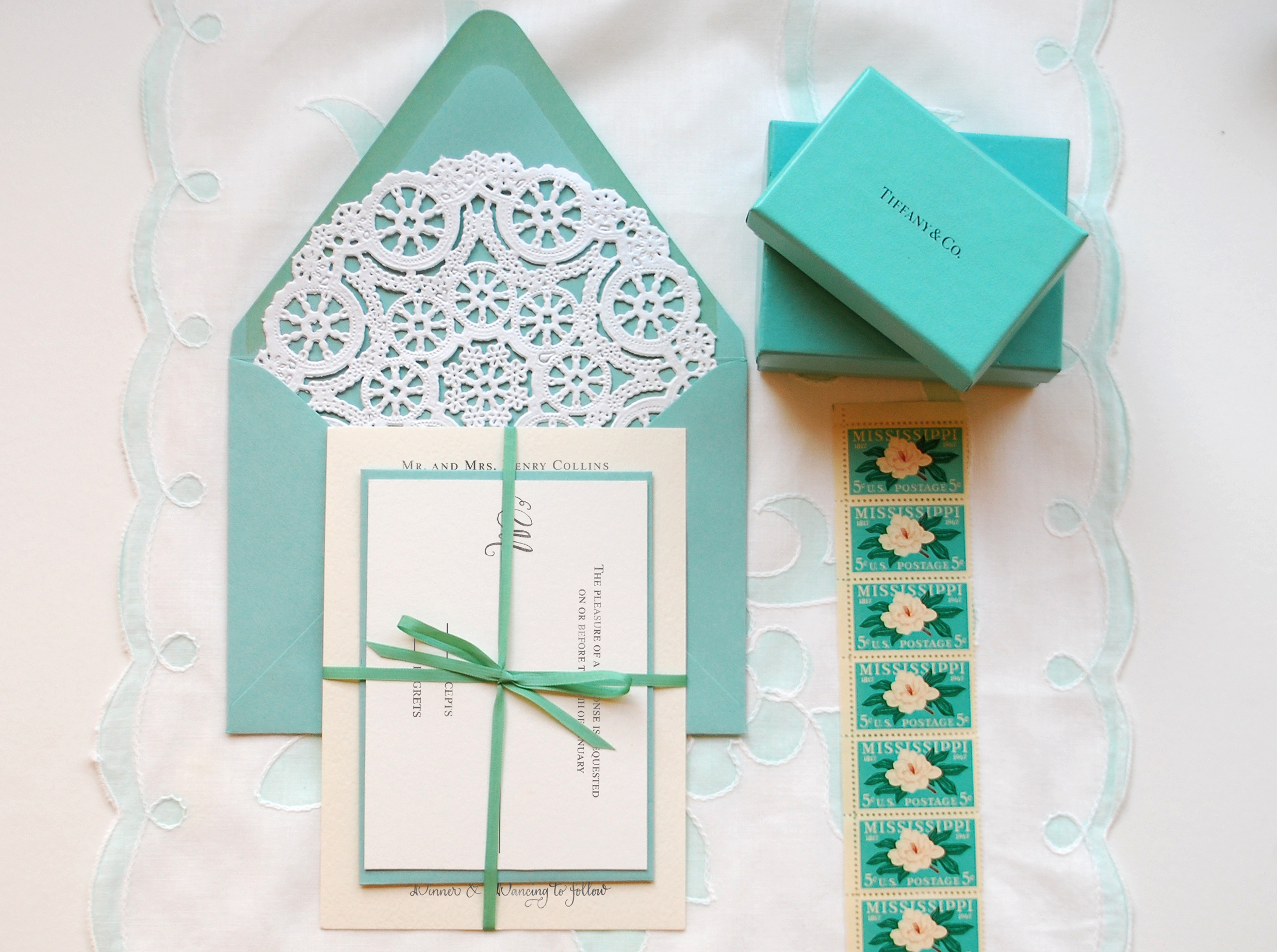
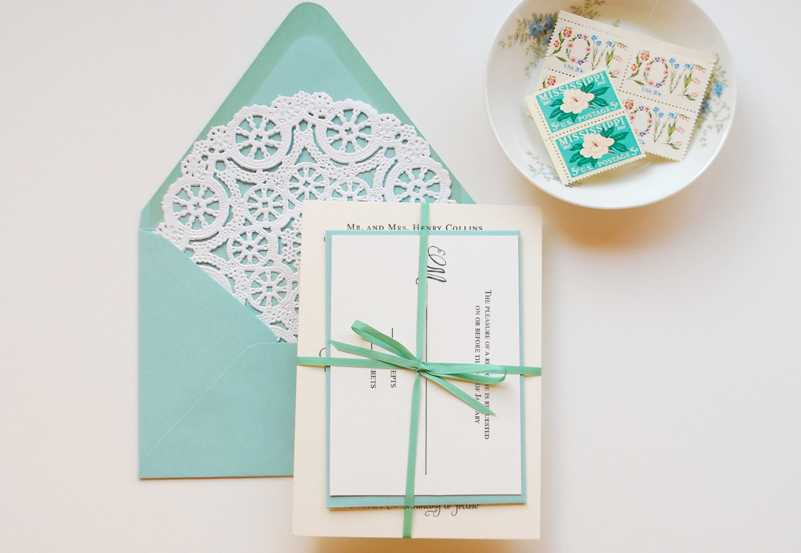
Have you ever felt the rush of excitement when a special friend, spouse, or loved one presents you with a gift packaged in the little blue box?  This wedding invitation suite was designed to elicit that feeling when your guest receives it in the mail.  Imagine their excitement when this feminine and traditional invitation finds its way into their mailbox.  This DIY is fairly simple yet the colors and packaging tie the whole thing together and give it a feeling of luxury.

Tiffany Blue DIY Wedding Invitation Suite

Tiffany Blue DIY Wedding Invitation Suite

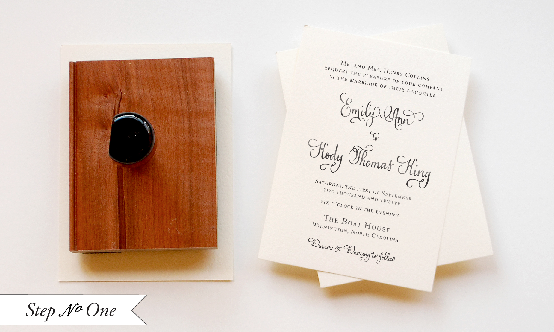
Step One: Cut your paper to size A6 (4.5″x6.25″).  Since this is a luxurious suite, we would suggest a thick high quality cotton watercolor paper.  Ink your stamp (we used our Vintage Calligraphy Invitation Stamp) thoroughly and center it over your card.  Press down moderately to make the print.  Too hard, the image may be blurry and too light and it may be splotchy.  Let dry.

Tiffany Blue DIY Wedding Invitation Suite

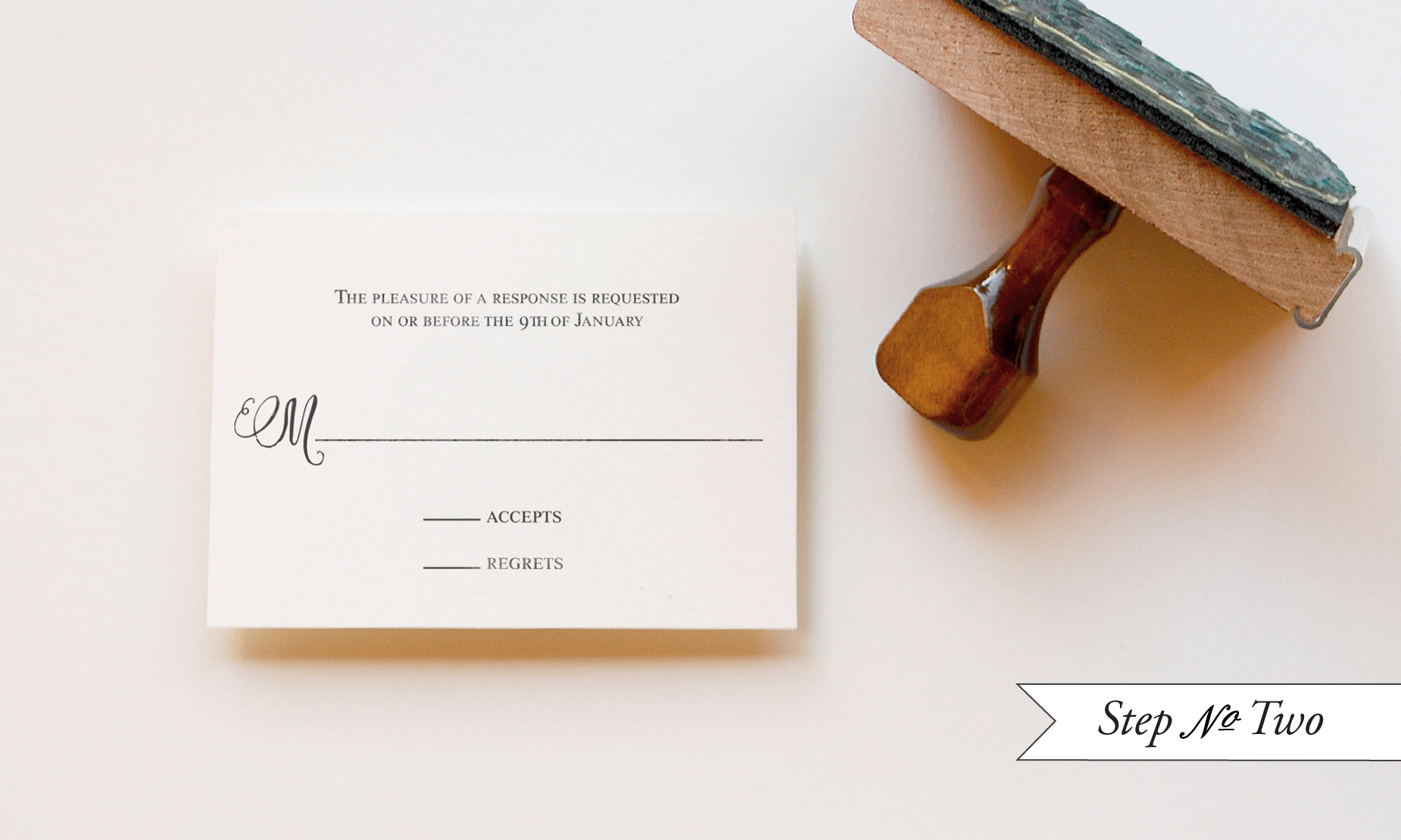
Step Two: In a similar fashion to printing the Invitation piece, you will now print the reply card.  For this piece, you will want to cut a 4bar (3.5″x5″) card out of the same paper used for the invitation.  Again, ink your stamp (we used our Vintage Calligraphy Reply Card stamp) thoroughly and make the print.  Let dry.

Tiffany Blue DIY Wedding Invitation Suite

Step Three: Using your return address stamp (we used our Calligraphy Accent Return Address stamp), stamp both the back flap of your A7 envelope and the front of your 4bar envelope.  This is such a great place to pinch pennies in your stationery budget as you are able to use one stamp for both envelopes and you will have it to use after the event is over!

Tiffany Blue DIY Wedding Invitation Suite

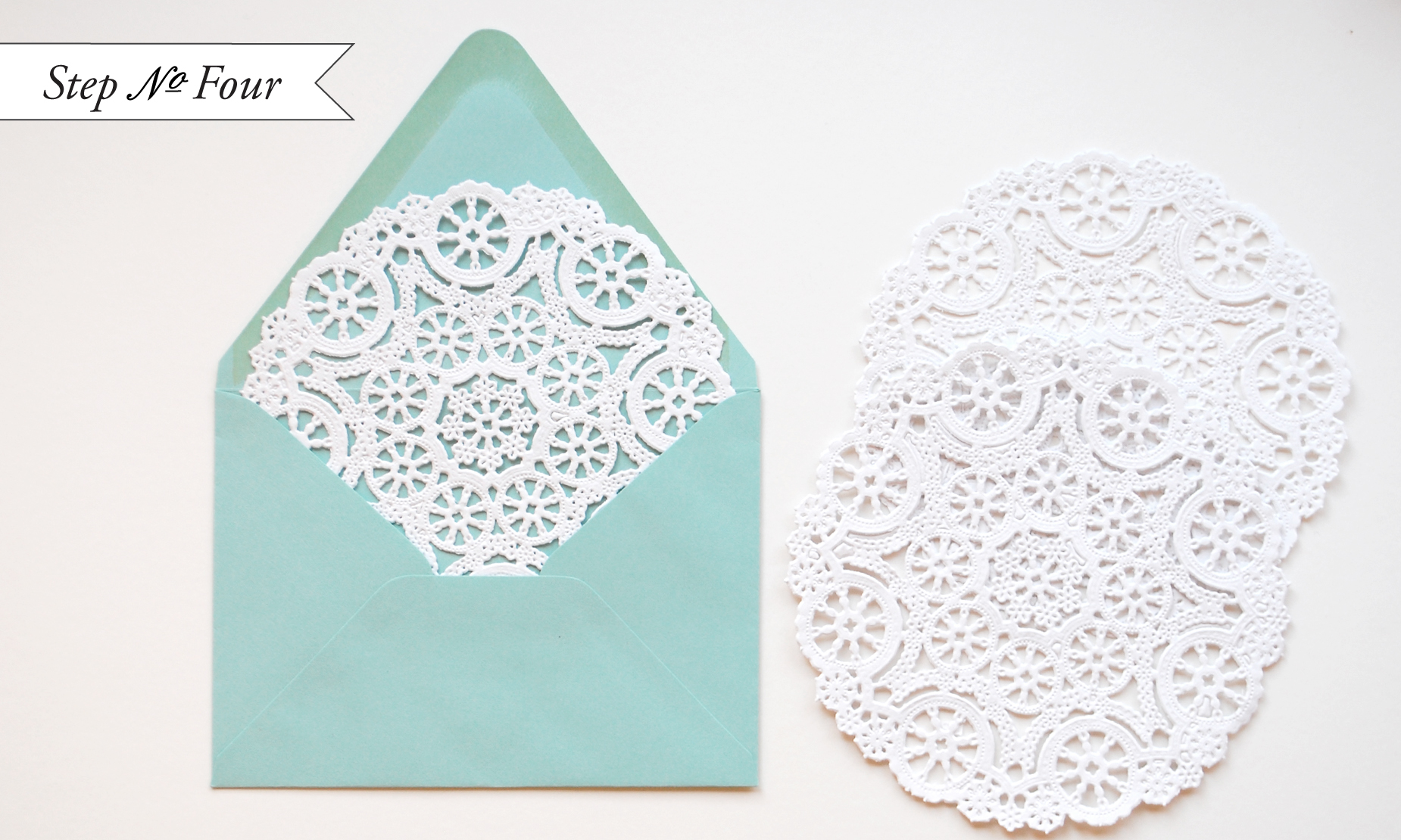
Step Four: To add a little extra flourish to the suite, we’ve used regular round doilies as an envelope liner.  We love the way that the aqua peeks through the lace and think it would be so fun to be the recipient and have this surprise await us once the seal was broken.  To install the doily liners, you will use spray adhesive.  Make sure to do this outside (or in an extremely well ventilated room).  Spray the back of the doily with a light mist of adhesive.  Slide the doily into the envelope, making sure not to press until the doily is placed in its intended spot (as shown above).  Let them dry & cure overnight.

Tiffany Blue DIY Wedding Invitation Suite

Step Five:  Use a thin ribbon to tie the suite together.  This will keep the components together and give your guest the thrill of “unwrapping” your invitation.

Tiffany Blue DIY Wedding Invitation Suite

Materials

Stamps:

Vintage Calligraphy Invitation stamp

Vintage Calligraphy Reply Card stamp

Calligraphy Accent Return Address stamp

Stamp Pad (we used black)

Heavy Watercolor Paper (for invitations & reply cards)

A6 Envelopes

4bar Envelopes

Ribbon, 1/8″ thickness

6″ Medallion Lace Paper Doilies

Spray Adhesive

Photo Credits: Antiquaria

Marcus + Jillian’s Whimsical Kraft Paper Letterpress Wedding Invitations

I love the whimsical design elements and natural color palette in these kraft paper wedding invitations, sent over by Matthew from A Fine Press.  Designed by Laura Helm of Ashton Events, the invitation features hand drawn illustrations and hand lettering – all letterpress printed in soft white and gold by Matthew – and accompanied by navy and lavender envelopes for a fun pop of color.

From Matthew: We did a tone-on-tone theme for these invitations, using a transparent white ink for the return address, a shimmery lavender ink for the RSVP envelopes, and white and gold inks for the invitation and RSVP.  The whole invitation was printed on French Paper (Muscletone 140# kraft paper, Construction nightshift blue A7 envelopes, and Pop-Tone grapesicle 4-bar envelopes).

This is a great example of the compatibility between letterpress printing and  hand-drawn illustrations.  Laura created the illustrations in black ink on white paper, at which point they were scanned and sent for platemaking. 

Thanks Matthew!

Design: Ashton Events

Letterpress Printing: A Fine Press

Check out the Designer Rolodex for more tal­ented wed­ding invi­ta­tion design­ers and the real invi­ta­tions gallery for more wedding invitation ideas!

Photo Credits: Matthew R Photography

p.s. Don’t forget to enter the save the date giveaway from Delphine!  Check out details right here!

The Printing Process: Edge Painting

Every morning this week, I’m running a series of guests posts about different printing methods â€“ so if you’ve ever wondered why certain printing methods are best for certain kinds of designs (or cost more than others), this is for you!  You can read the previous installments covering digital printingengravingscreen printingletterpress printing with antique type, and foil stamping all right here.  Today Michael from Czar Press is here to walk us through edge painting!

What is Edge Painting?

Edge painting at its surface sounds pretty simple – it’s a process by which color is applied to the edges of cards, invitations, even books or journals.  Edge painting can be done in any color, including metallics and foils (!), and is usually mixed by hand to be matched to a specific Pantone color.

I’m a huge fan of edge painting for a bold pop of color on business cards and wedding invitations, like the new invitation collections from Bella Figura, Dauphine Press, and many others.  While edge painting is a commonly used technique, there is a whole lot of mystery surrounding the process – and printers seem to have different methods or processes for applying edge paint.  Today we have Michael from Czar Press walking us through his edge painting process and removing some of the mystery from this popular technique!

The Process

The edge painting process takes place after all graphics and text have been printed and all paper materials cut down to size.  For this example, we’re focusing in on a recent business card project.  I like to make sure my blade is especially nice and sharp when trimming out cards that are going to be edge painted.

Edge painting involves a padding press (pictured above), ink, and a brayer.  The cards should be stacked on the padding press, making sure that the cards are pressed against one wall of the padding press as evenly as possible.  Crank down the vice(s) on the press, applying pressure to the cards, making them nice and snug.  Remove the outer wall off the padding press, leaving one side exposed.  This the side that will receive the ink.


Then using just a little bit of ink, ink up your brayer.  Roll the brayer around and around on a piece of glass if possible in attempt to make the ink spread even across the brayer roller.  Then I apply the ink to the exposed side of the card, applying as little pressure as possible with the brayer to get good ink coverage on the cards.  Once the ink has been applied, I like to gently wipe down the inked side of the cards with a cotton cloth to remove any excess ink.


Let them dry for a while – maybe an hour, depending on conditions – until they are dry to the touch.  Put the outer wall back on the padding press, spin the cards around to the next side and repeat until all sides are complete.

Tips and Advice

Most printers recommend thicker papers – usually 160 lb and up – for maximum results with edge painting.  Edge painting can be done on thinner paper, but heavier (thicker) paper weights will better show the color and saturation of the ink color.

Similarly, most letterpress printers recommend darker or more saturated colors for edge painting.  Think bright red, cobalt blue, or even bright neon or metallic foils!  As with any custom process, most printers hand mix inks to match a specific Pantone color, so keep in mind that there may be slight variations in tone and saturation depending on the number of cards being painted.

Thanks Michael!  Check out more of Michael’s letterpress work right here!

Photo Credits: Example images via Bella Figura, process photos by Czar Press

Rachel + Josh’s Scrabble Letterpress Wedding Invitations

Happy Monday everyone!  We’re starting the week with fun and casual wedding invitations from Gus & Ruby Letterpress inspired by Scrabble tiles!  Samantha and Whitney created these playful invitations for a wedding this past summer, mixing bright colors with non-traditional wording and illustrations created by the bride – all letterpress printed on thick cotton paper.

From Samantha and Whitney: We designed these wedding invitations for a super rad couple getting married in Brewster, Massachusetts.  Rachel and Josh wanted their stationery to reflect their fun-loving, casual, family-oriented personalities and the tone of their event.  For the entire suite, we played off illustrations that the bride created of Scrabble tiles spelling out their names.  

We then used bright colors, a mix of casual fonts and a ruled-paper background to give the pieces lots of personality and fun.  Personal and non-traditional wording played off the Scrabble theme and set the tone for a celebratory event.  Of course, all the pieces were lovingly letterpress printed by hand on our antique press (c. 1896) on beautiful, textural, super thick 220# 100% cotton.

Thanks Sam and Whit!

Gus & Ruby Letterpress is a member of the Designer Rolodex – check out more of their beautiful work right here or visit the real invi­ta­tions gallery for more wedding invitation ideas!

Photo Credits: Brea McDonald Photography for Gus & Ruby Letterpress

Diane’s Circus-Inspired Bar Crawl Party Invitations

Lindsay from McMillian + Furlow sent over these super fun bar crawl invitations that she designed to help celebrate a friend’s return to the United States from a teaching stint overseas.  Lindsay wanted the invitations to feel jubilant and playful, so she drew inspiration from vintage circus posters, incorporating a very American red and blue color palette along with fun wood type-inspired fonts.  So cool!

From Lindsay: I decided to go with a circus themed bar crawl, and found a ton of inspiration in vintage Barnum and Bailey posters, raffle tickets and the beloved classic popcorn bag.  Along with the red and blue, I love how the design feels very American, which is appropriate for this particular celebration.

I’m always trying to find any excuse to use some of my favorite wood type fonts, and this project was no exception.  The combination of bold color, playful typography and circus-inspired illustration all contribute to the success of this festive design.  The invitations were printed digitally on a thick glossy paper and mailed in bright yellow envelopes.  With all this hype it’s bound to be a exceptionally good time!

Thanks Lindsay!

Photo Credits: McMillian and Furlow