Sarah + Michael’s Hip Hop Hollywood Regency Wedding Invitations

I love wedding invitations that a) are absolutely gorgeous and b) don’t take themselves too seriously. These stunners from Nichole at Coral Pheas­ant combine Hollywood Regency-inspired details and gold foil with hip-hop inspired lyrics. What more could you possibly ask for?

Art-Deco-Hollywood-Regency-Gold-Foil-Wedding-Invitations-Coral-Pheasant-OSBP

From Nichole: Sarah and Michael and their invitation suite are my favorite client/paper combo to date. They have the best style and an affinity for Hova and Bey. Seriously, what’s not to love? We brought both to their paper story combing the feel of Old Hollywood with hip-hop inspired lyrics.

Art-Deco-Hollywood-Regency-Gold-Foil-Wedding-Invitations-Coral-Pheasant-OSBP8

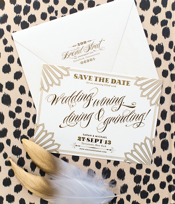
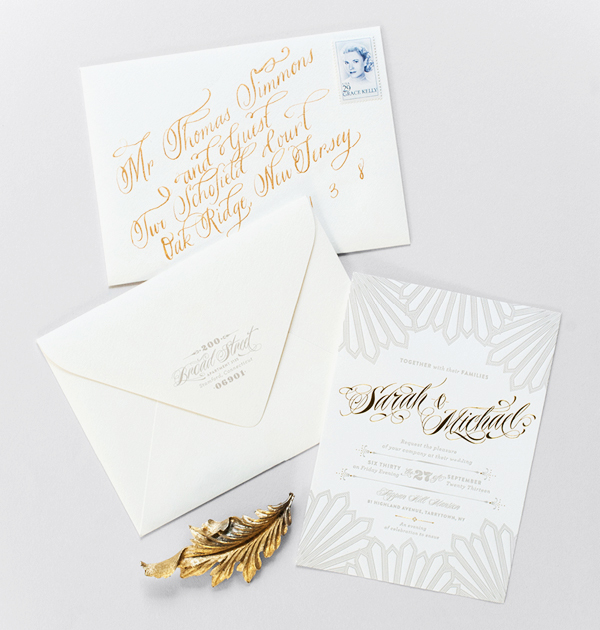
It all started with their foil stamped save the date. At first glance, you see a super-glamorous card – but wait – the words “wining and grinding” appear in a beautiful foil stamped script. It’s this combination of luxe with lingo that really gets me fired up – in a good way!

Art-Deco-Hollywood-Regency-Gold-Foil-Wedding-Invitations-Coral-Pheasant-OSBP4

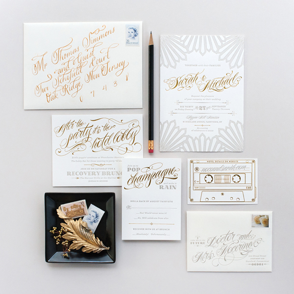
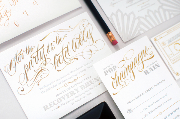
The design of their save the date carried over to the invitation suite which was letterpress printed and gold foil stamped on 110# Crane’s Lettra. The main invitation was kept formal with elegant details and traditional wording. It’s on the enclosure cards where we let loose with fun language.

Art-Deco-Hollywood-Regency-Gold-Foil-Wedding-Invitations-Coral-Pheasant-OSBP3

Art-Deco-Hollywood-Regency-Gold-Foil-Wedding-Invitations-Coral-Pheasant-OSBP7

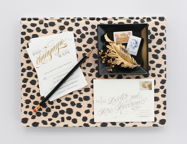
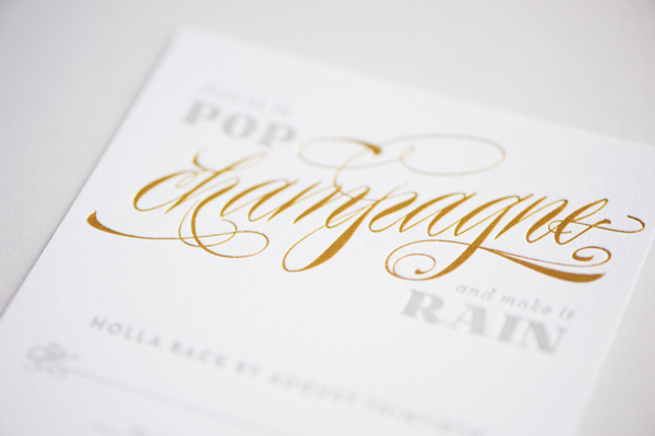
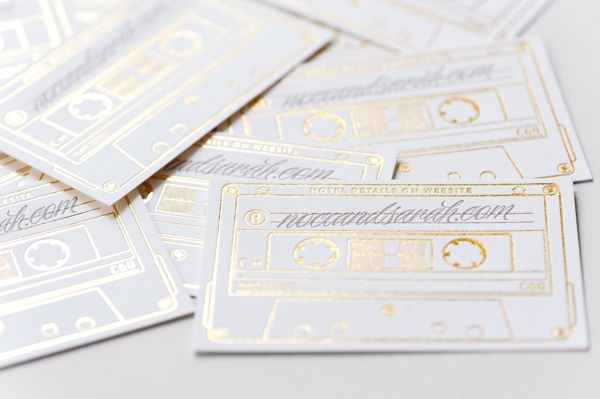
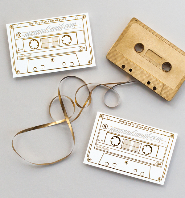
Guests were asked to “Pop champagne and make it rain” and were invited “After the party (to) the hotel lobby” for a recovery brunch. Of course this rap-inspired suite wouldn’t be complete without a mix tape. This cheeky card guided guests to their wedding website for all the celebration details.

Art-Deco-Hollywood-Regency-Gold-Foil-Wedding-Invitations-Coral-Pheasant-OSBP2

Art-Deco-Hollywood-Regency-Gold-Foil-Wedding-Invitations-Coral-Pheasant-OSBP5

Art-Deco-Hollywood-Regency-Gold-Foil-Wedding-Invitations-Coral-Pheasant-OSBP6

Thanks Nichole!

Design + Styling: Coral Pheas­ant

Calligraphy: Calligraphy by Hillary

Coral Pheasant is a member of the Designer Rolodex – you can see more of Nichole’s beautiful work right here or visit the real wedding invitations gallery for more invitation inspiration!

Photo Credits: Athena Bludé Photography

Happy Weekend!

Happy Friday everyone! Poor little Alice and I both have colds and Sophie seems to have come down with a stomach bug – so I’m pretty much just going to go crawl back into bed and hope for the best! But in the meantime…

Peonies-FloretFlower

Photo by Erin Benzakien / Floret Flower

…a few links for your weekend!

This week on Oh So Beautiful Paper:

Check back soon for this week’s cocktail! I hope you all have a wonderful weekend, and I’ll see you back here next week! xoxo

Calligraphy Inspiration: The Weekend Type

I hope you’re ready for some amazing calligraphy inspiration! This month’s calligrapher of note is the lovely Korie Lynn Herold of  The Weekend Type. Not only is she doing great work behind the camera as a talented wedding photographer, she’s providing beautiful work for the camera as a calligrapher. Her portfolio is a stunner – filled with hand-lettered goodies for you to feast your eyes on. – Julie

Calligraphy Inspiration: The Weekend Type via Oh So Beautiful Paper

Calligraphy Inspiration: The Weekend Type via Oh So Beautiful Paper

Simple light and wispy threads of ink make these wedding invitations utterly romantic. A gorgeous option for those seeking strong yet silent stationery.

Calligraphy Inspiration: The Weekend Type via Oh So Beautiful Paper

Calligraphy Inspiration: The Weekend Type via Oh So Beautiful Paper

Calligraphy Inspiration: The Weekend Type via Oh So Beautiful Paper

This message in a bottle invitation definitely works much better with lovely calligraphy rather than something overly kitsch to play on the theme.

Calligraphy Inspiration: The Weekend Type via Oh So Beautiful Paper

To see more of Korie’s calligraphy, be sure to check out her blog and Instagram!

Photos via: Korie Lynn Herold

Wedding Stationery Inspiration: Jewel Tones

As the colder months approach, most think it’s time to put color to the side for a while. Maybe you want to save the neon details for a spring or summer wedding, but why not incorporate your favorite colors in a deeper shade using jewel tones? Were you hoping for a bit of pink in your winter wedding? Try a berry shade. Or maybe a pop of green? Try emerald. Here are some of my favorite jewel tone stationery pieces for your wedding day! – Lauren

Jewel Tone Wedding Stationery Inspiration via Oh So Beautiful Paper

Spanish inspired place cards in a deep navy. Image by Luna Photo via Style Me Pretty.

Jewel Tone Wedding Stationery Inspiration via Oh So Beautiful Paper

If you want to keep the paper pieces simple, try adding ribbon in a deep shade to add contrast. Image by Christine Meintjes via The Pretty Blog.

Jewel Tone Wedding Stationery Inspiration via Oh So Beautiful PaperJewel Tone Wedding Stationery Inspiration via Oh So Beautiful Paper

White calligraphy looks gorgeous on a plum card stock. Left Image via Akimbo. Try table numbers in a pop of emerald. Right Image by CHARD PHOTOGRAPHER via Ruffled.

Jewel Tone Wedding Stationery Inspiration via Oh So Beautiful Paper

These tiles are a fun alternative for seating charts and you can find them in a variety of colors. Image by SAHARA COLEMAN via Seattle Bride.

Jewel Tone Wedding Stationery Inspiration via Oh So Beautiful Paper

Image by Katelyn James Photography via Wedding Chicks.

Jewel Tone Wedding Stationery Inspiration via Oh So Beautiful Paper

Image via The Bridal Collective.

What are your thoughts on color for the fall and winter? Do you stick with muted tones or continue on with your favorites from the warmer months?

DIY Tutorial: Vine and Berries Holiday Card

For those of you who craft your own holiday cards, it’s already time to get started. It’s always good to give yourself plenty of time to create and address them and the slight lull between Halloween and the week of Thanksgiving is usually when we try to get started. That way, they’re ready to mail out come December. The design in this tutorial features white embossing combined with white hand embellished vine details to create a one of a kind holiday card. You could even add a photo to the back of the card or simply write a note if you have more to say. We hope that this project inspires you to dream up and make your own holiday card this year! –Bailey and Emma of Antiquaria

DIY Holiday Card Tutorial by Antiquaria for Oh So Beautiful Paper

DIY Holiday Card Tutorial by Antiquaria for Oh So Beautiful Paper

Materials

Peace on Earth Holiday Greetings Stamp

Mod Holly Return Address Stamp

Banner Rubber Stamp

Frost White Stamp Pad or Embossing Stamp Pad

Olive Stamp Pad

White Embossing Powder

Embossing Heat Tool

5.5″ Square Cards,  in Chartreuse

5.75″ Square Envelopes, in Pure White

Calligraphy Starter Kit

Dr. Martin’s White Ink

Vintage Holiday Postage

DIY Holiday Card Tutorial by Antiquaria for Oh So Beautiful Paper

Step One: Stamp your holiday message (we used our Peace on Earth Holiday Greetings Stamp) in white ink in the center of a 5.5″ square card.

DIY Holiday Card Tutorial by Antiquaria for Oh So Beautiful Paper

Step Two: Immediately after step one, before the ink dries, pour white embossing powder over the stamped image. Heat set the powder using a heat embossing tool. For a step by step video on embossing, please watch the tutorial found here.

DIY Holiday Card Tutorial by Antiquaria for Oh So Beautiful Paper

Step Three: Next, let your imagination go wild! Embellish around the greeting with vines and berries using white ink and a pointed calligraphy pen. While this ink is our favorite for its opacity, you could also use a white gel pen if you prefer.

DIY Holiday Card Tutorial by Antiquaria for Oh So Beautiful Paper

Step Four: Stamp your return address on the back flap of a 5.75″ square white envelope. We used our Mod Holly Return Address stamp with olive ink to coordinate.

DIY Holiday Card Tutorial by Antiquaria for Oh So Beautiful Paper

Step Five: As snail mail lovers, addressing the envelope is half the fun for us. When we found this cute banner stamp, we knew exactly how we wanted to use it! We stamped it on the lefthand side of the envelope front and let it dry. Then, we added the addressing in a darker green ink (this was custom mixed from gouache paint) to add dimension and pull the whole design together.

DIY Holiday Card Tutorial by Antiquaria for Oh So Beautiful Paper

Add vintage postage and any additional photos or messages and send them off to your loved ones!

Photo Credits: Antiquaria for Oh So Beautiful Paper