November Wallpapers

Welcome to November everyone! And this happens to be a particularly important November thanks to the midterm elections – which are TOMORROW! Have you voted already? Do you have a voting plan tomorrow? And don’t forget to play Midterm Election Night Bingo while watching the returns tomorrow night! Whether you’ll be voting Democrat or Republican, please please please vote. It’s unbelievably important in every election, but especially this one. So! In honor of the midterms, we’re offering a couple of election-themed wallpapers for your enjoyment this month, plus a bonus non-election themed wallpaper from Kim at Bright Room Studio! The wallpapers are available in three sizes – desktop, iPad, and iPhone – so pick your favorite, or pick two and use them for two different devices! Or use the iPhone wallpaper to encourage your friends to vote on Instagram stories! Multipurpose wallpapers are the best wallpapers. Which one will you choose?

Election-Themed Wallpaper / VOTE

Desktop | iPad | iPhone

Election-Themed Wallpaper / Robert F. Kennedy Quote

Desktop | iPad | iPhone

Gourds Watercolor Wallpaper by Bright Room Studio for Oh So Beautiful Paper

Desktop | iPad | iPhone

Looking for more beautiful seasonal wallpapers? Here are the wallpapers from November 2017, November 2016November 2015, and November 2014!

p.s. Don’t forget to download and print your Midterm Election Night Bingo!

For personal use only. All illustrations by Oh So Beautiful Paper and Bright Room Studio.

If you’re a designer or illustrator interested in contributing your own designs to this column, please email your design to submissions(at)ohsobeautifulpaper.com with the subject line “desktop downloads.” If it’s a good fit I’ll add it to the post for the following month!

Illustrated Vineyard Wedding Invitations

Watercolor illustrations and dreamy vineyard scenery sounds like the perfect way to start the week. These illustrated vineyard wedding invitations come to us from Designer Rolodex member Wide Eyes Paper Co. I’m loving the fold-out invitation design that shares all the wedding details (and the couple’s love story!) on a single page – and Amanda always creates the most beautiful illustrated envelope liners!

Illustrated Vineyard Wedding Invitations by Wide Eyes Paper Co.

From Amanda: Nicole and David decided on a fully custom eight panel quad-fold invitation that captures every beautiful detail of their vineyard wedding. The opening page of the invitation shows the gleaming watercolor portraits of Nicole and David with hand painted greenery adorning the corners. Such a fun way to get everyone excited for this couple to walk the aisle!

Illustrated Vineyard Wedding Invitations by Wide Eyes Paper Co.

As the pages unfold you are whisked away to a hand painted watercolor scene of the Bluemont Vineyard, their lovely wedding location. I am tempted to hop in the car right now and head to Virginia! Our new favorite feature we have added to our invitations are the tiny custom icons that we curate for each couple.

Illustrated Vineyard Wedding Invitations by Wide Eyes Paper Co.

The back panels of these illustrated vineyard wedding invitations tell “The Story of Nicole and David” with every detail from inception to real time. We loved painting everything from the college where they met, to the tender steak on their first date, to their graduation caps and, of course pizza. Talk about a fun love story. For all of the special watercolor details this set is simple on the verbiage. Sometimes a picture says it all.

Illustrated Vineyard Wedding Invitations by Wide Eyes Paper Co.

The perforated RSVP is a good indicator that you should send your answer in the mail ASAP, because this wedding will be one for the record books. We love that the quad-fold invite allows the RSVP to be right on the bottom of the invitation for safe keeping and the fact that it is a postcard means it’s ready to be dropped right in the mail.

Illustrated Vineyard Wedding Invitations by Wide Eyes Paper Co.

Lastly, we incorporated the watercolor scenery of Bluemont Vineyard on the custom envelope liners for that special extra added touch. One of our favorite details of the entire suite!

Illustrated Vineyard Wedding Invitations by Wide Eyes Paper Co.

Thanks Amanda!

Design: Wide Eyes Paper Co.

Printing: Paper Jam Press

Wide Eyes Paper Co. is a member of the Designer Rolodex – you can see more of their beautiful work right here or visit the real invi­ta­tions gallery for more wedding invitation ideas!

Photo Credits: Jordan Hughes

Inspiring Calligraphers: Frani Matthews of Authentic By Frani

Hey everyone! So I have a beautiful collection of calligraphy to share with you all today. We’re taking a look at the work of Frani Matthews and her take on the art of lettering work and favorite projects she’s worked on with her business Authentic by Frani. Let’s dive in! – Jen

Inspiring Calligraphers: Authentic by Frani

Inspiring Calligraphers: Authentic Frani

Inspiring Calligraphers: Authentic by Frani

On her start as a calligrapher, Frani shares:

“When I started lettering (more seriously than my notebook-doodling days, mind you), I simply mimicked the letter forms and fonts I saw in magazines, on Instagram, in advertisements, etc. I would trace things and break more intricate forms into smaller, more manageable portions; but in the end, my style just looks like the upgraded version of my loose, cursive handwriting. Using a pointed pen and ink amps it up to its characteristic look: effortless, romantic, whimsical. After almost three years of refining, my style is now a part of me. Each stroke carries the tension of my day, the joy, the hunger-shakes. We live (and create) out of the overflow of our hearts, and I’m thankful that this art continues to be a release.”

Inspiring Calligraphers: Authentic by Frani

Photo Credit: Swak Photography

Paper or digital? The answer is clear, according to Frani:

“When designing pieces, I always sketch it out on paper first. I’m kind of a noob at digitizing my work (read: I’m still learning!), and I’d have no idea how to start from the screen. Sometimes, I consider saving up for a fancy iPad or something. Maybe one day. But I definitely feel most connected to my art, the client, and the energy of the piece when creating simply by hand. Is it wrong to say I tend to love my rough pencil sketch more than the crisp, completed piece? I don’t think so.”

Inspiring Calligraphers: Authentic by Frani

This wedding suite that Frani created for an October bride featured so many creative favorites on one wish list: handmade paper, gold foil lettterpress printing, warm and muted tones, silk ribbon, wax seals, and vintage stamps. No surprise why this was a dream project to work on!

Inspiring Calligraphers: Authentic by Frani

Photo Credit: Klaire Dixius

Frani likes to experiment with non-paper surfaces, too. On her favorites, she shares:

“In my spare time, I do some chalkboard lettering. It’s such a fun medium, and it stretches me creatively— between designing interesting layouts and then properly measuring and planning to ensure my ideas are portrayed accurately. I’m amazed by people who have a serious knack for it. I also appreciate lettering on fabric and embroidering my calligraphy as well.”

Inspiring Calligraphers: Authentic by Frani

Inspiring Calligraphers: Authentic by Frani

Another design medium she loves: designing tattoos. Frani shares, “It gives me so much life to illustrate florals and encouraging words as it is, but the fact that people want something I’ve drawn on their bodies permanently totally blows my mind. There really aren’t accurate words for it.”

Thanks so much to Frani for sharing a peek into her work and process as a calligrapher!

Photo Credits: All images via Authentic By Frani, except where noted.

Want to be featured in our calligraphy column? Reach out to us at submissions [at] ohsobeautifulpaper [dot] com with the subject line “Calligraphy Feature” for more details!

Behind the Stationery: Fourteen-Forty

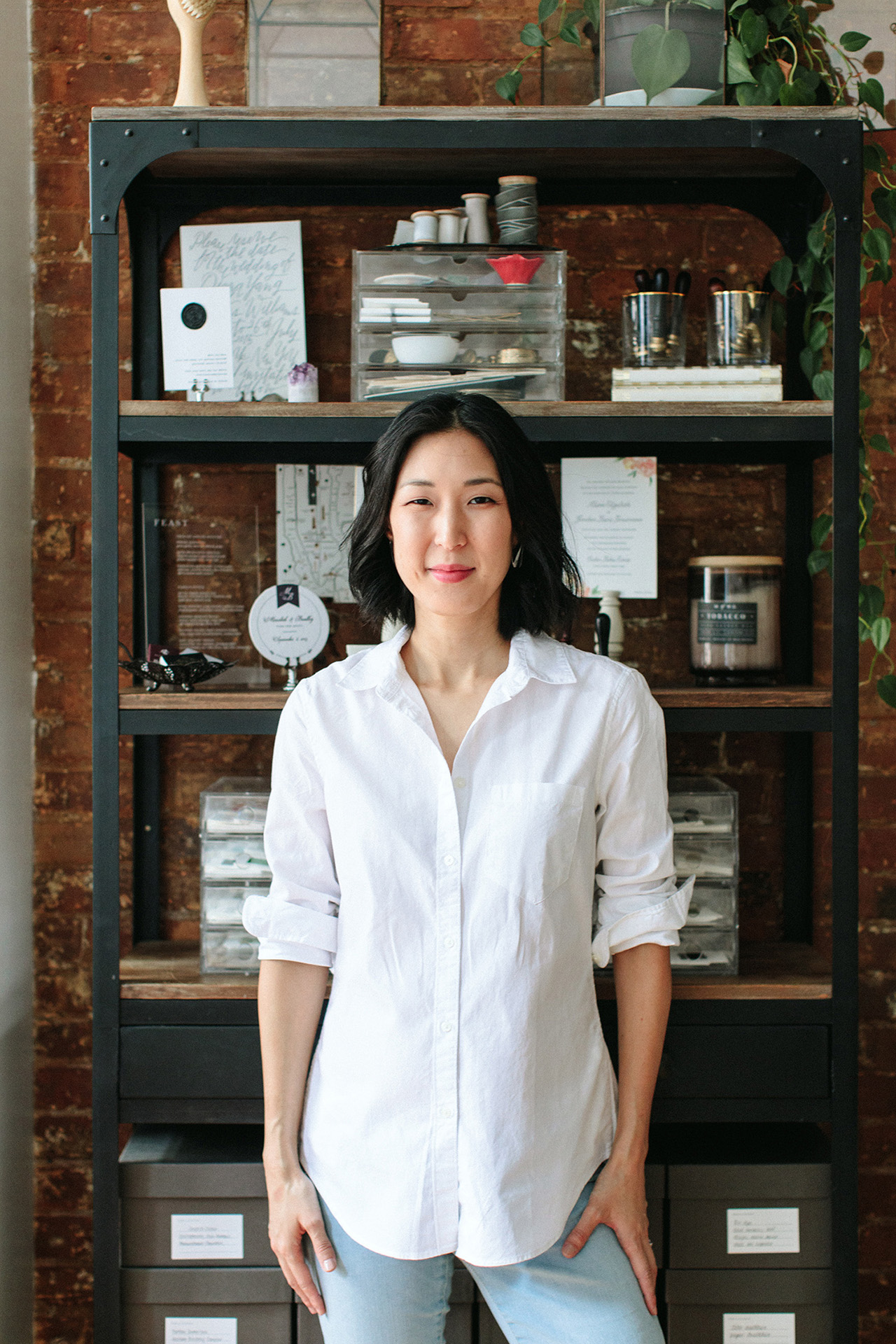
I’m thrilled to introduce our next stationery designer, Tricia Kim of Fourteen-Forty! Based here in New York, Tricia works with couples on custom wedding stationery and has grown her business focused in the wedding industry for many years now. She’s here to share about how learning about production processes informed her design process and how her growing team approaches the design process with each client. —Megan Soh

Behind the Stationery: Fourteen Forty

From Tricia: I started Fourteen-Forty about six years ago, after years of designing in the magazine industry. Funny enough, my first job was actually for a wedding publication! While what I learned at these companies was invaluable, working for large brands made me realize that I really wanted to take ownership of something that I could put my heart into. I’ve always loved making things with my hands, so letterpress printing with its mix of art and mechanics came naturally to me, which is where this obsession with stationery all began.

Behind the Stationery: Fourteen Forty

I was living in New York City when letterpress printing was really starting to emerge again as a craft, and I was able to find a lot of resources to start honing my skills as a printer. By no means did I ever completely master the art of printing, but it became a wonderful outlet for creativity and I loved the problem solving that it required. Looking back, I am so glad that I was able to learn the production side since understanding it from first hand experience has truly made me better equipped as a designer. Knowing the limitations, technical aspects, and possibilities helps me make good design decisions for my clients. As I gained experience at the press and became more embedded in the stationery community, the idea of Fourteen-Forty came to life (the name is an homage to the year moveable type was invented) and I slowly started building the company from the ground up.

Behind the Stationery: Fourteen Forty

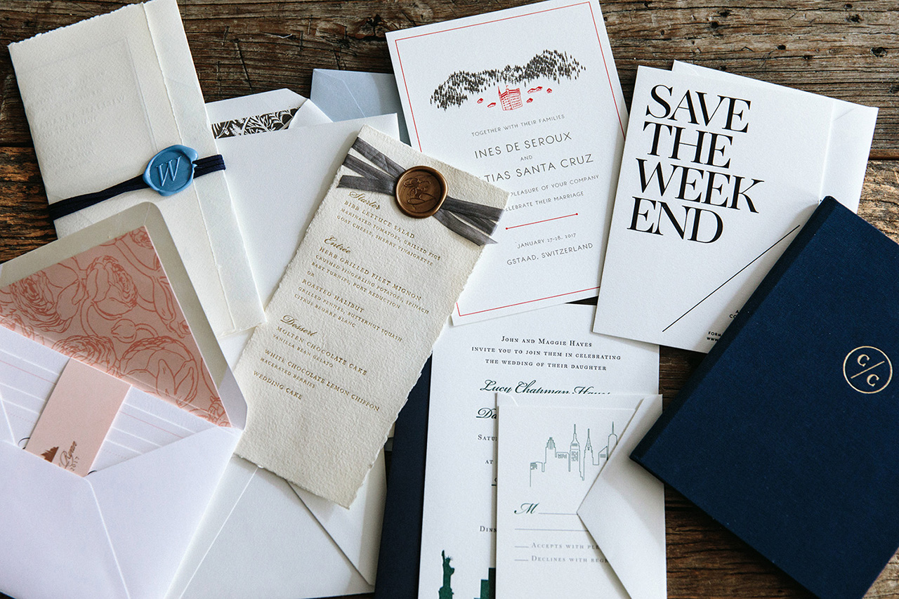
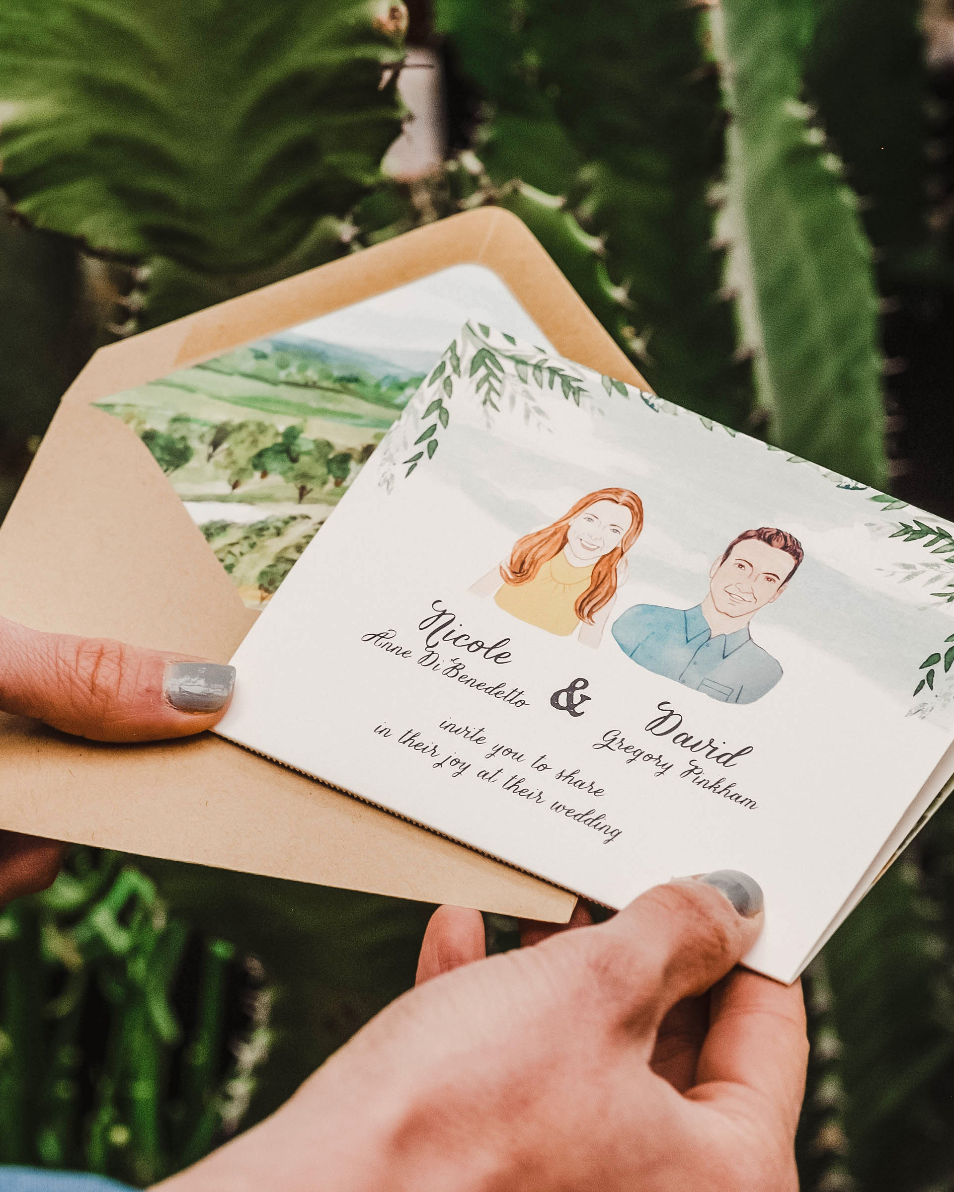
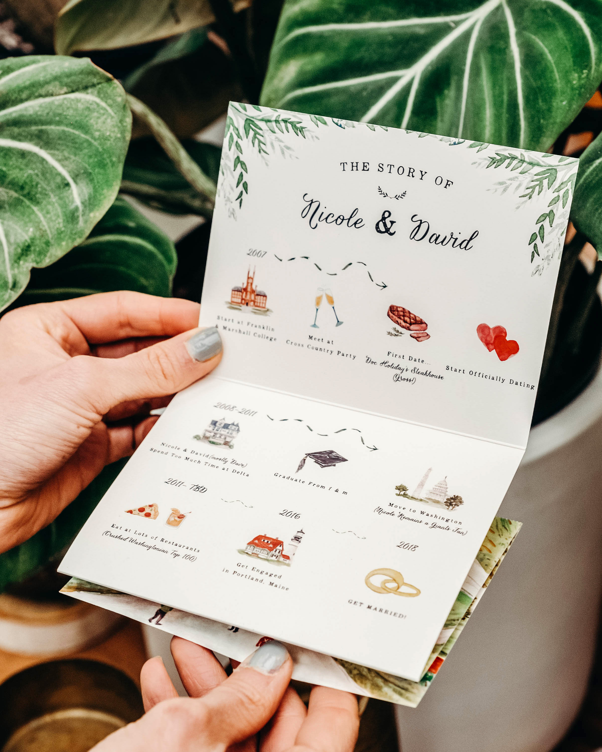
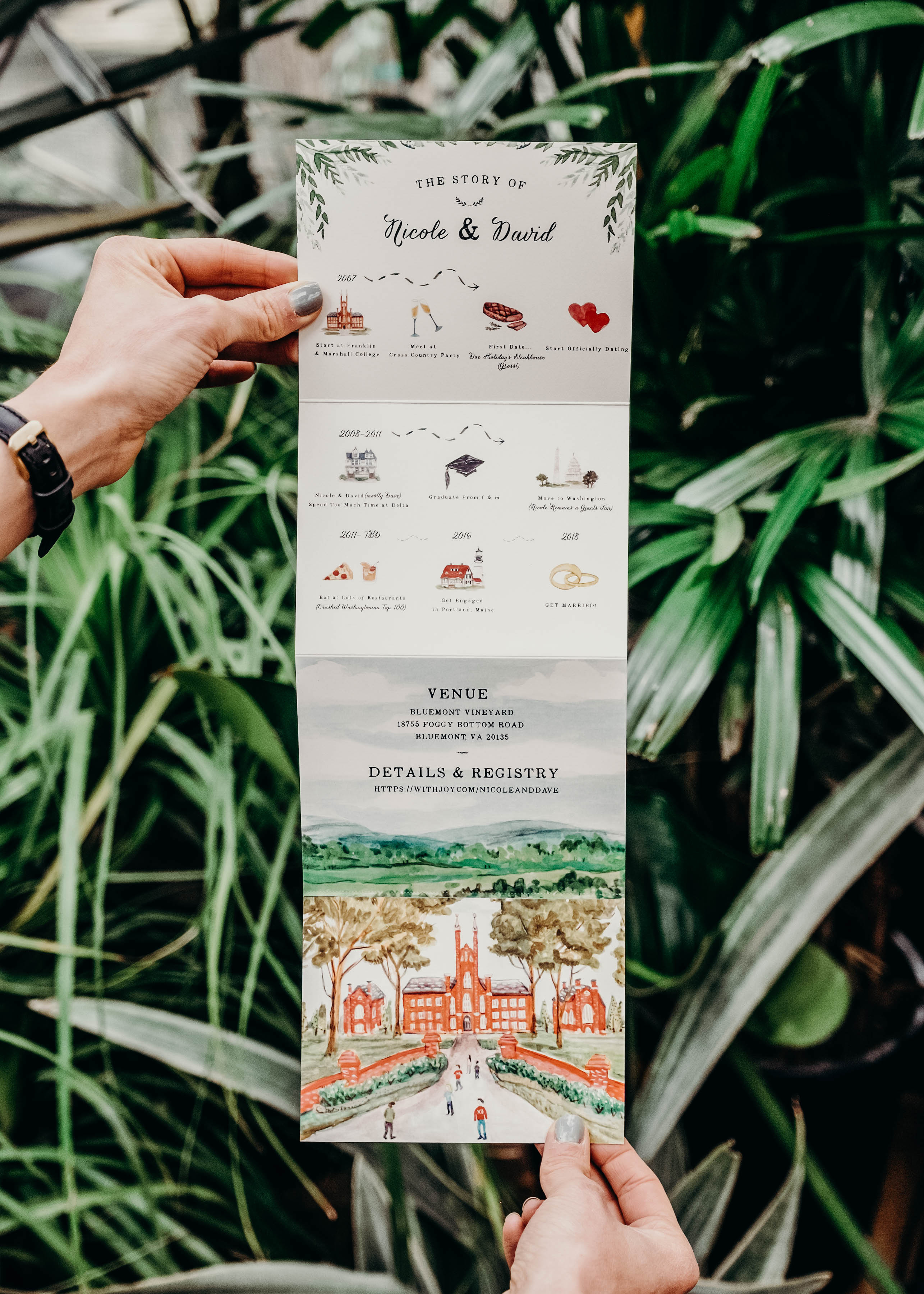
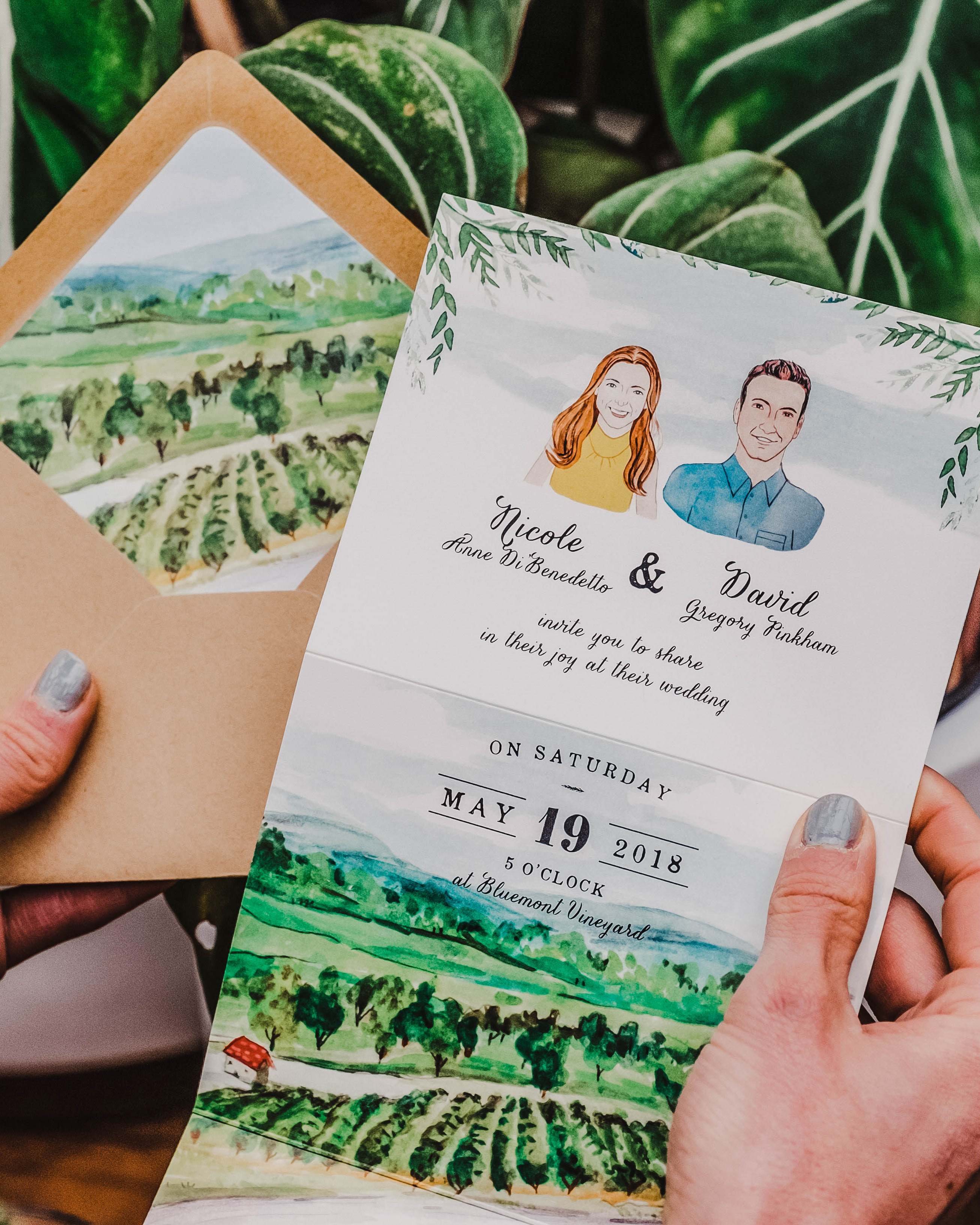
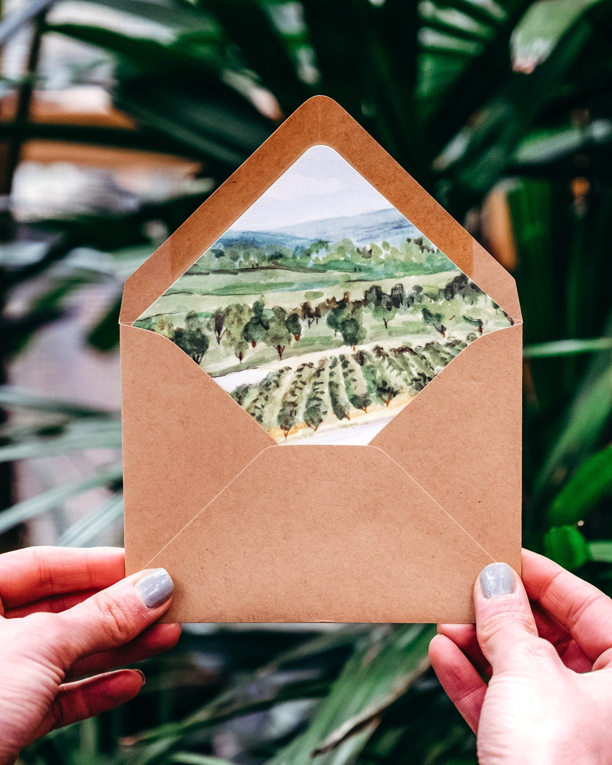
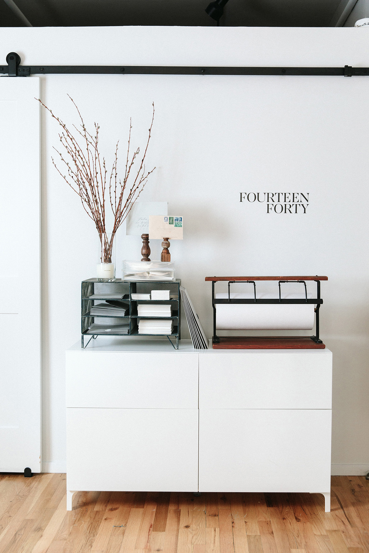
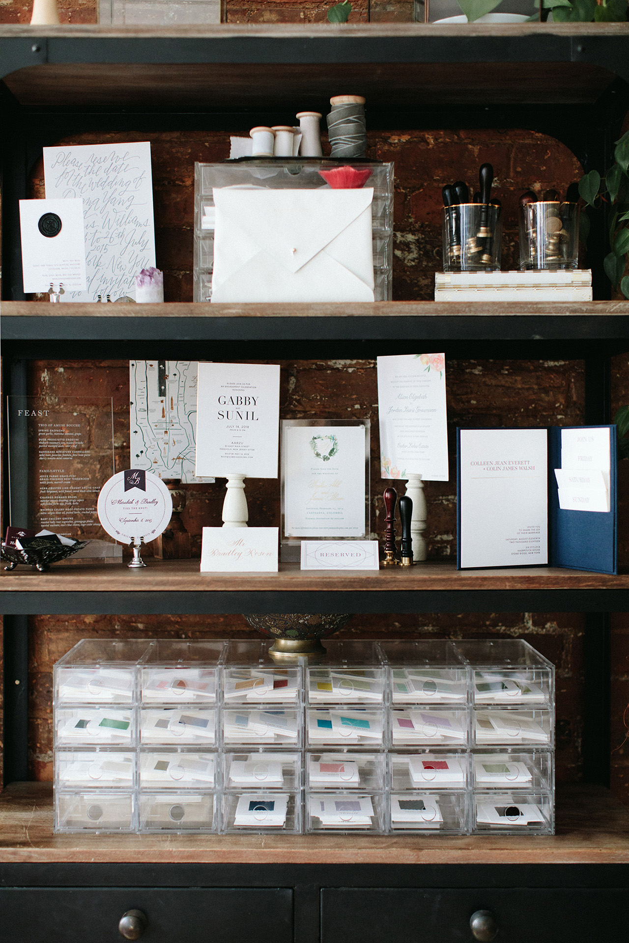
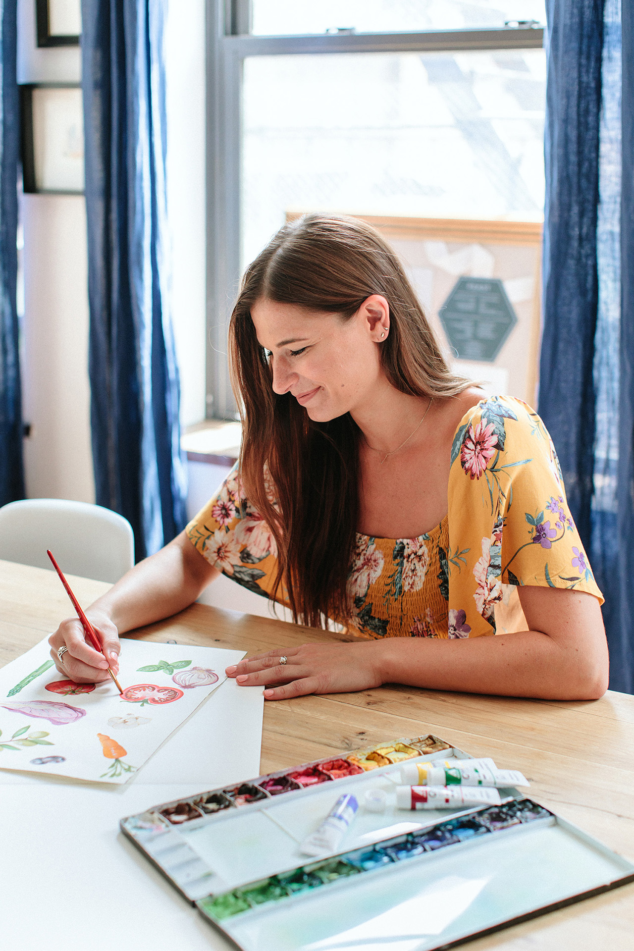
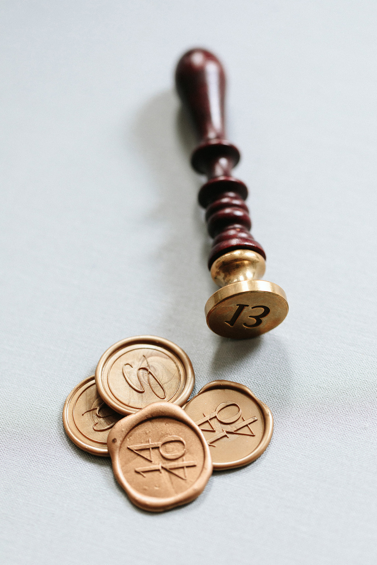
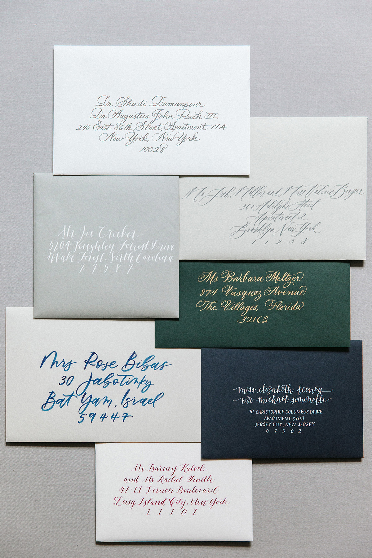
Fast forward six years, and today Fourteen-Forty is primarily focused on designing custom wedding invitations. Located in the downtown area of Manhattan, we are a hardworking group of creatives dedicated to dreaming up unique keepsakes. We offer custom illustration, watercolor, typographical designs, all kinds of specialty printing, calligraphy, wax sealing, and more. We love working with paper along with other materials, like leather, fabric, acrylic, and wood. And if we haven’t done it before, we’re always willing to try something new!

Behind the Stationery: Fourteen Forty

Behind the Stationery: Fourteen Forty

As the owner of the studio, I handle most of the client-facing and business duties, which pretty much means I am constantly on email. One of the most important things to us is customer service. I love connecting with clients on this level and helping them navigate the whole process, which is usually a completely foreign experience to them. On the business side, I am constantly brainstorming to expand the brand and refine our processes, enhance our client experience, and just meet the day to day challenges of running a small business—fielding emails, meetings, and calls, connecting with planners and vendors, strategizing on marketing initiatives and and checking in to see how different projects are going.

Behind the Stationery: Fourteen Forty

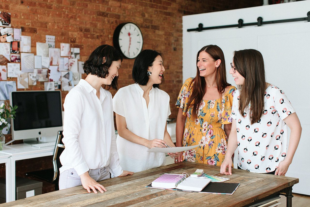
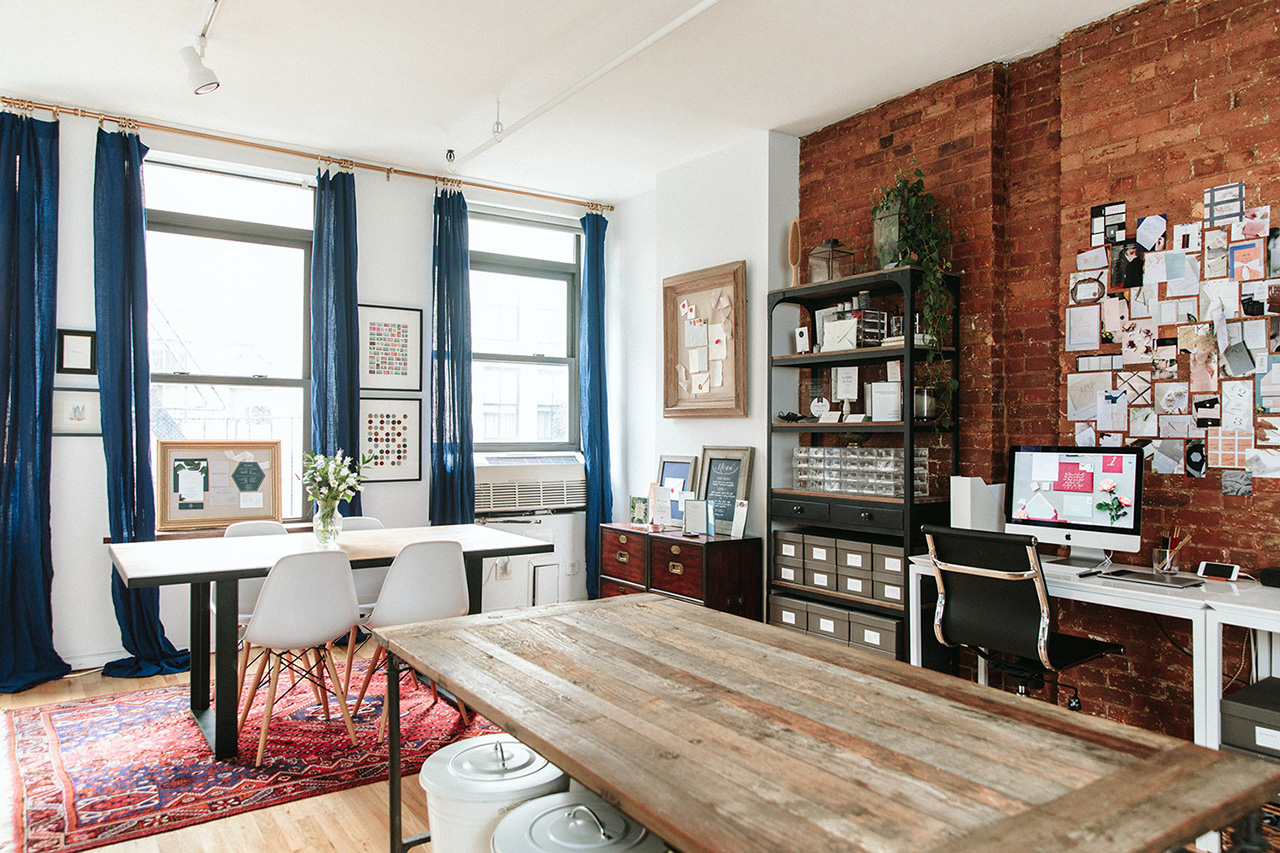
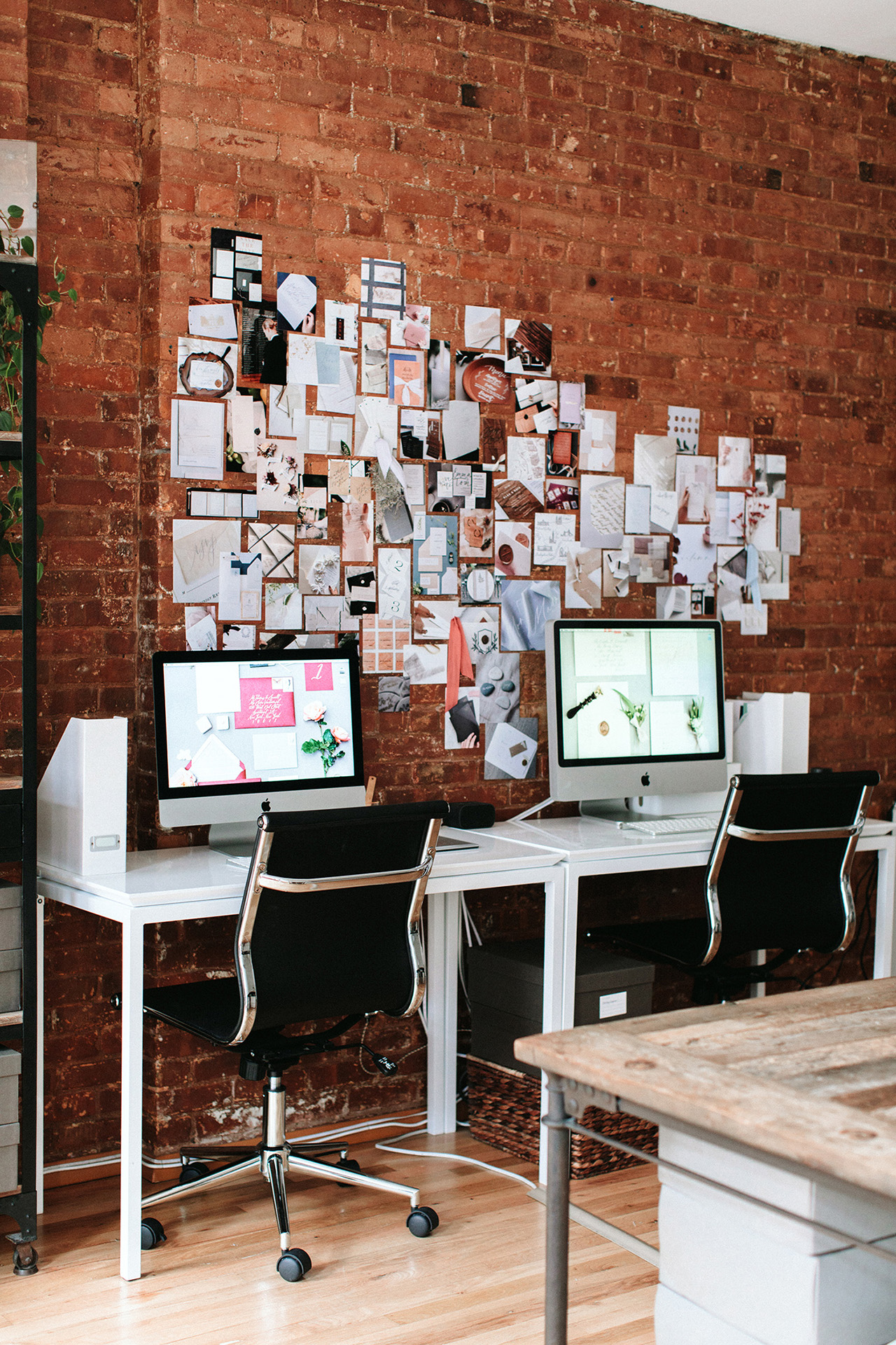
We all work together in an open plan studio, which I love because it promotes an incredible amount of collaboration, which is so key to this process. I find that this set up promotes efficiency as well as keeps everyone aware of the tasks at hand and the goals we need to meet.

Behind the Stationery: Fourteen Forty

One of the more difficult things to manage in a busy studio is prioritizing tasks and keeping the wheels moving for all our clients at the same time. There are days when the to-do list is overwhelming, and it’s so important to see clearly what needs to be done first, second, and so on down the line. That’s why timelines are so important to us—we set a timeline for each client and make sure we do everything we can to stick with the dates and prioritize appropriately.

Behind the Stationery: Fourteen Forty

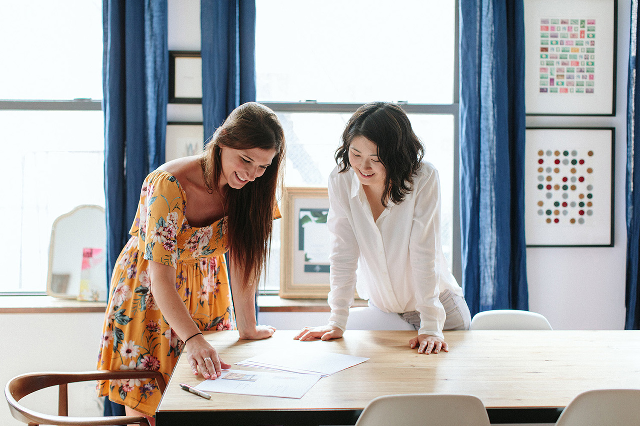
Our process typically starts with a call and/or client meeting, during which we really start drilling down into the client’s vision, and start sharing with them all of the possibilities. Once a plan is formulated, we begin the design process, during which we’re brainstorming and sketching out ideas, and presenting them in a series of proofs. There is a period of back and forth when we integrate changes, really listening to our client’s feedback, and hone everything to perfection.

Behind the Stationery: Fourteen Forty

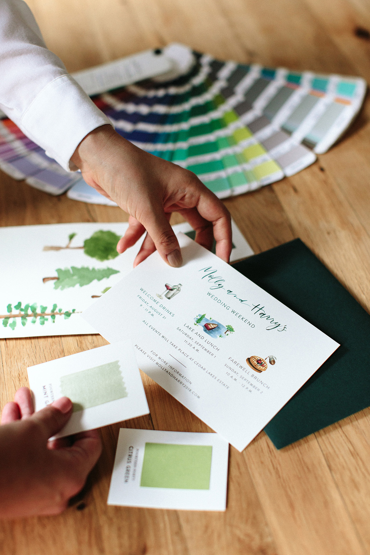
Then we are signing off on the designs and sending them to print. Depending on the project, the next phase can actually be the most intense for us. This is when production begins, and we are spending on average one to five weeks (sometimes more!) actually producing the designs. With more elaborate projects, we may be getting supplies and finishing techniques done by 5-10 different artisans during this phase, which takes time and a lot of coordination to get right.

Behind the Stationery: Fourteen Forty

Behind the Stationery: Fourteen Forty

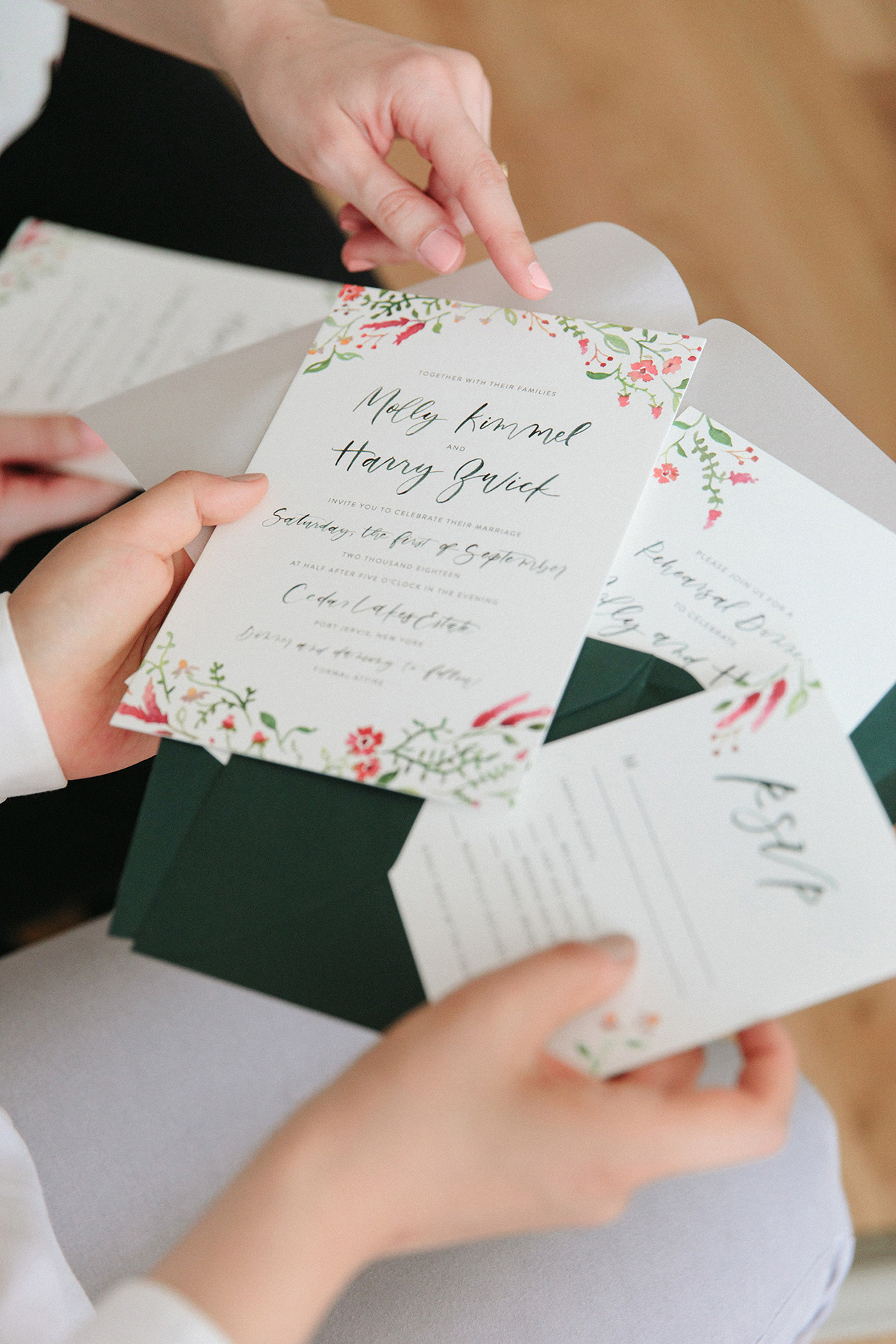
In addition, some of the assembly that we do (liners, vintage stamps, calligraphy, wax seal ties, and even simply collating the right items into a particular guest’s envelope) take an enormous amount of time and precision to achieve.

Behind the Stationery: Fourteen Forty

Behind the Stationery: Fourteen Forty

In the end, it’s all worth it to reach our goal—a design that is new, special, and specific to each client. There is no better moment then when we present the finished suite after months of hard work, and see our client look at their dream invitation for the first time!

Behind the Stationery: Fourteen Forty

All photos by Sasithon Photography except where noted.

Want to be featured in the Behind the Stationery column? Reach out to Megan at megan [at] ohsobeautifulpaper [dot] com for more details.

Thirteen Beautiful 2019 Calendars

I’ve had calendars on the brain the last couple of weeks, so I thought we’d start the week with a round up of thirteen beautiful 2019 calendars! We’ve got everything from food puns and an animal swimsuit calendar (!!) to delicate floral illustrations and colorful abstract shapes. In many ways, this round up is a reflection of some of the major design trends we’ve seen over this past year. Oh, and I feel like stationers finally heard everyone begging for more space to write appointments on their calendars, since there are more appointment calendars this year than ever before – let’s take a look!

Thirteen Beautiful 2019 Calendars

1. Love, love, LOVE the colors in this abstract shapes wall calendar from Worthwhile Paper. You can even order it with the wood frame kit!

2. Loving the delicate illustrations on this botanical calendar from Esther Clark Co.

3. A colorful monthly wall calendar from Katharine Watson featuring a different gouache painting inspired by her traditional block print work and stationery designs

4. Loving the simplicity of the floral line drawings in this year’s calendar from Our Heiday – and plenty of space for notes and appointments!

5. Each year, Dear Hancock produces the cutest calendar featuring illustrations of their signature bunny. This year, bunny is arranging flowers! So cute.

6. Add an extra dose of positivity to your day with this Positivity wall calendar from Fox & Fallow! Rose gold foil on alternating pink and black pages. They also have a more traditional floral appointment calendar!

7. Rifle Paper Co. is always a safe bet for beautiful calendars. I’m particularly fond of this garden party floral appointment calendar.

8. I cannot resist a birth month floral calendar, and this beauty from Juliet Meeks is no exception! Each month features a unique floral pattern hand painted by Juliet and representative of that month’s birth flower.

9. If you prefer your calendar to double as wall art, look no further than this XL calendar from One Canoe Two! They also have a beautiful appointment calendar and illustrated desk calendar.

10. Food puns from ilootpaperie! I mean, can you think of a more perfect calendar to hang in your kitchen?? I think not.

11. This animal swimsuit calendar from Paper Wilderness CRACKS ME UP. Each month features a different watercolor illustration with an animal wearing a swimsuit, from a bikini-wearing shark to a bear hanging out in a swan pool float. Ha!

12. This big write-in calendar from Wild Ink Press makes my mom heart so happy. Two months at a glance, with plenty of space for notes, chore charts, special events, and more! Available in black (just use a white gel pen or paint marker) or kraft paper. 

13. A beautiful desk calendar from Page Stationery x Atticus – each month features one of his poems in a different lettering style!