Crescent & Anchor Letterpress Business Cards

It’s always a treat when I get to showcase some beautiful custom letterpress business cards! Jacqueline Marque is an editorial, documentary and lifestyle photographer based in Newport, Rhode Island. In addition to offering portrait, interior, and lifestyle photography, she works as a staff photographer for The Newport Daily News, the arts and entertainment weekly Mercury, and the bimonthly lifestyle magazine Newport Life. Busy lady! After rebranding her photography website and blog Crescent & Anchor, where she shares her work and tidbits of domestic life, she was excited to commission her very own letterpress business cards!

Gray-White-Edge-Painted-Letterpress-Business-Cards

From Jacqueline: After many months of working closely with the designers at SPACECAMP CO on branding for my photography business and blog, I was excited to have an excuse to commission my very own letterpress business cards. They were designed by Danielle Brodersen of SPACECAMP CO and printed by hand, using an antique tabletop press, by Christy Schneider of Inkello.

Gray-White-Edge-Painted-Letterpress-Business-Cards3

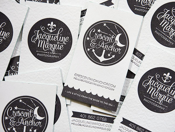
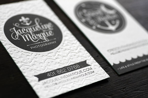
I wanted my photography business and blog to have sister logos that would be similar but each stand on their own. From the start of the design process, I envisioned corresponding logos on a double-sided card. I wanted the branding to have a vintage feel but still look fresh and modern. The fonts Mercury Script and Neutraface helped us achieve that balance.

Gray-White-Edge-Painted-Letterpress-Business-Cards4

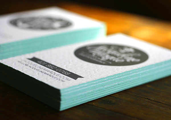
The cards were printed on 220 lb. Crane paper. One side is blind embossed with my logo, which combines an anchor and a fleur-de-lis. Aqua edge-painting adds a splash of color to the simple gray and white design.

Gray-White-Edge-Painted-Letterpress-Business-Cards6

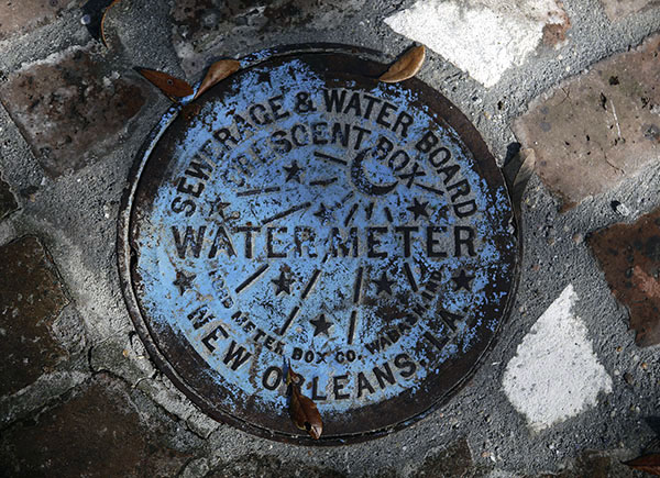
The designs and tag line, “Life & Style from the River to the Sea,” are references to my two homes, Newport and New Orleans. The Crescent & Anchor logo draws inspiration from the water meter covers in the Crescent City (seen below).

Gray-White-Edge-Painted-Letterpress-Business-Cards7

Thanks Jaqueline!

Design: SPACECAMP CO

Letterpress Printing: Inkello

Photo Credits: Jacqueline Marque Photography

Jaimie + Miles’s Rustic Jackson Hole Wedding Invitations

I’m in love with every detail in these Jackson Hole wedding invitations from Cara at XOWYO! From the antlers used throughout the suite to the screen printed wood veneer rehearsal dinner invitations to the green edge painting, this invitation suite is perfectly understated and entirely cohesive. Love!

Rustic-Letterpress-Jackson-Hole-Wedding-Invitations-XOWYO

From Cara: When Jaimie and her mother came to me for her wedding invitations, they wanted a letterpress printed suite their friends and family had not seen before. As a buyer for Macy’s, Jaimie has great style and really led the direction of this suite and other paper products. She wanted her invitations to reflect the woodsy, rustic, and western themes of Jackson Hole, but without being too stereotypical or kitchsy. With plans to be married on a ranch, they envisioned antlers, brands, wood, and kraft paper.

Rustic-Letterpress-Jackson-Hole-Wedding-Invitations-XOWYO6

We first discussed using Jackson’s iconic antler arch for her invitations, but ultimately decided to use just the antlers. We carried the antler theme throughout her entire wedding, from invitation to cocktail napkins. We also decided that rather than using a wood print, or an image of a tree trunk, we would incorporate real wood into the invitation suite with the rehearsal dinner invitation, which was screen printed onto walnut wood veneer. And of course, we added a custom brand like one would find on any Jackson Hole ranch.

Rustic-Letterpress-Jackson-Hole-Wedding-Invitations-XOWYO2

We selected 220# ecru paper for the invitation and reply, with edge painting to incorporate the green color Jaimie would use oner wedding tables. Combined with the gray ink and wood card, this set the tone for her contemporary rustic affair. We decided to do the event invitation in an 80# moss green stock because Jamie needed to convey so much information that it printed perfectly on the inside of the folded card. The website card ended up being a last minute addition, and tucked inside the event invitation perfectly.

Rustic-Letterpress-Jackson-Hole-Wedding-Invitations-XOWYO4

For the wedding, Jaimie found all the vintage keys in her home state of Texas. I printed guests name on parchment paper and then tied them together with champagne silk ribbon. We also created kraft paper bags filled with lavender, which guests used to shower the couple as they walked down the aisle.

Rustic-Letterpress-Jackson-Hole-Wedding-Invitations-XOWYO8Rustic-Letterpress-Jackson-Hole-Wedding-Invitations-XOWYO9

Rustic-Letterpress-Jackson-Hole-Wedding-Invitations-XOWYO5

Thanks Cara!

Design: XOWYO

Letterpress Printing and Edge Painting: Boxcar Press

Wood Veneer Screen Printing: Cards of Wood

Check out the Designer Rolodex for more tal­ented wed­ding invi­ta­tion design­ers and the real invi­ta­tions gallery for more wedding invitation ideas!

Photo Credits: Hannah Hardaway

DIY Hand Painted Envelopes

We all love to dress up our envelopes with beautiful postage stamps, gorgeous calligraphy, and pretty address labels. But what about cards (and envelopes) delivered in person? I always try to personalize the front of my hand delivered envelopes, whether it’s a simple hand drawn border or a pretty flourish around the recipients’ names. This week I thought I’d share a few of the ways I’m personalizing my hand delivered holiday cards, although you can totally use these ideas year round. These aren’t really tutorials – just a few ideas that I wanted to share. Today we’re starting with my favorite idea: hand painted envelopes!

OSBP-DIY-Tutorial-Painted-Envelopes-6

Watercolor paints are one of my favorite ways to dress up light color envelopes – the pattern options are endless! I’m partial to stripes and line borders, but you can also create a watercolor wash by using more water to dilute your chosen color. For this example, I used a deep cobalt blue and emerald green on Mohawk Superfine White envelopes.

OSBP-DIY-Tutorial-Painted-Envelopes-55OSBP-DIY-Tutorial-Painted-Envelopes-45

OSBP-DIY-Tutorial-Painted-Envelopes-54

You’ll probably want to play around with colors and patterns on some scrap paper before moving on to your envelopes. Normally, watercolors would be used on super thick paper, so depending on your particular envelopes there will most likely be some warping/wrinkling in the paper. I’m not bothered by this, but just make sure that the envelopes are completely dry before you insert your card or address the finished envelope.

OSBP-DIY-Tutorial-Painted-Envelopes-46

OSBP-DIY-Tutorial-Painted-Envelopes-16

OSBP-DIY-Tutorial-Painted-Envelopes-26

For darker envelopes, I like to use opaque acrylic paint for a fun light-on-dark effect. Here I used white acrylic paint on Mohawk antique vellum envelopes (in Iris) paired with my favorite gold and copper metallic Sharpie markers.

OSBP-DIY-Tutorial-Painted-Envelopes-29OSBP-DIY-Tutorial-Painted-Envelopes-40

To create a dry brush effect along the edge, simply start out with a small amount of paint on the edge of your brush. Too much paint, and you’ll loose the feathery texture. Starting at the top left corner of your envelope, paint a horizontal stroke – moving in a single motion until your brush runs out of paint. Repeat down each side of the envelope. Let dry, then write the name of your recipient on the envelope!

OSBP-DIY-Tutorial-Painted-Envelopes-31

For the border effect, I like to start with the small curves in each corner to serve as guides. Then draw lines to connect the ends of each curve. I used the flat edge of my brush for the outer frame to achieve a thinner line, then switched to the broad edge of the brush for a thicker inner frame. Don’t worry about painting perfectly straight lines – any wobbly lines or changes in texture will only add to the hand painted charm. Let dry, then write in the name of your recipient – and done!

OSBP-DIY-Tutorial-Painted-Envelopes-32OSBP-DIY-Tutorial-Painted-Envelopes-34

OSBP-DIY-Tutorial-Painted-Envelopes-38

I’ll be back with a couple more ideas later in the week!

Photo Credits: Nole Garey for Oh So Beautiful Paper

Huilin + Martin’s Gold Foil Boarding Pass Wedding Invitations

After years working as a freelance designer, Huilin Dai finally had the chance to design for herself: invitations for her upcoming wedding! Inspired by a recent move to San Diego, California and a love of travel, Huilin drew design inspiration from an airplane boarding pass. The invitation suite was letterpress printed by Mama’s Sauce in seafoam green and gold foil, then finished with seafoam edge painting!

Mint-Gold-Foil-Destination-Wedding-Invitations-Huilin-Dai

From Huilin: After working as a freelance designer for many projects, I was excited to have an opportunity to design my own wedding invitations! Our invitation was inspired by a plane ticket for two reasons. First, we both love traveling, so we would like to have a travel theme goes along our wedding. Second, we both moved to San Diego and are getting married here – most of our guests will fly into town without knowing each other.

Mint-Gold-Foil-Destination-Wedding-Invitations-Huilin-Dai5

We thought it would be a fun idea to give them a “plane ticket.” The ticket was created in two parts: the invitation and a perforated RSVP that can be torn off and mailed back to us, just like the boarding ticket! I also created a set of 4″ x 4″ coasters that will also be used as escort cards for the reception.

Mint-Gold-Foil-Destination-Wedding-Invitations-Huilin-Dai4

The invitations and coasters were printed by Mama’s Sauce – they were so nice and willing to do what I asked for. The invitations were printed in three colors: gold foil, seafoam, and blind, with edge paint in seafoam. The detail on finished product was incredible, and I was so glad I found them!

Mint-Gold-Foil-Destination-Wedding-Invitations-Huilin-Dai6

Mint-Gold-Foil-Destination-Wedding-Invitations-Huilin-Dai7

Thanks Huilin!

Design: Huilin Dai

Letterpress Printing: Mama’s Sauce

Check out the Designer Rolodex for more tal­ented wed­ding invi­ta­tion design­ers and the real invitations gallery for more wedding invitation ideas!

Photo Credits: Huilin Dai

James + Daniel’s Masculine Letterpress Wedding Invitations

James and Daniel approached designer Chase Kettl looking for a masculine design for their wedding invitations. Chase created a modern two-color design with bold typography-inspired elements. Blue edge painting was the perfect finishing touch!

Masculine-Wedding-Invitations-Dependable-Letterpress

From Chase: James and Daniel contacted me looking for a masculine feel for their wedding invitations. Being a wedding of two men, they wanted to have a masculine feel as opposed to something flowery and frilly. I was thrilled to work with them! We decided to go with a two-color letterpress with bold design elements. We also decided to invest in blue edge painting to really give it a clean, dapper finish.

Masculine-Wedding-Invitations-Dependable-Letterpress3

Masculine-Wedding-Invitations-Dependable-Letterpress7

Masculine-Wedding-Invitations-Dependable-Letterpress5

Thanks Chase!

Design: Chase Kettl

Letterpress Printing: Dependable Letterpress

Check out the Designer Rolodex for more tal­ented wed­ding invi­ta­tion design­ers and the real invi­ta­tions gallery for more wedding invitation ideas!

Photo Credits: Chase Kettl