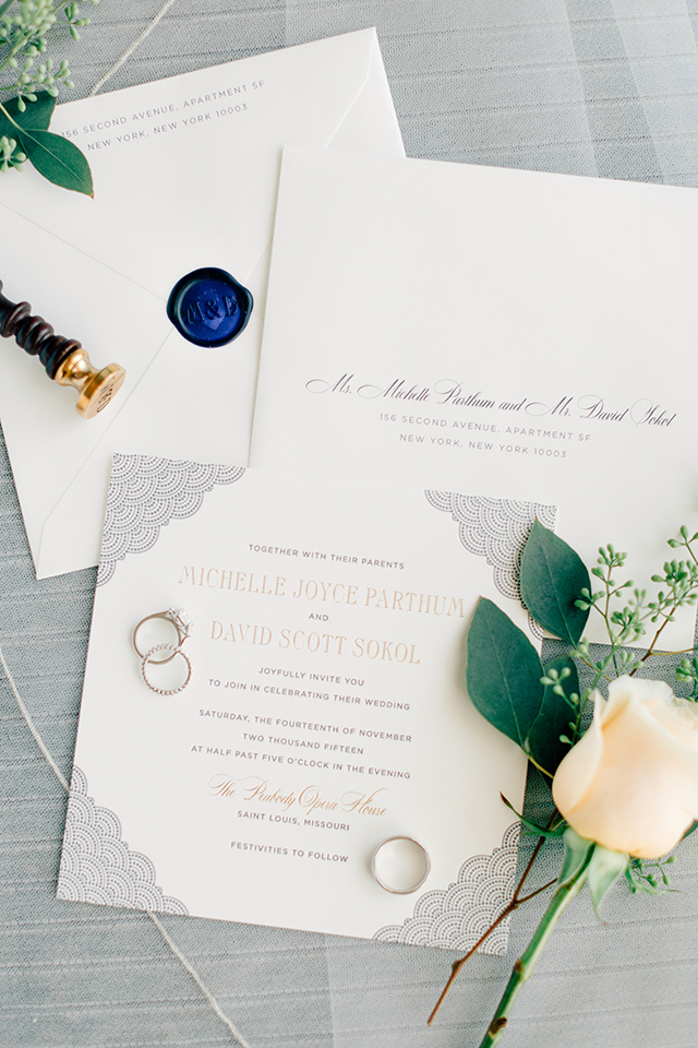
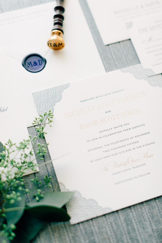
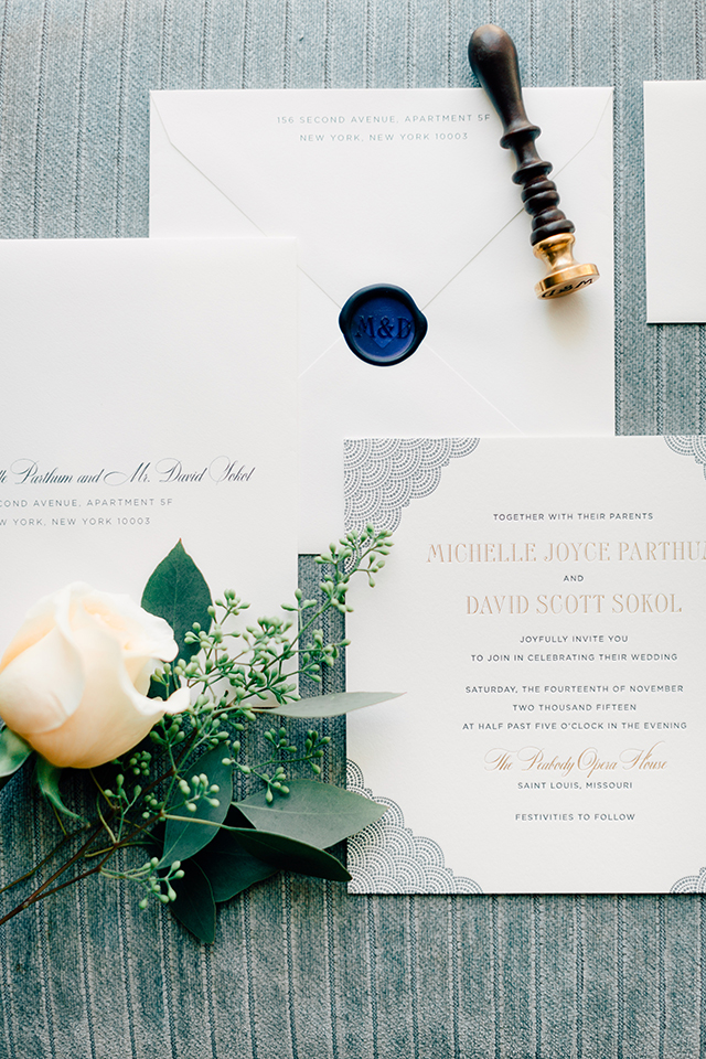
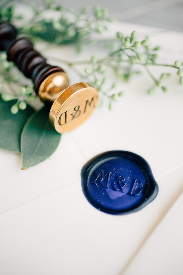
These elegant and classic navy wedding invitations from Patricia at Fourteen-Forty have two of my favorite things: a whimsical dot pattern and a wax seal! Seriously, how gorgeous is that pop of dark navy blue wax against the off-white envelopes? The navy blue of the dot pattern is especially beautiful paired with a subtle dose of champagne foil in the invitation text. And I love the combination of clean and classic text with a more modern – and attention-grabbing!– square invitation shape.

From Patricia:Â Michelle’s invitations were a true collaboration. She had seen our dot envelope liner pattern and loved it, so we decided to incorporate the dots front and center in the invitations, while working variations into the other pieces. It worked out really well with the venue, as they evoke opera curtains in a subtle and beautiful way.

Letterpress printing was key in bringing out the important details, along with a little foil shine. And then the blue – we used a subtle two tone color palette that was continued in her reception items and florals, which were a combination of soft peaches, light blues, and whites. Her bridesmaids dresses were also a deep and elegant navy blue. We absolutely love when we can coordinate all these pieces from beginning to end so that a cohesive look is created.

Another thing to notice is the more unique square shape of the invitation. They give the invitations a bit more grandeur – guests just can’t help but take notice at the special size. And the wax seal is definitely difficult to overlook. The dark blue was just a stunning pop of color on her off-white envelopes and they always make such a lovely keepsake.

Thanks Patricia!
Invitation Design:Â Fourteen-Forty
Flowers:Â Randy Felkey
Check out the Designer Rolodex for more talÂented wedÂding inviÂtaÂtion designÂers and the real inviÂtaÂtions gallery for more wedding invitation ideas!
Photo Credits:Â Mike Cassimatis

Love seeing these on OSBP, always a pleasure!!