I judge books by their covers, wine by its label and brands by their logos. I know the good stuff is on the inside, but I could ogle good packaging all day and have been known to buy things for reasons far divorced from utility. (I’d guess I’m not alone in this crowd.) Packaging may not seem like the sexiest topic, but good packaging is an invitation to purchase, and that’s an invitation we want to extend. –Emily of Clementine

Illustration by Emily McDowell for Oh So Beautiful Paper
First, the golden rule of retail packaging: They’re going to try to open it anyway. I know, you wrote “blank inside.†Customers will still look at me and ask “is it blank inside?†while opening the cellophane. I know, it’s sealed with a sticker. They will carefully peal back the sticker and reach for the card. I know, you labeled what’s inside and drew a little picture on the back showing the 6 different cards in a card set. Maybe they’ll ask me to open it. Why? I think it’s human nature. If you close something, people want to open it. Especially if it’s pretty. But let’s see if we can make your packaging something customers want to open, but instead choose to purchase and wait until they get home to break into. How? 90% of it is simple show & tell.
1. Tell them what’s inside. Pretty basic, but I receive a lot of beautiful, poorly labeled stationery. Is it a flat card? Is it blank inside? Is it a card set? How many card are in the set? Are they all the same or different? How big is that print? Is it a sticker or a mini-note? What’s it for….? I watch customers fumble through unclear packaging every day. Often, I can interrupt a quizzical look to explain what’s inside, but if I don’t, she’s stranded and will put it back down. If you don’t know what to include, try calling a friend and describing what the product looks like. Then find a well designed way to say the same thing. (Where? My vote is usually on the back. Unless you can make it work with the image.)

J. Falkner’s Perfect Little Notes use paper bands to tell what’s inside without interfering with the product. The bands are a slight deterrent for customers to open the box and allow retailers to slip the band off for a photo, and put it back on for customers. Win/win!
2. Show them what’s inside. In your online shops, you can clearly photograph and explain. In person, your packaging must speak for the contents. Unless you are packaging a single card or print that is clearly visible, you need to show what’s inside (with a photo, a great good drawing or innovative packaging). Every time customers pick up a box of cards, they’re asking “what’s inside? Answering this clearly increases the likelihood that your product will sell. (Where should you put this information? My vote is for the back if it’s a card/set/calendar or smack in the middle if it’s a tube.)

The Albertine Press letterpress library is one of the few products, I (happily) display without cellophane. The spine tells what’s inside and a quick flip open reveals the cards. The packaging itself feels like a gift and looks beautiful displayed in multiples.
3. Extend your branding. The cost of packaging increases the price of your products, but don’t make it a throwaway purchase. Good packaging makes your product feel like a gift, and if done well, can make an indelible mark that the customer returns to.
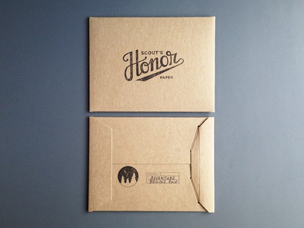
Scout’s Honor Paper packages her prints in stiff craft sleeves with a strong branded stamp on the front and back that tells the print name and size. Though she totally breaks my rule of showing what’s inside, I can easily take one print out to display and house the extras behind.Â
4. Packaging should keep it together and look great. Do you want the parade of horribles? I’ve had cello sleeves crumple or split as customers shove cards back in; stiff cello boxes that pop open; sealed small notes that aren’t affixed within the package so they jumble, but I can’t adjust them without damaging the package; prints with crumpled corners after being dropped; boxes that obscure the card design; gorgeous prints, postcards and tea towels that no one buys because they have no idea what’s inside; closure stickers that pop open more than they stick; belly bands that come unstuck and end up all over the floor; twine that frays and looks frumpy; calendars and prints with no backing that slide to the floor; products that fade in the window; and (through fault of my own) a cello box or two melted each winter due to radiator proximity. Those horribles are not so horrible, but these are costs that retailers absorb, if a product remains poorly packaged we won’t take the risk. You can’t always avoid these pitfalls, but you can mitigate by simply using the packaging yourself: pack your product up, throw the box around, unpack it and leave it on a table for a few weeks. See which of your items still shine, and adjust the rest.
5. There’s no right answer. When in doubt, reach out to a retailer you trust or hop into your favorite store and see what’s working. You should decide on the packaging you want, but here are some considerations:
- Single Cards – Cellophane sleeves are a must. I’m torn on whether a sleeve with the fold over seal is preferable. A little sticker on the back can tell the customer if the card is flat or folded, how big it is and whether the card is blank inside.
- Card Sets – Card sets are the slowest sellers. I think they’re also the most vaguely labeled. You can only show one card on the front, but you can show and tell on the back of the box. How many cards are in there? Are they all the same (if not, please include a label with a photo or drawing), what color is the envelope? Tying it with twine can look pretty or obstruct your image. Stickers can make a pretty seal but the occasional customer that ignores the sticker’s purpose and opens it, leaves me with a damaged product.

Moglea’s vibrant packaging shows both envelope and note, while the sticker draws your eye from the front to the back of the box where you learn the details of what’s inside!
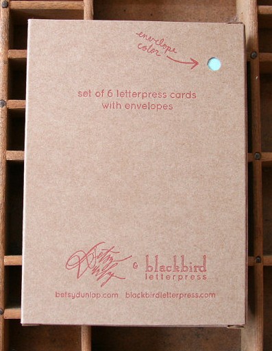
The cute peephole on the back of this card set from Blackbird Letterpress invites the customer to look closer while communicating basic info about this card set.
- Tiny notes, gift tags, book plates, recipe cards – These things don’t often get much respect in a retail setting because they’re little and often confuse the customer. They benefit from super clear packaging, and a bit of personality to invite the customer to pick them up.
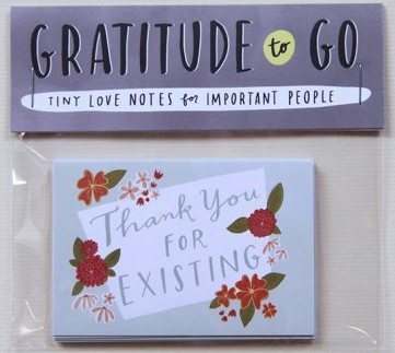
Emily McDowell draws people in with words alone. By the time customers read what her notes say, they’re already sold on the sentiment, with little need to even know the function.
- Pads of paper, journals & notebooks – You guys, wars could be started over whether a notebook should have lined or unlined pages. Let the customer know upfront. Also, let them know how many pages are in there. Cello sleeves help keep the corners neat and the pages clean.
- Prints – Customers often buy prints for gifts or quick decor, so including the dimensions is crucial. A sturdy piece of cardboard lets retailers display the print safely. Prints packaged in tubes are the most difficult to sell. I often have large prints professionally framed, but if the framed print sells, we’re back to the tube. A large color sticker is the best way to show what’s inside.
- Calendars – Customers who are on a calendar hunt want the days to be in boxes, customers who fall in love with your designs don’t care! Either way, it’s nice to show the customer whether or not there are boxes and display each month on the back (customers want to see their birth month, it’s often what sells them.) Like prints, a sturdy piece of cardboard is helpful for display and protection. I see a lot of dual purpose calendars these days (eg, once used, each month can be a print!) I love this idea, but make sure it’s clear so the customer knows they’re getting two uses for the price.
- Coasters – Coasters are one item where the packaging might be saved for storage, so this can be a great chance to extend your brand into a customer’s home.
 Rifle Paper Co’s coasters are packaged in boxes that make adorable storage for any other little thing. It’s a perfect extension of branding and makes the packing bridge into extended use.
- Tea Towels – Tea towels are almost always displayed folded. To prevent constant unfolding, a nice wide belly band with an image of the opened towel can help. (Bonus: offer to send a sample to display if your retailer buys a certain quantity.)
- Temporary tattoos – Temporary tattoos are often shared, or used as party favors, so people want to know how many they’re getting. I also think they look better on the body, so a photo of them in action is a super plus.
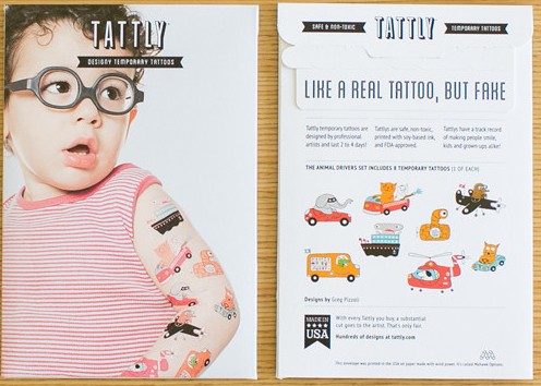
Tattly’s packing shows the products on (uh, adorable) models, then the back manages to be fun while describing exactly what’s inside.
- All other beauties – You makers are so darn prolific, I can’t even keep up with all of the areas that you’re branching into, so I’ll leave you with something simple: let the product speak for itself. Let it guide the packaging and be ok with being simple. Sometimes, that’s the best approach.

I’m utterly blown away by the beauty created by mixing the talents of Angela Liguori and Maybelle Imasa Stukuls. All I want to know is more about this ribbon, and Angela’s simple spool and clear font on a card give me just that.Â
The final golden rule of packaging is this: if you have an innovative idea, go for it. All of this is open to your interpretation. I don’t like cello sleeves, but I’m pimping them out here because it’s the current best solution to selling cards. If you have a better idea, please, go on. As long as your packaging shows and tells what’s inside, you’re meeting your retailers’ needs. If you can make it inventive and even more fun, you’re taking a step further to extend your brand and build a relationship with your retailers and customers.
Search outside of the stationery world for ideas. When I need a bit of inspiration (like how to finish up this post)Â I pull a collection of items from Clementine to see where themes emerge. I love the packaging below for all kinds of reasons: font, color, utility. Mostly, because it draws you a step closer to the product, making the customer one step closer to falling in love and taking it home.

Just another day in the shop, lost down a rabbit-hole of the beauty you all make via my Instagram.
I can’t wait to see what you pack up next! xoxoxo – Emily
Great tips, Emily!! Thanks so much. I know I am guilty of not having a sticker on my cards stating they are blank inside. I have been thinking of actually including that information within my logo I print on the back of the card that states how the card is printed and where. I wonder if customers actually read that, or if you are better off with a small .5″ round sticker that just says “blank inside?” We switched to open top cello bags for our cards because it is so much easier and quicker to package, especially when you are doing thousands at a time. But I do have a few retailers that request closed top and we gladly oblige and keep extras on hand. The fading thing is interesting too because I know cards are susceptible to that. We have one retailer that knows this is an issue at her shop and requests all our envelopes be white, so we swap them out for her orders. I don’t think they sell UV protective cello bags (especially the biodegradable ones we buy). Thanks, again!! 🙂
Sarah, Good questions! I just pulled a few of your cards from the shelves to take a look at. I love when vendors, like you, actually letterpress print a sweet little blurb about yourself as part of the card.
1. Blank Inside: Though I like the fact that adding “blank inside” would save you an additional step (ie, no sticker to put on) it doesn’t feel special enough to be part of your branding, plus: a sticker is really a message to the buyer, your logo/info on the back becomes a message to the recipient. (In otherwords, once the giver gives the card, it’s not really “blank inside” anymore!) If cost/time is ok, I would vote for a sticker, and I think customers would read it far more easily than as part of your card. If you do that, I’d use it as an opportunity to do something fun with the sticker to enhance your branding even more (ie I love the little heart stickers you put on my wholesale order! And/or a little round sticker with your “Merci!” large and then something like “this card is blank inside” under?
2. Envelopes! Yes, I have so many faded envelopes in addition to faded ink. The faded ink is often ok, as long as it’s consistent, but , I really don’t know what to do about the envelopes. I’ve actually meant to keep a list of whose ink/envelopes fade and whose doesnt. I love the idea of UV protective bags.
3. Either is ok with the cello sleeves. I love the intent behind the biodegradable ones, but they do crinkle a lot. I appreciate what you’re saying for ease/time of the open ones and truly, I think you’ve come to a good balance with offering the closure if the vendor wants it.
I’m all out of my Middlebury cards so I’m off to your website! xoxo!
I’ve been super curious about the envelope thing. I personally love colored envelopes that match the cards, but noticed that in stationery stores most cards come with kraft envelopes. Do retailers typically have a preference?
Cassandra, I love color! Especially if it corresponds with your card. But I do understand the cost/organization of different colors. I also like when a line chooses one color envelope for all of their cards (if it works with all of the cards!)
Good to know, thanks! Now I’m going to throw a few envelopes in the window and see how they hold up after a while 🙂
Thanks for the feedback, Emily! Great point about the sticker being for the buyer and the logo being for the the recipient (duh!). I think I am off to design and purchase new “blank” stickers. 🙂 I will have to some research on the UV cello sleeves. And I agree, the biodegradable ones are SO crinkly. They are improving them, though, so they are a little better than batches I have bought in the past which felt way too flimsy. It’s always a work in progress….improving your business is always on-going and the research does not end. That is my advice to all who are new to the biz here! 😉
Such a helpful post, Emily! Thank you! I’ve just launched wholesale, and this information is incredibly wonderful to have. So far all of my stickers are very descriptive (without being overly wordy), although I didn’t include “blank inside” as there was no proper place to put it on the sticker. Perhaps I will go back + try to add that information into the existing sticker. Curious though, what do you think of adding a small round sticker to the front stating that it’s blank inside? I like the idea of the customer knowing upfront, but I feel having two stickers on the back might get ‘busy’, especially if I can’t find a good place for it on my current design. However, I worry having it on the front the customer might think it gets in the way, even if it’s small. Just wondering your thoughts! Thanks so much!
Julie – Thank you! I’m so glad this is helpful. I agree with the fact that two stickers would seem too busy. I’d go with the stickers you have for now and include “blank inside” next time. I often forget (being part of the current stationery world) that so many people assume there’s something on the inside, so it really is good to include. The other downside of a sticker on the front is that it can really interrupt your design….and if I want to take a photo for my blog or instagram…it just doesn’t look as good. Hope that helps! Emily
Thank you so much for this post! As someone just starting out, the Brick + Mortar series has been insanely helpful. I was REALLY hoping to get a firm preference as sealed cellophane sleeve vs. non, but it looks like I’ll have to make that decision for myself. I’m currently working on refining the back of my cards, so this post came at the perfect time. Thanks again!
Cassandra, Thank you! I so appreciate hearing that this series is helpful. I love writing, it, but it’s the back and forth I love the most, so thank you! Ok, a firm response: I’d go with non-sealed, you’re just starting out, so take one more step out of it for yourself right now. If you find retailers requesting it or you like the look of it more, you can always change!
xo!
Thank you, thank you!! I currently use sealable, but that’s because I’m only selling online and it makes more sense in a rigid mailer. I think non-sealed would be SO much easier for wholesale, so good to know! I’m starting the Tradeshow Bootcamp webinar series today, so I’m really looking forward to breaking into the wholesale scene soon.
Emily,
This post is incredibly helpful. We are always looking to improve our packaging for our current collection and working on ideas for new products. These tips will help keep us ahead of our game and to create smart, informative, creative packaging that shows off our product in the best way. Thank you!
Andria, I love your designs so much and because they’re so delicate, I’d advocate even more for your stickers to go on the back. Your stickers are really well designed, but they do interrupt your beautiful designs! Keep it coming though, Lilikoi is making such wonderful things!
Wow! I’m starting a stationery line and this information is fantastic! Thanks for this post.
Thanks Emily & best wishes for your line!
this blog is dangerous, I always want everything you post!
Abbie, then I’m doing my job! Thank you, your photos are dreamy.
THANK YOU!!! This was an AMAZING article! I’ve been struggling with my packaging, and now I have lots of great ideas and it was so great to have the customer’s perspective! Thank you so much!
Thanks Amy! Best wishes for building your line!
Hi Emily, I love reading all your tips and advice. It’s so helpful now that I’m doing wholesale. Your tip on tiny notes is great. I have these teeny tiny envelopes that do well at craft shows but not at retail. I’m definitely going to try to improve on the packaging. Love Emily McDowell’s play on words. I’m curious why it’s important to have the card size written on the label. When you’re holding a card, you see how big it is in your hands. I do include the card size in my online shop but on my the label. Thanks so much!
Thank you, Lisa, good point!
Short answer, you’re totally right, and VERY few of my single cards say anything about the size. This is the rare bit of info that you need online but not as much in the shop. Bottom line, if you don’t include it, it’s fine. But here are two thoughts on why it’s helpful.
But, food for thought: Many cards are so great, customers buy them to frame so, like prints, it’s nice to know what the size is. In fact, I’d love to see cheeky packaging that says something like “this card fits perfectly into a standard 5×7 frame, just in case you want some ready made art!”
I just gobbled up all of that information – thank you so much for sharing! As someone who will be entering the wholesale stationery arena quite soon, it’s really helpful to read the ins/outs of packaging AND that it’s okay to try something new if we think it’s a stellar way to go. I’ll be back to re-read this again! Thank you! xo
Emily: Your article, as always, is so helpful. Since we are just completing our first year in business, I like to go back and re-read your posts. There is always something new to pick up on. I often ask my husband, “who died and made me queen?” I have a degree in business not branding, packaging, website design, photography, human resources, booth design, etc. There are so many facets in running a letterpress business that it is nice to feel like someone has taken you under their wing to help you learn. You have been one of my “wing men”. Thank you so much for sharing. I really value your expertise and experience.
Ahhhh, yes, it would be wise to start labeling journals with page numbers and un-lined status. Tell me, do you prefer journals packed in cello (to keep them pristine) or with a belly band, which will keep them closed and label them, but allow for use and abuse of the edges by curios hands?
Thanks, as always, for sharing the shopkeepers perspective. 🙂
Can we talk more about envelopes? As an individual card buyer (i.e., I’m buying for me, not a shop), I prefer it when the maker chooses an envelope that suits their card. Whether that be a kraft, white, or colored envelope. To me, the envelope is a continuation of the card.
Cards with brightly colored envelopes really pop and are fun to find amidst the bills, flyers, and catalogs in the mailbox. Vividly colored envelopes are also quite fun to write on. Parrot Design Studio, Lady Fingers Letterpress, Farewell Paperie, and Studio SloMo (among many others) pair many of their cards with colorful envelopes.
Kraft envelopes are well-suited to some cards (see Sapling Press) but sometimes kraft isn’t a good match. It’s a bit of a disappointment when someone created a great card but didn’t follow it through to the envelope. In my experience, kraft envelopes sometimes have the following drawbacks: a texture that doesn’t take ink well from a regular pen (ballpoint/rollerball), a dark color that makes the address hard to read, poor glue on the flap, and a texture that doesn’t accept stickers well. I like to pepper my envelopes with stickers, but more importantly, stamps are stickers. I don’t like having to hunt down a glue stick to affix a stamp to a card.
White is often a fine color choice, but please make sure that it matches the quality of your card. A luxurious letterpress card paired with a thin, basically see-through envelope? Maddening. If I’m spending the money for a high-quality letterpress card, the envelope better be up to par.
Lined envelopes? Drool. I love them. As a frequent stationery buyer, it’s something for which I willingly pay extra.
In summary, see the envelope as part of the card. A friendly letter is such a rarity these days that it is a gift. And the envelope? It’s the wrapping paper.
Thank you so much for your thoughts on envelopes! It really helps to hear perspective from many different people. I have seen so many envelopes that are thin and was really double (and triple) thinking my decision to spend more on envelopes that I feel are of great quality. This makes me feel much better about the fact that I feel strongly about quality envelopes, even if it’s cutting into my profit slightly. I LOVE your analogy that the envelope is the wrapping paper. Nailed it.
Regarding 4. Packaging should keep it together and look great. Test drive your packaging to make sure it doesn’t damage your product. Last year I purchased a set of cards in a plastic box where the maker affixed a vellum sticker to the top card in the set. The card was white. The glue from the sticker left a stain on the card. When contacted, the maker sent a replacement set. But a recent trip to the stationery store indicates that the maker still places the vellum sticker directly on the top card in the set, thus ruining one card in the set before it’s even opened. While their designs are great (and envelopes lined), I will not be purchasing any cards from them until the packaging issue is corrected.
What a fantastic post Emily.
Packaging is always in my mind when I’m starting a new product / line as its such a huge part of the whole brand experience and creating something really great. I’ve revised the backs of my cards several times now as on singles they kind of act as the packaging (wrapped around an envelope).
You summed it all up fantastically (again) – thank you.
Love this post and get to work thinking we should “sell” our actually lovely packaging better by advertising it. It comes as a surprise for buyers, but we don’t have our products photographed in it. This gives us the option of shipping out things right after there are ready to ship – when we’re short in time… Maybe we should change this.
You really make it seem so easy togeter with your presentation however I to find this topic to be actually somethung wich I believe I would never
understand. It seems too complex and very vast for me.
I am taking a look ahead onn your next submit, I’ll attempt too get the grasp of it!