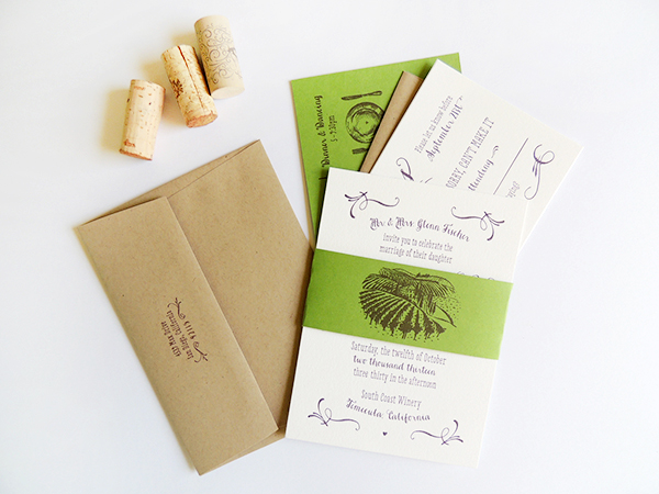
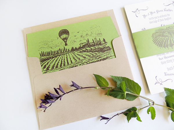
Happy Monday everyone! We’re kicking off the week with these beautiful invitations from Brynne of Harken Press for her own upcoming wedding! As with her save the dates, Brynne drew her inspiration from the vineyard wedding venue in Southern California. I’m loving the nature-inspired color palette along with the wonderful illustrated envelope liner and belly band featuring the venue’s endless rows of grapevines.

From Brynne: Nothing sets the scene for romance like a vineyard. Our wedding invitation suite has modern typography with whimsical flourishes and illustrations. The color palette – plum, forest green, kraft brown, and pearl white – came from the rich colors of the vineyard where our wedding will take place in the fall.
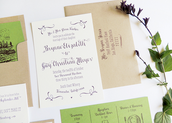
Much like our vineyard save the date, the design was inspired by our wedding venue in Temecula wine country in Southern California. The hand drawn style of the illustrations convey the casual, easy-going vibe of the event. Since the grape vines are literally growing all over the property of the resort, we wanted to get our guests excited by showing the rows of vines and the hot air balloons in the sky in the mornings.
 Â
Â
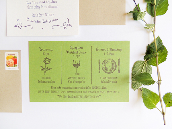
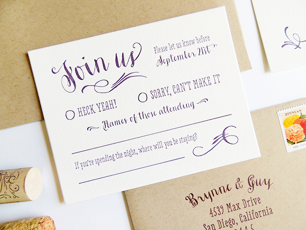
The vineyard invitation suite includes an invitation, reply card, guest information card, kraft envelopes, and a belly band to hold all the pieces together. The invitation and reply card are letterpress printed, while the other pieces are digital printed.
Thanks Brynne!
Design:Â Harken Press
Digital Printing:Â Harken Press
Letterpress Printing:Â Quality Letterpress
Check out the Designer Rolodex for more talÂented wedÂding inviÂtaÂtion designÂers and the real inviÂtaÂtions gallery for more wedding invitation ideas!
Photo Credits:Â Harken Press
