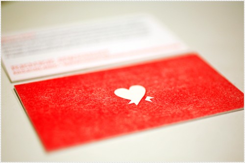
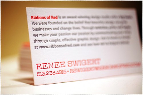
I’m usually not the biggest fan of the color red, but today I’m really digging the contrast between the bright red and crisp white on these letterpress business cards designed by Ribbons of Red and printed by Angel Bomb Design:


The Ribbons of Red website is actually really cute, too (I’m kind of in love with their logo).
{image credits: ribbons of red, found via card observer}

Her website is really really sweet and so is her story!
this is amazing. love.
Soooooo sweet.
I really like how they treated the red ink so that it looks worn. Really nice cards.
hooray for cincinnati-based companies!
this is just gorgeous!
Thank you so much for the wonderful comments and for featuring me on your beautiful blog!! 🙂