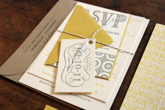
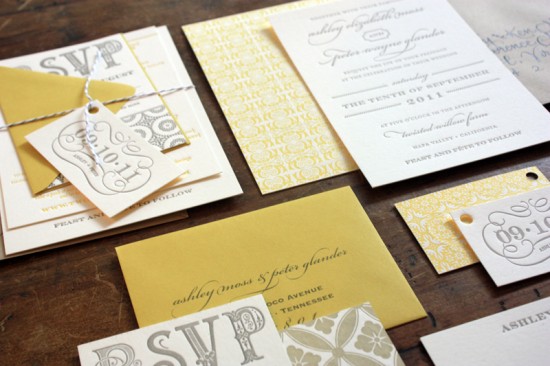
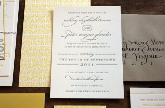
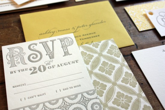
As far as color combinations go, yellow and gray will always be one of my favorites.  Sarah from The Happy Envelope created these gorgeous wedding invitations for a destination wedding in Napa Valley.  She paired elegant script and serif fonts with beautiful patterns for an overall design that is both laid back and sophisticated – and completely stunning.
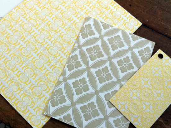
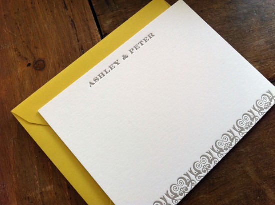
From Sarah: This wedding is a Napa Valley destination event.  The upbeat color palette of yellow, gray and taupe brings a sense of cheer to the whole suite.  All pieces were letterpress printed on weighty conservation board — thick enough to allow for letterpress printing on both sides of the invitation.  All pieces were printed in a warm putty gray on the front, with various patterns printed in warm yellow ink on the back of the invitation, the reply card, and the hangtag.
The entire suite is wrapped in oyster gray twine paired with a neutral khaki envelope and hand-lettered black ink calligraphy.
The bride wanted a laid-back, California feel but with an understated, simple aesthetic. Â The invitation itself is fairly understated on the front with a mixture of type and a light dotted line motif. Â The punch to this invitation is the bold pattern printing on the reverse side of select pieces.
So pretty! Â Thank you so much Sarah!
Photo Credits: The Happy Envelope

gorgeous. love the colors!
Such beautiful patterns!
Oh those patterns are just perfect! If those were made into sheets, I’d snap them right up!
this is SO gorgeous!! what great color palette too!