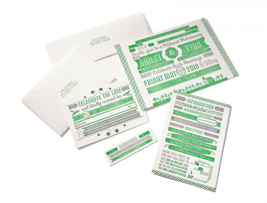
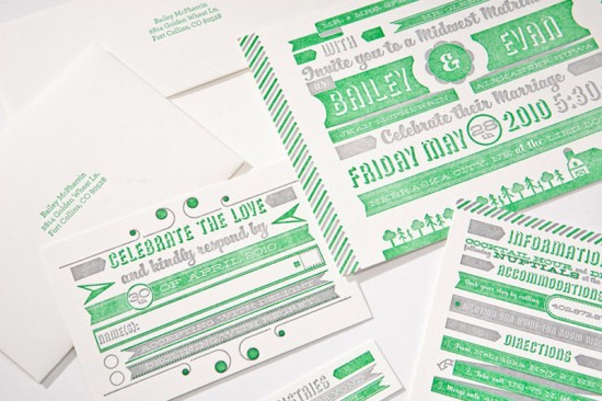
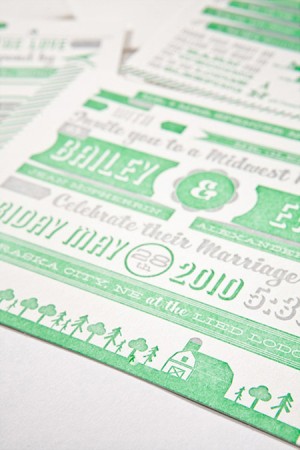
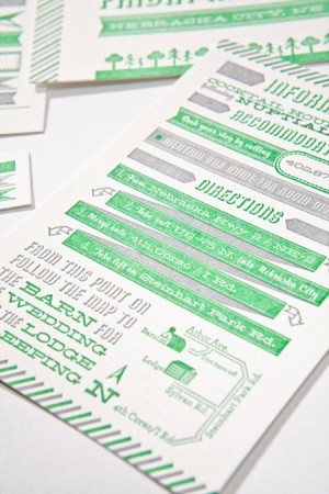
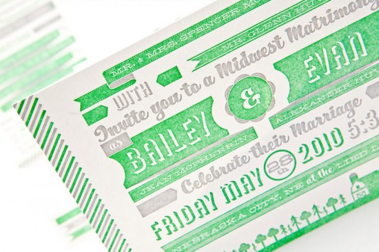
I stumbled across these fun and modern wedding invitations while putting this morning’s business card post together. Â Evan Huwa designed them for his own wedding last spring. Â I’m loving the bright pops of green paired with the warm gray, and I also really love the salty texture of the solid letterpress printed areas. Â I know the salty look isn’t for everyone, but I like the contrast of that texture against the modern graphic elements used in the invitation. Â Very cool!
You can check out more of Evan’s creative work on his website right here!
Photo Credits: Evan Huwa

Awesome!!! Love the color combo.
Seems a bit hard to read, but love the color combo nonetheless!
I love the typography and letterpress on these!
it’s funny because at first it looks like there is so much going on and that they might be hard to read. but when you actually do so, it’s quite simple. line by line…just a lot more interesting.
the green addresses on the envelopes was a little stroke of genius as well. a simple but different little attention getter!
Thanks for the post guys!!