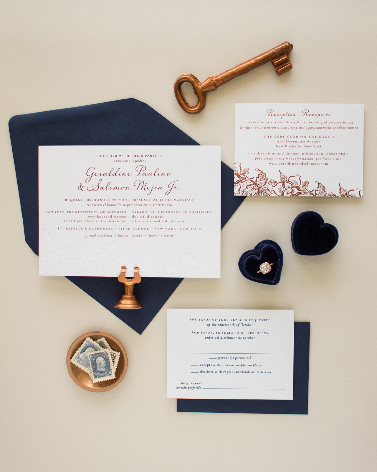
If you can’t have a typical destination wedding, why not bring the destination home to you? Sarah from Banter & Charm designed these bilingual copper foil and blind letterpress wedding invitations as a nod to both the English and Spanish heritage of the couple! A delicate blind letterpress printed lace-inspired design was the perfect way to complement the festive copper foil details!

From Sarah: Copper foil and blind letterpress with navy accents – it’s no wonder that Geraldine and Salomon’s wedding invitation suite is one of my favorite designs from the past year. Geraldine came to me looking for a custom invitation design to accommodate the bilingual wording she and her fiancé would be using for their New York wedding. Since Geraldine and Salomon were inviting guests that spoke both English and Spanish, they wanted to include both languages in their wedding stationery.

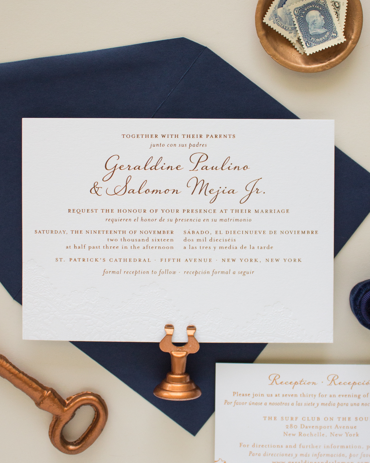
Instead of having two separate invitations, they decided to go with a bilingual design that incorporated both languages on a single card. Geraldine knew she wanted a romantic design, and really wanted to incorporate a vintage lace graphic with blind letterpress printing. She loved several of the designs from my invitation collection, but we decided to go with a custom design to accommodate the additional wording she needed.

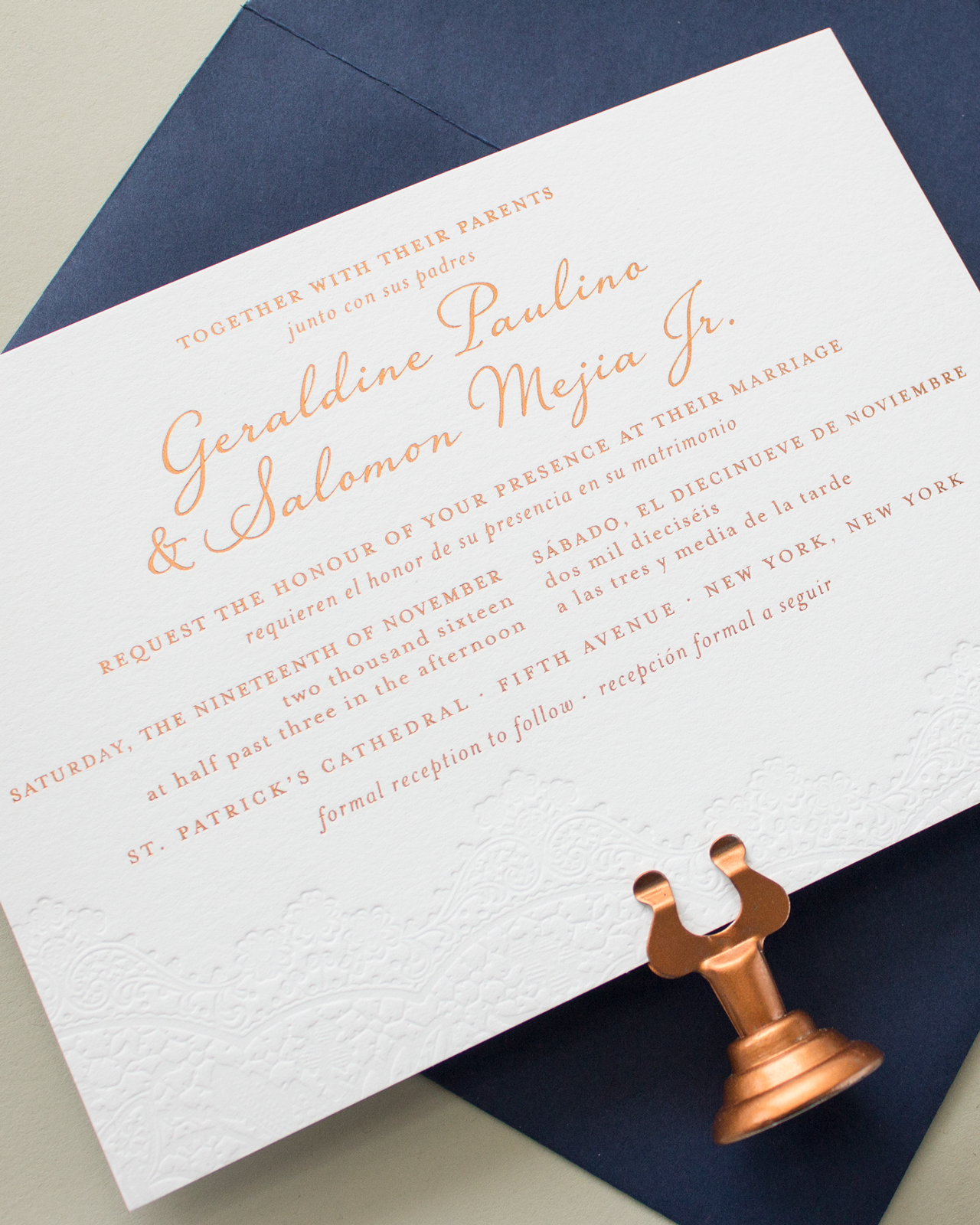
The final invitation design featured a gorgeous blind letterpress printed lace detail along the bottom edge, with copper foil printing for the text, all on Crane’s Lettra paper in Fluorescent white. With so much text to include, we needed to get creative on the layout. By using italics for the Spanish wording, we were able to distinguish between the two languages while keeping the design cohesive.

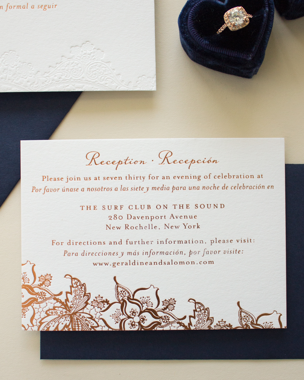
The reception card was also bilingual, and featured copper foil printing for all the elements. I love the contrast of the subtle blind letterpress printed lace on the invitation with the bold copper foil lace on the reception card. To bring in some color, we went with navy ink in flat printing for the response card. The navy ink added a great pop of color, and by using flat printing for the response card we were able to keep costs down.

I absolutely love the way this suite turned out. Copper is my new favorite foil, and I have a feeling I’ll be using it a lot in the future.

Thanks Sarah!
Design: Banter & Charm
Banter & Charm is a member of the Designer Rolodex – you can see more of their beautiful work right here or visit the real inviÂtaÂtions gallery for more wedding invitation ideas!
Photo Credits: Banter & Charm
