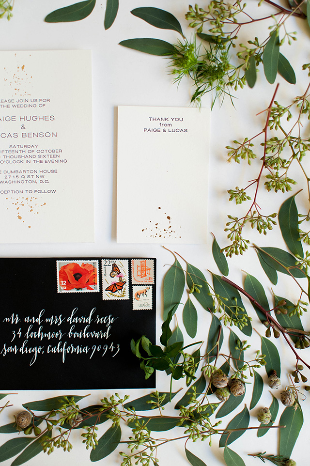
These subtle gold foil splatter wedding invitations from Mariko at Miks Letterpress+ incorporate gold foil in the most delicate and surprising way! Gold foil is usually the star of the show, but I love the subtle splash of gold foil against the modern sans serif type-driven design. Mariko wove the gold foil splatter pattern throughout the invitation suite, from the save the dates to the post-wedding thank you cards. And I absolutely adore the contrasting black envelope with calligraphed addresses in white ink by Meant to Be Calligraphy and colorful pop of color from the vintage postage stamps!
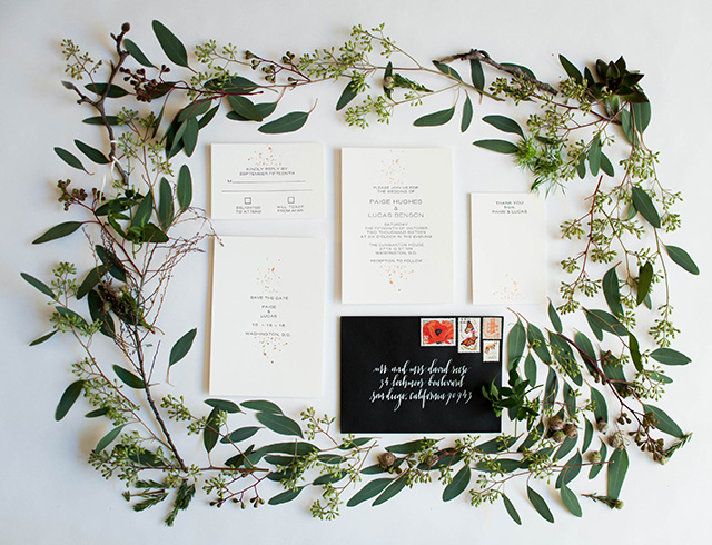
From Mariko: The bride wanted to incorporate gold foil, but not anything too over the top. To add a subtle gold foil element to the invitation design, I decided to go with a splash (literally) on each page. I chose a tame and modern sans serif font to counter balance the chaos of the gold foil splash. This suite is great for keeping it simple, yet having a little bit of luxury through the gold foil.
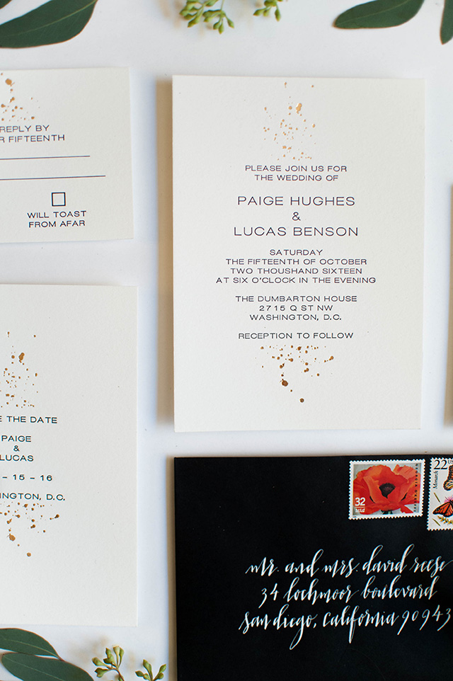
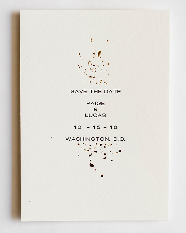
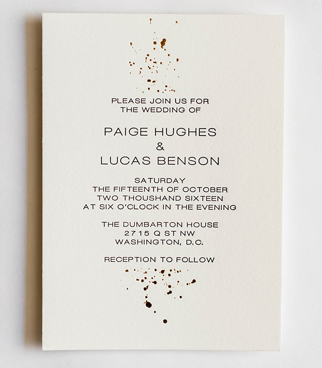
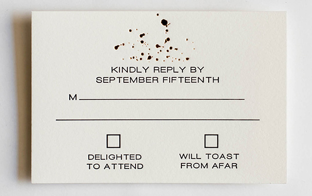
The suite was hand letterpress printed in black ink along with gold foil on 100% cotton paper. The black envelopes help to balance all of the white space in the invitation suite itself, with a white ink address by Meant to Be Calligraphy in her Reese lettering style. Here the vintage postage stamps also add a splash of color to match the color palette of the wedding. We had a great time styling the shoot using eucalyptus and other greenery to complement the suite.
Thanks Mariko!
Design and Letterpress Printing: Miks Letterpress+
Envelope Calligraphy: Meant to Be Calligraphy
Floral Styling: Taffy Floral
Check out the Designer Rolodex for more talÂented wedÂding inviÂtaÂtion designÂers and the real inviÂtaÂtions gallery for more wedding invitation ideas!
Photo Credits: Rachel Lynn Photography
