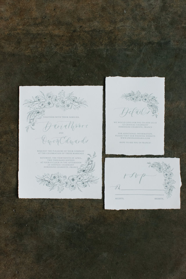
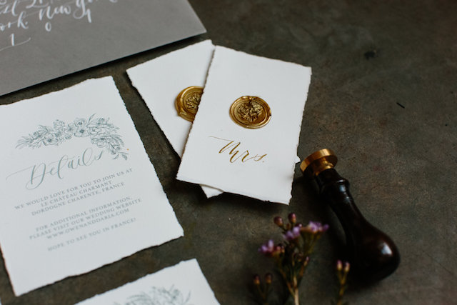
I love big, colorful watercolor floral illustrations as much as the next girl, but sometimes it’s refreshing to see something more restrained. And while these monochromatic illustrated floral wedding invitations from Jill at Art + Alexander are pared down in color, they don’t sacrifice anything when it comes to elegance and romance. I love that Jill used a calligraphy pen and nib to create the floral illustrations – and how pretty are the deckled edges on that Cartiera Magnani paper??
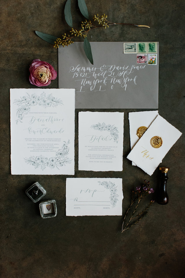
From Jill: I wanted this invitation to be elegant, romantic, organic, and pared down. As an invitation designer, I get a lot of requests for my watercolor florals, which I love creating – but I wanted to try something a bit different for this invitation design.
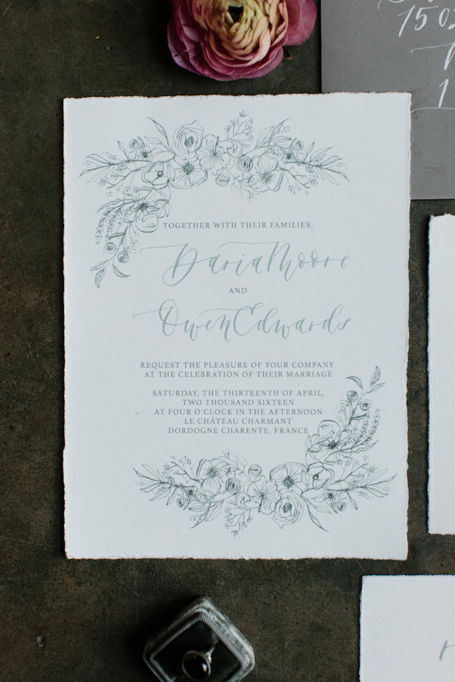
I chose to create the floral illustration using a calligraphy pen and India ink. I wanted the crisp line that a calligraphy pen offers. I opted for a monochromatic design to really keep things simple, allowing the eye to focus attention on the calligraphy and florals. I incorporated pops of color in the invitation suite through the antique postage stamps I used on the envelopes, which I found in an old steamer trunk that belonged to my Grandmother.
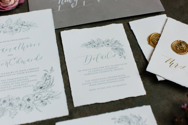
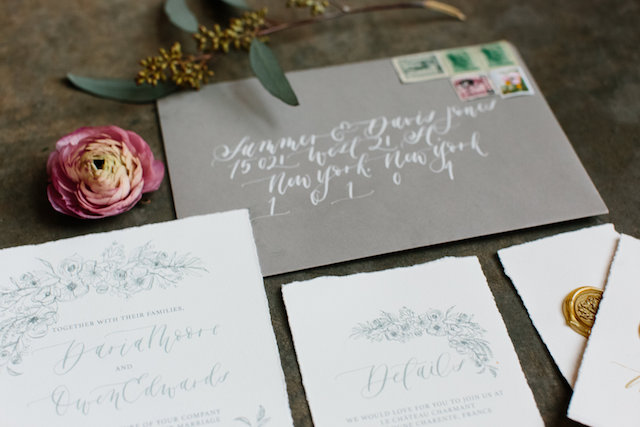
The invitations were digitally printed on Cartiera Magnani paper, which has long been a favourite of mine and offers a very rich, pulpy, organic feel. I decided on a dark gray envelope to add a touch of contrast, and used white ink for the addresses to pull everything together. These envelopes were sourced from Reid’s Stationer’s here in Calgary, and the address calligraphy ink is white India ink.
Thanks Jill!
Design and calligraphy: Art + Alexander
Check out the Designer Rolodex for more talÂented wedÂding inviÂtaÂtion designÂers and the real inviÂtaÂtions gallery for more wedding invitation ideas!
Photographed by: Shannon Yau
