With spring officially here, that means trade show season will be upon us before we know it. Things around the studio have been hectic, between shipping The Parcel, filling samples and a bit of business travel, I barely even noticed the hellebores blooming. Before we get too busy, I wanted to share this brand identity for Brass Union that draws on the history of its surroundings for its design inspiration. – Jill
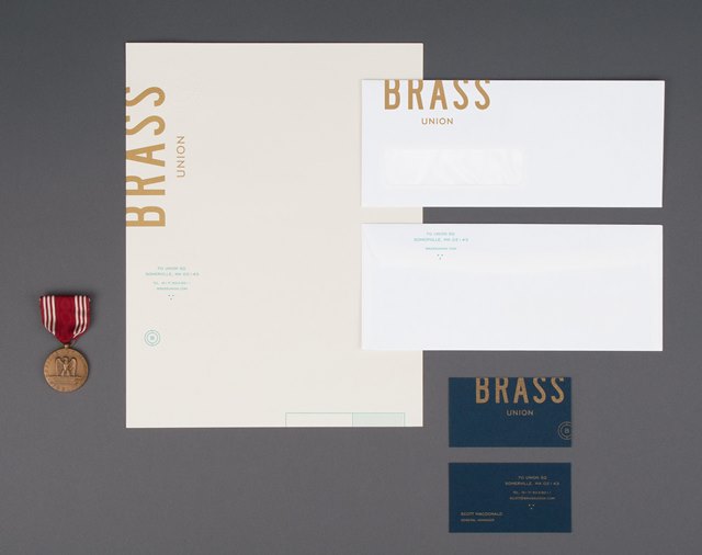
With a cohesive brand identity that pays homage to the building’s history, Brass Union is a pub housed in the former police station in Union Square’s Somerville neighborhood. Designed by Rory & Jen at Oat, Brass Union’s brand identity is a great example of the stellar results that can be achieved when mixing different paper stocks, textures, type and production techniques. The team at Oat utilized the building’s history to channel bureaucratic and administrative in a subterranean hideaway, housed in a historic police station.
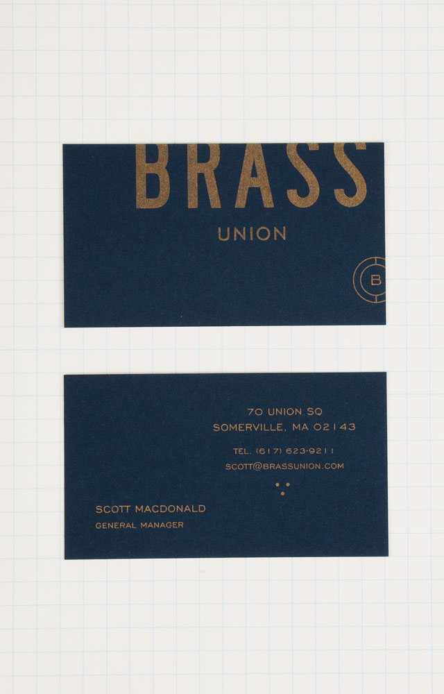
Gold metallic ink pairs beautifully on the deep blue shade of the business cards, offset printed in one color on French Paper’s Construction 100# Cover in Midnight Blue.
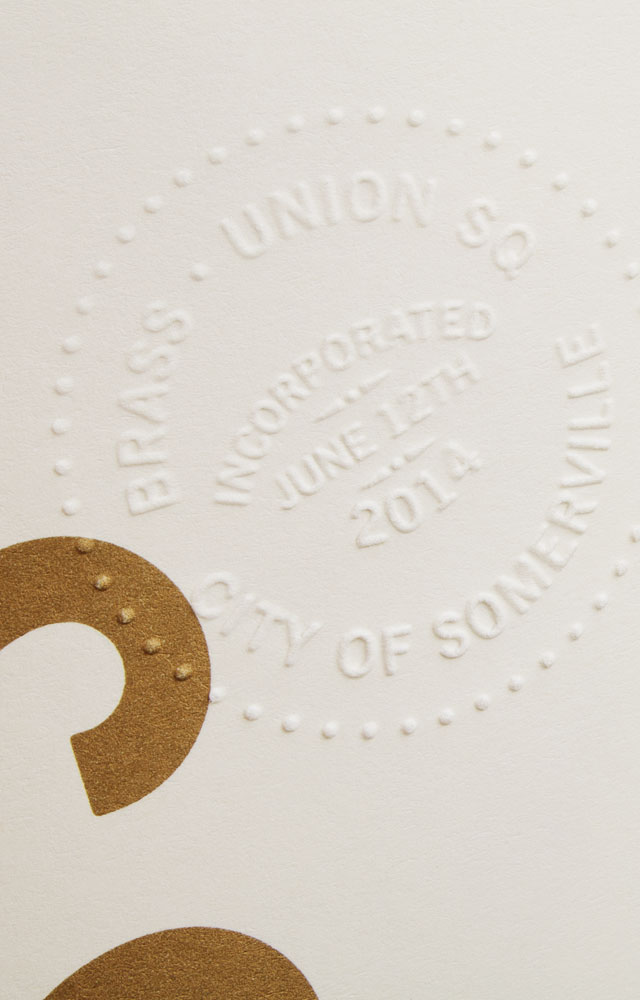
The letterhead feels official with a blind embossed seal on text weight paper, printed offset in two colors on Mohawk Via 70# Text in 100% PC Cream White. Accompanied by a standard bright white #10 window envelope, giving the stationery suite a utilitarian look.
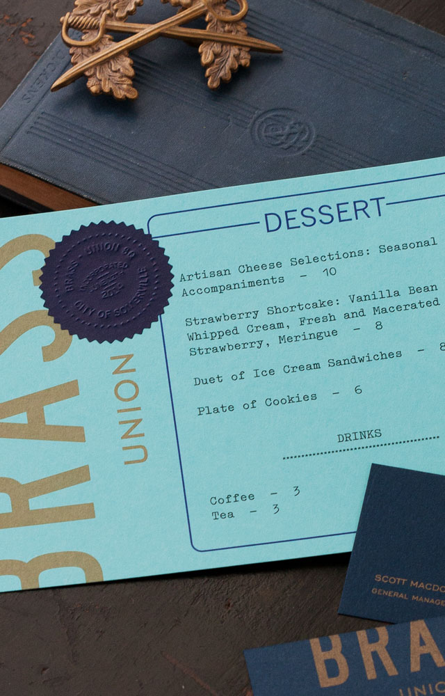
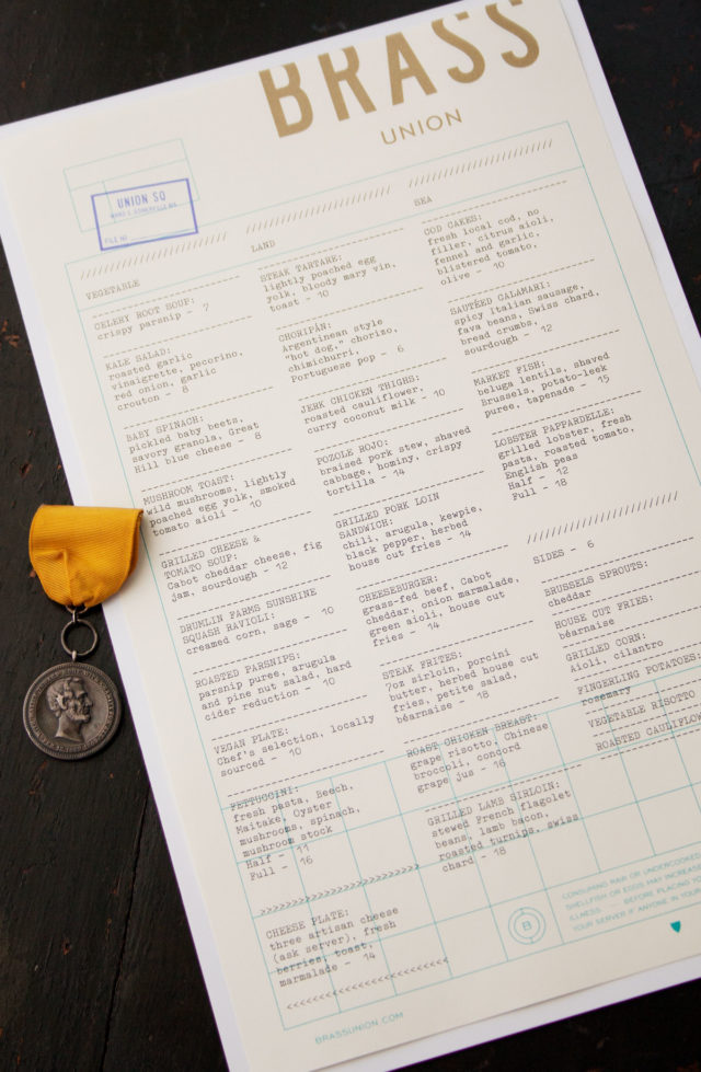
The menu system echoes the details of the stationery, with main menu printed offset on the same stock as the letterhead in metallic gold and blue. The drink and dessert menus carry through with the cropped type treatment, bringing in a bit of color. The drink menu is printed on Mohawk Via Light Pink 70# Text. The metallic gold on the dessert menu pops, printed on French Poptone 100# Cover in Blu Raspberry and sporting a blind embossed navy seal.
With die-cut, badge shapes and cropped type in shades of blue, the coasters tie in perfectly to Brass Union’s identity and space. Cheers!

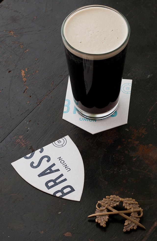
Photo Credits: Oat

Oh how cool this is in my neck of the woods! I’ll have to go visit. Of course I LOVE all the play-on colors and words! All the blue and the name “Brass” all referring back to the police station! So great! Reminds me of the old Charles St jail, now a hotel, with their restaurant named “Clink”! It works on so many levels and makes my word-loving heart sing!
Kristina – I know what you mean, it’s always so fun to see a brand identity take form and that this one does with a nod to its historic surroundings seems fitting. I think they were spot on with their choice of paper and production techniques – it could have easily gone over the top but the team at Oat executed beautifully.